Feeds:
Posts
Comments

Archive for January, 2010

Recap

Part One of the series started with this statement:

If there’s one area that often seems to catch the imagination of many who call themselves “climate skeptics”, it’s the idea that CO2 at its low levels of concentration in the atmosphere can’t possibly cause the changes in temperature that have already occurred – and that are projected to occur in the future. Instead, the sun, that big bright hot thing in the sky (unless you live in England), is identified as the most likely cause of temperature changes.

And covered the “zero-dimensional” model of the sun and the earth. Also known as the “billiard ball” model. It was just a starting point to understand the very basics.

In Part Two we looked a little closer at why certain gases absorbed energy in certain bands and what the factors were that made them more, or less, effective “greenhouse” gases.

In this part, we are going to start looking at the “1-dimensional” model. I try and keep any maths as basic as possible and have separated out some maths for the keen students.

When you arrive at a new subject, the first time you see an analysis, or model, it can be confusing. After you’ve seen it and thought about it a few times it becomes more obvious and your acceptance of it grows – assuming it’s a good analysis.

So for people new to this, if at first it seems a bit daunting but you do want to understand it, don’t give up. Come back and take another look in a few days..

Models

If your background doesn’t include much science it’s worth understanding what a “model” is all about. Especially because many people have their doubts about GCM’s or “Global Climate Models”.

One of the ways that a model of a physics (or any science) problem is created is by starting from first principles, generating some equations and then finding out what the results of those equations are. Sometimes you can solve this set of equations “analytically” – which means the result is a formula that you can plot on a graph and analyze whichever way you like. Usually in the real world there isn’t an “analytical” solution to the problem and instead you have to resort to numerical analysis which means using some kind of computer package to calculate the answer.

The starting point of any real world problem is a basic model to get an understanding of the key “parameters” – or key “players” in the process. Then – whether you have an analytical solution or have to do a numerical analysis doesn’t really matter – you play around with the parameters and find out how the results change.

Additionally, you look at how closely the initial equations matched the actual situation you were modeling and that gives you an idea of whether the model will be a close fit or a very rudimentary one.

And you take some real-world measurements and see what kind of match you have.

Radiative Transfer

In the “zero dimensional” analysis we used a very important principle:

Energy into a system = Energy out of a system, unless the system is warming or cooling

The earth’s climate was considered like that for the simple model. And for the simple model we didn’t have to think about whether the earth was heating up, the actual temperature rise is so small year by year that it wouldn’t affect any of those results.

In looking at “radiative transfer” – or energy radiated through each layer of the atmosphere – this same important principle will be at the heart of it.

What we will do is break up the atmosphere into lots of very thin sections and analyze each section. The mathematical tools are there (calculus) to do that. The same kind of principles are applied, for example, when structural engineers work out forces in concrete beams – and in almost all physics and engineering problems.

And when we step back and try and re-analyze, again it will be on the basis of Energy in = Energy out

If you are new to ideas of radiation and absorption, go back and take a look at Part One – if you haven’t done so already.

In this first look I’ll keep the maths as light as possible and try and explain what it means. If following a little maths is what you want, there is some extra maths separated out.

First Step – Absorption

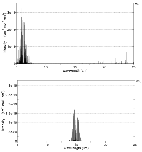
As we saw in part one, radiation absorbed by a gas is not constant across wavelengths. For example, here is CO2 and water vapor:

CO2 and water vapor absorption, by SpectraCalc from the HITRANS database

CO2 and water vapor absorption, by spectracalc.com from the HITRANS database

What we want to know is if we take radiation of a given wavelength which travels up through the atmosphere, how much of the radiation is absorbed?

We’ll define some parameters or “variables”.

I(λ) – The intensity, I, of radiation which is a function of wavelength, λ

I0(λ) –  is the initial or starting condition (the intensity at the earth’s surface).

z – the vertical height through the atmosphere

n – how much of an absorbing gas is present

σ(λ) – absorption cross-section at wavelength λ (this parameter is dependent on the gas we are considering, and identifies how effective it is at capturing a photon of radiation at that wavelength)

The result of a simple mathematical analysis produces an equation that says that as you:

  • increase the depth through the atmosphere that the radiation travels
  • or the concentration of the gas
  • or its “absorption cross-section”

Then more radiation is absorbed. Not too surprising!

When the concentration of the gas is independent of depth (or height) the mathematical result becomes:

Iz = I0(λ).exp(-nσ(λ)z) also written as Iz = I0(λ).e-nσ(λ)z

This is the Beer-Lambert Law. The assumption that the number of gas molecules is independent of depth isn’t actually correct in the real world, but this first simple approximation gets us started. We could write n(z) in the equation above to show that n was a function of depth through the atmosphere.

[In the above equation, e is the natural log value of 2.781 that comes up everywhere in natural processes. To make complex equations easier to read, it is a convention to write “e to the power of x” as “exp(x)”]

Here’s what the function looks like as “nσ(λ)z” increases – I called this term “x” here in this graph.

Typical form of many natural processes, Iz=I0.exp (-x)

Transmittance of Radiation as "optical thickness" (x) increases.

It’s not too hard to imagine now. Iz is the amount of radiation making it through the gas. Iz=1 means all of it got through, and Iz=0 means none of it got through.

As you increase vertical height through the gas, or the amount of the gas, or the absorption of the gas, then the amount of radiation that gets through decreases. And it doesn’t decrease linearly. You see this kind of shape of curve everywhere in nature including the radiation decay of uranium..

This result is not too surprising to most people. But it’s knowing only this part which has many confused, because the question comes – about CO2 – doesn’t it saturate?

Isn’t it true that as CO2 increases eventually it has no effect? And haven’t we already reached that point?

Excellent questions. Skip the maths derivation of this section if you aren’t interested to find out about our Second Step – Radiation

First Step – Absorption – Skip this, it’s the Maths

You can skip this if you don’t like maths.

The intensity of light of wavelength λ is I(λ). This light passes through a depth dz (“thin slice”) of an absorber with number concentration n, and absorption cross-section σ(λ), and so is reduced by an amount dI(λ) given by:

dI(λ) = -I(λ)nσ(λ)dz = I(λ)dχ                   [equation 1]

where χ is defined as optical depth. It’s just a convenient new variable that encapsulates the complete effect of that depth of atmosphere at that wavelength for that gas.

We integrate equation 1 to obtain the intensity of light transmitted a distance z through the absorber Iz(λ):

Iz(λ) = I0(λ) exp{-∫nσ(λ)dz}                 [equation 2]
[note the integral is from 0 to z – not able to get the webpage to display what I want here]

In the case where the concentration of the absorbing gas is independent of the depth through the atmosphere the above equation is simplified to the Beer Lambert Law

Iz = I0(λ).exp(-nσ(λ)z) also written as Iz = I0(λ).e-nσ(λ)z

Note that this assumption is not strictly true of the atmosphere in general – the closer to the surface the higher the pressure and, therefore, there is more of absorbing gases like CO2.

Second Step – Radiation

Once the atmosphere is absorbing radiation something has to happen.

The conceptual mistake that most people make who haven’t really understood radiative transfer is they think of it something like torchlight trying to shine through sand – once you have enough sand nothing gets through and that’s it.

But energy absorbed has to go somewhere and and in this case the energy goes into increased heat of that section of the atmosphere, as we saw in Part Two of this series.

In general, and especially true in the troposphere (the lower part of the atmosphere up to around 10km), the increased energy of a molecule of CO2 (or water vapor, CH4, etc) heats up the molecules around it – and that section of the atmosphere then radiates out energy, both up and down.

Let’s introduce a new variable, B = intensity of emitted radiation

The relationship between I (radiation absorbed) – and B (radiation emitted) – integrated across all wavelengths, all directions and all surfaces is linked through conservation of energy.

But these two parameters are not otherwise related. Making it more difficult to conceptually understand the problem.

I depends on the radiation from the ground, which in turn is dependent on the energy received from the sun and longwave radiation re-emitted back to the ground.

Whereas B is a function of the temperature of that “slice” of the atmosphere.

The equation that includes absorption and emission for this thin “slice” through the atmosphere becomes:

dI = -Inσdz + Bnσdz = (I – B)dχ  (where χ is defined as optical depth)

dI is “calculus” meaning the change in I, dz is the change in z and dχ is the change in χ, or optical thickness.

What does this mean? Well, if I could have just written down the “result” like I did in the section on absorption, I would have done, but because it has become more difficult, instead I have written down the equation linking B and I in the atmosphere..

What it does mean is that the more radiation that is absorbed in a given “slice”  of the atmosphere, the more it heats up and consequently the more that “slice” then re-emits radiation across a spectrum of wavelengths.

Solving the Equation to Find out what’s Going on

There are two concepts introduced above:

  • absorption, relatively easy to understand
  • emission, a little harder but linked to absorption by the concept “energy in = energy out”

From here there are two main approaches..

  1. One approach is called the grey model of radiative transfer, and it uses a big simplification to show how radiation moves energy through the atmosphere.
  2. The other approach is to really solve the equations using numerical analysis via computers.

The problem is that we have some equations but they aren’t simple. We saw the Beer-Lambert law of absorption links to the emission in a given section of the atmosphere, but we know that the absorption is not constant across wavelengths.

So we have to integrate these equations across wavelengths and through the atmosphere (to link radiation flowing through each “slice” of the atmosphere)

To really find the solutions – how much longwave radiation gets re-radiated back down to the earth’s surface as a result of CO2, water vapor and methane – we need a powerful computer with all of the detailed absorption bands of every gas, along with the profile of how much of each gas at each level in the atmosphere.

The good news is that they exist. But the bad news is that you can’t grab the equation and put it in excel and draw a graph – and find out the answer to that burning question that you had.. what about the role of CO2? and how does that compare with the role of water vapor?

And I still haven’t spelt out the saturation issue..

Finding out that the subject is more complex that it originally appeared is the first step to understanding this subject!

The important concept to grasp before we move on is that it is not just about absorption, it’s also about re-emission.

The Gray Model

The “gray” model is very useful because it allows us to produce a simple mathematical model of the temperature profile through the atmosphere. We can do this because instead of thinking about the absorption bands, instead we assume that the absorption across wavelengths is constant.

What? But that’s not true!

Well, we do it to get a conceptual idea of how energy moves through the atmosphere when absorption and re-emission dominate the process. We obviously don’t expect to find out the exact effect of any given gas. The gray model uses the equations we have already derived and adds the fact that the absorber varies in concentration as a function of pressure.
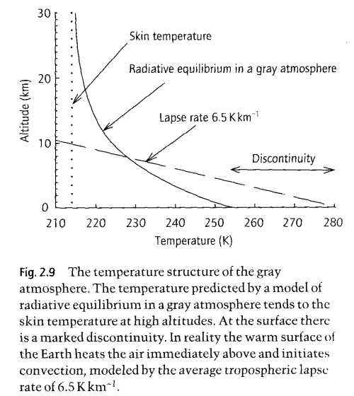
Radiative-equilibrium-Grey-model-Hugh-Coe

The Gray Model of Radiative Equilibrium, from "Handbook of Atmospheric Science" Hewitt and Jackson (2003)

The graph shown here is the result of developing the equations we have already seen, both for absorption and the link between absorption and re-emission.

The equations totally ignore convection! On the graph you can see the real “lapse rate”, which is the change in temperature with altitude. This is dominated by convection, not by radiation.

So how does the gray model help us?

It shows us how the temperature profile would look in an atmosphere with no convection and where there is significant and uniform absorption of longwave radiation.

Convection exists and is more significant than radiation in the troposphere – for moving energy around! Not for absorbing and re-emitting energy. The significance of the real “environmental lapse rate” of 6.5K/km is that it will change the re-emission profile. So it complicates the numerical analysis we need to do. It means that when the numerical analysis is done of the equations we have already derived, the real lapse rate is one more factor that has to be added to that 1-d analysis.

To get a conceptual feel for how that might change things – remember how the radiation spectrum changes with temperature – not a huge amount. So at each layer in the atmosphere the radiation spectrum using the real atmospheric temperature profile will be slightly different than using the “gray model”. But it can be taken into account.

Conclusion

This post has covered a lot of ground and not given you a nice tidy result. Sorry about that.

It’s an involved subject, and there’s no point jumping to the conclusion without explaining what the processes are. It is understanding the processes involved in radiative physics and the way in which the subject is approached that will help you understand the subject better.

And especially important, it will help you see the problems with a flawed approach. There are lots of these on the internet. There isn’t a nice tidy analytical expression which links radiative forcing to CO2 concentration, and which separates out CO2 from water vapor. But 1-d numerical models can generate reliable and believable results.

In Part Four, we will finally look at saturation, how it’s misunderstood, how much radiative forcing more CO2 will add (all other things being equal!) and how CO2 compares with water vapor.

So watch out for Part Four, and feel free to comment on this post or ask questions.

Update – Part Four is now online
Read Full Post »

If you’re not a veteran of the blogosphere wars about climate change but have followed recent events you are probably wondering what to believe.

First, what recent events (Jan 2010)?

The issues arising from the story in the UK Mail that the IPCC used “sexed-up” climate forecasts to put political pressure on world leaders:

Dr Murari Lal also said he was well aware the statement (about Himalayan glaciers melting by 2035), in the 2007 report by the Intergovernmental Panel on Climate Change (IPCC), did not rest on peer-reviewed scientific research.

In an interview with The Mail on Sunday, Dr Lal, the co-ordinating lead author of the report’s chapter on Asia, said: ‘It related to several countries in this region and their water sources. We thought that if we can highlight it, it will impact policy-makers and politicians and encourage them to take some concrete action.

Then there are a number of stories on a similar theme where the predictions of climate change catastrophe weren’t based on “peer-reviewed” literature but on reports from activist organizations, like the WWF. And the reports were written not by specialists in the field, but activists..

And these follow the “climategate” leak of November 2009 where emails from the CRU from prominent IPCC scientists like Phil Jones, Michael Mann, Keith Briffa and others show them in a poor light.

This blog is focused on the science but once you read stories like this you wonder how much of anything to believe.

  • For some, the science is settled, these are distractions by the right/big oil/energy companies and what is there to discuss?
  • For others, we knew all along that the IPCC is a green/marxist plot to take over world government, what is there to discuss?

If you are in one of those mindsets, this blog is probably the wrong place to come.

Be Skeptical

Being skeptical doesn’t mean not believing anything you hear. Being skeptical means asking for some evidence.

I see many individuals watching the recent events unfolding and saying:

See! CO2 can’t cause climate change. It’s all a scam.

Actually the two aren’t related. CO2 and the IPCC are not an indivisible unit!

It’s a challenge to keep a level head. To be a good skeptic means to realize that an organization can be flawed, corrupt even, but it doesn’t mean that all the people whose work it has drawn on have produced junk science.

When a government tries to convince its electorate that it has produced amazing economic results by stretching or inventing a few statistics, does this mean the statisticians working for that government are all corrupt, or even that the very science of statistics is clearly in error?

Most people wouldn’t come to that conclusion.

Politics and Science

But in climate science it’s that much harder because to understand the science itself takes some effort. The IPCC is a political body formed to get political momentum behind action to “prevent climate change”. Whereas climate science is mostly about physics and chemistry.

They are a long way apart.

For myself, I believe that the IPCC has been bringing the science of climate into disrepute for a long time, despite producing some excellent work.  It has claimed too much certainty about what the science can predict. Tenuous findings that might possibly show that a warmer world will lead to more problems are pressed into service. Findings against are ignored.

This causes a problem for anyone trying to find out the truth.

It’s tempting to dismiss anything that is in an IPCC report because of these obvious flaws – and they have been obvious for a long time. But even that would be a mistake. Much of what the IPCC produces is of a very high quality. They have a bias, so don’t take it all on faith..

The Easy Answer

Find a group of people you like and just believe them.

The Road Less Travelled

My own suggestion, for what it’s worth, is to put time into trying to get a better understanding of climate science. Then it is that much easier to separate fact from fiction. One idea – if you live near a university, you can visit their library and probably find a decent entry-level book or two about climate science basics.

Another idea – for around $40 you can purchase Elementary Climate Physics by Prof. F.W. Taylor – from http://www.bookdepository.co.uk/ – free shipping around the world. Amazing. And I don’t get paid for this advert either, not until I work out how to get adverts down the side of the blog. It’s an excellent book with some maths, but skip the maths and you will still learn 10x more than reading any blog including mine.

And, of course, visit blogs which focus on the science and ask a few questions.

Be prepared to change your mind.

Read Full Post »

Recap

Part One of the series started with this statement:

If there’s one area that often seems to catch the imagination of many who call themselves “climate skeptics”, it’s the idea that CO2 at its low levels of concentration in the atmosphere can’t possibly cause the changes in temperature that have already occurred – and that are projected to occur in the future. Instead, the sun, that big bright hot thing in the sky (unless you live in England), is identified as the most likely cause of temperature changes.

Part One looked mainly at the radiation balance – what the sun provides (lots of energy at shortwave) and what the earth radiates out (longwave). Then it showed how “greenhouses gases” – water vapor, CO2 and methane (plus some others)  – absorb longwave radiation and re-emit radiation both up out of the atmosphere and back down to the earth’s surface. And without this absorption of longwave radiation the earth would be 35°C cooler at its surface. The post concluded with:

CO2 and water vapor are very significant in the earth’s climate, otherwise it would be a very cold place.

What else can we conclude? Nothing really, this is just the starting point. It’s not a sophisticated model of the earth’s climate, it’s a “zero dimensional model”.. the model takes a very basic viewpoint and tries to establish the effect of the sun and the atmosphere on surface temperature. It doesn’t look at feedback and it’s very simplistic.

Two images to remember..

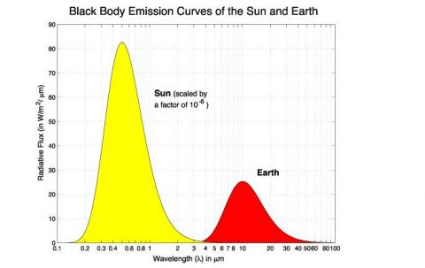
First, the sun’s radiated energy is mostly under 4μm in wavelength (shortwave), while the earth’s radiated energy is over 4μm (longwave), meaning that we can differentiate the two very easily:

Radiation vs Wavelength -Sun and Earth

Radiation vs Wavelength - Sun and Earth

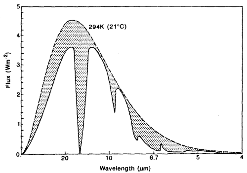
Second, the aborption that we can easily measure in the earth’s longwave radiation from different molecules:

Radiation spectra from the earth with absorption

Radiation spectra from the earth showing absorption from atmospheric gases

Recap over.. This post was going to introduce the basic 1-d model of radiative transfer, but enough people asked questions about the absorption properties of gases that I thought it was was worth covering in more detail.. The 1-d model will have to wait until Part Three.

Why don’t the Atmospheric Gases Absorb Energy according to their Relative Volume?

Just because CO2 only consists of 0.04% of gases doesn’t mean it only contributes 0.04% of atmospheric absorption and re-emission of long wave radiation. Why is that?

Oxygen, O2, constitutes 21% of the atmophere and nitrogen, N2, constitutes 78%. Why aren’t they important “greenhouse” gases? Why are water vapor, CO2 and methane (CH4) the most important when they are present in such small amounts?

For reference, the three most important gases by volume are:

  • Water vapor – 0.4% averaged throughout the atmosphere, but actual value in any one place and time varies (See note 1 at end of article)
  • CO2               – 0.04% (380ppmv), well mixed (note: ppmv is parts per million by volume)
  • CH4               – 0.00018% (1.8ppmv), well mixed

Now there are three factors in determining the effect of longwave absorption:

  1. The amount of the gas by volume
  2. How much longwave energy is radiated from the earth at wavelengths that the gas absorbs
  3. The ability of the gas to absorb energy at a given wavelength

The first one is the simplest to understand. In fact, it’s knowing only this factor that causes so much confusion.

The second point is not immediately obvious, but should become clearer by reviewing the earth’s radiation spectrum:

Radiation vs Wavelength -Sun and Earth

Radiation vs Wavelength - Sun and Earth

Different amounts of energy are radiated at different wavelengths. For example, the amount of energy emitted between 10-11μm is eight times the amount of energy between 4-5μm (for radiation from a surface temperature of 15 °C or 288K).

CO2 has a wide absorption band centered around 15μm, which is where the long-wave radiation from the earth is at almost its highest level. By contrast, one of water vapor’s absorption lines is at 6.27μm – where the radiation is a slightly lower level (about 25% less) and more importantly, the other water vapor absorption lines are where the radiation is 5-10x lower intensity.

However, there is around 10x as much water vapor than CO2 in the atmosphere, which is why it is the most important greenhouse gas.

And Third, Why are Some Gases More Effective at Absorbing Longwave Energy?

Why aren’t O2 and N2 absorbers of longwave radiation?

Molecules with two identical atoms don’t change their symmetry when any rotation or vibration takes place. As a result they can’t move into different energy states.

But triatomic molecules like CO2, H2O and CH4 can bend as they vibrate. They can move into different energy states by changing their shape. Consequently they can absorb the energy from an incoming photon if its energy matches the new state.

And some molecules have many more energy states they can move into. This changes their absorption profile because their spectral breadth is effectively wider.

Here’s a graphic of one part of the actual CO2 absorption lines. Apologies for the poor quality scan..

CO2 spectral lines from one part of the 15um band

From "Handbook of Atmospheric Sciences", Hewitt & Jackson 2003

(Note that the x-axis is “Wavenumber, cm-1”. This is a convention for spectral people. Wavenumber is the number of wavelengths present in 1cm. I added the actual wavelength underneath.)

This shows the complexity of the subject once we look at the real detail. In practice, these individual discrete absorption lines “broaden” due to pressure broadening (collisions with other molecules) and Doppler broadening (as a result of the absorbing molecule moving in the same or opposite direction to the photon of light).

However, the important point to remember is that different molecules absorb at different frequencies and across different ranges of frequencies.

This third factor is the most important in determining the absorption properties of longwave radiation.

As an interesting comparison, molecule by molecule methane absorbs about 20x as much energy as CO2. But of course it is present in much smaller quantities.

Here are water vapor and CO2 across 5-25μm from the HITRANS database:

CO2 and water vapor absorption, by SpectraCalc from the HITRANS database

CO2 and water vapor absorption, by spectracalc.com from the HITRANS database

See Note 2 at the end of the article.

What about Oxygen?

A digression on oxygen.. It is important in the earth’s atmosphere because it absorbs UV, but when these high energy photons from the sun interact with O2 it breaks into O+O. Then a cycle takes place where O2 and O combine to form O3 (ozone), and later O3 breaks up again. By the time the sun’s energy has reached the lower part of the atmosphere (troposphere) all of the lower wavelength energy (most of the UV) has been filtered out.

O3 itself does absorb some longwave energy, at 9.6um, but because there is so little O3 in the troposphere it is not very significant.

What Happens when a Greenhouse Gas Absorbs Energy?

Once a gas molecule has absorbed radiation from the earth it has a lot more energy. But in the lower 100km of the atmosphere, the absorbed energy is transferred to kinetic energy by collisions between the absorbing molecules and others in the layer. Effectively, it heats up this layer of the atmosphere.

The layer itself will act as a blackbody and re-radiate infrared radiation. But it re-radiates in all directions, including back down to the earth’s surface. (If it only radiated up away from the earth there would be no “greenhouse” effect from this absorption).

Conclusion

We are still on the “zero dimensional model” – some call it the billiard ball model – of the radiative balance in the earth’s climate system.

A few different factors affect the absorption of the earth’s longwave radiation by various gases.

O2 barely absorbs any (see note 2 below), and neither does N2 (nitrogen). Among the other gases – the main greenhouse gases being water vapor, CO2 and methane – we see that each one has different properties – none of which can be determined by our intuition!

Different molecules can absorb energy in certain frequencies simply because of their ability to change shape and move to different energy states. The primary property that creates a strong “greenhouse” effect is to have a strong and wide absorption around a wavelength that the earth radiates. This is centered about 10μm (and isn’t symmetrical) so the further away from the peak energy the absorption occurs, the less relevant that absorption line becomes in the earth’s energy balance.

In the next part in the series, we will look at the 1-dimensional model and also what happens when absorption in a wavelength is saturated.

Note 1 – Water Vapor ppmv: After consulting numerous reference works, I couldn’t find one which gave the averaged water vapor throughout the atmosphere, or the troposphere. The actual source for the 0.4% was Wikipedia.

Because all the reference works danced around without actually giving a number I suspect it is “up in the air”. Here is one example:

Water vapor concentration is highly variable, ranging from over 20,000 ppmv (2%) in the lower tropospherical atmosphere to only a few ppmv in the stratosphere..

Atmospheric Science for Environmental Scientists (2009) Hewitt & Jackson

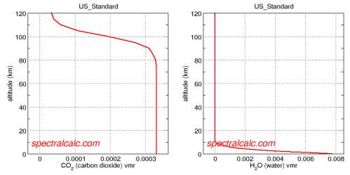
There is a great application, Spectral Calc for looking at atmospheric concentrations and absorption lines. Specifically http://spectralcalc.com/atmosphere_browser gives plots of atmospheric concentration and the data agrees with the Wikipedia number given in the body of this article:

CO2 and water vapor by volume

CO2 and water vapor by volume, from "Spectral Calculator" database

Averaging over the whole atmosphere, the concentration of water vapor does seem to be around 10x the CO2 value.

Note 2 – Optical Thickness: The spectral plots from the HITRANS database shown in the body of the article give the capture cross-section per mole (i.e. per “unit” of that gas, not per unit volume of the general atmosphere).

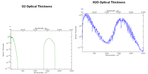
One commenter asked why another plot from a different website drawing on the same HITRANS database produced this:

Optical Thickness of O2 and water vapor

Optical Thickness of O2 and water vapor from http://www.atm.ox.ac.uk

Note that I’ve adjusted the plots so that similar values on the y-axes are aligned for both graphs. And note that the vertical axis is logarithmic.

His comment was that oxygen, O2, is only maybe 1000 times lower in absorption than water vapor (100 =1 vs 103 =1000) at 6.7μm and given that O2 is 20% of the atmosphere instead of 0.4%, O2 should be comparable to water vapor as a greenhouse gas.

But in fact, this graphical plot isn’t plotting the absorption by units of molecule – instead it is plotting Optical Thickness.

This is a handy variable which we will see more of in Part Three. Optical Thickness essentially takes the value of Intensity, which is per unit of molecules,  and “integrates” that value up through the entire height of the atmosphere.

As a result it gives the picture of the complete influence of that gas at different frequencies without having to work out the relative proportions of the gas at different heights in the atmosphere.

So the example above compares the complete absorption (in a simplistic model) through the whole atmosphere, giving O2 about 3000x less effect than water vapor at 6.7μm.

Update Part Three is now online

Read Full Post »

Urban Heat Island in Japan

For newcomers to the climate debate it is often difficult to understand if global warming even exists. Controversy rages about temperature records, “adjustments” to individual stations, methods of creating the global databases like CRU and GISS and especially the problem of UHI.

UHI, or the urban heat island, refers to the problem that temperatures in cities are warmer than temperatures in nearby rural areas, not due to a real climatic effect, but due to concrete, asphalt, buildings and cars. There are also issues raised as to the actual location of many temperature stations, as Anthony Watts and his volunteer work demonstrated in the US.

First of all, everyone agrees that the UHI exists. The controversy rages about how large it is. The IPCC (2007) believes it is very low – 0.006°C per decade globally. This would mean that out of the 0.7°C temperature rise in the 20th century, the UHI was only 0.06°C or less than 10% – not particularly worth worrying about.

For those few not familiar with the mainstream temperature reconstruction of the last 150 years, here is the IPCC from 2007 (global reconstructions):

IPCC 2007 Global Temperature 1840-2000

IPCC 2007, Working Group 1, Historical Overview of Climate Change

New Research from Japan

Detection of urban warming in recent temperature trends in Japan by Fumiaki Fujibe was published in the International Journal of Climatology (2009). It is a very interesting paper which I’ll comment on in this post.

The abstract reads:

The contribution of urban effects on recent temperature trends in Japan was analysed using data at 561 stations for 27 years (March 1979–February 2006). Stations were categorized according to the population density of surrounding few kilometres. There is a warming trend of 0.3–0.4 °C/decade even for stations with low population density (<100 people per square kilometre), indicating that the recent temperature increase is largely contributed by background climatic change. On the other hand, anomalous warming trend is detected for stations with larger population density. Even for only weakly populated sites with population density of 100–300/km2, there is an anomalous trend of 0.03–0.05 °C/decade. This fact suggests that urban warming is detectable not only at large cities but also at slightly urbanized sites in Japan. Copyright, 2008 Royal Meteorological Society.

Why the last 27 years?

The author first compares the temperature over 100 years as measured in Tokyo in the central business district with that in Hachijo Island, 300km south.

Tokyo –               3.1°C rise over 100 years (1906-2006)
Hachijo Island –  0.6°C over the same period

Tokyo vs Hachijo Island, 100 years

This certainly indicates a problem, but to do a thorough study over the last 100 years is impossible because most temperature stations with a long history are in urban areas.

However, at the end of the 1970’s, the Automated Meteorological Data Acquisition System (AMeDAS) was deployed around Japan providing hourly temperature data at 800 stations. The temperature data from these are the basis for the paper. The 27 years coincides with the large temperature rise (see above) of around 0.3-0.4°C globally.

And the IPCC (2007) summarized the northern hemisphere land-based temperature measurements from 1979- 2005 as 0.3°C per decade.

How was Urbanization measured?

The degree of urbanization around each site was calculated from grid data of population and land use, because city populations often used as an index of urban size (Oke, 1973; Karl et al., 1988; Fujibe, 1995) might not be representative of the thermal environment of a site located outside the central area of a city.

What were the Results?

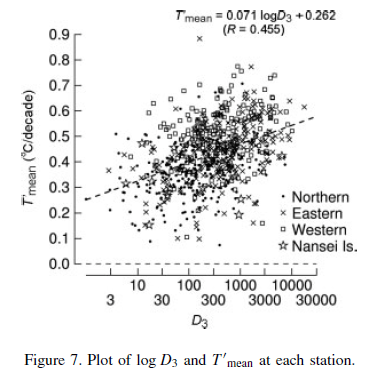
Temperature anomaly against population density, Japan

Mean temperature anomaly vs population density, Japan

The x-axis, D3, is a measure of population density. T’mean is the change in the mean temperature per decade.

Tmean is the average of all of the hourly temperature measurements, it is not the average of Tmax and Tmin.

Notice the large scatter – this shows why having a large sample is necessary. However, in spite of that, there is a clear trend which demonstrates the UHI effect.

There is large scatter among stations, indicating the dominance of local factors’ characteristic to each station. Nevertheless, there is a positive correlation of 0.455 (Tmean = 0.071 logD3 + 0.262 °C), which is significant at the 1% level, between logD3 and Tmean.

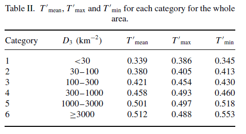
Here’s the data summarized with T’mean as well as the T’max and T’min values. Note that D3 is population per km2 around the point of temperature measurement, and remember that the temperature values are changes per decade:

The effect of UHI demonstrated in various population densities

The effect of UHI demonstrated in various population densities

Note that, as observed by many researchers in other regions, especially Roger Pielke Sr, the Tmin values are the most problematic – demonstrating the largest UHI effect. Average temperatures for land-based stations globally are currently calculated from the average of Tmax and Tmin, and in many areas globally it is the Tmin which has shown the largest anomalies. But back to our topic under discussion..

And for those confused about how the Tmean can be lower than the Tmin value in each population category, it is because we are measuring anomalies from decade to decade.

And the graphs showing the temperature anomalies by category (population density):

Dependence of Tmean, Tmax and Tmin on population density for different regions in Japan

Dependence of Tmean, Tmax and Tmin on population density for different regions in Japan

Quantifying the UHI value

Now the author carries out an interesting step:

As an index of net urban trend, the departure of T from its average for surrounding non-urban stations was used on the assumption that regional warming was locally uniform.

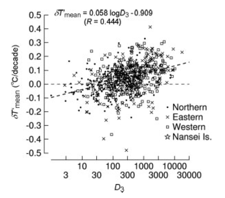
That is, he calculates the temperature deviation in each station in category 3-6 with the locally relevant category 1 and 2 (rural) stations. (There were not enough category 1 stations to do it with just category 1). The calculation takes into account how far away the “rural” stations are, so that more weight is given to closer stations.

Estimate of actual UHI by referencing the closest rural stations

Estimate of actual UHI by referencing the closest rural stations - again categorized by population density

And the relevant table:

Temperature delta from nearby rural areas vs population density

Temperature delta from nearby rural areas vs population density

Conclusion

Here’s what the author has to say:

On the one hand, it indicates the presence of warming trend over 0.3 °C/decade in Japan, even at non-urban stations. This fact confirms that recent rapid warming at Japanese cities is largely attributable to background temperature rise on the large scale, rather than the development of urban heat islands.

..However, the analysis has also revealed the presence of significant urban anomaly. The anomalous trend for the category 6, with population density over 3000 km−2 or urban surface coverage over 50%, is about 0.1 °C/decade..

..This value may be small in comparison to the background warming trend in the last few decades, but they can have substantial magnitude when compared with the centennial global trend, which is estimated to be 0.74°C/century for 1906–2005 (IPCC, 2007). It therefore requires careful analysis to avoid urban influences in evaluating long-term temperature changes.

So, in this very thorough study, in Japan at least, the temperature rise that has been measured over the last few decades is a solid result. The temperature increase from 1979 – 2006 has been around 0.3°C/decade

However, in the larger cities the actual measurement will be overstated by 25%.

And in a time of lower temperature rise, the UHI may be swamping the real signal.

The IPCC (2007) had this to say:

A number of recent studies indicate that effects of urbanisation and land use change on the land-based temperature record are negligible (0.006ºC per decade) as far as hemispheric- and continental-scale averages are concerned because the very real but local effects are avoided or accounted for in the data sets used.

So, on the surface at least, this paper indicates that the IPCC’s current position may be in need of modification.

Read Full Post »

I’m halfway through writing the 2nd post in the series CO2 – An Insignificant Trace Gas? – which is harder work than I expected and I came across a new video by John Coleman called Global Warming: The Other Side.

I only watched the first section which is 11 minutes long and promises in its writeup:

..we present the rebuttal to the bad science behind the global warming frenzy.. We show how that theory has failed to verify and has proven to be wrong.

http://www.kusi.com/weather/colemanscorner/81557272.html

The 1st video section claims to show the IPCC wrong but is actually a critique of one section of Al Gore’s movie, An Inconvenient Truth.

The presenter points out the well-known fact that in the ice-core record of the last million years CO2 increases lag temperature increases. And this appears to be the complete rebuttal of “CO2 causes temperature to increase”.

The IPCC has a whole chapter on the CO2 cycle in its TAR (Third Assessment Report) of 2001.

A short extract from chapter 3, page 203:
..Whatever the mechanisms involved, lags of up to 2,000 to 4,000 years in the drawdown of CO2 at the start of glacial periods suggests that the low CO2 concentrations during glacial periods amplify the climate change but do not initiate glaciations (Lorius and Oeschger, 1994; Fischer et al., 1999). Once established, the low CO2 concentration is likely to have enhanced global cooling (Hewitt and Mitchell, 1997)..

So the creator of this “documentary” hasn’t even bothered to check the IPCC report. They agree with him. And even more amazing, they put it in print!

If you are surprised by either of these points:

  • CO2 lags temperature changes in the last million years of temperature history
  • The IPCC doesn’t think this fact affects the theory of AGW (anthropogenic global warming)

Then read on a little further. I keep it simple.

The Oceans Store CO2

There is a lot of CO2 dissolved into the oceans.

“All other things being equal”, as the temperature of the oceans rises, CO2 is “out-gassed” – released into the atmosphere. As the temperature falls, more CO2 is dissolved in.

“All other things being equal” is the science way of conveying that the whole picture is very complex but if we concentrate on just two variables we can understand the relationship.

“All Other Things being Equal”

Just a note for those interested..

In the current environment, we (people) are increasing the amount of CO2 in the atmosphere. So, currently as ocean temperatures rise CO2 is not leaving the oceans, but in fact a proportion of the human-emitted CO2 (from power stations, cars, etc) is actually being dissolved into the ocean.

So in this instance temperature rises don’t cause the oceans to give up some of their CO2 because “all other things are not equal”.

Doesn’t the fact that CO2 lags temperature in the ice core record prove it doesn’t cause temperature changes?

It does prove that CO2 didn’t initiate those changes of direction in temperature. In fact the whole subject of why the climate has changed so much in the past is very complex and poorly understood, but let’s stay on topic.

Let’s suppose that there is an increase in solar radiation and so global temperatures increase. As a result the oceans will “out gas” CO2. We will see a record of CO2 changes following temperature changes.

But note that it tells us nothing about whether or not CO2 itself can increase temperatures.

[It might say something important about Al Gore’s movie.]

More than one factor affects temperature rise. There are lots of inter-related effects in the climate and the physics and chemistry of climate science are very complex.

Conclusion

Whether or not the IPCC is correct in its assessment that doubling CO2 in the atmosphere will lead to dire consequences from high temperature rises is not the subject of this post.

This post is about a subject that causes a lot of confusion.

I haven’t watched Al Gore’s movie but it appears he links past temperature rises with CO2 changes to demonstrate that CO2 increases are a clear and present danger. He relies on the ignorance of his audience. Or demonstrates his own.

“Skeptics” now arrive and claim to “debunk” the science of the IPCC by debunking Al Gore’s movie. They rely on the ignorance of their audience. Or demonstrate their own.

CO2 is certainly very important in our atmosphere despite being a “trace gas”. Physics and the properties of “trace gases” cannot be deduced from our life experiences. Have a read of CO2 – An Insignificant Trace Gas? Part One to understand more about this subject.

CO2 is both a cause and a consequence of temperature changes. That’s what makes climate science so fascinating.

Read Full Post »

In many debates on whether the earth has been cooling this decade we often hear

This decade is the warmest on record

(Note: reference is to the “naughties” decade).

This post isn’t about whether or not the temperature has gone up or down but just to draw attention to a subject that you would expect climate scientists and their marketing departments to handle better.

An Economic Analogy

Analogies don’t prove anything, but they can be useful illustrations, especially for those whose heads start to spin as soon as statistics are mentioned.

Suppose that the nineties were a roaring decade of economic progress, as measured by the GDP of industrialized nations (and ignoring all problems relating to what that all means). And suppose that the last half century with a few ups and downs had been one of strong economic progress.

Now suppose that around the start of the new millennium the industrialized nations fell into a mild recession and it dragged on for the best part of the decade. Towards the end of the decade a debate starts up amongst politicians about whether we are in recession or not.

There would be various statistics put forward, and of these the politicians out of power would favor the indicators that showed how bad things were. The politicians in power would favor the indicators that showed how good things were, or at least “the first signs of economic spring”.

Suppose in this debate some serious economists stood up and said,

But listen everyone, this decade has the highest GDP of any decade since records began.

What would we all think of these economists?

The progress that had taken the world to the start of the millennium would be the reason for the high GDP in the “naughties” decade. It doesn’t mean there isn’t a recession. In fact, it tells you almost nothing about the last few years. Why would these economists be bringing it up unless they didn’t understand “Economics 101”?

GDP and other measures of economic prosperity have a property that they share with the world’s temperature. The status at the end of this year depends in large part on the status at the end of last year.

In economics we can all see how this works. Prosperity is stored up year after year within the economic system. Even if some are spending like crazy others are making money as a result. When hard times come we don’t suddenly reappear, in economic terms, in 1935.

In climate it’s because the earth’s climate system stores energy. This is primarily the oceans and cryosphere (ice) but also includes the atmosphere.

Auto-Correlation for the total layman/woman who doesn’t want to hear about statistics

For those not statistically inclined, don’t worry this isn’t a technical treatment.

When various people analyze the temperature series for the last few decades they usually try and work out some kind of trend line and also other kinds of statistical treatments like “standard deviation”.

You can find lots of these on the web. I’m probably in a small minority but I don’t see the point of most of them. More on this at Is the climate more than weather? Is weather just noise?

However, for those who do see the point and carry out these analyses to prove or disprove that the world is warming or cooling in a “statistically significant” way, the more statistically inclined will be sure to mention one point. Because the temperature from year to year is related strongly to the immediate past – or in technical language “auto-correlated” – this changes the maths and widens the error bars.

Auto-correlation in layman’s terms is what I described in the economic analogy. Next year depends in large part on what happened last year.

Why mention this?

First, a slightly longer explanation of auto-correlation – skip that section if you are not interested..

Auto-Correlation in a little more detail

If you ever read anything about statistics you would have read about “the coin toss”.

I toss a coin – it’s 50/50 whether it comes up heads or tails. I have one here, flipping.. catching.. ok, trust me it’s heads.

Now I’m going to toss the coin again. What are the odds of heads or tails? Still 50/50. Ok, tossing.. heads again.

Now I’m going to toss the coin a 3rd time. At this point you check the coin and get it scientifically analyzed. Finally, much poorer, you hand me back the coin because it’s been independently verified as a “normal coin”. Ok so I toss the coin a 3rd time and it’s still 50/50 whether it lands heads or tails.

Many people who have never been introduced to statistics – like all the people who play roulette for real money that matters to them – have no concept of independent statistical events.

It’s a simple concept. What happened previously to the coin when I flipped it has absolutely no effect on a future toss of the coin. The coin has no memory. The law of averages doesn’t change the future. If I have tossed 10 heads in a row the next toss of this standard coin is no more likely to be tails than heads.

In statistics, the first kind of problems that are covered are ones where each event or each measurement are “independent”. Like the coin toss. This makes analysis of calculation of the mean (average) and standard deviation (how spread out the results are) quite simple.

Once a measurement or event is dependent in some way on the last reading (or an earlier reading) it gets much more complicated.

In technical language: Autocorrelation is the correlation of a signal with itself

If you want to assess a series of temperature measurements and work out a trend line and statistical significance of the results you need to take account of its auto-correlation.

What’s the Point?

What motivated this post was watching the behavior of some climate scientists, or at least their marketing departments. You can see them jump into many debates to point out that the error bars aren’t big enough on a particular graph, with a sad shake of their head as if to say “why aren’t people better at stats? why do we have to keep explaining the basics? you have to use an ARMA(1,1) process..

But the same people, in debates about current cooling or warming, keep repeating

This decade IS the warmest decade on record

as if they hadn’t heard the first thing about auto-correlation.

Statistically minded climate scientists, like our mythical economists earlier, should be the last people to make that statement. And they should be the first to be coughing slightly and putting up a hand when others make that point in the context of whether the current decade is warming or cooling.

Conclusion

Figuring out whether the current decade is cooling or warming isn’t as easy as it might seem and isn’t the subject of this post.

But next time someone tells you “This decade IS the warmest decade on record” – which means in the last 150 years, or a drop in the geological ocean – remember that it is true, but doesn’t actually answer the question of whether the last 10 years have seen warming or cooling.

And if they are someone who appears to know statistics, you have to wonder. Are they trying to fool you?

After all, if they know what auto-correlation is there’s no excuse.

Read Full Post »