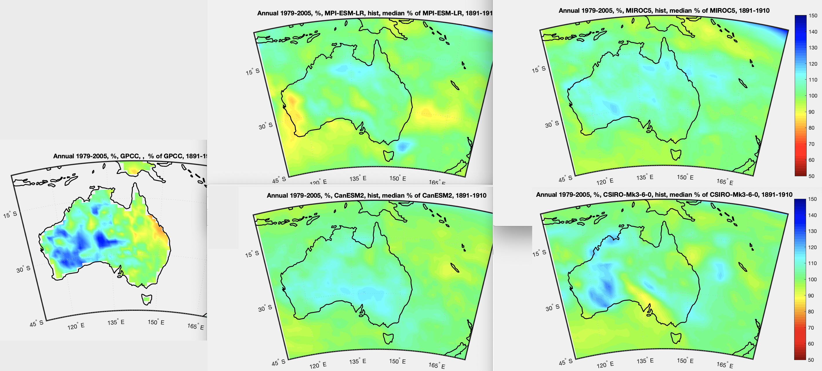
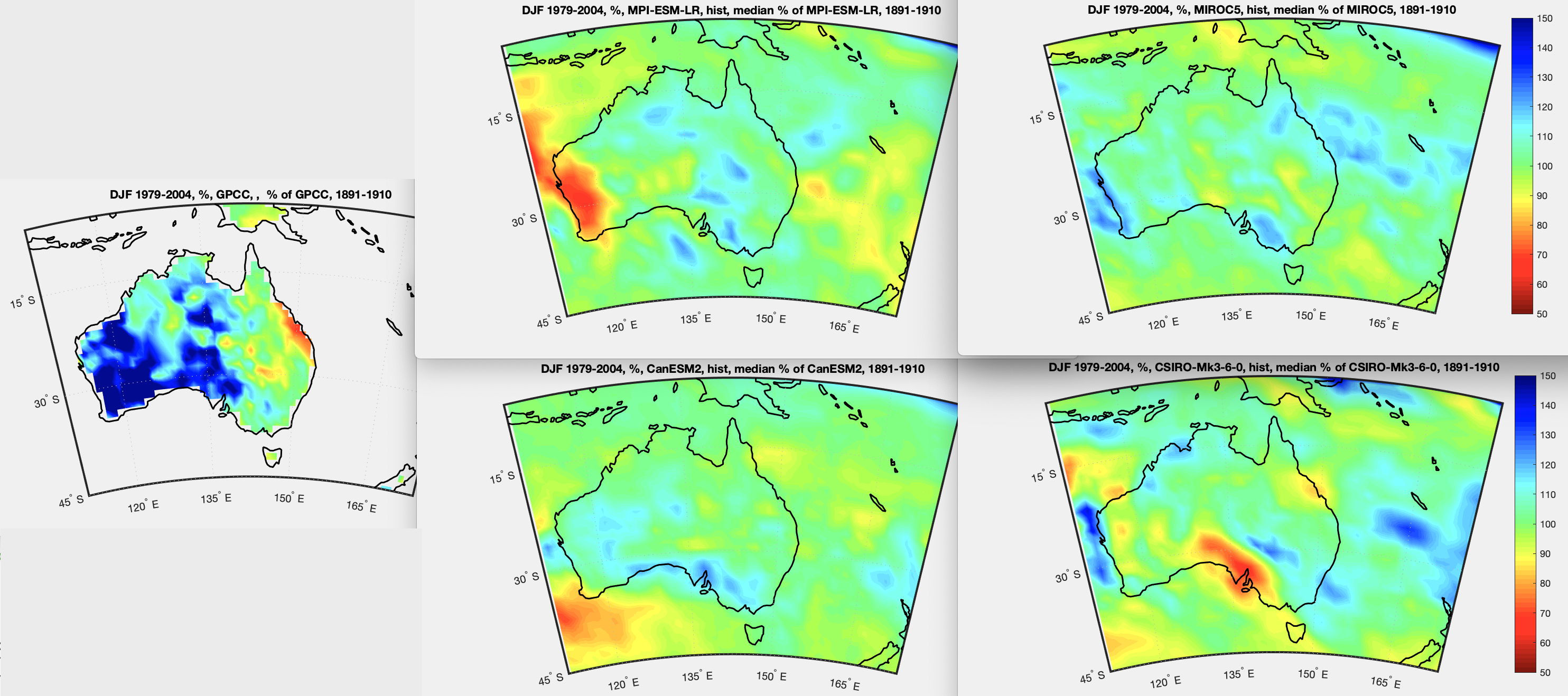
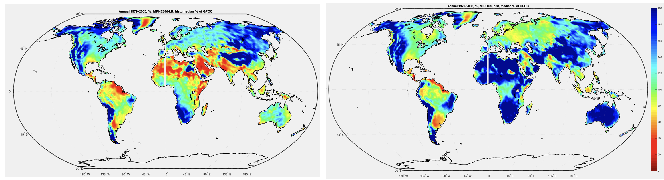
In VI – Australia CanESM2, CSIRO, Miroc and MRI compared vs history we looked at how each model thought rainfall had changed in Australia over about 100 years, and we compared that to observations. We did this for annual rainfall, also for Australian summer (Dec, Jan, Feb) and Australian winter (Jun, Jul, Aug).
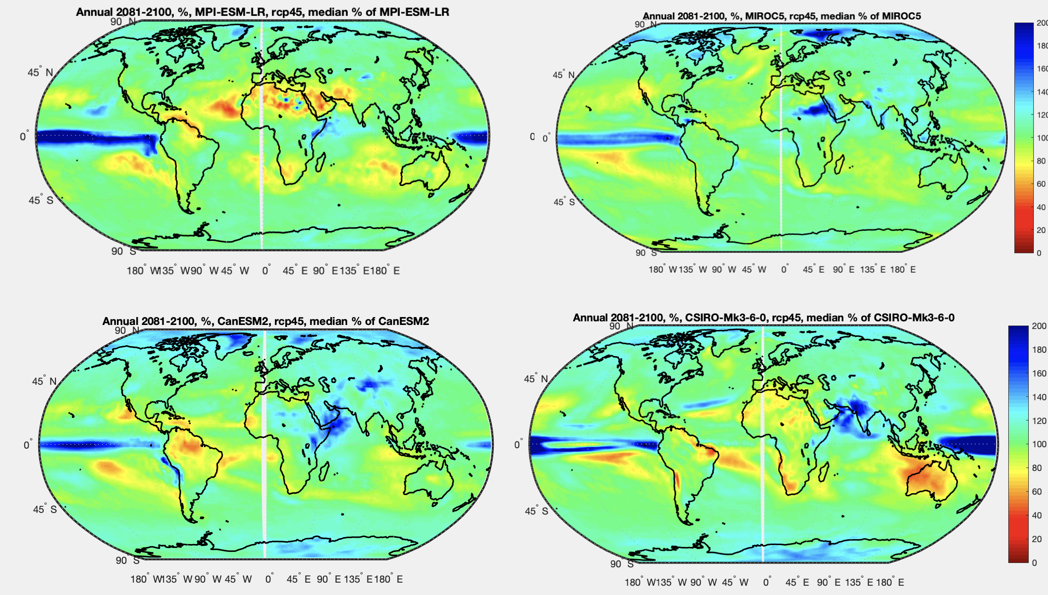
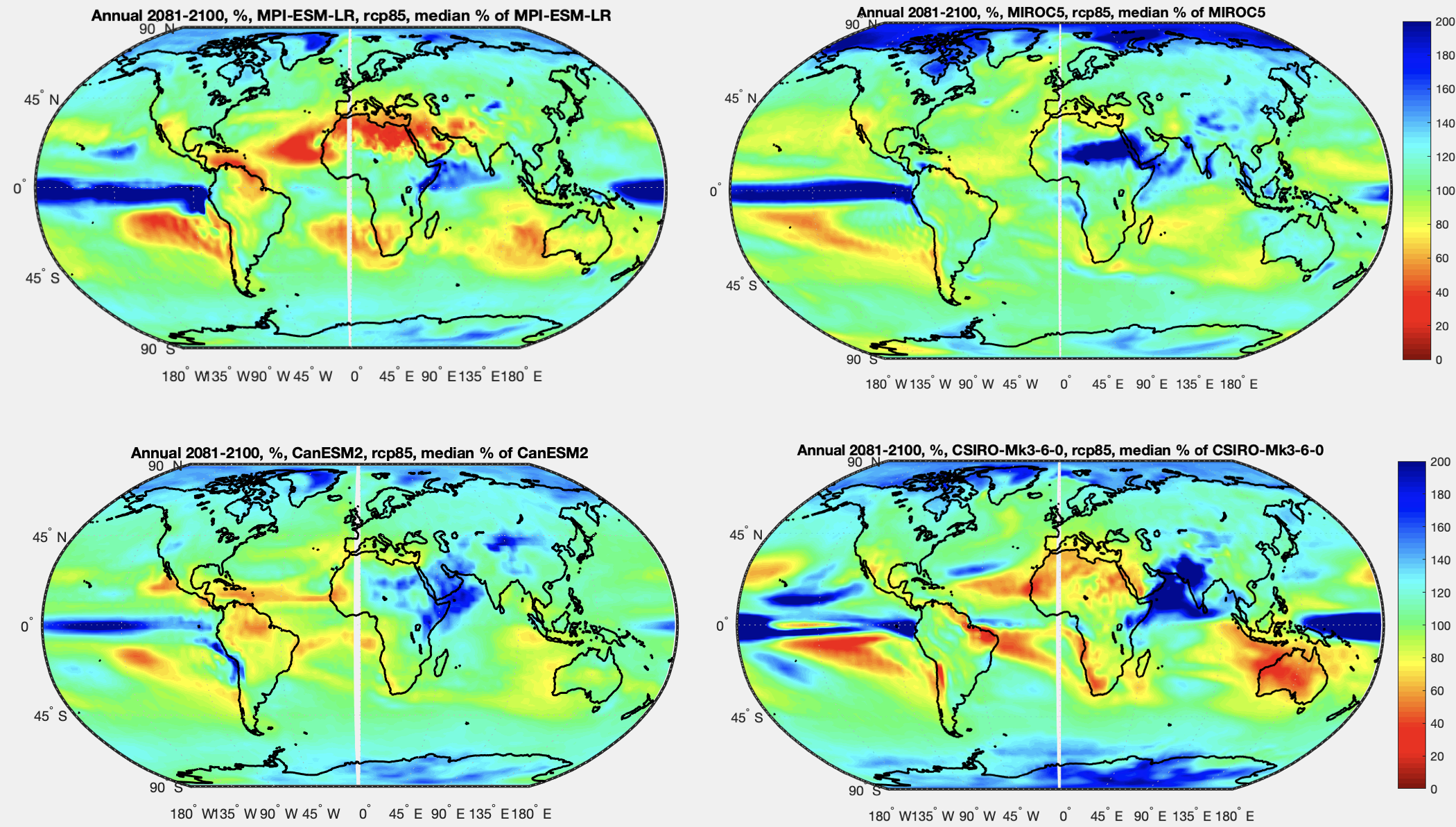
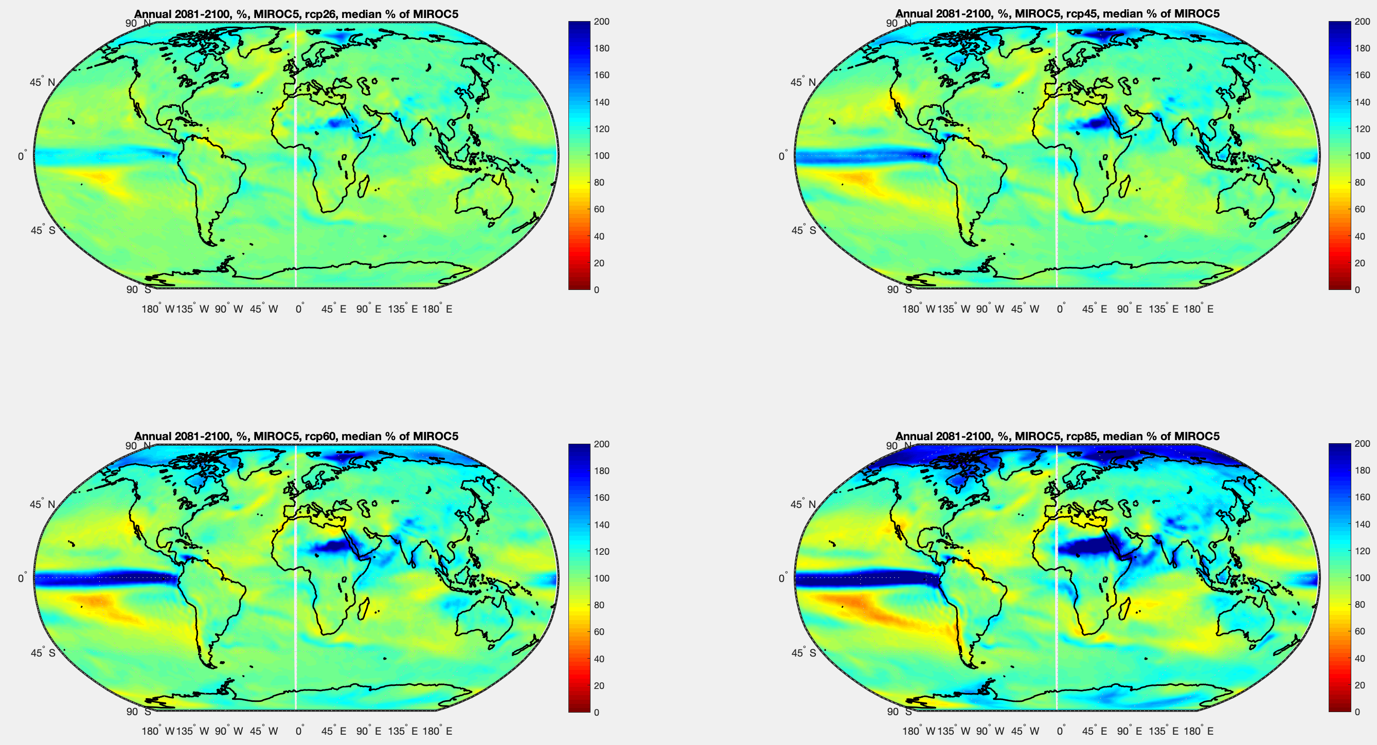
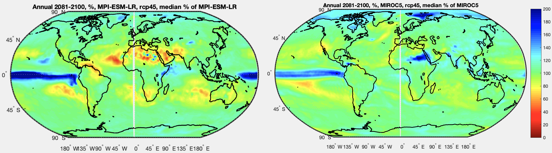
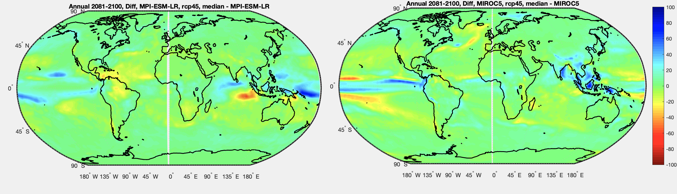
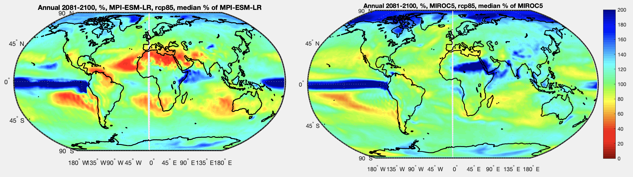
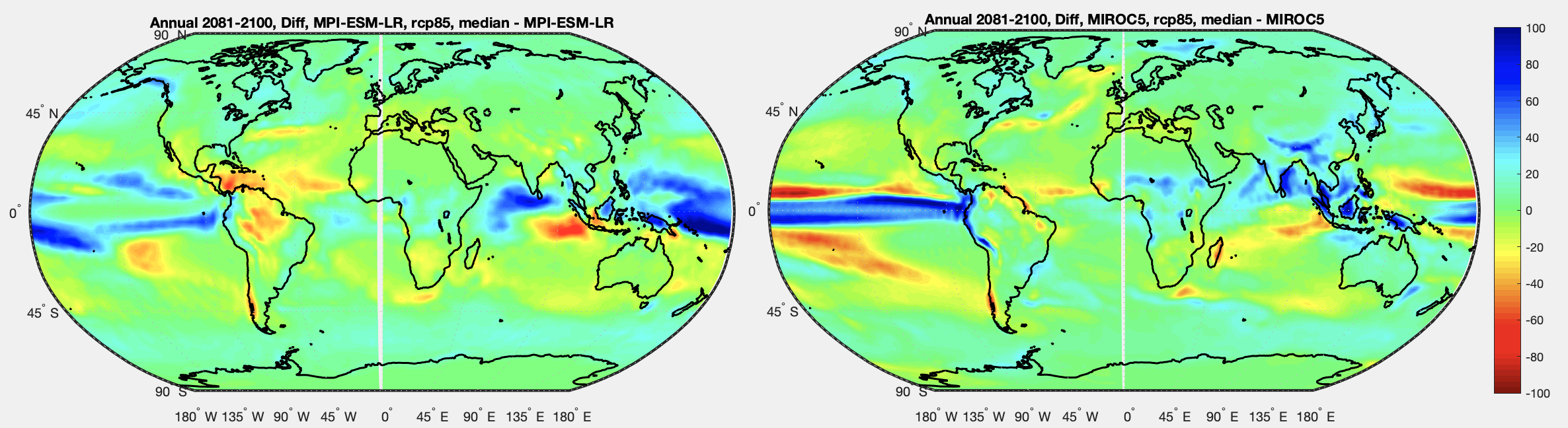
Here we will look at two of the four emissions scenarios. We compare 2081-2100 vs 1979-2005.
Note that we are not comparing the end of the 21st century from the model with observations at the end of the 20th century. That produces much different results – the model’s view of recent history doesn’t match observations very well. We are comparing the model future with the model past. So we are asking the model to say how it sees rainfall changing as a result of different amounts of CO2 being emitted.
The two scenarios are:
- RCP4.5 – with current trends continuing we are something like RCP6. I think of RCP4.5 as being “what we are doing now” but with some substantial reductions in CO2 emissions. But it’s nothing like RCP2.6, which is more “project Greta” where emissions basically stop in a decade
- RCP8.5 – extreme CO2 emissions. Often described as “business as usual” perhaps to get people’s attention. Think – most of Africa moving out of abject poverty, not passing through the demographic transition (so population going very high) and burning coal like crazy with the efficiency of 19th century Europe.
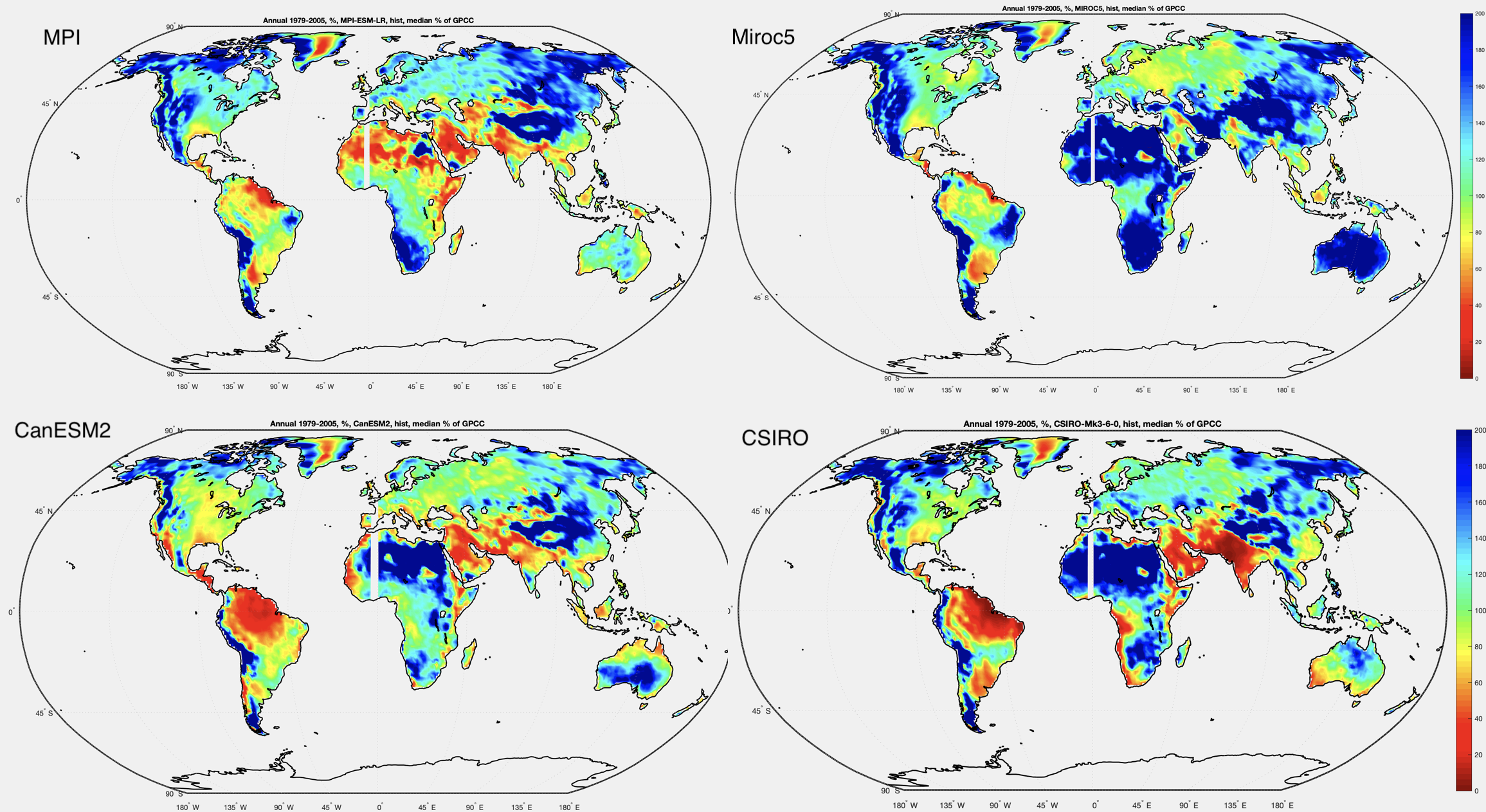
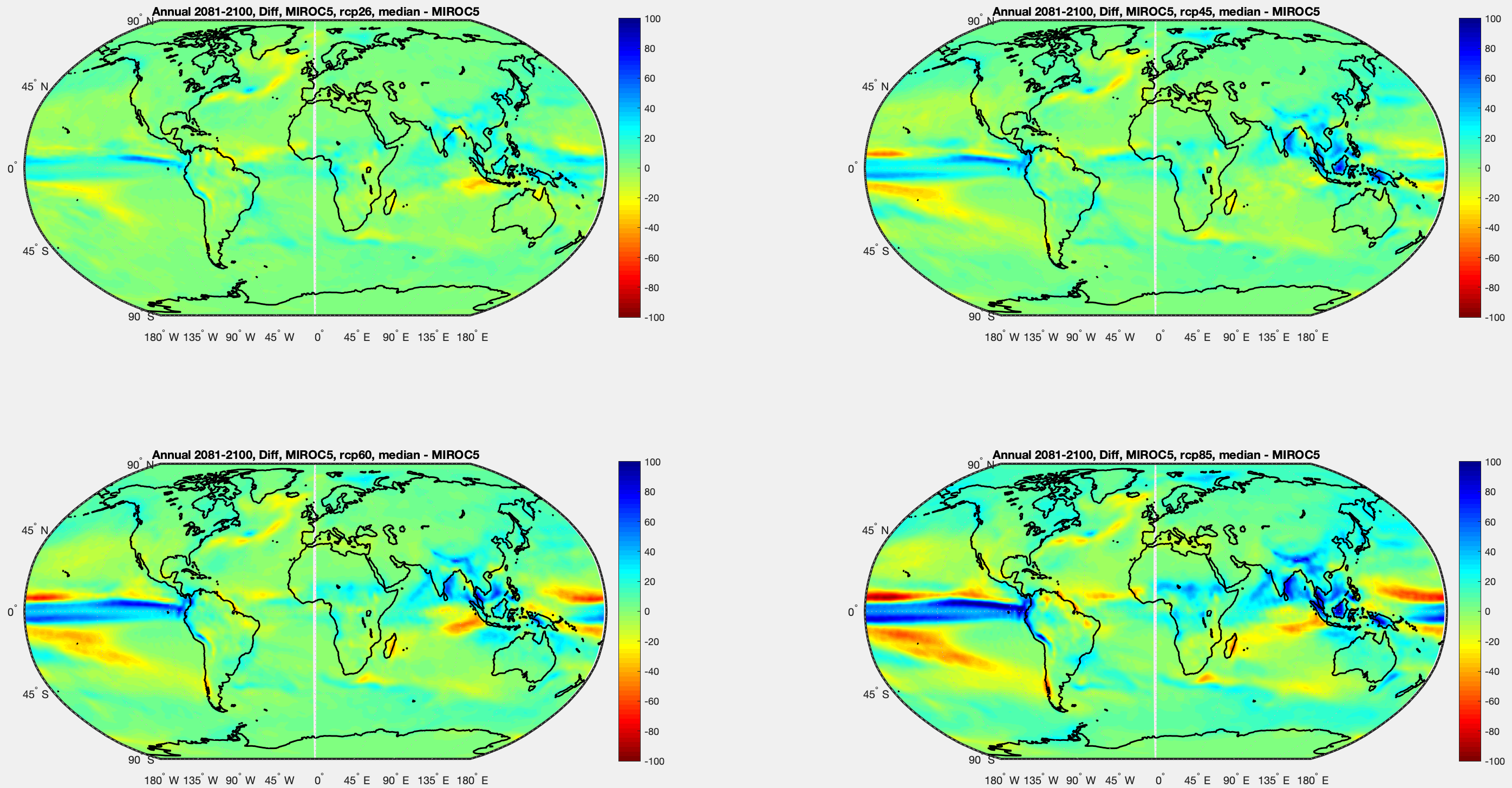
Each pair of graphs is future RCP4.5 as % of recent past, and RCP8.5 as % of recent past. The four models, clockwise from top left – MPI (Germany), Miroc (Japan), CSIRO (Australia) and CAN (Canada):
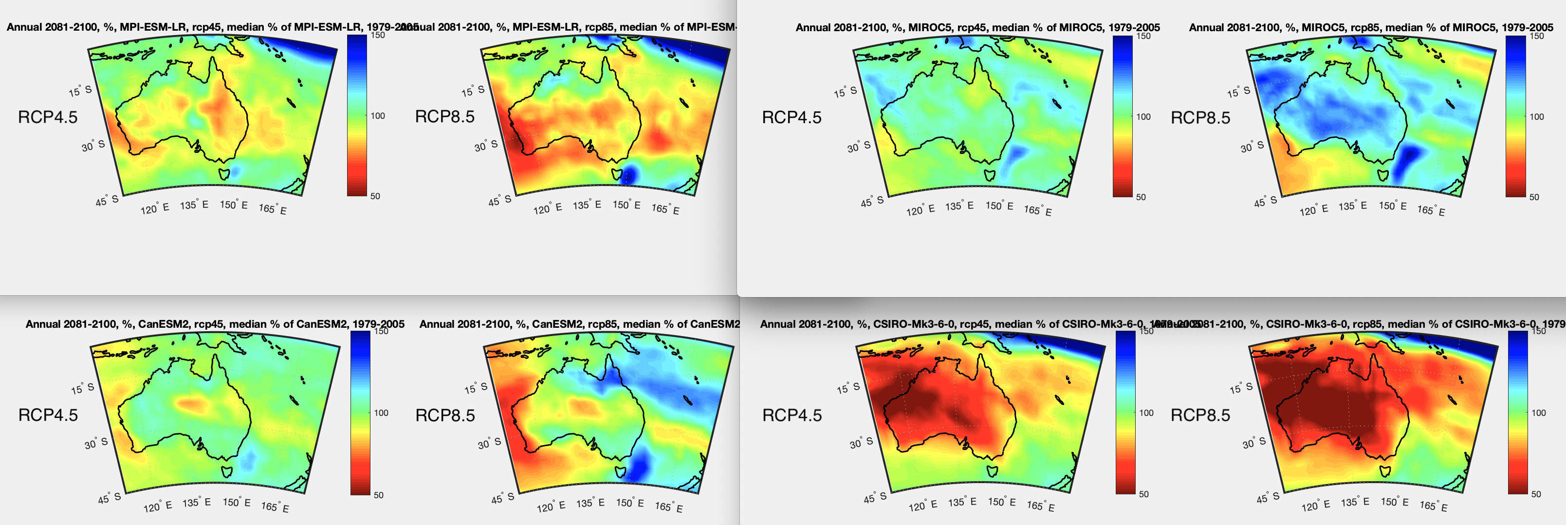
Figure 1 – Click to expand
And now the same, but only looking at Australian summer, DJF:
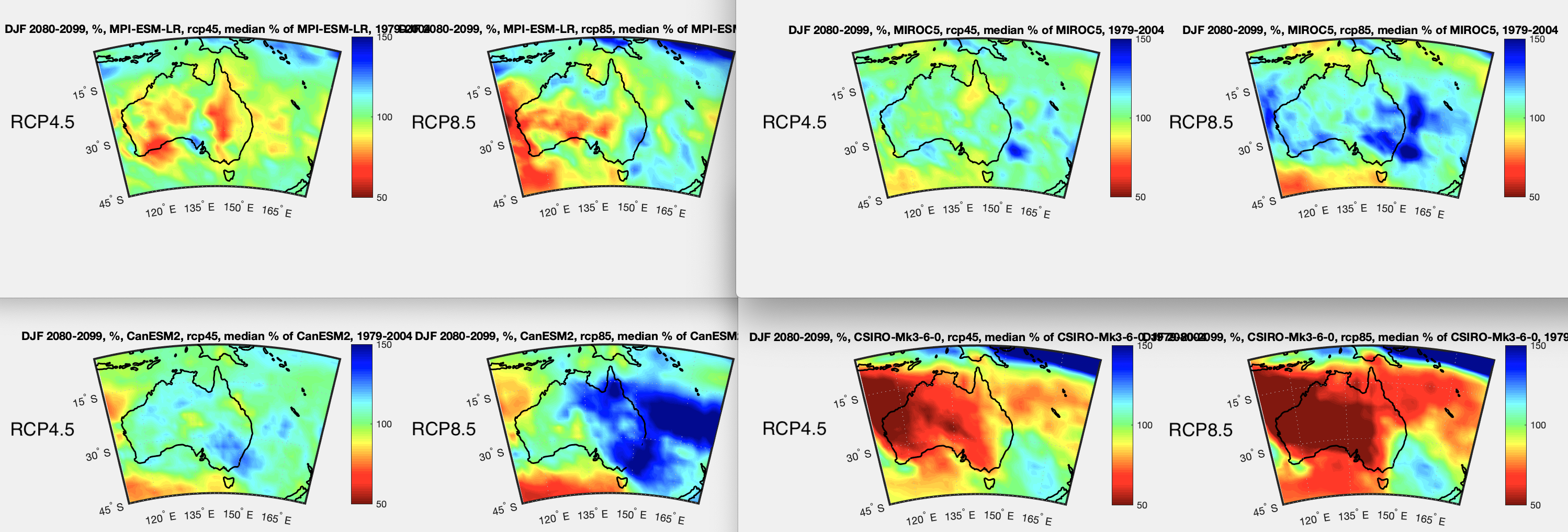
Figure 2 – Click to expand
Depending on which model you like, things could be really bad, or really good, or about the same with “climate change”.
Note that the color scale I’m using here is the same as the last article, but different from all the earlier articles, the % range is from 50% to 150% (rather than 0% to 200%).
References
An overview of CMIP5 and the experiment design, Taylor, Stouffer & Meehl, AMS (2012)
GPCP data provided by the NOAA/OAR/ESRL PSL, Boulder, Colorado, USA, from their Web site at https://psl.noaa.gov/
GPCC data provided from https://psl.noaa.gov/data/gridded/data.gpcc.html
CMIP5 data provided by the portal at https://esgf-data.dkrz.de/search/cmip5-dkrz/