In the last article we looked at the MPI model – comparisons of 2081-2100 for different atmospheric CO2 concentrations/emissions with 1979-2005. And comparisons between the MPI historical simulation and observations. These were all on an annual basis.
This article has a lot of graphics – I found it necessary because no one or two perspectives really help to capture the situation. At the end there are some perspectives for people who want to skip through.
In this article we look at similar comparisons to the last article, but seasonal. Mostly winter (northern hemisphere winter), i.e. December, January, February. Then a few comparisons of northern hemisphere summer: June, July, August. The graphics can all be expanded to see the detail better by clicking on them.
Future scenarios vs modeled history
Here we see the historical simulation over DJF 1979-2005 (1st graph) followed by the three scenarios, RCP2.6, RCP4.5, RCP8.5 over DJF 2080-2099:
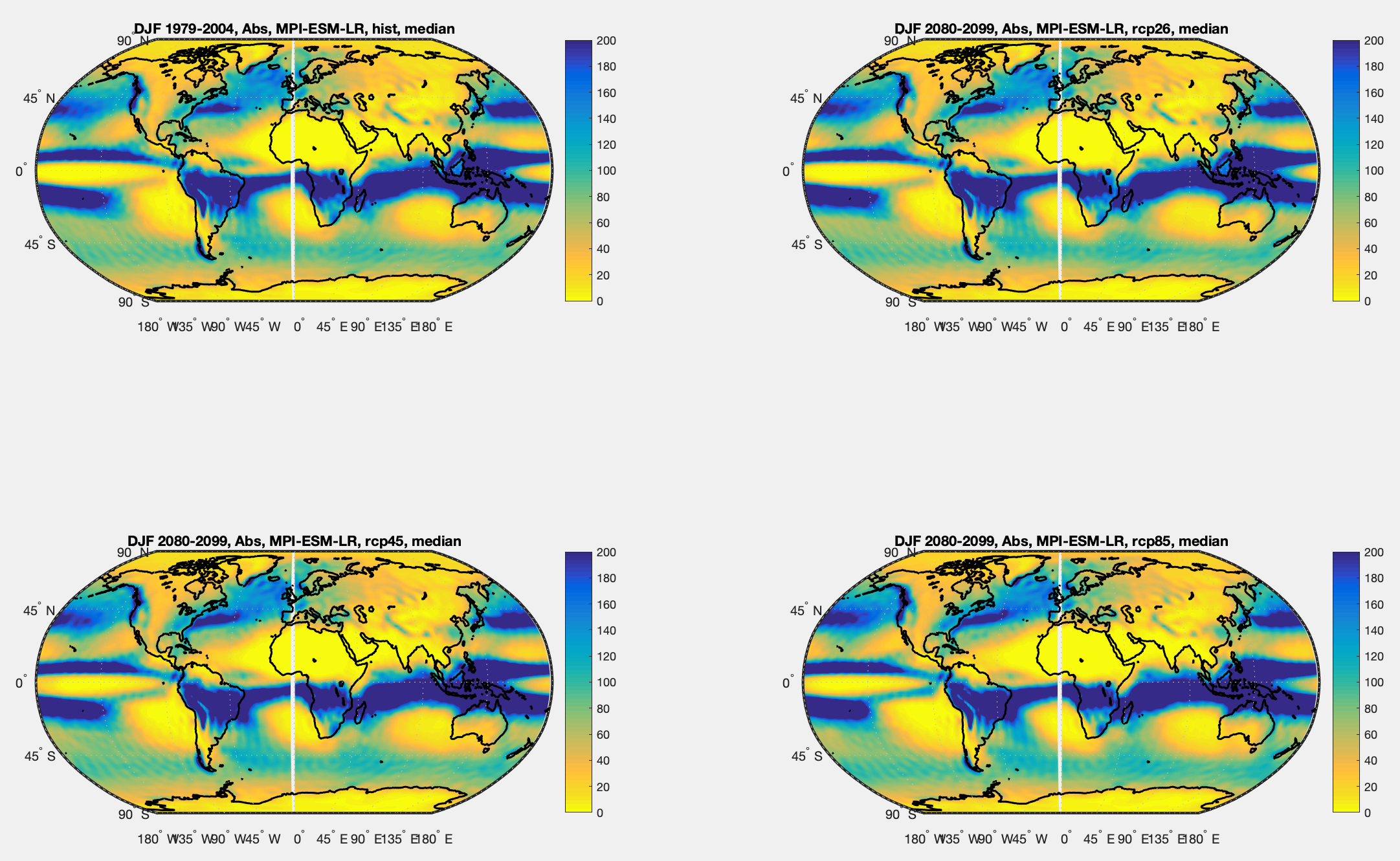
Figure 1 – DJF Simulations from MPI-ESM-LR for historical 1979-2005 & 3 RCPs 2080-2099 – Click to expand
Now the results are displayed as a difference from the historical simulation. Positive is more rainfall in the future simulation, negative is less rainfall:
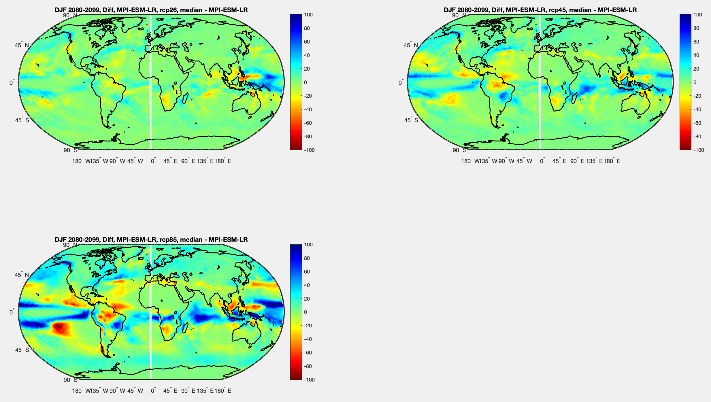
Figure 2 – DJF Simulations from MPI-ESM-LR for 3 RCPs in 2080-2099 minus simulation of historical 1979-2005 – Click to expand
And the % change. The Saharan changes look dramatic, but it’s very low rainfall turning to zero, at least in the model. For example, I picked one grid square, 20ºN, 0ºE, and the historical simulated rainfall was 0.2mm/month, under RCP2.6 0.05mm/month and for RCP8.6 0mm/month.
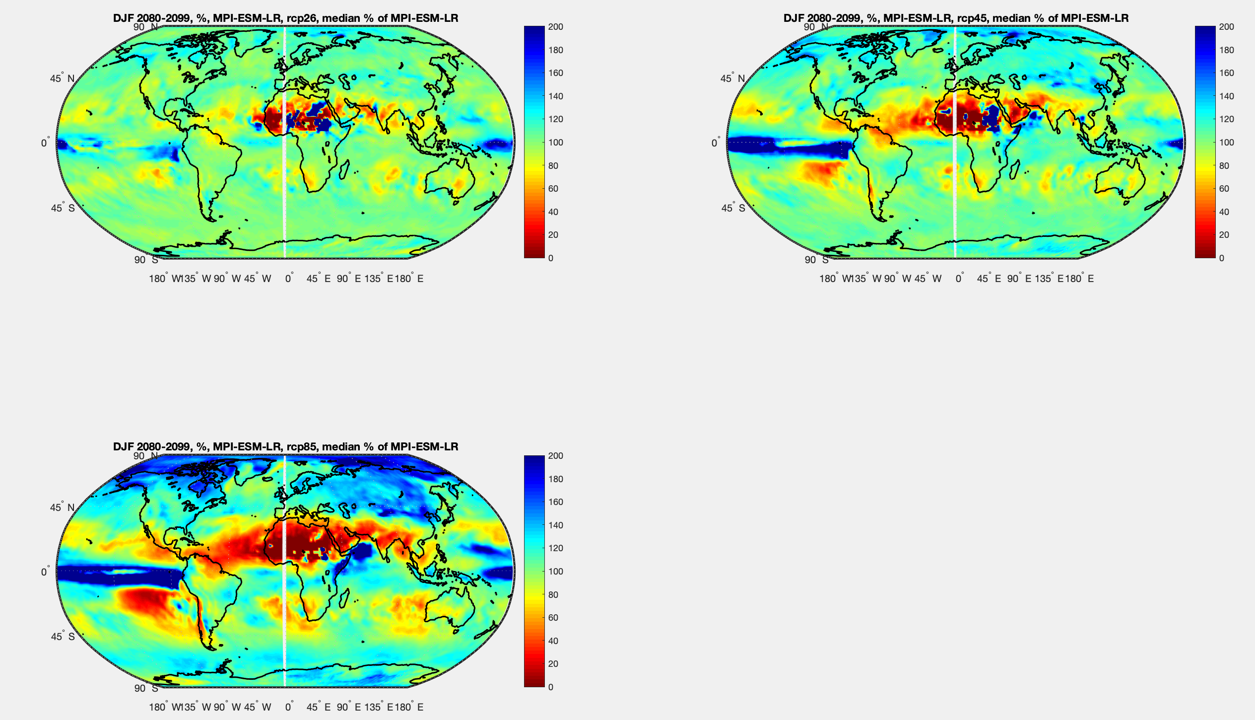
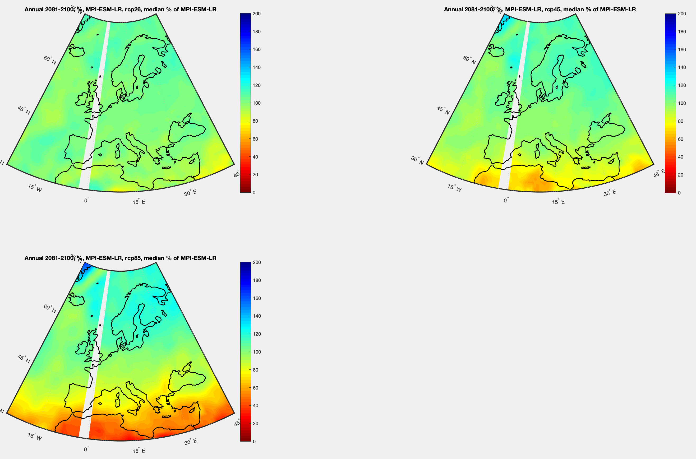
Figure 3 – DJF Simulations from MPI-ESM-LR for 3 RCPs in 2080-2099 as % of simulation of historical 1979-2005 – Click to expand
I zoomed in on Australia – each graph is absolute values. The first is the historical simulation, then the 2nd, 3rd, 4th are the 3 RCPs as before:
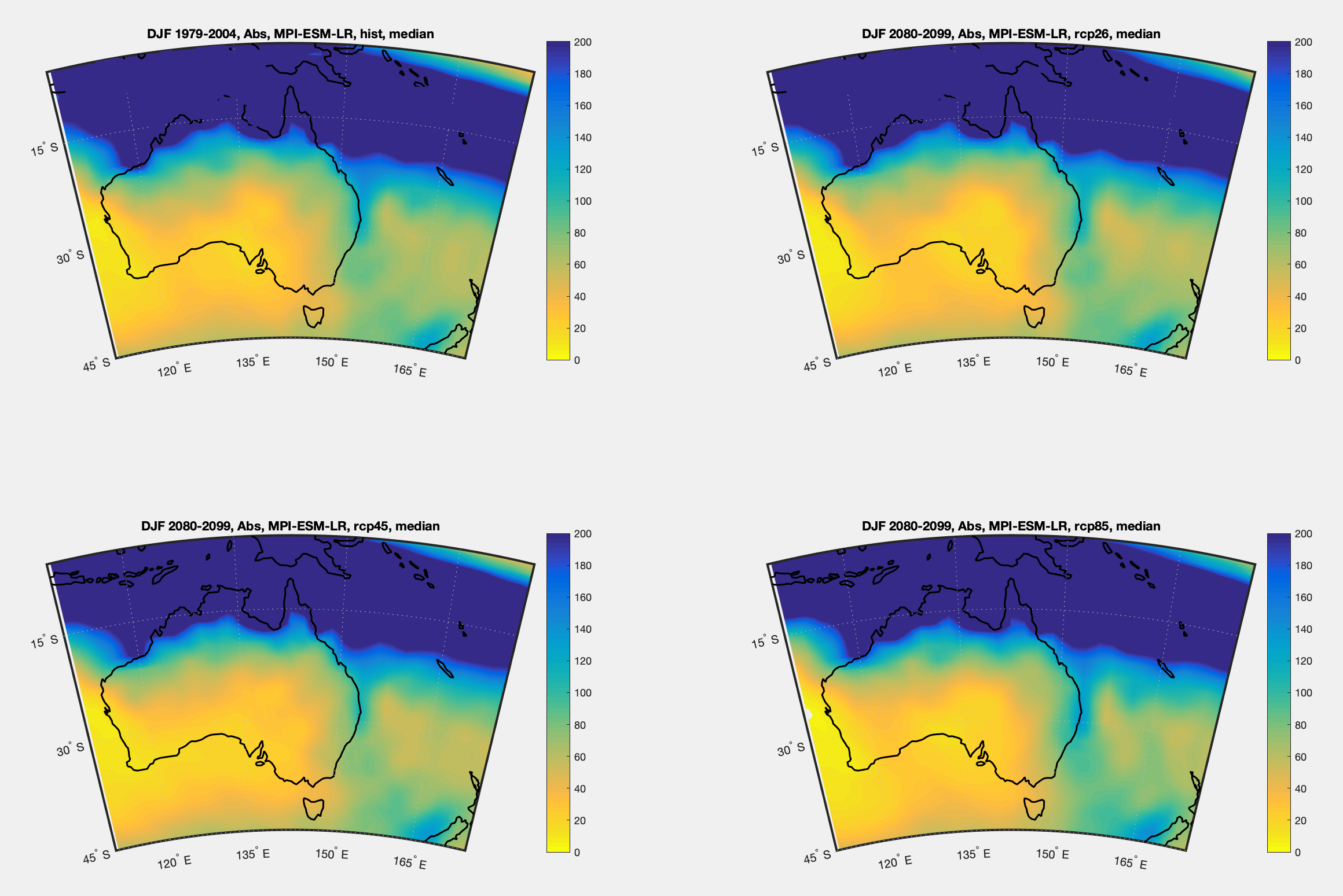
Figure 4 – DJF Australia – simulations from MPI-ESM-LR for historical 1979-2005 & 3 RCPs 2080-2099 – Click to expand
Then differences from the historical simulation:
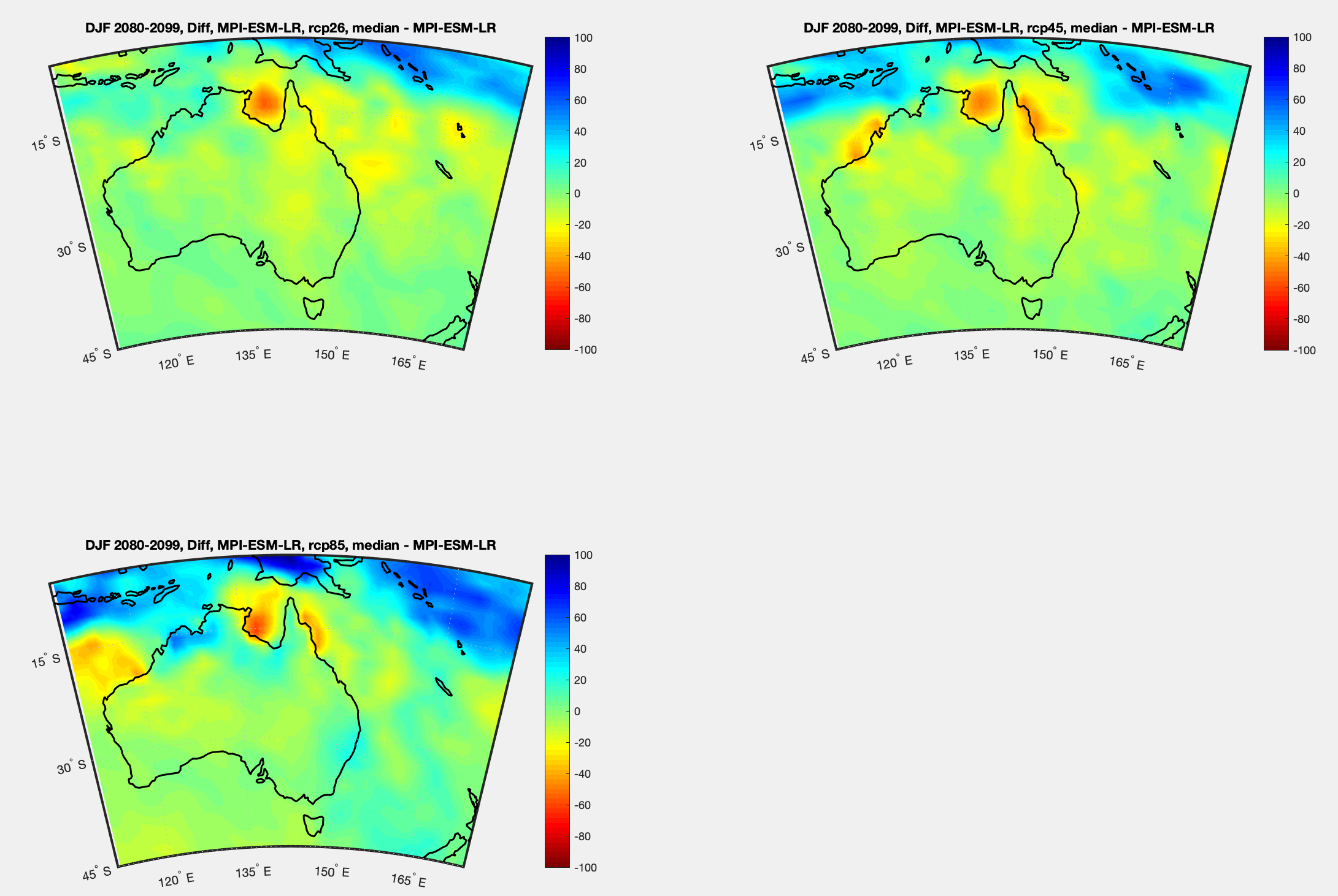
Figure 5 – DJF Australia – Simulations from MPI-ESM-LR for 3 RCPs in 2080-2099 minus simulation of historical 1979-2005 – Click to expand
Then percentage changes from the historical simulation:
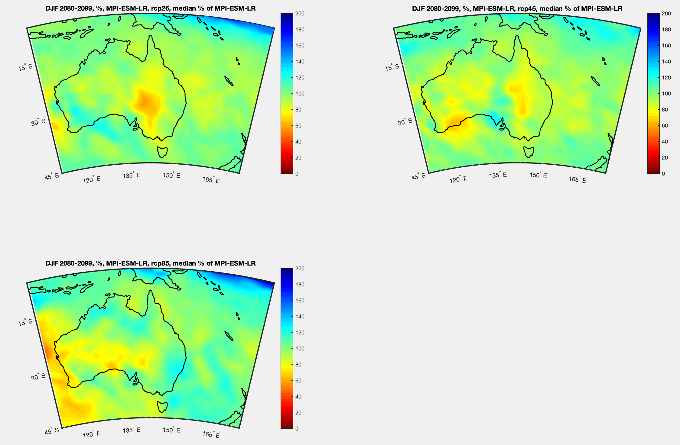
Figure 6 – DJF Australia – Simulations from MPI-ESM-LR for 3 RCPs in 2080-2099 as % of simulation of historical 1979-2005 – Click to expand
And the same for Europe – each graph is absolute values. The first is the historical simulation, then the 2nd, 3rd, 4th are the 3 RCPs as before:
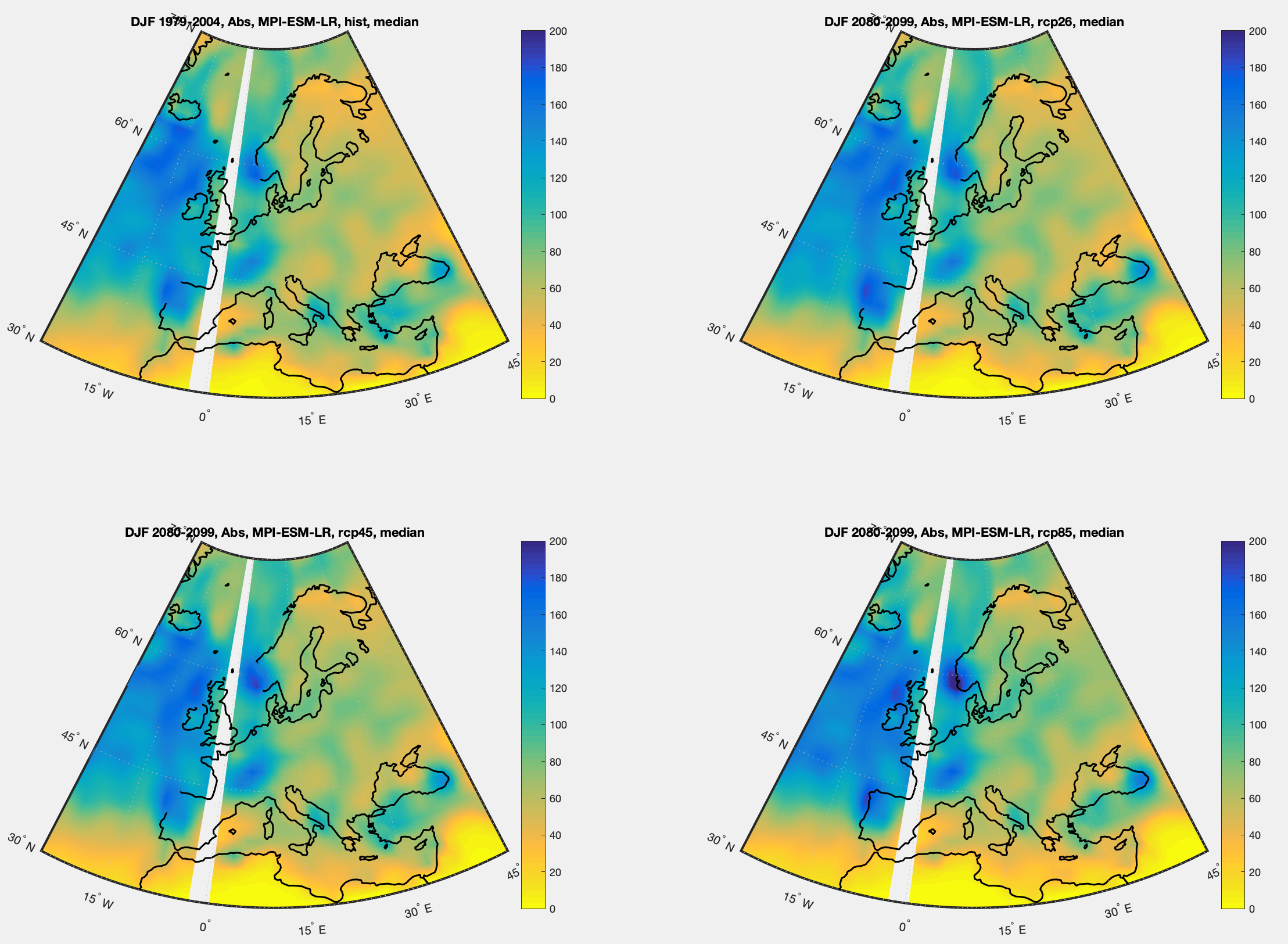
Figure 7 – DJF Europe – simulations from MPI-ESM-LR for historical 1979-2005 & 3 RCPs 2080-2099 – Click to expand
Then differences from the historical simulation:
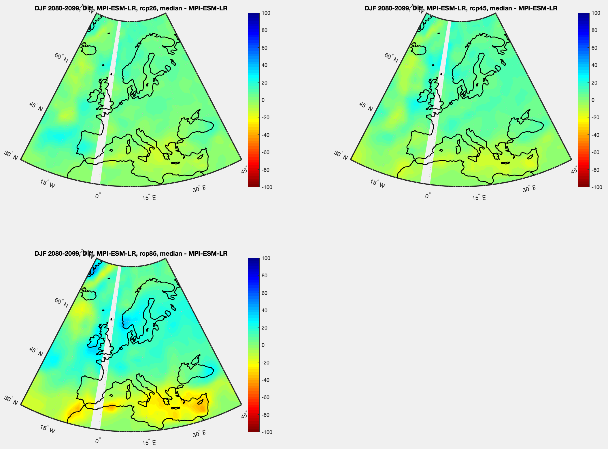
Figure 8 – DJF Europe – Simulations from MPI-ESM-LR for 3 RCPs in 2080-2099 minus simulation of historical 1979-2005 – Click to expand
Then percentage changes from the historical simulation:
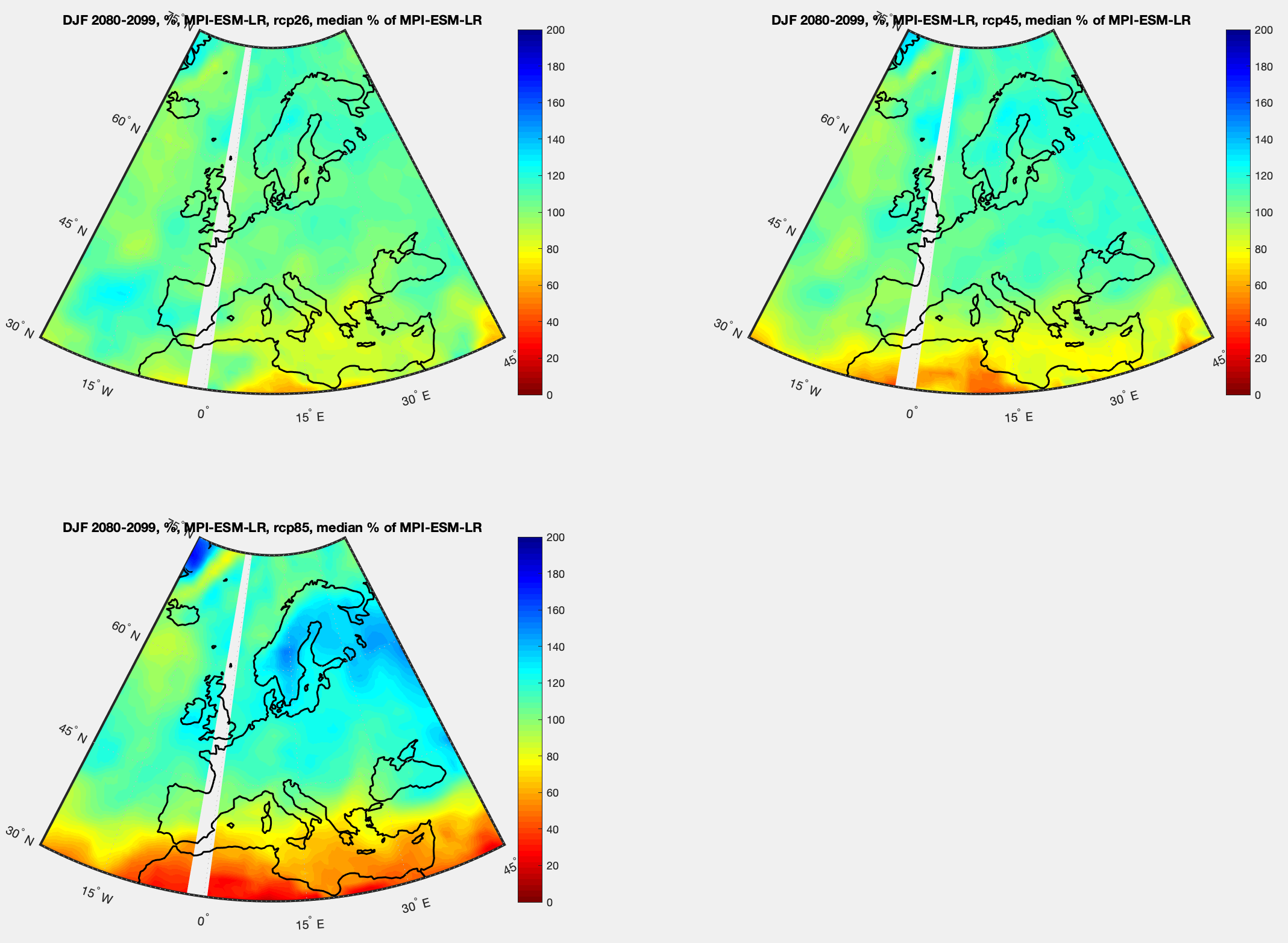
Figure 9 – DJF Europe – Simulations from MPI-ESM-LR for 3 RCPs in 2080-2099 as % of simulation of historical 1979-2005 – Click to expand
Now the global picture for northern hemisphere summer, June July August. First, absolute for the model for historical, then absolute for each RCP:
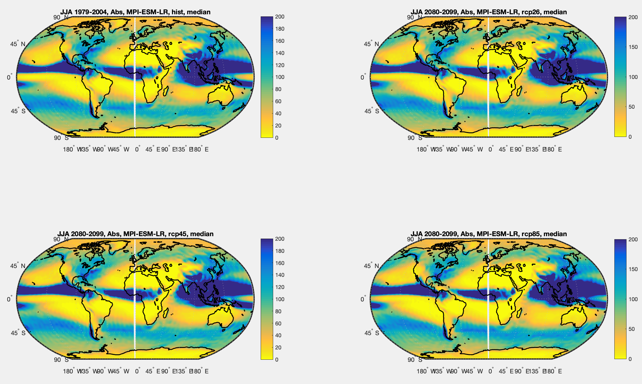
Figure 10 – JJA Simulations from MPI-ESM-LR for historical 1979-2005 & 3 RCPs 2080-2099 – Click to expand
Now the results are displayed as a difference from the historical simulation. Positive is more rainfall in the future simulation, negative is less rainfall:
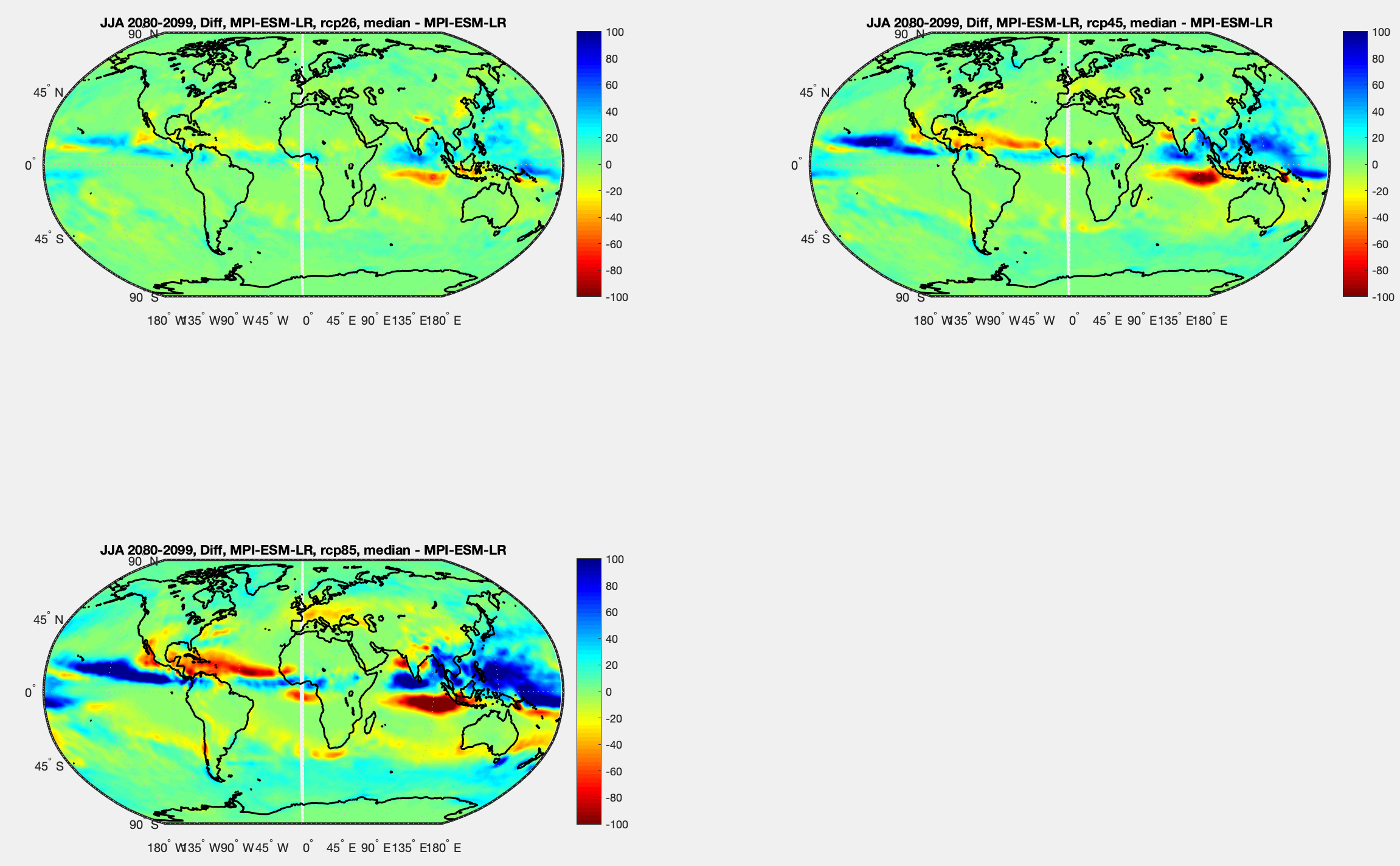
Figure 11 – JJA Simulations from MPI-ESM-LR for 3 RCPs in 2080-2099 minus simulation of historical 1979-2005 – Click to expand
And the % change:
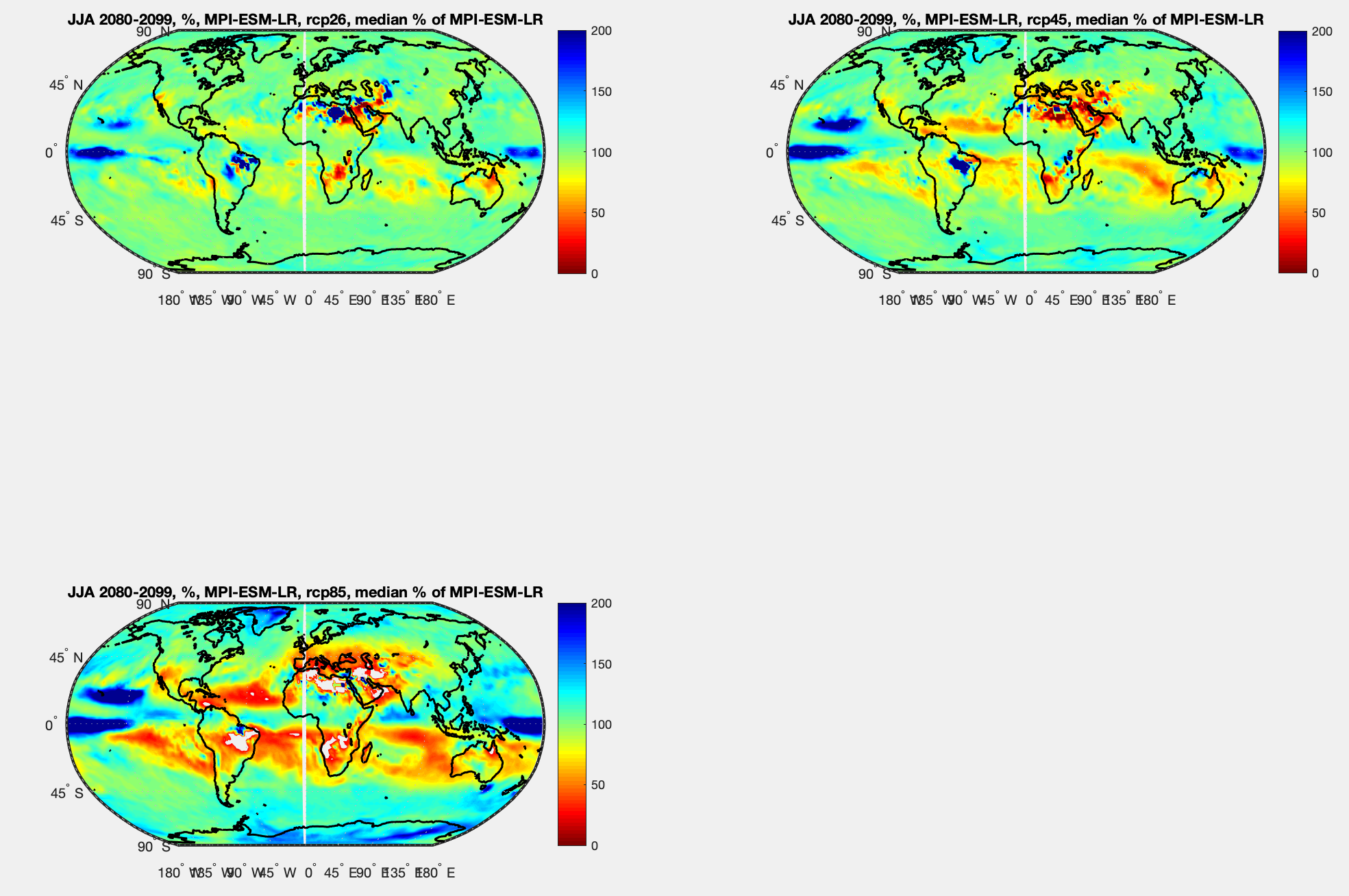
Figure 12 – JJA Simulations from MPI-ESM-LR for 3 RCPs in 2080-2099 as % of simulation of historical 1979-2005 – Click to expand
Modeled History vs Observational History
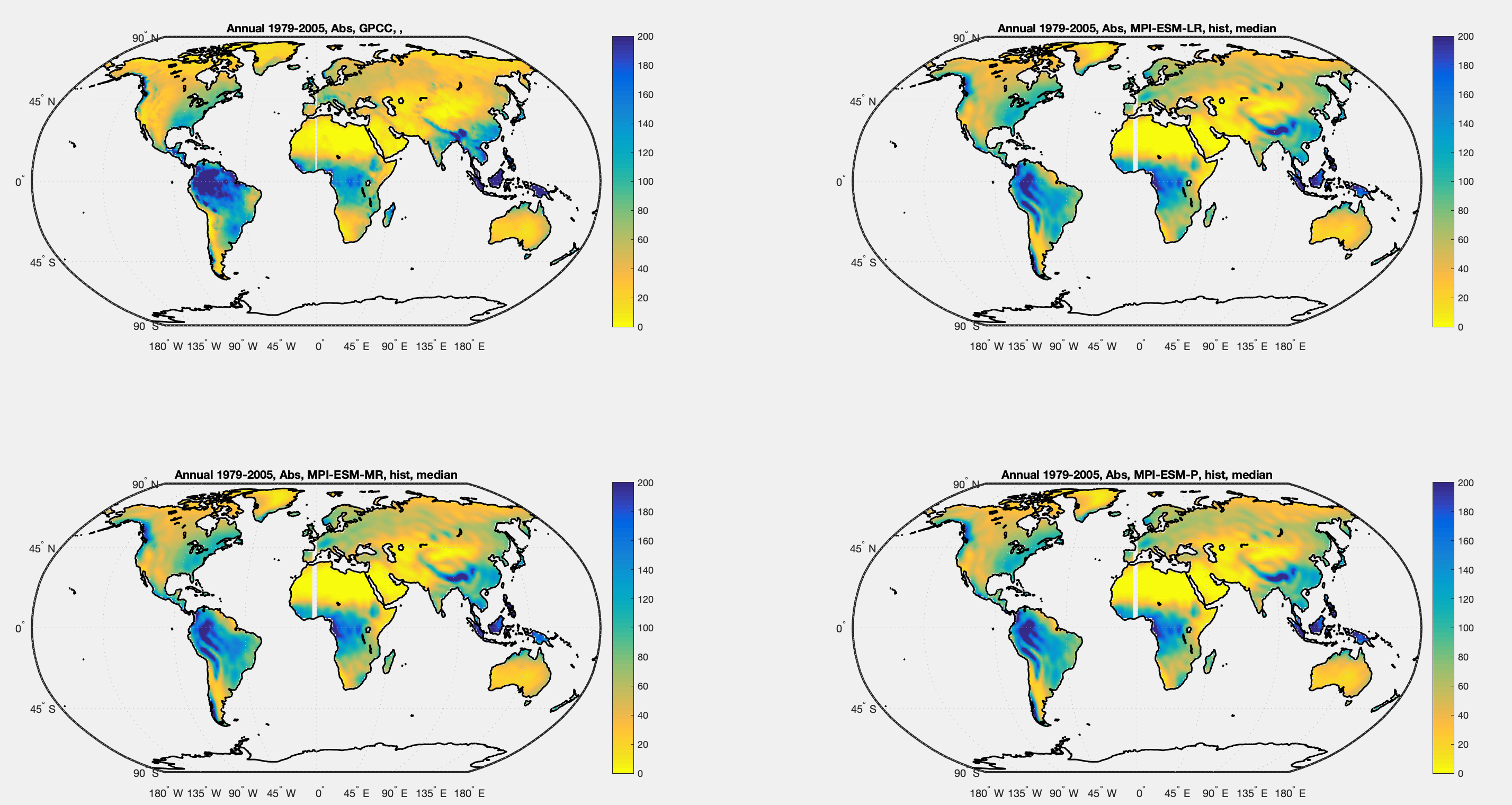
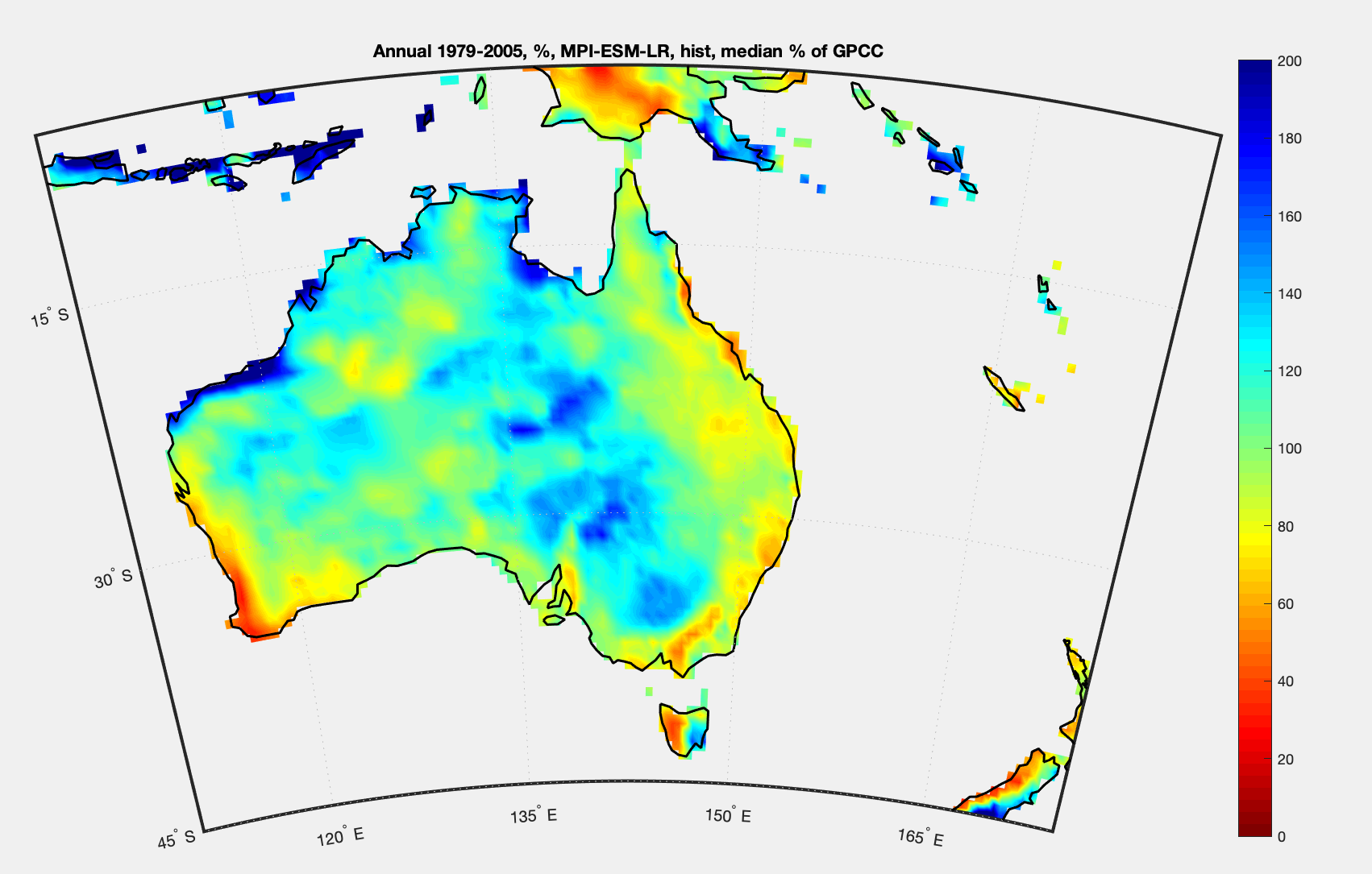
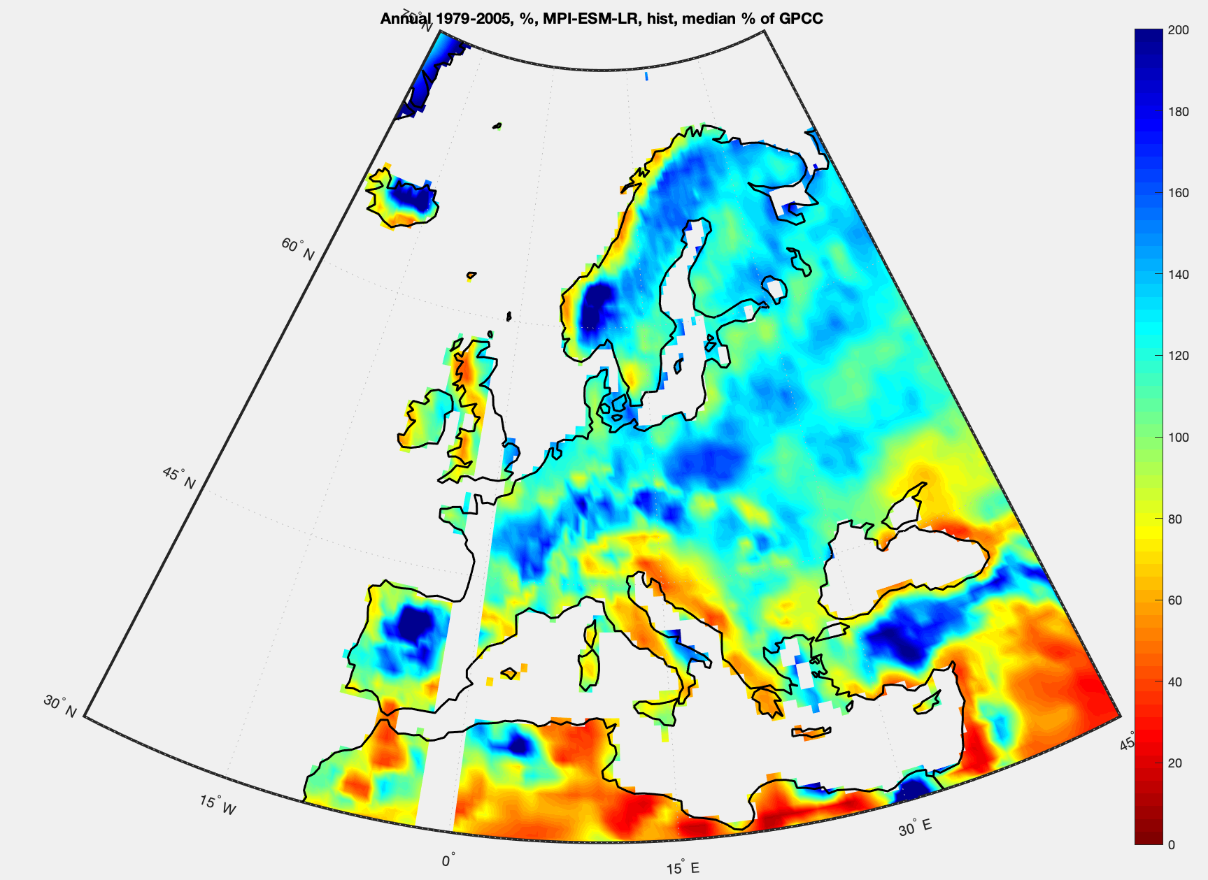
As in the last article, how the historical model compares with observations over the same period but for DJF. The GPCC observational data on the left and the median of all the historical simulations from the three MPI models (8 simulations total) on the right:
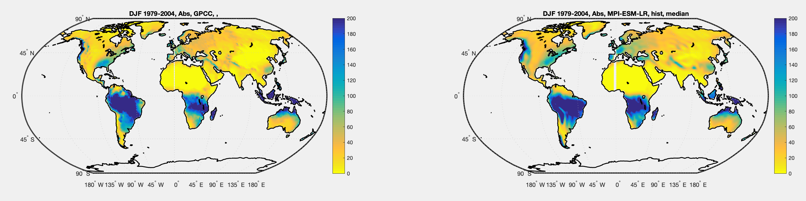
Figure 13 – DJF 1979-2005 GPCC Observational data & Median of all MPI historical simulations – Click to expand
The difference, so blue means the model produces more rain than reality, while red means the model produces less rain:
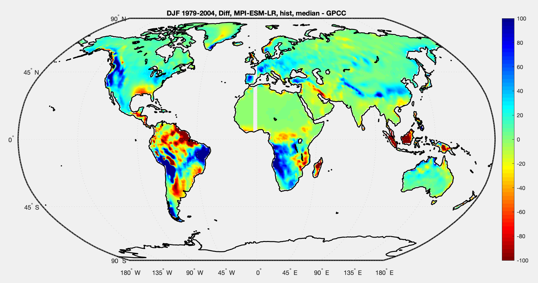
Figure 14 – DJF 1979-2005 Median of all MPI historical simulations less GPCC Observational data – Click to expand
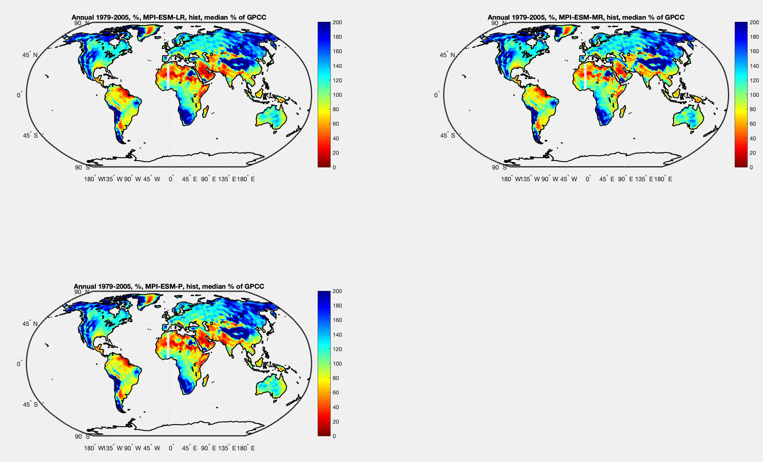
And percentage change:
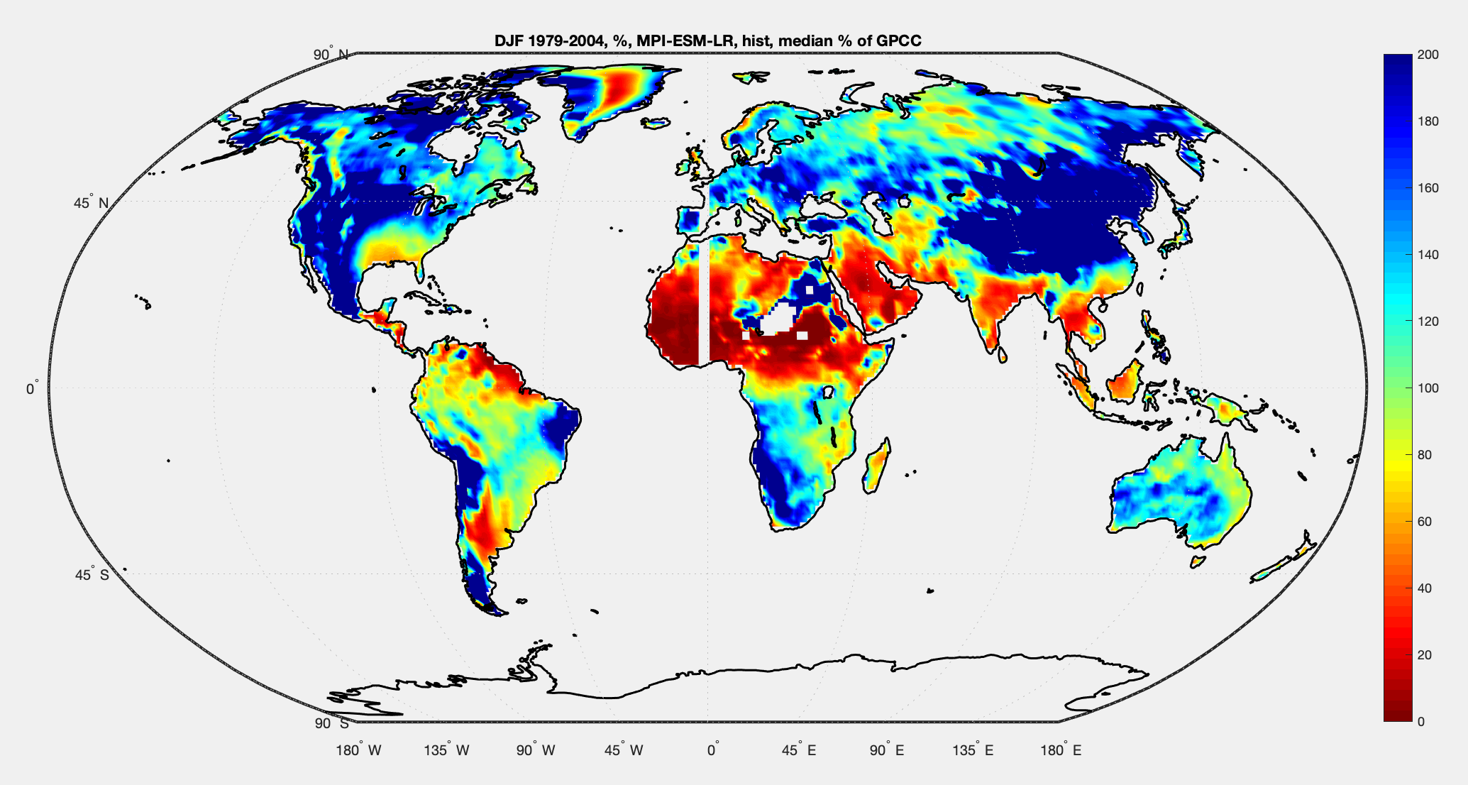
Figure 15 – DJF 1979-2005 Median of all MPI historical simulations as % of GPCC Observational data – Click to expand
Some Perspectives
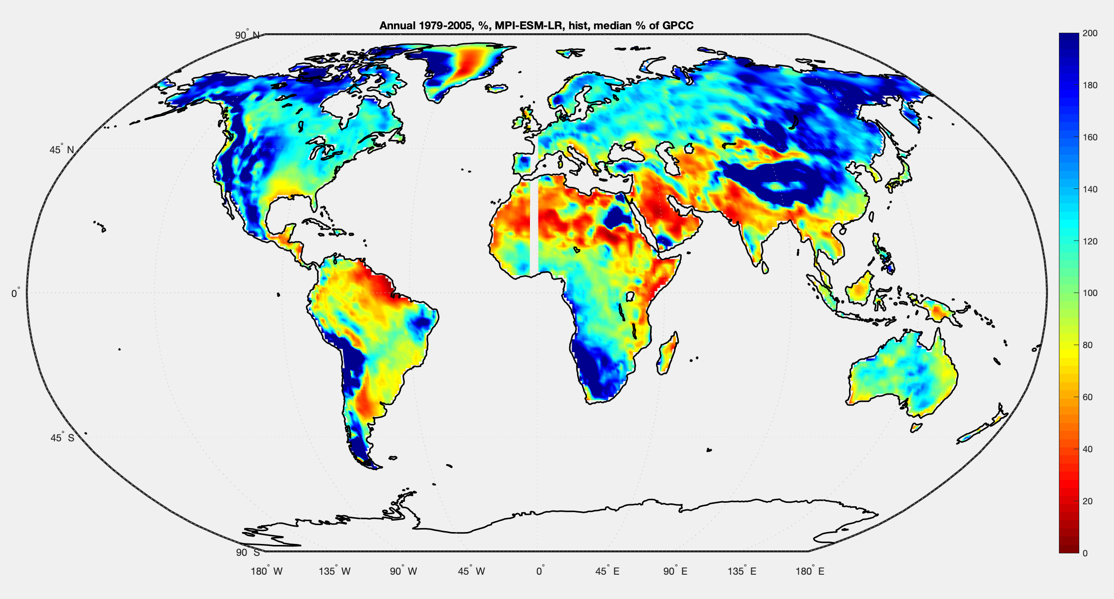
Now let’s look at annual, DJF and JJA for how simulation compare with observations, this is median MPI less GPCC – like figure 13. You can click to expand the image:
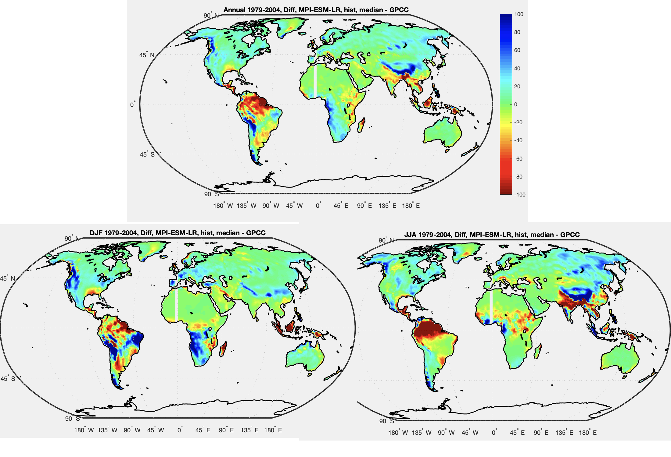
Figure 16 – Annual/seasons 1979-2005 Median of all MPI historical simulations less GPCC Observational data – Click to expand
Another perspective, compare projections of climate change with model skill. Top is skill (MPI simulation of DJF 1979-2005 less GPCC observation), bottom left is 2081-2100 RCP2.6 less MPI simulation, bottom right is RCP8.5 less MPI simulation:
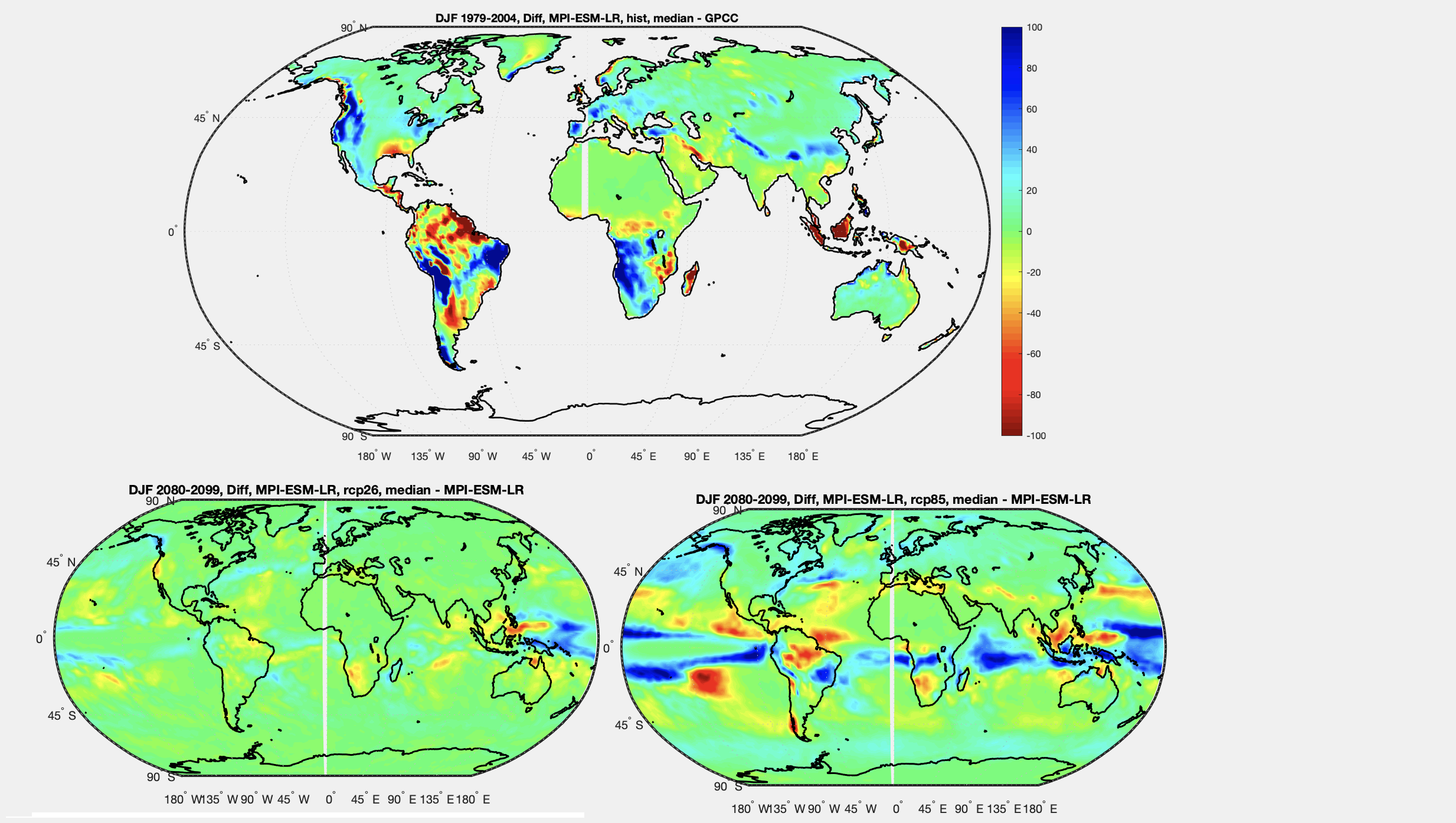
Figure 17 – DJF Compare model skill with projections of climate change for RCP2.6 & RCP8.5 – Click to expand
So let’s look at it another way.
Let’s look at the projected rainfall change for RCP2.6 and RCP8.5 vs actual observations. That is, MPI median DJF 2081-2099 less GPCC DJF 1979-2005:
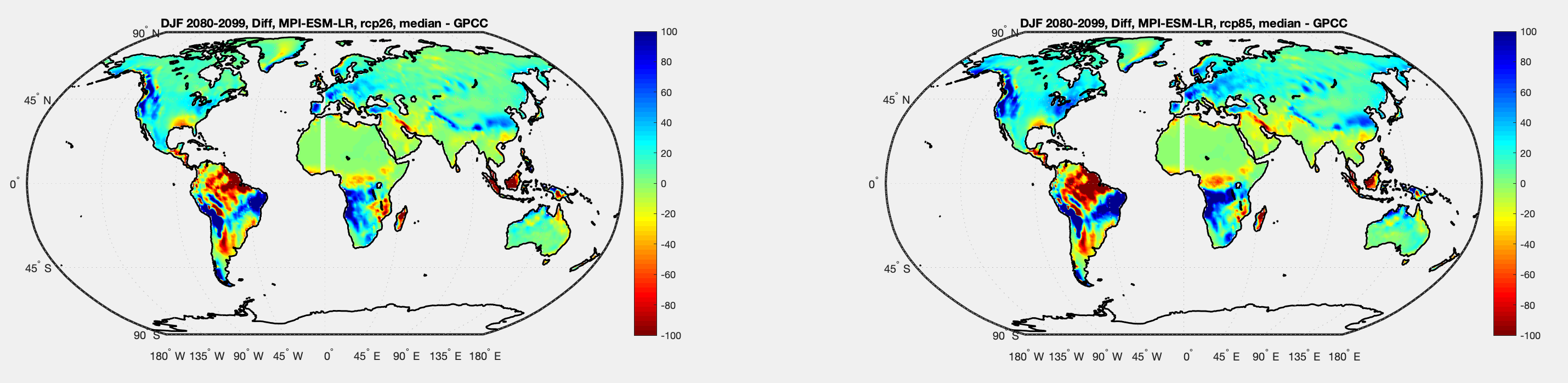
Figure 18 – DJF Compare model projections with actual historical – Click to expand
And the same for annual:
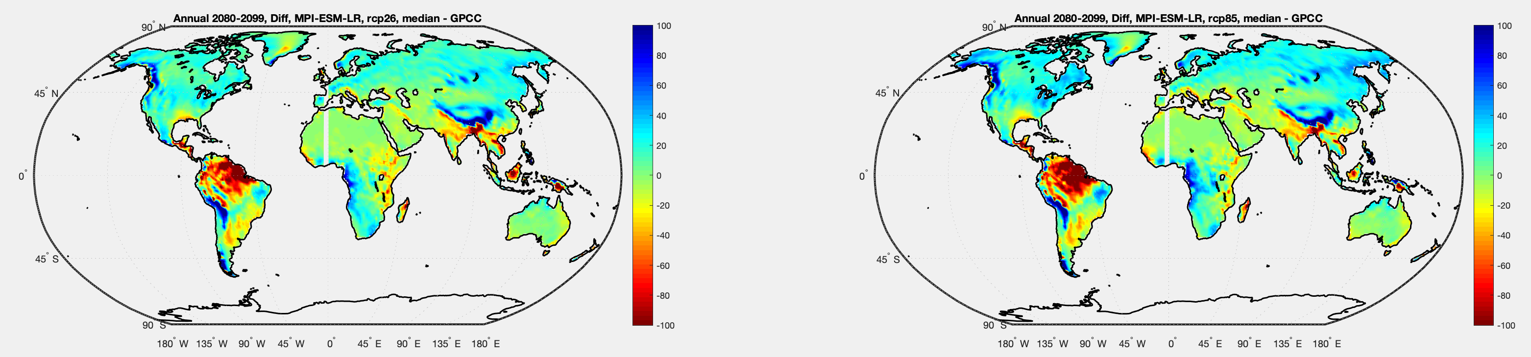
Figure 19 – Annual Compare model projections with actual historical – Click to expand
Let’s just compare the same two RCPs with model projections of climate change (as they are usually displayed, future less model historical):
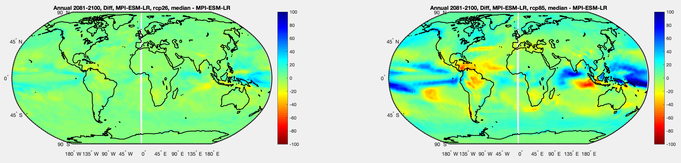
Figure 20 – For contrast, as figure 19 but compare with model historical – Click to expand
If we look at SW Africa, for example, we see a progressive drying from RCP2.6 (drastic cuts in CO2 emissions) to RCP8.5 (very high emissions). But if we look at figure 19 then the model projections at the end of the century for that region have more rainfall than current.
If we look at California we see the same kind of progressive drying. But compare model projections with observations and we see more rainfall in California under both those scenarios.
Of course, this just reflects the fact that climate models have issues with simulating rainfall, something that everyone in climate modeling knows. But it’s intriguing.
In the next article we’ll look at another model.
References
An overview of CMIP5 and the experiment design, Taylor, Stouffer & Meehl, AMS (2012)
GPCP data provided by the NOAA/OAR/ESRL PSL, Boulder, Colorado, USA, from their Web site at https://psl.noaa.gov/
GPCC data provided from https://psl.noaa.gov/data/gridded/data.gpcc.html
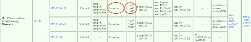
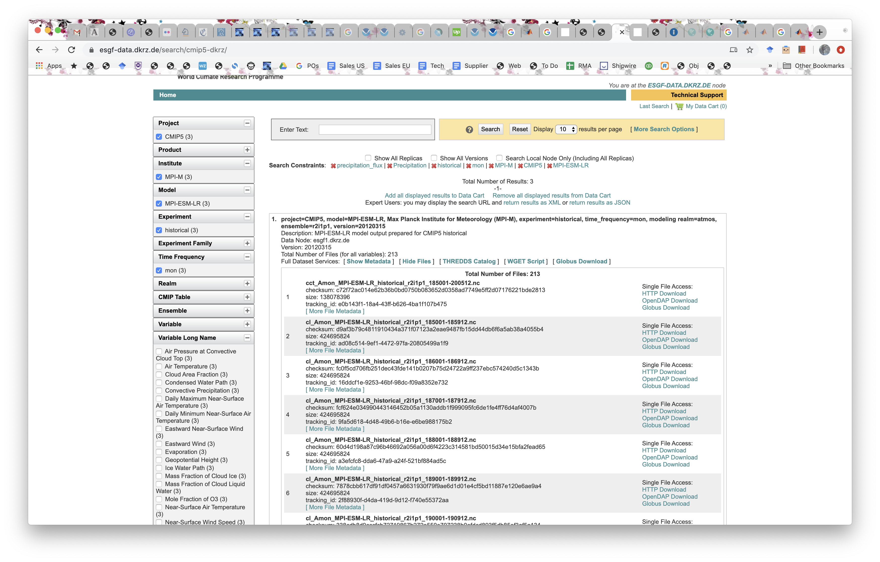
CMIP5 data provided by the portal at https://esgf-data.dkrz.de/search/cmip5-dkrz/
The representative concentration pathways: an overview, van Vuuren et al, Climatic Change (2011)