Feeds:
Posts
Comments

Archive for July, 2011

In the first two parts we looked at some basic statistical concepts, especially the idea of sampling from a distribution, and investigated how this question is answered:  Does this sample come from a population of mean = μ?

If we can answer this abstract-looking question then we can consider questions such as:

  • “how likely is it that the average temperature has changed over the last 30 years?”
  • “is the temperature in Boston different from the temperature in New York?”

It is important to understand the assumptions under which we are able to put % probabilities on the answers to these kind of questions.

The statistical tests so far described rely upon each event being independent from every other event. Typical examples of independent events in statistics books are:

  • the toss of a coin
  • the throw of a dice
  • the measurement of the height of a resident of Burkina Faso

In each case, the result of one measurement does not affect any other measurement.

If we measure the max and min temperatures in Ithaca, NY today, and then measure it tomorrow, and then the day after, are these independent (unrelated) events?

No.

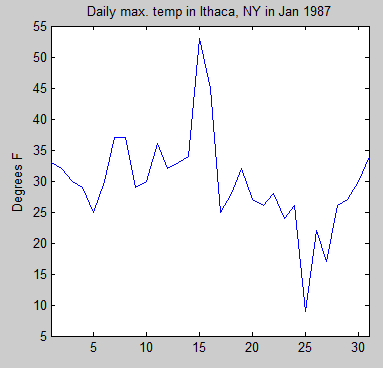
Here is the daily maximum temperature for January 1987 for Ithaca, NY:

Data from Wilks (2011)

Figure 1

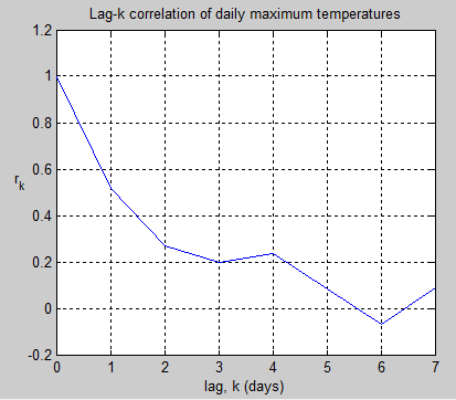
Now we want to investigate how values on one day are correlated with values on another day. So we look at the correlation of the temperature on each day with progressively larger lags in days. The correlation goes by the inspiring and memorable name of the Pearson product-moment correlation coefficient.

This correlation is the value commonly known as “r”.

So for k=0 we are comparing each day with itself, which obviously has a perfect correlation. And for k=1 we are comparing each day with the one afterwards – and finding the (average) correlation. For k=2 we are comparing 2 days afterwards. And so on. Here are the results:

Figure 2

As you can see, the autocorrelation decreases as the number of days increases, which is intuitively obvious. And by the time we get to more than 5 days, the correlation has decreased to zero.

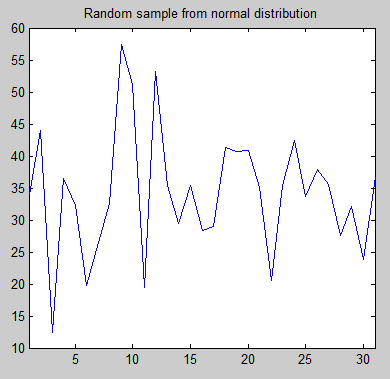
By way of comparison, here is one random (normal) distribution with the same mean and standard deviation as the Ithaca temperature values:

Figure 3

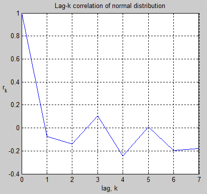
And the autocorrelation values:

Figure 4

As you would expect, the correlation of each value with the next value is around zero. The reason it is not exactly zero is just the randomness associated with only 31 values.

Digression: Time-Series and Frequency Transformations

Many people will be new to the concept of how time-series values convert into frequency plots – the Fourier transform. For those who do understand this subject, skip forward to the next sub-heading..

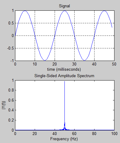
Suppose we have a 50Hz sine wave. If we plot amplitude against time we get the first graph below.

Figure 5

If we want to investigate the frequency components we do a fourier transform and we get the 2nd graph below. That simply tells us the obvious fact that a 50Hz signal is a 50Hz signal. So what is the point of the exercise?

What about if we have the time-based signal shown in the next graph – what can we tell about its real source?

Figure 6

When we see the frequency transform in the 2nd graph we can immediately tell that the signal is made up of two sine waves – one at 50Hz and one at 120Hz – along with some noise. It’s not really possible to deduce that from looking at the time-domain signal (not for ordinary people anyway).

Frequency transforms give us valuable insights into data.

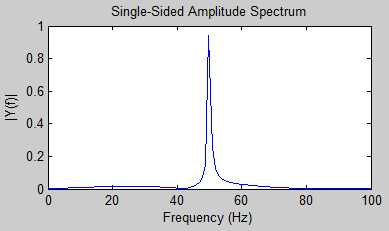
Just as a last point on this digression, in figure 5, why isn’t the frequency plot a perfect line at 50Hz? If the time-domain data went from zero to infinity, the frequency plot would be that perfect line. In figure 5, the time-domain data actually went from zero to 10 seconds (not all of which was plotted).

Here we see the frequency transform for a 50Hz sine wave over just 1 second:

Figure 7

For people new to frequency transforms it probably doesn’t seem clear why this happens but by having a truncated time series we have effectively added other frequency components – from the 1 second envelope surrounding the 50 Hz sine wave. If this last point isn’t clear, don’t worry about it.

Autocorrelation Equations and Frequency

The simplest autocorrelation model is the first-order autoregression, or AR(1) model.

The AR(1) model can be written as:

xt+1 – μ = φ(xt – μ) + εt+1

where xt+1 = the next value in the sequence, xt = the last value in the sequence, μ = the mean, εt+1 = random quantity and φ = auto-regression parameter

In non-technical terms, the next value in the series is made up of a random element plus a dependence on the last value – with the strength of this dependence being the parameter φ.

It appears that there is some confusion about this simple modelRecently, referencing an article via Bishop Hill, Doug Keenan wrote:

To draw that conclusion, the IPCC had to make an assumption about the global temperature series. The assumption that it made is known as the “AR1” assumption (this is from the statistical concept of “first-order autoregression”). The assumption implies, among other things, that only the current value in a time series has a direct effect on the next value. For the global temperature series, it means that this year’s temperature affects next year’s, but temperatures in previous years do not. For example, if the last several years were extremely cold, that on its own would not affect the chance that next year will be colder than average. Hence, the assumption made by the IPCC seems intuitively implausible.

[Update – apologies to Doug Keenan for misunderstanding his point – see his comment below ]

The confusion in the statement above is that mathematically the AR1 model does only rely on the last value to calculate the next value – you can see that in the formula above. But that doesn’t mean that there is no correlation between earlier values in the series. If day 2 has a relationship to day 1, and day 3 has a relationship to day 2, clearly there is a relationship between day 3 and day 1 – just not as strong as the relationship between day 3 and day 2 or between day 2 and day 1.

(And it is easy to demonstrate with a lag-2 correlation of a synthetic AR1 series – the 2-day correlation is not zero).

Well, more for another article when we look at the various autoregression models.

For now we will consider the simplest model, AR1, to learn a few things about time-series data with serial correlation.

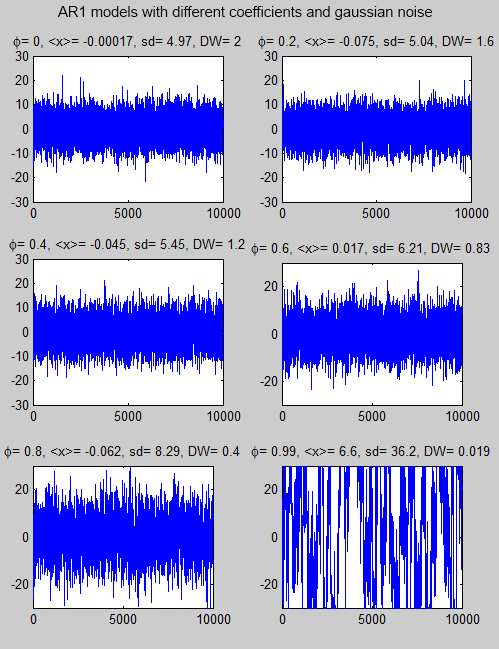
Here are some synthetic time-series with different autoregression parameters (the value φ in the equation) and gaussian (=normal, or the “bell-shaped curve”) noise. The gaussian noise is the same in each series – with a standard deviation=5.

I’ve used long time-series to make the frequency characteristics clearer (later we will see the same models over a shorter time period):

Figure 8

The value <x> is the mean. Note that the standard deviation (sd) of the data gets larger as the autoregressive parameter increases. DW is the Durbin-Watson statistic which we will probably come back to at a later date.

When φ = 0, this is the same as each data value being completely independent of every other data value.

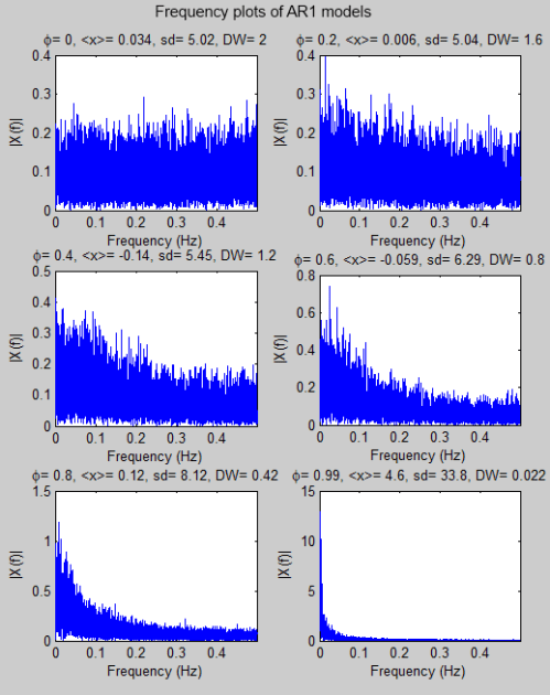
Now the frequency transformation (using a new dataset to save a little programming time on my part):

Figure 9

The first graph in the panel, with φ=0, is known as “white noise“. This means that the energy per unit frequency doesn’t change with frequency. As the autoregressive parameter increases you can see that the energy shifts to lower frequencies. This is known as “red noise“.

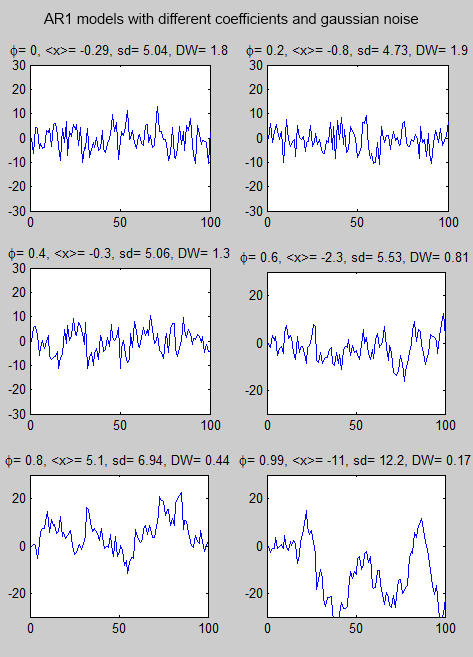
Here are the same models over 100 events (instead of 10,000) to make the time-based characteristics easier to see:

Figure 10

As the autoregression parameter increases you can see that the latest value is more likely to be influenced by the previous value.

The equation is also sometimes known as a red noise process because a positive value of the parameter φ averages or smoothes out short-term fluctuations in the serially independent series of innovations, ε, while affecting the slower variations much less strongly. The resulting time series is called red noise by analogy to visible light depleted in the shorter wavelengths, which appears reddish..

It is evident that the most erratic point to point variations in the uncorrelated series have been smoothed out, but the slower random variations are essentially preserved. In the time domain this smoothing is expressed as positive serial correlation. From a frequency perspective, the resulting series is “reddened”.

From Wilks (2011).

There is more to cover on this simple model but the most important point to grasp is that data which is serially correlated has different statistical properties than data which is a series of independent events.

Luckily, we can still use many standard hypothesis tests but we need to make allowance for the increase in the standard deviation of serially correlated data over independent data.

References

Statistical Methods in the Atmospheric Sciences, 3rd edition, Daniel Wilks, Academic Press (2011)
Read Full Post »

In Part One we raced through some basics, including the central limit theorem which is very handy.

This theorem tells us that even if we don’t know the type of distribution of a population we can say something very specific about the mean of a sample from that population (subject to some caveats).

Even though this theorem is very specific and useful it is not the easiest idea to grasp conceptually. So it is worth taking the time to think about it – before considering the caveats..

What do we know about Samples taken from Populations?

Usually we can’t measure the entire “population”. So we take a sample from the population. If we do it once and measure the mean (= “the average”) of that sample, then repeat again and again, and then plot the “distribution” of those means of the samples we get the graph on the right:

Figure 1

– and the graph on the right follows a normal distribution.

We know the probabilities associated with normal distributions, so this means that even if we have just ONE sampling distribution – the usual case – we can assess how likely it is that it comes from a specific population.

Here is a demonstration..

Using Matlab I created a population – the uniform distribution on the left of figure 1. Then I took a random sample from the population. Note that in real life you don’t know the details of the actual population, this is what you are trying to ascertain via statistical methods.

Figure 2

Each sample was 100 items. The test was made using the known probabilities of the normal distribution – “is this sample from a population of mean = 10?” And for a statistical test we can’t get a definite yes or no. We can only get a % likelihood. So a % threshold was set – you can see in figure 3, it was set at 95%.

Basically we are asking, “is there a 95% likelihood that this sample was drawn from a population with a mean of 10?

The exercise of

a) extracting a random sample of 100 items, and

b) carrying out the test

– was repeated 100,000 times

Even though the sample was drawn from the actual population every single time, 5% of the time (4.95% to be precise) the test rejected the sample as coming from this population. This is to be expected. Statistical tests can only give answers in terms of a probability.

All we have done is confirmed that the test to 95% threshold gives us 95% correct answers and 5% incorrect answers. We do get incorrect answers. So why not increase the level of confidence in the test by increasing the threshold?

Ok, let’s try it. Let’s increase the threshold to 99%:

Figure 3

Nice. Now we only get just under 1% false rejections. We have improved our ability to tell whether or not a sample is drawn from a specific population!

Or have we?

Unfortunately there is no free lunch, especially in statistics.

Reducing the Risk of Rejecting one Error Increases the Risk of Accepting a Different Error..

In each and every case here we happen to know that we have drawn the sample from the population. Suppose we don’t know this? – The usual situation. The wider we cast the net, the more likely we are to assume that a sample is drawn from a population when in fact it is not.

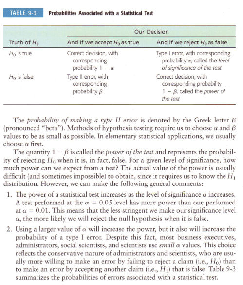
I’ll show some examples shortly, but here is a good summary of the problem – along with the terminology of Type I and Type II errors – note that H0 is the hypothesis that the sample was drawn from the population in question:

From Brase & Brase (2009)

Figure 4

What we have been doing by moving from 95% to 99% certainty is reducing the possibility of making a Type I error = thinking that the sample does not come from the population in question when it actually does. But in doing so we have been increasing the possibility of making a Type II error = thinking that the sample does come from the population when it does not.

So now let’s widen the Matlab example – we have added an alternative population and are drawing samples out of that as well.

So first – as before – we take samples from the main population and use the statistical test to find out how good it is at determining whether the samples do come from this population. Then second, we take samples from the alternative population and use the same test to see whether it makes the mistake of thinking the samples come from the original population.

Figure 5

As before, the % of false rejections is about what we would expect (note the number of tests was reduced to 10,000, for no particular reason) for a 95% significance test.

But now we see the % of “false acceptance” – where a sample from an alternative population is assessed to see whether it came from the original population. This error is – in this case – around 4%.

Now we increase the significance level to 99%:

Figure 6

Of course, the number of false rejections (type I error) has dropped to 1%. Excellent.

But the number of false accepts (type II error) has increased from 4% to 13%. Bad news.

Now let’s demonstrate why it is that we can’t know in advance how likely Type II errors are. In the following example, the mean of the alternative population has moved to 10.5 (from 10.3):

Figure 7

So no Type II errors. And we widen the test to 99%:

Figure 8

Still no Type II errors. So we widen the test further to 99.9%:

Figure 9

Finally we get some Type II errors. But because the population we are drawing the samples from is different enough from the population we are testing for (our hypothesis) the statistical test is very effective. The “power of the test” – in this case – is very high.

So, in summary, when you see a test “at the 5% significance level” =95%, or at the “1% significance level” = 99%, you have to understand that the more impressive the significance level, the more likely that a false result has been accepted.

Increasing the Sample Size

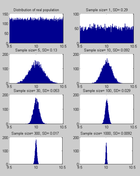
As the sample size increases the distribution of “the mean of the sample” gets smaller. I know, stats sounds like gobbledygook..

Let’s see a simple example to demonstrate what is a simple idea turned into incomprehensible English:

Figure 10

As you increase the size of the sample, you reduce the spread of the “sampling means” and this means that separating truth from fiction becomes easier.

It isn’t always possible to increase the sample size (for example, the monthly temperatures since satellites were introduced), but if it is possible, it makes it easier to find whether a sample is drawn from a given distribution or not.

Student T-test vs Normal Distribution test

What is a student t-test? It sounds like something “entry level” that serious people don’t bother with..

Actually it is a test developed by William Gossett just over 100 years ago and he had to write under a pen name because of his employer. Statistics was one of his employer’s trade secrets..

In the tests shown earlier we had to know the standard deviation of the population from which the sample was drawn. Often we don’t know this, and so we have a sample of unknown standard deviation – and we want to test the probability that it is drawn from a population of a certain mean.

The principle is the same, but the process is slightly different.

More in the next article, and hopefully we get to the concept of autocorrelation.

In all the basic elements we have covered so far we have assumed that each element in a sample and in a population is unrelated to any other element – independent events. Unfortunately, in the atmosphere and in climate, this assumption is not true (perhaps there are some circumstances where it is true, but generally it is not true).

Read Full Post »

I am very much a novice with statistics. Until recently I have avoided stats in climate, but of course, I keep running into climate science papers which introduce some statistical analysis.

So I decided to get up to speed and this series is aimed at getting me up to speed as well as, hopefully, providing some enlightenment to the few people around who know less than me about the subject. In this series of articles I will ask questions that I hope people will answer, and also I will make confident statements that will turn out to be completely or partially wrong – I expect knowledgeable readers to put us all straight when this happens.

One of the reasons I have avoided stats is that I have found it difficult to understand the correct application of the ideas from statistics to climate science. And I have had a suspicion (that I cannot yet prove and may be totally wrong about) that some statistical analysis of climate is relying on unproven and unstated assumptions. All for the road ahead.

First, a few basics. They will be sketchy basics – to avoid it being part 30 by the time we get to interesting stuff – and so if there are questions about the very basics, please ask.

In this article:

  • independence, or independent events
  • the normal distribution
  • sampling
  • central limit theorem
  • introduction to hypothesis testing

Independent Events

A lot of elementary statistics ideas are based around the idea of independent events. This is an important concept to understand.

One example would be flipping a coin. The value I get this time is totally independent of the value I got last time. Even if I have just flipped 5 heads in a row, assuming I have a normal unbiased coin, I have a 50/50 chance of getting another head.

Many people, especially people with “systems for beating casinos”, don’t understand this point. Although there is only a 1/25 = 1/32 = 3% chance of getting 5 heads in a row, once it has happened the chance of getting one more head is 50%. Many people will calculate the chance – in advance – of getting 6 heads in a row (=1.6%) and say that because 5 heads have already been flipped, therefore the probability of getting the 6th head is 1.6%. Completely wrong.

Another way to think about this interesting subject is that the chance of getting H T H T H T H T is just as unlikely as getting H H H H H H H H. Both have a 1/28 = 1/256 = 0.4% chance.

On the other hand, the chance of getting 4 heads and 4 tails out of 8 throws is much more likely, so long as you don’t specify the order like we did above.

If you send 100 people to the casino for a night, most will lose “some of their funds”, a few will lose “a lot”, and a few will win “a lot”. That doesn’t mean the winners have any inherent skill, it is just the result of the rules of chance.

A bit like fund managers who set up 20 different funds, then after a few years most have done “about the same as the market”, some have done very badly and some have done well. The results from the best performers are published, the worst performers are “rolled up” into the best funds and those who understand statistics despair of the standards of statistical analysis of the general public. But I digress..

Normal Distributions and “The Bell Curve”

The well-known normal distribution describes a lot of stuff unrelated to climate. The normal distribution is also known as a gaussian distribution.

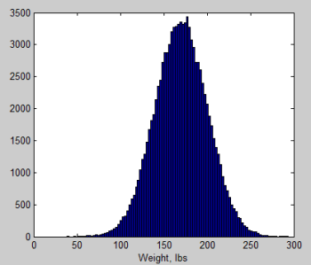
For example, if we measure the weights of male adults in a random country we might get a normal distribution that looks like this:

Figure 1

Essentially there is a grouping around the “mean” (= arithmetic average) and outliers are less likely the further away they are from the mean.

Many distributions match the normal distribution closely. And many don’t. For example, rainfall statistics are not Gaussian.

The two parameters that describe the normal distribution are:

  • the mean
  • the standard deviation

The mean is the well-known concept of the average (note that “the average” is a less-technical definition than “the mean”), and is therefore very familiar to non-statistics people.

The standard deviation is the measure of the spread of the population. In the example of figure 1 the standard deviation = 30. A normal distribution has 68% of its values within 1 standard deviation from the mean – so in figure 1 this means that 68% of the population are between 140-200 lbs. And 95% of its values are within 2 standard deviation from the mean – so 95% of the population are between 110-230 lbs.

Sampling

If there are 300M people in a country and we want to find out their weights it is a lot of work. A lot of people, a lot of scales, and a lot of questions about privacy. Even under a dictatorship it is a ton of work.

So the idea of “a sample” is born.. We measure the weights of 100 people, or 1,000 people and as a result we can make some statements about the whole population.

The population is the total collection of “things” we want to know about.

The sample is our attempt to measure some aspects of “the population” without as much work as measuring the complete population

There are many useful statistical relationships between samples and populations. One of them is the central limit theorem.

Central Limit Theorem

Let me give an example, along with some “synthetic data”, to help get this idea clear.

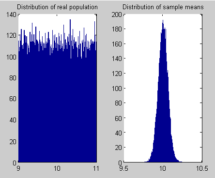
I have a population of 100,000 with a uniform distribution between 9 and 11. I have created this population using Matlab.

Now I take a random sample of 100 out of my population of 100,000. I measure the mean of this sample. Now I take another random sample of 100 (out of the same population) and measure the mean. I do this many many many times (100,000 times in this example below). What does the sampling distributions of the mean look like?

Figure 2

Alert readers will see that the sampling distribution of the means – right side graph – looks just like the “bell curve” of the normal distribution. Yet the original population is not a normal distribution.

It turns out that regardless of the population distribution, if you have enough items in your sample, you get a normal distribution (when you plot the mean of each sample distribution).

The mean of this normal distribution (the sampling distribution of the mean) is the same as the mean of the population, and the standard deviation, s = σ/√n, where σ= standard deviation of the population, and n = number of items in one sampling distribution.

This is the central limit theorem – in non-technical language – and is the reason why the normal distribution takes on such importance in statistical analysis. We will see more in considering hypothesis testing..

Hypothesis Testing

We have zoomed through many important statistical ideas and for people new to the concepts, probably too fast. Let’s ask this one question:

If we have a sampling distribution can we asses how likely it is that is was drawn from a particular population?

Let’s pose the problem another way:

The original population is unknown to us. How do we determine the characteristics of the original population from the sample we have?

Because the probabilities around the normal distribution are very well understood, and because the sampling distribution of the mean has a normal distribution, this means that if we have just one sampling distribution we can calculate the probability that it has come from a population of specified mean and specified standard deviation.

More in the next article in the series.

Read Full Post »

In Frontiers of Climate Modeling, Jeffrey Kiehl says:

The study of the Earth’s climate system is motivated by the desire to understand the processes that determine the state of the climate and the possible ways in which this state may have changed in the past or may change in the future..

Earth’s climate system is composed of a number of components (e.g., atmosphere, hydrosphere, cryosphere and biosphere). These components are non-linear systems in themselves, with various processes, which are spatially non-local.

Each component has a characteristic time scale associated with it. The entire Earth system is composed of the coupled interaction of these non-local, non-linear components.

Given this level of complexity, it is no wonder that the system displays a rich spectrum of climate variability on time scales ranging from the diurnal to millions of years.. This level of complexity also implies the system is chaotic (Lorenz, 1996, Hansen et al., 1997), which means the representation of the Earth system is not deterministic.

However, this does not imply that the system is not predictable. If it were not predictable at some level, climate modeling would not be possible. Why is it predictable? First, the climate system is forced externally through solar radiation from the Sun. This forcing is quasi-regular on a wide range of time scales. The seasonal cycle is the largest forcing Earth experiences, and is very regular. Second, certain modes of variability, e.g., the El Nino southern oscillation (ENSO), North Atlantic oscillation, etc., are quasi-periodic unforced internal modes of variability. Because they are quasi-periodic, they are predictable to some degree of accuracy.

The representation of the Earth system requires a statistical approach, rather than a deterministic one.

Modeling the climate system is not concerned with predicting the exact time and location of a specific small-scale event. Rather, modeling the climate system is concerned with understanding and predicting the statistical behavior of the system; in simplest terms, the mean and variance of the climate system.

He goes on to comment on climate history – warm periods such as the Cretaceous & Eocene, and very cold states such as the ice ages (e.g., 18,000 years ago), as well as climate fluctuations on very fast time scales.

The complexity of the mathematical relations and their solutions requires the use of large supercomputers. The chaotic nature of the climate system implies that ensembles are required to best understand the properties of the system. This requires numerous simulations of the state of the climate. The length of the climate simulations depends on the problem of interest..

And later comments:

There is some degree of skepticism concerning the predictive capabilities of climate models. These concerns center on the ability to represent all of the diverse processes of nature realistically. Since many of these processes (e.g., clouds, sea ice, water vapor) strongly affect the sensitivity of climate models, there is concern that model response to increased greenhouse-gas concentrations may be in error.

For this reason alone, it is imperative that climate models be compared to a diverse set of observations in terms of the time mean, the spatio-temporal variability and the response to external forcing. To the extent that models can reproduce observed features for all of these features, belief in the model’s ability to predict future climate change is better justified.

Interesting stuff.

Jeffrey Kiehl has 110 peer-reviewed papers to his name, including papers co-authored with the great Ramanathan and Petr Chylek, to name just a couple.

Probably the biggest question to myself and the readers on this blog is the measure of predictability of the climate.

I’m a beginner with non-linear dynamics but have been playing around with some basics. I would have preferred to know a lot more before writing this article, but I thought many people would find Kiehl’s comments interesting.

In various blogs I have read that climate is predictable because summer will be warmer than winter and the equator warmer than the poles. This is clearly true. However, there is a big gap between knowing that and knowing the state of the climate 50 years from now.

Or, to put it another way – if it is true that summer will be warmer than winter, and it is true that climate models forecast that summer will be warmer than winter, does it follow that climate models are reliable about the mean climate state 50 years from now? Of course, it doesn’t – and I don’t think many people would make this claim in such simplistic terms. How about – if it is true that a climate model can reproduce the mean annual climatology over the next few years (whatever precisely that entails) does it follow that climate models are reliable about the mean climate state 50 years from now?

I haven’t found many papers that really address this subject (which doesn’t mean there aren’t any). From my very limited understanding of chaotic systems I believe that the question is not easily resolvable. With a precise knowledge of the equations governing the system, and a detailed study of the behavior of the system described by these equations, it is possible to determine the boundary conditions which lead to various types of results. And without a precise knowledge it appears impossible. Is this correct?

However, with a little knowledge of the stochastic behavior of non-linear systems, I did find Jeffrey Kiehl’s comments very illuminating as to why ensembles of climate models are used.

Climatology is more about statistics than one day in one place. Which helps explain why, just as an example, the measure of a climate model is not measuring the average temperature in Moscow in January 2012 vs what a climate model “predicts” about the average temperature in Moscow in January 2012. You can easily create systems that have unpredictable time-varying behavior, yet very predictable statistical behavior. (The predictable statistical behavior can be seen in frequency based plots, for example).

So the fact that climate is a non-linear system does not mean as a necessary consequence that it is statistically unpredictable.

But it might in practical terms – that is, in terms of the certainty we would like to ascribe to future climatology.

I would be interested to know how the subject could be resolved.

Reference

Frontiers of Climate Modeling, edited by J.T. Kiehl & V. Ramanathan, Cambridge University Press (2006)


Read Full Post »