In Part Three – Attribution & Fingerprints we looked at an early paper in this field, from 1996. I was led there by following back through many papers referenced from AR5 Chapter 10. The lead author of that paper, Gabriele Hegerl, has made a significant contribution to the 3rd report, 4th and 5th IPCC reports on attribution.
We saw in Part Three that this particular paper ascribed a probability:
We find that the latest observed 30-year trend pattern of near-surface temperature change can be distinguished from all estimates of natural climate variability with an estimated risk of less than 2.5% if the optimal fingerprint is applied.
That paper did note that greatest uncertainty was in understanding the magnitude of natural variability. This is an essential element of attribution.
It wasn’t explicitly stated whether the 97.5% confidence was with the premise that natural variability was accurately understood in 1996. I believe that this was the premise. I don’t know what confidence would have been ascribed to the attribution study if uncertainty over natural variability was included.
IPCC AR5
In this article we will look at the IPCC 5th report, AR5, and see how this field has progressed, specifically in regard to the understanding of natural variability. Chapter 10 covers Detection and Attribution of Climate Change.
From p.881 (the page numbers are from the start of the whole report, chapter 10 has just over 60 pages plus references):
Since the AR4, detection and attribution studies have been carried out using new model simulations with more realistic forcings, and new observational data sets with improved representation of uncertainty (Christidis et al., 2010; Jones et al., 2011, 2013; Gillett et al., 2012, 2013; Stott and Jones, 2012; Knutson et al., 2013; Ribes and Terray, 2013).
Let’s have a look at these papers (see note 1 on CMIP3 & CMIP5).
I had trouble understanding AR5 Chapter 10 because there was no explicit discussion of natural variability. The papers referenced (usually) have their own section on natural variability, but chapter 10 doesn’t actually cover it.
I emailed Geert Jan van Oldenborgh to ask for help. He is the author of one paper we will briefly look at here – his paper was very interesting and he had a video segment explaining his paper. He suggested the problem was more about communication because natural variability was covered in chapter 9 on models. He had written a section in chapter 11 that he pointed me towards, so this article became something that tried to grasp the essence of three chapters (9 – 11), over 200 pages of reports and several pallet loads of papers.
So I’m not sure I can do the synthesis justice, but what I will endeavor to do in this article is demonstrate the minimal focus (in IPCC AR5) on how well models represent natural variability.
That subject deserves a lot more attention, so this article will be less about what natural variability is, and more about how little focus it gets in AR5. I only arrived here because I was determined to understand “fingerprints” and especially the rationale behind the certainties ascribed.
Subsequent articles will continue the discussion on natural variability.
Knutson et al 2013
The models [CMIP5] are found to provide plausible representations of internal climate variability, although there is room for improvement..
..The modeled internal climate variability from long control runs is used to determine whether observed and simulated trends are consistent or inconsistent. In other words, we assess whether observed and simulated forced trends are more extreme than those that might be expected from random sampling of internal climate variability.
Later
The model control runs exhibit long-term drifts. The magnitudes of these drifts tend to be larger in the CMIP3 control runs than in the CMIP5 control runs, although there are exceptions. We assume that these drifts are due to the models not being in equilibrium with the control run forcing, and we remove the drifts by a linear trend analysis (depicted by the orange straight lines in Fig. 1). In some CMIP3 cases, the drift initially proceeds at one rate, but then the trend becomes smaller for the remainder of the run. We approximate the drift in these cases by two separate linear trend segments, which are identified in the figure by the short vertical orange line segments. These long-term drift trends are removed to produce the drift corrected series.
[Emphasis added].
Another paper suggests this assumption might not be correct. Here is Jones, Stott and Christidis (2013) – “piControl” are the natural variability model simulations:
Often a model simulation with no changes in external forcing (piControl) will have a drift in the climate diagnostics due to various flux imbalances in the model [Gupta et al., 2012]. Some studies attempt to account for possible model climate drifts, for instance Figure 9.5 in Hegerl et al. [2007] did not include transient simulations of the 20th century if the long-term trend of the piControl was greater in magnitude than 0.2 K/century (Appendix 9.C in Hegerl et al. [2007]).
Another technique is to remove the trend, from the transient simulations, deduced from a parallel section of piControl [e.g., Knutson et al., 2006]. However whether one should always remove the piControl trend, and how to do it in practice, is not a trivial issue [Taylor et al., 2012; Gupta et al., 2012]..
..We choose not to remove the trend from the piControl from parallel simulations of the same model in this study due to the impact it would have on long-term variability, i.e., the possibility that part of the trend in the piControl may be long-term internal variability that may or may not happen in a parallel experiment when additional forcing has been applied.
Here are further comments from Knutson et al 2013:
Five of the 24 CMIP3 models, identified by “(-)” in Fig. 1, were not used, or practically not used, beyond Fig. 1 in our analysis. For instance, the IAP_fgoals1.0.g model has a strong discontinuity near year 200 of the control run. We judge this as likely an artifact due to some problem with the model simulation, and we therefore chose to exclude this model from further analysis
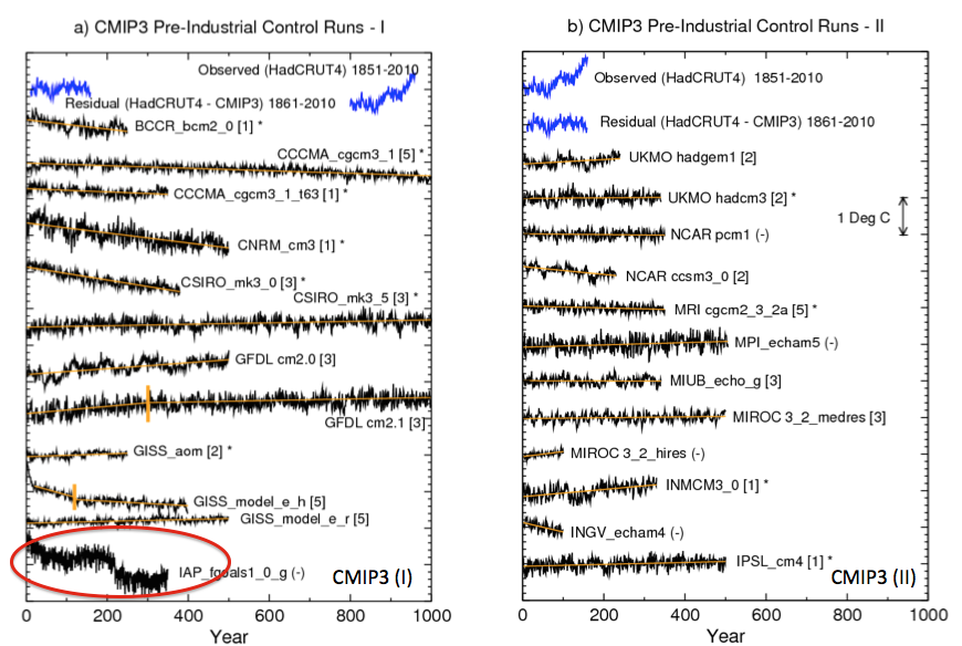
From Knutson et al 2013
Figure 1
Perhaps this is correct. Or perhaps the jump in simulated temperature is the climate model capturing natural climate variability.
The authors do comment:
As noted by Wittenberg (2009) and Vecchi and Wittenberg (2010), long-running control runs suggest that internally generated SST variability, at least in the ENSO region, can vary substantially between different 100-yr periods (approximately the length of record used here for observations), which again emphasizes the caution that must be placed on comparisons of modeled vs. observed internal variability based on records of relatively limited duration.
The first paper referenced, Wittenberg 2009, was the paper we looked at in Part Six – El Nino.
So is the “caution” that comes from that study included in the probability of our models ability to simulate natural variability?
In reality, questions about internal variability are not really discussed. Trends are removed, models with discontinuities are artifacts. What is left? This paper essentially takes the modeling output from the CMIP3 and CMIP5 archives (with and without GHG forcing) as a given and applies some tests.
Ribes & Terray 2013
This was a “Part II” paper and they said:
We use the same estimates of internal variability as in Ribes et al. 2013 [the “Part I”].
These are based on intra-ensemble variability from the above CMIP5 experiments as well as pre-industrial simulations from both the CMIP3 and CMIP5 archives, leading to a much larger sample than previously used (see Ribes et al. 2013 for details about ensembles). We then implicitly assume that the multi-model internal variability estimate is reliable.
[Emphasis added]. The Part I paper said:
An estimate of internal climate variability is required in detection and attribution analysis, for both optimal estimation of the scaling factors and uncertainty analysis.
Estimates of internal variability are usually based on climate simulations, which may be control simulations (i.e. in the present case, simulations with no variations in external forcings), or ensembles of simulations with the same prescribed external forcings.
In the latter case, m – 1 independent realisations of pure internal variability may be obtained by subtracting the ensemble mean from each member (assuming again additivity of the responses) and rescaling the result by a factor √(m/(m-1)) , where m denotes the number of members in the ensemble.
Note that estimation of internal variability usually means estimation of the covariance matrix of a spatio-temporal climate-vector, the dimension of this matrix potentially being high. We choose to use a multi-model estimate of internal climate variability, derived from a large ensemble of climate models and simulations. This multi-model estimate is subject to lower sampling variability and better represents the effects of model uncertainty on the estimate of internal variability than individual model estimates. We then simultaneously consider control simulations from the CMIP3 and CMIP5 archives, and ensembles of historical simulations (including simulations with individual sets of forcings) from the CMIP5 archive.
All control simulations longer than 220 years (i.e. twice the length of our study period) and all ensembles (at least 2 members) are used. The overall drift of control simulations is removed by subtracting a linear trend over the full period.. We then implicitly assume that this multi- model internal variability estimate is reliable.
[Emphasis added]. So two approaches to evaluate internal variability – one approach uses GCM runs with no GHG forcing; and the other approach uses the variation between different runs of the same model (with GHG forcing) to estimate natural variability. Drift is removed as “an error”.
Chapter 10 on Spatial Trends
The IPCC report also reviews the spatial simulations compared with spatial observations, p. 880:
Figure 10.2a shows the pattern of annual mean surface temperature trends observed over the period 1901–2010, based on Hadley Centre/ Climatic Research Unit gridded surface temperature data set 4 (Had- CRUT4). Warming has been observed at almost all locations with sufficient observations available since 1901.
Rates of warming are generally higher over land areas compared to oceans, as is also apparent over the 1951–2010 period (Figure 10.2c), which simulations indicate is due mainly to differences in local feedbacks and a net anomalous heat transport from oceans to land under GHG forcing, rather than differences in thermal inertia (e.g., Boer, 2011). Figure 10.2e demonstrates that a similar pattern of warming is simulated in the CMIP5 simulations with natural and anthropogenic forcing over the 1901–2010 period. Over most regions, observed trends fall between the 5th and 95th percentiles of simulated trends, and van Oldenborgh et al. (2013) find that over the 1950–2011 period the pattern of observed grid cell trends agrees with CMIP5 simulated trends to within a combination of model spread and internal variability..
van Oldenborgh et al (2013)
Let’s take a look at van Oldenborgh et al (2013).
There’s a nice video of (I assume) the lead author talking about the paper and comparing the probabilistic approach used in weather forecasts with that of climate models (see Ensemble Forecasting). I recommend the video for a good introduction to the topic of ensemble forecasting.
With weather forecasting the probability comes from running ensembles of weather models and seeing, for example, how many simulations predict rain vs how many do not. The proportion is the probability of rain. With weather forecasting we can continually review how well the probabilities given by ensembles match the reality. Over time we will build up a set of statistics of “probability of rain” and compare with the frequency of actual rainfall. It’s pretty easy to see if the models are over-confident or under-confident.
Here is what the authors say about the problem and how they approached it:
The ensemble is considered to be an estimate of the probability density function (PDF) of a climate forecast. This is the method used in weather and seasonal forecasting (Palmer et al 2008). Just like in these fields it is vital to verify that the resulting forecasts are reliable in the definition that the forecast probability should be equal to the observed probability (Joliffe and Stephenson 2011).
If outcomes in the tail of the PDF occur more (less) frequently than forecast the system is overconfident (underconfident): the ensemble spread is not large enough (too large).
In contrast to weather and seasonal forecasts, there is no set of hindcasts to ascertain the reliability of past climate trends per region. We therefore perform the verification study spatially, comparing the forecast and observed trends over the Earth. Climate change is now so strong that the effects can be observed locally in many regions of the world, making a verification study on the trends feasible. Spatial reliability does not imply temporal reliability, but unreliability does imply that at least in some areas the forecasts are unreliable in time as well. In the remainder of this letter we use the word ‘reliability’ to indicate spatial reliability.
[Emphasis added]. The paper first shows the result for one location, the Netherlands, with the spread of model results vs the actual result from 1950-2011:
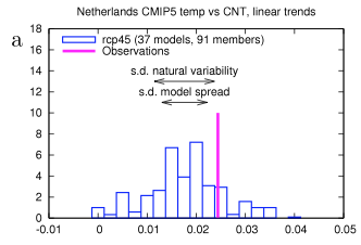
from van Oldenborgh et al 2013
Figure 2
We can see that the models are overall mostly below the observation. But this is one data point. So if we compared all of the datapoints – and this is on a grid of 2.5º – how do the model spreads compare with the results? Are observations above 95% of the model results only 5% of the time? Or more than 5% of the time? And are observations below 5% of the model results only 5% of the time?
We can see that the frequency of observations in the bottom 5% of model results is about 13% and the frequency of observations in the top 5% of model results is about 20%. Therefore the models are “overconfident” in spatial representation of the last 60 year trends:
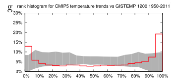
From van Oldenborgh et al 2013
Figure 3
We investigated the reliability of trends in the CMIP5 multi-model ensemble prepared for the IPCC AR5. In agreement with earlier studies using the older CMIP3 ensemble, the temperature trends are found to be locally reliable. However, this is due to the differing global mean climate response rather than a correct representation of the spatial variability of the climate change signal up to now: when normalized by the global mean temperature the ensemble is overconfident. This agrees with results of Sakaguchi et al (2012) that the spatial variability in the pattern of warming is too small. The precipitation trends are also overconfident. There are large areas where trends in both observational dataset are (almost) outside the CMIP5 ensemble, leading us to conclude that this is unlikely due to faulty observations.
It’s probably important to note that the author comments in the video “on the larger scale the models are not doing so badly”.
It’s an interesting paper. I’m not clear whether the brief note in AR5 reflects the paper’s conclusions.
Jones et al 2013
It was reassuring to finally find a statement that confirmed what seemed obvious from the “omissions”:
A basic assumption of the optimal detection analysis is that the estimate of internal variability used is comparable with the real world’s internal variability.
Surely I can’t be the only one reading Chapter 10 and trying to understand the assumptions built into the “with 95% confidence” result. If Chapter 10 is only aimed at climate scientists who work in the field of attribution and detection it is probably fine not to actually mention this minor detail in the tight constraints of only 60 pages.
But if Chapter 10 is aimed at a wider audience it seems a little remiss not to bring it up in the chapter itself.
I probably missed the stated caveat in chapter 10’s executive summary or introduction.
The authors continue:
As the observations are influenced by external forcing, and we do not have a non-externally forced alternative reality to use to test this assumption, an alternative common method is to compare the power spectral density (PSD) of the observations with the model simulations that include external forcings.
We have already seen that overall the CMIP5 and CMIP3 model variability compares favorably across different periodicities with HadCRUT4-observed variability (Figure 5). Figure S11 (in the supporting information) includes the PSDs for each of the eight models (BCC-CSM1-1, CNRM-CM5, CSIRO- Mk3-6-0, CanESM2, GISS-E2-H, GISS-E2-R, HadGEM2- ES and NorESM1-M) that can be examined in the detection analysis.
Variability for the historical experiment in most of the models compares favorably with HadCRUT4 over the range of periodicities, except for HadGEM2-ES whose very long period variability is lower due to the lower overall trend than observed and for CanESM2 and bcc-cm1-1 whose decadal and higher period variability are larger than observed.
While not a strict test, Figure S11 suggests that the models have an adequate representation of internal variability—at least on the global mean level. In addition, we use the residual test from the regression to test whether there are any gross failings in the models representation of internal variability.
Figure S11 is in the supplementary section of the paper:
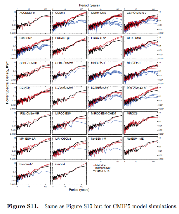
From Jones et al 2013, figure S11
Figure 4
From what I can see, this demonstrates that the spectrum of the models’ internal variability (“historicalNat”) is different from the spectrum of the models’ forced response with GHG changes (“historical”).
It feels like my quantum mechanics classes all over again. I’m probably missing something obvious, and hopefully knowledgeable readers can explain.
Chapter 9 of AR5 – Climate Models’ Representation of Internal Variability
Chapter 9, reviewing models, stretches to over 80 pages. The section on internal variability is section 9.5.1:
However, the ability to simulate climate variability, both unforced internal variability and forced variability (e.g., diurnal and seasonal cycles) is also important. This has implications for the signal-to-noise estimates inherent in climate change detection and attribution studies where low-frequency climate variability must be estimated, at least in part, from long control integrations of climate models (Section 10.2).
Section 9.5.3:
In addition to the annual, intra-seasonal and diurnal cycles described above, a number of other modes of variability arise on multi-annual to multi-decadal time scales (see also Box 2.5). Most of these modes have a particular regional manifestation whose amplitude can be larger than that of human-induced climate change. The observational record is usually too short to fully evaluate the representation of variability in models and this motivates the use of reanalysis or proxies, even though these have their own limitations.
Figure 9.33a shows simulated internal variability of mean surface temperature from CMIP5 pre-industrial control simulations. Model spread is largest in the tropics and mid to high latitudes (Jones et al., 2012), where variability is also large; however, compared to CMIP3, the spread is smaller in the tropics owing to improved representation of ENSO variability (Jones et al., 2012). The power spectral density of global mean temperature variance in the historical simulations is shown in Figure 9.33b and is generally consistent with the observational estimates. At longer time scale of the spectra estimated from last millennium simulations, performed with a subset of the CMIP5 models, can be assessed by comparison with different NH temperature proxy records (Figure 9.33c; see Chapter 5 for details). The CMIP5 millennium simulations include natural and anthropogenic forcings (solar, volcanic, GHGs, land use) (Schmidt et al., 2012).
Significant differences between unforced and forced simulations are seen for time scale larger than 50 years, indicating the importance of forced variability at these time scales (Fernandez-Donado et al., 2013). It should be noted that a few models exhibit slow background climate drift which increases the spread in variance estimates at multi-century time scales.
Nevertheless, the lines of evidence above suggest with high confidence that models reproduce global and NH temperature variability on a wide range of time scales.
[Emphasis added]. Here is fig 9.33:
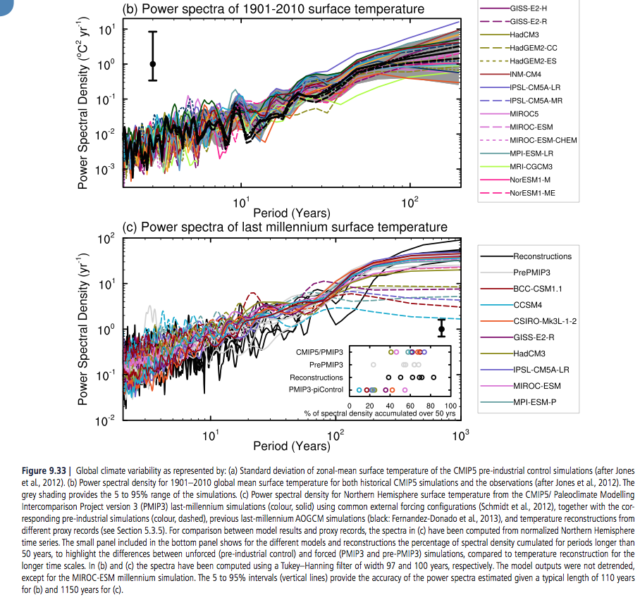
From IPCC AR5 Chapter 10
Figure 5 – Click to Expand
The bottom graph shows the spectra of the last 1,000 years – black line is observations (reconstructed from proxies), dashed lines are without GHG forcings, and solid lines are with GHG forcings.
In later articles we will review this in more detail.
Conclusion
The IPCC report on attribution is very interesting. Most attribution studies compare observations of the last 100 – 150 years with model simulations using anthropogenic GHG changes and model simulations without (note 3).
The results show a much better match for the case of the anthropogenic forcing.
The primary method is with global mean surface temperature, with more recent studies also comparing the spatial breakdown. We saw one such comparison with van Oldenborgh et al (2013). Jones et al (2013) also reviews spatial matching, finding a better fit (of models & observations) for the last half of the 20th century than the first half. (As with van Oldenborgh’s paper, the % match outside 90% of model results was greater than 10%).
My question as I first read Chapter 10 was how was the high confidence attained and what is a fingerprint?
I was led back, by following the chain of references, to one of the early papers on the topic (1996) that also had similar high confidence. (We saw this in Part Three). It was intriguing that such confidence could be attained with just a few “no forcing” model runs as comparison, all of which needed “flux adjustment”. Current models need much less, or often zero, flux adjustment.
In later papers reviewed in AR5, “no forcing” model simulations that show temperature trends or jumps are often removed or adjusted.
I’m not trying to suggest that “no forcing” GCM simulations of the last 150 years have anything like the temperature changes we have observed. They don’t.
But I was trying to understand what assumptions and premises were involved in attribution. Chapter 10 of AR5 has been valuable in suggesting references to read, but poor at laying out the assumptions and premises of attribution studies.
For clarity, as I stated in Part Three:
..as regular readers know I am fully convinced that the increases in CO2, CH4 and other GHGs over the past 100 years or more can be very well quantified into “radiative forcing” and am 100% in agreement with the IPCCs summary of the work of atmospheric physics over the last 50 years on this topic. That is, the increases in GHGs have led to something like a “radiative forcing” of 2.8 W/m²..
..Therefore, it’s “very likely” that the increases in GHGs over the last 100 years have contributed significantly to the temperature changes that we have seen.
So what’s my point?
Chapter 10 of the IPCC report fails to highlight the important assumptions in the attribution studies. Chapter 9 of the IPCC report has a section on centennial/millennial natural variability with a “high confidence” conclusion that comes with little evidence and appears to be based on a cursory comparison of the spectral results of the last 1,000 years proxy results with the CMIP5 modeling studies.
In chapter 10, the executive summary states:
..given that observed warming since 1951 is very large compared to climate model estimates of internal variability (Section 10.3.1.1.2), which are assessed to be adequate at global scale (Section 9.5.3.1), we conclude that it is virtually certain [99-100%] that internal variability alone cannot account for the observed global warming since 1951.
[Emphasis added]. I agree, and I don’t think anyone who understands radiative forcing and climate basics would disagree. To claim otherwise would be as ridiculous as, for example, claiming that tiny changes in solar insolation from eccentricity modifications over 100 kyrs cause the end of ice ages, whereas large temperature changes during these ice ages have no effect (see note 2).
The executive summary also says:
It is extremely likely [95–100%] that human activities caused more than half of the observed increase in GMST from 1951 to 2010.
The idea is plausible, but the confidence level is dependent on a premise that is claimed via one graph (fig 9.33) of the spectrum of the last 1,000 years. High confidence (“that models reproduce global and NH temperature variability on a wide range of time scales”) is just an opinion.
It’s crystal clear, by inspection of CMIP3 and CMIP5 model results, that models with anthropogenic forcing match the last 150 years of temperature changes much better than models held at constant pre-industrial forcing.
I believe natural variability is a difficult subject which needs a lot more than a cursory graph of the spectrum of the last 1,000 years to even achieve low confidence in our understanding.
Chapters 9 & 10 of AR5 haven’t investigated “natural variability” at all. For interest, some skeptic opinions are given in note 4.
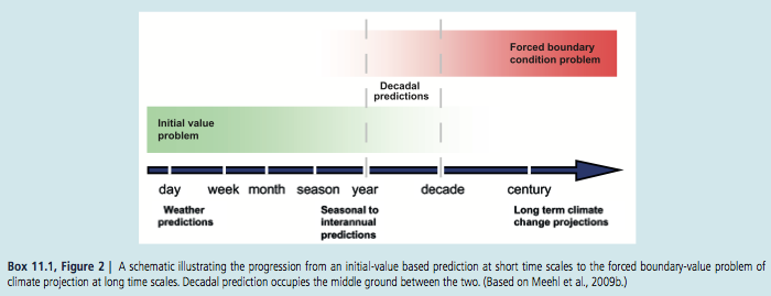
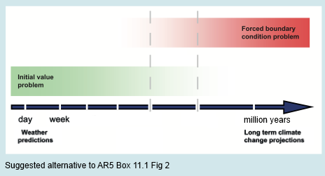
I propose an alternative summary for Chapter 10 of AR5:
It is extremely likely [95–100%] that human activities caused more than half of the observed increase in GMST from 1951 to 2010, but this assessment is subject to considerable uncertainties.
Articles in the Series
Natural Variability and Chaos – One – Introduction
Natural Variability and Chaos – Two – Lorenz 1963
Natural Variability and Chaos – Three – Attribution & Fingerprints
Natural Variability and Chaos – Four – The Thirty Year Myth
Natural Variability and Chaos – Five – Why Should Observations match Models?
Natural Variability and Chaos – Six – El Nino
Natural Variability and Chaos – Seven – Attribution & Fingerprints Or Shadows?
Natural Variability and Chaos – Eight – Abrupt Change
References
Multi-model assessment of regional surface temperature trends, TR Knutson, F Zeng & AT Wittenberg, Journal of Climate (2013) – free paper
Attribution of observed historical near surface temperature variations to anthropogenic and natural causes using CMIP5 simulations, Gareth S Jones, Peter A Stott & Nikolaos Christidis, Journal of Geophysical Research Atmospheres (2013) – paywall paper
Application of regularised optimal fingerprinting to attribution. Part II: application to global near-surface temperature, Aurélien Ribes & Laurent Terray, Climate Dynamics (2013) – free paper
Application of regularised optimal fingerprinting to attribution. Part I: method, properties and idealised analysis, Aurélien Ribes, Serge Planton & Laurent Terray, Climate Dynamics (2013) – free paper
Reliability of regional climate model trends, GJ van Oldenborgh, FJ Doblas Reyes, SS Drijfhout & E Hawkins, Environmental Research Letters (2013) – free paper
Notes
Note 1: CMIP = Coupled Model Intercomparison Project. CMIP3 was for AR4 and CMIP5 was for AR5.
Read about CMIP5:
At a September 2008 meeting involving 20 climate modeling groups from around the world, the WCRP’s Working Group on Coupled Modelling (WGCM), with input from the IGBP AIMES project, agreed to promote a new set of coordinated climate model experiments. These experiments comprise the fifth phase of the Coupled Model Intercomparison Project (CMIP5). CMIP5 will notably provide a multi-model context for
1) assessing the mechanisms responsible for model differences in poorly understood feedbacks associated with the carbon cycle and with clouds
2) examining climate “predictability” and exploring the ability of models to predict climate on decadal time scales, and, more generally
3) determining why similarly forced models produce a range of responses…
From the website link above you can read more. CMIP5 is a substantial undertaking, with massive output of data from the latest climate models. Anyone can access this data, similar to CMIP3. Here is the Getting Started page.
And CMIP3:
In response to a proposed activity of the World Climate Research Programme (WCRP) Working Group on Coupled Modelling (WGCM), PCMDI volunteered to collect model output contributed by leading modeling centers around the world. Climate model output from simulations of the past, present and future climate was collected by PCMDI mostly during the years 2005 and 2006, and this archived data constitutes phase 3 of the Coupled Model Intercomparison Project (CMIP3). In part, the WGCM organized this activity to enable those outside the major modeling centers to perform research of relevance to climate scientists preparing the Fourth Asssessment Report (AR4) of the Intergovernmental Panel on Climate Change (IPCC). The IPCC was established by the World Meteorological Organization and the United Nations Environmental Program to assess scientific information on climate change. The IPCC publishes reports that summarize the state of the science.
This unprecedented collection of recent model output is officially known as the “WCRP CMIP3 multi-model dataset.” It is meant to serve IPCC’s Working Group 1, which focuses on the physical climate system — atmosphere, land surface, ocean and sea ice — and the choice of variables archived at the PCMDI reflects this focus. A more comprehensive set of output for a given model may be available from the modeling center that produced it.
With the consent of participating climate modelling groups, the WGCM has declared the CMIP3 multi-model dataset open and free for non-commercial purposes. After registering and agreeing to the “terms of use,” anyone can now obtain model output via the ESG data portal, ftp, or the OPeNDAP server.
As of July 2009, over 36 terabytes of data were in the archive and over 536 terabytes of data had been downloaded among the more than 2500 registered users
Note 2: This idea is explained in Ghosts of Climates Past -Eighteen – “Probably Nonlinearity” of Unknown Origin – what is believed and what is put forward as evidence for the theory that ice age terminations were caused by orbital changes, see especially the section under the heading: Why Theory B is Unsupportable.
Note 3: Some studies use just fixed pre-industrial values, and others compare “natural forcings” with “no forcings”.
“Natural forcings” = radiative changes due to solar insolation variations (which are not known with much confidence) and aerosols from volcanos. “No forcings” is simply fixed pre-industrial values.
Note 4: Chapter 11 (of AR5), p.982:
For the remaining projections in this chapter the spread among the CMIP5 models is used as a simple, but crude, measure of uncertainty. The extent of agreement between the CMIP5 projections provides rough guidance about the likelihood of a particular outcome. But—as partly illustrated by the discussion above—it must be kept firmly in mind that the real world could fall outside of the range spanned by these particular models. See Section 11.3.6 for further discussion.
And p. 1004:
It is possible that the real world might follow a path outside (above or below) the range projected by the CMIP5 models. Such an eventuality could arise if there are processes operating in the real world that are missing from, or inadequately represented in, the models. Two main possibilities must be considered: (1) Future radiative and other forcings may diverge from the RCP4.5 scenario and, more generally, could fall outside the range of all the RCP scenarios; (2) The response of the real climate system to radiative and other forcing may differ from that projected by the CMIP5 models. A third possibility is that internal fluctuations in the real climate system are inadequately simulated in the models. The fidelity of the CMIP5 models in simulating internal climate variability is discussed in Chapter 9..
..The response of the climate system to radiative and other forcing is influenced by a very wide range of processes, not all of which are adequately simulated in the CMIP5 models (Chapter 9). Of particular concern for projections are mechanisms that could lead to major ‘surprises’ such as an abrupt or rapid change that affects global-to-continental scale climate.
Several such mechanisms are discussed in this assessment report; these include: rapid changes in the Arctic (Section 11.3.4 and Chapter 12), rapid changes in the ocean’s overturning circulation (Chapter 12), rapid change of ice sheets (Chapter 13) and rapid changes in regional monsoon systems and hydrological climate (Chapter 14). Additional mechanisms may also exist as synthesized in Chapter 12. These mechanisms have the potential to influence climate in the near term as well as in the long term, albeit the likelihood of substantial impacts increases with global warming and is generally lower for the near term.
And p. 1009 (note that we looked at Rowlands et al 2012 in Part Five – Why Should Observations match Models?):
The CMIP3 and CMIP5 projections are ensembles of opportunity, and it is explicitly recognized that there are sources of uncertainty not simulated by the models. Evidence of this can be seen by comparing the Rowlands et al. (2012) projections for the A1B scenario, which were obtained using a very large ensemble in which the physics parameterizations were perturbed in a single climate model, with the corresponding raw multi-model CMIP3 projections. The former exhibit a substantially larger likely range than the latter. A pragmatic approach to addressing this issue, which was used in the AR4 and is also used in Chapter 12, is to consider the 5 to 95% CMIP3/5 range as a ‘likely’ rather than ‘very likely’ range.
Replacing ‘very likely’ = 90–100% with ‘likely 66–100%’ is a good start. How does this recast chapter 10?
And Chapter 1 of AR5, p. 138:
Model spread is often used as a measure of climate response uncertainty, but such a measure is crude as it takes no account of factors such as model quality (Chapter 9) or model independence (e.g., Masson and Knutti, 2011; Pennell and Reichler, 2011), and not all variables of interest are adequately simulated by global climate models..
..Climate varies naturally on nearly all time and space scales, and quantifying precisely the nature of this variability is challenging, and is characterized by considerable uncertainty.
[Emphasis added in all bold sections above]
Read Full Post »


Natural Variability and Chaos – One – Introduction
Posted in Climate Models, Commentary, Statistics on July 22, 2014| 22 Comments »
There are many classes of systems but in the climate blogosphere world two ideas about climate seem to be repeated the most.
In camp A:
And in camp B:
Of course, like any complex debate, simplified statements don’t really help. So this article kicks off with some introductory basics.
Many inhabitants of the climate blogosphere already know the answer to this subject and with much conviction. A reminder for new readers that on this blog opinions are not so interesting, although occasionally entertaining. So instead, try to explain what evidence is there for your opinion. And, as suggested in About this Blog:
Pendulums
The equation for a simple pendulum is “non-linear”, although there is a simplified version of the equation, often used in introductions, which is linear. However, the number of variables involved is only two:
and this isn’t enough to create a “chaotic” system.
If we have a double pendulum, one pendulum attached at the bottom of another pendulum, we do get a chaotic system. There are some nice visual simulations around, which St. Google might help interested readers find.
If we have a forced damped pendulum like this one:
Figure 1 – the blue arrows indicate that the point O is being driven up and down by an external force
-we also get a chaotic system.
Digression on Non-Linearity for Non-Technical People
Common experience teaches us about linearity. If I pick up an apple in the supermarket it weighs about 0.15 kg or 150 grams (also known in some countries as “about 5 ounces”). If I take 10 apples the collection weighs 1.5 kg. That’s pretty simple stuff. Most of our real world experience follows this linearity and so we expect it.
On the other hand, if I was near a very cold black surface held at 170K (-103ºC) and measured the radiation emitted it would be 47 W/m². Then we double the temperature of this surface to 340K (67ºC) what would I measure? 94 W/m²? Seems reasonable – double the absolute temperature and get double the radiation.. But it’s not correct.
The right answer is 758 W/m², which is 16x the amount. Surprising, but most actual physics, engineering and chemistry is like this. Double a quantity and you don’t get double the result.
It gets more confusing when we consider the interaction of other variables.
Let’s take riding a bike [updated thanks to Pekka]. Once you get above a certain speed most of the resistance comes from the wind so we will focus on that. Typically the wind resistance increases as the square of the speed. So if you double your speed you get four times the wind resistance. Work done = force x distance moved, so with no head wind power input has to go up as the cube of speed (note 4). This means you have to put in 8x the effort to get 2x the speed.
On Sunday you go for a ride and the wind speed is zero. You get to 25 km/hr (16 miles/hr) by putting a bit of effort in – let’s say you are producing 150W of power (I have no idea what the right amount is). You want your new speedo to register 50 km/hr – so you have to produce 1,200W.
On Monday you go for a ride and the wind speed is 20 km/hr into your face. Probably should have taken the day off.. Now with 150W you get to only 14 km/hr, it takes almost 500W to get to your basic 25 km/hr, and to get to 50 km/hr it takes almost 2,400W. No chance of getting to that speed!
On Tuesday you go for a ride and the wind speed is the same so you go in the opposite direction and take the train home. Now with only 6W you get to go 25 km/hr, to get to 50km/hr you only need to pump out 430W.
In mathematical terms it’s quite simple: F = k(v-w)², Force = (a constant, k) x (road speed – wind speed) squared. Power, P = Fv = kv(v-w)². But notice that the effect of the “other variable”, the wind speed, has really complicated things.
The real problem with nonlinearity isn’t the problem of keeping track of these kind of numbers. You get used to the fact that real science – real world relationships – has these kind of factors and you come to expect them. And you have an equation that makes calculating them easy. And you have computers to do the work.
No, the real problem with non-linearity (the real world) is that many of these equations link together and solving them is very difficult and often only possible using “numerical methods”.
It is also the reason why something like climate feedback is very difficult to measure. Imagine measuring the change in power required to double speed on the Monday. It’s almost 5x, so you might think the relationship is something like the square of speed. On Tuesday it’s about 70 times, so you would come up with a completely different relationship. In this simple case know that wind speed is a factor, we can measure it, and so we can “factor it out” when we do the calculation. But in a more complicated system, if you don’t know the “confounding variables”, or the relationships, what are you measuring? We will return to this question later.
When you start out doing maths, physics, engineering.. you do “linear equations”. These teach you how to use the tools of the trade. You solve equations. You rearrange relationships using equations and mathematical tricks, and these rearranged equations give you insight into how things work. It’s amazing. But then you move to “nonlinear” equations, aka the real world, which turns out to be mostly insoluble. So nonlinear isn’t something special, it’s normal. Linear is special. You don’t usually get it.
..End of digression
Back to Pendulums
Let’s take a closer look at a forced damped pendulum. Damped, in physics terms, just means there is something opposing the movement. We have friction from the air and so over time the pendulum slows down and stops. That’s pretty simple. And not chaotic. And not interesting.
So we need something to keep it moving. We drive the pivot point at the top up and down and now we have a forced damped pendulum. The equation that results (note 1) has the massive number of three variables – position, speed and now time to keep track of the driving up and down of the pivot point. Three variables seems to be the minimum to create a chaotic system (note 2).
As we increase the ratio of the forcing amplitude to the length of the pendulum (β in note 1) we can move through three distinct types of response:
This is typical of chaotic systems – certain parameter values or combinations of parameters can move the system between quite different states.
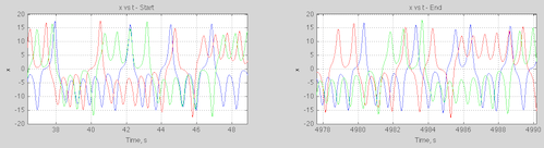
Here is a plot (note 3) of position vs time for the chaotic system, β=0.7, with two initial conditions, only different from each other by 0.1%:
Forced damped harmonic pendulum, b=0.7: Start angular speed 0.1; 0.1001
Figure 1
It’s a little misleading to view the angle like this because it is in radians and so needs to be mapped between 0-2π (but then we get a discontinuity on a graph that doesn’t match the real world). We can map the graph onto a cylinder plot but it’s a mess of reds and blues.
Another way of looking at the data is via the statistics – so here is a histogram of the position (θ), mapped to 0-2π, and angular speed (dθ/dt) for the two starting conditions over the first 10,000 seconds:
Histograms for 10,000 seconds
Figure 2
We can see they are similar but not identical (note the different scales on the y-axis).
That might be due to the shortness of the run, so here are the results over 100,000 seconds:
Histogram for 100,000 seconds
Figure 3
As we increase the timespan of the simulation the statistics of two slightly different initial conditions become more alike.
So if we want to know the state of a chaotic system at some point in the future, very small changes in the initial conditions will amplify over time, making the result unknowable – or no different from picking the state from a random time in the future. But if we look at the statistics of the results we might find that they are very predictable. This is typical of many (but not all) chaotic systems.
Orbits of the Planets
The orbits of the planets in the solar system are chaotic. In fact, even 3-body systems moving under gravitational attraction have chaotic behavior. So how did we land a man on the moon? This raises the interesting questions of timescales and amount of variation. Planetary movement – for our purposes – is extremely predictable over a few million years. But over 10s of millions of years we might have trouble predicting exactly the shape of the earth’s orbit – eccentricity, time of closest approach to the sun, obliquity.
However, it seems that even over a much longer time period the planets will still continue in their orbits – they won’t crash into the sun or escape the solar system. So here we see another important aspect of some chaotic systems – the “chaotic region” can be quite restricted. So chaos doesn’t mean unbounded.
According to Cencini, Cecconi & Vulpiani (2010):
And bad luck, Pluto.
Deterministic, non-Chaotic, Systems with Uncertainty
Just to round out the picture a little, even if a system is not chaotic and is deterministic we might lack sufficient knowledge to be able to make useful predictions. If you take a look at figure 3 in Ensemble Forecasting you can see that with some uncertainty of the initial velocity and a key parameter the resulting velocity of an extremely simple system has quite a large uncertainty associated with it.
This case is quantitively different of course. By obtaining more accurate values of the starting conditions and the key parameters we can reduce our uncertainty. Small disturbances don’t grow over time to the point where our calculation of a future condition might as well just be selected from a randomly time in the future.
Transitive, Intransitive and “Almost Intransitive” Systems
Many chaotic systems have deterministic statistics. So we don’t know the future state beyond a certain time. But we do know that a particular position, or other “state” of the system, will be between a given range for x% of the time, taken over a “long enough” timescale. These are transitive systems.
Other chaotic systems can be intransitive. That is, for a very slight change in initial conditions we can have a different set of long term statistics. So the system has no “statistical” predictability. Lorenz 1968 gives a good example.
Lorenz introduces the concept of almost intransitive systems. This is where, strictly speaking, the statistics over infinite time are independent of the initial conditions, but the statistics over “long time periods” are dependent on the initial conditions. And so he also looks at the interesting case (Lorenz 1990) of moving between states of the system (seasons), where we can think of the precise starting conditions each time we move into a new season moving us into a different set of long term statistics. I find it hard to explain this clearly in one paragraph, but Lorenz’s papers are very readable.
Conclusion?
This is just a brief look at some of the basic ideas.
Articles in the Series
Natural Variability and Chaos – One – Introduction
Natural Variability and Chaos – Two – Lorenz 1963
Natural Variability and Chaos – Three – Attribution & Fingerprints
Natural Variability and Chaos – Four – The Thirty Year Myth
Natural Variability and Chaos – Five – Why Should Observations match Models?
Natural Variability and Chaos – Six – El Nino
Natural Variability and Chaos – Seven – Attribution & Fingerprints Or Shadows?
Natural Variability and Chaos – Eight – Abrupt Change
References
Chaos: From Simple Models to Complex Systems, Cencini, Cecconi & Vulpiani, Series on Advances in Statistical Mechanics – Vol. 17 (2010)
Climatic Determinism, Edward Lorenz (1968) – free paper
Can chaos and intransivity lead to interannual variation, Edward Lorenz, Tellus (1990) – free paper
Notes
Note 1 – The equation is easiest to “manage” after the original parameters are transformed so that tω->t. That is, the period of external driving, T0=2π under the transformed time base.
Then:
where θ = angle, γ’ = γ/ω, α = g/Lω², β =h0/L;
these parameters based on γ = viscous drag coefficient, ω = angular speed of driving, g = acceleration due to gravity = 9.8m/s², L = length of pendulum, h0=amplitude of driving of pivot point
Note 2 – This is true for continuous systems. Discrete systems can be chaotic with less parameters
Note 3 – The results were calculated numerically using Matlab’s ODE (ordinary differential equation) solver, ode45.
Note 4 – Force = k(v-w)2 where k is a constant, v=velocity, w=wind speed. Work done = Force x distance moved so Power, P = Force x velocity.
Therefore:
P = kv(v-w)2
If we know k, v & w we can find P. If we have P, k & w and want to find v it is a cubic equation that needs solving.
Read Full Post »