In the last article we looked at a paper which tried to unravel – for clear sky only – how the OLR (outgoing longwave radiation) changed with surface temperature. It did the comparison by region, by season and from year to year.
The key point for new readers to understand – why are we interested in how OLR changes with surface temperature? The concept is not so difficult. The practical analysis presents more problems.
Let’s review the concept – and for more background please read at least the start of the last article: if we increase the surface temperature, perhaps due to increases in GHGs, but it could be due to any reason, what happens to outgoing longwave radiation? Obviously, we expect OLR to increase. The real question is how by how much?
If there is no feedback then OLR should increase by about 3.6 W/m² for every 1K in surface temperature (these values are global averages):
- If there is positive feedback, perhaps due to more humidity, then we expect OLR to increase by less than 3.6 W/m² – think “not enough heat got out to get things back to normal”
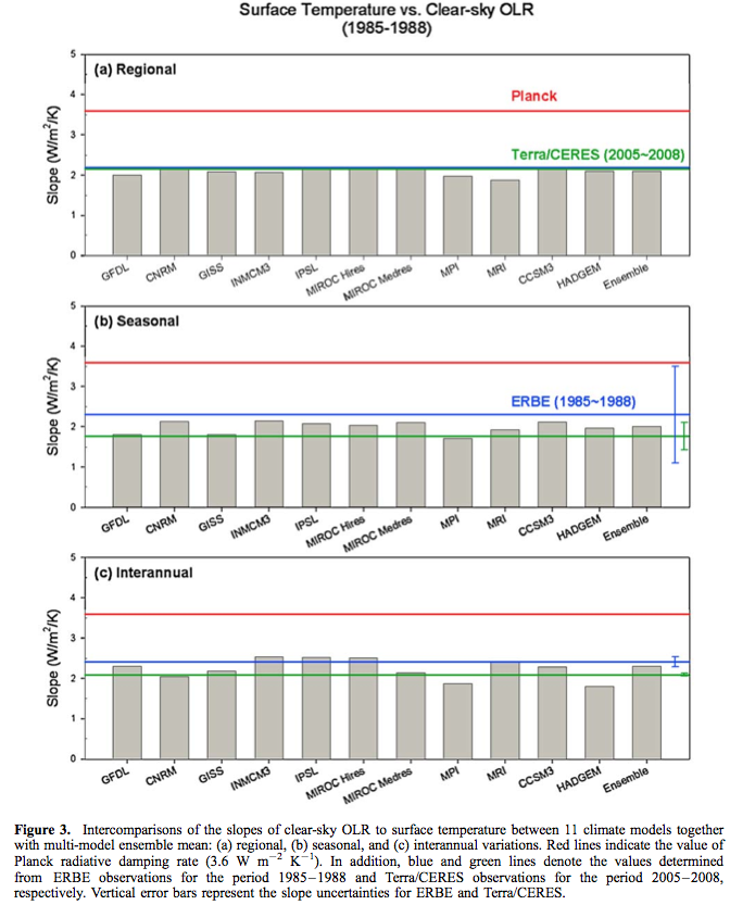
- If there is negative feedback, then we expect OLR to increase by more than 3.6 W/m². In the paper we reviewed in the last article the authors found about 2 W/m² per 1K increase – a positive feedback, but were only considering clear sky areas
One reader asked about an outlier point on the regression slope and whether it affected the result. This motivated me to do something I have had on my list for a while now – get “all of the data” and analyse it. This way, we can review it and answer questions ourselves – like in the Visualizing Atmospheric Radiation series where we created an atmospheric radiation model (first principles physics) and used the detailed line by line absorption data from the HITRAN database to calculate how this change and that change affected the surface downward radiation (“back radiation”) and the top of atmosphere OLR.
With the raw surface temperature, OLR and humidity data “in hand” we can ask whatever questions we like and answer these questions ourselves..
NCAR reanalysis, CERES and AIRS
CERES and AIRS – satellite instruments – are explained in CERES, AIRS, Outgoing Longwave Radiation & El Nino.
CERES measures total OLR in a 1ºx 1º grid on a daily basis.
AIRS has a “hyper-spectral” instrument, which means it looks at lots of frequency channels. The intensity of radiation at these many wavelengths can be converted, via calculation, into measurements of atmospheric temperature at different heights, water vapor concentration at different heights, CO2 concentration, and concentration of various other GHGs. Additionally, AIRS calculates total OLR (it doesn’t measure it – i.e. it doesn’t have a measurement device from 4μm – 100μm). It also measures parameters like “skin temperature” in some locations and calculates the same in other locations.
For the purposes of this article, I haven’t yet dug into the “how” and the reliability of surface AIRS measurements. The main point to note about satellites is they sit at the “top of atmosphere” and their ability to measure stuff near the surface depends on clever ideas and is often subverted by factors including clouds and surface emissivity. (AIRS has microwave instruments specifically to independently measure surface temperature even in cloudy conditions, because of this problem).
NCAR is a “reanalysis product”. It is not measurement, but it is “informed by measurement”. It is part measurement, part model. Where there is reliable data measurement over a good portion of the globe the reanalysis is usually pretty reliable – only being suspect at the times when new measurement systems come on line (so trends/comparisons over long time periods are problematic). Where there is little reliable measurement the reanalysis depends on the model (using other parameters to allow calculation of the missing parameters).
Some more explanation in Water Vapor Trends under the sub-heading Reanalysis – or Filling in the Blanks.
For surface temperature measurements reanalysis is not subverted by models too much. However, the mainstream surface temperature series are surely better than NCAR – I know that there is an army of “climate interested people” who follow this subject very closely. (I am not in that group).
I used NCAR because it is simple to download and extract. And I expect – but haven’t yet verified – that it will be quite close to the various mainstream surface temperature series. If someone is interested and can provide daily global temperature from another surface temperature series as an Excel, csv, .nc – or pretty much any data format – we can run the same analysis.
For those interested, see note 1 on accessing the data.
Results – Global Averages
For our starting point in this article I decided to look at global averages from 2001 to 2013 inclusive (data from CERES not yet available for the whole of 2014). This was after:
- looking at daily AIRS data
- creating and comparing NCAR over 8 days with AIRS 8-day averages for surface skin temperature and surface air temperature
- creating and comparing AIRS over 8-days with CERES for TOA OLR
More on those points in later articles.
The global relationship with surface temperature and OLR is what we have a primary interest in – for the purpose of determining feedbacks. Then we want to figure out some detail about why it occurs. I am especially interested in the AIRS data because it is the only global measurement of upper tropospheric water vapor (UTWV) – and UTWV along with clouds are the key factors in the question of feedback – how OLR changes with surface temperature. For now, we will look at the simple relationship between surface temperature (“skin temperature”) and OLR.
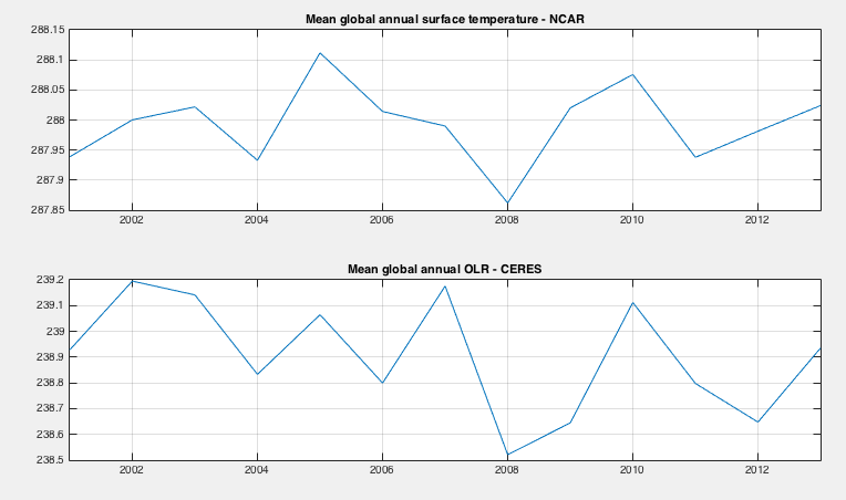
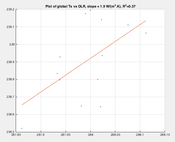
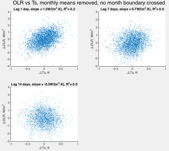
Here is the data, shown as an anomaly from the global mean values over the period Jan 1st, 2001 to Dec 31st, 2013. Each graph represents a different lag – how does global OLR (CERES) change with global surface temperature (NCAR) on a lag of 1 day, 7 days, 14 days and so on:
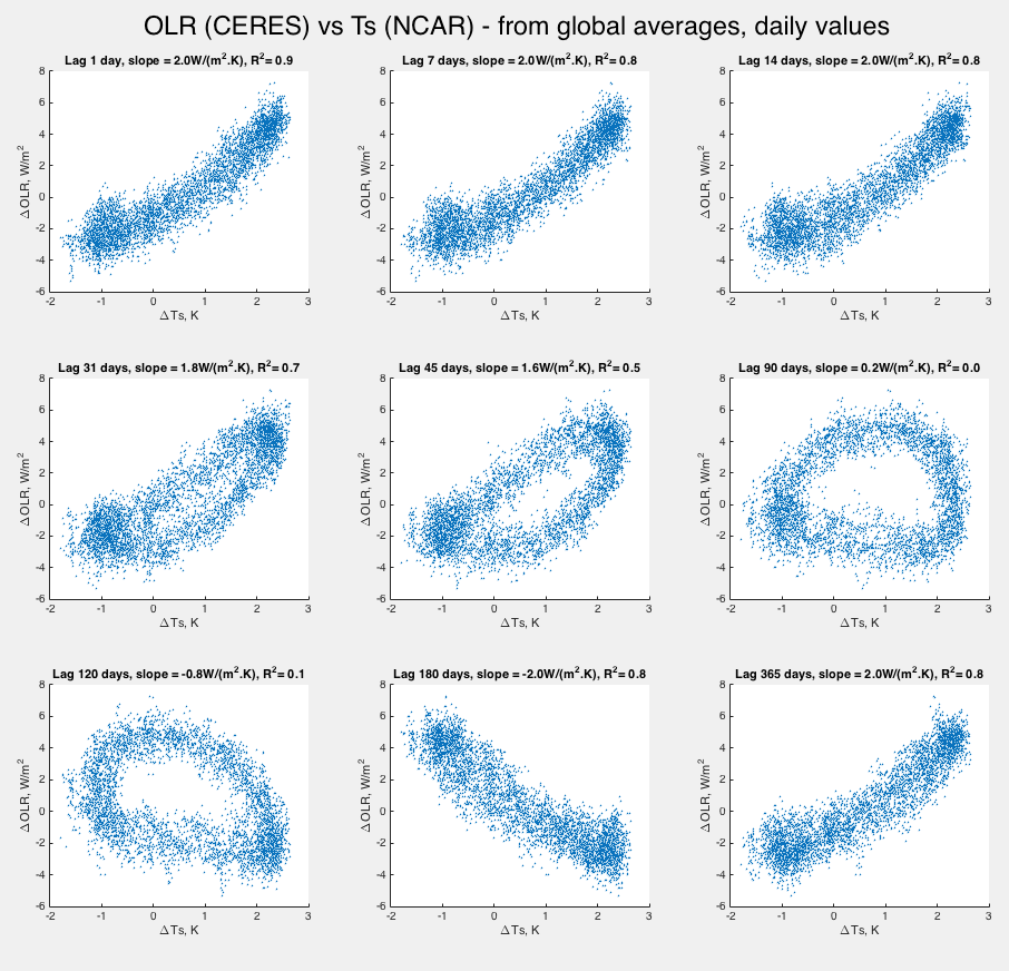
Figure 1 – Click to Expand
The slope gives the “apparent feedback” and the R² simply reflects how much of the graph is explained by the linear trend. This last value is easily estimated just by looking at each graph.
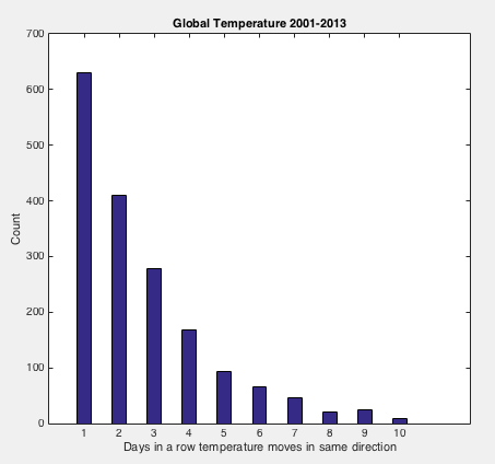
For reference, here is the timeseries data, as anomalies, with the temperature anomaly multiplied by a factor of 3 so its magnitude is similar to the OLR anomaly:
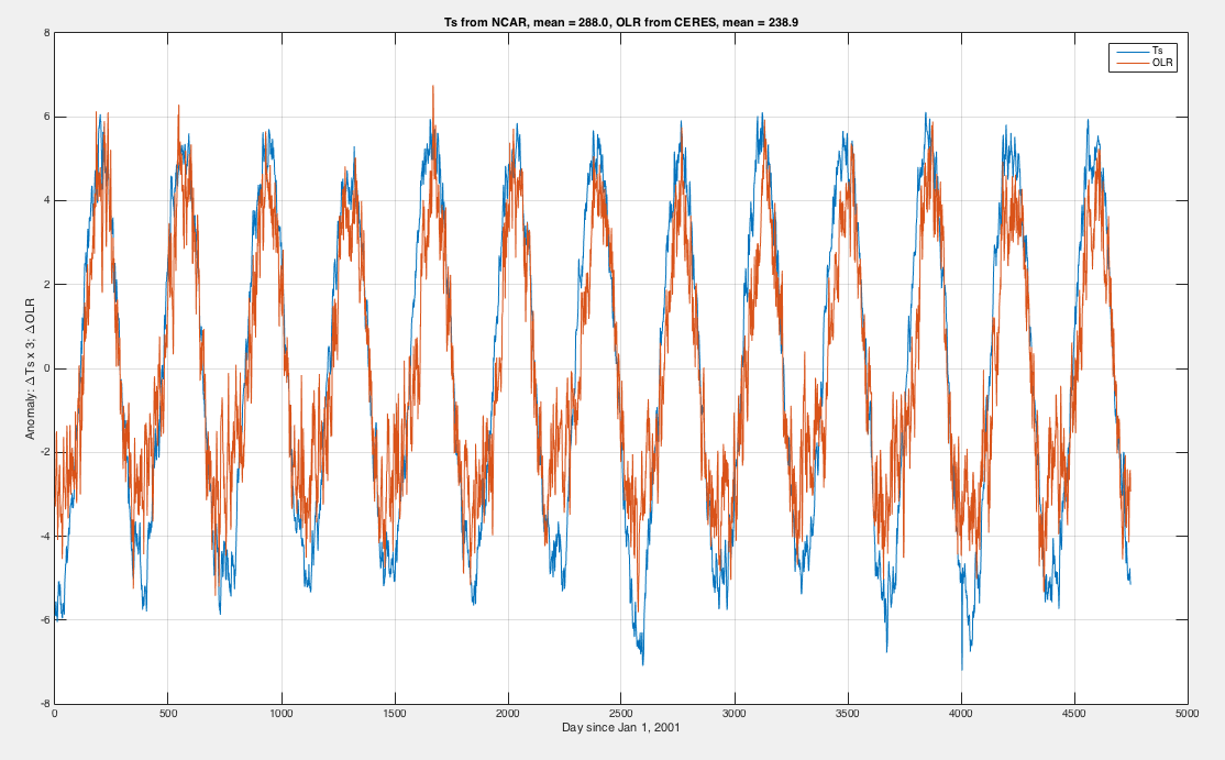
Figure 2 – Click to Expand
Note on the calculation – I used the daily data to calculate a global mean value (area-weighted) and calculated one mean value over the whole time period then subtracted it from every daily data value to obtain an anomaly for each day. Obviously we would get the same slope and R² without using anomaly data (just a different intercept on the axes).
For reference, mean OLR = 238.9 W/m², mean Ts = 288.0 K.
My first question – before even producing the graphs – was whether a lag graph shows the change in OLR due to a change in Ts or due to a mixture of many effects. That is, what is the interpretation of the graphs?
The second question – what is the “right lag” to use? We don’t expect an instant response when we are looking for feedbacks:
- The OLR through the window region will of course respond instantly to surface temperature change
- The OLR as a result of changing humidity will depend upon how long it takes for more evaporated surface water to move into the mid- to upper-troposphere
- The OLR as a result of changing atmospheric temperature, in turn caused by changing surface temperature, will depend upon the mixture of convection and radiative cooling
To say we know the right answer in advance pre-supposes that we fully understand atmospheric dynamics. This is the question we are asking, so we can’t pre-suppose anything. But at least we can suggest that something in the realm of a few days to a few months is the most likely candidate for a reasonable lag.
But the idea that there is one constant feedback and one constant lag is an idea that might well be fatally flawed, despite being seductively simple. (A little more on that in note 3).
And that is one of the problems of this topic. Non-linear dynamics means non-linear results – a subject I find hard to describe in simple words. But let’s say – changes in OLR from changes in surface temperature might be “spread over” multiple time scales and be different at different times. (I have half-written an article trying to explain this idea in words, hopefully more on that sometime soon).
But for the purpose of this article I only wanted to present the simple results – for discussion and for more analysis to follow in subsequent articles.
Articles in the Series
Part One – introducing some ideas from Ramanathan from ERBE 1985 – 1989 results
Part One – Responses – answering some questions about Part One
Part Two – some introductory ideas about water vapor including measurements
Part Three – effects of water vapor at different heights (non-linearity issues), problems of the 3d motion of air in the water vapor problem and some calculations over a few decades
Part Four – discussion and results of a paper by Dessler et al using the latest AIRS and CERES data to calculate current atmospheric and water vapor feedback vs height and surface temperature
Part Five – Back of the envelope calcs from Pierrehumbert – focusing on a 1995 paper by Pierrehumbert to show some basics about circulation within the tropics and how the drier subsiding regions of the circulation contribute to cooling the tropics
Part Six – Nonlinearity and Dry Atmospheres – demonstrating that different distributions of water vapor yet with the same mean can result in different radiation to space, and how this is important for drier regions like the sub-tropics
Part Seven – Upper Tropospheric Models & Measurement – recent measurements from AIRS showing upper tropospheric water vapor increases with surface temperature
Part Eight – Clear Sky Comparison of Models with ERBE and CERES – a paper from Chung et al (2010) showing clear sky OLR vs temperature vs models for a number of cases
Part Nine – Data I – Ts vs OLR – data from CERES on OLR compared with surface temperature from NCAR – and what we determine
Part Ten – Data II – Ts vs OLR – more on the data
References
Wielicki, B. A., B. R. Barkstrom, E. F. Harrison, R. B. Lee III, G. L. Smith, and J. E. Cooper, 1996: Clouds and the Earth’s Radiant Energy System (CERES): An Earth Observing System Experiment, Bull. Amer. Meteor. Soc., 77, 853-868 – free paper
Kalnay et al.,The NCEP/NCAR 40-year reanalysis project, Bull. Amer. Meteor. Soc., 77, 437-470, 1996 – free paper
NCEP Reanalysis data provided by the NOAA/OAR/ESRL PSD, Boulder, Colorado, USA, from their Web site at http://www.esrl.noaa.gov/psd/
Notes
Note 1: Boring Detail about Extracting Data
On the plus side, unlike many science journals, the data is freely available. Credit to the organizations that manage this data for their efforts in this regard, which includes visualization software and various ways of extracting data from their sites. However, you can still expect to spend a lot of time figuring out what files you want, where they are, downloading them, and then extracting the data from them. (Many traps for the unwary).
NCAR – data in .nc files, each parameter as a daily value (or 4x daily) in a separate annual .nc file on an (approx) 2.5º x 2.5º grid (actually T62 gaussian grid).
Data via ftp – ftp.cdc.noaa.gov. See http://www.esrl.noaa.gov/psd/data/gridded/data.ncep.reanalysis.surface.html.
You get lat, long, and time in the file as well as the parameter. Care needed to navigate to the right folder because the filenames are the same for the 4x daily and the daily data.
NCAR are using latest version .nc files (which Matlab circa 2010 would not open, I had to update to the latest version – many hours wasted trying to work out the reason for failure).
CERES – data in .nc files, you select the data you want and the time period but it has to be a less than 2G file and you get a file to download. I downloaded daily OLR data for each annual period. Data in a 1ºx 1º grid. CERES are using older version .nc so there should be no problem opening.
Data from http://ceres-tool.larc.nasa.gov/ord-tool/srbavg
AIRS – data in .hdf files, in daily, 8-day average, or monthly average. The data is “ascending” = daytime, “descending” = nighttime plus some other products. Daily data doesn’t give global coverage (some gaps). 8-day average does but there are some missing values due to quality issues. Data in a 1ºx 1º grid. I used v6 data.
Data access page – http://disc.sci.gsfc.nasa.gov/datacollection/AIRX3STD_V006.html?AIRX3STD&#tabs-1.
Data via ftp.
HDF is not trivial to open up. The AIRS team have helpfully provided a Matlab tool to extract data which helped me. I think I still spent many hours figuring out how to extract what I needed.
Files Sizes – it’s a lot of data:
NCAR files that I downloaded (skin temperature) are only 12MB per annual file.
CERES files with only 2 parameters are 190MB per annual file.
AIRS files as 8-day averages (or daily data) are 400MB per file.
Also the grid for each is different. Lat from S-pole to N-pole in CERES, the reverse for AIRS and NCAR. Long from 0.5º to 359.5º in CERES but -179.5 to 179.5 in AIRS. (Note for any Matlab people, it won’t regrid, say using interp2, unless the grid runs from lowest number to highest number).
Note 2: Checking data – because I plan on using the daily 1ºx1º grid data from CERES and NCAR, I used it to create the daily global averages. As a check I downloaded the global monthly averages from CERES and compared. There is a discrepancy, which averages at 0.1 W/m².
Here is the difference by month:
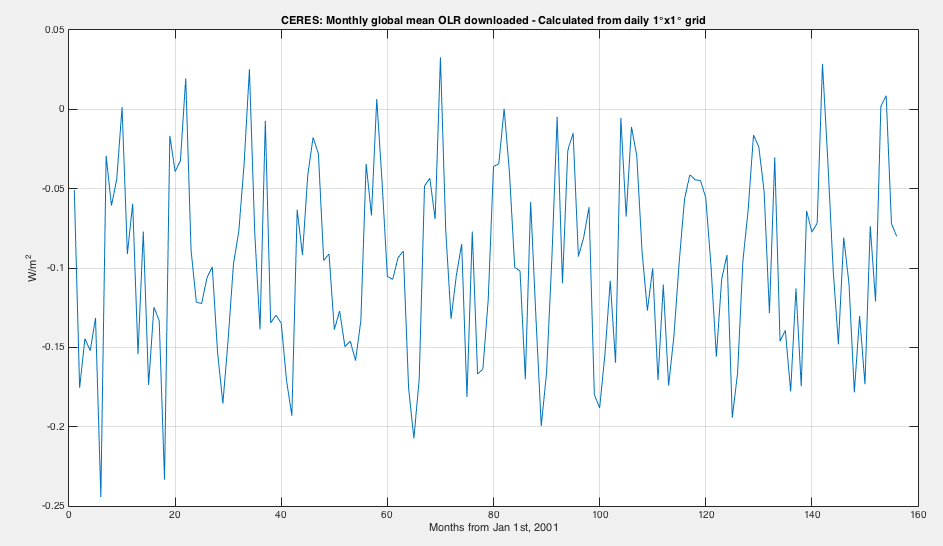
Figure 3 – Click to expand
And a scatter plot by month of year, showing some systematic bias:
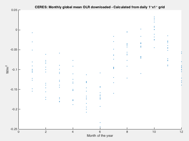
Figure 4
As yet, I haven’t dug any deeper to find if this is documented – for example, is there a correction applied to the daily data product in monthly means? is there an issue with the daily data? or, more likely, have I %&^ed up somewhere?
Note 3: Extract from Measuring Climate Sensitivity – Part One:
Linear Feedback Relationship?
One of the biggest problems with the idea of climate sensitivity, λ, is the idea that it exists as a constant value.
From Cloud Feedbacks in the Climate System: A Critical Review, Stephens, Journal of Climate (2005):
The relationship between global-mean radiative forcing and global-mean climate response (temperature) is of intrinsic interest in its own right. A number of recent studies, for example, discuss some of the broad limitations of (1) and describe procedures for using it to estimate Q from GCM experiments (Hansen et al. 1997; Joshi et al. 2003; Gregory et al. 2004) and even procedures for estimating from observations (Gregory et al. 2002).
While we cannot necessarily dismiss the value of (1) and related interpretation out of hand, the global response, as will become apparent in section 9, is the accumulated result of complex regional responses that appear to be controlled by more local-scale processes that vary in space and time.
If we are to assume gross time–space averages to represent the effects of these processes, then the assumptions inherent to (1) certainly require a much more careful level of justification than has been given. At this time it is unclear as to the specific value of a global-mean sensitivity as a measure of feedback other than providing a compact and convenient measure of model-to-model differences to a fixed climate forcing (e.g., Fig. 1).
[Emphasis added and where the reference to “(1)” is to the linear relationship between global temperature and global radiation].
If, for example, λ is actually a function of location, season & phase of ENSO.. then clearly measuring overall climate response is a more difficult challenge.
Read Full Post »