In previous posts we have seen – and critiqued – ideas about the causes of ice age inception and ice age termination being due to high latitude insolation. These ideas are known under the banner of “Milankovitch forcing”. Mostly I’ve presented the concept by plotting insolation data at particular latitudes, in one form or another. The insolation at different latitudes depends on obliquity and precession (as well as eccentricity).
Obliquity is the tilt of the earth’s axis – which varies over about 40,000 year cycles. Precession is the movement of point of closest approach (perihelion) and how it coincides with northern hemisphere summer – this varies over about a 20,000 year cycle. The effect of precession is modified by the eccentricity of the earth’s axis – which varies over a 100,000 year cycle.
If the earth’s orbit was a perfect circle (eccentricity = 0) then “precession” would have no effect, because the earth would be a constant distance from the sun. As eccentricity increases the impact of precession gets bigger.
How to understand these ideas better?
Peter Huybers has a nice explanation and presentation of obliquity and precession in his 2007 paper, along with some very interesting ideas that we will follow up in a later article.
The top graph shows the average insolation value by latitude and day of the year (over 2M years). The second graph shows the anomaly compared with the average at times of maximum obliquity. The third graph shows the anomaly compared with the average at times of maximum precession. The graphs to the right show the annual average of these values:
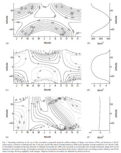
From Huybers (2007)
Figure 1
We can see immediately that times of maximum precession (bottom graph) have very little impact on annual averages (the right side graph). This is because the increase in, say, the summer/autumn, are cancelled out by the corresponding decreases in the spring.
But we can also see that times of maximum obliquity (middle graph) DO impact on annual averages (right side graph). Total energy is shifted to the poles from the tropics .
I was trying, not very effectively, to explain some of this in (too many graphs) in Part Five – Obliquity & Precession Changes.
Here is another way to look at this concept. For the last 500 kyrs, I plotted out obliquity and precession modified by eccentricity (e sin w) in the top graph, and in the bottom graph the annual anomaly by latitude and through time. WordPress kind of forces everything into 500 pixel wide graphs which doesn’t help too much. So click on it to get the HD version:
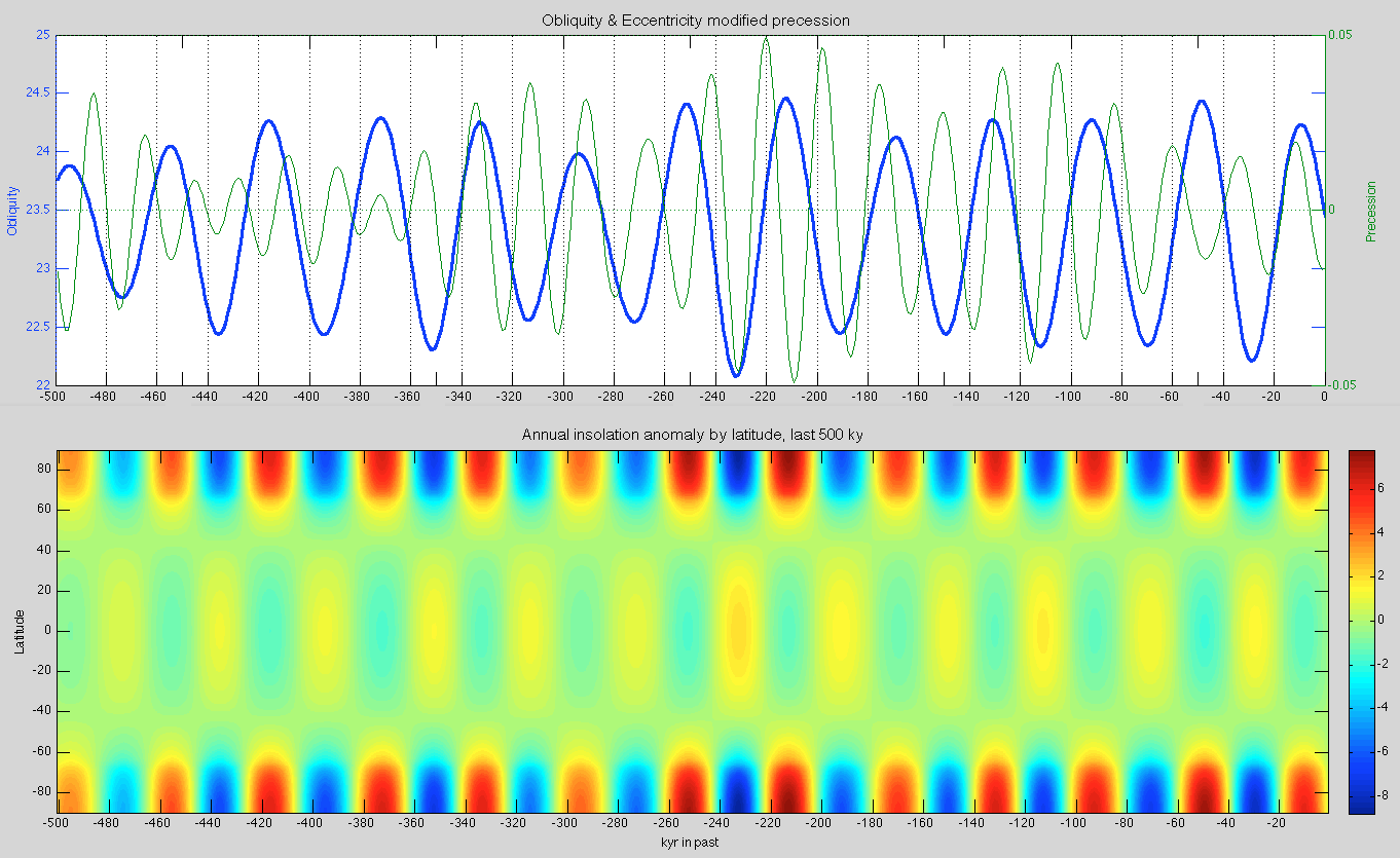
Figure 2 – Click to Expand
It is easy to see that the 40,000 year obliquity cycles correspond to high latitude (north & south) anomalies, which last for considerable periods. When obliquity is high, the northern and southern high latitude regions have an increase in annual average insolation. When obliquity is low, there is a decrease. If we look at the precession we don’t see a corresponding change in the annual average (because one season’s increase mostly cancels out the other season’s decrease).
Huybers’ paper has a lot more to it than that, and I recommend reading it. He has a 2M yr global proxy database, that isn’t dependent on “orbital tuning” (note 1) and an interesting explanation and demonstration for obliquity as the dominant factor in “pacing” the ice ages. We will come back to his ideas.
In the meantime, I’ve been collecting various data sources. One big challenge in understanding ice ages is that the graphs in the various papers don’t allow you to zoom in on the period of interest. I thought I could help to fix that by providing the data – and comparing the data – in High Definition instead of snapshots of 800,000 years on half the width of a standard pdf. It’s a work in progress..
The top graph (below) has two versions of temperature proxy. One is Huyber’s global proxy for ice volume (δ18O) from deep ocean cores, while the other is the local proxy for temperature (δD) from Dome C core from Antarctica (75°S). This location is generally known as EDC, i.e., EPICA Dome C. The two datasets are laid out on their own timescales (more on timescales below):
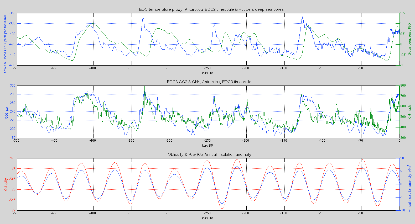
Figure 3 – Click to Expand
The middle graph has CO2 and CH4 from Dome C. It’s amazing how tightly CO2 and CH4 are linked to the temperature proxies and to each other. (The CO2 data comes from Lüthi et al 2008, and the CH4 data from Loulergue et al 2008).
The bottom graph has obliquity and annual insolation anomaly area-averaged over 70ºS-90ºS. Because we are looking at annual insolation anomaly this value is completely in phase with obliquity.
Why are the two datasets on the top graph out of alignment? I don’t know the full answer to this yet. Obviously the lag from the atmosphere to the deep ocean is part of the explanation.
Here is a 500 kyr comparison of LR04 (Lisiecki & Raymo 2005) and Huybers’ dataset – both deep ocean cores – but LR04 uses ‘orbital tuning’. The second graph has obliquity & precession (modified by eccentricity). The third graph has EDC from Antarctica:
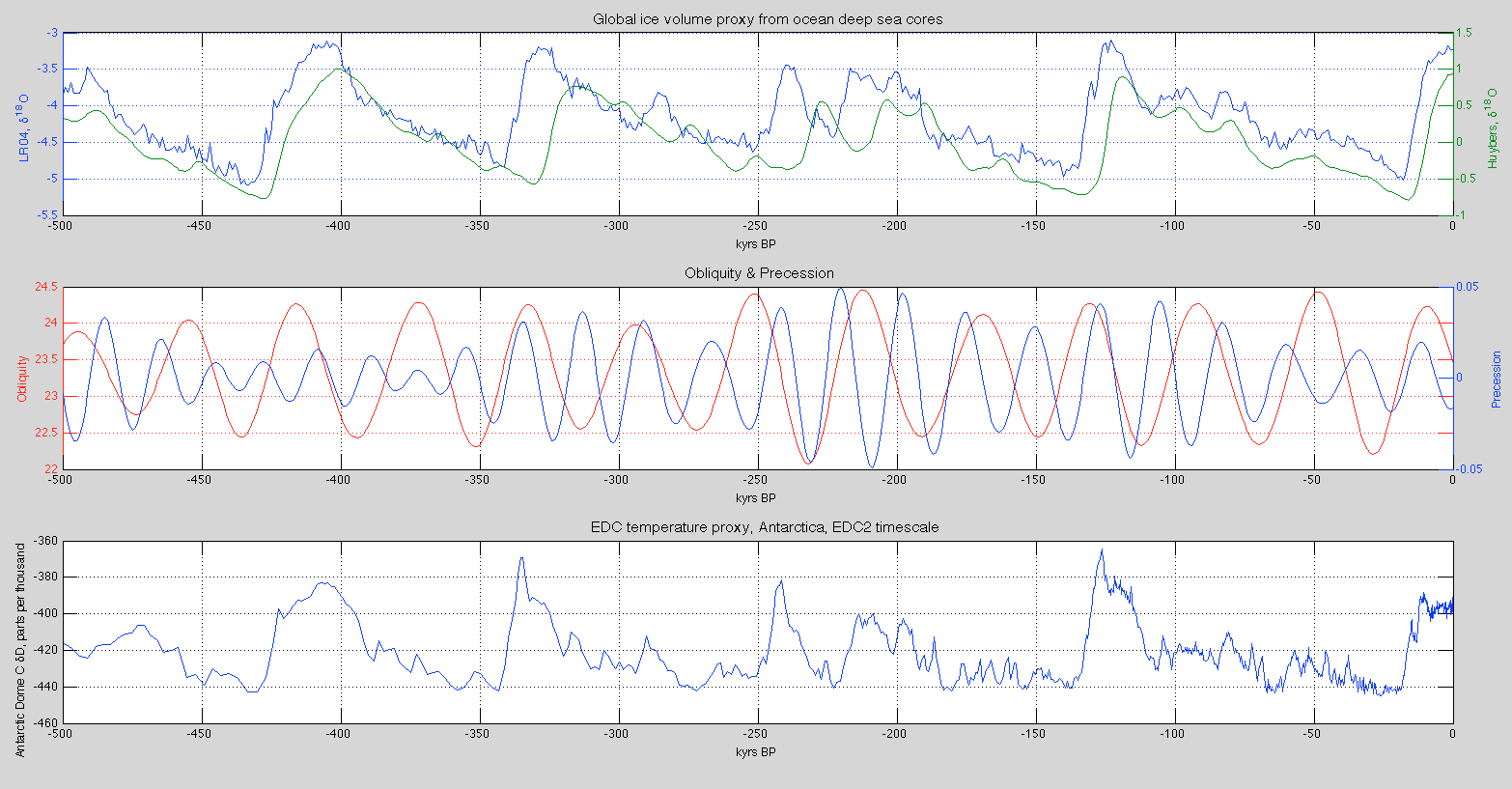
Figure 4 – Click to Expand
Now we zoom in on the last 150 kyrs with two Antarctic cores on the top graph and NGRIP (North Greenland) on the bottom graph:
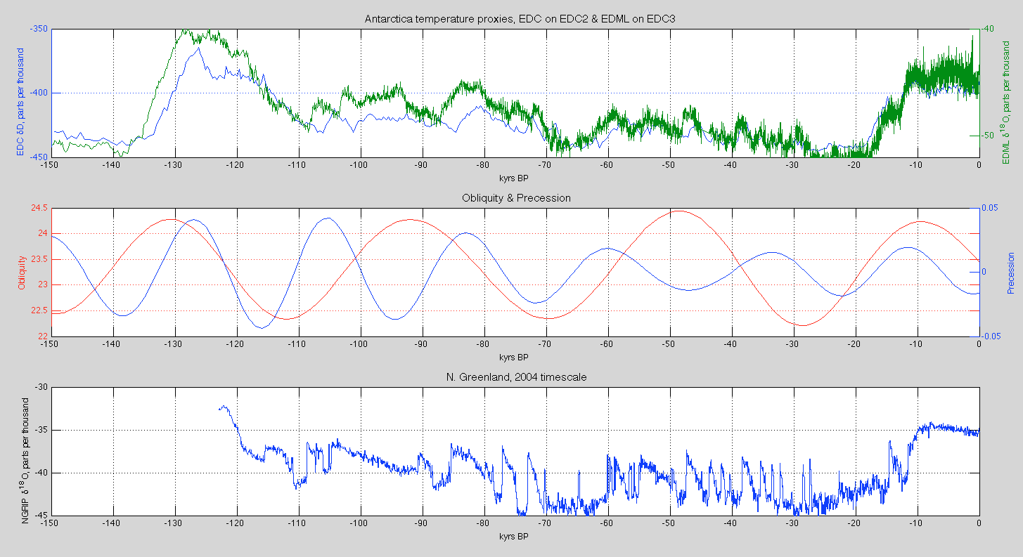
Figure 5 – Click to Expand
Here we see EDML (high resolution Antarctic core) compared with NGRIP (Greenland) over the last 150 kyrs (NGRIP only goes back to 123 kyrs) plus CO2 & CH4 from EDC – once again, the tight correspondence of CO2 and CH4 with the temperature records from both polar regions is amazing:
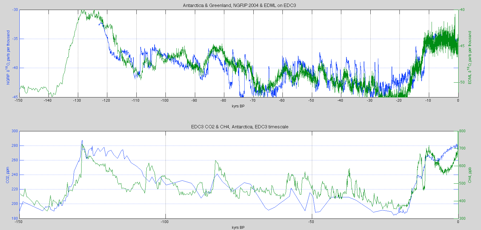
Figure 6 – Click to Expand
The comparison and linking of “abrupt climate change” in Greenland and Antarctic has been covered in EPICA 2006 (note the timescale is in the opposite direction to the graphs above):
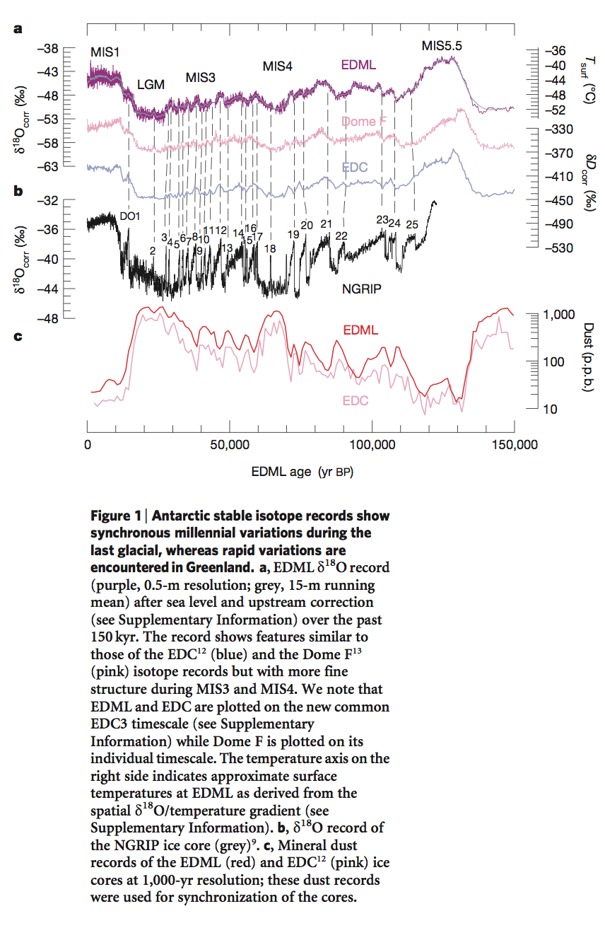
from EPICA 2006
Figure 7 – Click to Expand
Timescales
As most papers acknowledge, providing data on the most accurate “assumption free” timescales is the Holy Grail of ice age analysis. However, there are no assumption-free timescales. But lots of progress has been made.
Huybers’ timescale is based primarily on a) a sedimentation model, b) tying together the various identified inception & termination points for each of the proxies, c) the independently dated Brunhes- Matuyama reversal at 780,000 years ago.
The EDC (EPICA Dome ‘C’) timescale is based on a variety of age markers:
- for the first 50 kyrs by tying the data to Greenland (via high resolution CH4 in both records) which can be layer counted because of much higher precipitation
- volcanic eruptions
- 10Be events which can be independently dated
- ice flow models – how ice flows and compresses under pressure
- finally, “orbital tuning”
EDC2 was the timescale on which the data was presented in the seminal 2004 EPICA paper. This 2004 paper presented the EDC core going back over 800 kyrs (previously the Vostok core was the longest, going back 400 kyrs). The EPICA 2006 paper was the Dronning Maud Land Core (EDML) which covered a shorter time (150 kyrs) but at higher resolution, allowing a better matchup between Antarctica and Greenland. This introduced the improved EDC3 timescale.
In a technical paper on dating, Parannin et al 2007 show the differences between EDC3 and EDC2 and also between EDC3 and LR04.
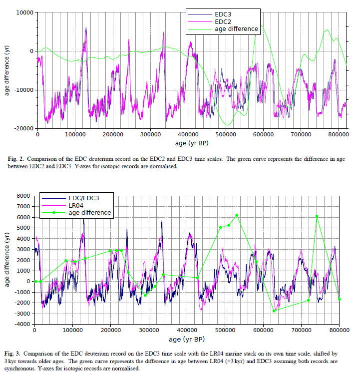
Figure 8 – Click to Expand
So if you have data, you need to understand the timescale it is plotted on.
I have the EDC3 timescale in terms of depth so next I’ll convert the EDC temperature proxy (δD) on EDC2 to EDC3 time. I also have dust vs depth for the EDC core – another fascinating variable that is about 25 times stronger during peak glacials compared with interglacials – this needs converting to the EDC3 timescale. Other data includes some other atmospheric chemical components. Then I have NGRIP data (North Greenland) going back 123,000 years but on the original 2004 timescale, and it has been relaid onto GICC05 timescale (still to find).
Very recently (mid 2013) a new Antarctic timescale was proposed – AICC2012 – which brings all of the Antarctic ice cores onto one common timescale. See references below.
Matlab
Calling Matlab gurus – plotting many items onto one graph has some benefits. Matlab is an excellent tool but I haven’t yet figured out how to plot lots of data onto the same graph. If multiple data sources have the same x-series data and a similar y-range there is no problem. If I have two data sources with similar x values (but different x-series data) and completely different y values I can use plotyy. How about if I have five datasources, each with different but similar x-series and different y-values. How do I plot them on one graph, and display the multiple y-axes (easily)?
Conclusion
This article was intended to highlight obliquity and precession in a different and hopefully more useful way. And to begin to present some data in high resolution.
Articles in the Series
Part One – An introduction
Part Two – Lorenz – one point of view from the exceptional E.N. Lorenz
Part Three – Hays, Imbrie & Shackleton – how everyone got onto the Milankovitch theory
Part Four – Understanding Orbits, Seasons and Stuff – how the wobbles and movements of the earth’s orbit affect incoming solar radiation
Part Five – Obliquity & Precession Changes – and in a bit more detail
Part Six – “Hypotheses Abound” – lots of different theories that confusingly go by the same name
Part Seven – GCM I – early work with climate models to try and get “perennial snow cover” at high latitudes to start an ice age around 116,000 years ago
Part Seven and a Half – Mindmap – my mind map at that time, with many of the papers I have been reviewing and categorizing plus key extracts from those papers
Part Eight – GCM II – more recent work from the “noughties” – GCM results plus EMIC (earth models of intermediate complexity) again trying to produce perennial snow cover
Part Nine – GCM III – very recent work from 2012, a full GCM, with reduced spatial resolution and speeding up external forcings by a factors of 10, modeling the last 120 kyrs
Part Ten – GCM IV – very recent work from 2012, a high resolution GCM called CCSM4, producing glacial inception at 115 kyrs
Pop Quiz: End of An Ice Age – a chance for people to test their ideas about whether solar insolation is the factor that ended the last ice age
Eleven – End of the Last Ice age – latest data showing relationship between Southern Hemisphere temperatures, global temperatures and CO2
Twelve – GCM V – Ice Age Termination – very recent work from He et al 2013, using a high resolution GCM (CCSM3) to analyze the end of the last ice age and the complex link between Antarctic and Greenland
Thirteen – Terminator II – looking at the date of Termination II, the end of the penultimate ice age – and implications for the cause of Termination II
Fifteen – Roe vs Huybers – reviewing In Defence of Milankovitch, by Gerard Roe
Sixteen – Roe vs Huybers II – remapping a deep ocean core dataset and updating the previous article
Seventeen – Proxies under Water I – explaining the isotopic proxies and what they actually measure
Eighteen – “Probably Nonlinearity” of Unknown Origin – what is believed and what is put forward as evidence for the theory that ice age terminations were caused by orbital changes
Nineteen – Ice Sheet Models I – looking at the state of ice sheet models
References
Glacial variability over the last two million years: an extended depth-derived agemodel, continuous obliquity pacing, and the Pleistocene progression, Peter Huybers, Quaternary Science Reviews (2007) – free paper
Eight glacial cycles from an Antarctic ice core, EPICA community members, Nature (2004) – free paper
One-to-one coupling of glacial climate variability in Greenland and Antarctica, EPICA Community Members, Nature (2006) – free paper
High-resolution carbon dioxide concentration record 650,000–800,000 years before present, Lüthi et al, Nature (2008)
Orbital and millennial-scale features of atmospheric CH4 over the past 800,000 years, Loulergue et al, Nature (2008)
A Pliocene-Pleistocene stack of 57 globally distributed benthic D18O records, Lorraine Lisiecki & Maureen E. Raymo, Paleoceanography (2005) – free paper
The EDC3 chronology for the EPICA Dome C ice core, Parennin et al, Climate of the Past (2007) – free paper
An optimized multi-proxy, multi-site Antarctic ice and gas orbital chronology (AICC2012): 120–800 ka, L. Bazin et al, Climate of the Past (2013) – free paper
The Antarctic ice core chronology (AICC2012): an optimized multi-parameter and multi-site dating approach for the last 120 thousand years, D. Veres et al, Climate of the Past (2013) – free paper
Notes
Note 1 – See for example Thirteen – Terminator II, under the heading What is the basis for the SPECMAP dating?
It is important to understand the assumptions built into every ice age database.
Huybers 2007 continues the work of HW04 (Huybers & Wunsch 2004) which attempts to produce a global proxy datbase (a proxy for global ice volume) without any assumptions relating to the “Milankovitch theory”.


This is just awesome work, great material for study, and I don’t know how Professor Carson keeps up this pace of production. I certainly have a very hard time keeping up with the reading. (I must say, I do have other non-work interests, even concerning climate, such as ocean-atmosphere energy exchange and modeling methdology.) Anyway, in short, kudos, congratulations on continuing to contribute cutting edge material and build a blog. It’s simply wonderful!
Thanks hypergeometric.
(And I’m not a Professor).
Here is a better version of figure 6 (where ‘better’ = 4 data lines on one graph for easier comparison):
– Click to Expand
For any Matlab people I found Addaxis on the file exchange, and used that to produce the above plot.
That looks certainly much better than what I have been able to produce without extra components, but perhaps the ideas of the following unfinished example are of help in some cases:
x1=[1 4 7];
x2=[2 5 6];
x3=[1 7 9];
y1=[2 1 0.5];
y2=[20 23 26];
y3=[40 70 90];
plot(x1,y1)
set(gca,’XLim’,[0 10])
hAxes=gca;
hAxes2=axes(‘Position’, hAxes_pos);
plot(x2,y2)
set(hAxes2, ‘YAxisLocation’,’right’,’Color’,’none’)
set(gca,’XLim’,[0 10])
hAxes3_pos=hAxes_pos;
hAxes3_pos(3)=hAxes_pos(1)+0.76*(hAxes_pos(3)-hAxes_pos(1));
hAxes3=axes(‘Position’, hAxes3_pos);
plot(x3,y3)
set(hAxes3, ‘YAxisLocation’,’right’,’Color’,’none’)
set(gca,’XLim’,[0 8])
Starting point for that was the Matlab example “Overlay Line Plot on Bar Graph Using Different Y-Axes”. (I don’t know, why the coefficient has to be 0.76 rather than 0.8. May have something to do with space reserved for numbers on the axis.)
Did you notice the further link to addaxes.m v1.1. That may also be of interest.
I put the temperature proxy in EDC (δD) onto the EDC3 timescale and compared with Parennin et al 2007. All looked good.
This plot has the last 500 kyrs of EDC against the ocean cores of LR04 and Huybers 2007. The black lines identify the ice age terminations (their midpoints) from Winograd 1992 (see Ghosts of Climates Past – Thirteen – Terminator II):
Click to Expand
And the bottom graph has obliquity along with 65N late June and 75S Jan 1st insolation for comparison.
There are no easy theories from this data as far as I can see..
This comment is not directly in response to most of this very good post, but in response to an observation in it, e.g., that CO2 and Methane levels track temperature levels well. A simple explanation for CO2 and Methane increase being closely linked to increasing temperature, before Human activity, is the combination of out-gassing of melting ice and the oceans at higher temperature, and increased decomposition of organic material. The argument that it became an additional AND DOMINATE forcing as it increased naturally has not been supported, so the models that relate CO2 (and Methane levels) to the cause of the amount of temperature rise are not supportable. While there my be a small added contribution, most models seem to imply that most of the warming ties directly to CO2 level.
Leonard,
I’d never really looked into the subject of why CO2 and methane rise so quickly at the termination of a glacial. But some preliminary reading now says that it is difficult to explain, for example, The role of Southern Ocean processes in orbital and millennial CO2 variations – A synthesis, Fischer et al, Quaternary Science Reviews (2010).
Also, as a note, if you haven’t seen Part Eleven – End of the Last Ice age we briefly looked at Synchronous Change of Atmospheric CO2 and Antarctic Temperature During the Last Deglacial Warming, Parrenin, Masson-Delmotte, Köhler, Raynaud, Paillard, Schwander, Barbante, Landais, Wegner & Jouzel, Science (2013), which finds that for the last deglaciation there isn’t a detectable lag between Antarctic temperature rise and CO2 rise. I’ve been reading a lot of the papers around the subject of gas age and ice age in ice cores and the argument looks pretty solid – that is, it’s a more accurate method of dating than the previous method.
More on both of these subjects in due course.
Can you explain a little more?
The argument that “it became an additional AND DOMINATE forcing as it increased naturally has not been supported” comes from two observed points.
1) The claim assumes a strong positive feedback from increased water vapor due to the initially small increase in CO2 driven temperature. Data does support an increase in absolute water vapor concentration near the surface with increasing temperature, but not at mid to higher altitudes where the effect was supposed to be most important. The exact cause is not fully understood, but cloud formation may be the limitation. Without increase in mid to high level water vapor concentration, the strong positive feedback is not supportable.
2) The temperature has not increased for over a decade of the fastest rising CO2. Arguments of the sea all of a sudden eating the extra energy are not supportable, and would not result in a later rise even if they were. There is no evidence from present data to support the strong CO2 forcing. While there is almost certainly some effect, strong claims require at least some real evidence.
@Leonard, 2:35 pm, 1/2/2014:
I cannot address “1)” because I am not familiar with the science, but I am familiar with the point made on “2)” and I have yet to find a compelling argument for that case. I do realize both the recent IPCC and the MetOffice Hadley felt compelled to respond to the claim of, as you report, “The temperature has not increased over a decade of the fastest increasing [carbon dioxide]”.
There are in my personal techinical opinion severe shortcomings in these findings, ranging from wholly inappropriate use of Null Hypothesis Testing (“NHT”) and often its interpretation, to unwittingly improper use or manipulation of ensembles like HadCRUT4, including ignoring their published covariance estimates and improperly accounting for observational censoring (in the statistical sense of the word). I am actively preparing a manuscript for arXiv.org on these, possibly a version for peer review. The practical effect of what I judge to be the latter misstep is to markedly understate the vaiance of observational estimates of Mean Surface Temperature and, so, to make it appear that estmates of distributions of climate model ensembles, like CMIP5, themselves suffering mischaracterizations, do not appreciably include the observational probability mass. Given that, it isn’t at all surprising NHT finds for incompatibility.
The latter practice is used beyond climate science, including in meteorology, and should really be remedied.
Nitpick: It becomes an additional and DOMINANT…, not a dominate. Either that or it dominates.
Also, I don’t think that forcing is the word you want to use here:
The HITRAN database and radiative transfer programs plus measured atmospheric spectra provide all sorts of evidence that CO2 is a strong forcing agent. What the recent temperature data shows is that there is little eidence of a high climate sensitivity to the CO2 forcing.
@DeWitt,
Your comment mentioned “climate sensitivity”. Which climate sensitivity do you mean, transient or asymptotic? And your expectation of a decade scale response implies a climate system time constant for lag in reesponse of, say, half that time. To what do you attribute this hypershort lag?
Leonard,
Pretty much along the lines of DeWitt’s reply..
Let’s ignore any feedbacks from water vapor due to increasing temperature (CO2 induced or whatever) and accept that natural variability is very significant (a point I agree with and hope to make in subsequent posts).
This still leaves an “easy to calculate” radiative forcing from CO2 moving from 180ppm to 280ppm, of about 3 W/m2.
Over a thousand years we would expect this to have some effect?
As a general rule I have found most discussion of statistics related to climate science problematic. It’s well known that statistical inference is difficult, when most or all the data is historical and the amount of precise systematically organized data rather small. All the straightforward rules that have been presented for confidence levels are based on the assumption that both the hypothesis and the testing procedures have been formulated without any direct or indirect influence of the data that’s used in the statistical analysis. Usually that means that the hypothesis and the test must be fixed totally and uniquely before the data becomes available in any form.
The requirement can be satisfied in testing of weather forecasting methods, but, in practice, not in climate science – ever. I added the word ‘ever’, because it’s clear that any unique precisely defined hypothesis and testing procedure will become outdated before a sufficient amount of new data becomes available. I emphasize also the word ‘unique’ because formulating now a large set of hypotheses and testing all of them is from the point of view of statistical inference not at all the same thing as fixing just a single one, because having many hypotheses will in future lead to cherry picking from the set.
On the other hand it’s also clear that exploratory research without a predefined hypothesis and with methods that evolve during the research is useful and valuable. Results that have a high apparent statistical significance are stronger than similar results with less apparent statistical significance. The word apparent refers here to the violation of the principles discussed above. In most exploratory sciences, and climate science is one of them, conclusions are drawn on weaker formal basis. It’s equally wrong to dismiss all such conclusions as it is to disregard the problems related to lack of formal basis for determination of confidence levels for null hypothesis rejection or ranges of parameter values.
Another equally or more difficult problem is related to the priors in Bayesian analysis (and personally I don’t believe in anything else than Bayesian analysis).
I certainly agree on the statistical hypothesis testing frameworks with respect to climate science, with the understanding that “hypothesis” in, e.g., Null Hypothesis Testing is not synonymous with “hypothesis” as used in general science. Many descriptions of Bayesian statistics in engineering and some parts of geophysics are caricatures of the field as it stood pre-1970. Vast progress has been made, primarily on the computational end. See http://www.atmosp.physics.utoronto.ca/C-SPARC/ss08/lectures/Kharin-lecture3.pdf for an overview probably best preceded by skimming http://www.atmosp.physics.utoronto.ca/C-SPARC/ss08/lectures/Kharin-lecture1.pdf and http://www.atmosp.physics.utoronto.ca/C-SPARC/ss08/lectures/Kharin-lecture2.pdf. A good introduction can be found at http://doingbayesiandataanalysis.blogspot.com/ and one small illustration of the technique applied to a time series is sketched at http://hypergeometric.wordpress.com/2013/12/23/jags-for-finding-highs-and-lows-in-a-week-of-wikipedia-accesses/, although that latter approach is not definitive and is in need of an update (forthcoming).
The matter of choice of priors is somewhat of a red herring. First of all, a “prior” might well be based upon good existing theory with a Bayesian update obtained from new observations. This kind of ability of Bayesian methods to fuse results from different sources is a strength. Second, in many instances, the influence of the prior is “washed out” after a series of updates.
Good examples of fully-fledged Bayesian approach to some of the problems related to climate ensembles are available at:
http://journals.ametsoc.org/doi/abs/10.1175/JCLI3784.1
http://journals.ametsoc.org/doi/abs/10.1175/JCLI3363.1
http://journals.ametsoc.org/doi/abs/10.1175/MWR2906.1
https://www.sciencemag.org/content/334/6061/1385.short
A good example of modern computational practice is available at the Kruschke site given above, in his textbook, in the recent book by Lunn, et al., THE BUGS BOOK, http://www.mrc-bsu.cam.ac.uk/bugs/thebugsbook/, and at the International Society for Bayesian Analysis (ISBA), per http://bayesian.org/sections/Env.
hypergeometric,
It’s a paleo record, the transient sensitivity isn’t an issue. If there is no lag between the temperature and CO2/CH4, I think it means that the effect of ghg’s must be quite small compared to what is actually driving the temperature change, whatever that is. We know the magnitude of the ghg forcing, so that implies a very low climate sensitivity. It may also mean that there is no difference between the transient and equilibrium climate sensitivity as well. I’m less sure about that.
I understand in paleo records the interaction between CO2 and other things, like water vapor and glacials may well be complicated. While the paleo record may give insights into modern responses to CO2 forcing, surely the remarkable thing about modern forcing is d/dt of it, and, hence, modern behavior MAY be out of family.
There is a new post at WUWT at: http://wattsupwiththat.com/2014/02/03/nature-can-selectively-buffer-human-caused-global-warming-say-israeli-us-scientists/
This post (and the referred published papers) points out the appearance of NEGATIVE feedback from water vapor increase near the surface due to other GHG warming effects. The point is not the 3 W/m2 possible with no feedback, but what is the actual net result from increased CO2 and Methane in the presence of the water vapor feedback. If that paper is correct, there is relatively little net effect from CO2 increase rather than a greatly amplified effect from water vapor.
Leonard,
That would be what is usually called the climate sensitivity, which includes all feedbacks, positive and negative. A positive water vapor feedback increases the climate sensitivity over the simple radiative feedback (increased temperature = increased emission) negative feedback and a negative water vapor feedback would reduce the sensitivity.
AND there are a series of articles by Professor Pierrehumbert addressing these matters:
http://www.realclimate.org/index.php/archives/2005/12/natural-variability-and-climate-sensitivity/comment-page-2/
Click to access InsightHydrology.pdf
Click to access pierrehumbert.2013.PNAS.commentary.pdf
Click to access Pierrehumbert_IP4_5-23-11_2pm.pdf
Hypergeometric,
Thanks, I just had a read of this first link.
More informed discussion in this style by climate scientists would be invaluable.
Right now it seems that on the one hand there are papers (peer-reviewed, relies on the reader knowing the last few decades of relevant research) and on the other hand polemic.
What’s a serious skeptic to do, except read 300 papers and try to infer where the real outstanding issues are..
Regarding “what’s a serious skeptic to do”, in my opinion, the only antidote to reading, assimilating, and judging thousands of pages of technlcal literature is mastering the physics at the level of the mathematics required, PDEs and all, proving to yourself that mastery is in hand by successfully executing problem sets. The former approach is a liberal arts-style approach to a subject where ultimately judgment by appealing to authirity of contributer is used. The latter is modern quantitative science. While familiarity with what’s been done is good, some of what’s been done is mistaken, especially if Fisherian NHT is the standard of finding, and there needs to be a way of finding these errors independent of authority. True, knowledge of special cases is often needed because, for instance, we can’t (yet) solve Navier-Stokes. Bur it’s ultimately more time efficient for the student of the subject to hang cases and evidence on a mathematical frame.
Observational evidence only means something in context. So, for example, relating fluctuations in brightness to absolute luminosity of Cepheid variable stars demands more than simply an empirical curve fit. I don’t see how climate geophysics could be any different.
hypergeometric,
I was more thinking about some good insights on the journey from people who understand the subtleties, the debate, the weaknesses, the strengths the questions.. Papers often obscure as much as they reveal. I agree that you need to do your own study, I’m a fan of that. But it’s like a good textbook vs a bad textbook. Both might be accurate but one gets you to the finish line quickly..
I don’t know what to say,and was going to simply not reply. But trying to lead, besides reading technical papers from the AGU and AMETSOC archives, my experience says
(1) David Archer’s course and book are best for an all-around, and are very approachable. There are also a number of other MOOCs, per http://www.realclimate.org/index.php/archives/2014/02/new-climate-science-moocs/
(2) Ray Pierrehumbert’s textbook (Principles of Planetary Climate) is the definitive single course,
(3) More details are available from (a) Petty’s book (A First Course in Atmospheric Radiation), and (b) Knauss’ oceanography book (An Introduction to Physical Oceanography, 2nd edition). For the latter, Stewart’s book is newer, but I don’t know the differences. See http://oceanworld.tamu.edu/home/course_book.htm
In my opinion, there is no “finish line”. For possibilities of solutions, might check out The Azimuth Project, http://www.azimuthproject.org/azimuth/show/HomePage
This is the most totally awesome (excuse my “Valley” roots) Climate Blog ever. Thanks so much for your hard work and excellent data presentation.
Perhaps dust concentration (Figure 7) and accumulation helps in the tipping point with other factors. On the mile-thick ice sheets that are now gone (unlike the cores from the ice that survives interglacial melting that would limit dust accumulation at the surface) the dust may accumulate at the surface during inter-annual melting events contributing to increasing albedo, more melting and dirtier ice ad infinitum.
Perhaps studying the present will help us understand the past:
http://www.sciencedaily.com/releases/2012/03/120301180830.htm
Which is the founding philosophy of the science that governs climate. From wiki:
You can’t have precession and e = 0 ? What about a simple top? Let’s assume it has a perfect circular symmetry. It precesses as it rotates.
Brian,
With the earth rotating around the sun – if the rotation followed a perfect circle then the distance from the earth to the sun would always be the same.
Currently eccentricity varies over 100 kyr and 400 kyr periods (approx), and the greater the eccentricity the more the impact of perihelion (closest approach to the sun) and aphelion (furthest distance to the sun) – and, therefore, the greater the impact of the precession of these points.
Right now perihelion occurs in January, which means the Southern Hemisphere (SH) summer is hotter than average, while NH summer (occurring at aphelion) is colder than average. 10,000 years from now these positions will be reversed and NH summer will be warmer than average.
Take eccentricity to zero and all of these effects disappear.
Precession will still be taking place, but it won’t affect the insolation of either hemisphere.
And what about a top? Why does a top precess?
Brian
Interesting question. Angular momentum was never a subject that I liked.
Thankfully not relevant to the subject of varying latitudinal insolation – unless of course you can demonstrate the relevance.
To demonstrate the relevance you need to show how, with zero eccentricity (i.e. a perfectly circular orbit), the precession of the earth’s orbit around the sun causes any change to the distribution of solar insolation. This will be difficult to do.
My only point is that I think you can have no eccentricity of an orbit and still have a precession. Otherwise I like your blog a lot, though I just found it.
(If you’re curious, how I found it was I was watching a Roger Penrose cosmology talk and he forgot the slide for the Planck radiation curve (http://youtu.be/npmDbbGbSoE). So, I googled images for it and the one I liked best was the one attached to your site.)
I was playing around with all these datasets, including dust from Dome C (EDC) and for what its worth, did a frequency plot (Fourier transform) of many of them:
Click to expand
The magenta lines are, from left to right, 41k (obliquity), 23k (precession) and 19k (precession).
I was expecting to get a big hit on obliquity and precession for the polar temperature proxies – left column – δD and δ18O, because polar temperature variation is strongly determined by local insolation.
Interesting in my ‘not much thought’ frequency plots that these frequencies don’t particularly stand out in the global ice volume proxies (Huybers and LW04). This was the essence of Carl Wunsch’s 2004 paper Quantitative estimate of the Milankovitch-forced contribution to observed Quaternary climate change.
Well worth a read.
Of course, we see a stronger hit in LW04 compared with Huybers because LW04 has been tuned to “summer insolation at 65’N”. See earlier comments.
Note that the ocean core proxies are over a much longer time period than the other data.
NGRIP and DML are over 123 kyrs and 150 kyrs respectively.
EDC temperature, CO2, CH4 and dust are all over about 800 kyrs.
Regarding Fourier transform plots …. presumably original data have fit-adjusted error bars. These could be passed through the FT process to obtain error bars on the spectrum … Typically a frequency to the right of which the spectrum is meaningless. I say “fit adjusted” because it is possible to get a typically smaller error bar per measurement than pure experimental technique would indicate by considering a set of related observations and a good model for them.
Wonder where that “transition to noise” occurs …..
Stupid question. on the x-axis, is 10-1 = 10K and 10-2 = 100K?
Can you explain what I am missing because if that is true (i doubt) your pink lines don’t match.
Thanks.
Howard,
Yes, from the left 10-2 is 1/100,000 years then the pink lines, then 10-1 is 1/10,000 years. So in between 1/100,000 years and 1/10,000 years are the pink lines at 1/41,000 years, 1/23,000 years and 1/19,000 years.
OK was counting backwards. Thanks
Excuse my typo. I meant 3 W/m2 not 3 C
Typo fixed.
An additional recommendation of a book I learn from extensively:
Modeling Methods for Marine Science Hardcover
by David M. Glover (Author) , William J. Jenkins (Author) , Scott C. Doney (Author)
[…] Fourteen – Concepts & HD Data – getting a conceptual feel for the impacts of obliquity and precession, and some ice age datasets in high resolution […]