Radiative forcing is a “useful” concept in climate science.
But while it informs it also obscures and many people are confused about its applicability. Also many people are confused about why stratospheric adjustment takes place and what that means. And why does the definition of the tropopause, which is a concept that doesn’t have one definite meaning, affect this all important concept of radiative forcing. Surely there is a definition which is clear and unambiguous?
So there are a few things we will attempt to understand in this article.
The Rate of Inflation and Other Stories
The value of radiative forcing (however it is derived) has the same usefulness as the rate of inflation, or the exchange rate as measured by a basket of currencies (with relevant apologies to all economists reading this article).
The rate of inflation tells you something about how prices are increasing but in the end it is a complex set of relationships reduced to a single KPI.
It’s quite possible for the rate of inflation to be the same value in two different years, and yet one important group of the country in question to see no increase in their spending in the first year yet a significant increase in their spending costs in the second year. That’s the problem with reducing a complex problem to one number.
However, the rate of inflation apparently has some value despite being a single KPI. And so it is with radiative forcing.
The good news is, when we get the results from a GCM, we can be sure the value of radiative forcing wasn’t actually used. Radiative forcing is more to inform the public and penniless climate scientists who don’t have access to a GCM.
Wonderland, the Simple Climate Model
The more precision you put into a GCM the slower it runs. So comparing 100’s of different cases can be impossible. Such is the dilemma of a climate scientist with access to a supercomputer running a GCM but a long queue of funded but finger-tapping climate scientists behind him or her.
Wonderland is a compromise model and is described in Wonderland Climate Model by Hansen et al (1997). This model includes some basic geography that is similar to the earth as we know it. It is used to provide insight into radiative forcing basics.
The authors explain:
A climate model provides a tool which allows us to think about, analyze, and experiment with a facsimile of the climate system in ways which we could not or would not want to experiment with the real world. As such, climate modeling is complementary to basic theory, laboratory experiments and global observations.
Each of these tools has severe limitations, but together, especially in iterative combinations they allow our understanding to advance. Climate models, even though very imperfect, are capable of containing much of the complexity of the real world and the fundamental principles from which that complexity arises.
Thus models can help structure the discussions and define needed observations, experiments and theoretical work. For this purpose it is desirable that the stable of modeling tools include global climate models which are fast enough to allow the user to play games, to make mistakes and rerun the experiments, to run experiments covering hundreds or thousands of simulated years, and to make the many model runs needed to explore results over the full range of key parameters. Thus there is great incentive for development of a highly efficient global climate model, i.e., a model which numerically solves the fundamental equations for atmospheric structure and motion.
Here is Wonderland, from a geographical point of view:
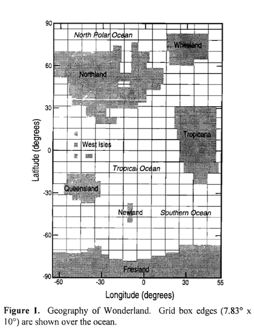
From Hansen et al (1997)
Figure 1
Wonderland is then used in Radiative Forcing and Climate Response, Hansen, Sato & Ruedy (1997). The authors say:
We examine the sensitivity of a climate model to a wide range of radiative forcings, including change of solar irradiance, atmospheric CO2, O3, CFCs, clouds, aerosols, surface albedo, and “ghost” forcing introduced at arbitrary heights, latitudes, longitudes, season, and times of day.
We show that, in general, the climate response, specifically the global mean temperature change, is sensitive to the altitude, latitude, and nature of the forcing; that is, the response to a given forcing can vary by 50% or more depending on the characteristics of the forcing other than its magnitude measured in watts per square meter.
In other words, radiative forcing has its limitations.
Definition of Radiative Forcing
The authors explain a few different approaches to the definition of radiative forcing. If we can understand the difference between these definitions we will have a much clearer view of atmospheric physics. From here, the quotes and figures will be from Radiative Forcing and Climate Response, Hansen, Sato & Ruedy (1997) unless otherwise stated.
Readers who have seen the IPCC 2001 (TAR) definition of radiative forcing may understand the intent behind this 1997 paper. Up until that time different researchers used inconsistent definitions.
The authors say:
The simplest useful definition of radiative forcing is the instantaneous flux change at the tropopause. This is easy to compute because it does not require iterations. This forcing is called “mode A” by WMO [1992]. We refer to this forcing as the “instantaneous forcing”, Fi, using the nomenclature of Hansen et al [1993c]. In a less meaningful alternative, Fi is computed at the top of the atmosphere; we include calculations of this alternative for 2xCO2 and +2% S0 for the sake of comparison.
An improved measure of radiative forcing is obtained by allowing the stratospheric temperature to adjust to the presence of the perturber, to a radiative equilibrium profile, with the tropospheric temperature held fixed. This forcing is called “mode B” by WMO [1992]; we refer to it here as the “adjusted forcing”, Fa [Hansen et al 1993c].
The rationale for using the adjusted forcing is that the relaxation time of the stratosphere is only several months [Manabe & Strickler, 1964], compared to several decades for the troposphere [Hansen et al 1985], and thus the adjusted forcing should be a better measure of the expected climate response for forcings which are present at least several months..The adjusted forcing can be calculated at the top of the atmosphere because the net radiative flux is constant throughout the stratosphere in radiative equilibrium. The calculated Fa depends on where the tropopause level is specified. We specify this level as 100 mbar from the equator to 40° latitude, changing to 189 mbar there, and then increasing linearly to 300 mbar at the poles.
[Emphasis added].
This explanation might seem confusing or abstract so I will try and explain.
Let’s say we have a sudden increase in a particular GHG (see note 1). We can calculate the change in radiative transfer through the atmosphere with a given temperature profile and concentration profile of absorbers with little uncertainty. This means we can see immediately the reduction in outgoing longwave radiation (OLR). And the change in absorption of solar radiation.
Now the question becomes – what happens in the next 1 day, 1 month, 1 year, 10 years, 100 years?
Small changes in net radiation (solar absorbed – OLR) will have an equilibrium effect over many decades at the surface because of the thermal inertia of the oceans (the heat capacity is very high).
The issue that everyone found when they reviewed this problem – the radiative forcing on day 1 was different from the radiative forcing on day 90.
Why?
Because the changes in net absorption above the tropopause (the place where convection stops and let’s review that definition a little later) affect the temperature of the stratosphere very quickly. So the stratosphere quickly adjusts to the new world order and of course this changes the radiative forcing. It’s like (in non-technical terms) the stratosphere responded very quickly and “bounced out” some of the radiative forcing in the first month or two.
So the stratosphere, with little heat capacity, quickly adapts to the radiative changes and moves back into radiative equilibrium. This changes the “radiative forcing” and so if we want to work out the changes over the next 10-100 years there is little point in considering the radiative forcing on day 1, but maybe if the quick responders sort themselves out in 60 days we can wait for the quick responders to settle down and pick the radiative forcing number after 90-120 days.
This is the idea behind the definition.
Let’s look at this in pictures. In the graph below the top line is for doubling CO2 (the line below is for increasing solar by 2%), and the top left is the flux change through the atmosphere for instantaneous and for adjusted. The red line is the “adjusted” value:
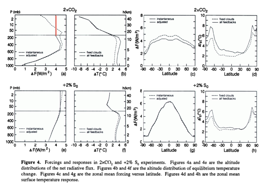
From Radiative Forcing & Climate Response, Hansen et al (1997)
Figure 2 – Click to expand
This red line is the value of flux change after the stratosphere has adjusted to the radiative forcing. Why is the red line vertical?
The reason is simple.
The stratosphere is now in temperature equilibrium because energy in = energy out at all heights. With no convection in the stratosphere this is the same as radiation absorbed = radiation emitted at all heights. Therefore, the net flux change with height must be zero.
If we plotted separately the up and down flux we would find that they have a slope, but the slope of the up and down would be the same. Net absorption of radiation going up balances net emission of radiation going down – more on this in Visualizing Atmospheric Radiation – Part Eleven – Stratospheric Cooling.
Another important point, we can see in the top left graph that the instantaneous net flux at the tropopause (i.e., the net flux on day one) is different from the net flux at the tropopause after adjustment (i.e., after the stratosphere has come into radiative balance).
But once the stratosphere has come into balance we could use the TOA net flux, or the tropopause net flux – it would not matter because both are the same.
Result of Radiative Forcing
Now let’s look at 4 different ways to think about radiative forcing, using the temperature profile as our guide to what is happening:
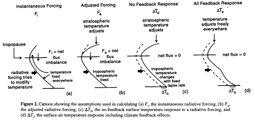
From Radiative Forcing & Climate Response, Hansen et al (1997)
Figure 3 – Click to expand
On the left, case a, instantaneous forcing. This is the result of the change in net radiation absorbed vs height on day one. Temperature doesn’t change instantaneously so it’s nice and simple.
On the next graph, case b, adjusted forcing. This is the temperature change resulting from net radiation absorbed after the stratosphere has come into equilibrium with the new world order, but the troposphere is held fixed. So by definition the tropospheric temperature is identical in case b to case a.
On the next graph, case c, no feedback response of temperature. Now we allow the tropospheric temperature to change until such time as the net flux at the tropopause has gone back to zero. But during this adjustment we have held water vapor, clouds and the lapse rate in the troposphere at the same values as before the radiative forcing.
On the last graph, case d, all feedback response of temperature. Now we let the GCM take over and calculate how water vapor, clouds and the lapse rate respond. And as with case c, we wait until the temperature has increased sufficiently that net tropopause flux has gone back to zero.
What Definition for the Tropopause and Why does it Matter?
We’ve seen that if we use adjusted forcing that the radiative forcing is the same at TOA and at the tropopause. And the adjusted forcing is the IPCC 2001 definition. So why use the forcing at the tropopause? And why does the definition of the tropopause matter?
The first question is easy. We could use the forcing at TOA, it wouldn’t matter so long as we have allowed the stratosphere to come into radiative equilibrium (which takes a few months). As far as I can tell, my opinion, it’s more about the history of how we arrived at this point. If you want to run a climate model to calculate the radiative forcing without stratospheric equilibrium then, on day one, the radiative forcing at the tropopause is usually pretty close to the value calculated after stratospheric equilibrium is reached.
So:
- Calculate the instantaneous forcing at the tropopause and get a value close to the authoritative “radiative forcing” – with the benefit of minimal calculation resources
- Calculate the adjusted forcing at the tropopause or TOA to get the authoritative “radiative forcing”
And lastly, why then does the definition of the tropopause matter?
The reason is simple, but not obvious. We are holding the tropospheric temperature constant, and letting the stratospheric temperature vary. The tropopause is the dividing line. So if we move the dividing line up or down we change the point where the temperatures adjust and so, of course, this affects the “adjusted forcing”. This is explained in some detail in Forster et al (1997) in section 4, p.556 (see reference below).
For reference, three definitions of the tropopause are found in Freckleton et al (1998):
- the level at which the lapse rate falls below 2K/km
- the point at which the lapse rate changes sign, i.e., the temperature minimum
- the top of convection
Conclusion
Understanding what radiative forcing means requires understanding a few basics.
The value of radiative forcing depends upon the somewhat arbitrary definition of the location of the tropopause. Some papers like Freckleton et al (1998) have dived into this subject, to show the dependence of the radiative forcing for doubling CO2 on this definition.
We haven’t covered it in this article, but the Hansen et al (1997) paper showed that radiative forcing is not a perfect guide to how climate responds (even in the idealized world of GCMs). That is, the same radiative forcing applied via different mechanisms can lead to different temperature responses.
Is it a useful parameter? Is the rate of inflation a useful parameter in economics? Usefulness is more a matter of opinion. What is more important at the start is to understand how the parameter is calculated and what it can tell us.
References
Radiative forcing and climate response, Hansen, Sato & Ruedy, Journal of Geophysical Research (1997) – free paper
Wonderland Climate Model, Hansen, Ruedy, Lacis, Russell, Sato, Lerner, Rind & Stone, Journal of Geophysical Research, (1997) – paywall paper
Greenhouse gas radiative forcing: Effect of averaging and inhomogeneities in trace gas distribution, Freckleton et al, QJR Meteorological Society (1998) – paywall paper
On aspects of the concept of radiative forcing, Forster, Freckleton & Shine, Climate Dynamics (1997) – free paper
Notes
Note 1: The idea of an instantaneous increase in a GHG is a thought experiment to make it easier to understand the change in atmospheric radiation. If instead we consider the idea of a 1% change per year, then we have a more difficult problem. (Of course, GCMs can quite happily work with a real-world slow change in GHGs. And they can quite happily work with a sudden change).