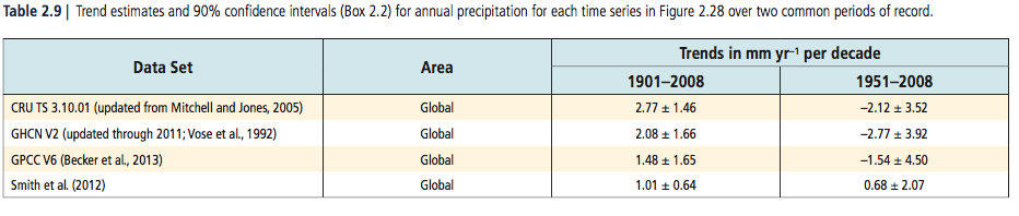
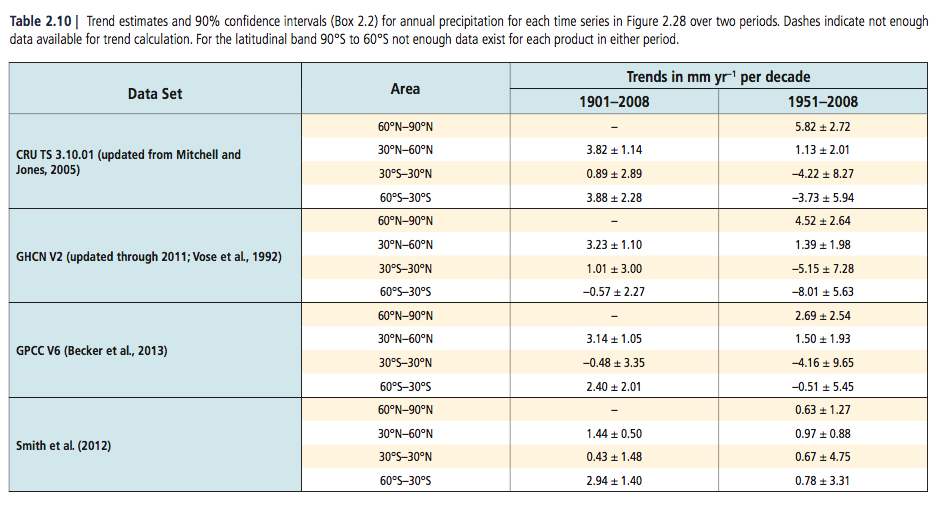
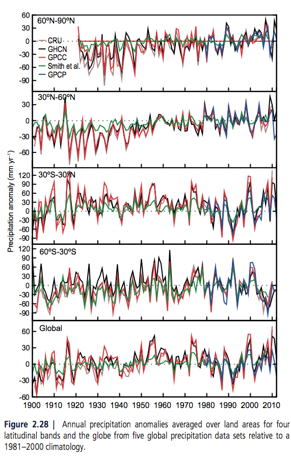
A couple of recent articles covered ground related to clouds, but under Models –Models, On – and Off – the Catwalk – Part Seven – Resolution & Convection & Part Five – More on Tuning & the Magic Behind the Scenes. In the first article Andrew Dessler, day job climate scientist, made a few comments and in one comment provided some great recent references. One of these was by Paulo Ceppi and colleagues published this year and freely accessible. Another paper with some complementary explanations is from Mark Zelinka and colleagues, also published this year (but behind a paywall).
In this article we will take a look at the breakdown these papers provide. There is a lot to the Ceppi paper so we’re not going to review it all in this article, hopefully in a followup article.
Globally and annually averaged, clouds cool the planet by around 18W/m² – that’s large compared with the radiative effect of doubling CO2, a value of 3.7W/m². The net effect is made up of two larger opposite effects:
- cooling from reflecting sunlight (albedo effect) of about 46W/m²
- warming from the radiative effect of about 28W/m² – clouds absorb terrestrial radiation and reemit from near the top of the cloud where it is colder, this is like the “greenhouse” effect
In this graphic, Zelinka and colleagues show the geographical breakdown of cloud radiative effect averaged over 15 years from CERES measurements:
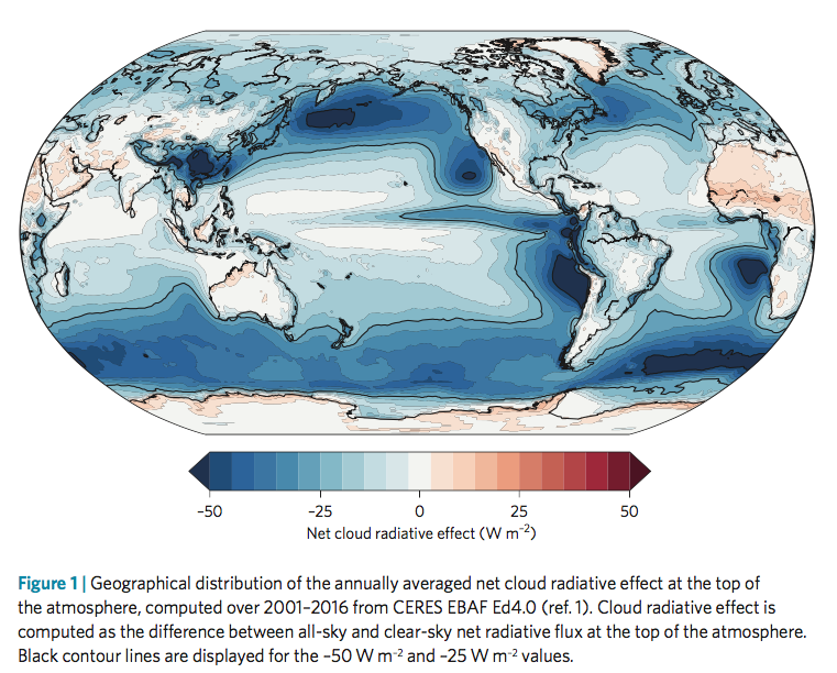
From Zelinka et al 2017
Figure 1 – Click to enlarge
Note that the cloud radiative effect shown above isn’t feedbacks from warming, it is simply the current effect of clouds. The big question is how this will change with warming.
In the next graphic, the inset in the top shows cloud feedback (note 1) vs ECS from 28 GCMs. ECS is the steady state temperature resulting from doubling CO2. Two models are picked out – red and blue – and in the main graph we see simulated warming under RCP8.5 (an unlikely future world confusing described by many as the “business as usual” scenario).
In the bottom graphic, cloud feedbacks from models are decomposed into the effect from low cloud amount, from changing high cloud altitude and from low cloud opacity. We see that the amount of low cloud is the biggest feedback with the widest spread, followed by the changing altitude of high clouds. And both of them have a positive feedback. The gray lines extending out cover the range of model responses.
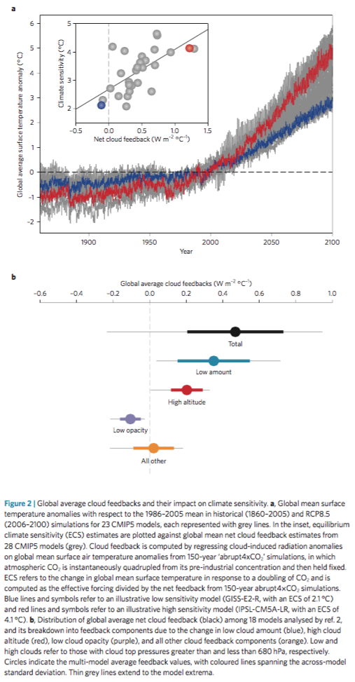
From Zelinka et al 2017
Figure 2 – Click to enlarge
In the next figure – click to enlarge – they show the progression in each IPCC report, helpfully color coded around the breakdown above:
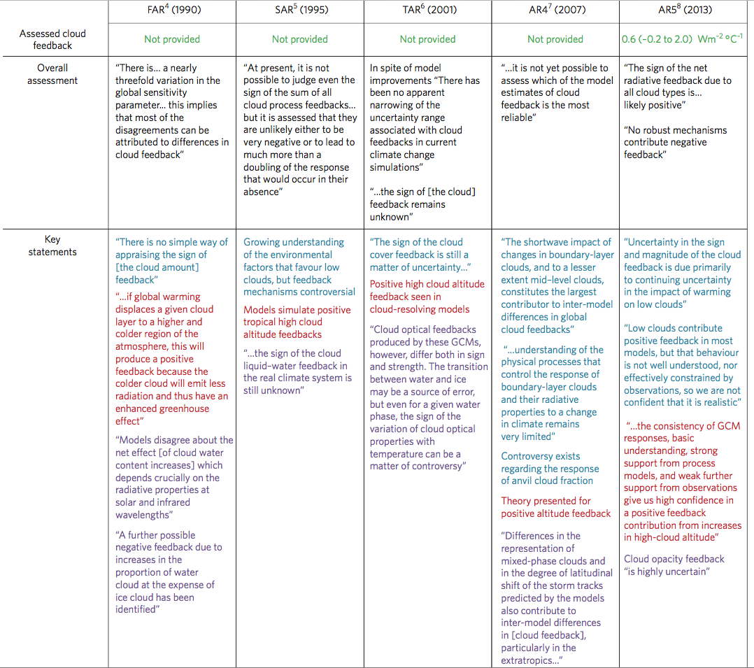
From Zelinka et al 2017
Figure 3 – Click to enlarge
On AR5:
Notably, the high cloud altitude feedback was deemed positive with high confidence due to supporting evidence from theory, observations, and high-resolution models. On the other hand, continuing low confidence was expressed in the sign of low cloud feedback because of a lack of strong observational constraints. However, the AR5 authors noted that high-resolution process models also tended to produce positive low cloud cover feedbacks. The cloud opacity feedback was deemed highly uncertain due to the poor representation of cloud phase and microphysics in models, limited observations with which to evaluate models, and lack of physical understanding. The authors noted that no robust mechanisms contribute a negative cloud feedback.
And on work since:
In the four years since AR5, evidence has increased that the overall cloud feedback is positive. This includes a number of high-resolution modelling studies of low cloud cover that have illuminated the competing processes that govern changes in low cloud coverage and thickness, and studies that constrain long-term cloud responses using observed short-term sensitivities of clouds to changes in their local environment. Both types of analyses point toward positive low cloud feedbacks. There is currently no evidence for strong negative cloud feedbacks..
Onto Ceppi et al 2017. In the graph below we see climate feedback from models broken out into a few parameters
- WV+LR – the combination of water vapor and lapse rate changes (lapse rate is the temperature profile with altitude)
- Albedo – e.g. melting sea ice
- Cloud total
- LW cloud – this is longwave effects, i.e., how clouds change terrestrial radiation emitted to space
- SW cloud- this is shortwave effects, i.e., how clouds reflect solar radiation back to space
From Ceppi et al 2017
Figure 4 – Click to enlarge
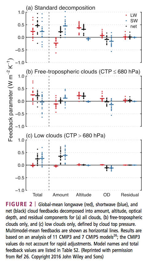
Then they break down the cloud feedback further. This graph is well worth understanding. For example, in the second graph (b) we are looking at higher altitude clouds. We see that the increasing altitude of high clouds causes a positive feedback. The red dots are LW (longwave = terrestrial radiation). If high clouds increase in altitude the radiation from these clouds to space is lower because the cloud tops are colder. This is a positive feedback (more warming retained in the climate system). The blue dots are SW (shortwave = solar radiation). If high clouds increase in altitude it has no effect on the reflection of solar radiation – and so the blue dots are on zero.
Looking at the low clouds – bottom graph (c) – we see that the feedback is almost all from increasing reflection of solar radiation from increasing amounts of low clouds.
From Ceppi et al 2017
Figure 5
Now a couple more graphs from Ceppi et al – the spatial distribution of cloud feedback from models (note this is different from our figure 1 which showed current cloud radiative effect):
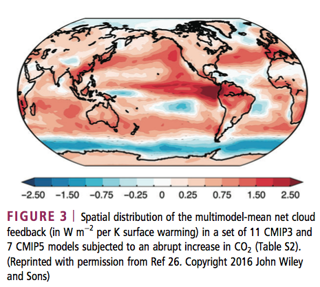
From Ceppi et al 2017
Figure 6
And the cloud feedback by latitude broken down into: altitude effects; amount of cloud; and optical depth (higher optical depth primarily increases the reflection to space of solar radiation but also has an effect on terrestrial radiation).
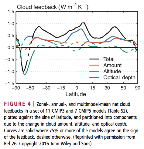
From Ceppi et al 2017
Figure 7
They state:
The patterns of cloud amount and optical depth changes suggest the existence of distinct physical processes in different latitude ranges and climate regimes, as discussed in the next section. The results in Figure 4 allow us to further refine the conclusions drawn from Figure 2. In the multi- model mean, the cloud feedback in current GCMs mainly results from:
- globally rising free-tropospheric clouds
- decreasing low cloud amount at low to middle latitudes, and
- increasing low cloud optical depth at middle to high latitudes
Cloud feedback is the main contributor to intermodel spread in climate sensitivity, ranging from near zero to strongly positive (−0.13 to 1.24 W/m²K) in current climate models.
It is a combination of three effects present in nearly all GCMs: rising free- tropospheric clouds (a LW heating effect); decreasing low cloud amount in tropics to midlatitudes (a SW heating effect); and increasing low cloud optical depth at high latitudes (a SW cooling effect). Low cloud amount in tropical subsidence regions dominates the intermodel spread in cloud feedback.
Happy Christmas to all Science of Doom readers.
Note – if anyone wants to debate the existence of the “greenhouse” effect, please add your comments to Two Basic Foundations or The “Greenhouse” Effect Explained in Simple Terms or any of the other tens of articles on that subject. Comments here on the existence of the “greenhouse” effect will be deleted.
References
Cloud feedback mechanisms and their representation in global climate models, Paulo Ceppi, Florent Brient, Mark D Zelinka & Dennis Hartmann, IREs Clim Change 2017 – free paper
Clearing clouds of uncertainty, Mark D Zelinka, David A Randall, Mark J Webb & Stephen A Klein, Nature 2017 – paywall paper
Notes
Note 1: From Ceppi et al 2017: CLOUD-RADIATIVE EFFECT AND CLOUD FEEDBACK:
The radiative impact of clouds is measured as the cloud-radiative effect (CRE), the difference between clear-sky and all-sky radiative flux at the top of atmosphere. Clouds reflect solar radiation (negative SW CRE, global-mean effect of −45W/m²) and reduce outgoing terrestrial radiation (positive LW CRE, 27W/m²−2), with an overall cooling effect estimated at −18W/m² (numbers from Henderson et al.).
CRE is proportional to cloud amount, but is also determined by cloud altitude and optical depth.
The magnitude of SW CRE increases with cloud optical depth, and to a much lesser extent with cloud altitude.
By contrast, the LW CRE depends primarily on cloud altitude, which determines the difference in emission temperature between clear and cloudy skies, but also increases with optical depth. As the cloud properties change with warming, so does their radiative effect. The resulting radiative flux response at the top of atmosphere, normalized by the global-mean surface temperature increase, is known as cloud feedback.
This is not strictly equal to the change in CRE with warming, because the CRE also responds to changes in clear-sky radiation—for example, due to changes in surface albedo or water vapor. The CRE response thus underestimates cloud feedback by about 0.3W/m² on average. Cloud feedback is therefore the component of CRE change that is due to changing cloud properties only. Various methods exist to diagnose cloud feedback from standard GCM output. The values presented in this paper are either based on CRE changes corrected for noncloud effects, or estimated directly from changes in cloud properties, for those GCMs providing appropriate cloud output. The most accurate procedure involves running the GCM radiation code offline—replacing instantaneous cloud fields from a control climatology with those from a perturbed climatology, while keeping other fields unchanged—to obtain the radiative perturbation due to changes in clouds. This method is computationally expensive and technically challenging, however.


 is not equal to the average of u x the average of w, written as
  . For the same reason we just looked at.
 , where
  = mean value; u’ = the varying component. So
  . Likewise for the other directions.
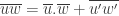
 , it turns into
 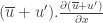 , which, when averaged, becomes:
 which is “the mean of potential temperature variations x upwards eddy velocity”.


 with a simple formula that just has mean horizontal velocity. We have “closed the equations” by some dimensional analysis.
 . Similar arguments give latent heat flux
  in a simple form.
 should be a constant – “scaled wind shear”. The inverse of that constant is known as the Von Karman constant, k = 0.4.
 , where these eddy values are at the surface


