This blog is about climate science.
I wanted to take a look at Renewable Energy because it’s interesting and related to climate science in an obvious way. Information from media sources confirms my belief that 99% of what is produced by the media is rehashed press releases from various organizations with very little fact checking. (Just a note for citizens alarmed by this statement – they are still the “go to source” for the weather, footage of disasters and partly-made-up stories about celebrities).
Regular readers of this blog know that the articles and discussion so far have only been about the science – what can be proven, what evidence exists, and so on. Questions about motives, about “things people might have done”, and so on, are not of interest in the climate discussion (not for this blog). There are much better blogs for that – with much larger readerships.
Here’s an extract from About this Blog:
Opinions
Opinions are often interesting and sometimes entertaining. But what do we learn from opinions? It’s more useful to understand the science behind the subject. What is this particular theory built on? How long has the theory been “established”? What lines of evidence support this theory? What evidence would falsify this theory? What do opposing theories say?
Anything else?
This blog will try and stay away from guessing motives and insulting people because of how they vote or their religious beliefs. However, this doesn’t mean we won’t use satire now and again as it can make the day more interesting.
The same principles will apply for this discussion about renewables. Our focus will be on technical and commercial aspects of renewable energy, with a focus on evidence rather than figuring it out from “motive attribution”. And wishful thinking – wonderful though it is for reducing personal stress – will be challenged.
As always, the moderator reserves the right to remove comments that don’t meet these painful requirements.
Here’s a claim about renewables from a recent media article:
By Bloomberg New Energy Finance’s most recent calculations a new wind farm in Australia would cost $74 a megawatt hour..
..”Wind is already the cheapest, and solar PV [photovoltaic panels] will be cheaper than gas in around two years, in 2017. We project that wind will continue to decline in cost, though at a more modest rate than solar. Solar will become the dominant source in the longer term.”
I couldn’t find any evidence in the article that verified the claim. Only that it came from Bloomberg New Energy Finance and was the opposite of a radio shock jock. Generally I favor my dogs’ opinions over opinionated media people (unless it is about the necessity of an infinite supply of Schmackos starting now, right now). But I have a skeptical mindset and not knowing the wonderful people at Bloomberg I have no idea whether their claim is rock-solid accurate data, or “wishful thinking to promote their products so they can make lots of money and retire early”.
Calculating the cost of anything like this is difficult. What is the basis of the cost calculation? I don’t know if the claim in BNEF’s calculation is “accurate” – but without context it is not such a useful number. The fact that BNEF might have some vested interest in a favorable comparison over coal and gas is just something I assume.
But, like with climate science, instead of discussing motives and political stances, we will just try and figure out how the numbers stack up. We won’t be pitting coal companies (=devils or angels depending on your political beliefs) against wind turbine producers (=devils or angels depending on your political beliefs) or against green activists (=devils or angels depending on your political beliefs).
Instead we will look for data – a crazy idea and I completely understand how very unpopular it is. Luckily, I’m sure I can help people struggling with the idea to find better websites on which to comment.
Calculating the Cost
I’ve read the details of a few business plans and I’m sure that most other business plans also have the same issue – change a few parameters (=”assumptions”, often “reasonable assumptions”) and the outlook goes from amazing riches to destitution and bankruptcy.
The cost per MWHr of wind energy will depend on a few factors:
- cost of buying a wind turbine
- land acquisition/land rental costs
- installation cost
- grid connection costs
- the “backup requirement” aka “capacity credit”
- cost of capital
- lifetime of equipment
- maintenance costs
- % utilization (output energy / nameplate capacity)
And of course, in any discussion about “the future”, favorable assumptions can be made about “the next generation”. Is the calculation of $74/MWHr based on what was shipped 5 years ago and its actuals, or what is suggested for a turbine purchased next year?
If you want wind to look better than gas or coal – or the converse – there are enough variables to get the result you want. I’ll be amazed if you can’t change the relative costs by a factor of 5 by playing around with what appear to be reasonable assumptions.
Perhaps the data is easy to obtain. I’m sure many readers have some or all of this data to hand.
Moore’s Law and Other Industries
Most people are familiar with the now legendary statement from the 1960s about semiconductor performance doubling every 18 months. This revolution is amazing. But it’s unusual.
There are a lot of economies of scale from mass production in a factory. But mostly limiting cases are reached pretty quickly, after which cost reductions of a few percent a year are great results – rather than producing the same product for 1% of what it cost just 10 years before. Semiconductors are the exception.
When a product is made from steel alloys, carbon fiber composites or similar materials we can’t expect Moore’s law to kick in. On the other hand, products that rely on a combination of software, electronic components and “traditional materials” and have been produced on small scales up until now can expect major cost reductions from amortizing costs (software, custom chips, tooling, etc) and general economies of scale (purchasing power, standardizing processes, etc).
In some industries, rapid growth actually causes cost increases. If you want an experienced team to provide project management, installation and commissioning services you might find that the boom in renewables is driving those costs up, not down.
A friend of mine working for a natural gas producer in Queensland, Australia recounted the story of the cost of building a dam a few years ago. Long story short, the internal estimates ranged from $2M to $7M, but when the tenders came in from general contractors the prices were $10M to $25M. The reason was a combination of:
- escalating contractor costs (due to the boom)
- compliance with new government environmental regulations
- compliance with the customer’s many policies / OH&S requirements
- the contractual risk due to all of the above, along with the significant proliferation of contract terms (i.e., will we get sued, have we taken on liabilities we don’t understand, etc)
The point being that industry insiders – i.e., the customer – with a strong vested interest in understanding current costs was out by a factor of more than three in a traditional enterprise. This kind of inaccuracy is unusual but it can happen when the industry landscape is changing quickly.
Even if you have signed a fixed price contract with an EPC you can only be sure this is the minimum you will be paying.
The only point I’m making is that a lot of costs are unknown even by experienced people in the field. Companies like BNEF might make some assumptions but it’s a low stress exercise when someone else will be paying the actual bills.
Intermittency & Grid Operators
We will discuss this further in future articles. This is a key issue between renewables and fossil fuel / nuclear power stations. The traditional power stations can create energy when it is needed. Wind and solar – mainstays of the renewable revolution – create energy when the sun shines and the wind blows.
As a starting point for any discussion let’s assume that storing energy is massively uneconomic. While new developments might be available “around the corner”, storing energy is very expensive. The only real mechanism is pumped hydro schemes. Of course, we can discuss this.
Grid operators have a challenge – balance demand with supply (because storage capacity is virtually zero). Demand is variable and although there is some predictability, there are unexpected changes even in the short term.
The demand curve depends on the country. For example, the UK has peak demand in the winter evenings. Wealthy hotter countries have peak demand in the summer in the middle of the day (air-conditioning).
There are two important principles:
- Grid operators already have to deal with intermittency because conventional power stations go off-line with planned outages and with unplanned, last minute, outages
- Renewables have a “capacity credit” that is usually less than their expected output
The first is a simple one. An example is the Sizewell B nuclear power station in the UK supplying about 1GW [fixed] out of 80GW of total grid supply. From time to time it shuts down and the grid operator gets very little notice. So grid operators already have to deal with this. They use statistical calculations to ensure excess supply during normal operation, based on an acceptable “loss of load probability”. Total electricity demand is variable and supply is continually adjusted to match that demand. Of course, the scale of intermittency from large penetration of renewables may present challenges that are difficult to deal with by comparison with current intermittency.
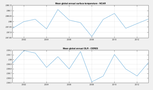
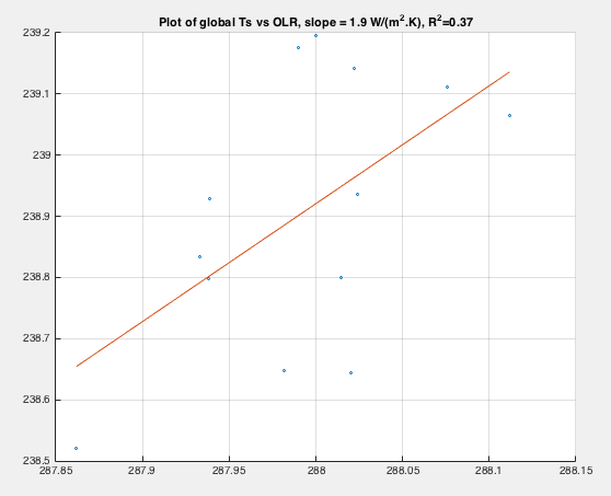
The second is the difficult one. Here’s an example from a textbook by Godfrey, that’s actually a collection of articles on (mainly) UK renewables:

The essence of the calculation is a probabilistic one. At small penetration levels, the energy input from wind power displaces the need for energy generation from traditional sources. But as the percentage of wind power increases, the “potential down time” causes more problems – requiring more backup generation on standby. In the calculations above, wind going from 0.5 GW to 25 GW only saves 4 GW in conventional “capacity”. This is the meaning of capacity credit – adding 25 GW of wind power (under this simulation) provides a capacity credit of only 4 GW. So you can’t remove 25 GW of conventional from the grid, you can only remove 4 GW of conventional power.
Now the calculation of capacity credit depends on the specifics of the history of wind speeds in the region. Increasing the geographical spread of wind power generation produces better results, dependent on the lower correlation of wind speeds across larger regions. Different countries get different results.
So there’s an additional cost with wind power that someone has to pay for – which increases along with the penetration of wind power. In the immediate future this might not be a problem because perhaps the capacity already exists and is just being put on standby. However, at some stage these older plants will be at end of life and conventional plants will need to be built to provide backup.
Many calculations exist of the estimated $/MWh from providing such a backup. We will dig into those in future articles. My initial impression is that there are a lot of unknowns in the real cost of backup supply because for much potential backup supply the lifetime / maintenance impact of frequent start-stops is unclear. A lot of this is thermal shock issues – each thermal cycle costs $X.. (based on the design of the plant to handle so many thousand starts before a major overhaul is needed).
The Other Side of the Equation – Conventional Power
It will also be interesting to get some data around conventional power. Right now, the cost of displacing conventional power is new investment in renewables, but keeping conventional power is not free. Every existing station has a life and will one day need to be replaced (or demand will need to be reduced). It might be a deferred cost but it will still be a cost.
$ and GHG emissions
There is a cost to adding 1GW of wind power. There is a cost to adding 1GW of solar power. There is also a GHG cost – that is, building a solar panel or a wind turbine is not energy free and must be producing GHGs in the process. It would be interesting to get some data on this also.
Conclusion – Introduction
I wrote this article because finding real data is demanding and many websites focused on the topic are advocacy-based with minimal data. Their starting point is often the insane folly and/or mendacious intent of “the other side”. The approach we will take here is to gather and analyze data.. As if the future of the world was not at stake. As if it was not a headlong rush into lunacy to try and generate most energy from renewables.. As if it was not an unbelievable sin to continue to create electricity from fossil fuels..
This approach might allow us to form conclusions from the data rather than the reverse.
Let’s see how this approach goes.
I am hoping many current (and future) readers can contribute to the discussion – with data, uncertainties, clarifications.
I’m not expecting to be able to produce “a number” for windpower or solar power. I’m hopeful that with some research, analysis and critical questions we might be able to summarize some believable range of values for the different elements of building a renewable energy supply, and also quantify the uncertainties.
Most of what I will write in future articles I don’t yet know. Perhaps someone already has a website where this project is already complete and in my Part Two will just point readers there..
Articles in this Series
Renewable Energy I – Introduction
Renewables II – Solar and Free Lunches – Solar power
Renewables III – US Grid Operators’ Opinions – The grid operators’ concerns
Renewables IV – Wind, Forecast Horizon & Backups – Some more detail about wind power – what do we do when the wind goes on vacation
Renewables V – Grid Stability As Wind Power Penetration Increases
Renewables VI – Report says.. 100% Renewables by 2030 or 2050
Renewables VII – Feasibility and Reality – Geothermal example
Renewables VIII – Transmission Costs And Outsourcing Renewable Generation
Renewables IX – Onshore Wind Costs
Renewables X – Nationalism vs Inter-Nationalism
Renewables XI – Cost of Gas Plants vs Wind Farms
Renewables XII – Windpower as Baseload and SuperGrids
Renewables XIII – One of Wind’s Hidden Costs
Renewables XIV – Minimized Cost of 99.9% Renewable Study
Renewables XV – Offshore Wind Costs
Renewables XVI – JP Morgan advises
Renewables XVII – Demand Management 1
Renewables XVIII – Demand Management & Levelized Cost
Renewables XIX – Behind the Executive Summary and Reality vs Dreams
References
Renewable Electricity and the Grid : The Challenge of Variability, Godfrey Boyle, Earthscan (2007)
Read Full Post »


Renewable Energy I
Posted in Commentary, Renewables on July 30, 2015| 122 Comments »
This blog is about climate science.
I wanted to take a look at Renewable Energy because it’s interesting and related to climate science in an obvious way. Information from media sources confirms my belief that 99% of what is produced by the media is rehashed press releases from various organizations with very little fact checking. (Just a note for citizens alarmed by this statement – they are still the “go to source” for the weather, footage of disasters and partly-made-up stories about celebrities).
Regular readers of this blog know that the articles and discussion so far have only been about the science – what can be proven, what evidence exists, and so on. Questions about motives, about “things people might have done”, and so on, are not of interest in the climate discussion (not for this blog). There are much better blogs for that – with much larger readerships.
Here’s an extract from About this Blog:
The same principles will apply for this discussion about renewables. Our focus will be on technical and commercial aspects of renewable energy, with a focus on evidence rather than figuring it out from “motive attribution”. And wishful thinking – wonderful though it is for reducing personal stress – will be challenged.
As always, the moderator reserves the right to remove comments that don’t meet these painful requirements.
Here’s a claim about renewables from a recent media article:
I couldn’t find any evidence in the article that verified the claim. Only that it came from Bloomberg New Energy Finance and was the opposite of a radio shock jock. Generally I favor my dogs’ opinions over opinionated media people (unless it is about the necessity of an infinite supply of Schmackos starting now, right now). But I have a skeptical mindset and not knowing the wonderful people at Bloomberg I have no idea whether their claim is rock-solid accurate data, or “wishful thinking to promote their products so they can make lots of money and retire early”.
Calculating the cost of anything like this is difficult. What is the basis of the cost calculation? I don’t know if the claim in BNEF’s calculation is “accurate” – but without context it is not such a useful number. The fact that BNEF might have some vested interest in a favorable comparison over coal and gas is just something I assume.
But, like with climate science, instead of discussing motives and political stances, we will just try and figure out how the numbers stack up. We won’t be pitting coal companies (=devils or angels depending on your political beliefs) against wind turbine producers (=devils or angels depending on your political beliefs) or against green activists (=devils or angels depending on your political beliefs).
Instead we will look for data – a crazy idea and I completely understand how very unpopular it is. Luckily, I’m sure I can help people struggling with the idea to find better websites on which to comment.
Calculating the Cost
I’ve read the details of a few business plans and I’m sure that most other business plans also have the same issue – change a few parameters (=”assumptions”, often “reasonable assumptions”) and the outlook goes from amazing riches to destitution and bankruptcy.
The cost per MWHr of wind energy will depend on a few factors:
And of course, in any discussion about “the future”, favorable assumptions can be made about “the next generation”. Is the calculation of $74/MWHr based on what was shipped 5 years ago and its actuals, or what is suggested for a turbine purchased next year?
If you want wind to look better than gas or coal – or the converse – there are enough variables to get the result you want. I’ll be amazed if you can’t change the relative costs by a factor of 5 by playing around with what appear to be reasonable assumptions.
Perhaps the data is easy to obtain. I’m sure many readers have some or all of this data to hand.
Moore’s Law and Other Industries
Most people are familiar with the now legendary statement from the 1960s about semiconductor performance doubling every 18 months. This revolution is amazing. But it’s unusual.
There are a lot of economies of scale from mass production in a factory. But mostly limiting cases are reached pretty quickly, after which cost reductions of a few percent a year are great results – rather than producing the same product for 1% of what it cost just 10 years before. Semiconductors are the exception.
When a product is made from steel alloys, carbon fiber composites or similar materials we can’t expect Moore’s law to kick in. On the other hand, products that rely on a combination of software, electronic components and “traditional materials” and have been produced on small scales up until now can expect major cost reductions from amortizing costs (software, custom chips, tooling, etc) and general economies of scale (purchasing power, standardizing processes, etc).
In some industries, rapid growth actually causes cost increases. If you want an experienced team to provide project management, installation and commissioning services you might find that the boom in renewables is driving those costs up, not down.
A friend of mine working for a natural gas producer in Queensland, Australia recounted the story of the cost of building a dam a few years ago. Long story short, the internal estimates ranged from $2M to $7M, but when the tenders came in from general contractors the prices were $10M to $25M. The reason was a combination of:
The point being that industry insiders – i.e., the customer – with a strong vested interest in understanding current costs was out by a factor of more than three in a traditional enterprise. This kind of inaccuracy is unusual but it can happen when the industry landscape is changing quickly.
Even if you have signed a fixed price contract with an EPC you can only be sure this is the minimum you will be paying.
The only point I’m making is that a lot of costs are unknown even by experienced people in the field. Companies like BNEF might make some assumptions but it’s a low stress exercise when someone else will be paying the actual bills.
Intermittency & Grid Operators
We will discuss this further in future articles. This is a key issue between renewables and fossil fuel / nuclear power stations. The traditional power stations can create energy when it is needed. Wind and solar – mainstays of the renewable revolution – create energy when the sun shines and the wind blows.
As a starting point for any discussion let’s assume that storing energy is massively uneconomic. While new developments might be available “around the corner”, storing energy is very expensive. The only real mechanism is pumped hydro schemes. Of course, we can discuss this.
Grid operators have a challenge – balance demand with supply (because storage capacity is virtually zero). Demand is variable and although there is some predictability, there are unexpected changes even in the short term.
The demand curve depends on the country. For example, the UK has peak demand in the winter evenings. Wealthy hotter countries have peak demand in the summer in the middle of the day (air-conditioning).
There are two important principles:
The first is a simple one. An example is the Sizewell B nuclear power station in the UK supplying about 1GW [fixed] out of 80GW of total grid supply. From time to time it shuts down and the grid operator gets very little notice. So grid operators already have to deal with this. They use statistical calculations to ensure excess supply during normal operation, based on an acceptable “loss of load probability”. Total electricity demand is variable and supply is continually adjusted to match that demand. Of course, the scale of intermittency from large penetration of renewables may present challenges that are difficult to deal with by comparison with current intermittency.
The second is the difficult one. Here’s an example from a textbook by Godfrey, that’s actually a collection of articles on (mainly) UK renewables:
The essence of the calculation is a probabilistic one. At small penetration levels, the energy input from wind power displaces the need for energy generation from traditional sources. But as the percentage of wind power increases, the “potential down time” causes more problems – requiring more backup generation on standby. In the calculations above, wind going from 0.5 GW to 25 GW only saves 4 GW in conventional “capacity”. This is the meaning of capacity credit – adding 25 GW of wind power (under this simulation) provides a capacity credit of only 4 GW. So you can’t remove 25 GW of conventional from the grid, you can only remove 4 GW of conventional power.
Now the calculation of capacity credit depends on the specifics of the history of wind speeds in the region. Increasing the geographical spread of wind power generation produces better results, dependent on the lower correlation of wind speeds across larger regions. Different countries get different results.
So there’s an additional cost with wind power that someone has to pay for – which increases along with the penetration of wind power. In the immediate future this might not be a problem because perhaps the capacity already exists and is just being put on standby. However, at some stage these older plants will be at end of life and conventional plants will need to be built to provide backup.
Many calculations exist of the estimated $/MWh from providing such a backup. We will dig into those in future articles. My initial impression is that there are a lot of unknowns in the real cost of backup supply because for much potential backup supply the lifetime / maintenance impact of frequent start-stops is unclear. A lot of this is thermal shock issues – each thermal cycle costs $X.. (based on the design of the plant to handle so many thousand starts before a major overhaul is needed).
The Other Side of the Equation – Conventional Power
It will also be interesting to get some data around conventional power. Right now, the cost of displacing conventional power is new investment in renewables, but keeping conventional power is not free. Every existing station has a life and will one day need to be replaced (or demand will need to be reduced). It might be a deferred cost but it will still be a cost.
$ and GHG emissions
There is a cost to adding 1GW of wind power. There is a cost to adding 1GW of solar power. There is also a GHG cost – that is, building a solar panel or a wind turbine is not energy free and must be producing GHGs in the process. It would be interesting to get some data on this also.
Conclusion– IntroductionI wrote this article because finding real data is demanding and many websites focused on the topic are advocacy-based with minimal data. Their starting point is often the insane folly and/or mendacious intent of “the other side”. The approach we will take here is to gather and analyze data.. As if the future of the world was not at stake. As if it was not a headlong rush into lunacy to try and generate most energy from renewables.. As if it was not an unbelievable sin to continue to create electricity from fossil fuels..
This approach might allow us to form conclusions from the data rather than the reverse.
Let’s see how this approach goes.
I am hoping many current (and future) readers can contribute to the discussion – with data, uncertainties, clarifications.
I’m not expecting to be able to produce “a number” for windpower or solar power. I’m hopeful that with some research, analysis and critical questions we might be able to summarize some believable range of values for the different elements of building a renewable energy supply, and also quantify the uncertainties.
Most of what I will write in future articles I don’t yet know. Perhaps someone already has a website where this project is already complete and in my Part Two will just point readers there..
Articles in this Series
Renewable Energy I – Introduction
Renewables II – Solar and Free Lunches – Solar power
Renewables III – US Grid Operators’ Opinions – The grid operators’ concerns
Renewables IV – Wind, Forecast Horizon & Backups – Some more detail about wind power – what do we do when the wind goes on vacation
Renewables V – Grid Stability As Wind Power Penetration Increases
Renewables VI – Report says.. 100% Renewables by 2030 or 2050
Renewables VII – Feasibility and Reality – Geothermal example
Renewables VIII – Transmission Costs And Outsourcing Renewable Generation
Renewables IX – Onshore Wind Costs
Renewables X – Nationalism vs Inter-Nationalism
Renewables XI – Cost of Gas Plants vs Wind Farms
Renewables XII – Windpower as Baseload and SuperGrids
Renewables XIII – One of Wind’s Hidden Costs
Renewables XIV – Minimized Cost of 99.9% Renewable Study
Renewables XV – Offshore Wind Costs
Renewables XVI – JP Morgan advises
Renewables XVII – Demand Management 1
Renewables XVIII – Demand Management & Levelized Cost
Renewables XIX – Behind the Executive Summary and Reality vs Dreams
References
Renewable Electricity and the Grid : The Challenge of Variability, Godfrey Boyle, Earthscan (2007)
Read Full Post »