[I started writing this some time ago and got side-tracked, initially because aerosol interaction in clouds and rainfall is quite fascinating with lots of current research and then because there are many papers on higher resolution simulations of convection that also looked interesting.. so decided to post it less than complete because it will be some time before I can put together a more complete article..]
In Part Four of this series we looked at the paper by Mauritsen et al (2012). Isaac Held has a very interesting post on his blog – and people interested in understanding climate science will benefit from reading his blog – he has been in the field writing papers for 40 years). He highlighted this paper: Cloud tuning in a coupled climate model: Impact on 20th century warming, Jean-Christophe Golaz, Larry W. Horowitz, and Hiram Levy II, GRL (2013).
Their paper has many similarities to Mauritsen et al (2013). Here are some of their comments:
Climate models incorporate a number of adjustable parameters in their cloud formulations. They arise from uncertainties in cloud processes. These parameters are tuned to achieve a desired radiation balance and to best reproduce the observed climate. A given radiation balance can be achieved by multiple combinations of parameters. We investigate the impact of cloud tuning in the CMIP5 GFDL CM3 coupled climate model by constructing two alternate configurations.
They achieve the desired radiation balance using different, but plausible, combinations of parameters. The present-day climate is nearly indistinguishable among all configurations.
However, the magnitude of the aerosol indirect effects differs by as much as 1.2 W/m², resulting in significantly different temperature evolution over the 20th century..
..Uncertainties that arise from interactions between aerosols and clouds have received considerable attention due to their potential to offset a portion of the warming from greenhouse gases. These interactions are usually categorized into first indirect effect (“cloud albedo effect”; Twomey [1974]) and second indirect effect (“cloud lifetime effect”; Albrecht [1989]).
Modeling studies have shown large spreads in the magnitudes of these effects [e.g., Quaas et al., 2009]. CM3 [Donner et al., 2011] is the first Geophysical Fluid Dynamics Laboratory (GFDL) coupled climate model to represent indirect effects.
As in other models, the representation in CM3 is fraught with uncertainties. In particular, adjustable cloud parameters used for the purpose of tuning the model radiation can also have a significant impact on aerosol effects [Golaz et al., 2011]. We extend this previous study by specifically investigating the impact that cloud tuning choices in CM3 have on the simulated 20th century warming.
What did they do?
They adjusted the “autoconversion threshold radius”, which controls when water droplets turn into rain.
Autoconversion converts cloud water to rain. The conversion occurs once the mean cloud droplet radius exceeds rthresh. Larger rthresh delays the formation of rain and increases cloudiness.
The default in CM3 was 8.2 μm. They selected alternate values from other GFDL models: 6.0 μm (CM3w) and 10.6 μm (CM3c). Of course, they have to then adjust others parameters to achieve radiation balance – the “erosion time” (lateral mixing effect reducing water in clouds) which they note is poorly constrained (that is, we don’t have some external knowledge of the correct value for this parameter) and the “velocity variance” which affects how quickly water vapor condenses out onto aerosols.
Here is the time evolution in the three models (and also observations):
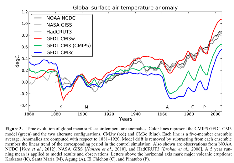
From Golaz et al 2013
Figure 1 – Click to enlarge
In terms of present day climatology, the three variants are very close, but in terms of 20th century warming two variants are very different and only CM3w is close to observations.
Here is their conclusion, well worth studying. I reproduce it in full:
CM3w predicts the most realistic 20th century warming. However, this is achieved with a small and less desirable threshold radius of 6.0 μm for the onset of precipitation.
Conversely, CM3c uses a more desirable value of 10.6 μm but produces a very unrealistic 20th century temperature evolution. This might indicate the presence of compensating model errors. Recent advances in the use of satellite observations to evaluate warm rain processes [Suzuki et al., 2011; Wang et al., 2012] might help understand the nature of these compensating errors.
CM3 was not explicitly tuned to match the 20th temperature record.
However, our findings indicate that uncertainties in cloud processes permit a large range of solutions for the predicted warming. We do not believe this to be a peculiarity of the CM3 model.
Indeed, numerous previous studies have documented a strong sensitivity of the radiative forcing from aerosol indirect effects to details of warm rain cloud processes [e.g., Rotstayn, 2000; Menon et al., 2002; Posselt and Lohmann, 2009; Wang et al., 2012].
Furthermore, in order to predict a realistic evolution of the 20th century, models must balance radiative forcing and climate sensitivity, resulting in a well-documented inverse correlation between forcing and sensitivity [Schwartz et al., 2007; Kiehl, 2007; Andrews et al., 2012].
This inverse correlation is consistent with an intercomparison-driven model selection process in which “climate models’ ability to simulate the 20th century temperature increase with fidelity has become something of a show-stopper as a model unable to reproduce the 20th century would probably not see publication” [Mauritsen et al., 2012].
Very interesting paper, and freely available. Kiehl’s paper, referenced in the conclusion, is also well-worth reading. In his paper he shows that models with the highest sensitivity to GHGs have the highest negative value from 20th century aerosols, while the models with the lowest sensitivity to GHGs have the lowest negative value from 20th century aerosols. Therefore, both ends of the range can reproduce 20th century temperature anomalies, while suggesting very different 21st century temperature evolution.
A paper on higher resolution models, Siefert et al 2015, did some model experiments, “large eddy simulations”, which are much higher resolution than GCMs. The best resolution GCMs today typically have a grid size around 100km x 100km. Their LES model had a grid size of 25m x 25m, with 2048 x 2048 x 200 grid points, to span a simulated volume of 51.2 km x 51.2 km x 5 km, and ran for a simulated 60hr time span.
They had this to say about the aerosol indirect effect:
It has also been conjectured that changes in CCN might influence cloud macrostructure. Most prominently, Albrecht [1989] argued that processes which reduce the average size of cloud droplets would retard and reduce the rain formation in clouds, resulting in longer-lived clouds. Longer living clouds would increase cloud cover and reflect even more sunlight, further cooling the atmosphere and surface. This type of aerosol-cloud interaction is often called a lifetime effect. Like the Twomey effect, the idea that smaller particles will form rain less readily is based on sound physical principles.
Given this strong foundation, it is somewhat surprising that empirical evidence for aerosol impacts on cloud macrophysics is so thin.
Twenty-five years after Albrecht’s paper, the observational evidence for a lifetime effect in the marine cloud regimes for which it was postulated is limited and contradictory. Boucher et al. [2013] who assess the current level of our understanding, identify only one study, by Yuan et al. [2011], which provides observational evidence consistent with a lifetime effect. In that study a natural experiment, outgassing of SO2 by the Kilauea volcano is used to study the effect of a changing aerosol environment on cloud macrophysical processes.
But even in this case, the interpretation of the results are not without ambiguity, as precipitation affects both the outgassing aerosol precursors and their lifetime. Observational studies of ship tracks provide another inadvertent experiment within which one could hope to identify lifetime effects [Conover, 1969; Durkee et al., 2000; Hobbs et al., 2000], but in many cases the opposite response of clouds to aerosol perturbations is observed: some observations [Christensen and Stephens, 2011; Chen et al., 2012] are consistent with more efficient mixing of smaller cloud drops leading to more rapid cloud desiccation and shorter lifetimes.
Given the lack of observational evidence for a robust lifetime effect, it seems fair to question the viability of the underlying hypothesis.
In their paper they show a graphic of what their model produced, it’s not the main dish but interesting for the realism:
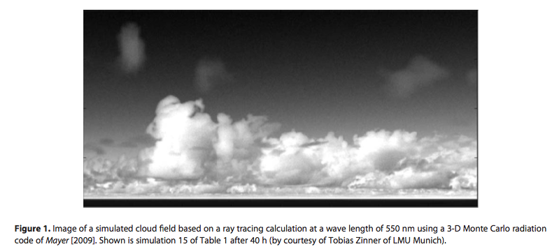
From Seifert et al 2015
Figure 2 – Click to expand
It is an involved paper, but here is one of the conclusions, relevant for the topic at hand:
Our simulations suggest that parameterizations of cloud-aerosol effects in large-scale models are almost certain to overstate the impact of aerosols on cloud albedo and rain rate. The process understanding on which the parameterizations are based is applicable to isolated clouds in constant environments, but necessarily neglects interactions between clouds, precipitation, and circulations that, as we have shown, tend to buffer much of the impact of aerosol change.
For people new to parameterizations, a couple of articles that might be useful:
Conclusion
Climate models necessarily have some massive oversimplifications, as we can see from the large eddy simulation which has 25m x 25m grid cells while GCMs have 100km x 100km at best. Even LES models have simplifications – to get to direct numerical solution (DNS) of the equations for turbulent flow we would need a scale closer to a few millimeters rather than meters.
The over-simplifications in GCMs require “parameters” which are not actually intrinsic material properties, but are more an average of some part of a climate process over a large scale. (Note that even if we had the resolution for the actual fundamental physics we wouldn’t necessary know the material parameters necessary, especially in the case of aerosols which are heterogeneous in time and space).
As the climate changes will these “parameters” remain constant, or change as the climate changes?
References
Cloud tuning in a coupled climate model: Impact on 20th century warming, Jean-Christophe Golaz, Larry W. Horowitz, and Hiram Levy II, GRL (2013) – free paper
Twentieth century climate model response and climate sensitivity, Jeffrey T. Kiehl, GRL (2007) – free paper
Large-eddy simulation of the transient and near-equilibrium behavior of precipitating shallow convection, Axel Seifert et al, Journal of Advances in Modeling Earth Systems (2015) – free paper


Impacts – VIII – Sea level 3 – USA
Posted in Commentary, Impacts on February 19, 2017| 101 Comments »
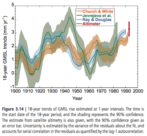
In Parts VI and VII we looked at past and projected sea level rise. It is clear that the sea level has risen over the last hundred years, and it’s clear that with more warming sea level will rise some more. The uncertainties (given a specific global temperature increase) are more around how much more ice will melt than how much the ocean will expand (warmer water expands). Future sea level rise will clearly affect some people in the future, but very differently in different countries and regions. This article considers the US.
A month or two ago, via a link from a blog, I found a paper which revised upwards a current calculation (or average of such calculations) of damage due to sea level rise in 2100 in the US. Unfortunately I can’t find the paper, but essentially the idea was people would continue moving to the ocean in ever increasing numbers, and combined with possible 1m+ sea level rise (see Part VI & VII) the cost in the US would be around $1TR (I can’t remember the details but my memory tells me this paper concluded costs were 3x previous calculations due to this ever increasing population move to coastal areas – in any case, the exact numbers aren’t important).
Two examples that I could find (on global movement of people rather than just in the US), Nicholls 2011:
And Anthoff et al 2010
I was struck by the “trillion dollar problem” paper and the general issues highlighted in other papers. The future cost of sea level rise in the US is not just bad, it’s extremely expensive because people will keep moving to the ocean.
So here is an obvious take on the subject that doesn’t need an IAM (integrated assessment model).. Perhaps lots of people missed the IPCC TAR (third assessment report) in 2001. Perhaps anthropogenic global warming fears had not reached a lot of the population. Maybe it didn’t get a lot of media coverage. But surely no could have missed Al Gore’s movie. I mean, I missed it from choice, but how could anyone in rich countries not know about the discussion?
So anyone since 2006 (arbitrary line in the sand) who bought a house that is susceptible to sea level rise is responsible for their own loss that they incur around 2100. That is, if the worst fears about sea level rise play out, combined with more extreme storms (subject of a future article) which create larger ocean storm surges, their house won’t be worth much in 2100.
Now, barring large increases in life expectancy, anyone who bought a house in 2005 will almost certainly be dead in 2100. There will be a few unlucky centenarians.
Think of it as an estate tax. People who have expensive ocean-front houses will pass on their now worthless house to their children or grandchildren. Some people love the idea of estate taxes – in that case you have a positive. Some people hate the idea of estate taxes – in that case strike it up as a negative. And, drawing a long bow here, I suspect a positive correlation between concern about climate change and belief in the positive nature of estate taxes, so possibly it’s a win-win for many people.
Now onto infrastructure.
From time to time I’ve had to look at depreciation and official asset life for different kinds of infrastructure and I can’t remember seeing one for 100 years. 50 years maybe for civil structures. I’m definitely not an expert. That said, even if the “official depreciation” gives something a life of 50 years, much is still being used 150 years later – buildings, railways, and so on.
So some infrastructure very close to the ocean might have to be abandoned. But it will have had 100 years of useful life and that is pretty good in public accounting terms.
Why is anyone building housing, roads, power stations, public buildings, railways and airports in the US in locations that will possibly be affected by sea level rise in 2100? Maybe no one is.
So the cost of sea level rise for 2100 in the US seems to be a close to zero cost problem.
These days, if a particular area is recognized as a flood plain people are discouraged from building on it and no public infrastructure gets built there. It’s just common sense.
Some parts of New Orleans were already below sea level when Hurricane Katrina hit. Following that disaster, lots of people moved out of New Orleans to a safer suburb. Lots of people stayed. Their problems will surely get worse with a warmer climate and a higher sea level (and also if storms gets stronger – subject of a future article). But they already had a problem. Infrastructure was at or below sea level and sufficient care was not taken of their coastal defences.
A major problem that happens overnight, or over a year, is difficult to deal with. A problem 100 years from now that affects a tiny percentage of the land area of a country, even with a large percentage (relatively speaking) of population living there today, is a minor problem.
Perhaps the costs of recreating current threatened infrastructure a small distance inland are very high, and the existing infrastructure would in fact have lasted more than 100 years. In that case, people who believe Keynesian economics might find the economic stimulus to be a positive. People who don’t think Keynesian economics does anything (no multiplier effect) except increase taxes, or divert productive resources into less productive resources will find it be a negative. Once again, drawing a long bow, I see a correlation between people more concerned about climate change also being more likely to find Keynesian economics a positive. Perhaps again, there is a win-win.
In summary, given the huge length of time to prepare for it, US sea level rise seems like a minor planning inconvenience combined with an estate tax.
Articles in this Series
Impacts – I – Introduction
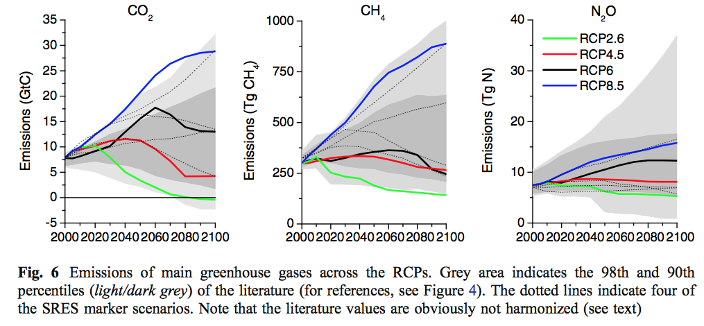
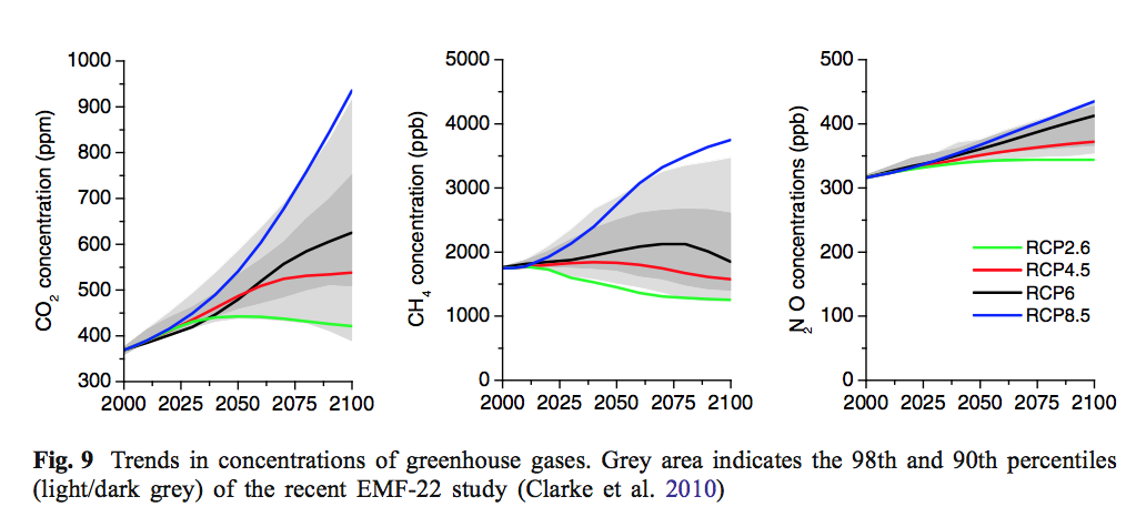
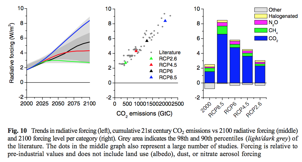
Impacts – II – GHG Emissions Projections: SRES and RCP
Impacts – III – Population in 2100
Impacts – IV – Temperature Projections and Probabilities
Impacts – V – Climate change is already causing worsening storms, floods and droughts
Impacts – VI – Sea Level Rise 1
Impacts – VII – Sea Level 2 – Uncertainty
References
Planning for the impacts of sea level rise, RJ Nicholls, Oceanography (2011)
The economic impact of substantial sea-level rise, David Anthoff et al, Mitig Adapt Strateg Glob Change (2010)
Read Full Post »