Feeds:
Posts
Comments

Archive for February, 2010

General Circulation Models or Global Climate Models – aka GCMs – often have a bad reputation outside of the climate science community. Some of it isn’t deserved. We could say that models are misunderstood.

Before we look at models on the catwalk, let’s just consider a few basics

Introduction

In an earlier series, CO2 – An Insignificant Trace Gas we delved into simpler numerical models. These were 1d models. They were needed to solve the radiative transfer equations through a vertical column in the atmosphere. There was no other way to solve the equations – and that’s the case with most practical engineering and physics problems.

Here’s a model from another world:

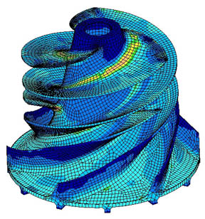
Stress analysis in an impeller

Stress analysis in an impeller

Here’s a visualization of “finite element analysis” of stresses in an impeller. See the “wire frame” look, as if the impeller has been created from lots of tiny pieces?

In this totally different application, the problem of calculating the mechanical stresses in the unit is that the “boundary conditions” – the strange shape – make solving the equations by the usual methods of re-arranging and substitution impossible. Instead what happens is the strange shape is turned into lots of little cubes. Now the equations for the stresses in each little cube are easy to calculate. So you end up with 1000’s of “simultaneous” equations. Each cube is next to another cube and so the stress on each common boundary is the same. The computer program uses some clever maths and lots of iterations to eventually find the solution to the 1000’s of equations that satisfy the “boundary conditions”.

Finite element analysis is used successfully in lots of areas of practical problem solving, many orders simpler of course, than GCMs.

Uses of Models

One use of models is to predict, no project, future climate scenarios. That’s the one that most people are familiar with. And to supply the explanation for recent temperature increases.

But models have more practical uses. They are the only way to provide quantitative analysis of certain situations we want to consider. And they are the only way to test our understanding of the causes of past climate change.

Analysis

On this blog one commenter asked about how much equivalent radiative forcing would be present if all the Arctic sea ice was gone. That is, with no sea ice, there is less reflection of solar radiation. So more absorption of energy – how do we calculate the amount?

You can start with a very basic idea and just look at the total area of Arctic sea ice as a proportion of the globe, and look at the local change in albedo from around 0.5-0.8 down to 0.03-0.09, multiply by the current percentage area in sea ice to find a number in terms of the change in total albedo of the earth. You can turn that into the change in radiation.

But then you think a little bit deeper and want to take into account the fact that solar radiation is at a much lower angle in the Arctic so the first number you got probably overstated the effect. So now, even without any kind of GCM, you can simply use the equation for the reduction in solar insolation due to the effective angle between the sun and the earth:

I = S cos θ – but because this angle, θ, changes with time of day and time of year for any given latitude you have to plug a straightforward equation into a maths program and do a numerical integration. Or write something up in Visual Basic or whatever your programming language of choice is. Even Excel might be able to handle it.

This approach also gives the opportunity to introduce the dependence of the ocean’s albedo on the angle of sunlight (the albedo of ocean with the sun directly overhead is 0.03 and with the sun almost on the horizon is 0.09).

This will give you a better result. But now you start thinking about the fact that the sun’s rays are travelling in a longer path through the atmosphere because of the low angle in the sky.. how to incorporate that? Is it insignificant or highly significant? Perhaps including or not including this effect would change the “radiative forcing” by a factor of two? (I have no idea).

So if you wanted to quantify the positive feedback effect of melting ice your “model” starts requiring a lot more specifics. Atmospheric absorption by O2 and O3 depending on the angle of the sun. And the model should include the spatial profile of O3 in the stratosphere (i.e., is there less at the poles, or more).

It’s only by doing these calculations that the effect of sea ice albedo can be reliably quantified. So your GCM is suddenly very useful – essential in fact.

Without it, you would simply be doing the same calculations very laboriously, slowly and less accurately on pieces of paper. A bit like how an accounts department used to work before modern PCs and spreadsheets. Now one person in finance can do the job of 10 or 20 people from a few decades ago. Without an accountant someone can just change an exchange rate, or an input cost on a well-created spreadsheet and find out the change in cash-flow, P&L and so on. Armies of people would have been needed before to work out the answers.

And of course, the beauty of the GCM is that you can play around with other factors and find out what effect they have. The albedo of the ocean also changes with waves. So you can try some limits between albedo with no waves and all waves and see the change. If it’s significant then you need a parameter that tells you how calm or stormy the ocean is throughout the year. And if you don’t have that data, you have some idea of the “error”.

Everyone wants their own GCM now..

Of course, in that thought experiment about sea ice albedo we haven’t calculated a “final” answer. Other effects will come into play (clouds).. But as you can see with this little example, different phenomena can be progressively investigated and reasonably quantified.

Past Climate

Do we understand the causes of past climate change or not? Do the Milankovitch cycles actually explain the end of the last ice age, or the start of it?

This is another area where models are invaluable. Without a GCM, you are just guessing. Perhaps with a GCM you are guessing as well, but just don’t know it.. A topic for another day.

Common Misconception

The idea floats around that models have “positive feedback” plugged into them. Positive feedback for those few who don’t understand it.. increases in temperature from CO2 will induce more changes (like melting Arctic sea ice) that increase temperature further.

Unless it’s done very secretly, this isn’t the case. The positive feedbacks are the result of the model’s output.

The models have a mixed bag of:

  • fundamental equations – like conservation of energy, conservation of momentum
  • parameterizations – for equations that are only empirically known, or can’t be easily solved in the “grid” that makes up the 3d “mesh” of the GCM

More on these important points in the next post.

“Necessary but Not Sufficient”

A last comment before we see them on the catwalk – the catwalk “retrospective” – is that models matching the past is a necessary but not sufficient condition for them to match the future. However, it is – or it would be – depending on what we find.. a great starting point.

Models On the Catwalk

20th century temperature hindcast vs actual - ensemble

20th century temperature hindcast vs actual - ensemble

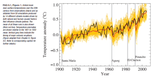
Most people have seen this graph. It comes from the IPCC AR4 (2007).

The IPCC comment:

Models can also simulate many observed aspects of climate change over the instrumental record. One example is that the global temperature trend over the past century (shown in Figure 1) can be modeled with high skill when both human and natural factors that influence climate are included.
And a little later:

In summary, confidence in models comes from their physical basis, and their skill in representing observed climate and past climate changes. Models have proven to be extremely important tools for simulating and understanding climate, and there is considerable confidence that they are able to provide credible quantitative estimates of future climate change, particularly at larger scales. Models continue to have significant limitations, such as in their representation of clouds, which lead to uncertainties in the magnitude and timing, as well as regional details, of predicted climate change. Nevertheless, over several decades of model development, they have consistently provided a robust and unambiguous picture of significant climate warming in response to increasing greenhouse gases.

Now of course, this is a hindcast. Looking backwards. One way to think about a hindcast is that it’s easy to tweak the results to match the past. That’s partly true and, of course, that’s how the model gets improved- until it can match the past.

The other way to think about the hindcast is that it’s a good way to test the model and find out how accurate it is.

The model gets to “past predict” many different scenarios. So if someone could tweak a model so that it accurately ran temperature patterns, rainfall patterns, ocean currents, etc – if it can be tweaked so that everything in the past is accurate – how can that be a bad thing? Also the model “tweaker” can change a parameter but it doesn’t give the flexibility that many would think. Let’s suppose you want to run the model to calculate average temperatures from 1980-1999 (see below) so you put your start conditions into the model, which are values for 1980 for temperature and all other “process variables” and crank up the model.

It’s not like being able to fix up a painting with a spot of paint in the right place – it’s more like tuning an engine and hoping you win the Dhaka rally. After you blew the engine halfway through you get to do a rebuild and guess what to change next. Well, analogies – just illustrations..

Obviously, these results would need to be achieved by equations and parameterizations that matched the real world. If “tweaking” requires non-physical laws then that would create questions. Well, more on this also in later posts.

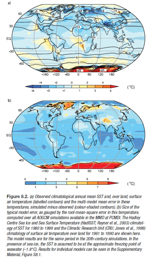
More model shots.. The top graphic is the one of interest. This is actual temperature (average 1980-1999) in contours with the shading denoting the model error (actual minus model values). Light blue and light orange (or is it white?) are good..

Actual 1980-1999 temperature and Model error from actual

Actual 1980-1999 temperature with shading denoting model error (top graphic)

The model error is not so bad. Not perfect though. (Note that for some reason, not explained, the land temperature average is over a different time period than sea surface temperatures).

Temperature range:

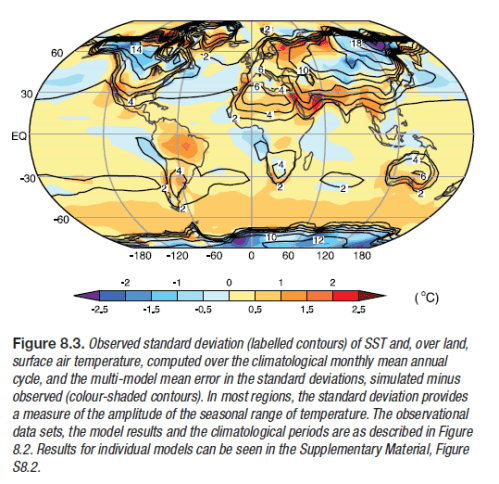
1980-1999 Temperature range in each location and Model error in temperature range

1980-1999 Temperature range in each location and Model error in temperature range

The standard deviation in temperature gives a measure of the range of temperatures experienced. The colors on the globe indicate the difference between the observed and simulated standard deviation of temperatures.

Simplifying, the light blue and light orange areas are where the models are best at working out the monthly temperature range. The darker colors are where the models are worse. Looks pretty good.

Rainfall:

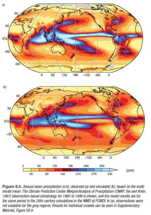
Actual Rainfall vs Model Rainfall, 1980-99

Actual Rainfall vs Model Rainfall, 1980-99

This one is awesome. Remember that rainfall is calculated by physical processes. Temperature, available water sources, clouds, temperature changes, winds, convection..

Ocean temperature:

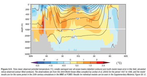
Ocean potential temperature and model error 1957-1990

Ocean potential temperature and model error 1957-1990

Ocean potential temperature, what’s that? Think of it as the real temperature with unstable up and down movements factored out, or read about potential temperature.. Note that the contours are the measurements (averaged over 34 years) and the shaded colors are the deviations of actual – model. So once again the light blue and light orange are very close to reality, the darker colors are further away from reality.

This one you would expect to be easier to get right than rainfall, but still, looking good.

Conclusion

It’s just the start of the journey into models. There will be more, next we will look at Models Off the Catwalk. So if you have comments it’s perhaps not necessary to write your complete thoughts on past climate, chaos.. Interesting, constructive and thoughtful comments are welcome and encouraged, of course. As are questions.

Hopefully, we can avoid the usual bunfight over whether the last ten years actual match the model’s predictions. Other places are so much better for those “discussions”..

Update – Part Two now published.
Read Full Post »

New Theory Proves AGW Wrong!

I did think about starting this post by pasting in some unrelated yet incomprehensible maths that only a valiant few would recognize, and finish with:

And so, the theory is overturned

But that might have put off many readers from making it past the equations, which would have been a shame, even though the idea was amusing.

From time to time new theories relating to, and yet opposing, the “greenhouse” effect or something called AGW, get published in a science journal somewhere and make a lot of people happy.

What is the theory of AGW?

If we are going to consider a theory, then at the very least we need to understand what the theory claims. It’s also a plus to understand how it’s constructed, what it relies on and what evidence exists to support the theory. We also should understand what evidence would falsify the theory.

AGW usually stands for anthropogenic global warming or the idea the humans, through burning of fossil fuels and other activities have added to the CO2 in the atmosphere, thereby increased the “greenhouse” effect and warmed the planet. And the theory includes that the temperature rise over the last 100 years or so is largely explained by this effect, and further increases in CO2 will definitely lead to further significant temperature rises.

So far on this blog I haven’t really mentioned AGW, until now. A few allusions here and there. One very minor non-specific claim at the end of Part Seven.

And yet there is a whole series on CO2 – An Insignificant Trace Gas? where the answer is “no, it’s not insignificant”.

Doesn’t that support AGW? Isn’t the theory of “greenhouse” gases the same thing as AGW?

The concept that some gases in the atmosphere absorb and then re-radiate longwave radiation is an essential component of AGW. It is one foundation. But you can accept the “greenhouse gas” theory without accepting AGW. For example, John Christy, Roy Spencer, Richard Lindzen, and many more.

Suppose during the next 12 months the climate science community all start paying close attention to the very interesting theory of Svensmart & Friis-Christensen who propose that magnetic flux changes from the sun induce cloud formation and thereby changing the climate in much more significant ways than greenhouse gases. Perhaps the climate scientists all got bored with their current work, or perhaps some new evidence or re-analysis of the data showed that it was too strong a theory to ignore. Other explanations for the same data just didn’t hold up.

By the end of that 12 months, suppose that a large part of the climate science community were nodding thoughtfully and saying “this explains all the things we couldn’t explain before and in fact fits the data better than the models which use greenhouse gases plus aerosols etc“.  (It’s a thought experiment..)

Well, the theory of AGW would be, if not dead, “on the ropes”. And yet, the theory that some gases in the atmosphere absorb and re-radiate longwave radiation would still be alive and well. The radiative transfer equations (RTE) as presented in the CO2 series would still hold up. And the explanations as to how much energy CO2 absorbed and re-radiated versus water vapor would not have changed a jot.

That’s because AGW is not “the greenhouse gas” theory. The “greenhouse gas” theory is an important and essential building block for AGW. It’s foundational atmospheric physics.

Many readers know this, of course, but some visitors may be confused over this point. Overturning the “greenhouse” theory would require a different approach. And in turn, that theory is based on a few elements each of which are very strong, but perhaps one could fall, or new phenomena could be found which affected the way these elements came together. It’s all possible.

So it is essential to understand what theory we are talking about. And to understand what that theory actually says, and what in turn, it depends on.

A Digression about the Oceans

Analogies prove nothing, they are illustrations. This analogy may be useful.

Working out the 3d path of the oceans around the planet is a complex task. You can read a little about some aspects of ocean currents in Predictability? With a Pinch of Salt please.. Computer models which attempt to calculate some aspects of the volume of warm water flowing northwards from the tropics to Northern Europe and then the cold water flowing southwards back down below struggle in some areas to get the simulated flow of water anywhere near close to the measured values (at least in the papers I was reading).

Why is that? The models use equations for conservation of momentum, conservation of angular momentum and density (from salinity and temperature). Plus a few other non-controversial theories.

Most people reading that there is a problem probably aren’t immediately thinking:

Oh, it’s got to be angular momentum, never believed in it!

Instead many readers might theorize about the challenges of getting the right starting conditions – temperature, salinity, flow at many points in the ocean. Then being able to apply the right wind-drag, how much melt-water flowing from Greenland, how cold that is.. And perhaps how well-defined the shape of the bottom of the oceans are in the models. How fine the “mesh” is..

We don’t expect momentum and density equations to be wrong. Of course, they are just theories, someone might publish a paper which picks a hole in conservation of momentum.. and angular momentum, well, never really believed in that!

The New Paper that Proves “The Theory” Wrong!

Let’s pick a theory. Let’s pick – solving the radiative transfer equations in a standard atmosphere. In laymans terms this would include absorption and re-radiation of longwave radiation by various trace gases and the effect on the temperature profile through the atmosphere – we could call it the “greenhouse theory”.

Ok.. so a physicist has a theory that he claims falsifies our theory. Has he proven our “greenhouse theory” wrong?

We establish that, yes, he is a physicist and has done some great work in a related or similar field. That’s a good start. We might ask next?

Has the physicist published the theory anywhere?

So what we are asking is, has anyone of standing checked the paper? Perhaps the physicist has a good idea but just made a mistake. Used the wrong equation somewhere, used a minus sign where a plus sign should have been, or just made a hash of re-arranging some important equation..

Great, we find out that a journal has published the paper.

So this proves the theory is right?

Not really. It just proves that the editor accepted it for publication. There might be a few reasons why:

  • the editor is also convinced that an important theory has been overturned by the new work and is equally excited by the possibilities
  • the editor thought that it was interesting new approach to a problem that should see the light of day, even though he thinks it’s unlikely to survive close scrutiny
  • the editor is fed up with being underpaid and overworked and there aren’t enough papers being submitted
  • the editor thinks it will really wind up Gavin Schmidt and this will get him to the front of the queue quicker

Well, people are people. All we know is one more person probably thinks it is a decent approach to a problem. Or was having an off day.

For a theory to become “an accepted theory” (because even the theory of gravity is “a theory” not “a fact”) it usually takes some time to be accepted by the people who understand that field.

Sheer Stubbornness and How to be Right

The fact that it’s not accepted by the community of scientists in that discipline doesn’t mean it’s wrong. People who have put their life’s work behind a theory are not going to be particularly accepting. They might die first!

How scientific theories get overturned is a fascinating subject. Those who don’t mind reading quite turgid work describing a fascinating subject might enjoy The Structure of Scientific Revolutions by Thomas Kuhn. No doubt there are more fun books that others can recommend.

The new theory might be right and it might be wrong. The fact that it’s been published somewhere is only the first step on a journey. If being published was sufficient then what to make of opposing papers that both get published?

Why Papers which Prove “it’s all wrong” are Celebrated

Many people are skeptical of the AGW theory.

Some are skeptical of “greenhouse gas” theory. Some accept that theory in essence but are skeptical of the amount that CO2 contributes to the “greenhouse” gas effect.

Some didn’t realize there was a difference..

If you are skeptical about something and someone with credentials agrees with you, it’s a breath of fresh air! Of course, it’s natural to celebrate.

But it’s also important to be clear.

If, for example, you celebrate Richard Lindzen’s concept as put forward in Lindzen & Choi (2009) then you probably shouldn’t be celebrating Miskolczi’s paper. And if you celebrated either of those, you shouldn’t be celebrating Gerlich & Tscheuschner because they will be at odds with the previous ones (as far as I can tell). And if you like Roy Spencer’s work, he is at odds this all of these.

Now, please don’t get me wrong, I don’t want to attack anyone’s work. Lindzen and Choi’s paper is very interesting although I had a lot of questions about it and maybe will get an opportunity at some stage to explain my thoughts. And of course, Professor Lindzen is a superstar physicist.

Miskolczi’s paper confused me and I put it aside to try and read it again – update April 2011, some major problems as explained in The Mystery of Tau – Miskolczi and the following two parts. And I thought it might be easier to understand the evidence that would falsify that theory (and then look for it) than lots of equations. Someone just pointed me to Gerlich & Tscheuschner so I’m not far into it. Perhaps it’s the holy grail – update, full of huge errors as explained in On the Miseducation of the Uninformed by Gerlich and Tscheuschner (2009).

And Lindzen and Choi’s is in a totally different category which is why I introduced it. Widely celebrated as proving the death of AGW beyond a shadow of doubt by the illustrious and always amusing debater Christopher Monckton, they aren’t at odds with “greenhouse gas” theory. They are at odds with the feedback resulting from an increase in “radiative forcing” from CO2 and other gases. They are measuring climate sensitivity. And as many know and understand, the feedback or sensitivity is the key issue.

So, if New Theory Proves AGW Wrong is an exciting subject, you will continue to enjoy the subject for many years, because I’m sure there will be many more papers from physicists “proving” the theory wrong.

However, it’s likely that if they are papers “falsifying” the foundational “greenhouse” gas effect – or radiative-convective model of the atmosphere – then probably each paper will also contradict the ones that came before and the ones that follow after.

Well, predictions are hard to make, especially about the future. Perhaps there will be a new series on this blog Why CO2 Really is Insignificant. Watch out for it.

Read Full Post »

We cover some basics in this post. The subject was inspired by one commenter on the blog.

  • When we look at a “radiative forcing” what does it mean?
  • What immediate and long-term impact does it have on temperature?
  • What is the new equilibrium temperature?

Radiative Forcing

The IPCC, drawing on the work of many physicists over the years, states that the radiative forcing from the increase in CO2 to about 380ppm is 1.7 W/m2. You can see how this is all worked out in the series CO2 – An Insignificant Trace Gas.

What is “radiative forcing”? At the top of atmosphere (TOA) there is an effective downward increase in radiation. So more energy reaches the surface than before..

Thermal Lag

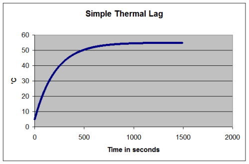
If you put very cold water in a pot and heat it on a stove, what happens? Let’s think about the situation if the water doesn’t boil because we don’t apply so much heat..

Simple Thermal Lag

Simple Thermal Lag

I used simple concepts here.

T= water temperature and the starting temperature of the water, T (t=0) = 5°C

Air temperature, T1 = 5°C

Energy in per second = constant (=1000W in this example)

Energy out per second = h x (T – T1), where h is just a constant (h=20 in this example)

And the equation for temperature increase is:

Energy per second, Q = mc.ΔT

m = mass, and c= specific heat capacity (how much heat is required to raise 1kg of that material by 1’C) – for water this is 4,200 J kg-1 K-1. I used 1kg.

ΔT is change in temperature (and because we have energy per second the result is change in temperature per second)

The simple and obvious points that we all know are:

  • the liquid doesn’t immediately jump to its final temperature
  • as the liquid gets closer to its final temperature the rate of temperature rise slows down
  • as the temperature of the liquid increases it radiates or conducts or convects more energy out, so there will be a new equilibrium temperature reached

In this case, the heat calculation is by some kind of simple conduction process. And is linearly proportional to the temperature difference between the water and the air.

It’s not a real world case but is fairly close – as always, simplifying helps us focus on the key points.

What might be less obvious until attention is drawn to it (then it is obvious) – the final temperature doesn’t depend on the heat capacity of the liquid. That only affects how long it takes to reach its equilibrium – whatever that equilibrium happens to be.

Heating the World

Suppose we take the radiative forcing of 1.7W/m2 and heat the oceans. The oceans are the major store of the climate system’s heat, around 1000x more energy stored than in the atmosphere. We’ll ignore the melting of ice which is a significant absorber of energy.

Ocean mean depth = 4km (4000m)  – the average around the world

Only 70% of the earth’s surface is covered by ocean and we are going to assume that all of the energy goes into the oceans so we need to “scale up” – energy into the oceans =  1.7/0.7 = 2.4 W/m2 going into the oceans.

The density of ocean water is approximately 1000 kg/m3 (it’s actually a little more because of salinity and pressure..)

Each square meter of ocean has a volume of 4000 m3 (thinking about a big vertical column of water), and therefore a mass of 4×10⁶ kg.

Q = mc x dT

Q is energy, m is mass, c is specific heat capacity = 4.2 kJ kg-1 K-1,
dT = change in temperature

We have energy per second (W/m2), so change in temperature per second, dT = Q/mc

dT per second = 2.4 / (4×106 x 4.2×103)

= 1.4 x10⁻¹⁰ °C/second

dT per year = 0.004 °C/yr

That’s really small! It would take 250 years to heat the oceans by 1°C..
Let’s suppose – more realistically – that only the top “well-mixed” 100m of ocean receives this heat, so we would get (just scaling by 4000m/100m):

dT per year = 0.18 ‘C per year.

An interesting result, which of course, ignores the increase in heat lost due to increased radiation, and ignores the heat lost to the lower part of the ocean through conduction.

If we took this result and plotted it on a graph the temperatures would just keep going up!

Calculating the new Equilibrium Temperature

The climate is slightly complicated. How do we work out the new equilibrium temperature?

Do we think about the heat lost from the surface of the oceans into the atmosphere through conduction, convection and radiation? Then what happens to it in the atmosphere? Sounds tricky..

Fortunately, we can take a very simple view of planet earth and say energy in = energy out. This is the “billiard ball” model of the climate, and you can see it explained in CO2 – An Insignificant Trace Gas – Part One and subsequent posts.

What this great and simple model lets us do is compare energy in and out at the top of atmosphere (TOA). Which is why “radiative forcing” from CO2 is “published” at TOA. It helps us get the big picture.

Energy radiated from a body per unit area per second is proportional to T4, where T is temperature in Kelvin (absolute temperature). Energy radiated from the earth has to be balanced by energy we absorb from the sun.

This lets us do a quick comparison, using some approximate numbers.

Energy absorbed from the sun, averaged over the surface of the earth, we’ll call it Pold = 239 W/m2.

Surface temperature, we’ll call it Told = 15°C = 288K

If we add 1.7W/m2 at TOA what does this do to temperature? Well, we can simply divide the old and new values, making the equation slightly easier..

(Tnew/Told)4 =Pnew/Pold

So Tnew=288 x (239+1.7/239)1/4

Therefore, Tnew = 288.5K or 15.5°C   – a rise of 0.5°C

I don’t want to claim this represents some kind of complete answer, but just for some element of completeness, if we redo the calculation with the radiative forcing for all of the “greenhouse” gases, excluding water vapor, we have a radiative forcing of 2.4W/m2.

Tnew = 288.7 or 15.7°C   – a rise of 0.7°C.

(Note for the purists, I believe the only way to actually calculate the old and new surface temperature is using the complete radiative transfer equations, but the results aren’t so different)

Conclusion

The aim of this post is to clarify a few basics, and in the process we looked at how quickly the oceans might warm as a result of increased radiative forcing from CO2.

It does demonstrate that depending on how well-mixed the oceans are, the warming can be extremely slow (250 years for 1°C rise) or very quick (5 years for 1°C rise).

So from the information presented so far, temperatures we currently experience at the surface might be the new equilibrium from increased CO2, or a long way from it – this post doesn’t address that huge question! Or any feedbacks.

What we ignored in the calculation of temperature rise was the increased energy lost as the temperature rose – which would slow the rise down (like the heated water in the graph). But at least it’s possible to get a starting point.

We can also see a rudimentary calculation of the final increase in temperature – the new equilibrium – as a result of this forcing (we are ignoring any negative or positive feedbacks).

And the new equilibrium doesn’t depend on the thermal lag of the oceans.

Of course, calculations of feedback effects in the real climate might find thermal lag parameters to be extremely important.

Read Full Post »

In the series CO2 – An Insignificant Trace Gas? we concluded (in Part Seven!) with the values of “radiative forcing” as calculated for the current level of CO2 compared to pre-industrial levels.

That value is essentially a top of atmosphere (TOA) increase in longwave radiation. The value from CO2 is 1.7 W/m2. And taking into account all of the increases in trace gases (but not water vapor) the value totals 2.4 W/m2.

Comparing Radiative Forcing

The concept of radiative forcing is a useful one because it allows us to compare different first-order effects on the climate.

The effects aren’t necessarily directly comparable because different sources have different properties – but they do allow a useful first pass or quantitative comparison. When we talk about heating something, a Watt is a Watt regardless of its source.

But if we look closely at the radiative forcing from CO2 and solar radiation – one is longwave and one is shortwave. Shortwave radiation creates stratospheric chemical effects that we won’t get from CO2. Shortwave radiation is distributed unevenly – days and nights, equator and poles – while CO2 radiative forcing is more evenly distributed. So we can’t assume that the final effects of 1 W/m2 increase from the two sources are the same.

But it helps to get some kind of perspective. It’s a starting point.

The Solar “Constant”, now more accurately known as Total Solar Irradiance

TSI has only been directly measured since 1978 when satellites went into orbit around the earth and started measuring lots of useful climate values directly. Until it was measured, solar irradiance was widely believed to be constant.

Prior to 1978 we have to rely on proxies to estimate TSI.

Earth from Space

Earth from Space - pretty but irrelevant..

Accuracy in instrumentation is a big topic but very boring:

  • absolute accuracy
  • relative accuracy
  • repeatability
  • long term drift
  • drift with temperature

These are just a few of the “interesting” factors along with noise performance.

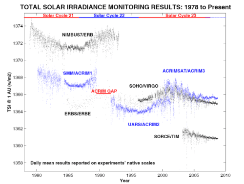
We’ll just note that absolute accuracy – the actual number – isn’t the key parameter of the different instruments. What they are good at measuring accurately is the change. (The differences in the absolute values are up to 7 W/m2, and absolute uncertainty in TSI is estimated at approximately 4 W/m2).

So here we see the different satellite measurements over 30+ years. The absolute results here have not been “recalibrated” to show the same number:

Total Solar Irradiation, as measured by various satellites

Total Solar Irradiation, as measured by various satellites

We can see the solar cycles as the 11-year cycle of increase and decrease in TSI.

One item of note is that the change in annual mean TSI from minimum to maximum of these cycles is less than 0.08%, or less than 1.1 W/m2.

In The Earth’s Energy Budget we looked at “comparing apples with oranges” – why we need to convert the TSI or solar “constant” into the absorbed radiation (as some radiation is reflected) averaged over the whole surface area.

This means a 1.1 W/m2 cyclic variation in the solar constant is equivalent to 0.2 W/m2 over the whole earth when we are comparing it with say the radiative forcing from extra CO2 (check out the Energy Budget post if this doesn’t seem right).

How about longer term trends? It seems harder to work out as any underlying change is the same order as instrument uncertainties. One detailed calculation on the minimum in 1996 vs the minimum in 1986 (by R.C. Willson, 1998) showed an increase of 0.5 W/m2 (converting that to the “radiative forcing” = 0.09 W/m2). Another detailed calculation of that same period showed no change.

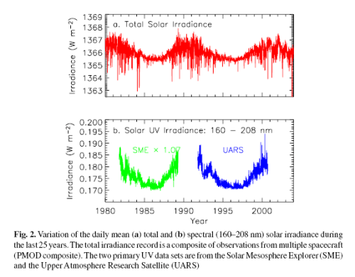
Here’s a composite from Fröhlich & Lean (2004) – the first graphic is the one of interest here:

Composite TSI from satellite, 1978-2005, Frohlich & Lean

Composite TSI from satellite, 1978-2004, Frohlich & Lean

As you can see, their reanalysis of the data concluded that there hasn’t been any trend change during the period of measurement.

Proxies

What can we work out without satellite data – prior to 1978?

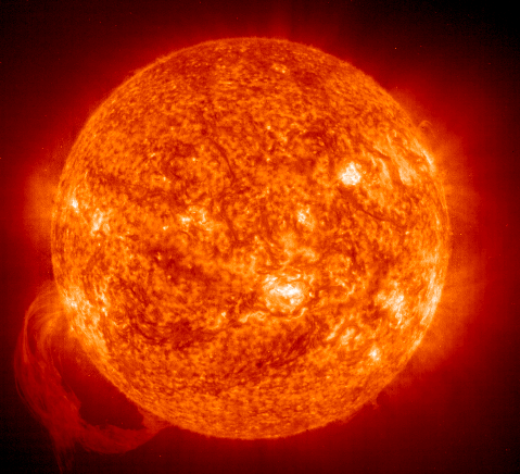
The Sun

The Sun

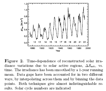
The historical values of TSI have to be estimated from other data. Solanski and Fligge (1998) used the observational data on sunspots and faculae (“brightspots”) primarily from the Royal Greenwich Observatory dating to back to 1874. They worked out a good correlation between the TSI values from the modern satellite era with observational data and thereby calculated the historical TSI:

Reconstruction of changes in TSI, Solanski & Fligge

Reconstruction of changes in TSI, Solanski & Fligge

As they note, these kind of reconstructions all rely on the assumption that the measured relationships have remained unchanged over more than a century.

They comment that depending on the reconstructions, TSI averaged over its 11-year cycle has varied by 0.4-0.7W/m2 over the last century.

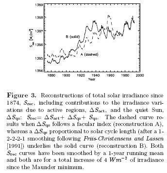
Then they do another reconstruction which includes changes that take place in the “quiet sun” periods – because the reconstruction above is derived from observations of active regions –  in part from data comparing the sun to similar stars.. They comment that this method has more uncertainty, although it should be more complete:

Second reconstruction of TSI back to 1870, Solanski & Fligge

Second reconstruction of TSI back to 1870, Solanski & Fligge

This method generates an increase of 2.5 W/m2 between 1870 and 1996. Which again we have to convert to a radiative forcing of 0.4 W/m2

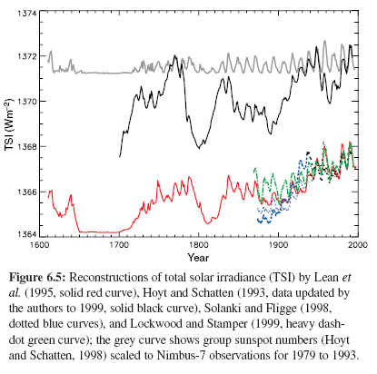
The IPCC summary (TAR 2001), p.382, provides a few reconstructions for comparison, including the second from Solanski and Fligge:

Reconstructions of TSI back to 1600, IPCC (2001)

Reconstructions of TSI back to 1600, IPCC (2001)

And then bring some sanity:

Thus knowledge of solar radiative forcing is uncertain, even over the 20th century and certainly over longer periods.

They also describe our level of scientific understanding (of the pre-1978 data) as “very low”.

The AR4 (2007) lowers some of the historical changes in TSI commenting on updated work in this field, but from an introductory perspective the results are not substantially changed.

Second Order Effects

This post is all about the first-order forcing due to solar radiation – how much energy we receive from the sun.

There are other theories which rely on relationships like cloud formation as a result of fluctuations in the sun’s magnetic flux – Svensmart & Friis-Christensen. These would be described as “second-order” effects – or feedback.

These theories are for another day.

First of all, it’s important to establish the basics.

Conclusion

We can see from satellite data that the cyclic changes in Total Solar Irradiance over the last 30 years are small. Any trend changes are small enough that they are hard to separate from instrument errors.

Once we go back further, it’s an “open field”. Choose your proxies and reconstruction methods and wide ranging numbers are possible.

When we compare the known changes (since 1978) in TSI we can directly compare the radiative forcing with the “greenhouse” effect and that is a very useful starting point.

References

Solar radiative output and its variability: evidence and mechanisms, Fröhlich & Lean, Astrophysics Review (2004)

Solar Irradiance since 1874 Revisited, Solanski & Fligge, Geophysical Research Letters (1998)

Total Solar Irradiance Trend During Solar Cycles 21 and 22, R.C.Willson, Science (1997)

Read Full Post »

Recap

In Part Five we finally got around to seeing our first calculations by looking at two important papers which used “numerical methods” – 1-dimensional models – to calculate the first order effect from CO2. And to separate out the respective contribution of water vapor and CO2.

Both papers were interesting in their own way.

The 1978 Ramanathan and Coakley paper because it is the often cited paper as the first serious calculation. And it’s good to see the historical perspective as many think scientists have been looking around for an explanation of rising temperatures and “hit on” CO2. Instead, the radiative effect of CO2, other trace gases and water vapor has been known for a very long time. But although the physics was “straightforward”, solving the equations was more challenging.

The 1997 Kiehl and Trenberth paper was discussed because they separate out water vapor from CO2 explicitly. They do this by running the numerical calculations with and without various gases and seeing the effects. We saw that water vapor contributed around 60% with CO2 around 26%.

I thought the comparison of CO2 and water vapor was useful to see because it’s common to find people nodding to the idea that longwave from the earth is absorbed and re-emitted back down (the “greenhouse” effect) – but then saying something like:

Of course, water vapor is 95%-98% of the whole effect, so even doubling CO2 won’t really make much difference

The question to ask is – how did they work it out? Using the complete radiative transfer equations in a 1-d numerical model with the spectral absorption of each and every gas?

Of course, everyone’s entitled to their opinion.. it’s just not necessarily science.

The “Standardized Approach”

In the calculations of the “greenhouse” effect for CO2, different scientists approached the subject slightly differently. Clear skies and cloudy skies, for example. Different atmospheric profiles. Some feedback from the stratosphere (higher up in the atmosphere), or not. Some feedback from water vapor, or not. Different band models (see Part Four). And also different comparison points of CO2 concentrations.

As the subject of the exact impact of CO2 – prior to any feedbacks – became of more and more concern, a lot of effort went into standardizing the measurement/simulation conditions.

One of the driving forces behind this was the fact that many different GCMs (Global Climate Models) produced different results and it was not known how much of this was due to variations in the “first order forcing” of CO2. (“First order forcing” means the effect before any feedbacks are taken into account). So different models had to be compared and, of course, this required some basis of comparison.

There was also the question about how good band models were in action compared with line by line (LBL) calculations. LBL calculations require a huge computational effort because the minutiae of every absorption line from every gas has to be included. Like this small subset of the CO2 absorption lines:

CO2 spectral lines from one part of the 15um band

From "Handbook of Atmospheric Sciences", Hewitt & Jackson 2003

Band models are much simpler, and therefore widely used in GCMs. Band models are “paramaterizations”, where a more complex effect is turned into a simpler equation that is easier to solve.

Averaging

Does one calculation of CO2 radiative forcing from an “average atmosphere” gives us the real result for the whole planet?

Asking the question another way, if we calculate the CO2 radiative forcings from all the points around the globe and average the radiative forcing do we get the same result as one calculation for the “average atmosphere”.

This subject was studied in a 1998 paper: Greenhouse gas radiative forcing: Effects of average and inhomogeneities in trace gas distribution, by Freckleton et al. They ran the same calculations with 1 profile (the “standard atmosphere”), 3 profiles (one tropical plus a northern and southern extra-tropical “standard atmosphere”), and then by resolving the globe into ever finer sections.

The results were averaged (except the single calculation of course) and plotted out. It was clear from this research that using the average of 3 profiles – tropical, northern and southern extra-tropics – was sufficient and gave only 0.1% error compared with averaging the calculation at 2.5% resolution in latitude.

The Standard Result

The standard definition of radiative forcing is:

The change in net (down minus up) irradiance (solar plus longwave; in W/m2) at the tropopause after allowing for stratospheric temperatures to readjust to radiative equilibrium, but with surface and tropospheric temperatures and state held fixed at the unperturbed values.

What does it mean? The extra incoming energy flow at the top of atmosphere (TOA) without feedbacks from the surface or the troposphere (lower part of the atmosphere). The stratospheric adjustment is minor and happens almost immediately (there are no oceans to heat up or ice to melt in the stratosphere unlike at the earth’s surface). Later note added – “almost immediately” in the context of the response of the surface, but the timescale is the order of 2-3 months.

The common CO2 doubling scenario, from pre-industrial, is:

278ppm -> 556 ppm

And the comparison to the present day, of course, depends on when the measurement occurs but most commonly uses the 278ppm value as a comparison.

IPCC AR4 (2007)  pre-industrial to the present day (2005),  1.7 W/m2

IPCC AR4 (2007)  doubling CO2,  3.7 W/m2

Just for interest.. Myhre at al (1998) calculated the effects of CO2 – and 12 other trace gases – from the current increases in those gases (to 1995). They calculated separate results for clear sky and cloudy sky. Clear sky results are useful in comparisons between models as clouds add complexity and there are more assumptions to untangle.

They also ran the calculations using the very computationally expensive Line by Line (LBL) absorption, and compared with a Narrow Band Model (NBM) and Broad Band Model (BBM).

CO2 current (1995) compared to pre-industrial, clear sky – 1.76W/m2, cloudy sky 1.37W/m2

(The NBM and BBM were within a few percent of the LBL calculations).

There are lots of other papers looking at the subject. All reach similar conclusions, which is no surprise for such a well-studied subject.

Where does the IPCC Logarithmic Function come from?

The 3rd assessment report (TAR) and the 4th assessment report (AR4) have an expression showing a relationship between CO2 increases and “radiative forcing” as described above:

ΔF = 5.35 ln (C/C0)

where:

C0 = pre-industrial level of CO2 (278ppm)
C = level of CO2 we want to know about
ΔF = radiative forcing at the top of atmosphere.

(And for non-mathematicians, ln is the “natural logarithm”).

This isn’t a derived expression which comes from simplifying down the radiative transfer equations in one fell swoop!

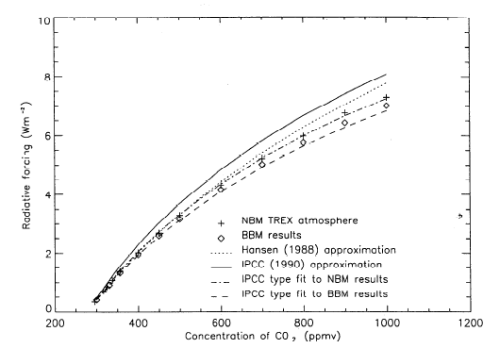
Instead, it comes from running lots of values of CO2 through the standard 1d model we have discussed, and plotting the numbers on a graph:

Radiative Forcing vs CO2 concentration, Myhre et al (1998)

Radiative Forcing vs CO2 concentration, Myhre et al (1998)

From New estimates of radiative forcing due to well mixed greenhouse gases, Myhre et al, Geophysical Research Letters (1998).

The graph reasonably closely approximates to the equation above. It’s very useful because it enables people to do a quick calculation.

E.g. CO2 = 380ppm, ΔF = 1.7W/m2

CO2 = 556ppm, ΔF = 3.7 W/m2

Easy.

Benefit of Using “Radiative Forcing” at TOA (top of atmosphere)

First of all, we can use this number to calculate a very basic temperature increase at the surface. Prior to any feedbacks – or can we? [added note, James McC kindly pointed out that my calculation of temperature is wrong and so maybe it is too simplistic to use this method when there is an absorbing and re-transmitting atmosphere in the way. I abused this approach myself rather than following any standard work. All errors are mine in this bit – we’ll let it stand for interest. See James McC’s comments in About this Blog)

In Part One of this series, in the maths section at the end (to spare the non-mathematically inclined), we looked at the Stefan-Boltzmann equation, which shows the energy radiated from any “body” at a given temperature (in K):

Total energy per unit area per unit time, j = εσT4

where ε= emissivity (how close to a “blackbody”: 0-1), σ=5.67×10⁻⁸ and T = absolute temperature (in K).

The handy thing about this equation is that when the earth’s climate is in overall equilibrium, the energy radiated out will match the incoming energy. See The Earth’s Energy Budget – Part Two and also Part One might be of interest.

We can use the equations to do a very simple calculation of what ΔF = 3.7W/m2 (doubling CO2) means in terms of temperature increase. It’s a rough and ready approach. It’s not quite right, but let’s see what it churns out.

Take the solar incoming absorbed energy of 239W/m2 (see The Earth’s Energy Budget – Part One) and comparing the old  (only solar) – and new (solar + radiative forcing for doubling CO2 values), we get:

Tnew4/Told4 = (239 + 3.7)/239

where Tnew = the temperature we want to determine, Told = 15°C or 288K

We get Tnew = 289.1K or a 1.1°C increase.

Well, the full mathematical treatment calculates a 1.2°C increase – prior to any feedbacks – so it’s reasonably close.

[End of dodgy calculation that when recalculated is not close at all. More comments when I have them].

Secondly, we can compare different effects by comparing their radiative forcing. For example, we could compare a different “greenhouse” gas. Or we could compare changes in the sun’s solar radiation (don’t forget to compare “apples with oranges” as explained in The Earth’s Energy Budget – Part One). Or albedo changes which increase the amount of reflected solar radiation.

What’s important to understand is that the annualized globalized TOA W/m2 forcing for different phenomena will have subtly different impacts on the climate system, but the numbers can be used as a “broad-brush” comparison.

Conclusion

We can have a lot of confidence that the calculations of the radiative forcing of CO2 are correct. The subject is well-understood and many physicists have studied the subject over many decades. (The often cited “skeptics” such as Lindzen, Spencer, Christy all believe these numbers as well). Calculation of the “radiative forcing” of CO2 does not have to rely on general circulation models (GCMs), instead it uses well-understood “radiative transfer equations” in a “simple” 1-dimensional numerical analysis.

There’s no doubt that CO2 has a significant effect on the earth’s climate – 1.7W/m2 at top of atmosphere, compared with pre-industrial levels of CO2.

What conclusion can we draw about the cause of the 20th century rise in temperature from this series? None so far! How much will temperature rise in the future if CO2 keeps increasing? We can’t yet say from this series.

The first step in a scientific investigation is to isolate different effects. We can now see the effect of CO2 in isolation and that is very valuable.

Although there will be one more post specifically about “saturation” – this is the wrap up.

Something to ponder about CO2 and its radiative forcing.

If the sun had provided an equivalent increase in radiation over the 20th century to a current value of 1.7W/m2, would we think that it was the cause of the temperature rises measured over that period?

Update – CO2 – An Insignificant Trace Gas? Part Eight – Saturation is now published

References

Greenhouse gas radiative forcing: Effects of average and inhomogeneities in trace gas distribution, Freckleton at al, Q.J.R. Meteorological Society (1998)

New estimates of radiative forcing due to well mixed greenhouse gases, Myhre et al, Geophysical Research Letters (1998)


Read Full Post »

In Part One we looked at a few basic numbers and how to compare “apples with oranges” – or the solar radiation in vs the earth’s longwave radiation going out.

And in Part One I said:

Energy radiated out from the climate system must balance the energy received from the sun. This is energy balance. If it’s not true then the earth will be heating up or cooling down.

Why hasn’t the Outgoing Longwave Radiation (OLR) increased?

In a discussion on another blog when I commented about CO2 actually creating a “radiative forcing” – shorthand for “it adds a certain amount of W/m^2 at the earth’s surface” – one commenter asked (paraphrasing because I can’t remember the exact words):

If that’s true – if CO2 creates extra energy at the earth’s surface – why has OLR not increased in 20 years?

This is a great question and inspired a mental note to add a post which includes this question.

Hopefully, most readers of this blog will know the answer. And understanding this answer is the key to understanding an important element of climate science.

Energy Balance and Imbalance

It isn’t some “divine” hand that commands that Energy in = Energy out.

Instead, if energy in > energy out, the system warms up.

And conversly, if energy in < energy out, the system cools down.

So if extra CO2 increases surface temperature… pause a second… backup, for new readers of this blog:

First, check out the CO2 series if it seems like some crazy idea that CO2 in the atmosphere can increase the amount of radiation at the earth’s surface. 10,000 physicists over 100 years are probably right, but depending on what and where you have been reading I can understand the challenge..

Second, we like to use weasel words like “all other things being equal” to deal with the fact that the climate is a massive mix of cause and effect. The only way that science can usually progress is to separate out one factor at a time and try and understand it..

So, if extra CO2 increases surface temperature – all other things being equal, why hasn’t energy out of the system increased?

Because the system will accumulate energy until energy balance is restored?

More or less correct. No, definitely correct – probably an axiom – and probably describes what we see.

Higher Surface Temperature – Same OLR  – Does that make sense?

The question that the original commenter was asking was a very good one. He (or she) was trying to get something clear – if surface temperature has increased why hasn’t OLR increased?

Here’s a graphic which has caused much head scratching for non-physicists: (And I can understand why).

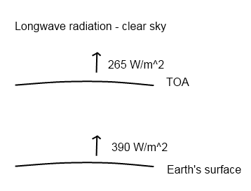
Upward Longwave Radiation, Numbers from Kiehl & Trenberth

Upward Longwave Radiation, Numbers from Kiehl & Trenberth (1997)

For those new to the blog or to climate science concepts, “Longwave” means energy originally radiated from the earth’s surface (check out CO2 – An Insignificant Trace Gas – Part One for a little more on this).

Where’s the energy going? Everyone asks.

Some of it is being absorbed and re-radiated. Of this, some is re-radiated up. No real change there. And some is re-radiated down.

The downwards radiation, which we can measure – see Part Six – Visualization, is what increases the surface temperature.

Add some CO2 – and, all other things being equal, or weasel words to that effect, there will be more absorption of longwave radiation in the atmosphere, and more re-radiation back down to the surface – so clearly, less OLR.

In fact, that’s the explanation in a nutshell. If you add CO2, as an immediate effect less longwave radiation leaves the top of atmosphere (TOA). Therefore, more energy comes in than leaves, therefore, temperatures increase.

Eventually, energy balance is restored when higher temperatures at the surface finally mean that enough longwave radiation is leaving through the top of atmosphere.

If you are new to this, you might be saying “What?

So, take a minute and read the post again. Or even – come back tomorrow and re-read it.

New concepts are hard to absorb inside five minutes.

Conclusion

This post has tried to look at energy balance from a couple of perspectives. Picture the whole climate system and think about energy in and energy out.

The idea is very illuminating.

The energy balance at TOA (top of atmosphere) is the “driver” for whether the earth heats or cools.

In the next post we will learn the annoying fact that we can’t measure the actual values accurately enough.. Which is also why even if there is an energy imbalance for an extended period, it is hard to measure.

Update – Part Three in the series on how the earth radiates energy from its atmosphere and what happens when the amount of “greenhouse” gas is increased. (And not, as promised, on measurement issues..)

Read Full Post »

Ghosts of Climates Past

For many approaching the climate debate it is a huge shock to find out how much our climate has varied in the past.

Even Prince Charles is allegedly confused about it:

Well, if it is but a myth, and the global scientific community is involved in some sort of conspiracy, why is it then that around the globe sea levels are more than six inches higher than they were 100 years ago?

Comical (and my sincere apologies to the Prince if he has been misquoted by the UK media), but unsurprising – as most people really have no idea.

Take a look at An Inconvenient Temperature Graph if you want to see how the temperature has varied over the last 150,000 and the last million years. And one graph reproduced here:

Last 1M years of global temperatures

From “Holmes’ Principles of Physical Geology” 4th Ed. 1993

The last million years are incredible. Sea levels – as best as we can tell – have moved up and down by at least 120m, possibly more.

There are two ways to think about these massive changes. Interesting how the same data can be interpreted in such different ways..

The huge changes in past climate that we can see from temperature and sea level reconstructions demonstrates that climate always changes. It demonstrates that the 20th century temperature increases are nothing unusual. And it demonstrates that climate is way too unpredictable to be accurately modeled.

Or..

The huge changes in past climate demonstrate the sensitivity nature of our climate. Small changes in solar output and minor variations in the distribution of solar energy across seasons (from minor changes in the earth’s orbit) have created climate changes that would be catastrophic today. Climate models can explain these past changes. And if we compare the radiative forcing from anthropogenic CO2 with those minor variations we see what incredible danger we have created for our planet.

One dataset.

Two reactions.

We will try and understand the ghosts of climate pasts in future articles.

Articles in this Series

Part Two – Lorenz – one point of view from the exceptional E.N. Lorenz

Part Three – Hays, Imbrie & Shackleton – how everyone got onto the Milankovitch theory

Part Four – Understanding Orbits, Seasons and Stuff – how the wobbles and movements of the earth’s orbit affect incoming solar radiation

Part Five – Obliquity & Precession Changes – and in a bit more detail

Part Six – “Hypotheses Abound” – lots of different theories that confusingly go by the same name

Part Seven – GCM I – early work with climate models to try and get “perennial snow cover” at high latitudes to start an ice age around 116,000 years ago

Part Seven and a Half – Mindmap – my mind map at that time, with many of the papers I have been reviewing and categorizing plus key extracts from those papers

Part Eight – GCM II – more recent work from the “noughties” – GCM results plus EMIC (earth models of intermediate complexity) again trying to produce perennial snow cover

Part Nine – GCM III – very recent work from 2012, a full GCM, with reduced spatial resolution and speeding up external forcings by a factors of 10, modeling the last 120 kyrs

Part Ten – GCM IV – very recent work from 2012, a high resolution GCM called CCSM4, producing glacial inception at 115 kyrs

Pop Quiz: End of An Ice Age – a chance for people to test their ideas about whether solar insolation is the factor that ended the last ice age

Eleven – End of the Last Ice age – latest data showing relationship between Southern Hemisphere temperatures, global temperatures and CO2

Twelve – GCM V – Ice Age Termination – very recent work from He et al 2013, using a high resolution GCM (CCSM3) to analyze the end of the last ice age and the complex link between Antarctic and Greenland

Thirteen – Terminator II – looking at the date of Termination II, the end of the penultimate ice age – and implications for the cause of Termination II

Read Full Post »

After posting some comments on various blogs and seeing the replies I realized that a page like this was necessary.

For people who’ve just arrived at this page, you might be asking:

What effect?

-which in itself is one of the most important questions, but let’s not jump ahead..

The background is the series CO2 – An Insignificant Trace Gas? and especially the last post – which maybe should have come earlier! – CO2 – An Insignificant Trace Gas? Part 6 – Visualization

If you take a quick look at that last post you will find a few simple measurements that demonstrate that CO2 and other “greenhouse” gases have an effect at the earth’s surface.

What Effect?

In brief, simply that CO2 and other greenhouse gases add a “radiative forcing” to the earth’s surface. A “radiative forcing” means more energy and, therefore, heating at the earth’s surface. And more CO2 will increase this slightly.

At this stage, we have said nothing about feedback effects or even the end of the world.. The series on CO2 is simply to unravel its effect on global temperatures all other things being equal. Which of course, they are not! But we have to start somewhere.

Here are two graphics from Part Six showing energy up and energy down that are the basis for many many questions..

Upward Longwave Radiation, Numbers from Kiehl & Trenberth

Upward Longwave Radiation, Numbers from Kiehl & Trenberth (1997)

“TOA” = top of atmosphere.

Downwards Longwave Radiation at the Earth's Surface, From Evans & Puckrin

Downwards Longwave Radiation at the Earth's Surface, From Evans & Puckrin

The simple story these two graphics outline is that the earth radiates “longwave radiation” from its surface (because it has been heated by “shortwave radiation” from the sun).

The radiation from the earth’s surface is a lot more than the radiation leaving the atmosphere. Where does it go?

And why do we measure longwave radiation downwards at the earth’s surface. Where does that come from? And why do the wavelengths match those of CO2, methane and so on?

The answer – CO2 and other “greenhouse” gases absorb longwave radiation and re-emit radiation, both up (which continues on its journey out of the atmosphere) and down. The downward component increases the temperature at the earth’s surface.

The story sparked many questions on other blogs..

Questions like these are great, they clarify for me the common problems people have in understanding the “greenhouse” effect (always in quotes because it’s not really like a greenhouse at all!)

I’m not writing to try and change people’s minds. I’m writing for people who are asking questions and want to understand the subject. The only two things I ask:

  • Be prepared to think it over
  • If you have questions or comments, please ask these questions or make these comments (just remember the etiquette)

1. The Downwards Radiation is probably from the Sun

One commenter said:

You cite measurements of downward radiation. Were those measurements taken during the day or at night? Your link doesn’t say, and the answer is extremely critical to your argument.

I wasn’t clear why it really mattered so I asked. The response from the commenter was:

More than half of what we receive from the sun is already in the IR, so a daytime measurement is just measuring spectral lines by shining a light source through a gas. Anyone could do that in a lab with just air. The energy measured is just solar energy.

Anyone who has read the CO2 series on this blog, even just Part One, will have their hands in the air already..

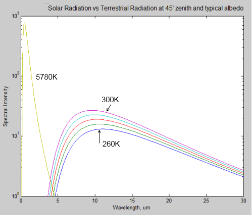
Log plot of solar radiation vs terrestrial radiation by wavelength. The solar radiation is amount absorbed (i.e. takes into account typical albedo) and received at 45°.

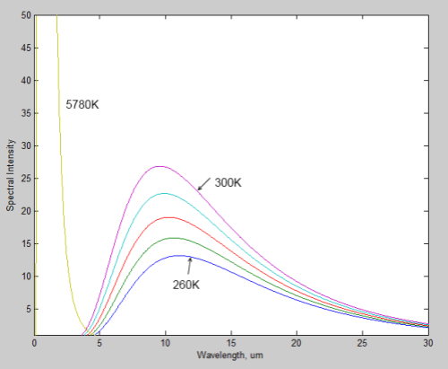
Linear plot of the same data.

  • 99% of the sun’s radiation has a wavelength less than 4μm
  • 99.9% of the earth’s radiation has a wavelength greater than 4μm

There is almost no overlap, so if we measure what we conventionally call longwave radiation (>4μm) we know it comes from the earth. And if we measure what we conventionally call shortwave radiation (<4μm) we know if comes from the sun.

This simple fact is an amazing help in understanding the climate! But most people don’t know it!

Two related points have arisen, one of which is alluded to in the question above:

1. “Half of the radiation from the sun is infra-red, therefore..”

True but a red-herring. Infra-red means longer wavelength than visible light. Greater than 0.7μm. Not greater than 4μm.

2. “The sun’s energy is way way higher, so even though only 1% of its energy is greater than 4μm this will still overwhelm the earth’s energy above 4μm.”

This is true when we look at the energy at its source, but only a two billionth of the sun’s total energy is received by the earth. Alternatively, considering the radiation per m² the solar radiation is reduced by a factor of 46,000 (as a result of the inverse square law) by the time it reaches the earth.

The total energy from the sun’s radiation (at the earth’s surface) is very similar to the total energy radiated from the earth. (Actually no surprise otherwise the earth would rapidly heat up!)

For more on this, see The Sun and Max Planck Agree – Part Two.

2. Energy has to Balance (at the Top of Atmosphere)

If you measure all the energy going in at TOA vs all the energy going out at TOA, you will find that they net to zero over time.

This is true. Everyone agrees. The “greenhouse” gas theory doesn’t make a claim that contradicts this well-established fact. In fact, it relies on it!

Let’s clarify the numbers because I gave the “clear sky” results in the graphic, but most of the time it’s cloudy and then the numbers are lower.

The average over the globe and over a year at the top of atmosphere for incoming and outgoing radiation is about 240W/m2. Strictly speaking it is incoming radiation absorbed, because about 30% of “incoming” is reflected by clouds and the earth’s surface. Check out the numbers in The Earth’s Energy Budget. This is all measured by satellites.

Note – what is very important about this is that the radiation in and out at the top of atmosphere balance. Down at the earth’s surface many other effects are going on – convection, latent heat (evaporation and condensation of water) as well as radiation. Energy in = Energy out is true everywhere that no heating or cooling is going on. But it’s not necessarily true that Radiation in = Radiation out at the surface or in the atmosphere, as other ways exist of losing or gaining energy. At the top of atmosphere there is no convection and no water vapor, so energy can only be moved by radiation.

Hopefully that makes sense. Read on..

3. The most popular – You are “Creating” Energy!

Since there is no NEW energy being put into the system, and the amount of energy being put in will, over the long term, equal exactly the amount of energy coming out, all you get at most is a short term fluctuation. If I am wrong, then you have invented perpetual motion.

This is a common theme and a recurring one. Many people think that the theory is effectively claiming that CO2 is creating energy.

Obviously that doesn’t happen.

Therefore, QED, the “greenhouse” effect doesn’t occur! The defence rests.

Well.. let’s take a look.

I’ll first give an analogy. This is an illustration not a proof.

You have a house without a roof. It has a heater on the floor and there aren’t any other sources of energy. The temperature being measured is around 10°C, it’s a bit chilly. Someone puts a roof on the house, what happens to the temperature? It goes up, maybe now it is 15°C.

No, it can’t have gone up. The roof doesn’t create energy so the temperature must still be 10°C!

Of course, no one reading this is confused. But when I gave that example I had people still trying to demonstrate that this analogy wasn’t valid.

Suppose there was no energy source. The roof – or insulation – wouldn’t create any heat.

True – and if the earth had no sun heating it, CO2 wouldn’t have any heating effect at the earth’s surface either.

What is the theory claiming for CO2?

  1. It isn’t creating energy
  2. It isn’t adding energy to the climate system
  3. It is absorbing and re-emitting “energy”

So instead of all the radiation from the earth’s surface simply heading up and out of the top of atmosphere, instead, some proportion is being “redirected” back down to the earth’s surface.

Like a roof but different.

The point is, there is no violation of energy conservation or any other law of thermodynamics.

The longwave energy being re-emitted back down to the earth’s surface – as you can see in the 2nd graphic above – simply increases the surface temperature. It increases the surface temperature above what it would be if this effect didn’t exist. (Like a roof on a house).

4. Your Radiation Numbers are Wrong

Referring to my “Upwards longwave radiation from the surface of the earth is around 390W/m2.”

Nyet. At 0 C, radiance is about 320 watts/m2. At 30 C, its about 550 watts/m2. You can’t just average the numbers from low to high across the globe and get the right answer either. you get a curve with a peak or high about mid day, but you also get a curve with a peak at the equator as compared to the poles. The average between the lows and the highs is NOT the average of the curve.

This is a very good point and worth covering in a little detail.

How do we come up with the number 390W/m2 in the first place?

There is a relationship between temperature and radiation, which is very well established, known as the Stefan-Boltzman law. You can see it at the start of the maths section in Part One.

Energy radiated is proportional to the 4th power of (absolute) temperature

Yuck. Before you skip forward, here are some example numbers (I used the amazing and recommended  spectralcalc.com).

  • -20°’C (253K) or -4°F – 232 W/m2
  • -10°C (263K) or 14°F- 271 W/m2
  • 0°C (273K) or 32°F – 315 W/m2
  • 10°C (283K) or 50°F – 364 W/m2
  • 20°C (293K) or 68°F – 418 W/m2
  • 30°C (303K) or 86°F – 477W/m2

So our commentor was correct as to the method. If you want to work out how much energy is radiated from the surface of the earth, you can’t just assume you can use the earth’s average annual global temperature (15°C) to get the average radiation of 390W/m2.

This is true because the relationship is non-linear – see how the radiation increases more and more for the same 10°C or 10K rise in temperature.

Luckily this work has already been done for us, it doesn’t actually change the result that much.

Average annual global radiation from the earth’s surface = 396 W/m2 (See note 1 at end)

What’s very interesting about this number is that it is nowhere near 240W/m2 – that number would represent a temperature of -18°C (about 0°F).

So in fact, energy radiated upwards from the earth’s surface is a lot higher than energy radiated out of the top of atmosphere. What’s going on?

5. If your numbers are correct, which I doubt, the earth will ignite

I’m not going to go check your numbers but just consider what you are saying. Your claim is that 156 w/m2 is being retained as extra energy kept inside the atmosphere over the long term. If you are right the planet should ignite in a few days.

So, we saw that the energy out of the system – from the top of atmosphere – is only 240W/m2

And energy radiated up from the earth’s surface is 396W/m2. So if the claim is correct that this “missing energy” is re-radiated back down to the surface, then simple arithmetic demonstrates that the energy will keep “piling up” and the earth will ignite.

Obviously that won’t happen. QED, the theory or the measurements are wrong. The defence rests.

Except.. let’s look a bit closer. The measurements are right, of course. So in fact, anyone disputing the theory needs their own theory to explain the numbers..

If we add extra radiation to the surface of the earth what happens? Simple – it heats up. As the surface heats up it radiates more energy back out. So it keeps heating up until the energy being lost is balanced by the energy coming in.

The point at which the earth’s temperature will stop changing is the value at which the outgoing radiation from the top of the atmosphere is balanced by the sun’s incoming radiation absorbed.

Well, that’s why the earth’s temperature is not -18°C. With no greenhouse effect it would be.

If there was nothing absorbing the upwards longwave radiation, and re-radiating some of it downwards, the radiation from the surface of the earth would only be 240W/m2 – a surface temperature of around -18°C (0°F).

Conclusion

To many people it seems like a wacky theory easily refuted by common sense, the basic laws of thermodynamics or the fact that the earth hasn’t apparently heated up for a decade. (I didn’t comment on that one, the climate is very complex, many factors affect climate).

The theory wasn’t invented by the IPCC or Al Gore (he only invented the internet). And it wasn’t formed from a desire to understand why the earth warmed up over much of the 20th century.

The theory was developed by physicists going back to the start of the 20th century (well, probably before but I’m haven’t studied the history of the subject). Thousands of physicists have studied the subject, dissected it, written papers on it and improved on it.

Even the many “skeptics” of what has become known as AGW in its IPCC form are not skeptics of these concepts. (e.g. Lindzen, Roy Spencer, John Christy)

I don’t want to try and pull the “argument from authority” because I don’t really accept it myself. But pause for thought if you are still not convinced, if you still think this theory magically creates energy from somewhere or violates the 2nd law of thermodynamics – and ask yourself:

If 99.99% of physicists past and present believe this effect is real and measurable, how likely is it that none of them realized there is a basic error in the theory?

Note 1

The value of 396W/m2 is calculated in Trenberth and Kiehl’s 2008 update to their 1997 paper: Earth’s Annual Global Mean Energy Budget. In the 2008 paper they comment that the upwards radiation from the surface cannot be assumed by averaging the temperature arithmetically and then calculating the radiation. So they take data on the surface temperature around the globe and re-calculate. Depending on exactly the method the values come in at 396.4, 396.1, 393.4. They stick with 396W/m2.

Read Full Post »

Introduction

There are two themes in current “consensus” climate science. Perhaps it’s not apparent that they are contradictory..

  • One side – climate is predictable
  • The other – “tipping” points ahead, perhaps very close

This subject isn’t easy to untangle and no one really knows what the answer is.

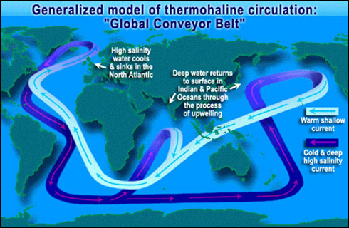
What this post is about is one of those “tipping” points and how complex climate really is. This post is about the thermohaline circulation, also known in shorthand as the THC.

“Thermohaline” sounds like a tough concept to understand – but although the concepts involved don’t require any special science knowledge they aren’t immediately obvious.

Thermo – relates to temperature, and Haline relates to Saline, or Salt..

Energy Balance and the “Conveyor Belt”

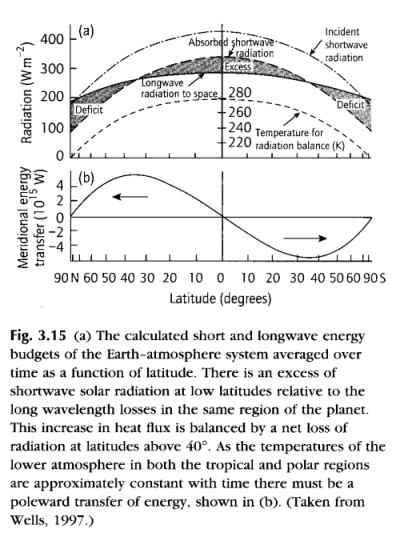
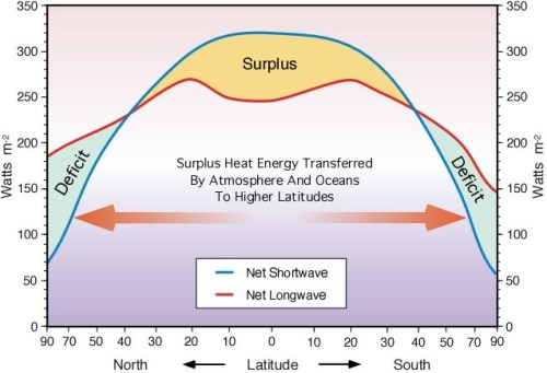
When you consider the difference between the incoming solar radiation and the outgoing longwave radiation by latitude you start to realize how the earth’s climate moves heat around – more specifically how heat moves from the equator to the poles:

Solar Radiation vs Outgoing Longwave Radiation against Latitude

Solar Radiation vs Outgoing Longwave Radiation against Latitude, "Atmospheric Science for Environmental Scientists", Hewitt &Jackson

This graphic demonstrates the calculated solar radiation in – versus latitude, against the radiation out from the earth’s surface (longwave radiation).

In short, the equator receives a lot more energy compared with the poles because the sun is – comparatively – overhead a lot more. Therefore, the atmosphere and the oceans transport heat from the equator to the poles.

Here’s another graphic of the same imbalance:

Energy Received and Radiated - by Latitude

Energy Received and Radiated - by Latitude

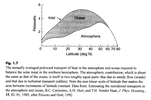
Interestingly, the oceans and the atmosphere share the heat transfer more or less 50/50:

Energy Transfer Polewards, by Oceans and Atmosphere

Energy Transfer Polewards, by Oceans and Atmosphere, Taylor (2005)

Now we see that the ocean takes a big role in moving energy to the poles, let’s look a closer look at what drives the ocean currents..

Temperature.. and Salt

Two obvious factors that push the ocean currents around are winds and the coriolis effect. The coriolis effect has to do with the fact that earth is rotating. Every explanation I have seen of it seems like a recipe for confusion if you haven’t already spent some time on it, so I’m not going to repeat that problem.. (take a look at the link above if you want to understand it better).

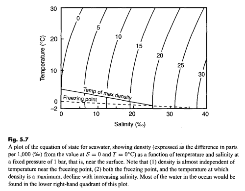
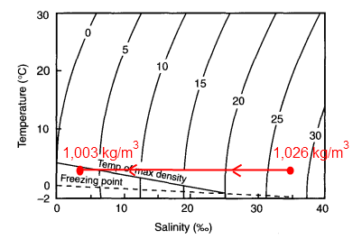
But the major factor that drives ocean currents is density. What determines density? Temperature and salinity:

Density vs Salinty and Temperature

Density vs Salinty and Temperature, Taylor (2005)

The first time you see this kind of chart your eyes glaze over and you quickly move on to the next section.

But let’s try and make it easier to understand:

Density Changes as Cold Seawater becomes less Saline

Density Changes as Cold Seawater becomes less Saline

Here’s one example – cold water, almost freezing, becomes less saline. This might happen if a lot of ice was melting. See the change in density – 1.026 to 1.003kg/m3 – it doesn’t seem like much but it is very significant.

If you take the reverse direction, as water freezes it leaves most of its salt behind, so the water becomes much more saline and the density goes in the other direction.

The Thermohaline Circulation

Cold and high salinity water has a higher density than any other ocean water and so it sinks. There are two places that most ocean water sinks – around Greenland and at the Wedell Sea in Antarctica. Here is a simplistic representation of global ocean circulation:

Thermohaline Circulation

Thermohaline Circulation

One consequence of the THC is that warm surface water moves from the equator up to norther Europe. If that “global conveyor” didn’t exist then northern Europe would be much colder.

The driving force is the very cold very saline water that sinks rapidly just south of Greenland.

The Tipping Point

As the world heats up, which it is currently doing (in a broad sense, see Note 1), Arctic sea ice and the Greenland ice sheet are melting more rapidly.

At some point, the amount of melt water – low salinity water – will probably change the balance of the THC and send the system into reverse.

All the evidence is that this has happened before.

When – and if – it does happen, the heat conveyor will turn off, northern Europe will cool down and the Arctic and Greenland will refreeze.

As that happens, positive feedback from ice albedo and then from water vapor will keep driving the temperatures in the colder direction.

Well, who knows exactly what will happen? Or when.

In some follow on posts we will look at this in some more detail. Currently, GCMs (general circulation models) do not have a “tipping point” for the THC, they just show a weakening.

Conclusion

Our understanding of ocean dynamics do not require any new development of physics but we do require a lot more data. Temperature and salinity throughout the oceans has started to be provided through the Argo project. How much ice is melting is – surprisingly – a difficult subject.

Solving the equations of motion for the oceans requires temperature and salinity data as well as the meltwater component.

The possibility that the THC will change direction is a huge issue in the predictability of future climate.

If it does “switch” there will be significant climate effects. We can’t assume this effect will have a happy ending.

Note 1: The world has been heating up – broadly speaking, as there have been some ups and downs – since the end of the last ice age, 18,000 years ago. Sea levels have risen around 120m. And in the last 100 years the earth’s surface temperature has increased by around 0.7°C.

Read Full Post »

Perhaps I should say most of us are not really skeptics.

The Black Swan by Nassim Nicholas Taleb is such a well-written book. One of his subjects is the confirmation bias.

Consider a scientific theory. Most people coming to this blog are probably interested in science in some shape or form and know that for a theory to be scientific it has to be falsifiable – that is, we have to be able to create some tests in advance and say “if it fails these tests then the theory is not true”.

For example, the pink fairy down the bottom of my garden. I say it exists. You say, “Why can’t I see it?

I say, “It’s invisible.” You ask, “How do I know it’s there?

And so, in the end I have to provide some kind of evidence that can be tested. Otherwise it’s not a scientific theory.

Taleb gives a great example of what we all really do in practice, from research by pyschologists. Pay attention to Nicholas..

Subjects were presented with the three number sequence 2, 4, 6 and asked to guess the rule generating it. Their method of guessing was to produce other three-number sequences to which the experimenter would say “yes” or “no” depending on whether the new sequences were consistent with the rule.

What did the subjects do? They tried to guess the rule.. of course! That’s what they should have done.

And then they tested it by.. producing a sequence consistent with their theory. So almost no one worked out that the real rule was simply, “numbers in ascending order”

Perhaps they decided that the rule was a starting number x1, x2, x3. Or perhaps they decided that the rule was to take starting number then add 2, and add 2 again.

And they generated a sample sequence from their theory and told the experimenter.

But what almost no one did was to suggest a sequence inconsistent with their own mental theory – a test which would allow them to more easily falsify their theory.

The scientific method is to find a way to falsify a theory, but unconsciously almost all of us just try to corroborate our own theories.

Don’t look at the people around you.. ask yourself,

Do I try and test my theories by falsifying them?

Do I try and understand what my “opponents” say?

Do I spend time at blogs where I feel uncomfortable with their “false and unwarranted” conclusions of the world? And try and understand why they think what they do?

Become a real skeptic. Try and prove yourself wrong!

Read Full Post »

Older Posts »