Feeds:
Posts
Comments

Archive for March, 2010

There are many misconceptions about how atmospheric processes work, and one that often seems to present a mental barrier is the idea of How much work can one molecule do?

This idea – presented in many ways – has been a regular occurence in comments here and it also appears in many blogs with eloquent essays on the “real role” of CO2 in the atmosphere, usually unencumbered by any actual knowledge of the scientific discipline known as physics.

Well, we all need mental images of how invisible or microscopic stuff really works.

When we consider CO2 (or any trace gas) absorbing longwave radiation the mental picture is first of trying to find a needle in a haystack.

And second, we found it, but it’s so tiny and insignificant it can’t possibly do all this work itself?

How much can one man or woman really do?

This article is really about the second mental picture, but a quick concept for the first mental picture for new readers of this blog..

Finding a Needle in a Haystack

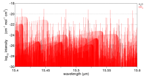
Think of a beam of energy around 15.5μm. Here is the graph of CO2 absorption around this wavelength. It’s a linear plot so as not to confuse people less familiar with log plots. Water vapor is also plotted on this graph but you can’t see it because the absorption ability of water vapor in this band is so much lower than CO2.

CO2 absorption, 15.4-15.6um, linear, from spectralcalc.com

CO2 absorption, 15.4-15.6um, linear, from spectralcalc.com

The vertical axis down the side has some meaning but just think of it for now as a relative measure of how effective CO2 is at each specific wavelength.

Here’s the log plot of both water vapor and CO2. You can see some black vertical lines – water vapor – further down in the graph. Remember as you move down each black horizontal grid line on the graph the absorption ability is dropping by a factor of 100. Move down two black grid lines and the absorption ability has dropped by a factor of 10,000.

CO2 absorption - log graph - 15.4-15.6um, from spectralcalc.com

CO2 absorption - log graph - 15.4-15.6um, from spectralcalc.com

Now, I’ll add in the absorption ability of O2 and N2 – the gases that make up most of the atmosphere – check out the difference:

O2 and N2 added..

O2 and N2 added..

Spectralcalc wouldn’t churn anything out – nothing in the database.

15.5μm photons go right through O2 and N2 as if they didn’t exist. They are transparent at this wavelength.

So, on our needle in the haystack idea, picture a field – a very very long field. The haystacks are just one after the other going on for miles. Each haystack has one needle. You crouch down and look along the line of sight of all these haystacks – of course you can only see the hay right in front of you in the first one.

Some magic happens and suddenly you can see through hay.

Picture it..  Hay is now invisible.

Will you be able to see any needles?

That’s the world of a 15.5μm photon travelling up through the atmosphere. Even though CO2 is only 380ppm, or around 0.04% of the atmosphere, CO2 is all that exists for this photon and the chances of this 15.5μm photon being absorbed by a CO2 molecule, before leaving this world for a better place, is quite high.

In fact, there is a mathematical equation which tells us exactly the proportion of radiation of any wavelength being absorbed, but we’ll stay away from maths in this post. You can see the equation in CO2 – An Insignificant Trace Gas? Part Three. And if you see any “analysis” of the effectiveness of CO2 or any trace gas which concludes it’s insignificant, but doesn’t mention this equation, you will know that it is more of a poem than science. Nothing wrong with a bit of poetry, if it’s well written..

Anyway, it’s just a mental picture I wanted to create. It’s not a perfect mental picture and it’s just an analogy – a poem, if you will. If you want real science, check out the CO2 – An Insignificant Trace Gas Series.

CO2 – The Stakhanovite of the Atmospheric World?

Back in the heady days of Stalinist Russia a mythological figure was created (like most myths, probably from some grain of truth) when Aleksei Stakhanov allegedly mined 14 times his quote of coal in one shift. And so the rest of the workforce was called upon to make his or her real contribution to the movement. To become Stakhanovites.

This appears to be the picture of the atmospheric gases.

Most molecules are just hanging around doing little, perhaps like working for the _____ (mentally insert name of least favorite and laziest organization but don’t share – we try not to offend people here, except for poor science)

So there’s a large organization with little being done, and now we bring in the Stakhanovites – these champions of the work ethic. Well, even if they do 14x or 100x the work of their colleagues, how can it really make much difference?

After all, they only make up 0.04% of the workforce.

But this is not what the real atmosphere is like..

Let’s try and explain how the atmosphere really works, and to aid that process..

A Thought Experiment

For everyone thinking, “there’s only so much one molecule can do”, let’s consider a small “parcel” of the atmosphere at 0°C.

We shine 15.5μm radiation through this parcel of the atmosphere and gradually wind up the intensity. Because it’s a thought experiment all of the molecules involved just stay around and don’t drift off downwind.

The CO2 molecules are absorbing energy – more and more. The O2 and N2 molecules are just ignoring it, they don’t know why the CO2 molecules are getting so worked up.

What is your mental picture? What’s happening with these CO2 molecules?

a) they are just getting hotter and hotter? So the O2 and N2 molecules are still at 0°C and CO2 is at first 10°C, then 100°C, then 1000°C?

b) they get to a certain temperature and just put up a “time out” signal so the photons “back off”?

c) other suggestions?

The Real Atmosphere – From Each According to His Ability, To Each According to His Need

What is the everyday life of a molecule like?

It very much depends on temperature. The absolute temperature of a molecule (in K) is proportional to the kinetic energy of the molecule. Kinetic energy is all about speed and mass. Molecules zing around very fast if they are at any typical atmospheric temperature.

Here’s a nice illustration of the idea (from http://www.chem.ufl.edu/~itl/2045/lectures/lec_d.html).

At sea level, a typical molecule will experience around 1010 (10 billion) collisions with other molecules every second. The numbers vary with temperature and molecule.

Think of another way – at sea level 8×10²³ molecules hit every cm2 of surface per second.

Every time molecules collide they effectively “share” energy.

Therefore, if a CO2 molecule starts getting a huge amount of energy from photons that “hit the spot” (are the right wavelength) then it will heat up, move even faster, and before it’s had time to say “¤” it will have collided with other molecules and shared out its energy.

This section of the atmosphere heats up together. CO2 can keep absorbing energy all day long even as a tiny proportion of the molecular population. It takes in the energy and it shares the energy.

If we can calculate how much energy CO2 absorbs in a given volume of the atmosphere we know that will be the energy absorbed by that whole volume of atmosphere. And therefore we can apply other well-known principles:

  • heating rates will be determined by the specific heat capacity of that whole volume of atmosphere
  • re-radiation of energy will be determined by the new temperature and ability of each molecule to radiate energy at wavelengths corresponding to those temperatures

Conclusion

The ability of a CO2 molecule to be “effective” in the atmosphere isn’t dependent on its specific heat capacity.

Molecules have embraced “communism” – they share totally, and extremely quickly.

Update – New post on the related topic of understanding the various heat transfer components at the earth’s surface – Sensible Heat, Latent Heat and Radiation

Read Full Post »

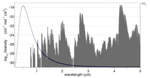
One commenter asked about CO2 absorption in the solar spectrum.

If CO2 absorbs incoming solar radiation then surely an increase in CO2 will reduce incoming radiation and balance any increase in longwave radiation.

The important factor is the usual question of quantifying the different effects.

Let’s take a look.

CO2 absorption in the 0.17-5um band, with solar spectrum overlaid

CO2 absorption in the 0.17-5um band, with solar spectrum overlaid

The CO2 absorption spectrum is from the line list browser of the recommended spectralcalc.com. The line list only goes down to 0.17μm (170nm), hence the reason for the graph not starting at 0.0μm.

The solar radiation is overlaid. Well, more accurately, the Planck function for 5780K is overlaid (simply drawn using Excel). Note that the CO2 absorption spectrum is on a log graph, while the radiation is on a linear graph. For those not so familiar with logarithmic graphs, the peak absorption around 4.3μm is 10-18, while the two peak absorptions just below 1μm are at 10-26 – which is 100,000,000 less.

The value of seeing the solar radiation spectrum overlaid is it enables you to see the relative importance of each absorption area of CO2. For example, the solar radiation between 2 – 4μm is only 5% of the solar radiation, so any absorption by CO2 will be quite limited.

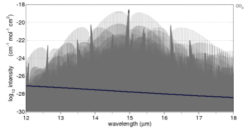
Here’s the comparison with the important 15μm band of CO2. A 6μm width is shown, overlaid (blue line) with the 12-18um longwave radiation of a 288K (15°C) blackbody:

CO2 absorption in the 12-18um band, with terrestrial spectrum overlaid

CO2 absorption in the 12-18um band, with terrestrial spectrum overlaid

Just a little explanation of this graph and how to compare it to the solar version.

The average surface temperature of the earth is 15ºC, and it emits radiation very close to blackbody radiation (watch out for a dull post on Emissivity soon).

The proportion of radiation of a 288K blackbody between 12-18μm is 28%. What we want to do is enable a comparison between the CO2 absorption of solar radiation and terrestrial radiation.

Averaged across the globe and the year the incoming solar radiation at the top of atmosphere (TOA) is 239 W/m2 and the radiation from the earth’s surface is 396 W/m2. This works out to 65% higher, but so as not to upset people who don’t quite believe the earth’s surface radiation is higher than incoming solar radiation I simply assumed they were equal and scaled this section of the earth’s terrestrial radiation to about 28% of the solar radiation on the earlier graph. We are only eyeballing the two graphs anyway.

So with this information digested, the way to compare the two graphs is to think about the absorption spectra of CO2 simply being scaled by the amount of radiation shown overlaid in both cases.

As you can see the amount of absorption by CO2 of solar radiation is a lot less than the absorption of longwave radiation. Remember that we are looking at the log plot of absorption.

Is That the Complete Story?

Really, it’s more complicated, as always with atmospheric physics. There’s nothing wrong with taking a look at the approximate difference between the two absorption spectra, but luckily someone’s already done some heavy lifting with the complete solution to the radiative transfer equations using line by line calculations. For more on these equations, see the CO2 – An Insignificant Trace Gas series, especially Part Three, Four and Five.

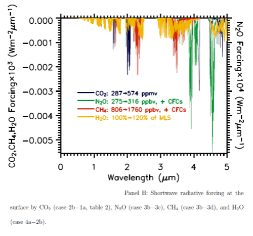
The paper with the heavy lifting is Radiative forcing by well-mixed greenhouse gases: Estimates from climate models in the IPCC AR4 by W.D. Collins (2006). There’s a lot in this paper and aspects of it will show up in the long awaited Part Eight of the CO2 series and also in Models, On – and Off, the Catwalk.

Solving these equations is important because we can look at the absorption spectrum of CO2 in the 15μm band, but then we have to think about the absorption already taking place and what change in absorption we can expect from more CO2. Likewise for the solar spectrum.

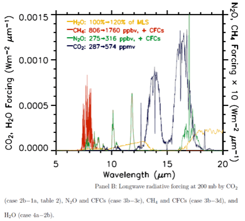
Here are the two graphs, which include other important trace gases, as well as the impact of a change in water vapor. Note the difference in vertical axis values – the forcing effect of these gases on solar radiation has to be multiplied by a factor of 1000 to show up on the graph. The blue lines are CO2.

Net absorption of solar radiation by various "greenhouse" gases

Net absorption of solar radiation by various "greenhouse" gases

Longwave radiative forcing from increases in various "greenhouse" gases

Longwave radiative forcing from increases in various "greenhouse" gases

You can also see that the CO2 absorption in shortwave is across quite narrow bands (as well as being scaled a lot lower than terrestrial radiation) – therefore the total energy is less again. The vertical scale is energy per μm..

From these calculations we can see that with a doubling of CO2 there will be a very small impact on the radiation received at the surface, but a comparatively huge increase in longwave radiation retained – “radiative forcing” at the tropopause (the top of the troposphere at 200mbar).

So Is That the Complete Story?

Not quite. If trace gases in the atmosphere absorb solar radiation, is that so different from the surface absorbing solar radiation?

Or to put it another way, if the radiation doesn’t strike the ground, where does it go? It’s still absorbed into the climate system, but in a different location (somewhere in the atmosphere).

But as one commenter said:

The other point [this one] you make is simply not true and/or also not proven. There is only so much energy that can be taken up by a molecule.

This is a theme that has arrived in various comments from various posts. So the concept of How much work can one molecule do? is worth exploring in a separate post.

Hopefully, it’s clear from what is presented here that increases in CO2 absorption of the solar radiation are very small compared with absorption of longwave radiation.

Read Full Post »

Recap

This post is a follow on from my original article: American Thinker – the Difference between a Smoking Gun and a Science Paper.

Gary Thompson who wrote the article in American Thinker that prompted my article was kind enough to make some comments and clarifications. Instead of responding in the comments to the first article, I thought it was worth a new post, especially to get the extra formatting that is allowed in posts rather than comments.

I appreciate him commenting and I’m sure he has a thick skin, but just in case, any criticisms are aimed at getting to the heart of the matter, rather than at him – or anyone else who has different views.

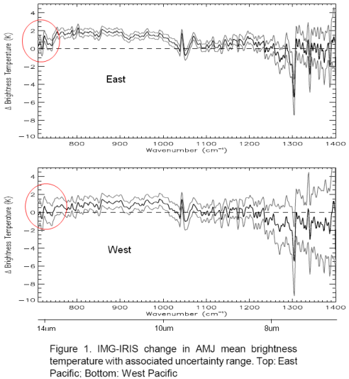
For people who have landed at this post and haven’t read the original.. the heart of Gary’s article were 3 papers, of which I examined one (the first). The paper compared two 3-month periods 27 years apart in the East and West Pacific. Gary commented that the actual OLR (outgoing longwave radiation) was higher in the later period in the important CO2 band (or what we could see of it).

His claim – the theory says that more CO2 should lead to less emission at those wavelengths and therefore the theory has been disproved.

My point – Gary doesn’t understand the theory. The temperature was higher in the later period in this region and therefore the radiation leaving the earth’s surface would be higher. We’ll see this explained again, but did I mention that you should read Gary’s article and my article before moving forward? Also at the end of the Science of Doom post you can see Gary’s comments. Always worth reading what people actually wrote rather than what someone (me) with the opposite point of view highlighted from their words..

The Unqualified Statements in Papers

Gary started by saying:

I know why the authors of the papers were using climate models to simulate the removal of effect from surface temperatures and humidity and that the ‘theory’ says you must do that. But my problem lies in two peer reviewed papers that casts doubt on that theory and that method.

And cites two papers. The first, a 1998 paper: The Trace Gas Greenhouse Effect and Global Warming by the great V. Ramanathan (I will continue to call him ‘great’ even though he didn’t reply to my email about his 1978 paper.. possibly busy, but still..).

I recommend this 1998 paper to everyone reading this article. Even though it is 12 years old, it is all relevant and a very readable summary.

The Great Ramanathan

Gary pointed out page 3 where statements appeared to back up his (Gary’s) interpretation of the later OLR study. Here’s what Ramanathan said:

Why does the presence of gases reduce OLR? These gases absorb the longwave radiation emitted by the surface of the earth and re-emit to space at the colder atmospheric temperatures. Since the emission increases with temperature, the absorbed energy is much larger than the emitted energy, leading to a net trapping of longwave photons in the atmosphere. The fundamental cause for this trapping is that the surface is warmer than the atmosphere; by the same reasoning decrease of temperature with altitude also contributes to the trapping since radiation emitted by the warmer lower layers are trapped in the regions above.

By deduction.. an increase in a greenhouse gas such as CO2 will lead to a further reduction in OLR. If the solar absorption remains the same, there will be a net heating of the planet.

Gary commented on the last part of this:

Notice there is no clarifying statement about having to use model simulated graphs to ‘correct’ for surface temperatures and water vapor before seeing that OLR reduction.

And on the first part:

“since the emission increases with temperature, the absorbed energy is much larger than the emitted energy, leading to a net trapping of longwave photons in the atmosphere.” – here the author stated clearly that even taking into account higher emissions from warmer surfaces, the net will still be a reduction.

For half the readers here, they are shaking their heads.. But for Gary and the other half of the readership, let’s press on.

First of all, if we took any of 1000 papers on the “greenhouse” effect and observations, models, theoretical adjustments, impacts on GCMs – I bet you could find at least 700 – 900 of them at some point will make a statement that could be pulled out which has no “clarifying statement”. That “cast doubt” on the theory. Perhaps 1000 out of a 1000.

Context, context, context as they say in real estate.

Where to begin? Let’s look at “the theory” first. And then come back and examine Ramanathan’s statements.

The Theory

There are a few basics. For newcomers, you can take an extended look at the theory in CO2 – An Insignificant Trace Gas? It’s in seven parts! Actually it’s a compressed treatment.

This is itself is a clue.

In the books I have seen on Atmospheric Physics many tens of pages are devoted to radiation, including absorption and re-radiation – the “greenhouse” effect – and many tens of pages are devoted to convection. Understanding the basics is critical.

For Gary and his followers, the theory is on a precipice and these papers are giving us that clue. For people who’ve studied the subject the theory of the “greenhouse” effect is as solid as the theory of angular momentum, or the 2nd law of thermodynamics (the real one, not the imaginary one).

As Ramanthan says in the same paper Gary cites:

It is convenient to separate the greenhouse effect from global warming. The former is based on observations and physical laws such as Planck’s law for black-body emission. The concept of warming that results from the greenhouse effect, is based on deductions from sound physical principles. Numerous feedback processes, determine the magnitude of the warming; these feedbacks are treated with varying degrees of sophistication in GCMs and other climate models. As a result, predictions of the magnitude of the warming are not only model dependent but are subject to large uncertainties..

If I can paraphrase:

Greenhouse effect – dead solid. Global warming – lots of factors, need GCMs, pretty complicated.

Perhaps he has not realized that his words in the same paper combined with experiments demonstrate a flaw in the theory of the dead-solid “greenhouse” effect..

Back to the theory, but first..

A Quick, possibly Annoying, Diversion to the Theory of Gravity

But before we start, I thought it was worth an analogy. Analogies are illustrations, not proof of anything. They can often inflame an argument, but that’s not the intention here. Many people who are still undecided about the amazing theory of the inappropriately-named “greenhouse” effect might welcome a break from thinking about it.

The theory of planetary movements is my analogy. I picture a world where gravity – and its effects on the planets orbiting the sun – is strangely controversial. A concerned citizen, leafing through some fairly recent scientific papers notices that planets don’t really go around the sun in ellipses as the theory claims. In fact, there are some quite odd movements. And so, surprised that the scientists can’t see what’s in plain sight, this citizen draws attention to them.

When some detail-orientated commenters point out that the theory is actually (in part):

F = GMm/r2

where F= force between 2 bodies, G is a constant, M and m are the masses of the 2 bodies and r is the distance between them

And the ellipse idea is just a handy generalization of the results of the laws of graviational attraction.

And the reason why some planetary movements recently measured don’t follow an ellipse is because a few planets are a bit closer together, there’s a large asteroid flying between them and so when we do the maths it all works out pretty well.

The original concerned citizen then pulls out a few papers where, in the introduction, gravity is explained as that force that produces elliptical movements in the planets.. with no disclaimers about F=GMm/r2 and claims that this theory is, therefore, under question.

Why this annoying analogy? Most “theories” in physics are developed because of some observations which get analyzed to death – and finally someone produces a “comprehensive theory” that satisfies most of the relevant scientific community. The paper with the comprehensive theory usually contains some equations, some observations, some matching of the two – but often in common everyday usage the shorthand version of the theory is used.

“The theory of gravity tells us that planets orbit the sun in an elliptical manner, and ..”

So much more tedious to keep saying F=GMm/r2, and the other formulae..

(I know, I haven’t proved anything, but maybe a few readers can take a moment and see a parallel..)

Back to the Radiative-Convective Theory

First, bodies radiate energy according to Planck’s formula, which looks complicated when written down. The idea is simplified by the total energy radiated according to the Stefan-Boltzmann law which says that total energy is proportional to the 4th power of temperature.

Temperature goes up, energy radiated goes up (quite a bit more) – and the peak wavelength is a little lower. Here’s a graphical look of the Planck formula which takes away the mathematical pain:
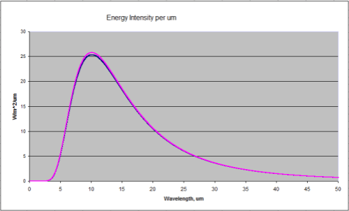
Blackbody Radiation at 288K and 289K (15'C and 16'C)

Blackbody Radiation at 288K and 289K (15'C and 16'C)

Two curves – 288K and 289K. Now zoomed in a little where most of the energy is:
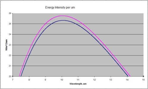
Close up of the peak energy of 288K and 289K

Close up of the peak energy of 288K and 289K

Total energy in the top curve (289K) is 396W/m^2, and in the bottom curve (288K) is 390W/m^2

Second, trace gases absorb energy according to a formula, which when simplifed is the Beer-Lambert law.
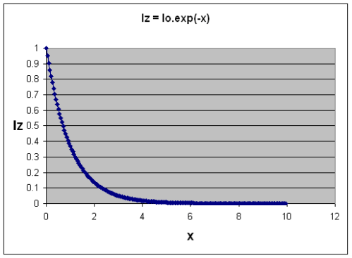
Absorption of Radiation as "optical thickness" increases, Iz=I0.exp (-x)

Absorption of Radiation as "optical thickness" increases

Without going into a lot of maths, as the concentration of a “greenhouse” gas increases, the absorption graph falls off more steeply – more energy is absorbed.

Third, re-radiation of this energy takes place according to an energy balance equation that you can see in CO2 – Part Three. The energy balance or radiative transfer equations rely on knowledge of the temperature profile in the lower atmosphere (the troposphere), because the actual temperature here is dominated by convection not radiation. (Radiation still takes place and the temperature profile is a major factor in the radiation – but this effect is not the primary determinant of the temperature profile).

When Gary says:

I know why the authors of the papers were using climate models to simulate the removal of effect from surface temperatures and humidity and that the ‘theory’ says you must do that. But my problem lies in two peer reviewed papers that casts doubt on that theory and that method.

It sounds like Gary believes this “model” is some suspicious extra that tries to deal with problems between the theory and the real world. But it’s the foundation. Anyone who had read an introduction to atmospheric physics would understand that. Someone who had tried hard to understand a few papers without a proper foundation would easily miss it.

  • Higher temperatures increase OLR
  • More trace gases reduce OLR in certain wavelengths

Which effect dominates in a particular situation?

It’s simple conceptually. But, if we want to find out exact results – such as, which effect dominates in a particular situation – we need a “model” = an equation or set of equations. Because if we want to quantify the effects we have to solve some tricky equations which you can see in a paper by.. the Great Ramanathan. Well, Ramanathan & Coakley 1978  – a seminal paper on Climate Modeling through Radiative-Convective Models, here’s an extract from p7:
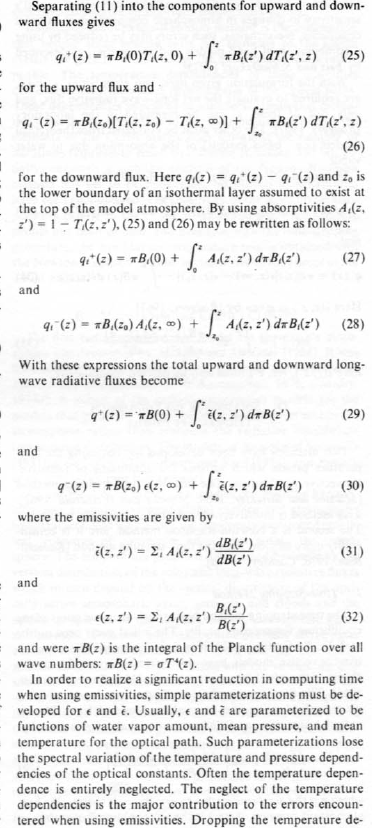
A few equations from Ramanathan and Coakley, p7

A few equations from Ramanathan and Coakley, p7

Lots of maths. The rest of the paper is similar. Let’s move on to Ramanathan’s much later paper and what he said and meant.

Has Ramanathan given up on The Theory?

Let’s review the words Gary pulled out of the paper:

Why does the presence of gases reduce OLR? These gases absorb the longwave radiation emitted by the surface of the earth and re-emit to space at the colder atmospheric temperatures. Since the emission increases with temperature, the absorbed energy is much larger than the emitted energy, leading to a net trapping of longwave photons in the atmosphere.

Gary reads into this “here the author stated clearly that even taking into account higher emissions from warmer surfaces, the net will still be a reduction“. By which Gary thinks Ramanathan is saying something like:

..measurements from a specific location at a later date when CO2 has increased will always lead to a reduction in OLR..

-my paraphrase.

But no, he has totally misunderstood what the author is saying. Ramanathan is doing a quick drive through of the basics and explaining how the greenhouse effect works.

Lower temperatures in the atmosphere mean that the radiation to space from this lower temperature atmosphere is lower than the radiation from the surface. (This is the “net trapping”). Therefore – the “greenhouse” effect. There is no conclusion here that “at all times in all situations increases in “greenhouse” gases will lead to a reduction in OLR in these bands“. The conclusion is just that “greenhouse” gases mean that the surface is warmer than it would be without these gases

And the first claim, Ramanathan said:

By deduction.. an increase in a greenhouse gas such as CO2 will lead to a further reduction in OLR. If the solar absorption remains the same, there will be a net heating of the planet.

Gary said:

Notice there is no clarifying statement about having to use model simulated graphs to ‘correct’ for surface temperatures and water vapor before seeing that OLR reduction.

That’s because the basics of the theory are the solid foundation and don’t need to be restated as qualifiers to every statement. Ramanathan helped write the theory! For people who think that this stuff is just some added extra, read his 1978 paper and see all the maths and the explanations. This is the theory.

In the earlier part of his earlier statement he said “Since the emission increases with temperature” but didn’t qualify it with “emission increases in proportion to the 4th power of temperature“.

Is Ramanathan losing confidence in the Stefan-Boltzmann formula? Or Planck? Are these rocks crumbling?

It’s only because Gary has decided that these points are somehow rocky that he would reach these conclusions. (And I could pick 10’s of other statements in the paper which, without qualifiers, could be taken to be the beginning of the end of a specific theory).

As a general point – when we look at the hypothetical global annual average after “new equilibrium” from increased CO2 is reached – if this new equilibrium exists – the theory (1st law of thermodynamics) predicts that the “new” OLR will match the “old” OLR (global annual average). And in that case the OLR in “greenhouse” gas bands will be reduced a little, while the OLR outside of those bands will be increased a little.

But when we look at one local situation we need the theory, also known as “the model”, also known as equations, to tell us what exactly the result will be.

Ramanathan hasn’t cast any doubt on it. He believes it. His papers from the 1970s to today work it all out. He just doesn’t write qualifiers to each statement as if every line will be read by people who don’t understand the theory..

Gary’s Maths

In Gary’s comment he reproduced his back of envelope calculations of how much surface temperature should have changed over this 27 year period.

He takes the charitable approach of considering a net reduction in OLR from one of the three papers he originally reviewed – if I understood this step correctly. The figure he takes to work with is a 1K reduction. And then tries to work out how much this 1K reduction in OLR in the CO2 band would have on surface temperatures.

Like all good science this starts on napkins and the back of envelopes, because everyone studying a problem first has to attempt to quantify it using available data and available formulae. Then when the first results are worked out and it seems like something new is discovered – or something old overturned – then the scientist, patent clerk, writer now has to turn to more serious methods.

In Gary’s preliminary results he shows that a reduction in OLR due to CO2 might have contributed something like 0.3°C to surface temperature change over 30 years or so – where the GISS temperature increase for the period is something like 0.7°C. The essence of the calculation was comparing the Planck function (see the first and second graph in this post) of two temperatures 1K apart, then considering how much is in the CO2 band and so calculating the approximate change in W/m2. Then by applying a “climate sensitivity” number from realclimate.org, converting that into a temperature change.

Radiative physics has the potential to confuse everyone. Perhaps if we consider the “equilibrium case”, one problem with Gary’s calculation above will become clearer.

What’s the equilibrium case? In fact, it’s one generalized result of the real theory. And because it’s easier to understand than dI = -Inσdz + Bnσdz = (I – B)dχ people start to think the generalized result under equilibrium is the theory..

Under equilibrium, energy out = energy in. This is for the whole climate system. So we calculate the incoming solar radiation that is absorbed, averaged across the complete surface area of the earth = 239 W/m2.

So if the planet is not heating up or cooling down, energy out (OLR) must also = 239 W/m2.

So we consider the golden age of equilibrium in 1800 or thereabouts. We’ll assume the above numbers are true for that case. Then lots of CO2 (and other stuff) was added. Let’s suppose CO2 has reached the new current CO2 level of 380ppm – and stays constant from now on. The downward radiative forcing as calculated at “top of atmosphere” from the increase in CO2 is 1.7 W/m2. And nothing else happens in the climate (“all other things being equal” as we say).

Eventually we will reach the new equilibrium. Doesn’t matter how long it takes, but let’s pretend it’s 2020. Before equilibrium the planet will be heating up, which means OLR < 239 W/m2 (because more energy must come into the planet than leave the planet for it to warm up). At equilibrium, in 2020, OLR = 239 W/m2 – once again. (Of course, at wavelengths around 15μm the energy will be lower than in 1800 and other wavelengths the energy will be higher).

At this new equilibrium point we still have a “radiative forcing” of 1.7W/m2, which is why the surface temperature is higher, but no change in OLR when measured at 1800 and again at 2020.

We’ll assume, like Gary, the realclimate.org climate sensitivity – how do we calculate the new equilibrium temperature?

The change in OLR is 0.0 W/m2. Therefore, change in temperature = 0’C. Ha, we’ve proved realclimate wrong. Climate sensitivity cannot exist.

Or, it was wrongly applied.

As trace gases like CO2 increase in concentration they absorb energy. The atmosphere warms up and re-radiates the energy in all direction. Simplifying, we say it re-radiates both up and down. The extra downward radiation is what is used to work out changes in surface temperature. Not the immediate or eventual change in OLR.

The extra downward part is usually called “radiative forcing” and comes with a number of definitions you can see in Part Seven of the CO2 series (along with my mistaken attempt to do a “back of envelope” calculation of surface temperature changes without feedback).

How do we work out the change in surface temperature?

In Gary’s case, what he will need to know is the change in downward longwave radiation. Not upwards.

Conclusion

The theory of radiative transfer in the atmosphere, at its heart, is a relatively simple one – but in application is a very challenging one computationally speaking. Therefore, it’s hard to grasp it in its details intuitively.

The theory isn’t the generalized idea of what will happen when moving from one equilibrium state to another equilibrium state with more “greenhouse” gases. That is a consequence of the theory under specific (and idealized) circumstances.

But because everyone likes shorthand, to many people this has become “the theory”. So when someone applies the maths to a specific situation it is “suspicious”. Maths becomes equated with “models” which to many people means “GCMs” which means “make-belief”. I think that if Gary had read Climate Modeling through Radiative-Convective Models by the Great Ramanthan, he might have a different opinion about the later paper and whether Ramanathan is “bailing out” on the extremely solid theory of “greenhouse” gases.

Anyone who has read a book on atmospheric physics would know that Gary’s claim is – no nice way to say it – “unsupported”. Yes – cruel, harsh, wounding words – but it had to be said.

However, most of the readers here and most on American Thinker haven’t read an undergraduate book on the topic. So it makes it worth trying to explain in some detail.

It’s also great to see people trying to validate or falsify theories with a little maths. Working out some numbers is an essential step in proving or disproving our own theories and those of others. In the example Gary provided he didn’t apply the correct calculation. (The subsequent pages of Ramanathan’s 1998 paper also run through these basics).

For those convinced that the idea that more CO2 will warm the surface of the planet is some crazy theory – these words are in vain.

But for the many more people who want to understand climate science, hopefully this article provides some perspective. The claims in American Thinker might at first sight seem to be a major problem to an important theory. But they aren’t.

Note – I haven’t yet opened the Philipona paper, but will do so in coming weeks and probably add another article about it. I didn’t want to leave Gary’s comments unanswered, and this post is already long enough..

Note on a Few Technical Matters

A few clarifications are in order, for people who like to get their teeth into the technical details.

Strictly speaking, at the very top of atmosphere there is no downward longwave forcing at all. That’s because there’s no atmosphere to radiate.

The IPCC definition of “radiative forcing” at “top of atmosphere” is a handy comparison tool of extra downward radiation before feedbacks and before equilibrium of the surface or troposphere is reached. In reality the increase in downward radiation doesn’t occur in just one location, extra downward longwave radiation occurs all throughout the troposphere and stratosphere.

In the example above, from 2010 to 2020 as surface and troposphere temperatures increased, radiative forcing would also increase slightly so it wouldn’t necessarily be constant at 1.7W/m2.

Climate sensitivity is calculated by GCMs to work out the resulting long term (“equilibrium”) temperature change, with climate feedbacks, from increased radiative forcing. No warranty express or implied as to their accuracy or usefulness, just explaining how to apply the climate sensitivity value correctly.

Read Full Post »

In Part One, we introduced some climate model basics, including uses of climate models (not all of which are about “projecting” the future).

And we took at a look at them in their best light – on the catwalk, as it were.

Well, really, we took a look at the ensemble of climate models. We didn’t actually see a climate model at all..

Ensembles

The overall evaluation in Part One was the presentation of a “multi-model mean” or an ensemble. An ensemble can be the average of many models, or the average of one model run many times, or both combined.

We will return to more discussion about the curious nature of ensembles in a later post. Just as a starter, two observations from the IPCC.

IPCC AR4 in Chapter 8, Climate Models and their Evaluation, comments:

There is some evidence that the multi-model mean field is often in better agreement with observations than any of the fields simulated by the individual models (see Section 8.3.1.1.2), which supports continued reliance on a diversity of modelling approaches in projecting future climate change and provides some further interest in evaluating the multi-model mean results.

and a little later:

Why the multi-model mean field turns out to be closer to the observed than the fields in any of the individual models is the subject of ongoing research; a superficial explanation is that at each location and for each month, the model estimates tend to scatter around the correct value (more or less symmetrically), with no single model consistently closest to the observations. This, however, does not explain why the results should scatter in this way.

One interpretation of this would be:

We like ensembles because they give more accurate results, but we don’t really understand why..

A subject to come back to, now it’s time for a real model..

Step Forward Climate Model “Cici” – CCSM3

CCSM3, “Cici”, is the model from NCAR (National Center for Atmospheric Research) in the USA. Out of all the GCMs discussed in the IPCC AR4, Cici has the “best curves” – the highest resolution grid. Well, she comes from the prestigious NCAR..

The model’s vital statistics – first the atmosphere:

  • top of atmosphere = 2.2 hPa (=2.2mbar), this is pretty much the top of the stratosphere, around 50km
  • grid size = 1.4° x 1.4° (T85)
  • number of layers vertically = 26 (L26)

second, the oceans:

  • grid size = 0.3°–1° x 1°
  • number of vertical layers = 40 (L40)

The vital statistics give a quick indication of the level of resolution in the model. And there are also model components for sea ice and land. The model doesn’t need the infamous “flux adjustment” which is the balancing term for energy, momentum and water between the atmosphere and oceans required in most models to keep the two parts of the model working correctly.

The CCSM3 model is described in the paper: The Community Climate System Model Version 3 (CCSM3) by W.D. Collins et al, Journal of Climate (2006). The source code and information about the model is accessible at http://www.ccsm.ucar.edu/models/.

And for those who love equations, especially lots of vector calculus, take a look at the 220 page technical document on CAM3, the atmospheric component.

It will be surprising for many to learn that just about everything on this model is out in the open.

CCSM3 Off the Catwalk – Hindcast Results

As with the multi-model means results in Part One we will take a look through a similar set of results for CCSM3.

Annual temperature

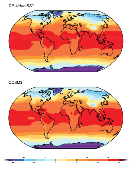
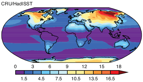
CCSM3 Annual Land & Sea Temperature Actual (top) vs Model (bottom)

CCSM3 Annual Land & Sea Temperature Actual (top) vs Model (bottom)

Cici looks pretty good.

Details – The HadISST (Rayner et al., 2003) climatology of SST for 1980-1999 and the CRU (Jones et al., 1999) climatology of surface air tempeature over land for 1961–1990 are shown here. The model results are for the same period of the CMIP3 20th Century simulations. In the presence of sea ice, the SST is assumed to be at the approximate freezing point of sea water (–1.8 °C).

However, it’s hard to tell looking at two sets of absolute values, so of course we turn to the difference between model and reality.

Annual Temperature – Model Error

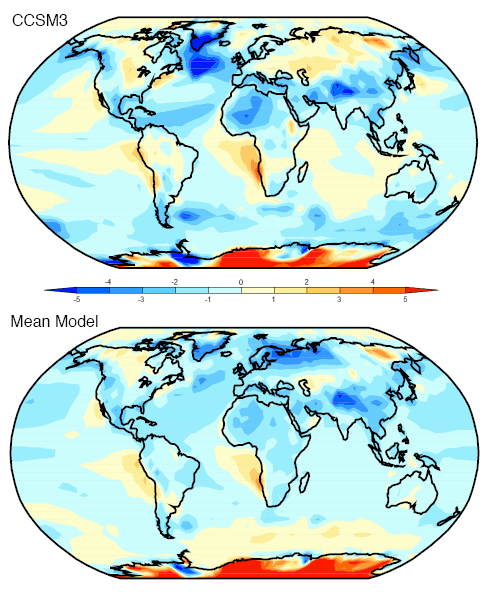
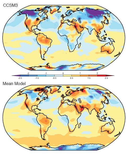
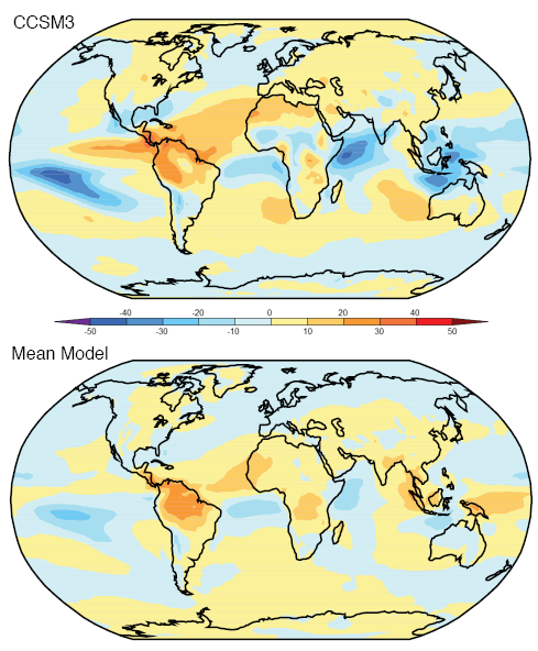
Model simulations of annual average temperature less observed values for Cici and for the “ensemble” or multi-model mean:

Annual Temperatures - Simulated minus observed for CCSM3 and the ensemble

Annual Temperatures - Simulated minus observed for CCSM3 and the ensemble

In terms of absolute error around the globe, Cici and the ensemble are very close (using the Anglotzen statistical method).

We could note that even though the values are “close”, there are areas where Cici – and the ensemble – don’t do so well. In Cici’s case southern Greenland and the Labrador Sea, which might be very important for predicting the future of the thermohaline circulation. And both are particularly bad for Antarctica, a general problem for models.

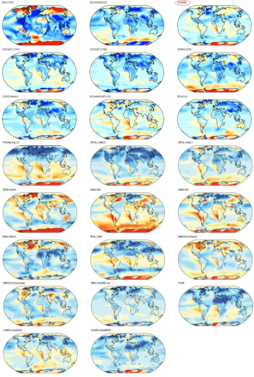
To give an idea of the variation of models, here are all of the models reviewed by the IPCC in AR4 (2007):

Annual Temperature - Model less Actual - All models

Annual Temperature - Simulated minus observed - All models

The top right is Cici (red circle). It’s clear that Cici is a supermodel..

Standard Deviation of Temperature

The standard deviation of temperature – “over the climatological monthly mean annual cycle ” – simulated less observed for Cici and the ensemble. We could describe it as how good is the model at working out how much temperature actually varies over the year in each location?

First, however, to make sense of the “error” of model less actual, we need to know what actual values look like:

Standard Deviation of Temperature over the climatological monthly mean annual cycle

Standard Deviation of Temperature over the climatological monthly mean annual cycle

As we would expect, the oceans show a lot less temperature variation than the land and around the tropics and sub-tropics the variation is close to zero.

Now let’s take a look at the model less actual, or “model error”:

Std Deviation of Temperature - Simulated minus observed for CCSM3 and the ensemble

Std Deviation of Temperature - Simulated minus observed for CCSM3 and the ensemble

We can see that Cici has some problems in modeling temperature variation especially under-estimating the actual variation around northern Russia and Canada and over-estimating the variation in the Middle East and Brazil. The ensemble appears to be in slightly better shape here.

Of course, these areas are where the largest temperature variation takes place.

Diurnal Range of Land Temperature

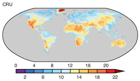
As before, first the actual values:

Annual average of diurnal temperature range over land

Annual average of diurnal temperature range over land

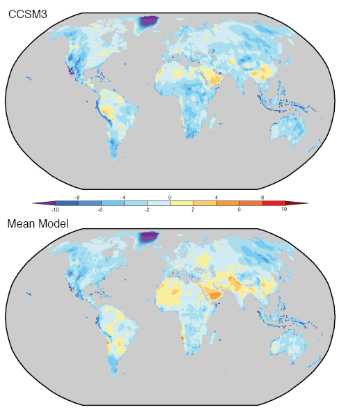
And now the model less actual, or “model error”:

Diurnal temperature range over land - Actual less Model for CCSM3 and ensemble

Diurnal temperature range over land - Actual less Model for CCSM3 and ensemble

We can see a lot of areas where the model error is quite large, usually corresponding to larger measured values. In the case of Greenland, for example, the annual average diurnal temperature range is over 20°C, while the model under-estimates this by more than 10°C. Given the legend the error might be as big as the actual value..

We can also see that on average Cici under-estimates the diurnal temperature range, and the ensemble is closer to neutral but still appears to under-estimate.

Here’s another comparison which demonstrates the problem of all the models vs observation:

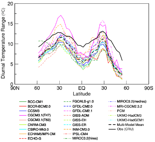
Diurnal temperature range vs latitude - Observed compared with all models

Diurnal temperature range vs latitude - Observed compared with all models

The black line is the observed value. We can see that all of the models except for one are definitely under-estimating, and none of the models are particularly close to the observed values.

Now we can get to see more fundamental values.

Reflected Solar Radiation

This value is essential for calculating the basic radiation budget for the earth.

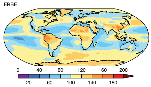
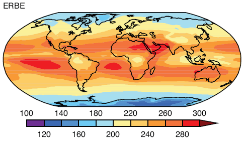
First the actual values as measured by ERBE (1985-1989):

Average Reflected Solar Radiation, ERBE

Average Reflected Solar Radiation, ERBE

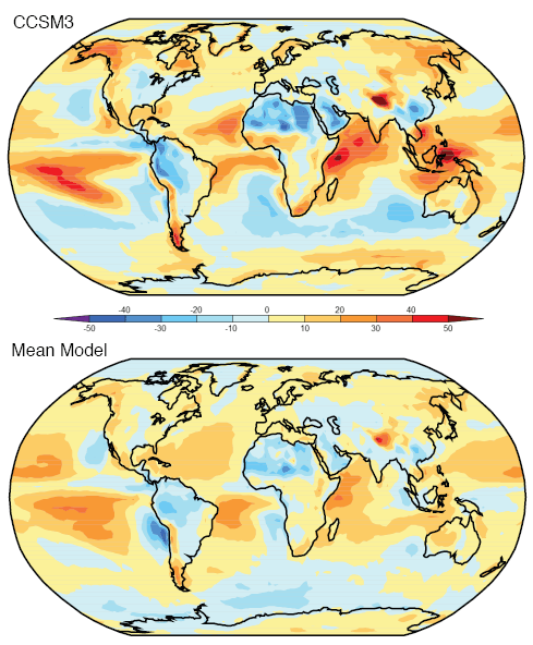
And now the model error – model less actual:

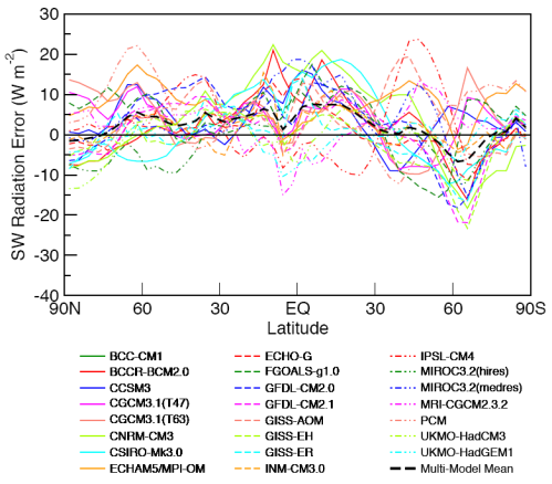
Reflected Solar Radiation - Actual less Model for CCSM3 and ensemble

Reflected Solar Radiation - Actual less Model for CCSM3 and ensemble

The ensemble is definitely better than Cici. Cici has some large errors, for example, North Africa, Pacific Ocean and the Western Indian Ocean where the model error seems to be up to half of the actual value.

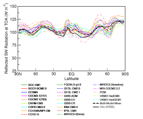
If we look at the values averaged by latitude the results appear a little better:

Reflected Solar Radiation vs latitude - Observed compared with all models

Reflected Solar Radiation vs latitude - Observed compared with all models

But the deviations give us a better view:

Reflected Solar Radiation vs latitude - Model error for all models

Reflected Solar Radiation vs latitude - Model error for all models

Note Cici in the solid blue line. The ensemble is proving to be the pick of the bunch..

So the model’s ability to simulate reflected solar radiation is much better by latitude than by location. But most or all of the models have significant discrepancies even when averaged over each latitude.

Outgoing Longwave Radiation

The other side of the radiation budget, first the actual ERBE measurement (1985-1989):

Outgoing Longwave Radiation, OLR, ERBE

Measured Outgoing Longwave Radiation, ERBE

And now the model error – model less actual:

OLR - Actual less Model for CCSM3 and ensemble

OLR - Actual less Model for CCSM3 and ensemble

As with reflected SW radiation, the ensemble performs better than Cici. So while measured values are in the range of 200-300 W/m2, Cici has some areas where the (absolute) error is in excess of 30W/m2.

Looking at the OLR values averaged by latitude, the results appear a little better:

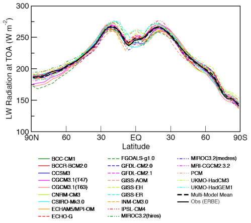
OLR vs latitude - Observed compared with all models

OLR vs latitude - Observed compared with all models

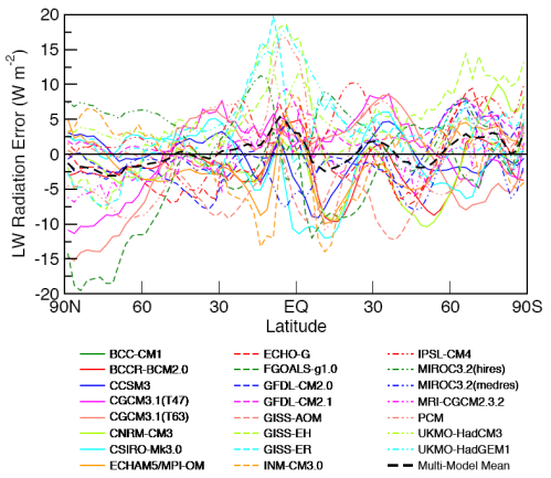
And the deviations, or model error:

OLR vs latitude - Model error for all models

OLR vs latitude - Model error for all models

Rainfall

Measured from CMAP, 1980-1999:

Rainfall 1980-1999

Rainfall 1980-1999

Units are in cm of rainfall per year. And now the model error – model less actual:

Rainfall - Actual less Model for CCSM3 and ensemble

Rainfall - Actual less Model for CCSM3 and ensemble

Once again the ensemble outshines Cici. There are some substantial errors in the areas where rainfall is high.

As with some of the previous model results, if we look at the model vs observed by latitude the picture is somewhat better:

Rainfall vs latitude - Observed vs all models

Rainfall vs latitude - Observed vs all models

Humidity

Lastly, we will take a look at specific humidity. First the “measured”, as recalculated by ERA-40:

Specific Humidity vs Latitude and Altitude, from ERA40

Specific Humidity in g/kg vs Latitude and Altitude, from ERA40

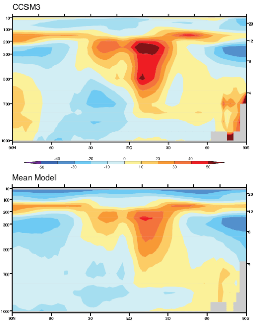
Observed annual mean specific humidity in g/kg, averaged zonally, 1980-1999. Note that the vertical axis is pressure on the left in mbar and km in height on the right.

And now the model error – but this time in % = (model – actual)/actual x 100:

Specific Humidity - % Error for CCSM3 and ensemble

Specific Humidity - % Error for CCSM3 and ensemble

Once again the ensemble appears to outperform Cici. And both, but especially Cici, have problems in the top half of the troposphere (around 500-200mbar) with 20-50% error in some regions in Cici’s case.

Conclusion

This has been a quick survey of model results for different parameters across the globe, but averaged annually, compared with observations.

In Part One, we saw the ensemble in its best light. But when we take a look at a real model, the supermodel Cici, we can see that she has a lot of areas for improvement.

There’s lots more to investigate about models, all to come in future parts of this series.

As always, comments and questions are welcome, but remember the etiquette.

Read Full Post »
In the previous article in this series, The Earth’s Energy Budget – Part Two we looked at outgoing longwave radiation (OLR) and energy imbalance. At the end of the article I promised that we would look at problems of measuring things and albedo but much time has passed, promises have been forgotten and the fascinating subject of how the earth really radiates energy needs to be looked at.

If you are new to the idea of incoming (absorbed) solar radiation being balanced by OLR, or wonder how the solar “constant” of 1367W/m2 can be balanced by the earth’s OLR of 239W/m2 then take a look at Part One and Part Two.

Introduction

If you’ve read more in depth discussions about energy balance or CO2 “saturation” you might have read statements like:

More absorption by CO2 causes emission of radiation to move to higher, colder layers of the atmosphere

If these kind of comments confuse you, sound plain wrong, or cause you to furrow your brow because “it sounds like it’s probably right but what does it actually mean?” – well, hopefully some enlightenment can be found.

Effective Radiation

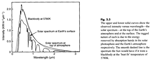
The sun’s core temperature is millions of degrees but we see a radiation from the sun that matches 5780K – its surface temperature:

Solar Radiation, top of atmosphere and at earth's surface, Taylor (2005)

Solar Radiation, top of atmosphere and at earth's surface, Taylor (2005)

In this figure there are two spectra: the top one is how the sun’s radiation looks before it reaches the top of the earth’s atmosphere – contrasted with the dotted line of a “blackbody” – or perfect radiator – at 5780K (5507°C for people new to Kelvin or absolute temperature).

The bottom one – of less interest for this article – is how the sun’s radiation looks at the earth’s surface after the atmosphere has absorbed at various wavelengths.

Why don’t we see a radiation spectrum from the sun that matches millions of degrees?

If we measure the upward longwave radiation from the earth’s surface at 15°C we see an effective “blackbody” radiator of 288K (15°C). But why don’t we see a radiation spectrum of 5000K – the temperature somewhere near the core?

The answer to both questions is that radiation from the hotter inner areas of these bodies gets completely absorbed by outer layers, which in turn heat up and radiate at lower temperatures. In the case of the sun, the radiation spectrum includes hotter areas below the surface that are not absorbed at some wavelengths, as well as the surface itself.

In the case of the earth it’s really the top skin layer that emits longwave radiation.

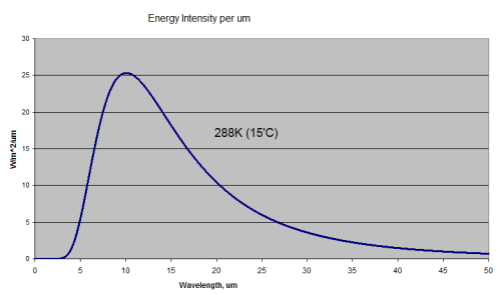
So when we measure the radiation from the earth with a surface temperature of 15°C (288K) we know we will see a longwave radiation that matches this 288K. This will be a total energy radiated of 390W/m2 with the peak wavelength of 10.1μm. The temperature below the surface is irrelevant.

(Well, it’s not really irrelevant. The hotter layers below warm up the layers above – through conduction and radiation).

This is what the radiation looks like:

Blackbody Radiation at 15'C or 288K

Blackbody Radiation at 15'C or 288K

This assumes an emissivity of 1. The emissivity of the surface of the earth varies slightly but is close to 1, typically around 0.98. Watch out for a dull post on emissivity at some stage..

At the top of atmosphere, as many know, the OLR is around 239W/m2. For those confused by how it can be 390W/m2 at the surface and 239W/m2 at the top, the answer is due to absorption and re-radiation of longwave radiation by trace gases – the “greenhouse” effect. See the CO2 – An Insignificant Trace Gas? series, and especially Part Six – Visualization and CO2 Can’t Have that Effect Because.. if you don’t understand or agree with these well-proven ideas.

If the earth’s atmosphere was completely transparent to longwave radiation this spectrum would look exactly the same at the earth’s surface and at the top of atmosphere (TOA).

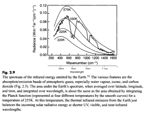
Here’s what it does look like with some typical blackbody radiation curves overlaid:

Outgoing longwave radiation at TOA, Taylor (2005)

Outgoing longwave radiation at TOA, Taylor (2005)

(Note that the spectrum is shown in wavenumber in cm-1. For convenience I added wavelength in μm under the wavenumber axis. Wavelength in μm = 10,000/wavenumber).

For energy balance – if the earth is not warming up or cooling down – we would expect the earth to radiate out the same amount of energy that it absorbs from the sun. That amount is 239W/m2, which equates to an average temperature of 255K (-18°C).

As the text for this graphic shows, when the energy under the curve is integrated this is what it comes to! But as you can see the actual spectrum is not a “blackbody curve” for 255K. So let’s take a closer look.

Everything Gets Through or Nothing Gets Through – a Few Thought Experiments

Imagine a world where the upwards longwave radiation from the earth’s surface didn’t get absorbed by any gases in the atmosphere.

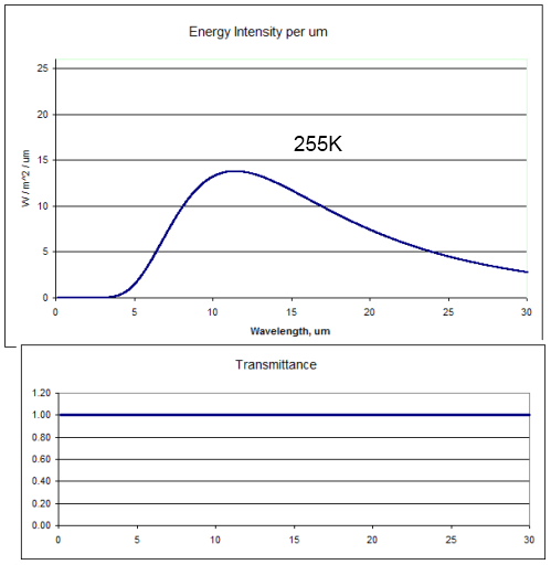
Most people are familiar with that thought experiment – it’s a staple of the most basic radiation model in climate science. The radiation at the top of the atmosphere would look like this (the top graph):

255K radiation, 100% transmittance

255K radiation, 100% transmittance

This is the blackbody radiation at 255K (-18°C) with 100% “transmittance” through the atmosphere. The area under the curve, if we extend it out to infinity, is 239W/m2.

And of course, because the radiation hadn’t been absorbed or attenuated in any way, the temperature at the earth’s surface would also be 255K. Chilly.

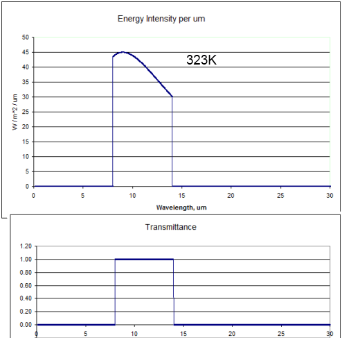
Now let’s think about what would happen if the atmosphere allowed radiation only through the “atmospheric window” and everywhere else the transmittance was zero:

323K radiation through a perfect "atmospheric window", 8-14um

323K radiation through a perfect "atmospheric window", 8-14um

The bottom graph shows how the transmittance of the atmosphere varies with wavelength in this thought experiment.

The top graph in this case is the blackbody radiation from 323K (50°C) only allowed through between 8-14μm. The energy under the curve is 239W/m2. (Note the higher values on the vertical scale compared with the earlier graphs).

So if the atmosphere absorbed all of the surface radiation below 8μm and above 14μm the earth’s surface would heat up until it reached 50°C (323K). Why? Because if the temperature was only 15°C the amount of energy radiated out would only be 141W/m2. More energy coming in than going out = earth heats up. The surface temperature would keep heating up until eventually 239W/m2 made it out through the atmospheric window – which is 50°C.

Closer to The Real World – Illustration of Radiation from Multiple Layers in the Atmosphere

Even in the atmospheric window some radiation is absorbed, i.e. the transmittance is not 1. But let’s assume for sake of argument it is 1. So energy in the 8-14μm band just passes straight through the atmosphere. It’s still a thought experiment.

Lots of gases absorb at lots of wavelengths – which makes thinking about it as a whole very difficult. So we’ll just assume that the rest of the atmosphere outside the atmospheric window all shares the same absorption characteristics – that is, every wavelength is identical in terms of absorption of radiation.

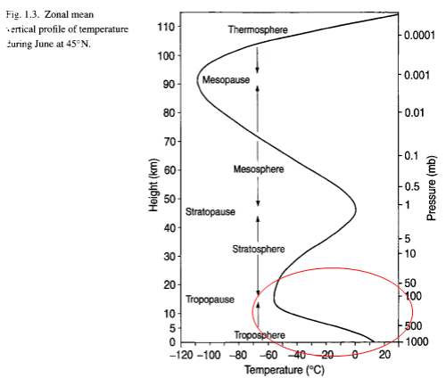
Now let’s try and consider what really happens in the atmosphere. Each “layer” of the atmosphere radiates out energy according to the temperature in that layer. For reference, here is the temperature (and pressure) at different heights:

Atmospheric Temperature & Pressure Profile, Bigg (2005)

Atmospheric Temperature & Pressure Profile, Bigg (2005)

The highlighted area at the bottom – the troposphere – is the area of interest. This is where most of the atmosphere (by molecules and mass) actually resides.

In our thought experiment radiation from the surface (outside the atmospheric window) gets completely absorbed by the atmosphere, or at least the amount that gets through is very small. Taken to the extreme we would get the result shown a few graphs earlier where the surface temperature rises up to 50’C.

But just because surface radiation doesn’t get out doesn’t mean that radiation from the atmosphere can’t get out.

Each layer of the atmosphere radiates according to its temperature. Even if the atmosphere’s transmittance is zero when considering the entire thickness of the atmosphere, there will be some layer where radiation starts to get through.

This is partly because there is less atmosphere to absorb the closer we get to the “top”. And also because as we get higher in the atmosphere it gets thinner. Less molecules to absorb radiation. Even if some gas is a fantastically good absorber of energy, there must be a point where radiation is hardly absorbed. For example, at the top of the stratosphere, about 50km, the pressure is around 1mbar – 1000x less than at the surface. At the top of the troposphere (the tropopause) the pressure is around 200mbar – 5x less than at the surface.

The challenge in thinking about the atmosphere radiating is that unlike the surface of the earth where all radiation is emitted from the very surface, instead radiation is emitted from lots of different layers:

  • Higher up – less absorption, more radiation makes it through
  • Lower down – more absorption, less radiation makes it through

But let’s still keep it simple and think about the surface temperature being our standard 15°C (288K) and the atmospheric window letting through everything between 8-14μm. This means 141W/m2 makes it out through this window.

If we have energy balance, the OLR = 239W/m2 in total = 141 (through the atmospheric window) + 98 (radiated from the atmosphere at some height, wavelengths outside 8-14μm).

What temperature equates to this layer in the atmosphere? Well, assuming no absorption above this radiating layer (not really the case), and only radiation outside 8-14μm, the temperature of the atmosphere would have to be 219K, or -54°C. Take a look back at the temperature profile above – this is pretty much the top of the troposphere, around 11km.

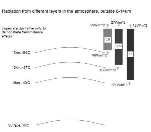
Remember that this isn’t exactly how radiation gets radiated out to space – it doesn’t come from one “skin layer”. We might consider that if the transmittance of the atmosphere is 1 at this height, then maybe at 10km the transmittance is 0.8 and at 9km the transmittance is 0.5, and at 8km the transmittance is 0.1..

So each layer is radiating energy, with higher layers being colder but more of their radiation getting through, and lower layers being warmer – so radiating a higher amount – but less of their radiation getting through.

For many people reading, this is a straightforward concept, why so long.. for others it might still seem tough to grasp..

So here is a sample radiation diagram with illustrative values only (and values a little different from above):

Radiation from different heights in the atmosphere, illustrative values only

Radiation from different heights in the atmosphere, illustrative values only

What the diagram shows is the radiation outside the 8-14μm band. That’s because in our thought experiment the 8-14μm band doesn’t absorb any radiation (and therefore can’t radiate in this band either).

Take the top layer at 11km. If we calculate the blackbody radiation of 219K (-54°C) and exclude radiation in the 8-14μm band the radiation is 98W/m2. Then the grey block above with “0.6” is the atmosphere above with transmittance of 0.6, so the radiation actually getting through from this layer to the top of atmosphere is 59W/m2. Similarly for the two other layers (with different values).

In total, the energy leaving the top of atmosphere (outside of the atmospheric window) is 98W/m2. (It’s just a coincidence that this is the value of the top layer before any absorption). And inside the atmospheric window was the number we already calculated of 141W/m2, so the total OLR is 239W/m2.

Of course, we all know the real atmosphere is much more complex with lots of different absorption at different wavelengths. But hopefully this “intermediate” example help to explain how the atmosphere radiates out energy.

So finally, onto the real point..

What Happens with More Absorbing Gases?

Remember how this long post started..

If you’ve read more in depth discussions about energy balance or CO2 “saturation” you might have read statements like:

More absorption by CO2 causes emission of radiation to move to higher, colder layers of the atmosphere

Now, maybe this kind of statement will make more sense.

In our model – our thought experiment – above, we had a uniform absorber of radiation outside the atmospheric window. Suppose we increase the amount of this absorber – the skies open and someone pours some more in and stirs it around. Let’s say the amount increases by 10%.

Well, take a look back at the last diagram. See the transmittance values for each layer in the atmosphere – 0.6 at 11km high, 0.25 at 10km high and 0.1 at 9km high.

Regardless of how realistic these actual numbers are, increasing the amount of absorbing gas by 10% will automatically mean that each of the transmittance numbers is reduced by 10%. And so less radiation makes it out to the TOA (top of atmosphere).

Effectively because lower layers are contributing less energy out through TOA the effective radiating height has moved up. It’s not because some directive has been passed down from a higher authority. And it’s not because one layer has stopped and another layer has taken over.

It’s just that lower layers contribute less, so the “average radiating height” is now higher and colder.

(Note: it might look at first sight that the average height is still the same even though the amount of radiation has reduced. This is not really the case, see the note at end).

In our particular example what would happen is that the OLR would reduce from 239W/m2 down to 141+98*0.9=229 W/m2. So the surface would warm up and this would warm up each layer of the atmosphere until eventually a new hotter steady state was reached.

Conclusion

This has been a long post to try and create more of an understanding of how the earth actually radiates energy, and why more of any trace gas increases the “greenhouse” effect.

It does it because more “absorbing gases” reduce the amount of radiation that can make it out from lower layers in the atmosphere. These lower layers are hotter and radiate much more energy. Proportionately more energy will then be radiated from higher layers which are colder, and therefore these radiate less energy.

It’s a not a mystical force that raises the “effective radiating height” in the atmosphere. But the effective radiating height does increase.

Note

In the example above, the three layers together contributed 98W/m2 at TOA. That is an “effective temperature” of 219K – remembering that we are excluding radiation from the 8-14μm window. If we reduce the radiation from these three layers by 10%, we now have 89W/m2 which is about 212K – effectively radiating from a colder level in the atmosphere.

Read Full Post »
Many readers of this blog would like progress towards the solution of the great questions in climate science. Other readers have stopped by still pondering the basics.

Some of those pondering the basics might have read many of the exciting claims on the internet that the “greenhouse” effect can’t exist because it would violate the 2nd law of thermodynamics.

It’s not a claim that you find in any books on atmospheric physics by the way, it’s strictly an “internet phenomenon”.

Just a few basics in case this is the first post you have read from this site.

The inappropriately named “greenhouse” effect can be summed up in a few sentences:

Longwave radiation from the earth’s surface is absorbed by many trace gases, including water vapor and CO2. The absorption causes these gases to heat up and energy is radiated back out – both up and down. The upward radiation is effectively “no change”. The downward radiation adds to the energy received from the sun and heats up the surface of the earth more than if this downward radiation did not occur.

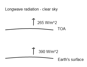
If there was no absorption of radiation by “greenhouse” gases the surface of the earth would be a lot colder. Here is a very simplified graphic to draw people’s attention to the fact that “something big” is going on:

Upward Longwave Radiation, Numbers from Kiehl & Trenberth

Upward Longwave Radiation, Numbers from Kiehl & Trenberth (1997)

(TOA = top of atmosphere). If there was no absorption and re-radiation back down the two numbers would be the same. (Note that the downward radiation is not shown to crystallize the issue)

These numbers are global annual averages under a clear sky. Under a cloudy sky the numbers are different but similar – and still the radiation from the surface of the earth is a lot greater than that leaving through the top of atmosphere. For more on this take a look at CO2 – An Insignificant Trace Gas? – Part Six – Visualization and the followup CO2 Can’t Have That Effect Because.. as well as the start of the series on CO2.

Many people have said that the numbers are obviously wrong, I’m mixing up solar radiation and longwave radiation, it can’t happen, the temperature varies a lot from equator to poles so that’s why the radiation numbers are wrong..

As one person said on another blog, possibly commenting on one of these earlier posts:

I even saw one where the guy had 100 watts/m2 going into the atmosphere MORE than was coming out FOREVER.

Sharp-eyed readers might notice that I haven’t drawn in the downward radiation. Energy is balanced in the atmosphere because of the downward radiation from the atmosphere (not drawn). This is the “greenhouse” effect.

Onto the Imaginary Second Law of Thermodynamics

How can a colder atmosphere add heat to a warmer surface?

Can a candle warm the sun?

There are many popular restatements of the imaginary 2nd law. These two should be a representative sample. And so follows the Q.E.D. claim that the “greenhouse” effect plainly contradicts the second law of thermodynamics.

What is the second law?

The Real Second Law of Thermodynamics

My boring thermodynamics books and I have long since had a parting of the ways, so I looked it up on Wikipedia. Not a 100% reliable source, but the (real) second law is just as I remember it so I looked no further.

It’s possible that the imaginary second law has taken a strong hold because anyone who does look it up finds statements like dS/dt>=0, where S is entropy. Wow. Clever people. What’s entropy? How does this relate to candles? Candles can’t warm the sun, so I guess the second law has just proved the “greenhouse” effect wrong..

According to Wikipedia, Clausius expressed the second law (validly) like this:

Heat generally cannot flow spontaneously from a material at lower temperature to a material at higher temperature

Again, that seems right and it doesn’t have any entropy involved in the description. I never did like entropy. It never seemed real.

Perhaps this formulation has been the inspiration for the imaginary second law. As a not very precise definition many people might read this and think no energy at all can flow from a cold body to a hot body.

In fact, no net energy can flow from a cold body to a hot body.

In the case of the real “greenhouse” effect and the real 2nd law of thermodynamics, net energy is flowing from the earth to the atmosphere. But this doesn’t mean no energy can flow from the colder atmosphere to the warmer ground.

It simply means more energy flows from the warmer surface to the colder atmosphere than in the reverse direction.

Another likely reason the imaginary second law has become popular is most people are much more familiar with conduction of heat than radiation. Conduction of heat only appears to flow one way.

A Thought Experiment

We’ll do a thought experiment to demonstrate why the imaginary second law of thermodynamics is wrong. It’s simpler, safer, cheaper AND more reliable than assembling equipment. After all, we are going to look at radiation and if we do an experiment we would need to ensure that no convection or conduction was taking place.

And the thought experiment will, I hope, be more powerful. Plus it will have the added benefit for those already convinced by the beguiling imaginary second law that they can say “you haven’t proven anything, it’s all in your head” and so the popular imaginary law can live on.

In our thought experiment we will consider the sun. It’s hot. It doesn’t conduct or convect any heat outside its immediate surface because space is a vacuum and heat can only travel by radiation through a vacuum.

So energy is radiated out from the sun equally in all directions. At a 1000km distance from the sun, we get our measuring instrument out and find that energy radiated is 10,000W/m2 (because I can’t be bothered to work out the actual number).

Now we fly in a cold large rock and park it at 1000km from the sun. Energy from the sun is absorbed on this cold rock and it heats up to some equilibrium value where it is also radiating out what it is receiving.

The temperature of this large once-cold rock is now a toasty 648K (375’C). All is well with both the real and imaginary formulations of the 2nd law, so far.

Now, from a galaxy far far away, we fly in a new star. Before we started moving it we checked the radiation 1000km away from the star and found that it was 11,000W/m2. We are careful in our relocation of this star that nothing changes in its inner generation of radiation. The new star is parked 1000km away from the once-cold rock and 1000km away from the sun.

It’s a love triangle. Due to the new star’s welcome appearance, the rock heats up further. It now receives 21,000W/m2. Its new equilibrium temperature is 780K. All is still well with both the real and imaginary formulations of the 2nd law.

Trouble in Paradise

But now a problem.. the new star is radiating out in all directions. Believers in the imaginary second law have no problem with the idea that the sun receives energy from the new star. After all the sun was a little colder.

But what about the sun? It is also radiating out in all directions. Or it was before the new star arrived.

Now that the new star is parked 1000km from the sun, squarely in the path of some portion of the sun’s radiation we have to ask ourselves what actually happens?

Believers in the real second law of thermodynamics are quite happy. No cognitive dissonance there. The energy from the sun which is incident on the new star’s surface actually increases the new star’s surface temperature compared with what it was before.

11,000W/m2 are flowing from the new star to the sun, and 10,000W/m2 are flowing from the sun to the new star. Some kind of new equilibrium might be reached, but for real second law believers there is no angst. The net flow of energy is from the hotter to the colder.

Believers in the imaginary second law, what happens?

One obvious suggestion is that the sun’s paltry 10,000W/m2 which was flowing through that exact spot now divert around the new star as if it had some kind of force field. Perhaps all the energy lines completely redistribute so that (depending on the diameter of this new star) about 10,015W/m2 flow in all directions except through the location of the new star.

Another obvious suggestion is that the sun “realizes” the new star is there and energy is flowing from the new star to it so just stops radiating in that exact direction. I put “realizes” in quotes of course because we all know the sun is not sentient. It’s just terminology. Some process that drives the imaginary second law will no doubt make this happen.

And the most likely suggestion of all is that this radiation from the sun, when it strikes the surface of the new star, just bounces off. Or is absorbed but doesn’t actually heat up the surface of the new star (unlike the inner radiation of this new star which does warm the surface from the inside).

Conclusion

I can’t help thinking that all my explanations for the imaginary second law have their own problems. And so I welcome explanations from promoters of the theory for the physical processes that take place near the surface of the new star.

Perhaps the problem is in the thought experiment itself. After all, you can’t just fly a star in from another galaxy and park it close to the sun. Barking mad!

And so the Imaginary Second Law of Thermodynamics lives on!

Update – the imaginary law also covered (possibly created by) On the Miseducation of the Uninformed by Gerlich and Tscheuschner (2009)

Update – a worked example with the maths, Radiation Basics and the Imaginary Second Law of Thermodynamics

Update – and more explanation with reference to one advocates explanation of this imaginary law, Intelligent Materials and the Imaginary Second Law of Thermodynamics

Read Full Post »
There’s a paper out which has created some excitement, On Falsification Of The Atmospheric CO2 Greenhouse Effects, by Gerlich & Tscheuschner (2009). It was published in International Journal of Modern Physics B. I don’t know what the B stands for.

Usually I would try and read a paper all the way through to understand it, then reread it.. but I got as far as page 55 out of 115 – even the seminal Climate Modeling through Radiative Convective Methods by Ramanathan & Coakley (1978) paper only had 25 pages.

Quite a few points have already jumped out at me that made me not want to read the whole thing:

First, a lot of time was spent showing that greenhouses and bodies surrounded by glass (or anything that stops air movement) retain heat not because of absorption and reradiation of longwave energy but because convection is reduced.

Why spend so long on it when everyone agrees. Sadly the “so-called greenhouse effect” became that because it passed into common language to describe this effect even though it’s not the right description.

Even in CO2 – An Insignificant Trace Gas? Part Six – Visualization I said:

I tried to think of a good analogy, something to bring it to life..

But didn’t mention greenhouses, because the greenhouse isn’t a good analogy..

This is a concern if it’s a serious paper, because attacking arguments that no one agrees with is the strawman fallacy, a refuge of people with no strong argument.

Here is a nice example, commenting on a paper by Lee, who says that the “greenhouse” term is a misnomer:

Lee continues his analysis with a calculation based on radiative balance equations, which are physically questionable.. Nevertheless, Lee’s paper is a milestone marking the day after which every serious scientist or science educator is no longer allowed to compare the greenhouse with the atmosphere, even in the classroom, which Lee explicitly refers to.

The authors of this paper don’t actually explain where Lee’s equations are questionable, instead draw attention to a day that should be marked down in history.. and use that to show that anyone mentioning “greenhouses” have got it wrong.

None of the papers that discuss the radiative-convective method actually argue from the greenhouse. So why are the authors of this paper spending so much time on it?

Second, attacking poor presentations with a mixture of correct (but really irrelevant) and incorrect arguments.

They cite, not a paper, but an Encyclopedia..

In the 1974 edition of Meyer’s Enzyklopadischem Lexikon one finds under “glass house eff ect”:

Name for the influence of the Earth’s atmosphere on the radiation and heat budget of the Earth, which compares to the e ffect of a glass house: Water vapor and carbon dioxide in the atmosphere let short wave solar radiation go through down to the Earth’s surface with a relative weak attenuation and, however, reflect the portion of long wave (heat) radiation which is emitted from the Earth’s surface
(atmospheric backradiation).

Disproof: Firstly, the main part of the solar radiation lies outside the visible light. Secondly, reflection is confused with emission.

Nice. They have brought this up a few times. Yes, technically we call infrared that part of the radiation that is longer wavelength than visible light. So anything >700nm is infrared. Any yet, in common terminology, often cited to a point of pain, we use “longwave” to mean that radiation over 4μm because 99% of it is radiated from the earth, and we use “shortwave” to mean that radiation under 4μm which is solar radiation.

So their first “disproof” isn’t a disproof. And their second one is simply picking a terminology mistake in an encyclopedia. Yes, the encyclopedia has mixed up the phenomenon.

Why are they citing from this source?

Third, another example of “destroying” the opponent’s argument..

They quote another source:

The infrared radiation that is emitted downwards from the atmosphere (the so-called back-radiation) raises the energy supply of the Earth’s surface.

And comment:

The assumption that if gases emit heat radiation, then they will emit it only downwards, is rather obscure.

It wasn’t what their source actually said. Their source didn’t say, or imply, that radiation was emitted only downward.

Fourth, and most importantly, the paper gives the appearance of discussing prior work by discussing a real mix of very old work and lots of more recent comments by people in their “introduction” to something quite different. That is they are citing from papers which are introducing another subject while not attempting to demonstrate any formal proof of the inappropriately named “greenhouse effect”. They don’t discuss the relevant modern work that attempts to prove the relevance and solution of the radiative transfer equations.

They do reference one key paper but never discuss it to point out any problems.

The paper in question is S. Manabe and R.F. Strickler, Thermal Equilibrium of the Atmosphere with Convective Adjustment, J. Atmosph. Sciences 21, 361-385 (1964)

It is referenced through this quote:

The influence of CO2 on the climate was also discussed thoroughly in a number of publications that appeared between 1909 and 1980, mainly in Germany. The most influential authors were Moller, who also wrote a textbook on meteorology, and Manabe (the citation). It seems, that the joint work of Moller and Manabe has had a signifi cant influence on the formulation of the modern atmospheric CO2 greenhouse conjectures and hypotheses, respectively.

The work that most recent papers on the solution to the radiative transfer equations discuss or cite is Ramanathan and Coakley (1978) – often along with a citation of M&S – and of course Ramanathan and Coakley cite and discuss Manabe and Strickler (1964). That is, anyone calculating the effect of CO2 and other trace gases on the surface temperatures.

Why not open up these two great papers and show the flaws? Ramanathan and Coakley are never even cited. Manabe and Strickler aren’t discussed.

R&C is 25 pages long and works through a lot of thermodynamics in their paper. If Gerlich & Tscheuschner want to get a result, show their flaws. It should be a breeze for them..

This doesn’t instill any confidence in the paper. I starting writing this post a few weeks ago and at the time wrote:

One day I may find the energy to read and reread all 115 pages and do them justice. Perhaps there is some revelation inside. More likely, they are having a laugh. Otherwise why is half the paper nothing to do with disproving the theory that modern atmospheric physicists believe?

I’m sure they would say otherwise.. And I’m certain we would get on great over a few drinks. If we drank enough I’m sure they would admit they did it for a bet..

Non-Conclusion

If Gerlich & Tscheuschner want to be taken seriously maybe they can write a paper which is 20-30 pages long – it should be enough – and they can ignore greenhouses and encyclopedia references and what people say in introductions to less relevant works.

Their paper could reference and discuss recent work which from first principles demonstrate and solve the radiative transfer equations. And they should show the flaw in these papers. Use Ramanathan and Coakley (1978) – everyone else references it.

On that paper: Climate Modeling through Radiative Convective Methods – R&C are into the maths by page 2 and don’t mention greenhouses. I would recommend this excellent paper (you should be able to find it online without paying) to anyone who wants to learn more about the approach to solving this difficult but well-understood problem. Even if you don’t want to follow their maths there is lots to learn.

Gerlich & Tscheuschner waste 50 pages with irrelevance and poorly directed criticism.. if they have produced a great insight it will be lost on many.

In New Theory Proves AGW Wrong! I commented that many ideas come along which are widely celebrated.

Some “disprove” the “greenhouse effect” or modify it to the extent that if their ideas are correct our ideas about the (inappropriately named) greenhouse effect are quite wrong.

Some disprove AGW (anthropogenic global warming). There is a world of difference between the two.

This paper falls into the first category. I also commented that the papers in the first category usually disprove each other as well, so it’s not “one more nail in the greenhouse effect” – it’s “one more nail in the last theory” and the theories that will inevitably follow.

Interestingly (for me), since I wrote that article: New Theory Proves AGW Wrong! someone produced a list of a few papers that I should “disprove”. One was this paper by Gerlich and Tschueschner, another was by Miskolczi. Yet they disprove each other and both disprove what this person promoted as their own theory.

This doesn’t prove anyone wrong – just they can’t all be right. One or zero..

And I’ll be the first to admit I haven’t proven Gerlich and Tschueschner wrong in their central theory. I have pointed out a few “areas for improvement” in their paper but these are all distractions from the main event. More interesting stuff to do.

Update – new post: On the Miseducation of the Uninformed by Gerlich and Tscheuschner (2009)

Read Full Post »
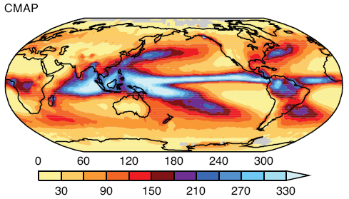
Gary Thompson at American Thinker recently produced an article The AGW Smoking Gun. In the article he takes three papers and claims to demonstrate that they are at odds with AGW.

A key component of the scientific argument for anthropogenic global warming (AGW) has been disproven. The results are hiding in plain sight in peer-reviewed journals.

The article got discussed on Skeptical Science, with the article Have American Thinker Disproven Global Warming? although the blog article really just covered the second paper. The discussion was especially worth reading because Gary Thompson joined in and showed himself to be a thoughtful and courteous fellow.

He did claim in that discussion that:

First off, I never stated in the article that I was disproving the greenhouse effect. My aim was to disprove the AGW hypothesis as I stated in the article “increased emission of CO2 into the atmosphere (by humans) is causing the Earth to warm at such a rate that it threatens our survival.” I think I made it clear in the article that the greenhouse effect is not only real but vital for our planet (since we’d be much cooler than we are now if it didn’t exist).

However, the papers he cites are really demonstrating the reality of the “greenhouse” effect. If his conclusions – different from the authors of the papers – are correct, then he has demonstrated a problem with the “greenhouse” effect, which is a component – a foundation – of AGW.

This article will cover the first paper which appears to be part of a conference proceeding: Changes in the earth’s resolved outgoing longwave radiation field as seen from the IRIS and IMG instruments by H.E. Brindley et al. If you are new to understanding the basics on longwave and shortwave radiation and absorption by trace gases, take a look at CO2 – An Insignificant Trace Gas?

Take one look at a smoking gun and you know it’s been fired. One look at a paper on a complex subject like atmospheric physics and you might easily jump to the wrong conclusion. Let’s hope I haven’t fallen into the same trap..

Even their mother couldn't tell them apart

Even their mother couldn't tell them apart

The Concept Behind the Paper

The paper examines the difference between satellite measurements of longwave radiation from 1970 and 1997. The measurements are only for clear sky conditions, to remove the complexity associated with the radiative effects of clouds (they did this by removing the measurements that appeared to be under cloudy conditions). And the measurements are in the Pacific, with the data presented divided between east and west. Data is from April-June in both cases.

The Measurement

The spectral data is from 7.1 – 14.1 μm (1400 cm-1 – 710 cm-1 using the convention of spectral people, see note 1 at end). Unfortunately, the measurements closer to the 15μm band had too much noise so were not reliable.

Their first graph shows the difference of 1997 – 1970 spectral results converted from W/m2 into Brightness Temperature (the equivalent blackbody radiation temperature). I highlighted the immediate area of concern, the “smoking gun”:

Spectral difference - 1997 less 1970 over East and West Pacific, Brindley

Spectral difference - 1997 less 1970 over East and West Pacific, Brindley

Note first that the 3 lines on each graph correspond to the measurement (middle) and the error bars either side.

I added wavelength in μm under the cm-1 axis for reference.

What Gary Thompson draws attention to is the fact that OLR (outgoing longwave radiation) has increased even in the 13.5+μm range, which is where CO2 absorbs radiation – and CO2 has increased during the period in question (about 330ppm to 380ppm). Surely, with an increase in CO2 there should be more absorption and therefore the measurement should be negative for the observed 13.5μm-14.1μm wavelengths.

One immediate thought without any serious analysis or model results is that we aren’t quite into the main absorption of the CO2 band, which is 14 – 16μm. But let’s read on and understand what the data and the theory are telling us.

Analysis

The key question we need to ask before we can draw any conclusions is what is the difference between the surface and atmosphere in these two situations?

We aren’t comparing the global average over a decade with an earlier decade. We are comparing 3 months in one region with 3 months 27 years earlier in the same region.

Herein seems to lie the key to understanding the data..

For the authors of the paper to assess the spectral results against theory they needed to know the atmospheric profile of temperature and humidity, as well as changes in the well-studied trace gases like CO2 and methane. Why? Well, the only way to work out the “expected” results – or what the theory predicts – is to solve the radiative transfer equations (RTE) for that vertical profile through the atmosphere. Solving those equations, as you can see in CO2 – Part Three, Four and Five – requires knowledge of the temperature profile as well as the concentration of the various gases that absorb longwave radiation. This includes water vapor and, therefore, we need to know humidity.

Atmospheric Temperature Profile, Brindley

Change in Atmospheric Temperature Profile, Brindley

I’ve broken up their graphs, this is temperature change – the humidity graphs are below.

Now it is important to understand where the temperature profiles came from. They came from model results, by using the recorded sea surface temperatures during the two periods. The temperature profiles through the atmosphere are not usually available with any kind of geographic and vertical granularity, especially in 1970. This is even more the case for humidity.

Note that the temperature – the real sea surface temperature – in 1997 for these 3 months is higher than 1970.

Higher temperature = higher radiation across the spectrum of emission.

Now the humidity:

Change in Humidity Profile through the atmosphere, Brindley

Change in Humidity Profile through the atmosphere, Brindley

The top graph is change in specific humidity – how many grams of water vapor per kg of air. The bottom is change in relative humidity. Not relevant to the subject of the post, but you can see how even though the difference in relative humidity is large high up in the atmosphere it doesn’t affect the absolute amount of water vapor in any meaningful way – because it is so cold high up in the atmosphere. Cold air cannot hold as much water vapor as warm air.

It’s no surprise to see higher humidity when the sea temperature is warmer. Warmer air has a higher ability to absorb water vapor, and there is no shortage of water to evaporate from the surface of the ocean.

Model Results of Expected Longwave Radiation

Now here are some important graphs which initially can be a little confusing. It’s worth taking a few minutes to see what these graphs tell us. Stay with me..

Top - model results not including trace gases; Bottom - model results including all effects

Top - model results not including trace gases; Bottom - model results including all effects

The top graph. The bold line is the model results of expected longwave radiation – not including the effect of CO2, methane, etc – but taking into account sea surface temperature and modeled atmospheric temperature and humidity profiles.

This calculation includes solving the radiative transfer equations through the atmosphere (see CO2 – An Insignificant Trace Gas? Part Five for more explanation on this, and you will see why the vertical temperature profile through the atmosphere is needed).

The breakdown is especially interesting – the three fainter lines. Notice how the two fainter lines at the top are the separate effects of the warmer surface and the higher atmospheric temperature creating more longwave radiation. Now the 3rd fainter line below the bold line is the effect of water vapor. As a greenhouse gas, water vapor absorbs longwave radiation through a wide spectral range – and therefore pulls the longwave radiation down.

So the bold line in the top graph is the composite of these three effects. Notice that without any CO2 effect in the model, the graph towards the left edge trends up: 700 cm-1 to 750 cm-1 (or 13.5μm to 14.1μm). This is because water vapor is absorbing a lot of radiation to the right (wavelengths below 13.5μm) – dragging that part of the graph proportionately down.

The bottom graph. The bold line in the bottom graph shows the modeled spectral results including the effects of the long-term changes in the trace gases CO2, O3, N2O, CH4, CFC11 and CFC12. (The bottom graph also confuses us by including some inter-annual temperature changes – the fainter lines – let’s ignore those).

Compare the top and bottom bold graphs to see the effect of the trace gases. In the middle of the graph you see O3 at 1040 cm-1 (9.6μm). Over on the right around 1300cm-1 you see methane absorption. And on the left around 700cm-1 you see the start of CO2 absorption, which would continue on to its maximum effect at 667cm-1 or 15μm.

Of course we want to compare this bottom graph – the full model results – more easily with the observed results. And the vertical axes are slightly different.

First for completeness, the same graphs for the West Pacific:

Model results for West Pacific

Model results for West Pacific

Let’s try the comparison of observation to the full model, it’s slightly ugly because I don’t have source data, just a graphics package to try and line them up on comparable vertical axes.

Here is the East Pacific. Top is observed with (1 standard deviation) error bars. Bottom is model results based on: observed SST; modeled atmospheric profile for temperature and humidity; plus effect of trace gases:

Comparison on similar vertical axes - top, observed; bottom, model

Comparison on similar vertical axes - top, observed; bottom, model

Now the West Pacific:

Comparison, West Pacific, Observed (top) vs Model (bottom)

Comparison, West Pacific, Observed (top) vs Model (bottom)

We notice a few things.

First, the model and the results aren’t perfect replicas.

Second, the model and the results both show a very similar change in the profile around methane (right “dip”), ozone (middle “dip”) and CO2 (left “dip”).

Third, the models show a negative value in change of brightness temperature (-1K) at the 700 cm-1 wavelength, whereas the actual results for the East Pacific is around 1K and for West Pacific is around -0.5K. The 1 standard deviation error bars for measurement include the model results – easily for West Pacific and just for East Pacific.

It appears to be this last observation that has prompted the article in American Thinker.

Conclusion

Hopefully, those who have taken the time to review:

  • the results
  • the actual change in surface and atmospheric conditions between 1970 and 1997
  • the models without trace gas effects
  • the models with trace gas effects

might reach a different conclusion to Gary Thompson.

The radiative transfer equations as part of the modeled results have done a pretty good job of explaining the observed results but aren’t exactly the same. However, if we don’t include the effect of trace gases in the model we can’t explain some of the observed features – just compare the earlier graphs of model results with and without trace gases.

It’s possible that the biggest error is the water vapor effect not being modeled well. If you compare observed vs model (the last 2 sets of graphs) from 800cm-1 to 1000cm-1 there seems to be a “trend line” error. The effect of water vapor has the potential to cause the most variation for two reasons:

  • water vapor is a strong greenhouse gas
  • water vapor concentration varies significantly vertically through the atmosphere and geographically (due to local vaporization, condensation, convection and lateral winds)

It’s also the case that the results for the radiative transfer equations will have a certain amount of error using “band models” compared with the “line by line” (LBL) codes for all trace gases. (A subject for another post but see note 2 below). It is rare that climate models – even just 1d profiles – are run with LBL codes because it takes a huge amount of computer time due to the very detailed absorption lines for every single gas.

The band models get good results but not perfect – however, they are much quicker to run.

Comparing two spectra from two different real world situations where one has higher sea surface temperatures and declaring the death of the model seems premature. Perhaps Gary ran the RTE calculations through a pen and paper/pocket calculator model like so many others have done.

There is a reason why powerful computers are needed to solve the radiative transfer equations. And even then they won’t be perfect. But for those who want to see a better experiment that compared real and modeled conditions, take a look at Part Six – Visualization where actual measurements of humidity and temperature through the atmosphere were taken, the detailed spectra of downwards longwave radiation was measured and the model and measured values were compared.

The results might surprise even Gary Thompson.

Notes:

1. Wavelength has long been converted to wavenumber, or cm-1. This convention is very simple. 10,000/wavenumber in cm-1 = wavelength in μm.

e.g. CO2 central absorption wavelength of 15μm => 667cm-1 (=10,000/15)

2. Solving the radiative transfer equations through the atmosphere requires knowledge of the absorption spectra of each gas. These are extremely detailed and consequently the numerical solution to the equations require days or weeks of computational time. The detailed versions are known as LBL – line by line transfer codes. The approximations, often accurate to within 10% are called “band models”. These require much less computational time and so the band models are almost always used.

Read Full Post »
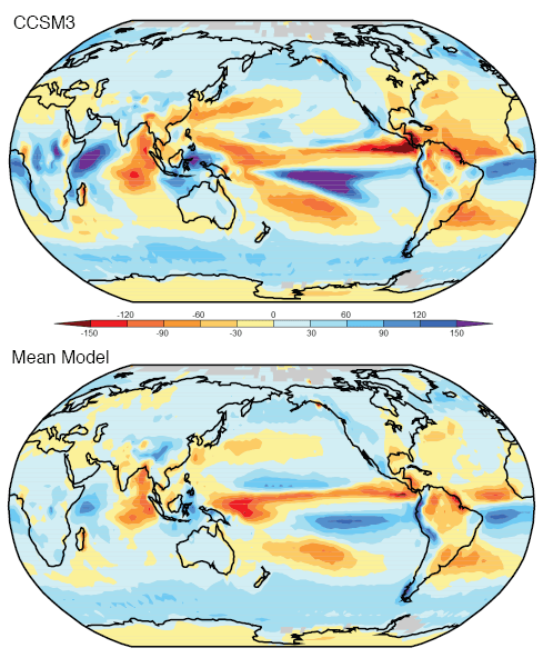
The title should really be:

The Real Measure of Global Warming – Part Two – How Big Should Error Bars be, and the Sad Case of the Expendable Bathythermographs

But that was slightly too long.

This post picks up from The Real Measure of Global Warming which in turn followed Why Global Mean Surface Temperature Should be Relegated, Or Mostly Ignored

The discussion was about ocean heat content being a better measure of global warming than air temperature. However, ocean heat down into the deep has been less measured than air temperature, so is subject to more uncertainty the further back in time we travel.

We had finished up with a measure of changes in OHC (ocean heat content) over 50 years from Levitus (2005):

Ocean heat change, Levitus (2005)

Ocean heat change, Levitus (2005)

Some of the earlier graphs were a little small but you could probably see that the error bars further back in time are substantial. Unfortunately, it’s often the case that the error bars themselves are placed with too much confidence, and so it transpired here.

In 2006, GRL (Geophysical Research Letters) published the paper How much is the ocean really warming? by Gouretski and Koltermann.

They pointed out a significant error source in XBTs (expendable bathythermographs ). The XBT’s estimate temperature against depth by estimating depth from fall rate, a value which was found to be inaccurate.

The largest discrepancies are found between the expendable bathythermographs (XBT) and bottle and CTD data, with XBT temperatures being positively biased by 0.2–0.4C on average. Since the XBT data are the largest proportion of the dataset, this bias results in a significant World Ocean warming artefact when time periods before and after introduction of XBT are compared.

And conclude:

Comparison with LAB2005 [Levitus 2005] results shows that the estimates of global warming are rather sensitive to the data base and analysis method chosen, especially for the deep ocean layers with inadequate sampling. Clearly instrumental biases are an important issue and further studies to refine estimates of these biases and their impact on ocean heat content are required. Finally, our best estimate of the increase of the global ocean heat content between 1957–66 and 1987–96 is 12.8 ± 8.0 x 10²² J with the XBT offsets corrected. However, using only the CTD and bottle data reduces this estimate to 4.3 ± 8.0 x 10²² J.

If we refer back to Levitus, they had calculated a value over the same time period of 15×1022 J.

Gouretski and Koltermann are saying, in layman’s terms, if I might paraphrase:

Might be around what Levitus said, might be a lot less, might even be zero.. we don’t know.

Some readers might be asking, does this heretical stuff really get published?

Well, moving back to ocean heat content, we don’t want to drown in statistical analysis because anything more than a standard deviation and I am out of my depth, so to speak.. Better just to see what the various experts have concluded as our measure of uncertainty.

Ocean Heat Content is one of the hot topics, so no surprise to see others weighing in..

Domingues et al

In 2008, Nature then published Improved estimates of upper-ocean warming and multi-decadal sea-level rise by Domingues et al.

Remembering that the major problem of ocean heat content is first a lack of data, and now revealed, problematic data in the major data source.. Domingues says in the abstract:

..using statistical techniques that allow for sparse data coverage..

My brief excursion into statistics was quickly abandoned when the first paper cited (Reduced space optimal interpolation of historical marine sea level pressure: 1854-1992, Kaplan 2000) states:

..A novel procedure of covariance adjustment brought the results of the analysis to the consistency with the a priori assumptions on the signal covariance structure..

Let’s avoid the need for strong headache medication and just see their main points, interesting asides and conclusions. Which are interesting.

OHC 1951-2004, Domingues (2008)

OHC 1951-2004, Domingues (2008)

The black line is their story. Note their “error bars” in the top graph, the grey shading around the black line is one standard deviation. This helps us see “a measure” of uncertainty as we go back in time. The red line is the paper we have just considered, Levitus 2005.

Domingues calculates the 1961-2003 increase in OHC as 16 x1022 J, with their error bars as ±3 x1022 J. They calculate a number very close to Levitus (2005).

Interesting aside:

Climate models, however, do not reproduce the large decadal variability in globally averaged ocean heat content inferred from the sparse observational database.

From one of the papers they cite (Simulated and observed variability in ocean temperature and heat content, AchutaRao 2007) :

Several studies have reported that models may significantly underestimate the observed OHC variability, raising concerns about the reliability of detection and attribution findings.

And on to Levitus et al 2009

From GRL, Global ocean heat content 1955–2008 in light of recently revealed instrumentation problems

Or, having almost the last word with his updated paper:

Ocean heat change 1955- 2009 - Levitus (2009)

Ocean heat change 1955- 2009 - Levitus (2009)

The red line being the updated version, the black dotted line the old version.

Willis Back, 2006 and Forwards, 2009

In the meantime, Josh Willis, using the brand new Argo floats, (see part one for the Argo floats) published a paper (GRL 2006) showing such a sharp reduction in ocean heat from 2003 – 2005 that there was no explanation for.

And then a revised paper in 2009 in Journal of Atmospheric and Oceanic Technology showing that the previous correction was a mistake, instrument problems again.. now it’s all flat for a few years:

no significant warming or cooling is observed in upper-ocean heat content between 2003 and 2006

Probably more papers we could investigate, including one which I planned to cover before realizing I can’t find it and this post has gone on way too long already.

Conclusion

We are looking at a very important measurement, ocean heat content. We aren’t as sure as we would like to be about the history of OHC and not much can be done about that, although novel statistical methods of covariance adjustment may have their place.

Some could say, based on one of the papers presented here, “No ocean warming for 50 years”. It’s a possibility, but probably a distant one. One day when we get to the sea level “budget”, more usefully called “sea level rise”, we will probably think that the rise of sea level is usefully explained by the ocean heat content going up.

We do have excellent measurements in place now, and since around 2000, although even that exciting project has been confused by instrument uncertainty, or uncertainty about instrument uncertainty.

We have seen a great example that error bars aren’t really error bars. They are “statistics”, not real life.

And perhaps, most useful of all, we might have seen that papers which show “a lot less warming” and “unexplained cooling”, still make it into print with peer-reviewed science journals like GRL. This last factor may give us more confidence than anything that we are seeing real science in progress. And save us from having to analyze 310,000 temperature profiles with and without covariance adjustments. Instead, we can wait for the next few papers to see what the final consensus is.

Or spend a lifetime in study of statistics.

Read Full Post »
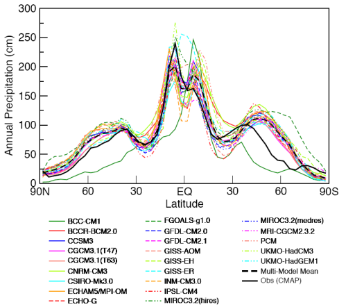
In an earlier post – Why Global Mean Surface Temperature Should be Relegated, Or Mostly Ignored – I commented:

There’s a huge amount of attention paid to the air temperature 6ft off the ground all around the continents of the world. And there’s an army of bloggers busy re-analyzing the data.

It seems like one big accident of history. We had them, so we used them, then analyzed them, homogenized them, area-weighted them, re-analyzed them, wrote papers about them and in so doing gave them much more significance than they deserve. Consequently, many people are legitimately confused about whether the earth is warming up.

Then we looked at some of the problems of measuring the surface temperature of the earth via the temperature of a light ephemeral substance approximately 6ft off the ground.

In Warming of the World Ocean 1955-2003, Levitus (2005) shows an interesting comparison of estimates of absorbed heat over almost half a century:

Heat absorbed in different elements of the climate, Levitus (2005)

Heat absorbed in different elements of the climate, Levitus (2005)

Once you find out that the oceans have around 1000x the heat capacity of the atmosphere, the above chart won’t be surprising.

For those who haven’t considered this relative difference in heat capacity before:

  • if the oceans cooled down by a tiny 0.1°, transferring their heat to the atmosphere, the atmosphere would heat up by 100°C (it wouldn’t happen like this but it gives an idea of the relative energy in both)
  • if the atmosphere transferred so much heat to the oceans that the air temperature went from an average of 15°C to a freezing -15°C, the oceans would heat up by a tiny, almost unnoticeable 0.03°C

So if we want to understand the energy in the climate system, if we want to understand whether the earth is warming up, we need to measure the energy in the oceans.

An Accident of History

Measuring the temperature of the earth’s surface by measuring the highly mobile atmosphere 6ft off the ground is a problem. By contrast, measuring ocean heat is simple..

Except we didn’t start until much later. Sea surface temperatures date back to the 19th century, but that doesn’t tell us much. We want to know the temperature down into the deep all around the world.

Ocean temperature vs depth in one location, Bigg (2003)

Ocean temperature vs depth in one location, "Oceans and Climate", Bigg (2003)

Here is a typical sample. Unlike the atmosphere, the oceans are more “stratified” – see Why Global Mean Surface Temperature Should be Relegated, Or Mostly Ignored for more on the basic physics of why the ocean is warmer at the surface. However, the oceans have complex global currents so we need to take a lot of measurements.

Measurements of the temperature down into the ocean depths didn’t really start until the 1940s and progressed very slowly since then. Levitus says:

Most of the data from the deep ocean are from research expeditions. The amount of data at intermediate and deep depths decreases as we go back further in time.

Fast forward to 2000 and the Argo project began to be deployed. By early 2010, over 3300 sensors have been moved into place around the world’s oceans. The Argo sensors drop to 2km in depth every 10 days and automatically measure temperature and salinity from the surface to this 2km depth:

Argo profile, Temperature and Salinity vs Depth

Argo profile, Temperature and Salinity vs Depth

Why salinity? Salinity is the other major factor apart from temperature which affects ocean density and therefore controls the ocean currents. See Predictability? With a Pinch of Salt please.. for more..

As we go back from 2010 there is progressively less data available. Even during the last 10 years measurement issues have created waves. But more on that later..

The Leviathan

It’s often best to step back a little to understand a subject better.

In 2000, Science published the paper Warming of the World Ocean by Sydney Levitus and a few co-workers. The paper has a thorough analysis of the previous 50 years of ocean history.

Ocean heat change, upper 3000m, 1955-1996, from Levitus (2000)

Ocean heat change, upper 3000m, 1955-1996, from Levitus (2000)

Now and again the large number of joules (unit of energy) are turned into a comparison W/m2 absorbed for the time period in question. 1W/m2 for a year (averaged over the entire surface of the earth) translates into 1.6×10²²J.

But it’s better to get used to the idea that change in energy in the oceans is usually expressed as 1022J.

The graphs above show a lot of variability between oceans but still they all demonstrate the similar warming pattern.

Comparison of OHC in top 3000m, top 800m, top 300m, Levitus (2000)

Comparison of OHC in top 3000m, top 800m, top 300m, Levitus (2000)

Here is the data shown (from left to right) as the energy change in the deeper 3000m, 800m and 300m.

We are used to seeing temperature graphs, even sea surface temperature graphs that go up and down from year to year. Of course we want to understand exactly why, for example see Is climate more than weather? Is weather just noise? It’s easy to think of reasons why that might happen, even in a warming world (or a cooling world) – with one of the main reasons being that heat has moved around in the oceans.

For example, due to ocean currents colder water has been brought to the surface. The measured sea surface temperature would be significantly lower but the total heat hasn’t necessarily changed – because we are only measuring the temperature at one vertical location (the top).

So we wouldn’t expect to see a big yearly decline in total energy.. not if the planet was “warming up”.

So this is quite surprising! See the change downward in the 1980’s:

Ocean heat change - global summary, Levitus (2000). Numbers in 10^22 J

Ocean heat change - global summary, Levitus (2000). Numbers in 10^22 J

What caused this drop?

Here’s a another fascinating look into the depths that we don’t usually get to see:

Temperature comparison 1750m down. 1970-74 cf 55-59 & 1988-92 cf 70-74

Temperature comparison 1750m down. 1970-74 cf 55-59 & 1988-92 cf 70-74

Here we see changes in the deeper North Atlantic in two comparison periods about 15 years apart. (As a minor note the reason for the comparisons of averaged 5-year periods is the sparsity of data below the surface of the oceans).

See how the 1990 period has cooled from 15 years earlier.

Levitus, Antonov and Boyer updated their paper in 2005 (reference below).

They comment:

Here we present new yearly estimates for the 1955– 2003 period for the upper 300 m and 700 m layers and pentadal (5-year) estimates for the 1955–1959 through 1994–1998 period for the upper 3000 m of the world ocean.

The heat content estimates we present are based on an additional 1.7 million temperature profiles that have become available as part of the World Ocean Database 2001.

Also, we have processed approximately 310,000 additional temperature profiles since the release of WOD01 and include these in our analyses.

(My emphasis added). Think re-doing GISS and CRU is challenging? And for those who like to know where the data lives, check out the World Ocean Database and World Ocean Atlas Series

Ocean heat change, Levitus (2005)

Ocean heat change, Levitus (2005)

Here’s a handy comparison of the changing heat when we look at progressively deeper sections of the ocean with the more up-to-date data.

The actual numbers (change in energy) from 1955-1998 were calculated to be:

  • 0-300m:   7×10²²J
  • 0-700m:   11×1022J
  • 0-3000m:   15×1022J
  • 1000-3000m:   1.3×10²²J

So the oceans below 1000m only accounted for 9% of the change. This gives an idea of the relative importance of measuring the temperatures as we go deeper.

In their 2005 paper they comment on the question of the early 80’s cooling:

One dominant feature .. is the large decrease in ocean heat content beginning around 1980. The 0–700 m layer exhibits a decrease of approximately 6 x 10²² J between 1980 and 1983. This corresponds to a cooling rate of 1.2 Wm2 (per unit area of Earth’s total surface).

Most of this decrease occurs in the Pacific Ocean.. Most of the net decrease occurred at 5°S, 20°N, and 40°N. Gregory et al. [2004] have cast doubt on the reality of this decrease but we disagree. Inspection of pentadal data distributions at 400 m depth (not shown here) indicates excellent data coverage for these two pentads.

And they also comment:

However, the large decrease in ocean heat content starting around 1980 suggests that internal variability of the Earth system significantly affects Earth’s heat balance on decadal time-scales.


So far so interesting, but as the article is already long enough we will come back to the subject in a later post with the follow up:

How Big Should Error Bars be and the Sad Case of the Expendable Bathythermographs.

And for one reader, in anticipation:

XBT

XBT

Update – follow up post – The Real Measure of Global Warming – Part Two – How Big Should Error Bars be, and the Sad Case of the Expendable Bathythermographs

References

Warming of the World Ocean, Levitus et al, Science (2000)

Warming of the World Ocean 1955-2003, Levitus et al, GRL (2005)

Read Full Post »

Older Posts »