In Thirteen – Terminator II we had a cursory look at the different “proxies” for temperature and ice volume/sea level. And we’ve considered some issues around dating of proxies.
There are two main proxies we have used so far to take a look back into the ice ages:
- δ18O in deep ocean cores in the shells of foraminifera – to measure ice volume
- δ18O in the ice in ice cores (Greenland and Antarctica) – to measure temperature
Now we want to take a closer look at the proxies themselves. It’s a necessary subject if we want to understand ice ages, because the proxies don’t actually measure what they might be assumed to measure. This is a separate issue from the dating: of ice; of gas trapped in ice; and of sediments in deep ocean cores.
If we take samples of ocean water, H2O, and measure the proportion of the oxygen isotopes, we find (Ferronsky & Polyakov 2012):
- 16O – 99.757 %
- 17O – 0.038%
- 18O – 0.205%
There is another significant water isotope, Deuterium – aka, “heavy hydrogen” – where the water molecule is HDO, also written as 1H2HO – instead of H2O.
The processes that affect ratios of HDO are similar to the processes that affect the ratios of H218O, and consequently either isotope ratio can provide a temperature proxy for ice cores. A value of δD equates, very roughly, to 10x a value of δ18O, so mentally you can use this ratio to convert from δ18O to δD (see note 1).
In Note 2 I’ve included some comments on the Dole effect, which is the relationship between the ocean isotopic composition and the atmospheric oxygen isotopic composition. It isn’t directly relevant to the discussion of proxies here, because the ocean is the massive reservoir of 18O and the amount in the atmosphere is very small in comparison (1/1000). However, it might be of interest to some readers and we will return to the atmospheric value later when looking at dating of Antarctic ice cores.
Terminology and Definitions
The isotope ratio, δ18O, of ocean water = 2.005 ‰, that is, 0.205 %. This is turned into a reference, known as Vienna Standard Mean Ocean Water. So with respect to VSMOW, δ18O, of ocean water = 0. It’s just a definition. The change is shown as δ, the Greek symbol for delta, very commonly used in maths and physics to mean “change”.
The values of isotopes are usually expressed in terms of changes from the norm, that is, from the absolute standard. And because the changes are quite small they are expressed as parts per thousand = per mil = ‰, instead of percent, %.
So as δ18O changes from 0 (ocean water) to -50‰ (typically the lowest value of ice in Antarctica), the proportion of 18O goes from 0.20% (2.0‰) to 0.19% (1.9‰).
If the terminology is confusing think of the above example as a 5% change. What is 5% of 20? Answer is 1; and 20 – 1 = 19. So the above example just says if we reduce the small amount, 2 parts per thousand of 18O by 5% we end up with 1.9 parts per thousand.
Here is a graph that links the values together:
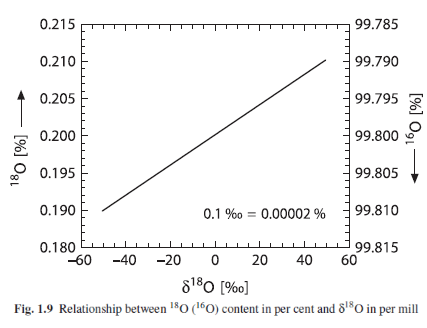
From Hoefs 2009
Figure 1
Fractionation, or Why Ice Sheets are So Light
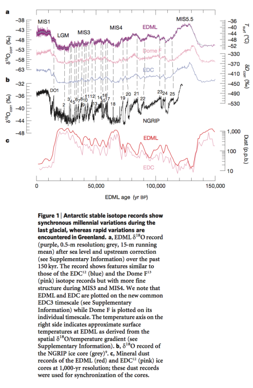
We’ve seen this graph before – the δ18O (of ice) in Greenland (NGRIP) and Antarctica (EDML) ice sheets against time:
From EPICA 2006
Figure 2
Note that the values of δ18O from Antarctica (EDML – top line) through the last 150 kyrs are from about -40 to -52 ‰. And the values from Greenland (NGRIP – black line in middle section) are from about -32 to -44 ‰.
There are some standard explanations around – like this link – but the I’m not sure the graphic alone quite explains it – unless you understand the subject already..
If we measure the 18O concentration of a body of water, then we measure the 18O concentration of the water vapor above it, we find that the water vapor value has 18O at about -10 ‰ compared with the body of water. We write this as δ18O = -10 ‰. That is, the water vapor is a little lighter, isotopically speaking, than the ocean water.
The processes (fractionation) that cause this are easy to reproduce in the lab:
- during evaporation, the lighter isotopes evaporate preferentially
- during precipitation, the heavier isotopes precipitate preferentially
(See note 3).
So let’s consider the journey of a parcel of water vapor evaporated somewhere near the equator. The water vapor is a little reduced in 18O (compared with the ocean) due to the evaporation process. As the parcel of air travels away from the equator it rises and cools and some of the water vapor condenses. The initial rain takes proportionately more 18O than is in the parcel – so the parcel of air gets depleted in 18O. It keeps moving away from the equator, the air gets progressively colder, it keeps raining out, and the further it goes the less the proportion of 18O remains in the parcel of air. By the time precipitation forms in polar regions the water or ice is very light isotopically, that is, δ18O is the most negative it can get.
As a very simplistic idea of water vapor transport, this explains why the ice sheets in Greenland and Antarctica have isotopic values that are very low in 18O. Let’s take a look at some data to see how well such a simplistic idea holds up..
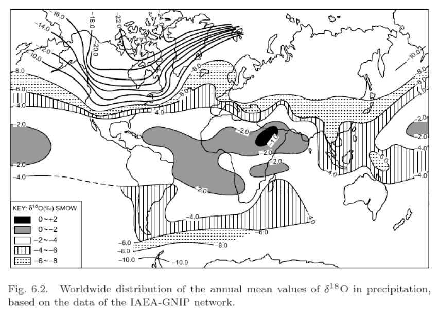
The isotopic composition of precipitation:
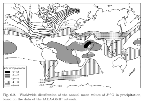
From Gat 2010
Figure 3 – Click to Enlarge
We can see the broad result represented quite well – the further we are in the direction of the poles the lower the isotopic composition of precipitation.
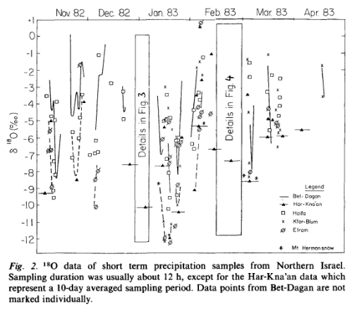
In contrast, when we look at local results in some detail we don’t see such a tidy picture. Here are some results from Rindsberger et al (1990) from central and northern Israel:

From Rindsberger et al 1990
Figure 4
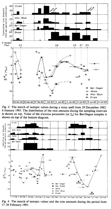
From Rindsberger et al 1990
Figure 5
The authors comment:
It is quite surprising that the seasonally averaged isotopic composition of precipitation converges to a rather well-defined value, in spite of the large differences in the δ value of the individual precipitation events which show a range of 12‰ in δ18O.. At Bet-Dagan.. from which we have a long history.. the amount weighted annual average is δ18O = 5.07 ‰ ± 0.62 ‰ for the 19 year period of 1965-86. Indeed the scatter of ± 0.6‰ in the 19-year long series is to a significant degree the result of a 4-year period with lower δ values, namely the years 1971-75 when the averaged values were δ18O = 5.7 ‰ ± 0.2 ‰. That period was one of worldwide climate anomalies. Evidently the synoptic pattern associated with the precipitation events controls both the mean isotopic values of the precipitation and its variability.
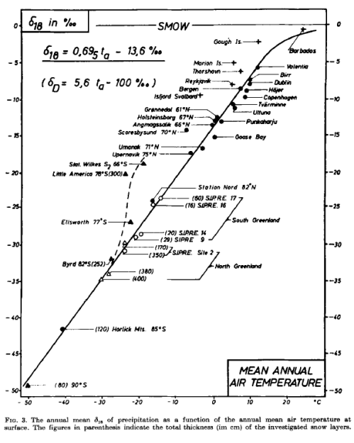
The seminal 1964 paper by Willi Dansgaard is well worth a read for a good overview of the subject:
As pointed out.. one cannot use the composition of the individual rain as a direct measure of the condensation temperature. Nevertheless, it has been possible to show a simple linear correlation between the annual mean values of the surface temperature and the δ18O content in high latitude, non-continental precipitation. The main reason is that the scattering of the individual precipitation compositions, caused by the influence of numerous meteorological parameters, is smoothed out when comparing average compositions at various locations over a sufficiently long period of time (a whole number of years).
The somewhat revised and extended correlation is shown in fig. 3..
From Dansgaard 1964
Figure 6
So we appear to have a nice tidy picture when looking at annual means, a little bit like the (article) figure 3 from Gat’s 2010 textbook.
Before “muddying the waters” a little, let’s have a quick look at ocean values.
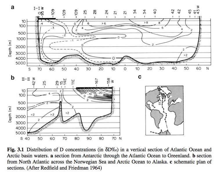
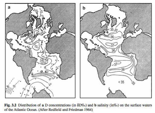
Ocean δ18O
We can see that the ocean, as we might expect, is much more homogenous, especially the deep ocean. Note that these results are δD (think, about 10x the value of δ18O):
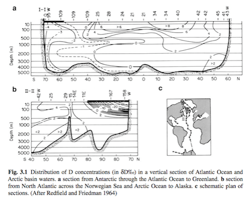
From Ferronsky & Polyakov (2012)
Figure 7 – Click to enlarge
And some surface water values of δD (and also salinity), where we see a lot more variation, again as might expect:

From Ferronsky & Polyakov 2012
Figure 8
If we do a quick back of the envelope calculation, using the fact that the sea level change between the last glacial maximum (LGM) and the current interglacial was about 120m, the average ocean depth is 3680m we expect a glacial-interglacial change in the ocean of about 1.5 ‰.
This is why the foraminifera near the bottom of the ocean, capturing 18O from the ocean, are recording ice volume, whereas the ice cores are recording atmospheric temperatures.
Note as well that during the glacial, with more ice locked up in ice sheets, the value of ocean δ18O will be higher. So colder atmospheric temperatures relate to lower values of δ18O in precipitation, but – due to the increase in ice, depleted in 18O – higher values of ocean δ18O.
Muddying the Waters
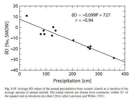
Hoefs 2009, gives a good summary of the different factors in isotopic precipitation:
The first detailed evaluation of the equilibrium and nonequilibrium factors that determine the isotopic composition of precipitation was published by Dansgaard (1964). He demonstrated that the observed geographic distribution in isotope composition is related to a number of environmental parameters that characterize a given sampling site, such as latitude, altitude, distance to the coast, amount of precipitation, and surface air temperature.
Out of these, two factors are of special significance: temperature and the amount of precipitation. The best temperature correlation is observed in continental regions nearer to the poles, whereas the correlation with amount of rainfall is most pronounced in tropical regions as shown in Fig. 3.15.
The apparent link between local surface air temperature and the isotope composition of precipitation is of special interest mainly because of the potential importance of stable isotopes as palaeoclimatic indicators. The amount effect is ascribed to gradual saturation of air below the cloud, which diminishes any shift to higher δ18O-values caused by evaporation during precipitation.
[Emphasis added]
From Hoefs 2009
Figure 9
The points that Hoefs make indicate some of the problems relating to using δ18O as the temperature proxy. We have competing influences that depend on the source and journey of the air parcel responsible for the precipitation. What if circulation changes?
For readers who have followed the past discussions here on water vapor (e.g., see Clouds & Water Vapor – Part Two) this is a similar kind of story. With water vapor, there is a very clear relationship between ocean temperature and absolute humidity, so long as we consider the boundary layer. But what happens when the air rises high above that – then the amount of water vapor at any location in the atmosphere is dependent on the past journey of air, and as a result the amount of water vapor in the atmosphere depends on large scale circulation and large scale circulation changes.
The same question arises with isotopes and precipitation.
The ubiquitous Jean Jouzel and his colleagues (including Willi Dansgaard) from their 1997 paper:
In Greenland there are significant differences between temperature records from the East coast and the West coast which are still evident in 30 yr smoothed records. The isotopic records from the interior of Greenland do not appear to follow consistently the temperature variations recorded at either the east coast or the west coast..
This behavior may reflect the alternating modes of the North Atlantic Oscillation..
They [simple models] are, however, limited to the study of idealized clouds and cannot account for the complexity of large convective systems, such as those occurring in tropical and equatorial regions. Despite such limitations, simple isotopic models are appropriate to explain the main characteristics of dD and d18O in precipitation, at least in middle and high latitudes where the precipitation is not predominantly produced by large convective systems.
Indeed, their ability to correctly simulate the present-day temperature-isotope relationships in those regions has been the main justification of the standard practice of using the present day spatial slope to interpret the isotopic data in terms of records of past temperature changes.
Notice that, at least for Antarctica, data and simple models agree only with respect to the temperature of formation of the precipitation, estimated by the temperature just above the inversion layer, and not with respect to the surface temperature, which owing to a strong inversion is much lower..
Thus one can easily see that using the spatial slope as a surrogate of the temporal slope strictly holds true only if the characteristics of the source have remained constant through time.
[Emphases added]
If all the precipitation occurs during warm summer months, for example, the “annual δ18O” will naturally reflect a temperature warmer than Ts [annual mean]..
If major changes in seasonality occur between climates, such as a shift from summer-dominated to winter- dominated precipitation, the impact on the isotope signal could be large..it is the temperature during the precipitation events that is imprinted in the isotopic signal.
Second, the formation of an inversion layer of cold air up to several hundred meters thick over polar ice sheets makes the temperature of formation of precipitation warmer than the temperature at the surface of the ice sheet. Inversion forms under a clear sky.. but even in winter it is destroyed rapidly if thick cloud moves over a site..
As a consequence of precipitation intermittancy and of the existence of an inversion layer, the isotope record is only a discrete and biased sampling of the surface temperature and even of the temperature at the atmospheric level where the precipitation forms. Current interpretation of paleodata implicitly assumes that this bias is not affected by climate change itself.
Now onto the oceans, surely much simpler, given the massive well-mixed reservoir of 18O?
Mix & Ruddiman (1984):
The oxygen-isotopic composition of calcite is dependent on both the temperature and the isotopic composition of the water in which it is precipitated
..Because he [Shackleton] analyzed benthonic, instead of planktonic, species he could assume minimal temperature change (limited by the freezing point of deep-ocean water). Using this constraint, he inferred that most of the oxygen-isotope signal in foraminifera must be caused by changes in the isotopic composition of seawater related to changing ice volume, that temperature changes are a secondary effect, and that the isotopic composition of mean glacier ice must have been about -30 ‰.
This estimate has generally been accepted, although other estimates of the isotopic composition have been made by Craig (-17‰); Eriksson (-25‰), Weyl (-40‰) and Dansgaard & Tauber (≤30‰)
..Although Shackleton’s interpretation of the benthonic isotope record as an ice-volume/sea- level proxy is widely quoted, there is considerable disagreement between ice-volume and sea- level estimates based on δ18O and those based on direct indicators of local sea level. A change in δ18O of 1.6‰ at δ(ice) = – 35‰ suggests a sea-level change of 165 m.
..In addition, the effect of deep-ocean temperature changes on benthonic isotope records is not well constrained. Benthonic δ18O curves with amplitudes up to 2.2 ‰ exist (Shackleton, 1977; Duplessy et al., 1980; Ruddiman and McIntyre, 1981) which seem to require both large ice- volume and temperature effects for their explanation.
Many other heavyweights in the field have explained similar problems.
We will return to both of these questions in the next article.
Conclusion
Understanding the basics of isotopic changes in water and water vapor is essential to understand the main proxies for past temperatures and past ice volumes. Previously we have looked at problems relating to dating of the proxies, in this article we have looked at the proxies themselves.
There is good evidence that current values of isotopes in precipitation and ocean values give us a consistent picture that we can largely understand. The question about the past is more problematic.
I started looking seriously at proxies as a means to perhaps understand the discrepancies for key dates of ice age terminations between radiometric dating and ocean cores (see Thirteen – Terminator II). Sometimes the more you know, the less you understand..
Articles in the Series
Part One – An introduction
Part Two – Lorenz – one point of view from the exceptional E.N. Lorenz
Part Three – Hays, Imbrie & Shackleton – how everyone got onto the Milankovitch theory
Part Four – Understanding Orbits, Seasons and Stuff – how the wobbles and movements of the earth’s orbit affect incoming solar radiation
Part Five – Obliquity & Precession Changes – and in a bit more detail
Part Six – “Hypotheses Abound” – lots of different theories that confusingly go by the same name
Part Seven – GCM I – early work with climate models to try and get “perennial snow cover” at high latitudes to start an ice age around 116,000 years ago
Part Seven and a Half – Mindmap – my mind map at that time, with many of the papers I have been reviewing and categorizing plus key extracts from those papers
Part Eight – GCM II – more recent work from the “noughties” – GCM results plus EMIC (earth models of intermediate complexity) again trying to produce perennial snow cover
Part Nine – GCM III – very recent work from 2012, a full GCM, with reduced spatial resolution and speeding up external forcings by a factors of 10, modeling the last 120 kyrs
Part Ten – GCM IV – very recent work from 2012, a high resolution GCM called CCSM4, producing glacial inception at 115 kyrs
Pop Quiz: End of An Ice Age – a chance for people to test their ideas about whether solar insolation is the factor that ended the last ice age
Eleven – End of the Last Ice age – latest data showing relationship between Southern Hemisphere temperatures, global temperatures and CO2
Twelve – GCM V – Ice Age Termination – very recent work from He et al 2013, using a high resolution GCM (CCSM3) to analyze the end of the last ice age and the complex link between Antarctic and Greenland
Thirteen – Terminator II – looking at the date of Termination II, the end of the penultimate ice age – and implications for the cause of Termination II
Fourteen – Concepts & HD Data – getting a conceptual feel for the impacts of obliquity and precession, and some ice age datasets in high resolution
Fifteen – Roe vs Huybers – reviewing In Defence of Milankovitch, by Gerard Roe
Sixteen – Roe vs Huybers II – comparing the results if we take the Huybers dataset and tie the last termination to the date implied by various radiometric dating
Eighteen – “Probably Nonlinearity” of Unknown Origin – what is believed and what is put forward as evidence for the theory that ice age terminations were caused by orbital changes
Nineteen – Ice Sheet Models I – looking at the state of ice sheet models
References
Isotopes of the Earth’s Hydrosphere, VI Ferronsky & VA Polyakov, Springer (2012)
Isotope Hydrology – A Study of the Water Cycle, Joel R Gat, Imperial College Press (2010)
Stable Isotope Geochemistry, Jochen Hoefs, Springer (2009)
Patterns of the isotopic composition of precipitation in time and space: data from the Israeli storm water collection program, M Rindsberger, Sh Jaffe, Sh Rahamim and JR Gat, Tellus (1990) – free paper
Stable isotopes in precipitation, Willi Dansgaard, Tellus (1964) – free paper
Validity of the temperature reconstruction from water isotopes in ice cores, J Jouzel, RB Alley, KM Cuffey, W Dansgaard, P Grootes, G Hoffmann, SJ Johnsen, RD Koster, D Peel, CA Shuman, M Stievenard, M Stuiver, J White, Journal of Geophysical Research (1997) – free paper
Oxygen Isotope Analyses and Pleistocene Ice Volumes, Mix & Ruddiman, Quaternary Research (1984) – free paper
– and on the Dole effect, only covered in Note 2:
The Dole effect and its variations during the last 130,000 years as measured in the Vostok ice core, Michael Bender, Todd Sowers, Laurent Labeyrie, Global Biogeochemical Cycles (1994) – free paper
A model of the Earth’s Dole effect, Georg Hoffmann, Matthias Cuntz, Christine Weber, Philippe Ciais, Pierre Friedlingstein, Martin Heimann, Jean Jouzel, Jörg Kaduk, Ernst Maier-Reimer, Ulrike Seibt & Katharina Six, Global Biogeochemical Cycles (2004) – free paper
The isotopic composition of atmospheric oxygen Boaz Luz & Eugeni Barkan, Global Biogeochemical Cycles (2011) – free paper
Notes
Note 1: There is a relationship between δ18O and δD which is linked to the difference in vapor pressures between H2O and HDO in one case and H216O and H218O in the other case.
δD = 8 δ18O + 10 – known as the Global Meteoric Water Line.
The equation is more of a guide and real values vary sufficiently that I’m not really clear about its value. There are lengthy discussions of it and the variations from it in Ferronsky & Polyakov.
Note 2: The Dole effect
When we measure atmospheric oxygen, we find that the δ18O = 23.5 ‰ with respect to the oceans (VSMOW) – this is the Dole effect
So, oxygen in the atmosphere has a greater proportion of 18O than the ocean
Why?
How do the atmosphere and ocean exchange oxygen? In essence, photosynthesis turns sunlight + water (H2O) + carbon dioxide (CO2) –> sugar + oxygen (O2).
Respiration turns sugar + oxygen –> water + carbon dioxide + energy
The isotopic composition of the water in photosynthesis affects the resulting isotopic composition in the atmospheric oxygen.
The reason the Dole effect exists is well understood, but the reason why the value comes out at 23.5‰ is still under investigation. This is because the result is the global aggregate of lots of different processes. So we might understand the individual processes quite well, but that doesn’t mean the global value can be calculated accurately.
It is also the case that δ18O of atmospheric O2 has varied in the past – as revealed first of all in the Vostok ice core from Antarctica.
Michael Bender and his colleagues had a go at calculating the value from first principles in 1994. As they explain (see below), although it might seem as though their result is quite close to the actual number it is not a very successful result at all. Basically due to the essential process you start at 20‰ and should get to 23.5‰, but they o to 20.8‰.
Bender et al 1994:
The δ18O of O2.. reflects the global responses of the land and marine biospheres to climate change, albeit in a complex manner.. The magnitude of the Dole effect mainly reflects the isotopic composition of O2 produced by marine and terrestrial photosynthesis, as well as the extent to while the heavy isotope is discriminated against during respiration..
..Over the time period of interest here, photosynthesis and respiration are the most important reactions producing and consuming O2. The isotopic composition of O2 in air must therefore be understood in terms of isotope fractionation associated with these reactions.
The δ18O of O2 produced by photosynthesis is similar to that of the source water. The δ18O of O2 produced by marine plants is thus 0‰. The δ18O of O2 produced on the continents has been estimated to lie between +4 and +8‰. These elevated δ18O values are the result of elevated leaf water δ18O values resulting from evapotranspiration.
..The calculated value for the Dole effect is then the productivity-weighted values of the terrestrial and marine Dole effects minus the stratospheric diminution: +20.8‰. This value is considerably less than observed (23.5‰). The difference between the expected value and the observed value reflects errors in our estimates and, conceivably, unrecognized processes.
Then they assess the Vostok record, where the main question is less about why the Dole effect varies apparently with precession (period of about 20 kyrs), than why the variation is so small. After all, if marine and terrestrial biosphere changes are significant from interglacial to glacial then surely those changes would reflect more strongly in the Dole effect:
Why has the Dole effect been so constant? Answering this question is impossible at the present time, but we can probably recognize the key influences..
They conclude:
Our ability to explain the magnitude of the contemporary Dole effect is a measure of our understanding of the global cycles of oxygen and water. A variety of recent studies have improved our understanding of many of the principles governing oxygen isotope fractionation during photosynthesis and respiration.. However, our attempt to quantitively account for the Dole effect in terms of these principles was not very successful.. The agreement is considerably worse than it might appear given the fact that respiratory isotope fractionation alone must account for ~20‰ of the stationary enrichment of the 18O of O2 compared with seawater..
..[On the Vostok record] Our results show that variation in the Dole effect have been relatively small during most of the last glacial-interglacial cycle. These small changes are not consistent with large glacial increases in global oceanic productivity.
[Emphasis added]
Georg Hoffmann and his colleagues had another bash 10 years later and did a fair bit better:
The Earth’s Dole effect describes the isotopic 18O/16O-enrichment of atmospheric oxygen with respect to ocean water, amounting under today’s conditions to 23.5‰. We have developed a model of the Earth’s Dole effect by combining the results of three- dimensional models of the oceanic and terrestrial carbon and oxygen cycles with results of atmospheric general circulation models (AGCMs) with built-in water isotope diagnostics.
We obtain a range from 22.4‰ to 23.3‰ for the isotopic enrichment of atmospheric oxygen. We estimate a stronger contribution to the global Dole effect by the terrestrial relative to the marine biosphere in contrast to previous studies. This is primarily caused by a modeled high leaf water enrichment of 5–6‰. Leaf water enrichment rises by ~1‰ to 6–7‰ when we use it to fit the observed 23.5‰ of the global Dole effect.
Very recently Luz & Barkan (2011), backed up by lots of new experimental work produced a slightly closer estimate with some revisions of the Hoffman et al results:
Based on the new information on the biogeochemical mechanisms involved in the global oxygen cycle, as well as new and more precise experimental data on oxygen isotopic fractionation in various processes obtained over the last 15 years, we have reevaluated the components of the Dole effect.Our new observations on marine oxygen isotope effects, as well as, new findings on photosynthetic fractionation by marine organisms lead to the important conclusion that the marine, terrestrial and the global Dole effects are of similar magnitudes.
This result allows answering a long‐standing unresolved question on why the magnitude of the Dole effect of the last glacial maximum is so similar to the present value despite enormous environmental differences between the two periods. The answer is simple: if DEmar [marine Dole effect] and DEterr [terrestrial Dole effect] are similar, there is no reason to expect considerable variations in the magnitude of the Dole effect as the result of variations in the ratio terrestrial to marine O2 production.
Finally, the widely accepted view that the magnitude of the Dole effect is controlled by the ratio of land‐to‐sea productivity must be changed. Instead of the land‐sea control, past variations in the Dole effect are more likely the result of changes in low‐latitude hydrology and, perhaps, in structure of marine phytoplankton communities.
[Emphasis added]
Note 3:
Jochen Hoefs (2009):
Under equilibrium conditions at 25ºC, the fractionation factors for evaporating water are 1.0092 for 18O and 1.074 for D. However under natural conditions, the actual isotopic composition of water is more negative than the predicted equilibrium values due to kinetic effects.
The discussion of kinetic effects gets a little involved and I don’t think is really necessary to understand – the values of isotopic fractionation during evaporation and condensation are well understood. The confounding factors around what the proxies really measure relate to the journey (i.e. temperature history) and mixing of the various air parcels as well as the temperature of air relating to the precipitation event – is the surface temperature, the inversion temperature, both?
Read Full Post »


Natural Variability and Chaos – Two – Lorenz 1963
Posted in Atmospheric Physics, Climate Models, Commentary on July 27, 2014| 25 Comments »
In Part One we had a look at some introductory ideas. In this article we will look at one of the ground-breaking papers in chaos theory – Deterministic nonperiodic flow, Edward Lorenz (1963). It has been cited more than 13,500 times.
There might be some introductory books on non-linear dynamics and chaos that don’t include a discussion of this paper – or at least a mention – but they will be in a small minority.
Lorenz was thinking about convection in the atmosphere, or any fluid heated from below, and reduced the problem to just three simple equations. However, the equations were still non-linear and because of this they exhibit chaotic behavior.
Cencini et al describe Lorenz’s problem:
Willem Malkus and Lou Howard of MIT came up with an equivalent system – the simplest version is shown in this video:
Figure 1
Steven Strogatz (1994), an excellent introduction to dynamic and chaotic systems – explains and derives the equivalence between the classic Lorenz equations and this tilted waterwheel.
L63 (as I’ll call these equations) has three variables apart from time: intensity of convection (x), temperature difference between ascending and descending currents (y), deviation of temperature from a linear profile (z).
Here are some calculated results for L63 for the “classic” parameter values and three very slightly different initial conditions (blue, red, green in each plot) over 5,000 seconds, showing the start and end 50 seconds – click to expand:
Figure 2 – click to expand – initial conditions x,y,z = 0, 1, 0; 0, 1.001, 0; 0, 1.002, 0
We can see that quite early on the two conditions diverge, and 5000 seconds later the system still exhibits similar “non-periodic” characteristics.
For interest let’s zoom in on just over 10 seconds of ‘x’ near the start and end:
Figure 3
Going back to an important point from the first post, some chaotic systems will have predictable statistics even if the actual state at any future time is impossible to determine (due to uncertainty over the initial conditions).
So we’ll take a look at the statistics via a running average – click to expand:
Figure 4 – click to expand
Two things stand out – first of all the running average over more than 100 “oscillations” still shows a large amount of variability. So at any one time, if we were to calculate the average from our current and historical experience we could easily end up calculating a value that was far from the “long term average”. Second – the “short term” average, if we can call it that, shows large variation at any given time between our slightly divergent initial conditions.
So we might believe – and be correct – that the long term statistics of slightly different initial conditions are identical, yet be fooled in practice.
Of course, surely it sorts itself out over a longer time scale?
I ran the same simulation (with just the first two starting conditions) for 25,000 seconds and then used a filter window of 1,000 seconds – click to expand:
Figure 5 – click to expand
The total variability is less, but we have a similar problem – it’s just lower in magnitude. Again we see that the statistics of two slightly different initial conditions – if we were to view them by the running average at any one time – are likely to be different even over this much longer time frame.
From this 25,000 second simulation:
Repeat for the data from the other initial condition.
Here is the result:
Figure 6
To make it easier to see, here is the difference between the two sets of histograms, normalized by the maximum value in each set:
Figure 7
This is a different way of viewing what we saw in figures 4 & 5.
The spread of sample means shrinks as we increase the time period but the difference between the two data sets doesn’t seem to disappear (note 2).
Attractors and Phase Space
The above plots show how variables change with time. There’s another way to view the evolution of system dynamics and that is by “phase space”. It’s a name for a different kind of plot.
So instead of plotting x vs time, y vs time and z vs time – let’s plot x vs y vs z – click to expand:
Figure 8 – Click to expand – the colors blue, red & green represent the same initial conditions as in figure 2
Without some dynamic animation we can’t now tell how fast the system evolves. But we learn something else that turns out to be quite amazing. The system always end up on the same “phase space”. Perhaps that doesn’t seem amazing yet..
Figure 7 was with three initial conditions that are almost identical. Let’s look at three initial conditions that are very different: x,y,z = 0, 1, 0; 5, 5, 5; 20, 8, 1:
Figure 9 – Click to expand
Here’s an example (similar to figure 7) from Strogatz – a set of 10,000 closely separated initial conditions and how they separate at 3, 6, 9 and 15 seconds. The two key points:
From Strogatz 1994
Figure 10
A dynamic visualization on Youtube with 500,000 initial conditions:
Figure 11
There’s lot of theory around all of this as you might expect. But in brief, in a “dissipative system” the “phase volume” contracts exponentially to zero. Yet for the Lorenz system somehow it doesn’t quite manage that. Instead, there are an infinite number of 2-d surfaces. Or something. For the sake of a not overly complex discussion a wide range of initial conditions ends up on something very close to a 2-d surface.
This is known as a strange attractor. And the Lorenz strange attractor looks like a butterfly.
Conclusion
Lorenz 1963 reduced convective flow (e.g., heating an atmosphere from the bottom) to a simple set of equations. Obviously these equations are a massively over-simplified version of anything like the real atmosphere. Yet, even with this very simple set of equations we find chaotic behavior.
Chaotic behavior in this example means:
Articles in the Series
Natural Variability and Chaos – One – Introduction
Natural Variability and Chaos – Two – Lorenz 1963
Natural Variability and Chaos – Three – Attribution & Fingerprints
Natural Variability and Chaos – Four – The Thirty Year Myth
Natural Variability and Chaos – Five – Why Should Observations match Models?
Natural Variability and Chaos – Six – El Nino
Natural Variability and Chaos – Seven – Attribution & Fingerprints Or Shadows?
Natural Variability and Chaos – Eight – Abrupt Change
References
Deterministic nonperiodic flow, EN Lorenz, Journal of the Atmospheric Sciences (1963)
Chaos: From Simple Models to Complex Systems, Cencini, Cecconi & Vulpiani, Series on Advances in Statistical Mechanics – Vol. 17 (2010)
Non Linear Dynamics and Chaos, Steven H. Strogatz, Perseus Books (1994)
Notes
Note 1: The Lorenz equations:
dx/dt = σ (y-x)
dy/dt = rx – y – xz
dz/dt = xy – bz
where
x = intensity of convection
y = temperature difference between ascending and descending currents
z = devision of temperature from a linear profile
σ = Prandtl number, ratio of momentum diffusivity to thermal diffusivity
r = Rayleigh number
b = “another parameter”
And the “classic parameters” are σ=10, b = 8/3, r = 28
Note 2: Lorenz 1963 has over 13,000 citations so I haven’t been able to find out if this system of equations is transitive or intransitive. Running Matlab on a home Mac reaches some limitations and I maxed out at 25,000 second simulations mapped onto a 0.01 second time step.
However, I’m not trying to prove anything specifically about the Lorenz 1963 equations, more illustrating some important characteristics of chaotic systems
Note 3: Small differences in initial conditions grow exponentially, until we reach the limits of the attractor. So it’s easy to show the “benefit” of more accurate data on initial conditions.
If we increase our precision on initial conditions by 1,000,000 times the increase in prediction time is a massive 2½ times longer.
Read Full Post »