Here’s an extract from a paper by Mehran et al 2014, comparing climate models with observations, over the same 1979-2005 time period:
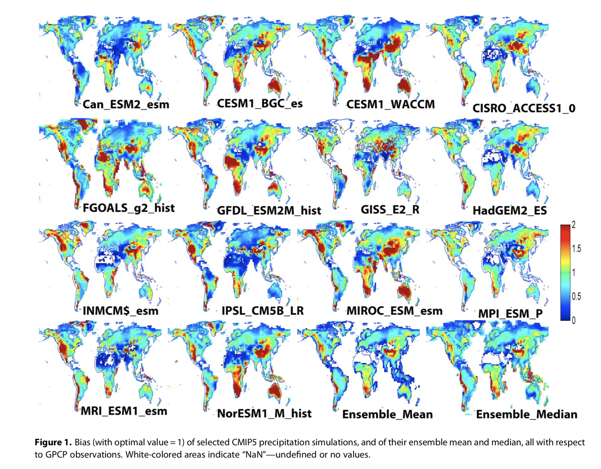
From Mehran et al 2014
Click to enlarge
The graphs show the ratios of models to observations. Therefore, green is optimum, red means the model is producing too much rain, while blue means the model is producing too little rain (slightly counter-intuitive for rainfall and I’ll be showing data with colors reversed).
You can easily see that as well as models struggling to reproduce reality, models can be quite different from each other, for example the MPI model has very low rainfall for lots of Australia, whereas the NorESM model has very high rainfall. In other regions sometimes the models mostly lean the same way, for example NW US and W Canada.
For people who understand some level of detail about how models function it’s not a surprise that rainfall is more challenging than temperature (see Opinions and Perspectives – 6 – Climate Models, Consensus Myths and Fudge Factors).
But this challenge makes me wonder about drawing a solid black line through the median and expecting something useful to appear.
Here is an extract from the recent IPCC 1.5 report:
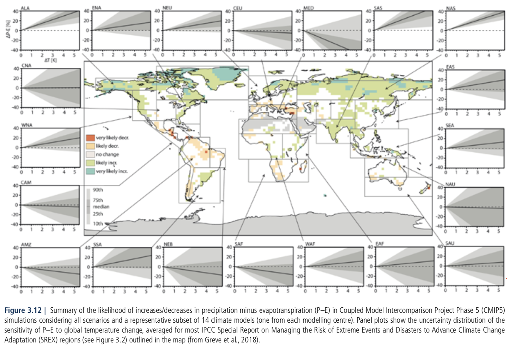
Global Warming of 1.5°C. An IPCC Special Report
I’ll try to shine some light on the outputs of rainfall in climate models in subsequent articles.
References
Note: these papers should be easily accessible without a paywall, just use scholar.google.com and type in the title.
Evaluation of CMIP5 continental precipitation simulations relative to satellite-based gauge-adjusted observations, Mehran, AghaKouchak, & Phillips, Journal of Geophysical Research: Atmospheres (2014)
The Version-2 Global Precipitation Climatology Project (GPCP) Monthly Precipitation Analysis (1979–Present), Adler et al, American Meteorological Society (2003)
Hoegh-Guldberg, O., D. Jacob, M. Taylor, M. Bindi, S. Brown, I. Camilloni, A. Diedhiou, R. Djalante, K.L. Ebi, F. Engelbrecht, J. Guiot, Y. Hijioka, S. Mehrotra, A. Payne, S.I. Seneviratne, A. Thomas, R. Warren, and G. Zhou, 2018: Impacts of 1.5ºC Global Warming on Natural and Human Systems. In: Global Warming of 1.5°C. An IPCC Special Report on the impacts of global warming of 1.5°C above pre-industrial levels and related global greenhouse gas emission pathways, in the context of strengthening the global response to the threat of climate change, sustainable development, and efforts to eradicate poverty [Masson-Delmotte, V., P. Zhai, H.-O. Pörtner, D. Roberts, J. Skea, P.R. Shukla, A. Pirani, W. Moufouma-Okia, C. Péan, R. Pidcock, S. Connors, J.B.R. Matthews, Y. Chen, X. Zhou, M.I. Gomis, E. Lonnoy, T. Maycock, M. Tignor, and T. Waterfield (eds.)].
The datasets are accessible in websites below – there are options to plot specific regions, within specific dates, and to download the whole dataset as a .nc file.


Just eyeballing the comparison of observations with models, almost all of the models seem to under predict precipitation. Most even under under predict the Sahara desert region.
That’s just my eyeballs. Looking forward to your analysis.
The IPCC’s 1.5 degC report attempts to show the additional benefits from limiting warming to 1.5 degC compared with 2.0 degC. Since we are already 2/3rds of the way to +1.5 degC, this report would provide an ideal opportunity validate these model predictions.
However, Seager (2018) did this comparison for winter precipitation in Mediterranean climates. (Winter is when the vast majority of rain falls in Mediterranean climates.) Major aspects of the predicted rainfall decrease in the Mediterranean have been observed and also in some other locations. A 10 mm/month change in six winter months is 6 cm (or 2.4 inches), which is probably a 10% change or more in these semi-arid areas.
https://journals.ametsoc.org/doi/full/10.1175/JCLI-D-18-0472.1