In Models and Rainfall – III – MPI Seasonal and Models and Rainfall – II – MPI we looked at one model, MPI from Germany, from a variety of perspectives.
In this article we’ll look at another model that took part in the last Climate Model Intercomparison Project (CMIP5) – Miroc5 from Japan and compare it with MPI.
A reminder from an earlier article – the scenarios (Representative Concentration Pathways) in brief (and see van Vuuren reference below):
- rcp2.6 – large reductions in CO2 emissions within a short space of time. Conceptual model – shutting off the world’s power stations, and no burning of fossil fuels, by 2030. Think: Project Greta
- rcp 4.5 – substantial improvements in reducing CO2 emissions
- rcp 6 – roughly where we will be in 2100 based on current trends
- rcp 8.5 – extreme CO2 emissions, often misleadingly cited as “business as usual” (see Opinions and Perspectives – 3 – How much CO2 will there be? And Activists in Disguise and Opinions and Perspectives – 3.5 – Follow up to “How much CO2 will there be?”)
Miroc5 (just called Miroc in the rest of the article) did five simulations of historical and three simulations of each RCP through to 2100.
The first graphic has five maps: first, the median Miroc simulation of 1979-2005, followed by simulations of 2081-2100 for rcp2.6 to rcp8.5 (each one is the median of the three simulations):
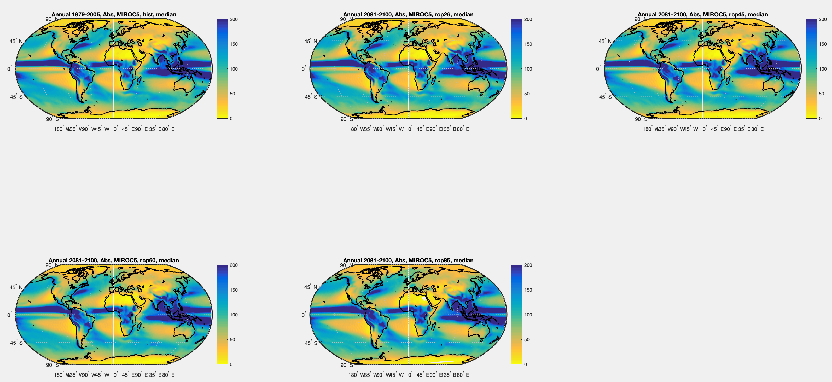
Figure 1 – Miroc simulations of historical 1979-2005 and the 4 RCPs in 2081-2100 – Click to expand
The % change of the median Miroc simulation for each scenario from the median historical simulation:
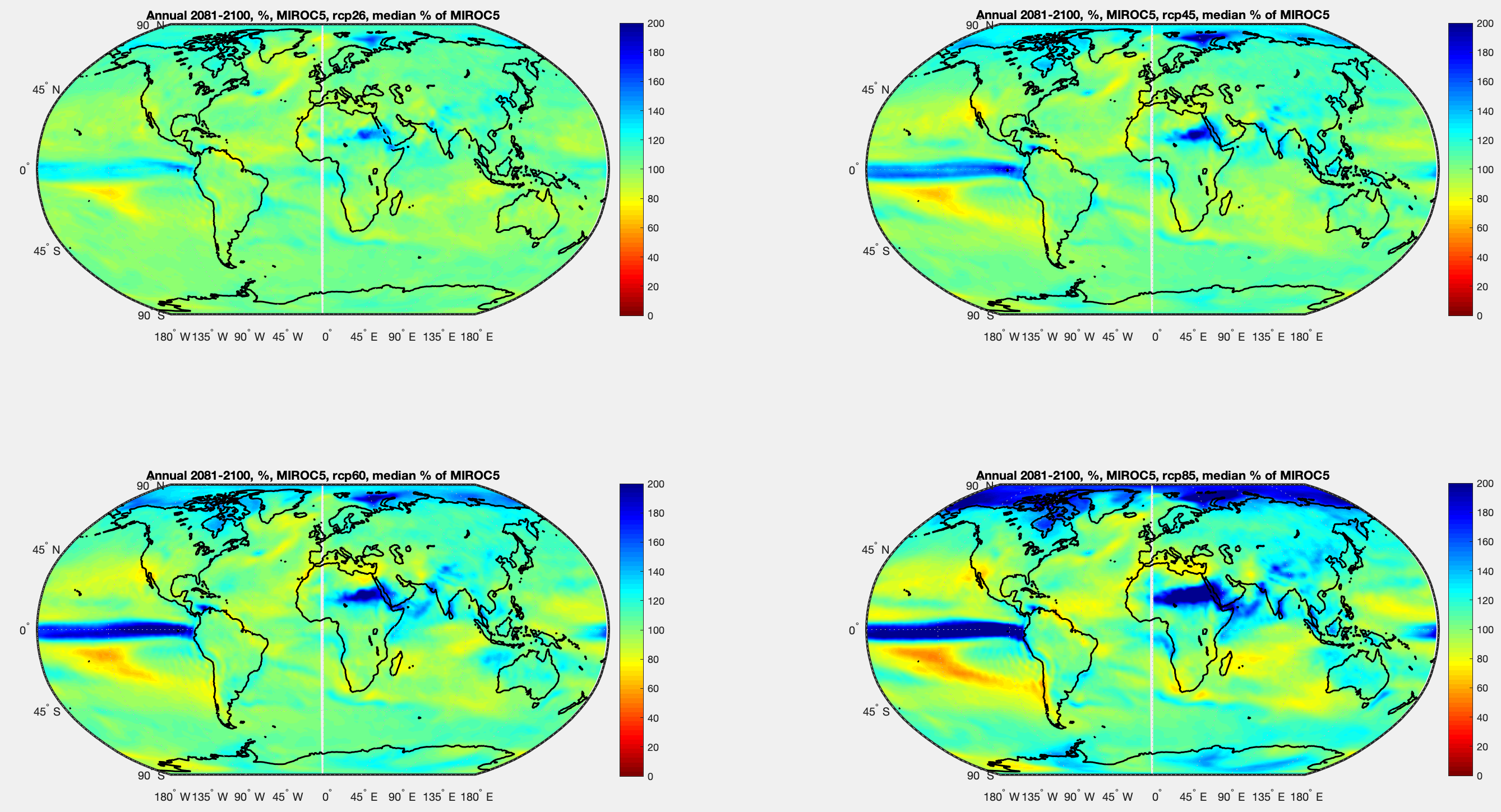
We can see a consistent theme through increasing CO2 concentrations.
Figure 2 – Miroc simulations for RCPs 2081-2100 as % of Miroc historical 1979-2005 – Click to expand
As the previous figure, but difference (future – historical):
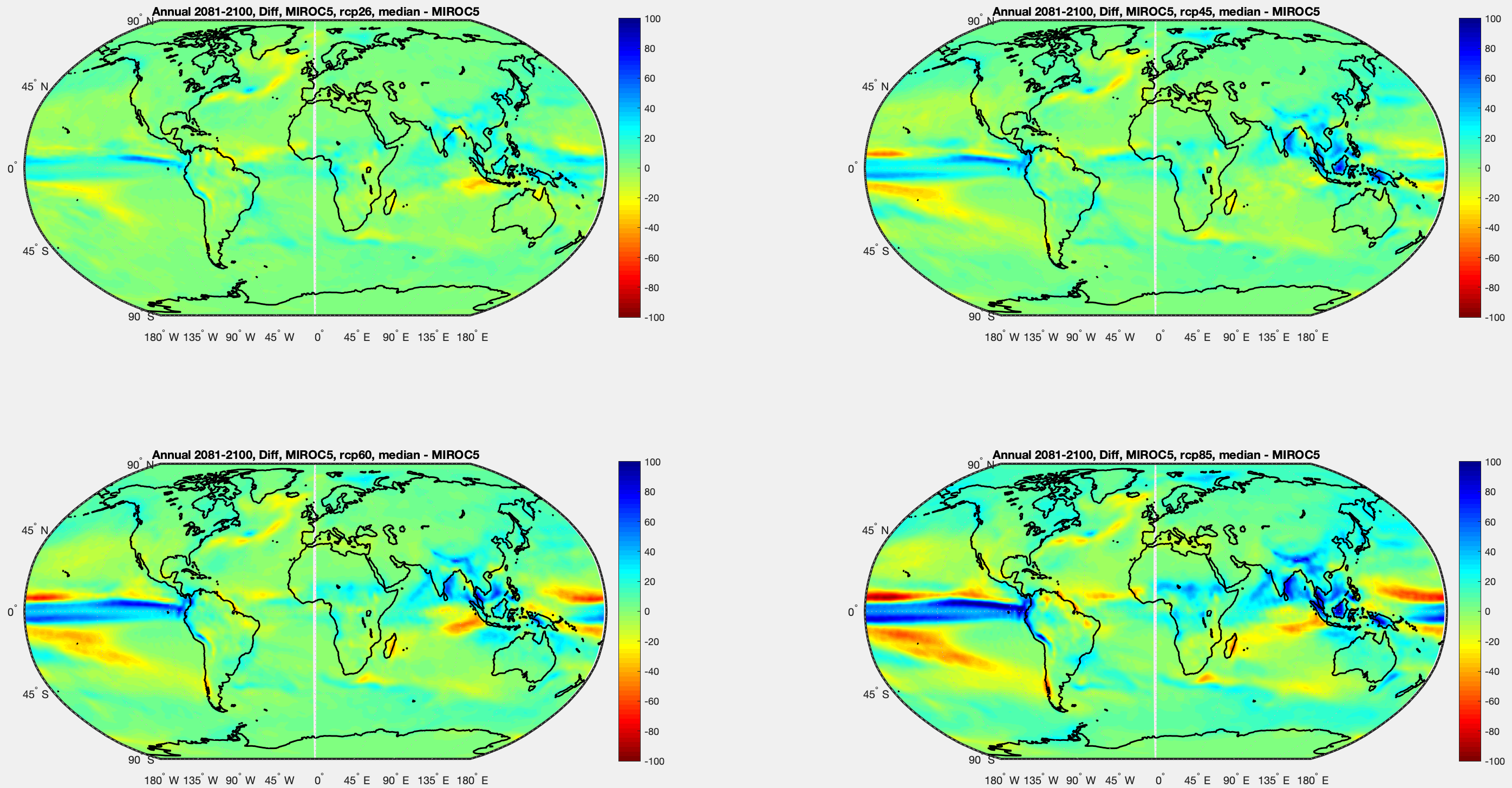
Figure 3 – Miroc simulations for RCPs 2081-2100 less Miroc historical 1979-2005 – Click to expand
Side by Side Comparisons of MPI and Miroc Predictions
And now some comparisons side by side. On the left MPI, on the right Miroc. Both are comparing RCP4.5 as a percentage of their own historical simulation (and both are the medians of the simulations):
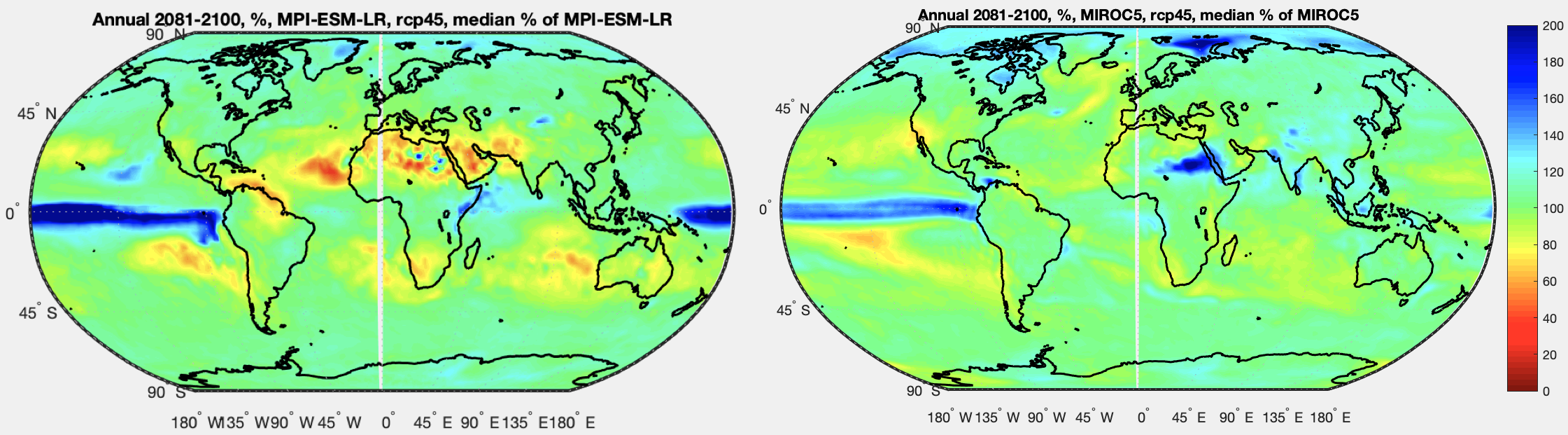
Figure 4 – MPI compared with Miroc for RCP4.5 (%) – Click to expand
I think seeing the future less historical (as a difference rather than %) is also useful – in areas with very low rain the % difference can appear extreme even though the impact is very low. Overall, % graphs are more useful – if you live in an area with say 20mm of rainfall per month on average then -10mm might not show up very well on a difference chart, but it can be critical. But for reference, the difference:
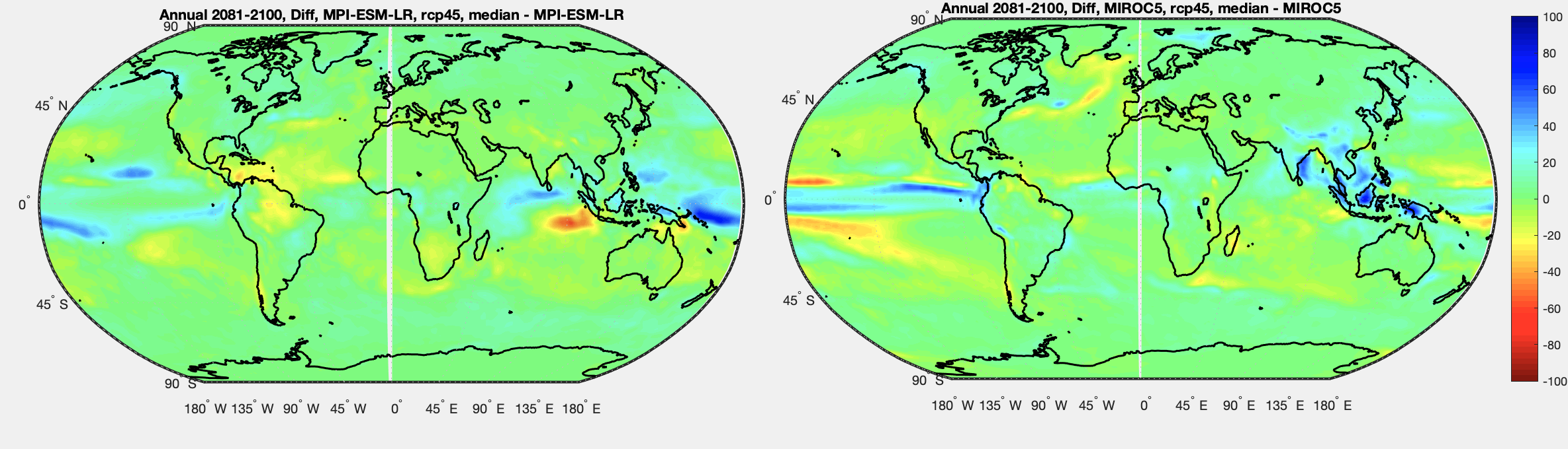
Figure 5 – MPI compared with Miroc for RCP4.5 (difference) – Click to expand
Now the same two graphs for RCP8.5. On the left MPI, on the right Miroc. % of their historical simulation in each case:
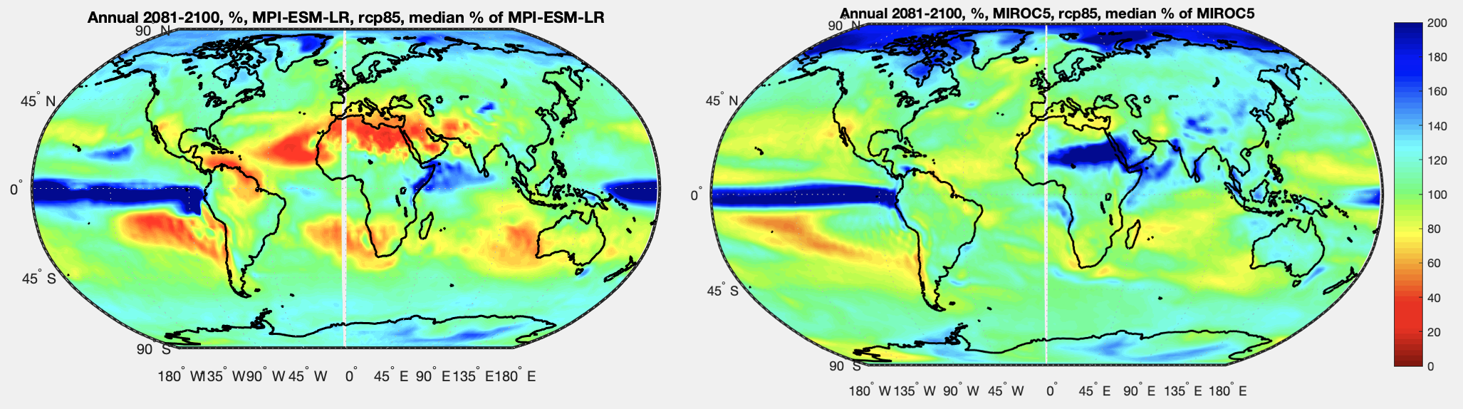
Figure 6 – MPI compared with Miroc for RCP8.5 (%) – Click to expand
And now difference (future less historical) in each case:
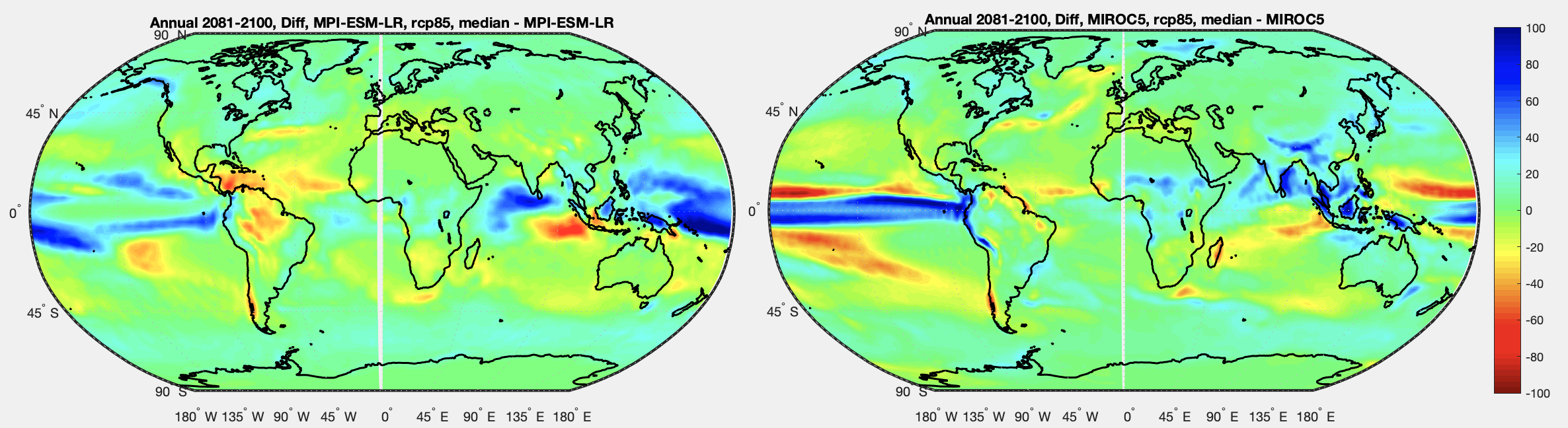
Figure 7 – MPI compared with Miroc for RCP8.5 (difference) – Click to expand
Side by Side Comparisons of Models vs Observations
In Part II we saw some comparisons of the MPI model with GPCC observations, both over the same 1979-2005 time period. Here is MPI (left) and MIROC (right) each as a % of GPCC:
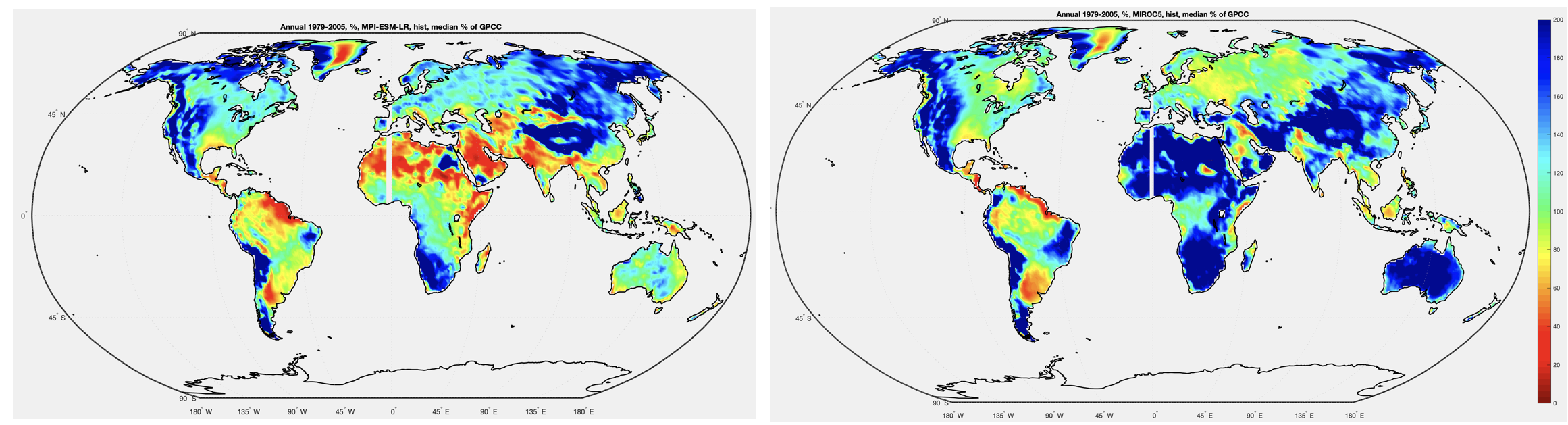
Figure 8 – MPI compared with Miroc for GPCC observations (%) – Click to expand
It’s clear that different models, at least for now MPI and Miroc, have significant differences between them.
References
An overview of CMIP5 and the experiment design, Taylor, Stouffer & Meehl, AMS (2012)
GPCP data provided by the NOAA/OAR/ESRL PSL, Boulder, Colorado, USA, from their Web site at https://psl.noaa.gov/
GPCC data provided from https://psl.noaa.gov/data/gridded/data.gpcc.html
CMIP5 data provided by the portal at https://esgf-data.dkrz.de/search/cmip5-dkrz/
The representative concentration pathways: an overview, van Vuuren et al, Climatic Change (2011)


[…] « Models and Rainfall – IV – Miroc and MRI compared […]