[Note: This article was significantly updated August 5th, 2010. Therefore, many comments became obsolete, or at least proved their worth, by encouraging an update]
If there’s one area that often seems to catch the imagination of many who call themselves “climate skeptics”, it’s the idea that CO2 at its low levels of concentration in the atmosphere can’t possibly cause the changes in temperature that have already occurred – and that are projected to occur in the future. Instead, the sun, that big bright hot thing in the sky (unless you live in England), is identified as the most likely cause of temperature changes.
Argument from Inconceivability
I personally find it hard to believe that we are hurtling through space at 67,000 miles per hour on a big spinning rock. It doesn’t feel like it. (Actually that’s just the speed that we orbit the sun, and the sun is moving as well, so its more complicated..)
And is this table (you can’t see my table, but any table will do) really made of tiny atoms but science claims it’s mostly space between the little balls? What? Not likely.
Satire over.
For science, personal experience and imagination are not the deciding factors. They lead you astray. Instead, investigation of phenomena lead to hypotheses, experiments and eventually “theories” – as well-established science “facts” are known. Your intuition might be great for understanding people’s motivations, or whether a person can run 100m in 3 seconds, but not so great for the energy absorption characteristics of invisible molecules.
Let’s look at the science.
How do we analyze the Earth’s Climate?
It’s a tricky problem. And like most tricky science problems we start with some simplications. We analyze a simplified model and see where that gets us. Like, how does this simple model compare to reality? And how do we verify the results from the simplified model if the reality is so much more complicated?
Read on, it’s a journey.
Energy from the Sun
The sun is our source of heat. We are 150 million km from the sun, so how does that heat energy get here?
There are 3 mechanisms for heat transfer – conduction, convection and radiation. It’s a vacuum between the sun and the earth so energy from the sun can only arrive here through radiation. What does that radiation look like? A “body” emits radiation across a spread (a “spectrum”) of wavelengths, in a way that depends on that body’s temperature.
The fact that the wavelengths of the energy emitted vary with temperature is a key point, essential for understanding this aspect of climate science.
Here’s a few samples – each color represents a different temperature object. The blue line is a body at 5000K = 4727°C (8540°F).
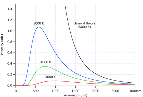
Energy intensity versus wavelength for different temperature objects
For those new to the subject, K (“Kelvin”) is absolute temperature. It tracks degree Centigrade/Celsius one for one, but whereas °C starts at the freezing point of water, K starts at, well, absolute zero.
So 0°C = 32°F = 273K; and -273°C = -459°F = 0K
There are reasons why this temperature scale exists, but let’s just leave it at that.
So if you look at the graph you can see that the higher the temperature, the higher the total energy (which everyone would expect) and the lower the wavelengths of the peak energy.
At the end of the post I’ll show some maths, but many people don’t want to see any equations. Just as a preview, total energy is proportional to the 4th power of absolute temperature. Double the temperature and the energy goes up by 16 times.
And it’s worth stating as well at this point, none of this is in question. It’s reproduceable, non-controversial thermodynamics – a branch of physics. You can reproduce it in the lab and measure it everywhere in the real world.
Energy from the Earth
Now the earth also emits radiation according to the same formula. If the earth isn’t heating up or cooling down the energy absorbed will be equal to the energy emitted. (And we’ll leave discussions about how we know whether the earth is heating up and exactly what that means for another day).
If you do the maths (see the end of the post), you find that the equations say that the earth should be about -18°C (255K) when in fact it is an average +15°C across the globe. What’s going on?
First let’s look at the energy from the earth and sun on the same graph. The sun has a surface temperature of 5780K:
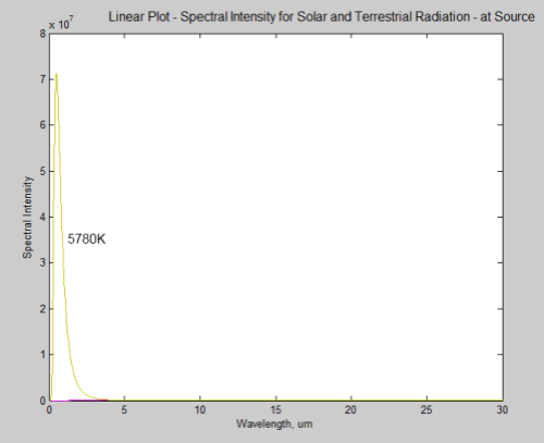
What’s happened to the earth’s radiation? It can barely be seen on a linear plot, it is so small in comparison. However, this is at source – picture a spaceship parked just off the surface of the sun taking the measurements.
By the time the solar radiation has reached the earth it has reduced in intensity by a factor of around 46,000 (see the Inverse Square Law or The Sun and Max Planck Agree – Part Two):
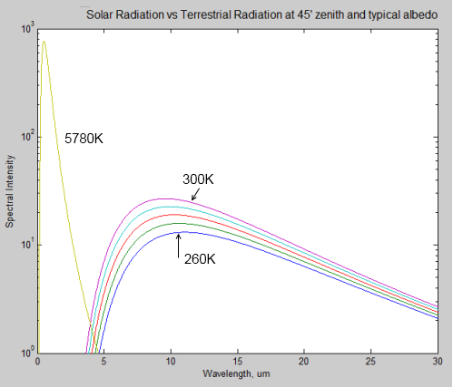
Here is a comparison of solar radiation (the 5780K curve) at the top of the atmosphere, compared with a few terrestrial radiation curves for 260K (-13°C) though to 300K (27°C). Note that it is a logarithmic plot.
Here is a linear plot of the same for comparison:
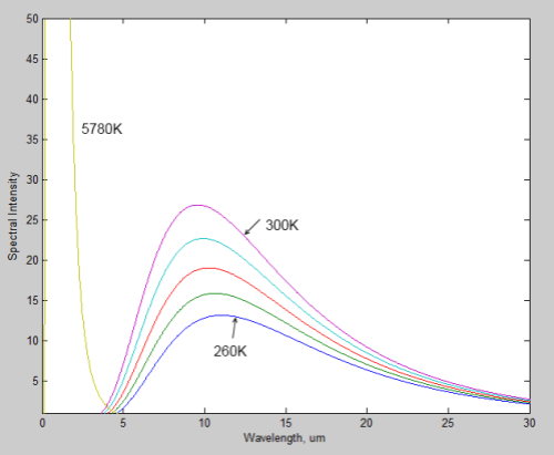
Notice how the wavelength of the peak value of radiation shifts to the right as the source of the radiation gets colder. The typical value for the earth is 10μm, while for the sun it is 0.5μm.
What’s great about the graph is you can see clearly how the radiation from the sun can be easily discriminated from the radiation from the earth. There’s no complicated deductive work, if you measure radiation below 4μm, you know it came from the sun, no matter how many things it bounced off in the meantime. If you measure radiation above 4μm, you know it’s generated by the terrestrial system.
Check out The Sun and Max Planck Agree and The Sun and Max Planck Agree – Part Two for more on this subject.
What does this mean? It means that we can confident of the amount of energy:
- Arriving from the sun at the top of atmosphere and at the surface
- From the sun that is reflected back into space by the atmosphere or the earth’s surface
- Emitted by the earth
How do we work out 3)? We have satellites in space that look at the energy coming from the earth’s surface in the longer wavelengths that correspond to the lower temperatures of the earth’s surface.
And the climate science convention is to call the energy less than 4μm: short wave radiation and the energy greater than 4μm: long wave radiation.
Note that “infrared” is radiation greater than 0.7μm – a different term than “longwave”.
Energy Absorbed by Gases in the Atmosphere
Let’s look at some more standard science.
Each gas in the atmosphere has different absorption characteristics, which vary according to the wavelength of the radiation. In detail it is very complex, but here is a broad overview of total absorption:

Absorption of different wavelength radiation in the earth’s atmosphere
Note that the horizontal axis is a logarithmic scale. The vertical axis shows “opacity” or what proportion of the energy is absorbed by the atmosphere. I picked this graph because you can easily see where the visible light fits in. What you should notice is how much radiation is actually absorbed by the atmosphere. This graphic is a bit too simplistic.
Here’s solar radiation at the top of atmosphere, and at the surface:
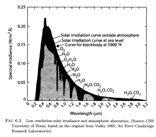
From Vardavas & Taylor (2007)
The lighter color is what we observe at the earth’s surface, while the darker surrounding is the observation of solar radiation by satellite. The difference is absorption by various molecules in the atmosphere and you can see from the annotation which gases absorb at which wavelength.
Here is a measurement of outgoing longwave radiation (terrestrial radiation) measured by satellite at the top of the atmosphere:
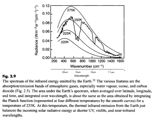
Outgoing longwave radiation at TOA, Taylor (2005)
For those new to this kind of graph, they are usually shown in “wavenumber” rather than wavelength. It’s not important at this stage except to note that the longer wavelengths are to the left and the shorter wavelengths are to the right.
The reason for picking this measurement to show is that the emission curves for typical temperatures of the earth’s surface are shown overlaid. The highest one is 275K or 2°C. The surface of the earth emits radiation very close to the blackbody shape (see The Dull Case of Emissivity and Average Temperatures) but by the time the radiation leaves the earth’s atmosphere that isn’t what we see.
Here is another example, this time with a theoretical calculation (overlaid and displaced for comparison) which is something covered much later in this series:
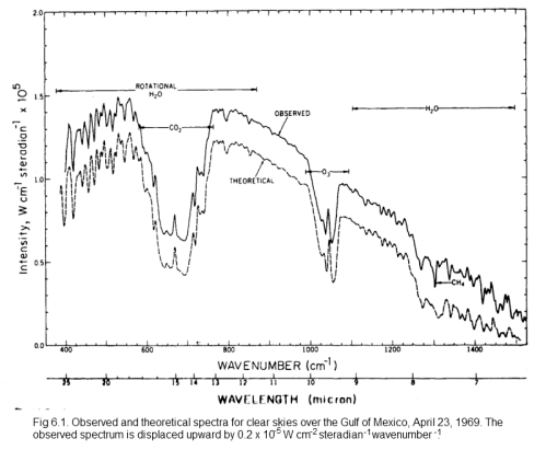
Measured and theoretical spectra, from Goody & Yung (1989)
Click for a larger view
On this spectrum, the authors have noted the reduced areas of outgoing radiation and marked CO2, H2O, O3 (ozone) and CH4 (methane).
How do they know these gases are the cause?
And what effect does it really have?
Measurements in the Lab
Scientists have been measuring the absorption characteristics of each gas in the atmosphere at different wavelengths for many decades.
Here is a good summary of the main absorption bands:
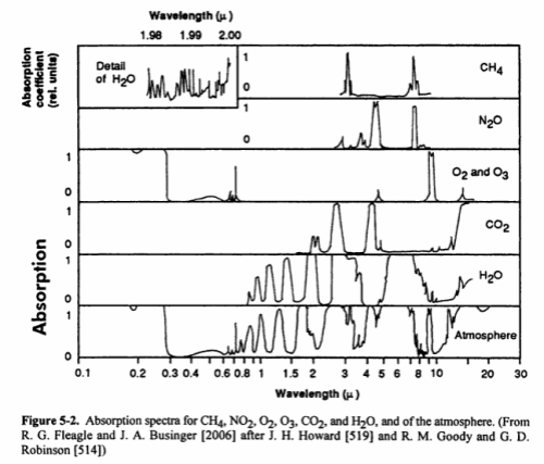
The last bottom line shows the total in the atmosphere. You might notice that N2 (nitrogen) doesn’t show up. Is climate science ignoring this important gas? No – nitrogen absorbs almost nothing, for reasons that are touched on in Part Two. We can say that nitrogen is transparent to solar and terrestrial radiation.
You will also notice that O2 and O3 (oxygen and ozone) are shown. There is a chemical cycle in the upper atmosphere called the Chapman cycle which is responsible for generating ozone. In the very short wavelengths – below 0.3μm – oxygen and ozone both absorb solar radiation. In the longer wavelengths, ozone absorbs around 9.6μm. Oxygen doesn’t absorb at all in longwave – it is also (like nitrogen) transparent to terrestrial radiation.
What you can’t tell from the chart above is how influential each of the gases is in terms of total energy absorbed. That is a much more complex challenge – covered in later articles (but it isn’t as simple as the ratio of each of the absorbing gases in the atmosphere).
Before we leave the subject of absorption, it’s worth showing some lab measurements – from the HITRANS database. This might help see the main characteristics of CO2 and water vapor as well as the complexity.
First the main characteristics on a linear graph:
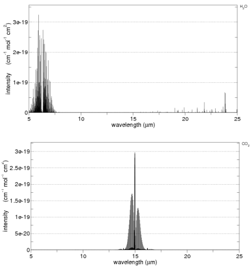
From the HITRANS 2008 database, via spectralcalc.com
You can see that CO2 has high absorption around 15μm and water vapor around 6.3μm.
Now on a log plot – this shows the complexity – but note that each horizontal line represents a factor of 100. O2 and N2 are included at the bottom for comparison:
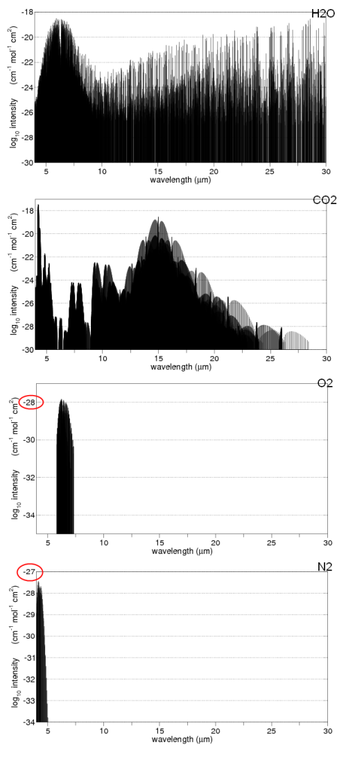
From the HITRANS 2008 database from spectralcalc.com
Note the vertical scale for N2 and O2 – even at their peak they absorb less than a billionth the radiation of CO2 and water vapor.
What Effect Does it Have?
Outside the world of atmospheric physics there is a lot of confusion about some thermodynamics basics. There are many articles on this blog that address those specific points (checkout the Roadmap) and there is no way to cover all of the misconceptions in this article – without it being 100 pages long..
As the surface of the earth heats up from the solar radiation absorbed, it in turn emits radiation – as shown in the 3rd and 4th graphs above.
If the atmosphere didn’t absorb any of this radiation then we would measure a spectrum like one of the Planck curves (as they are known). Instead we see large “chunks” (to use a non-technical term) of energy removed by the time the radiation leaves the atmosphere – “chunks” corresponding to water vapor, CO2 and ozone (as well as a number of other gases). And the larger the “chunk”, the more energy has been absorbed by the corresponding gas from the radiation.
When the atmosphere absorbs radiation it heats up. The absorbed energy is shared thermally via collisions with all other gas molecules, so the whole atmosphere in that region heats up. And the gases like CO2 and water vapor emit radiation – more emission as they increase in temperature.
The atmosphere, once heated up, radiates equally in all directions. Some of this is downward. Here is a measured spectrum at the earth’s surface:
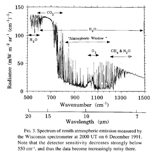
Wisconsin, Ellingson & Wiscombe (1996)
As you can see, the emission of radiation measured at the earth’s surface corresponds to the missing sections at the top of the atmosphere. See The Amazing Case of “Back-Radiation” and The Amazing Case of “Back Radiation” – Part Two.
Note: If a gas can absorb 15μm radiation it can also emit 15μm radiation. If a gas can’t absorb 15μm radiation it also can’t emit at that wavelength.
The energy radiated by the atmosphere which is received at the earth’s surface increases the temperature at the surface. (See The Amazing Case of “Back Radiation” – Part Three).
Although many people have become confused with imaginary second laws of thermodynamics to believe that this can’t happen, here is the easy way to understand the problem:
If we average the incoming solar radiation that is absorbed by the earth’s climate over the surface of the earth we get around 239 W/m2. (See The Earth’s Energy Budget – Part One).
If we average the outgoing longwave radiation from the top of atmosphere we get the same value: 239 W/m2.
If the atmosphere didn’t absorb any terrestrial radiation then the surface of the earth must also be emitting 239 W/m2.
The only way that the surface of the earth could emit this amount is if the temperature of the earth was around 255K or -18°C.
And yet we measure an average surface temperature of around 15°C – an emission of radiation of 396 W/m2. (See note 1).
If the atmosphere wasn’t absorbing and re-radiating longwave then the surface of the earth would be -18°C. This is the inappropriately-named “greenhouse” effect (and note that I haven’t used a greenhouse to demonstrate anything).
Conclusion
The question asked at the start was “Is CO2 an insignificant trace gas?” and the answer is no.
CO2 and water vapor are very significant in the earth’s climate, otherwise it would be a very cold place.
What else can we conclude? Nothing really, this is just the starting point. It’s not a sophisticated model of the earth’s climate, it’s a “zero dimensional model” or “billiard ball model” which takes a very basic viewpoint and tries to establish the effect of the sun and the atmosphere on surface temperature. It doesn’t look at feedback and it’s very simplistic.
Climate is a complex subject. Hopefully this explains some basics and we can start looking a little deeper in subsequent posts.
More in this series
Part Two – why different gases absorb different amounts of energy, why some gases absorb almost no longwave radiation
Part Three – the Beer Lambert model of absorption and the concept of re-emission of radiation
Part Four – band models and how transmittance of CO2 changes as the amount of CO2 increases under “weak” and “strong” conditions
Part Five – two results from solving the 1-d equations – and how CO2 compares to water vapor
Part Six – Visualization -what does the downwards longwave radiation look like at the earth’s surface
Part Seven – The Boring Numbers – the values of “radiative forcing” from CO2 for current levels and doubling of CO2.
Part Eight – Saturation – explaining “saturation” in more detail
CO2 Can’t have that Effect Because.. – common “problems” or responses to the theory and evidence presented
Other later series covering similar material
Visualizing Atmospheric Radiation – a lot more detail on how radiation travels through the atmosphere, and how it is absorbed and re-emitted by various “greenhouse” gases
Atmospheric Radiation and the “Greenhouse” Effect
The Maths
The Stefan-Boltzmann Law states:
j = εσT4
Where
j = total energy radiated per unit area per unit time
ε = emissivity, ranging from 0 to 1, where 1 is a perfect black body
σ = the Stefan Boltzmann constant, 5.67 x 10⁻⁸
T = temperature in K
The effective temperature of the sun is 5780K, its emissivity is quite close to 1, and so it radiates 6.3 x 10⁷ W/m2
As the sun is a long way from the earth, its radiation by the time it reaches the earth is reduced according to Inverse Square Law.
The radius of the sun, rsun = 696 x 106m
Distance from the sun to earth, ao = 1.5×10¹¹ m (150 million km)
Therefore the solar radiation is reduced by a factor of (1.5×10¹¹/(696 x 106)2 = (215)2 = 46,225. Therefore, the solar radiation reaching the earth’s atmosphere = 6.3 x 10⁷ / 46,225 = 1360 W/m2.
And from measurement by satellite we get 1367 W/m2.
Now we have to note two important facts:
- Some of the solar radiation is reflected
- The sun isn’t directly above all points on the earth at the same time
So how much energy is actually absorbed by the climate system?
The measured proportion of reflected solar radiation is 30% – we call this the albedo.
To work out the effect of the day and night and different angles of solar radiation sounds tricky but it’s actually an easy problem. The solar radiation from a long way away hits a disc of area = πr². But the surface of a sphere is 4πr² – (see The Earth’s Energy Budget – Part One for a fuller explanation). Therefore, to calculate the energy absorbed by the climate system averaged over the surface of the earth we can just divide by 4:
Esolar = 1367 x (1 – 0.3) / 4 = 239 W/m²
If the earth is not heating up or cooling down then the earth’s climate system must also be emitting radiation at the same rate. Note that these are global annual averages.
If there was no absorption of surface radiation by the atmosphere then the surface radiation would also be – on average – 239 W/m².
What temperature of the earth’s surface does this correspond to?
Remember the equation at the start of the maths section: j = εσT4
Rearranging to solve, T = (j/εσ)1/4
The emissivity of the earth is very close to 1 (see The Dull Case of Emissivity and Average Temperatures), therefore:
T = 255K or -18°C
Given that we actually experience much higher temperatures on the surface of the earth, we need an explanation. This can be found in the inappropriately-named “greenhouse gases”, which include water vapor, CO2 and methane (CH4).
When the earth emits its longwave radiation, these gases absorb energy and then re-emit, so that the earth’s energy doesn’t just fly off into space but instead it’s absorbed and re-transmitted, some of it back down to earth.
The “greenhouse gases” heat the earth’s surface up approximately 33°C higher than it would be otherwise.
Note 1:
There is a lot of confusion about the use of average temperatures in this approach to explaining the role of CO2 and water vapor in the atmosphere.
Calculating an average temperature has a lot of issues, as explained in Why Global Mean Surface Temperature Should be Relegated, Or Mostly Ignored. However, the explanation above doesn’t rely in any way on the arbitrary construct of average temperatures.
I simply used average temperatures to help newcomers visualize the issue more clearly. If I say that the earth’s average temperature should be -18°C everyone knows that I am wrong. If I say that the emission of surface radiation should be 239 W/m² who would know?
The use of energy per m² also confuses – the poles are colder, the equator is hotter – maybe the averages have lost something important. Once again, the averages just make it easier to understand. However, for those readers convinced that there is a problem in comparing average values, we can calculate the total energy:
Total solar energy absorbed globally annually = solar “constant” x (1 – albedo) x surface area the solar radiation irradiates x number of seconds in a year
Total energy = 1367 W/m² . (1 – 0.3) . πre² . 365.24.3600 = 3.8 x 1024 J
where re = radius of the earth = 6.37 x 10⁶m.
How much energy does the surface of the earth radiate? Well, it can be calculated from the global temperature database and the Stefan-Boltzmann law.
This was done in Earth’s global energy budget, Trenberth and Kiehl, Bull. Amer. Meteor. Soc. (2009). They expressed the number as an global annual average – 396 W/m². We can simply multiply it back up the same way – using the surface area of the earth – to get
Total energy radiated from the surface = 396 x 4πre² . 365.24.3600 = 6.4 x 1024 J
Now there are no averages and no temperatures involved, but the same fundamental issue – the incoming and outgoing radiation balance at the top of the atmosphere, but the energy leaving from the surface of the earth is much higher than the incoming solar energy.
The absorption and re-radiation by “greenhouse” gases in the atmosphere is responsible.




Understanding the Flaw
December 13, 2009 by scienceofdoom
The debate about climate change is a very polarized one.
Understanding the points of view of people who disagree with you is essential to making progress. Even more importantly, you should understand the arguments that summarize the best of the opposite point of view.
Much that is written in the general media is the “polarized view”. So here is a wonderful open letter from a climate scientist that sums up a “skeptical” point of view in a humble way. Emphasis added.
I would add that the view presented is also the point of view of this blog. Standing on the shoulders of giants..
=====================
Date: Mon, 07 Dec 2009 08:28:38 -0700
From: Petr Chylek
To: Climate@lanl.gov, energy@lanl.gov, isr-all@lanl.gov, ees-all@lanl.gov
Dear Climate People:
FYI below is a letter that I sent on Saturday to about 100 top climate research experts including Jim Hansen, Steve Schneider, Phil Jones (UK) and other superstars. Till now I got 14 replies which are about 50/50 between supporting of what I said and defense of the IPCC process.
Greetings,
Petr
=====================
Open Letter to the Climate Research Community
I am sure that most of you are aware of the incident that took place recently at the University of East Anglia’s Climatic Research Unit (CRU). The identity of the whistle-blower or hacker is still not known.
The selected release of emails contains correspondence between CRU scientists and scientists at other climate research institutions. My own purely technical exchange of emails with CRU director Professor Phil Jones is, as far as I know, not included.
I published my first climate-related paper in 1974 (Chylek and Coakley, Aerosol and Climate, Science 183, 75-77). I was privileged to supervise Ph. D. theses of some exceptional scientists – people like J. Kiehl, V. Ramaswamy and J. Li among others. I have published well over 100 peer-reviewed papers, and I am a Fellow of the American Geophysical Union, the Optical Society of America, and Los Alamos National Laboratory. Within the last few years I was also honored to be included in Wikipedia’s blacklist of “climate skeptics”.
For me, science is the search for truth, the never-ending path towards finding out how things are arranged in this world so that they can work as they do. That search is never finished.
It seems that the climate research community has betrayed that mighty goal in science. They have substituted the search for truth with an attempt at proving one point of view. It seems that some of the most prominent leaders of the climate research community, like prophets of Old Israel, believed that they could see the future of humankind and that the only remaining task was to convince or force all others to accept and follow. They have almost succeeded in that effort.
Yes, there have been cases of misbehavior and direct fraud committed by scientists in other fields: physics, medicine, and biology to name a few. However, it was misbehavior of individuals, not of a considerable part of the scientific community.
Climate research made significant advancements during the last few decades, thanks to your diligent work. This includes the construction of the HadCRUT and NASA GISS datasets documenting the rise of globally averaged temperature during the last century. I do not believe that this work can be affected in any way by the recent email revelations. Thus, the first of the three pillars supporting the hypothesis of manmade global warming seems to be solid.
However, the two other pillars are much more controversial. To blame the current warming on humans, there was a perceived need to “prove” that the current global average temperature is higher than it was at any other time in recent history (the last few thousand years). This task is one of the main topics of the released CRU emails. Some people were so eager to prove this point that it became more important than scientific integrity.
The next step was to show that this “unprecedented high current temperature” has to be a result of the increasing atmospheric concentration of carbon dioxide from the burning of fossil fuels. The fact that the Atmosphere Ocean General Circulation Models are not able to explain the post-1970 temperature increase by natural forcing was interpreted as proof that it was caused by humans. It is more logical to admit that the models are not yet good enough to capture natural climate variability (how much or how little do we understand aerosol and clouds, and ocean circulation?), even though we can all agree that part of the observed post-1970 warming is due to the increase of atmospheric CO2 concentration. Thus, two of the three pillars of the global warming and carbon dioxide paradigm are open to reinvestigation.
The damage has been done. The public trust in climate science has been eroded. At least a part of the IPCC 2007 report has been put in question. We cannot blame it on a few irresponsible individuals. The entire esteemed climate research community has to take responsibility. Yes, there always will be a few deniers and obstructionists.
So what comes next? Let us stop making unjustified claims and exaggerated projections about the future even if the editors of some eminent journals are just waiting to publish them. Let us admit that our understanding of the climate is less perfect than we have tried to make the public believe. Let us drastically modify or temporarily discontinue the IPCC. Let us get back to work.
Let us encourage students to think their own thoughts instead of forcing them to parrot the IPCC conclusions. Let us open the doors of universities, of NCAR, NASA and other research institutions (and funding agencies) to faculty members and researchers who might disagree with the current paradigm of carbon dioxide. Only open discussion and intense searching of all possibilities will let us regain the public’s trust and move forward.
Regards,
Petr Chylek
Posted in Climate Models, Commentary | 38 Comments »