This post is intended to help readers better understand how changes in temperature and water vapor at different locations affect the radiation balance of the planet, primarily outgoing longwave radiation (OLR).
A lot of questions on this blog come about because people have trouble visualizing the process of radiative transfer. This is not surprising – it’s not an intuitive subject.
Basic energy balance for the planet is covered in The Earth’s Energy Budget – Part One and Part Two. If some change to the climate causes more energy to be radiated into space then the climate system will cool. Likewise, if some change causes less energy to be radiated into space then the climate system will warm (assuming constant absorbed solar radiation). We use the term OLR (outgoing longwave radiation) for the radiation from the climate system into space.
Heating the Atmosphere and the Surface
Here is a calculation of how changing temperature in the atmosphere affects OLR at different latitudes and different pressures (1000mbar at the bottom of the graph is the surface):
Figure 1 – Italic text is added
Understanding the Terminology
The top two graphs show the same effect under two different conditions. The top one is “All Sky” which is all conditions. And the second one is “Clear Sky”, i.e., the subset of conditions when clouds are not present. From left to right we have latitude and from bottom to top we have pressure. 1000mbar is the surface pressure = zero altitude, and 200mbar is the pressure at the top of the troposphere, and is around 14km (it varies depending on the latitude).
The units (the values are shown as colors) are in W/m².K.100hPa. (See Note 1). Already some readers are lost?
The important part is W/m² – this is flux (radiation in less technical language) or watts per square meter. We can call it power per unit area.
W/m².K is watts per square meter per 1K temperature change. So this asks – how much does the power per unit area increase (or decrease) for each 1K of temperature change?
If we asked, how much does the OLR increase for 1K increase in the whole atmosphere we would use the units of W/m².K. But when we want to look at how different layers in the atmosphere affect the OLR we are considering just once “slice”. So we have to have watts per meter squared per Kelvin per slice. In this case we are considering 100mbar (=100hPa) slices so this is how we get W/(m².K.100hPa).
Understanding the Results
So now the basics are out of the way, what do the graphs show us?
At the simplest level if the whole atmosphere heats up by 1K, the graphs show us the relative contribution of different latitudes and altitudes to OLR.
Let’s suppose we increase the temperature of the atmosphere at the equator between 1000 and 900 mbar by 1°C (=1K). This means we have taken a “layer” of the atmosphere and somehow just increased its temperature. What is the effect on the OLR? All bodies, including gases, emit according to their temperature and their emissivity.
Increase the temperature and the radiation (flux) increases. In our graph, at that location, for 1°C the flux increases by about 0.3 W/(m².100hPa).
Of course this means the climate cools which should be totally unsurprising. Increase the temperature of the atmosphere and it radiates more energy away into space. This is negative feedback. You can see from the graph that no matter where you heat the atmosphere it increases the flux into space – cooling the climate back down.
The bottom graph shows the result of heating the earth’s surface for clear sky and for all sky conditions. Note the difference. Under clear skies the increased flux emitted by the surface more easily escapes to space. When clouds are present the increased surface radiation is absorbed by clouds and the clouds emit at the cloud top temperature. (The cloud top temperature is high up in the atmosphere, is cooler than the surface, and so the emission to space is reduced by the presence of clouds).
At this point let’s make it clear what the graphs are not showing. They are not showing the ultimate result of heating the surface or a slice of the atmosphere after the whole climate has come into a new “equilibrium”. They are simply showing what happens directly to radiation balance as a result of a change in temperature of a “portion” of the climate.
If you’ve understood why the all sky/clear sky results in the surface graph are different then the difference between the first and second graph might be clear. The first graph is under all sky conditions (including clouds) and so the cloud tops are the region where a 1K increase has the greatest effect on OLR. Lower down in the atmosphere an increase in flux (due to hotter conditions) can be masked by clouds.
In contrast, under clear sky conditions changes in the lower atmosphere have a similar effect to changes in the upper atmosphere.
The authors say:
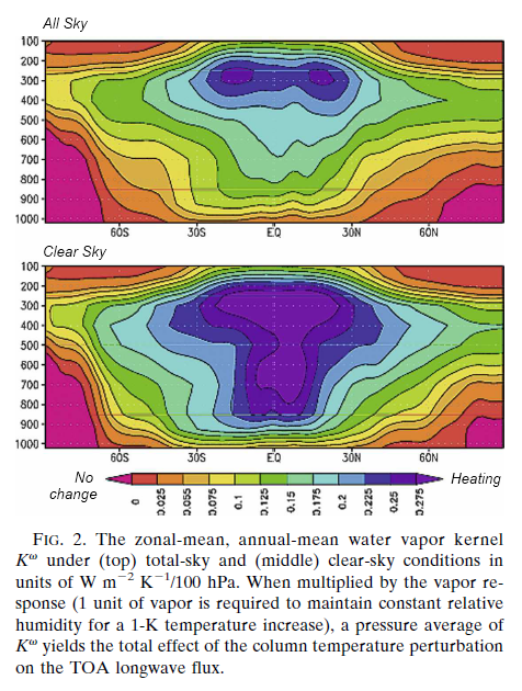
Under total-sky conditions the longwave fluxes are most sensitive to temperatures at the level of cloud tops that are exposed to space. This results in an obvious maximum just beneath the tropopause, where convectively detrained cirrus anvils are common, and along the top of the cloud topped boundary layer. By masking the surface, clouds also diminish the surface contribution to KT
Adding Water Vapor to the Atmosphere
More water vapor in the atmosphere generally reduces the outgoing longwave radiation which has a heating effect on the atmosphere. (The opposite of higher atmospheric temperatures).
The reason for this is with more water vapor the atmosphere becomes more opaque to longwave radiation. So, for example, with more water vapor in the upper atmosphere, radiation from the surface or the lower atmosphere is absorbed by the water vapor higher up.
Another way of looking at the problem is to say that the more opaque the atmosphere the higher up the effective radiation to space. And higher altitudes have colder temperatures. This is the essence of the inappropriately-named “greenhouse” effect. For more on this see The Earth’s Energy Budget – Part Three.
Figure 2 – Italic text is added
Any calculation / visualization of the climate effect of increased water vapor has a choice – do you show the effect from absolute or relative changes in water vapor? As water vapor concentration reduces by more than 1000 times as you go up through the atmosphere showing relative change is generally preferred over showing absolute change.
The authors of this paper have chosen relative changes and calculated the change in OLR if temperature changes by 1K and relative humidity stays constant.
Some of the readers might be tempted to jump in here thinking that some unproven claim is being used as a premise for a climate calculation. But this is not so. It is simply a convenient way of illustrating OLR changes with water vapor changes.
Reviewing the graphs, we can see that under clear skies the deep tropics have the dominant water vapor response. This is not surprising as the tropics have so much more water vapor than the rest of the globe. See Clouds and Water Vapor – Part Two for discussion on this.
Under all sky conditions the effects of clouds are seen. The subtropics become more important than the tropics because the subtropics are mostly cloud-free. In the deep tropics the clouds “mask” the effects of lower levels in the atmosphere.
The authors comment:
By masking underlying water vapor perturbations, clouds reduce the sensitivity of OLR to water vapor changes and increase the relative importance of upper-tropospheric moistening to the total feedback.
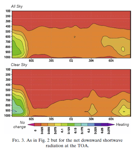
Water vapor also absorbs solar radiation. If there was no water vapor wouldn’t the surface absorb all the solar radiation anyway? Does it make a difference? The surface doesn’t absorb all the solar (shortwave) radiation, and especially over snow/ice covered areas the proportion of reflected solar radiation is high. Therefore, solar absorption by water vapor (as water vapor increases) has a relatively larger impact at the poles.
Figure 3 – Italic text is added
And Out of Interest..
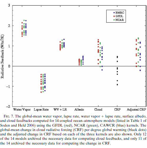
This graph below wasn’t the intent of the article, but is in the Soden et al paper and is quite interesting.
This article is aimed at showing how the net radiative climate balance changes when atmospheric temperature and water vapor changes under clear and cloudy skies.
But once a climate model is used to compute changes in temperature we can see what different climate models show for the difference between the feedbacks:
This graph shows the results of various climate models.
As an example, Lapse rate feedback is the feedback from changes in the atmospheric temperature profile.
Final results from climate models are much more complex than determining how changes in water vapor or atmospheric temperature affect the emission of thermal radiation into space.
Conclusion
This article is aimed at increasing understanding of how changes in temperature and water vapor change the net radiation balance of the climate before any feedback.
The whole paper is well worth reading.
Further reading
Understanding Atmospheric Radiation and the “Greenhouse” Effect – Part Ten
References
Quantifying Climate Feedbacks Using Radiative Kernels, Soden et al, Journal of Climate (2008) – Free Link
Notes
Note 1 – The units in figure 1 are Wm-2K-1. To non-mathematicians this notation can be difficult to understand. Most people know what m² means – it means meters squared. m-2 means per meter squared. So we can write Wm-2 or W/m2. Both mean the same thing.
The mathematical convention of Wm-2K-1 is better because it is more precise (when I write W/m2K does it mean watts per meter squared per Kelvin, or Watts per meter squared times Kelvin?)
But I write the slightly less mathematically precise way to provide better readability for the non-mathematicians.


I understand the need for simplification but please use “troposphere” instead of “atmosphere” 🙂
also the graphs are meant to be taken as what the values would be if convection didn’t exist, right?
omnologos,
The top of the troposphere, the tropopause, is around 200mbar. The graphs go up to 100mbar, into the stratosphere. Not sure I understand why you want troposphere as the description. Can you explain?
I should have explained more clearly. The graphs are the radiative response to a change in conditions.
– If you “magically” increased the temperature of a 100mbar slab of atmosphere by 1K, how much would the OLR change immediately as a result of only the temperature increase?
– If you “magically” increased the temperature of the same slab of atmosphere and kept the relative humidity the same, how much would the OLR change immediately as a result of only the water vapor change?
These questions separate out one part of the climate response. Even if convection didn’t exist these graphs would not represent any equilibrium response, as radiative changes would move heat around.
So the graphs are less about a world without convection and more about how net radiation balance changes as a result of specific changes to the atmosphere.
Hope that makes sense.
In the tropics, the tropopause is at ~100hPa. At least that’s the pressure where the temperature stops dropping and starts increasing in the MODTRAN tropical atmosphere:
km mbar K
14.00 156.000 210.3
15.00 132.000 203.7
16.00 111.000 197.0
17.00 93.700 194.8
18.00 78.900 198.8
19.00 66.600 202.7
Welcome back SOD. Thanks for another informative post.
Right on my birthday!! Great.. I was looking forward to some new info from SOD.
[…] the reduction in OLR depends on the temperature gradient between the surface and layers aloft. See “ScienceofDoom” for a qualitative introduction into this figure and a broader discussion of the “radiative […]