Feeds:
Posts
Comments

Archive for the ‘Climate Models’ Category

Introduction

This is the long-promised eighth part of the seven-part series on CO2 basics. Part One introduced the idea of CO2 with some basic concepts. Part Three opened up the radiative transfer equations, not solvable on the pocket calculator. Part Five showed two important solutions. And Part Seven showed the current best solutions along with what “radiative forcing” actually means, and where the IPCC logarithmic formula comes from.

The even numbers in the series shouldn’t be ignored either, especially Part Four which explained band models vs line by line (LBL) calculations.

Now the concept of “saturation” is one that everyone wants an answer to. Saturation, however, means different things to different people. Consider shining a torch through sand. Once you have a few millimeters thickness of sand, no light gets through. So adding a meter of sand won’t make any difference. That’s how most people are thinking about saturation and that is the perspective that we will look at in this article:

  • For CO2 – will doubling CO2 (from pre-industrial) levels add any more warming?
  • And will doubling it again add any more?

The answer already noted in earlier parts of this series is “yes”, but of course, everyone wants to know why, or what this means for the idea of “saturation”.

Boringly, we will first look at some results from the radiative transfer equations.

The RTE

The RTE were introduced in Part Three – these are the full solution to the problem of absorption and emission by each “layer” of the atmosphere. The equations are challenging to solve because every absorption line for each gas has to be calculated, and a similar process goes on for emission of radiation by each layer in the atmosphere. It’s not some kind of mystery, it’s just very computationally expensive, so big computers and plenty of time are required. See Part Six for an example of theory matched up with measurement.

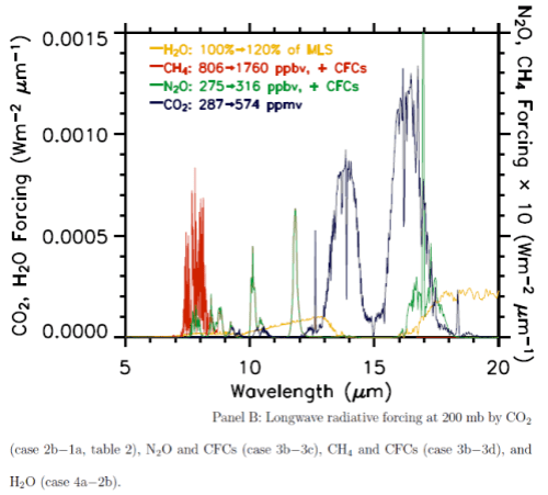
A fairly recent model inter-comparison effort was done which included the results from LBL (line by line spectra) for increases in CO2 and other trace gases. The inter-comparison focused on comparing the results from many GCM’s with the LBL results (see note 1). Although it wasn’t the focus of the paper, a graph of radiative forcing vs wavelength was included:


Longwave radiative forcing from increases in various "greenhouse" gases

Longwave radiative forcing from increases in various "greenhouse" gases


This is from W.D. Collins (2006), reference below. (Interested students will note that the vertical axis appears to have the wrong units, I have emailed Prof Collins to ask about this – update, he has confirmed that the vertical axis is incorrect).

The blue line is the “radiative forcing” vs wavelength for CO2.

The best way to explain why something called radiative forcing is used is that is a “standardization tool”. A simple explanation of radiative forcing is that it is the extra downward radiation at the tropopause before feedbacks from the surface and the lower atmosphere (the troposphere). You can see a little more on this concept in Part Seven.

Now that’s over with – check out the graph. Red is a methane increase from pre-industrial levels to current levels, green is a nitrous oxide increase and yellow is the effect of a possible increase in water vapor. The important point is that for the increases for CO2 (blue), most of the increase in energy is not in the center of the 15μm CO2 band.

It is interesting to see that the effect of the center of the CO2 band is not zero, although it is very low, but the main increase is in “the wings” of the band.  This is the primary reason why doubling CO2 provides a significant increase in “radiative forcing” – or more heat into the surface and lower atmosphere.

To demonstrate this result wrong simply requires the interested student to prove the RTE (radiative transfer equations) wrong, or the line by line database of absorption for CO2 wrong, or the particular methods of solving the RTE in these models wrong. So it could all be over here.. but of course there’s more to think about.

By the way, the line by line method uses each individual absorption line stored in a huge database (like HITRANS), but the story is yet more complicated because each line has a definite width and a line shape, and these factors depend on the pressure and temperature. For example, each CO2 line is broader closer to the surface than it is high up in the troposphere. And the shape also changes. More on this at some later date, maybe..

Some Conceptual Ideas – Absorption and Re-emission and Planck Blackbody Radiation

Everyone likes to understand a subject conceptually. This is sometimes difficult but these mental models are very helpful if they can provide us with understanding. However, it is important to remember that just because something seems “conceptually right” doesn’t mean it is, and vice-versa. In the end, a theory stands or falls on the ability to falsify it and not on our ability to “picture it”. (The popularity of a theory on the other hand..)

The most important conceptual idea to understand is that the radiation from the surface which is absorbed by CO2 doesn’t just disappear. (The same applies to all “greenhouse” gases but I’ll stay with using CO2 as the prime example).

We will consider the atmosphere in a number of vertical “layers”, stacked one on top of the other. CO2 absorbs energy, shares it with other molecules in the atmosphere and therefore that layer of the atmosphere heats up (see note 2). Some molecules, like nitrogen and oxygen, have no ability to absorb or emit longwave radiation (see CO2 – Part Two), but by collision with molecules like CO2 and water vapor they will share energy and be at the same temperature.

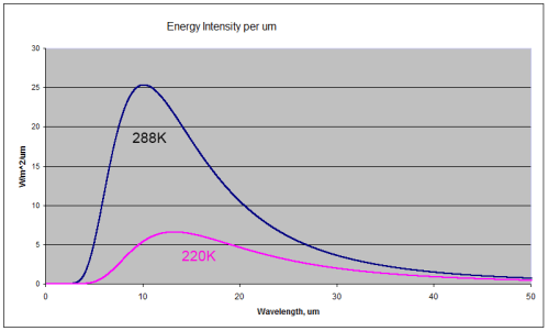
For those new to the basics of radiation, here are two comparison radiation curves for a blackbody at the typical temperature of the earth’s surface (288K or 15ºC) and at a typical temperature at the top of the troposphere
(220K or -53ºC).


Blackbody radiation at 288K (15'C) and 220K (-53'C)

Blackbody radiation at 288K (15'C) and 220K (-53'C)


You can see that the radiation emitted by a 288K body is a lot higher than the 220K body (the total integrated across all wavelengths is greater by a factor of 3). You can also see that for the colder body the energy has shifted to longer wavelengths (the wavelength of maximum radiance has moved from 10.1μm for 288K to 13.2μm for 220K).

A blackbody is a perfect radiator and absorber – so think of these curves as the ideal – the best that might be attained.

The surface of the earth is very close to a blackbody (the emissivity is close to 1) for longwave radiation – see The Dull Case of Emissivity and Average Temperatures. The atmosphere is not even close to being a blackbody. Atmospheric gases absorb and emit radiation at well-defined spectral lines. But the Planck function – as the curves above are called – tells us the “shape” that these spectral lines fit under.

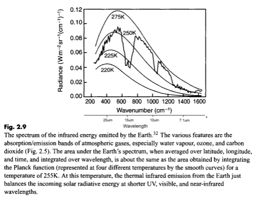
Here is a measurement of outgoing longwave radiation by satellite (the “upward” radiation) with the Planck function for different temperatures overlaid:


Outgoing longwave radiation at TOA, Taylor (2005)

Outgoing longwave radiation at top of atmosphere, Taylor (2005)


I’ve added “wavelength” under “wavenumber” on the horizontal axis for convenience.

What this shows is the effective temperature of radiation for each part of the longwave spectrum. Take a look at the spectrum between 10-13μm. The radiation between these wavelengths corresponds to around 270K. Now look at the spectrum between 14-16μm. The radiation here corresponds to around 223K.

That’s because there is not much absorption by the atmosphere in the 10-13μm spectrum, consequently most of the radiation from the surface goes straight out to space.

By comparison, absorption is very high between 14-16μm so almost no radiation from the surface goes straight out to space.

But – and here is the conceptual idea I want to get across – why is there any radiation between 14-16μm (measured by satellite)? Absorption by CO2 in the center of the 15um band is so strong that surely there should be no radiation – or nothing measurable..

This subject was covered in some detail in The Earth’s Energy Budget – Part Three, but essentially each layer of the atmosphere also radiates energy. If CO2 can absorb radiation at 15μm, it can also radiate at 15um. But it radiates according to its temperature. So when you see the measurement by satellite of the 15μm band reflecting a temperature of 223K you know that the bulk of the radiation was emitted by CO2 at a temperature of 223K (-50ºC).

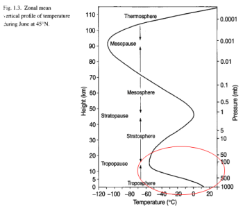
For the temperature of CO2 to be 223K (-50ºC) means that it must be located around the top of the troposphere:


Pressure and height vs temperature, Bigg 2005

Pressure and height vs temperature, Bigg 2005


How does all of this relate to “saturation”?

One Conceptual Saturation Idea – it Can’t Get any Colder

One way of thinking about the absorption and re-emission of 15μm radiation is like this – if the 15μm band is already radiating from the coldest part of the atmosphere, then increasing CO2 will have no effect on the earth’s energy balance because even if the 15μm band radiates from higher up, it won’t get any colder and, therefore, the amount of radiation at this wavelength won’t be decreased.

But this is just in the center of the 15μm band. As we saw from the detailed line by line calculation in the paper by Collins, the bulk of the reduction in outgoing radiation is from 13-14.5μm and from 15.5-17μm.

You can play around with these ideas by using the Modtran model. It uses band models (not line by line calculations) but band models give reasonable results. What is interesting is to increase the amount of CO2 and (looking down from 70km) see what effect takes place at 15μm – not much in the center of the band – for the reasons already explained: the atmosphere doesn’t get any colder.

However, you will notice that the width of this heavily saturated band increases – as with the more accurate treatment by Collins at the beginning of the article.

Another Conceptual Saturation Idea – the Two Slab Model

There is a simple model which is worth looking at by Barton Paul Levenson. What it demonstrates is that if you take a gas which absorbs across all longwave (>4μm) wavelengths, then even if this gas totally absorbs all radiation in the lower part of the atmosphere, adding more of this gas will still increase the surface temperature.

This is for the simple reason that the incoming solar energy at the top of the atmosphere must be balanced by energy leaving from the top of the atmosphere – otherwise temperature will increase (see The Earth’s Energy Budget – Part Two). And if one “layer” of the atmosphere totally absorbs it will still radiate energy to the atmosphere above. As the atmosphere gets thinner it will eventually be radiating out to space – and it’s at these levels (heights) in the atmosphere that adding more CO2 will reduce the outgoing radiation.

And if the outgoing radiation is reduced then there will be more incoming solar radiation than outgoing longwave radiation and the surface/atmosphere will heat up. Take a look at his model.

Fascinating as it is, I don’t think it answers the question of “saturation” or not by CO2 in the actual climate.

The reasons are complex, but read on if you are interested..

This is because the center of the CO2 band (15μm) is already radiating from the coldest part of the atmosphere. Therefore, increasing CO2 can’t reduce the radiation from the 15um band – unless more CO2 can change the temperature structure by lifting the height of the tropopause which will result in a colder tropopause.

In a climate with a “gray” absorber (one that absorbs equally across all wavelengths) an increase in this absorber would almost certainly change the tropopause height. Why? The tropopause is the point at which the atmosphere becomes optically thin and so radiation to space can take place from that point. Radiation is now more effective than convection at moving heat upwards through the atmosphere. So a climate model (even a more refined one with many layers) with a gray absorber will do as Levenson’s model predicts.

But a climate model with an almost transparent atmosphere in places will respond in less clear ways. Modeling the height and temperature of the tropopause is a difficult challenge and not something to get into here.

For those new to this topic, it probably doesn’t make a lot of sense. Think of this section as a “by the way an interesting idea about saturation..”

Conclusion

Most of the confusion about “saturation” of CO2 comes from a lack of understanding of how both absorption and re-emission are linked in the atmosphere.

The confusion also arises because atmospheric physics uses the term “saturation” to mean something more technically defined – that the atmosphere is “optically thick” at that wavelength. Two groups of people using the same word with a different (but related) meaning inevitably leads to confusion.

The radiative transfer equations are the basic and proven equations for the absorption and radiation of energy in the atmosphere. Solving these equations using line by line calculations shows that most of the additional effect from more CO2 occurs in the “wings” of the band and not in the band center.

Doubling CO2 from pre-industrial levels will lead to an increased “radiative forcing” of around 3.7 W/m2, and this part of climate science at least, is well understood.

Demonstrating that this result is wrong requires over-turning the radiative-convective model which currently calculates outgoing longwave radiation (at top of atmosphere) and downward longwave radiation (at the surface) quite accurately compared with measurements.

The mental models that many people have about saturation are not necessarily what is actually happening in the atmosphere.

Notes

Note 1 – The specific conditions for this inter-comparison (by Collins et al) were slightly different from the standardized method of “radiative forcing” in that they didn’t include stratospheric adjustment – allowing the stratospheric temperatures to achieve equilibrium after the changes in trace gases. This has a small but significant effect on the overall total values of radiative forcing, but the results are useful because the graph of radiative forcing against wavelength is given, whereas most results are simply given as a W/m2 value.

Note 2 – The subject of molecules of CO2 and water vapor absorbing energy and sharing this energy by collision with other molecules close by was covered to a limited extent in How Much Work Can One Molecule Do?

References

Radiative forcing by well-mixed greenhouse gases: Estimates from climate models in the IPCC AR4, W.D. Collins et al, Journal of Geophysical Research (2006)

Elementary Climate Physics, F.W. Taylor (2005) Oxford University Press
Read Full Post »

Redefining Physics

Dexter Wright re-defined the radiative transfer equations in his American Thinker article “Global Warming on Trial” with these immortal words:

Clearly, H2O absorbs more than ten times the amount of energy in the IR spectrum as does CO2. Furthermore, H2O is more than one hundred times more abundant in the atmosphere than CO2. The conclusion is that H2O is more than one thousand times as potent a greenhouse gas (GHG) as CO2.With such immutable facts facing the EPA, how will they explain their stance that CO2 is a greater danger to the public than water vapor?

So far, neither Dexter, nor his enthusiastic supporters at American Thinker have got around to updating the now defunct Wikipedia article on the Radiative Transfer Equations which describe the “old school” mathematics and are slightly more complicated.. (See also CO2- An Insignificant Trace Gas? Part Three.)

But in wondering why they hadn’t, it did occur to me that non-linearity is something that most people struggle with. Or don’t struggle with because they’ve never heard of it.

I think that the non-linear world we live in is not really understood because of the grocery factor..

(And it would be impolite of me to point out that Dexter didn’t know how to interpret the transmittance graphs he showed).

Groceries and Linearities

Dexter is in the supermarket. His car has broken down so he walked a mile to get here. He has collected a few groceries but his main buy is a lot of potatoes. He has a zucchini in his hand. He picks up a potato in the other hand and it weighs three times as much. He needs 100 potatoes – big cooking plan ahead – clearly 100 potatoes will weigh 300 times as much as one zucchini.

Carrying them home will be impossible, unless the shopping trolley can help him negotiate the trip..

Perhaps this is how most people are thinking of atmospheric physics.

In a book on Non-linear Differential Equations the author commented (my memory of what he stated):

The term “non-linear differential equations” is a strange one. In fact, books about linear differential equations should be called “linear differential equations” and books about everything else should just be called “differential equations” – after all, this subject describes almost all of the real-world problems

What is the author talking about?

Perhaps I can dive into some simple maths to explain. I usually try and avoid maths, knowing that it isn’t a crowd-puller. Stay with me..

If we had the weight of a zucchini = Mz, and the weight of a potato = Mp, then the weight of our shopping expedition would be:

Weight = Mz x 1 + Mp x 100, or more generally

Weight = Mz Nz + Mp Np , where Nz = number of zucchinis and Np = number of potatoes. (Maths convention is that AB means the same as AxB to make it easier to read equations)

Not so hard? This is a linear problem. If you change the weight (or number) of potatoes the change in total is easy to calculate because we can ignore the number and weight of zucchinis to calculate the change.

Suppose instead the equation was:

Weight = (Mz Nz) Np2 + (Mp Np) Nz3

What happens when we halve the number of potatoes? It’s much harder to work out because the term on the left depends on the number of zucchinis and the number of potatoes (squared) and the term on the right depends on the number of potatoes and the number of zucchinis (cubed).

So the final result from a change in one variable could not be calculated without knowing the actual values of the other variables.

This is most real-world science/engineering problems in a nutshell. When we have a linear equation – like groceries but not engineering problems – we can nicely separate it into multiple parts and consider each one in turn. When we have a non-linear equation – real world engineering and not like groceries – we can’t do this.

It’s the grocery fallacy. Science and engineering does not usually work like groceries.

Stratospheric Water Vapor

In many blogs, the role of water vapor in the atmosphere (usually the troposphere) is “promoted” and CO2 is “diminished” because of the grocery effect. Doing the radiative transfer equations in your head is pretty difficult, no one can disagree. But that doesn’t mean we can just randomly multiply two numbers together and claim the result is reality.

A recent (2010) paper, Contributions of Stratospheric Water Vapor to Decadal Changes in the Rate of Global Warming by Solomon and her co-workers has already attracted quite a bit of attention.

This is mainly because they attribute a significant proportion of late 20th century warming to increased stratospheric water vapor, and the last decade of cooling/warming/pause in warming/statistically significant “stuff” (delete according to preferences as appropriate) to reduced water vapor in the stratosphere.

(If you are new to the subject of the stratosphere, there is more about it at Stratospheric Cooling and useful background at Tropospheric Basics ).

There is much that is interesting in this paper.


Stratospheric water vapor - SW and LW effect vs altitude

Stratospheric water vapor - SW and LW effect vs altitude, Solomon (2010)


Firstly, take a look at the basic physics. The graph on the left is the effect of 1ppmv change in water vapor in 1km “layers” at different altitudes (from solving the radiative transfer equations).

Notice the very non-linear effect of “radiative forcing” of stratospheric water vapor vs height. This is a tiny 1ppmv of water vapor. Higher up in the stratosphere, 1 ppmv change doesn’t have much effect, but in the lower stratosphere it does have a significant effect. Very non-grocery-like behavior..

Unfortunately, historical stratospheric water vapor measurements are very limited, and prior to 1990 are limited to one site above Boulder, Colorado. After 1990, especially the mid-1990’s, much better quality satellite data is available. Here is the Boulder data with the later satellite data for that latitude “grafted on”:


Stratospheric water vapor measured 40'N, 1980-2010, Solomon (2010)

Stratospheric water vapor measured 40'N, 1980-2010, Solomon (2010)


And the global changes from post-2000 less pre-2000 from satellite data:


Stratospheric water vapor change, measured vs latitude, Solomon (2010)

Stratospheric water vapor change, measured vs latitude, Solomon (2010)


It looks as though the major (recent) changes have occurred in the most sensitive region – the lower stratosphere.

The paper comments:

Because of a lack of global data, we have considered only the stratospheric changes, but if the drop in water vapor after 2000 were to extend downward by 1 km, Fig. 2 shows that this would significantly increase its effect on surface climate.

The calculations done by Solomon compare the increases in radiative forcing from changes in CO2 with the stratospheric water vapor changes.

Increases in CO2 have caused a radiative forcing change of:

  • From 1980-1996, about +0.36 W/m2
  • From 1996-2005, about +0.26 W/m2

Changes in stratospheric water vapor have caused a radiative forcing change of:

  • From 1980-1996, between 0 and +0.24 W/m2
  • From 1996-2005, about -0.10 W/m2

The range in the 1980-1996 number for stratospheric water vapor reflects the lack of available data. The upper end of the range comes from the assumption that the changes recorded at Boulder are reflected globally. The lower end that there has been no global change.

What Causes Stratospheric Water Vapor Changes?

There are two mechanisms:

  • methane oxidation
  • transport of water vapor across the tropopause (i.e., from the troposphere into the stratosphere)

Methane oxidation has a small contribution near the tropopause – the area of greatest effect – and the paper comments that studies which only consider this effect have, therefore, found a smaller radiative forcing than this new study.

Water transport across the tropopause – the coldest point in the lower atmosphere – has of course been studied but is not well-understood.

Is this All New?

Is this effect something just discovered in 2010?

From Stratospheric water vapour changes as a possible contributor to observed stratospheric cooling by Forster and Shine (1999):

This study shows how increases in stratospheric water vapour, inferred from available observations, may be capable of causing as much of the observed cooling as ozone loss does; as the reasons for the stratospheric water vapour increase are neither fully understood nor well characterized, it shows that it remains uncertain whether the cooling of the lower stratosphere can yet be fully attributable to human influences. In addition, the changes in stratospheric water vapour may have contributed, since 1980, a radiative forcing which enhances that due to carbon dioxide alone by 40%.

(Emphasis added)

From Radiative Forcing due to Trends in Stratospheric Water Vapour (2001):

A positive trend in stratospheric H2O was first observed in radiosonde data [Oltmans and Hofmann, 1995] and subsequently in Halogen Occultation Experiment (HALOE) data [Nedoluha et. al., 1998; Evans et. al., 1998; Randel et. al., 1999]. The magnitude of the trend is such that it cannot all be accounted for by the oxidation of methane in the stratosphere which also show increasing trends due to increased emissions in the troposphere. This leads to the hypothesis that the remaining increase in stratospheric H2O must originate from increased injection of tropospheric H2O across the tropical tropopause.

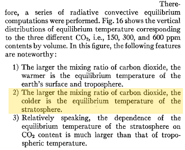
And back in 1967, Manabe and Wetherald said:

It should be useful to evaluate the effect of the variation of stratospheric water vapor upon the thermal equilibrium of the atmosphere, with a given distribution of relative humidity.. The larger the stratospheric mixing ratio, the warmer is the tropospheric temperature.. The larger the water vapor mixing ratio in the stratosphere, the colder is the stratospheric temperature..

Emphasis added – note that this paper was discussed a little in Stratospheric Cooling

Conclusion

The potential role of stratospheric water vapor on climate is not a new understanding – but finally there are some observations which can be used to calculate the effect on the radiative balance in the climate.

The paper does illustrate the non-linear effect of various climate mechanisms. It shows that small, almost unnoticed, influencers can have a large effect on climate.

And it demonstrates that important climate mechanisms are still not understood. The paper comments:

It is therefore not clear whether the stratospheric water vapor changes represent a feedback to global average climate change or a source of decadal variability. Current global climate models suggest that the stratospheric water vapor feedback to global warming due to carbon dioxide increases is weak, but these models do not fully resolve the tropopause or the cold point, nor do they completely represent the QBO, deep convective transport and its linkages to SSTs, or the impact of aerosol heating on water input to the stratosphere. This work highlights the importance of using observations to evaluate the effect of stratospheric water vapor on decadal rates of warming, and it also illuminates the need for further observations and a closer examination of the representation of stratospheric water vapor changes in climate models aimed at interpreting decadal changes and for future projections.
Given that the modeled changes add up to 70% on top of CO2 radiative forcing in an earlier period and then reduce CO2 radiative forcing by 40% in a later period, this is a very significant effect.
I expect that uncovering the mechanisms behind stratospheric water vapor change is an area of focus for the climate science community.

References

Contributions of Stratospheric Water Vapor to Decadal Changes in the Rate of Global Warming, by Solomon et al, Science (2010)

Thermal Equilibrium of the Atmosphere with a Given Distribution of Relative Humidity, by Manabe and Wetherald, Journal of Atmospheric Sciences (1967)

Stratospheric water vapour changes as a possible contributor to observed stratospheric cooling, by Forster and Shine, Geophysical Research Letters (1999)

Radiative Forcing due to Trends in Stratospheric Water Vapour, Smith et al, Geophysical Research Letters (2001)

Read Full Post »

In 1967 Journal of Atmospheric Sciences published the paper: Thermal Equilibrium of the Atmosphere with a Given Distribution of Relative Humidity by Manabe and Wetherald.

Here is one interesting model projection:


Model predictions 1967

Model predictions 1967


The corresponding note says:


Stratospheric cooling from increasing CO2

Stratospheric cooling from increasing CO2


Can this be true? How can “greenhouse” gases reduce temperature? Is this another “global warming causes more snow storms” type story?

First, a little about the stratosphere.

Stratospheric Basics


Atmospheric Pressure and Temperature, Bigg (2005)

Atmospheric Pressure and Temperature, Bigg (2005)


The stratosphere is the region of the atmosphere from around 10km to 50km. In pressure terms it’s the pressure between about 200mbar and 1mbar.

Ultraviolet radiation is almost completely absorbed in the stratosphere. The high energy photons of wavelength less than 0.24μm can break up molecular oxygen, O2, into atomic oxygen, O+O.

O2 and O combine to create O3, or ozone, which is again broken up with absorption of more ultraviolet.

Ozone production is greatest at a height around 25km. At higher levels, there are too few oxygen molecules to intercept all of the photons. At lower levels, there are few high energy photons left.

Here’s an interesting way of seeing how the absorption of solar energy at different wavelengths changes as thicker sections of the atmosphere,  especially the stratosphere, are traversed:


Absorption effects of different "amounts" of the atmosphere, Taylor (2005)

Absorption effects of different “amounts” of the atmosphere, Taylor (2005)


The reason why the troposphere (lower atmosphere) warms from the bottom is that once the UV is absorbed the atmosphere is mostly transparent to the rest of the solar radiation. Therefore, the radiation passes straight through and is absorbed by the earth’s surface, which warms up and consequently warms the atmosphere from beneath.

Air that warms expands, and so rises, causing convection to dominate the temperature profile of the lower atmosphere.

By contrast, the stratosphere is warmer at the top because of the effect of solar absorption by O2 and O3. If there was no absorption by O2 or O3 the stratosphere would be cooler at the top (as it would only be heated from underneath by the troposphere).

Just about everyone has heard about ozone depletion in the stratosphere due to CFCs (and other chemicals). Less ozone must also cause cooling in the stratosphere. This is easier to understand than the model results at the beginning (from increased “greenhouse” gases). Less ozone means less ability to absorb solar radiation. If less energy is absorbed, then the equilibrium stratospheric temperature must be lower.

Stratospheric Temperature Trends

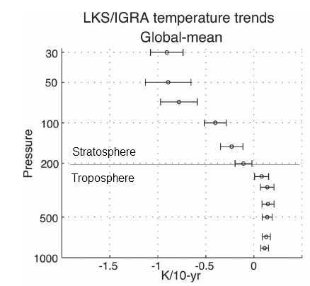
Temperature measurements of the stratosphere are limited. We have satellite data since 1979 which doesn’t provide as much vertical resolution as we need. We have radiosonde data since the 1940s which is limited geographically and also is primary below 30hPa (around 25km).

Lots of painful work has gone into recreating temperature trends by height/pressure and by latitude. For example, in the 2001 review paper by Ramaswamy and many co-workers (reference below), the analysis/re-analysis of the data took 23 of the 52 pages.

Here is one temperature profile reconstruction from Thompson and Solomon:


Stratospheric Temperature Trends 1979-2003, Thompson (2005)

Stratospheric Temperature Trends 1979-2003, Thompson (2005)


From Thompson & Solomon (2005):

From 1979 to 1994, global-mean stratospheric temperatures dropped by 0.75 K / decade in the stratosphere below 35 km and 2.5 K / decade near 50 km
Another reconstruction from Randel (2008):


Stratospheric temperature trends by pressure, 1979-2007, Randel (2008)

Stratospheric temperature trends by pressure, 1979-2007, Randel (2008)


Before explaining why more CO2 and other trace gases could cause “stratospheric cooling”, it’s worth looking at the model results to understand the expected temperature effects of less ozone – and more CO2.

Observations and Recent Model Results

Notice that in the 1967 paper the predicted temperature drop was larger the higher up in the stratosphere. The effects of ozone are more complex and also there is more uncertainty in the ozone trends because ozone depletion has been more localized.

Here are model results for ozone – the best estimate of the observed temperature changes are in brown but aren’t expected to match the models because ozone is only one of the factors affecting stratospheric temperature:


Stratospheric observations and models, Shine (2003)

Stratospheric observations and models for ozone changes, Shine (2003)


Note that the effect of ozone depletion has a projected peak cooling around 1hPa (50km) and a second peak cooling around 80hPa.

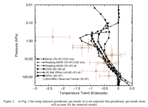
Now the same paper reviews the latest model results for stratospheric temperature from changes in “greenhouse” gases:


Stratospheric observations and models for "greenhouse" gas changes, Shine (2003)

Stratospheric observations and models for “greenhouse” gas changes, Shine (2003)


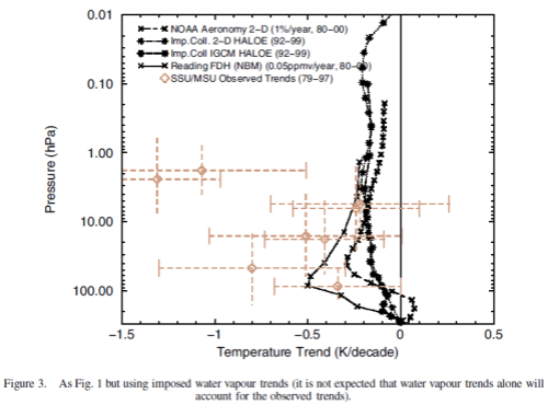
The same paper reviews the model results for changes in stratospheric water vapor. This is a subject which deserves a separate post (watch this space):


Stratospheric observations and models for water vapor, Shine (2003)

Stratospheric observations and models for water vapor, Shine (2003)


Finally, the model results when all of the effects are combined together:


Stratospheric observations and models for ozone, GHG and water vapor changes, Shine (2003)

Stratospheric observations and models for ozone, GHG and water vapor changes, Shine (2003)


The model results are a reasonable match with the observed trends – but a long way off perfect. By “reasonable match” I mean that they reproduce the general trends of decadal cooling vs height.

There are many uncertainties in the observations, and there are many uncertainties in the changes in concentration of stratospheric ozone and stratospheric water vapor (but not so much uncertainty about changes in the well-mixed “greenhouse” gases).

A couple of comments from A comparison of model-simulated trends in stratospheric temperatures, by Shine et al, first on the upper stratosphere, reviewing possible explanations of the discrepancies:

None of these potential explanations is compelling and so the possibility remains that the discrepancy is real, which would indicate that there is a temperature trend mechanism missing from the models.

and then on the 20-70hPa region:

Nonetheless, assuming that at least some part of this discrepancy is real, one possible explanation is stratospheric water vapour changes. Figure 3 indicates that an extra cooling of a few tenths of a K/decade would result if the Boulder sonde-based water vapour trends were used rather than the HALOE water vapour trends. If this were one explanation for the model–observation difference, water vapour could dominate over ozone as the main cause of temperature trends in this altitude region.

Why Is the Stratosphere Expected to Cool from Increases in “Greenhouse” Gases?

This is a difficult one to answer with a 30-second soundbite. You can find a few “explanations” on the web which don’t really explain it, and others which appear to get the explanation wrong.

The simplest approach to explaining it is to say that the physics of absorption and emission in the atmosphere – when calculated over a vertical section through the atmosphere and across all wavelengths – produces this result. That is – the maths produces this result..

You can see an introduction to absorption and re-emission in CO2 – An Insignificant Trace Gas? Part Three.

[Note added to this article much later, the series Visualizing Atmospheric Radiation has an article Part Eleven – Stratospheric Cooling – from January 2013 on why the stratosphere is expected to cool as CO2 increases. It is quite involved but shows the detailed mechanism behind stratospheric cooling].

After all, this approach is what led Manabe and Wetherald to their results in 1967. But of course, we all want to understand conceptually how an increase in CO2 – which causes surface and troposphere warming – can lead to stratospheric cooling.

The great Ramanathan in his 1998 review paper Trace-Gas Greenhouse Effect and Global Warming (thanks to Gary Thompson of American Thinker for recommending this paper) says this:

As we mentioned earlier, in our explanation of the greenhouse effect, OLR reduces (with an increase in CO2) because of the decrease in temperature with altitude.

In the stratosphere, however, temperature increases with altitude and as a result the cooling to space is larger than the absorption from layers below. This is the fundamental reason for the CO2 induced cooling.

In Ramaswamy (2001):

For carbon dioxide the main 15-um band is saturated over quite short distances. Hence the upwelling radiation reaching the lower stratosphere originates from the cold upper troposphere. When the CO2 concentration is increased, the increase in absorbed radiation is quite small and the effect of the increased emission dominates, leading to a cooling at all heights in the stratosphere.

Are they saying the same thing? Yes (probably).

If these explanations help – wonderful. If they don’t, refer to the maths. That is, the mathematical result provides this solution and overall “hand waving” explanations are only ever a second-best “guide”. Also check out The Earth’s Energy Budget – Part Three for explanations about emissions from various levels in the atmosphere.

Conclusion

Understanding stratospheric temperature trends is a difficult challenge. Understanding the mechanisms behind this changes is much more of a conceptual challenge.

But over 40 years ago, it was predicted that the upper stratosphere would cool significantly from increases in CO2.

The depletion of ozone is also predicted to have an effect on stratospheric temperatures – in the upper stratosphere (where CO2 increases will also have the most effect) and again in the lower stratosphere where ozone is the dominant factor.

Stratospheric water vapor also has an effect in the lower stratosphere (where more water vapor leads to more warming and vice-versa), but more on this in a later post.

For some, who feel/believe that CO2 can’t really significantly affect anything in climate – this post isn’t for you – check out the CO2 – An Insignificant Trace Gas? series.

There will be others who will say “Ozone is the reason the upper stratosphere has cooled“. True, but increases in CO2 are also an important factor. The same calculations (maths and physics) that lead to the conclusion that less ozone will cool also lead to the conclusion that more CO2 will cool the upper stratosphere.

This subject also has two other possible consequences. One is about attribution. Global temperatures have increased over the last 40 years and many people want to understand the cause.

If solar heating was the direct cause (see Here Comes the Sun) the stratosphere would not be cooling. However, other effects could possibly also cause stratospheric cooling at the same time as tropospheric and surface heating. It’s a complex subject. But something to question for those other potential causes – would they also cause stratospheric cooling?

The other consequence is about GCMs. Some say that stratospheric cooling is a “vindication” of GCMs. In so far as we have covered the subject in this post we couldn’t reach that conclusion. The modeling of tropospheric and stratospheric temperature profiles can be done (and was by Manabe and Wetherald) with 1D radiative-convective models. Certainly 3d GCMs have also been used to calculate the effect by latitude but these results have more issues – well, the whole subject is much more complex because the change of ozone with height and latitude are not well understood.

But it is important to understand the difference between a GCM solving the general climate problem and a more constrained mathematical model solving the temperature profile against height through the atmosphere.

However, stratospheric cooling while the surface and troposphere are warming does indicate that CO2 and other “greenhouse” gases are likely influencers.

References

Thermal Equilibrium of the Atmosphere with a Given Distribution of Relative Humidity, Manabe and Wetherald, Journal of Atmospheric Sciences (1967)

Trace-Gas Greenhouse Effect and Global Warming, Ramanathan, Royal Swedish Academy of Sciences (1998)

Stratospheric Temperature Trends: Observations and Model Simulations, Ramaswamy et al, Review of Geophysics (2001)

A comparison of model-simulated trends in stratospheric temperatures, Shine et al, Q. J. R. Meteorol. Soc. (2003)

Recent Stratospheric Climate Trends as Evidenced in Radiosonde Data: Global Structure and Tropospheric Linkages, Thompson & Solomon, Journal of Climate (2005)

An update of observed stratospheric temperature trends, Randel, Journal of Geophysical Research (2008)

Read Full Post »

There are many misconceptions about how atmospheric processes work, and one that often seems to present a mental barrier is the idea of How much work can one molecule do?

This idea – presented in many ways – has been a regular occurence in comments here and it also appears in many blogs with eloquent essays on the “real role” of CO2 in the atmosphere, usually unencumbered by any actual knowledge of the scientific discipline known as physics.

Well, we all need mental images of how invisible or microscopic stuff really works.

When we consider CO2 (or any trace gas) absorbing longwave radiation the mental picture is first of trying to find a needle in a haystack.

And second, we found it, but it’s so tiny and insignificant it can’t possibly do all this work itself?

How much can one man or woman really do?

This article is really about the second mental picture, but a quick concept for the first mental picture for new readers of this blog..

Finding a Needle in a Haystack

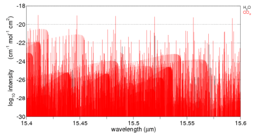
Think of a beam of energy around 15.5μm. Here is the graph of CO2 absorption around this wavelength. It’s a linear plot so as not to confuse people less familiar with log plots. Water vapor is also plotted on this graph but you can’t see it because the absorption ability of water vapor in this band is so much lower than CO2.

CO2 absorption, 15.4-15.6um, linear, from spectralcalc.com

CO2 absorption, 15.4-15.6um, linear, from spectralcalc.com

The vertical axis down the side has some meaning but just think of it for now as a relative measure of how effective CO2 is at each specific wavelength.

Here’s the log plot of both water vapor and CO2. You can see some black vertical lines – water vapor – further down in the graph. Remember as you move down each black horizontal grid line on the graph the absorption ability is dropping by a factor of 100. Move down two black grid lines and the absorption ability has dropped by a factor of 10,000.

CO2 absorption - log graph - 15.4-15.6um, from spectralcalc.com

CO2 absorption - log graph - 15.4-15.6um, from spectralcalc.com

Now, I’ll add in the absorption ability of O2 and N2 – the gases that make up most of the atmosphere – check out the difference:

O2 and N2 added..

O2 and N2 added..

Spectralcalc wouldn’t churn anything out – nothing in the database.

15.5μm photons go right through O2 and N2 as if they didn’t exist. They are transparent at this wavelength.

So, on our needle in the haystack idea, picture a field – a very very long field. The haystacks are just one after the other going on for miles. Each haystack has one needle. You crouch down and look along the line of sight of all these haystacks – of course you can only see the hay right in front of you in the first one.

Some magic happens and suddenly you can see through hay.

Picture it..  Hay is now invisible.

Will you be able to see any needles?

That’s the world of a 15.5μm photon travelling up through the atmosphere. Even though CO2 is only 380ppm, or around 0.04% of the atmosphere, CO2 is all that exists for this photon and the chances of this 15.5μm photon being absorbed by a CO2 molecule, before leaving this world for a better place, is quite high.

In fact, there is a mathematical equation which tells us exactly the proportion of radiation of any wavelength being absorbed, but we’ll stay away from maths in this post. You can see the equation in CO2 – An Insignificant Trace Gas? Part Three. And if you see any “analysis” of the effectiveness of CO2 or any trace gas which concludes it’s insignificant, but doesn’t mention this equation, you will know that it is more of a poem than science. Nothing wrong with a bit of poetry, if it’s well written..

Anyway, it’s just a mental picture I wanted to create. It’s not a perfect mental picture and it’s just an analogy – a poem, if you will. If you want real science, check out the CO2 – An Insignificant Trace Gas Series.

CO2 – The Stakhanovite of the Atmospheric World?

Back in the heady days of Stalinist Russia a mythological figure was created (like most myths, probably from some grain of truth) when Aleksei Stakhanov allegedly mined 14 times his quote of coal in one shift. And so the rest of the workforce was called upon to make his or her real contribution to the movement. To become Stakhanovites.

This appears to be the picture of the atmospheric gases.

Most molecules are just hanging around doing little, perhaps like working for the _____ (mentally insert name of least favorite and laziest organization but don’t share – we try not to offend people here, except for poor science)

So there’s a large organization with little being done, and now we bring in the Stakhanovites – these champions of the work ethic. Well, even if they do 14x or 100x the work of their colleagues, how can it really make much difference?

After all, they only make up 0.04% of the workforce.

But this is not what the real atmosphere is like..

Let’s try and explain how the atmosphere really works, and to aid that process..

A Thought Experiment

For everyone thinking, “there’s only so much one molecule can do”, let’s consider a small “parcel” of the atmosphere at 0°C.

We shine 15.5μm radiation through this parcel of the atmosphere and gradually wind up the intensity. Because it’s a thought experiment all of the molecules involved just stay around and don’t drift off downwind.

The CO2 molecules are absorbing energy – more and more. The O2 and N2 molecules are just ignoring it, they don’t know why the CO2 molecules are getting so worked up.

What is your mental picture? What’s happening with these CO2 molecules?

a) they are just getting hotter and hotter? So the O2 and N2 molecules are still at 0°C and CO2 is at first 10°C, then 100°C, then 1000°C?

b) they get to a certain temperature and just put up a “time out” signal so the photons “back off”?

c) other suggestions?

The Real Atmosphere – From Each According to His Ability, To Each According to His Need

What is the everyday life of a molecule like?

It very much depends on temperature. The absolute temperature of a molecule (in K) is proportional to the kinetic energy of the molecule. Kinetic energy is all about speed and mass. Molecules zing around very fast if they are at any typical atmospheric temperature.

Here’s a nice illustration of the idea (from http://www.chem.ufl.edu/~itl/2045/lectures/lec_d.html).

At sea level, a typical molecule will experience around 1010 (10 billion) collisions with other molecules every second. The numbers vary with temperature and molecule.

Think of another way – at sea level 8×10²³ molecules hit every cm2 of surface per second.

Every time molecules collide they effectively “share” energy.

Therefore, if a CO2 molecule starts getting a huge amount of energy from photons that “hit the spot” (are the right wavelength) then it will heat up, move even faster, and before it’s had time to say “¤” it will have collided with other molecules and shared out its energy.

This section of the atmosphere heats up together. CO2 can keep absorbing energy all day long even as a tiny proportion of the molecular population. It takes in the energy and it shares the energy.

If we can calculate how much energy CO2 absorbs in a given volume of the atmosphere we know that will be the energy absorbed by that whole volume of atmosphere. And therefore we can apply other well-known principles:

  • heating rates will be determined by the specific heat capacity of that whole volume of atmosphere
  • re-radiation of energy will be determined by the new temperature and ability of each molecule to radiate energy at wavelengths corresponding to those temperatures

Conclusion

The ability of a CO2 molecule to be “effective” in the atmosphere isn’t dependent on its specific heat capacity.

Molecules have embraced “communism” – they share totally, and extremely quickly.

Update – New post on the related topic of understanding the various heat transfer components at the earth’s surface – Sensible Heat, Latent Heat and Radiation

Read Full Post »

One commenter asked about CO2 absorption in the solar spectrum.

If CO2 absorbs incoming solar radiation then surely an increase in CO2 will reduce incoming radiation and balance any increase in longwave radiation.

The important factor is the usual question of quantifying the different effects.

Let’s take a look.

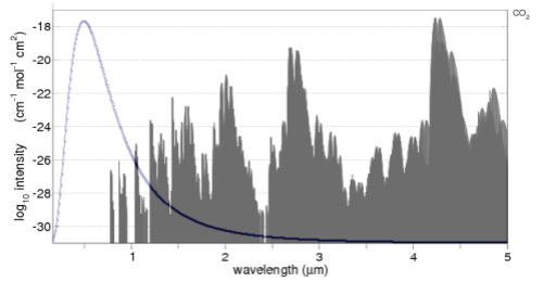
CO2 absorption in the 0.17-5um band, with solar spectrum overlaid

CO2 absorption in the 0.17-5um band, with solar spectrum overlaid

The CO2 absorption spectrum is from the line list browser of the recommended spectralcalc.com. The line list only goes down to 0.17μm (170nm), hence the reason for the graph not starting at 0.0μm.

The solar radiation is overlaid. Well, more accurately, the Planck function for 5780K is overlaid (simply drawn using Excel). Note that the CO2 absorption spectrum is on a log graph, while the radiation is on a linear graph. For those not so familiar with logarithmic graphs, the peak absorption around 4.3μm is 10-18, while the two peak absorptions just below 1μm are at 10-26 – which is 100,000,000 less.

The value of seeing the solar radiation spectrum overlaid is it enables you to see the relative importance of each absorption area of CO2. For example, the solar radiation between 2 – 4μm is only 5% of the solar radiation, so any absorption by CO2 will be quite limited.

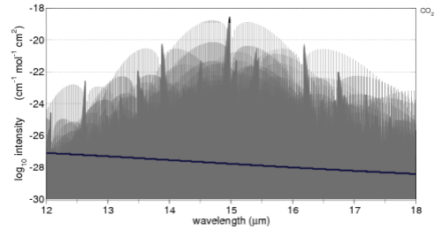
Here’s the comparison with the important 15μm band of CO2. A 6μm width is shown, overlaid (blue line) with the 12-18um longwave radiation of a 288K (15°C) blackbody:

CO2 absorption in the 12-18um band, with terrestrial spectrum overlaid

CO2 absorption in the 12-18um band, with terrestrial spectrum overlaid

Just a little explanation of this graph and how to compare it to the solar version.

The average surface temperature of the earth is 15ºC, and it emits radiation very close to blackbody radiation (watch out for a dull post on Emissivity soon).

The proportion of radiation of a 288K blackbody between 12-18μm is 28%. What we want to do is enable a comparison between the CO2 absorption of solar radiation and terrestrial radiation.

Averaged across the globe and the year the incoming solar radiation at the top of atmosphere (TOA) is 239 W/m2 and the radiation from the earth’s surface is 396 W/m2. This works out to 65% higher, but so as not to upset people who don’t quite believe the earth’s surface radiation is higher than incoming solar radiation I simply assumed they were equal and scaled this section of the earth’s terrestrial radiation to about 28% of the solar radiation on the earlier graph. We are only eyeballing the two graphs anyway.

So with this information digested, the way to compare the two graphs is to think about the absorption spectra of CO2 simply being scaled by the amount of radiation shown overlaid in both cases.

As you can see the amount of absorption by CO2 of solar radiation is a lot less than the absorption of longwave radiation. Remember that we are looking at the log plot of absorption.

Is That the Complete Story?

Really, it’s more complicated, as always with atmospheric physics. There’s nothing wrong with taking a look at the approximate difference between the two absorption spectra, but luckily someone’s already done some heavy lifting with the complete solution to the radiative transfer equations using line by line calculations. For more on these equations, see the CO2 – An Insignificant Trace Gas series, especially Part Three, Four and Five.

The paper with the heavy lifting is Radiative forcing by well-mixed greenhouse gases: Estimates from climate models in the IPCC AR4 by W.D. Collins (2006). There’s a lot in this paper and aspects of it will show up in the long awaited Part Eight of the CO2 series and also in Models, On – and Off, the Catwalk.

Solving these equations is important because we can look at the absorption spectrum of CO2 in the 15μm band, but then we have to think about the absorption already taking place and what change in absorption we can expect from more CO2. Likewise for the solar spectrum.

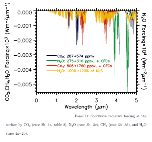
Here are the two graphs, which include other important trace gases, as well as the impact of a change in water vapor. Note the difference in vertical axis values – the forcing effect of these gases on solar radiation has to be multiplied by a factor of 1000 to show up on the graph. The blue lines are CO2.

Net absorption of solar radiation by various "greenhouse" gases

Net absorption of solar radiation by various "greenhouse" gases

Longwave radiative forcing from increases in various "greenhouse" gases

Longwave radiative forcing from increases in various "greenhouse" gases

You can also see that the CO2 absorption in shortwave is across quite narrow bands (as well as being scaled a lot lower than terrestrial radiation) – therefore the total energy is less again. The vertical scale is energy per μm..

From these calculations we can see that with a doubling of CO2 there will be a very small impact on the radiation received at the surface, but a comparatively huge increase in longwave radiation retained – “radiative forcing” at the tropopause (the top of the troposphere at 200mbar).

So Is That the Complete Story?

Not quite. If trace gases in the atmosphere absorb solar radiation, is that so different from the surface absorbing solar radiation?

Or to put it another way, if the radiation doesn’t strike the ground, where does it go? It’s still absorbed into the climate system, but in a different location (somewhere in the atmosphere).

But as one commenter said:

The other point [this one] you make is simply not true and/or also not proven. There is only so much energy that can be taken up by a molecule.

This is a theme that has arrived in various comments from various posts. So the concept of How much work can one molecule do? is worth exploring in a separate post.

Hopefully, it’s clear from what is presented here that increases in CO2 absorption of the solar radiation are very small compared with absorption of longwave radiation.

Read Full Post »

In Part One, we introduced some climate model basics, including uses of climate models (not all of which are about “projecting” the future).

And we took at a look at them in their best light – on the catwalk, as it were.

Well, really, we took a look at the ensemble of climate models. We didn’t actually see a climate model at all..

Ensembles

The overall evaluation in Part One was the presentation of a “multi-model mean” or an ensemble. An ensemble can be the average of many models, or the average of one model run many times, or both combined.

We will return to more discussion about the curious nature of ensembles in a later post. Just as a starter, two observations from the IPCC.

IPCC AR4 in Chapter 8, Climate Models and their Evaluation, comments:

There is some evidence that the multi-model mean field is often in better agreement with observations than any of the fields simulated by the individual models (see Section 8.3.1.1.2), which supports continued reliance on a diversity of modelling approaches in projecting future climate change and provides some further interest in evaluating the multi-model mean results.

and a little later:

Why the multi-model mean field turns out to be closer to the observed than the fields in any of the individual models is the subject of ongoing research; a superficial explanation is that at each location and for each month, the model estimates tend to scatter around the correct value (more or less symmetrically), with no single model consistently closest to the observations. This, however, does not explain why the results should scatter in this way.

One interpretation of this would be:

We like ensembles because they give more accurate results, but we don’t really understand why..

A subject to come back to, now it’s time for a real model..

Step Forward Climate Model “Cici” – CCSM3

CCSM3, “Cici”, is the model from NCAR (National Center for Atmospheric Research) in the USA. Out of all the GCMs discussed in the IPCC AR4, Cici has the “best curves” – the highest resolution grid. Well, she comes from the prestigious NCAR..

The model’s vital statistics – first the atmosphere:

  • top of atmosphere = 2.2 hPa (=2.2mbar), this is pretty much the top of the stratosphere, around 50km
  • grid size = 1.4° x 1.4° (T85)
  • number of layers vertically = 26 (L26)

second, the oceans:

  • grid size = 0.3°–1° x 1°
  • number of vertical layers = 40 (L40)

The vital statistics give a quick indication of the level of resolution in the model. And there are also model components for sea ice and land. The model doesn’t need the infamous “flux adjustment” which is the balancing term for energy, momentum and water between the atmosphere and oceans required in most models to keep the two parts of the model working correctly.

The CCSM3 model is described in the paper: The Community Climate System Model Version 3 (CCSM3) by W.D. Collins et al, Journal of Climate (2006). The source code and information about the model is accessible at http://www.ccsm.ucar.edu/models/.

And for those who love equations, especially lots of vector calculus, take a look at the 220 page technical document on CAM3, the atmospheric component.

It will be surprising for many to learn that just about everything on this model is out in the open.

CCSM3 Off the Catwalk – Hindcast Results

As with the multi-model means results in Part One we will take a look through a similar set of results for CCSM3.

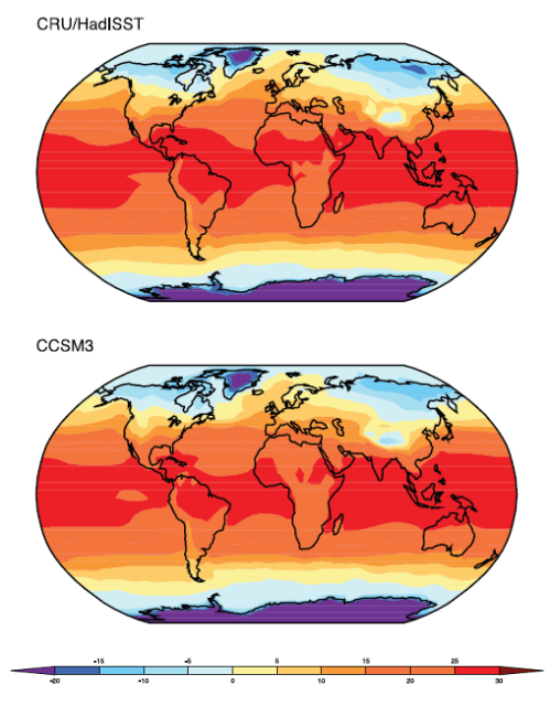
Annual temperature

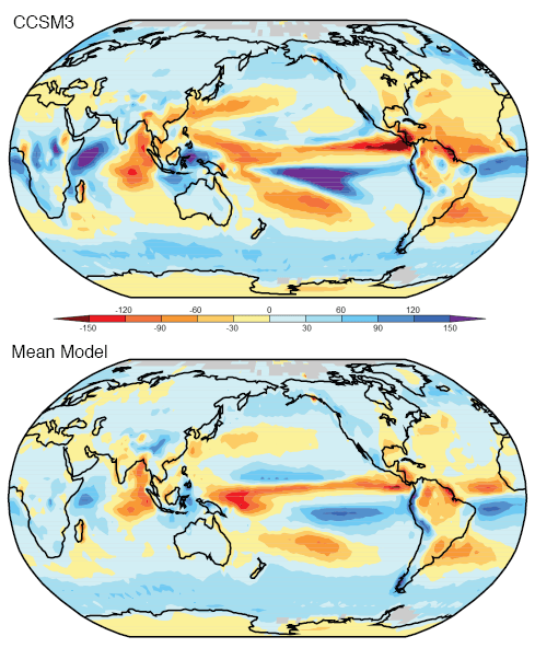
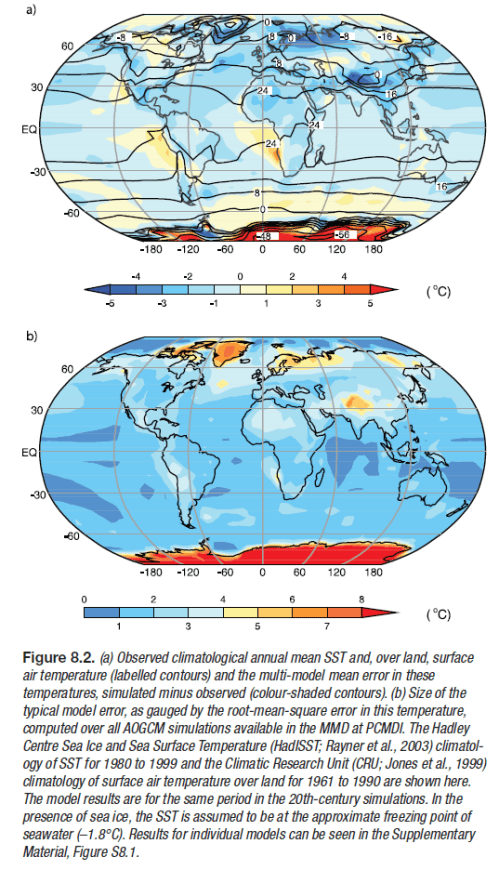
CCSM3 Annual Land & Sea Temperature Actual (top) vs Model (bottom)

CCSM3 Annual Land & Sea Temperature Actual (top) vs Model (bottom)

Cici looks pretty good.

Details – The HadISST (Rayner et al., 2003) climatology of SST for 1980-1999 and the CRU (Jones et al., 1999) climatology of surface air tempeature over land for 1961–1990 are shown here. The model results are for the same period of the CMIP3 20th Century simulations. In the presence of sea ice, the SST is assumed to be at the approximate freezing point of sea water (–1.8 °C).

However, it’s hard to tell looking at two sets of absolute values, so of course we turn to the difference between model and reality.

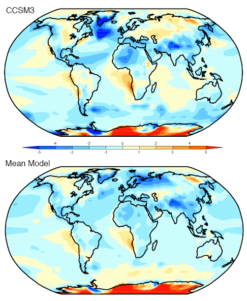
Annual Temperature – Model Error

Model simulations of annual average temperature less observed values for Cici and for the “ensemble” or multi-model mean:

Annual Temperatures - Simulated minus observed for CCSM3 and the ensemble

Annual Temperatures - Simulated minus observed for CCSM3 and the ensemble

In terms of absolute error around the globe, Cici and the ensemble are very close (using the Anglotzen statistical method).

We could note that even though the values are “close”, there are areas where Cici – and the ensemble – don’t do so well. In Cici’s case southern Greenland and the Labrador Sea, which might be very important for predicting the future of the thermohaline circulation. And both are particularly bad for Antarctica, a general problem for models.

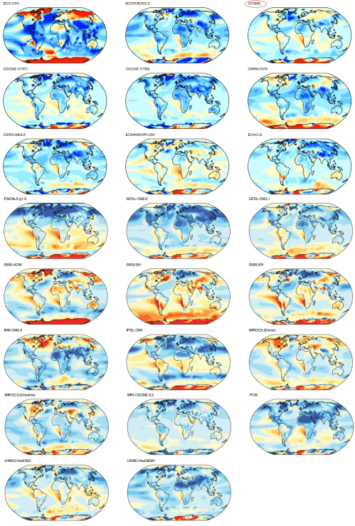
To give an idea of the variation of models, here are all of the models reviewed by the IPCC in AR4 (2007):

Annual Temperature - Model less Actual - All models

Annual Temperature - Simulated minus observed - All models

The top right is Cici (red circle). It’s clear that Cici is a supermodel..

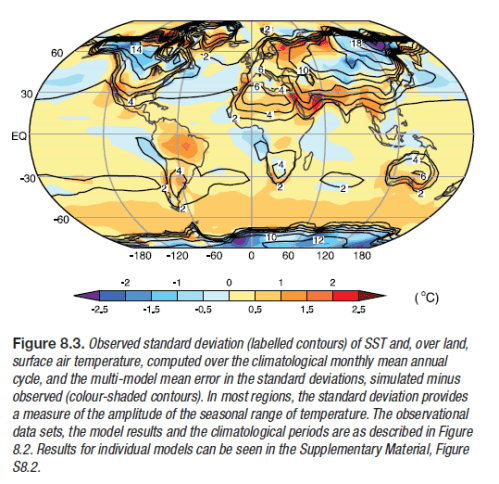
Standard Deviation of Temperature

The standard deviation of temperature – “over the climatological monthly mean annual cycle ” – simulated less observed for Cici and the ensemble. We could describe it as how good is the model at working out how much temperature actually varies over the year in each location?

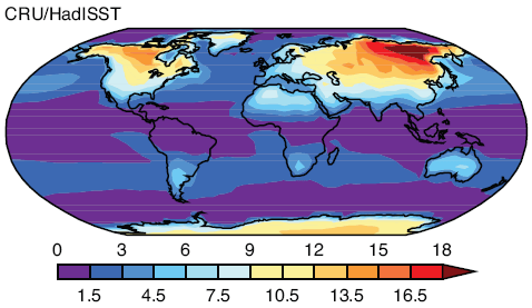
First, however, to make sense of the “error” of model less actual, we need to know what actual values look like:

Standard Deviation of Temperature over the climatological monthly mean annual cycle

Standard Deviation of Temperature over the climatological monthly mean annual cycle

As we would expect, the oceans show a lot less temperature variation than the land and around the tropics and sub-tropics the variation is close to zero.

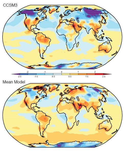
Now let’s take a look at the model less actual, or “model error”:

Std Deviation of Temperature - Simulated minus observed for CCSM3 and the ensemble

Std Deviation of Temperature - Simulated minus observed for CCSM3 and the ensemble

We can see that Cici has some problems in modeling temperature variation especially under-estimating the actual variation around northern Russia and Canada and over-estimating the variation in the Middle East and Brazil. The ensemble appears to be in slightly better shape here.

Of course, these areas are where the largest temperature variation takes place.

Diurnal Range of Land Temperature

As before, first the actual values:

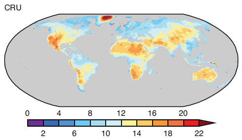
Annual average of diurnal temperature range over land

Annual average of diurnal temperature range over land

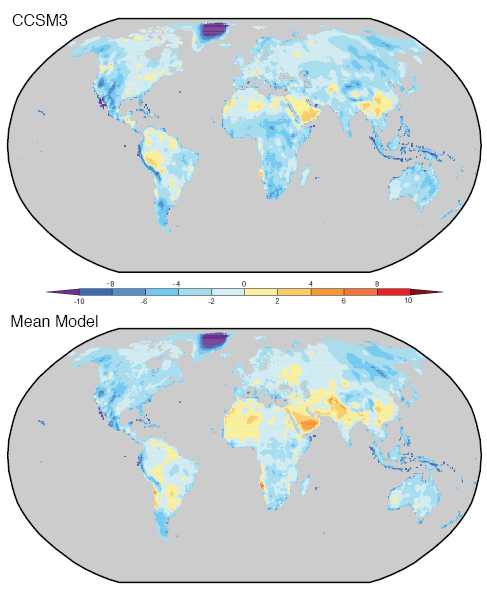
And now the model less actual, or “model error”:

Diurnal temperature range over land - Actual less Model for CCSM3 and ensemble

Diurnal temperature range over land - Actual less Model for CCSM3 and ensemble

We can see a lot of areas where the model error is quite large, usually corresponding to larger measured values. In the case of Greenland, for example, the annual average diurnal temperature range is over 20°C, while the model under-estimates this by more than 10°C. Given the legend the error might be as big as the actual value..

We can also see that on average Cici under-estimates the diurnal temperature range, and the ensemble is closer to neutral but still appears to under-estimate.

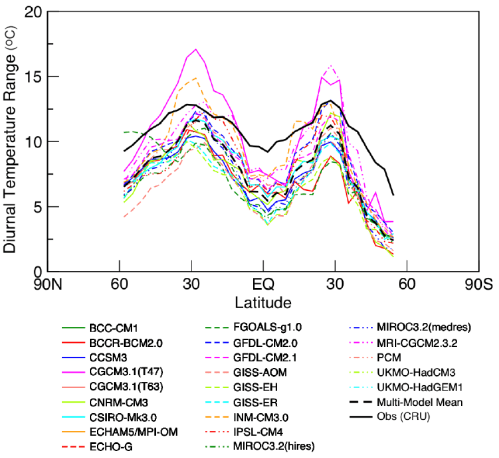
Here’s another comparison which demonstrates the problem of all the models vs observation:

Diurnal temperature range vs latitude - Observed compared with all models

Diurnal temperature range vs latitude - Observed compared with all models

The black line is the observed value. We can see that all of the models except for one are definitely under-estimating, and none of the models are particularly close to the observed values.

Now we can get to see more fundamental values.

Reflected Solar Radiation

This value is essential for calculating the basic radiation budget for the earth.

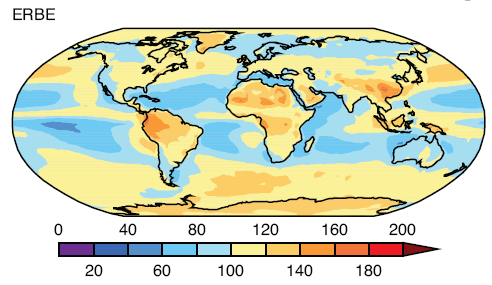
First the actual values as measured by ERBE (1985-1989):

Average Reflected Solar Radiation, ERBE

Average Reflected Solar Radiation, ERBE

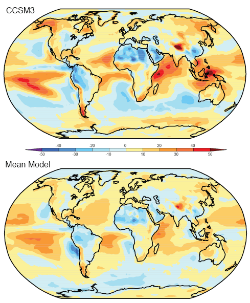
And now the model error – model less actual:

Reflected Solar Radiation - Actual less Model for CCSM3 and ensemble

Reflected Solar Radiation - Actual less Model for CCSM3 and ensemble

The ensemble is definitely better than Cici. Cici has some large errors, for example, North Africa, Pacific Ocean and the Western Indian Ocean where the model error seems to be up to half of the actual value.

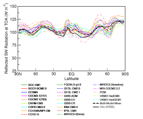
If we look at the values averaged by latitude the results appear a little better:

Reflected Solar Radiation vs latitude - Observed compared with all models

Reflected Solar Radiation vs latitude - Observed compared with all models

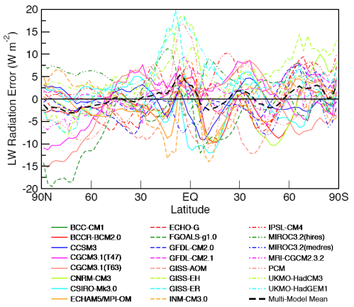
But the deviations give us a better view:

Reflected Solar Radiation vs latitude - Model error for all models

Reflected Solar Radiation vs latitude - Model error for all models

Note Cici in the solid blue line. The ensemble is proving to be the pick of the bunch..

So the model’s ability to simulate reflected solar radiation is much better by latitude than by location. But most or all of the models have significant discrepancies even when averaged over each latitude.

Outgoing Longwave Radiation

The other side of the radiation budget, first the actual ERBE measurement (1985-1989):

Outgoing Longwave Radiation, OLR, ERBE

Measured Outgoing Longwave Radiation, ERBE

And now the model error – model less actual:

OLR - Actual less Model for CCSM3 and ensemble

OLR - Actual less Model for CCSM3 and ensemble

As with reflected SW radiation, the ensemble performs better than Cici. So while measured values are in the range of 200-300 W/m2, Cici has some areas where the (absolute) error is in excess of 30W/m2.

Looking at the OLR values averaged by latitude, the results appear a little better:

OLR vs latitude - Observed compared with all models

OLR vs latitude - Observed compared with all models

And the deviations, or model error:

OLR vs latitude - Model error for all models

OLR vs latitude - Model error for all models

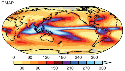
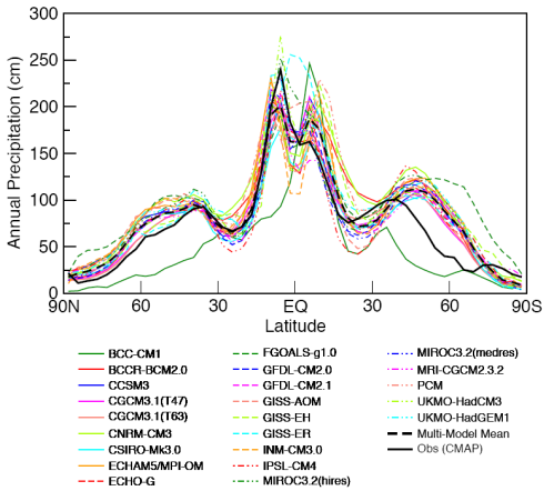
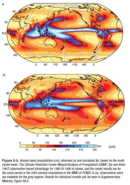
Rainfall

Measured from CMAP, 1980-1999:

Rainfall 1980-1999

Rainfall 1980-1999

Units are in cm of rainfall per year. And now the model error – model less actual:

Rainfall - Actual less Model for CCSM3 and ensemble

Rainfall - Actual less Model for CCSM3 and ensemble

Once again the ensemble outshines Cici. There are some substantial errors in the areas where rainfall is high.

As with some of the previous model results, if we look at the model vs observed by latitude the picture is somewhat better:

Rainfall vs latitude - Observed vs all models

Rainfall vs latitude - Observed vs all models

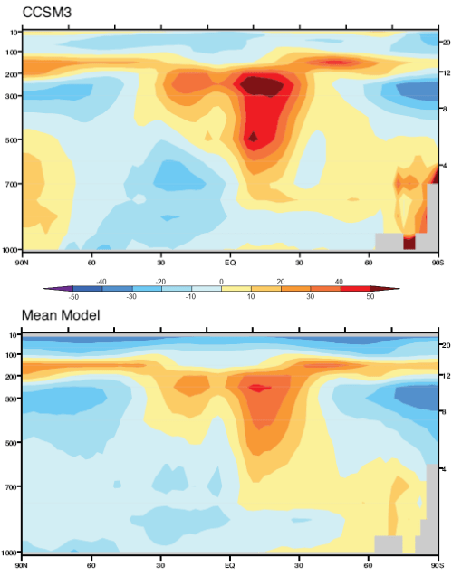
Humidity

Lastly, we will take a look at specific humidity. First the “measured”, as recalculated by ERA-40:

Specific Humidity vs Latitude and Altitude, from ERA40

Specific Humidity in g/kg vs Latitude and Altitude, from ERA40

Observed annual mean specific humidity in g/kg, averaged zonally, 1980-1999. Note that the vertical axis is pressure on the left in mbar and km in height on the right.

And now the model error – but this time in % = (model – actual)/actual x 100:

Specific Humidity - % Error for CCSM3 and ensemble

Specific Humidity - % Error for CCSM3 and ensemble

Once again the ensemble appears to outperform Cici. And both, but especially Cici, have problems in the top half of the troposphere (around 500-200mbar) with 20-50% error in some regions in Cici’s case.

Conclusion

This has been a quick survey of model results for different parameters across the globe, but averaged annually, compared with observations.

In Part One, we saw the ensemble in its best light. But when we take a look at a real model, the supermodel Cici, we can see that she has a lot of areas for improvement.

There’s lots more to investigate about models, all to come in future parts of this series.

As always, comments and questions are welcome, but remember the etiquette.

Read Full Post »

In the previous article in this series, The Earth’s Energy Budget – Part Two we looked at outgoing longwave radiation (OLR) and energy imbalance. At the end of the article I promised that we would look at problems of measuring things and albedo but much time has passed, promises have been forgotten and the fascinating subject of how the earth really radiates energy needs to be looked at.

If you are new to the idea of incoming (absorbed) solar radiation being balanced by OLR, or wonder how the solar “constant” of 1367W/m2 can be balanced by the earth’s OLR of 239W/m2 then take a look at Part One and Part Two.

Introduction

If you’ve read more in depth discussions about energy balance or CO2 “saturation” you might have read statements like:

More absorption by CO2 causes emission of radiation to move to higher, colder layers of the atmosphere

If these kind of comments confuse you, sound plain wrong, or cause you to furrow your brow because “it sounds like it’s probably right but what does it actually mean?” – well, hopefully some enlightenment can be found.

Effective Radiation

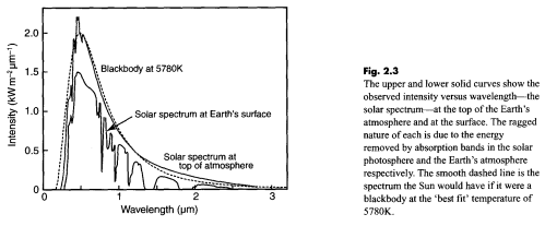
The sun’s core temperature is millions of degrees but we see a radiation from the sun that matches 5780K – its surface temperature:

Solar Radiation, top of atmosphere and at earth's surface, Taylor (2005)

Solar Radiation, top of atmosphere and at earth's surface, Taylor (2005)

In this figure there are two spectra: the top one is how the sun’s radiation looks before it reaches the top of the earth’s atmosphere – contrasted with the dotted line of a “blackbody” – or perfect radiator – at 5780K (5507°C for people new to Kelvin or absolute temperature).

The bottom one – of less interest for this article – is how the sun’s radiation looks at the earth’s surface after the atmosphere has absorbed at various wavelengths.

Why don’t we see a radiation spectrum from the sun that matches millions of degrees?

If we measure the upward longwave radiation from the earth’s surface at 15°C we see an effective “blackbody” radiator of 288K (15°C). But why don’t we see a radiation spectrum of 5000K – the temperature somewhere near the core?

The answer to both questions is that radiation from the hotter inner areas of these bodies gets completely absorbed by outer layers, which in turn heat up and radiate at lower temperatures. In the case of the sun, the radiation spectrum includes hotter areas below the surface that are not absorbed at some wavelengths, as well as the surface itself.

In the case of the earth it’s really the top skin layer that emits longwave radiation.

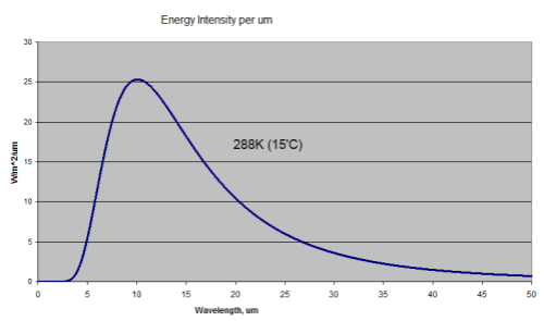
So when we measure the radiation from the earth with a surface temperature of 15°C (288K) we know we will see a longwave radiation that matches this 288K. This will be a total energy radiated of 390W/m2 with the peak wavelength of 10.1μm. The temperature below the surface is irrelevant.

(Well, it’s not really irrelevant. The hotter layers below warm up the layers above – through conduction and radiation).

This is what the radiation looks like:

Blackbody Radiation at 15'C or 288K

Blackbody Radiation at 15'C or 288K

This assumes an emissivity of 1. The emissivity of the surface of the earth varies slightly but is close to 1, typically around 0.98. Watch out for a dull post on emissivity at some stage..

At the top of atmosphere, as many know, the OLR is around 239W/m2. For those confused by how it can be 390W/m2 at the surface and 239W/m2 at the top, the answer is due to absorption and re-radiation of longwave radiation by trace gases – the “greenhouse” effect. See the CO2 – An Insignificant Trace Gas? series, and especially Part Six – Visualization and CO2 Can’t Have that Effect Because.. if you don’t understand or agree with these well-proven ideas.

If the earth’s atmosphere was completely transparent to longwave radiation this spectrum would look exactly the same at the earth’s surface and at the top of atmosphere (TOA).

Here’s what it does look like with some typical blackbody radiation curves overlaid:

Outgoing longwave radiation at TOA, Taylor (2005)

Outgoing longwave radiation at TOA, Taylor (2005)

(Note that the spectrum is shown in wavenumber in cm-1. For convenience I added wavelength in μm under the wavenumber axis. Wavelength in μm = 10,000/wavenumber).

For energy balance – if the earth is not warming up or cooling down – we would expect the earth to radiate out the same amount of energy that it absorbs from the sun. That amount is 239W/m2, which equates to an average temperature of 255K (-18°C).

As the text for this graphic shows, when the energy under the curve is integrated this is what it comes to! But as you can see the actual spectrum is not a “blackbody curve” for 255K. So let’s take a closer look.

Everything Gets Through or Nothing Gets Through – a Few Thought Experiments

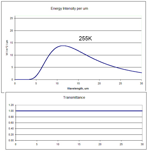
Imagine a world where the upwards longwave radiation from the earth’s surface didn’t get absorbed by any gases in the atmosphere.

Most people are familiar with that thought experiment – it’s a staple of the most basic radiation model in climate science. The radiation at the top of the atmosphere would look like this (the top graph):

255K radiation, 100% transmittance

255K radiation, 100% transmittance

This is the blackbody radiation at 255K (-18°C) with 100% “transmittance” through the atmosphere. The area under the curve, if we extend it out to infinity, is 239W/m2.

And of course, because the radiation hadn’t been absorbed or attenuated in any way, the temperature at the earth’s surface would also be 255K. Chilly.

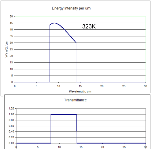
Now let’s think about what would happen if the atmosphere allowed radiation only through the “atmospheric window” and everywhere else the transmittance was zero:

323K radiation through a perfect "atmospheric window", 8-14um

323K radiation through a perfect "atmospheric window", 8-14um

The bottom graph shows how the transmittance of the atmosphere varies with wavelength in this thought experiment.

The top graph in this case is the blackbody radiation from 323K (50°C) only allowed through between 8-14μm. The energy under the curve is 239W/m2. (Note the higher values on the vertical scale compared with the earlier graphs).

So if the atmosphere absorbed all of the surface radiation below 8μm and above 14μm the earth’s surface would heat up until it reached 50°C (323K). Why? Because if the temperature was only 15°C the amount of energy radiated out would only be 141W/m2. More energy coming in than going out = earth heats up. The surface temperature would keep heating up until eventually 239W/m2 made it out through the atmospheric window – which is 50°C.

Closer to The Real World – Illustration of Radiation from Multiple Layers in the Atmosphere

Even in the atmospheric window some radiation is absorbed, i.e. the transmittance is not 1. But let’s assume for sake of argument it is 1. So energy in the 8-14μm band just passes straight through the atmosphere. It’s still a thought experiment.

Lots of gases absorb at lots of wavelengths – which makes thinking about it as a whole very difficult. So we’ll just assume that the rest of the atmosphere outside the atmospheric window all shares the same absorption characteristics – that is, every wavelength is identical in terms of absorption of radiation.

Now let’s try and consider what really happens in the atmosphere. Each “layer” of the atmosphere radiates out energy according to the temperature in that layer. For reference, here is the temperature (and pressure) at different heights:

Atmospheric Temperature & Pressure Profile, Bigg (2005)

Atmospheric Temperature & Pressure Profile, Bigg (2005)

The highlighted area at the bottom – the troposphere – is the area of interest. This is where most of the atmosphere (by molecules and mass) actually resides.

In our thought experiment radiation from the surface (outside the atmospheric window) gets completely absorbed by the atmosphere, or at least the amount that gets through is very small. Taken to the extreme we would get the result shown a few graphs earlier where the surface temperature rises up to 50’C.

But just because surface radiation doesn’t get out doesn’t mean that radiation from the atmosphere can’t get out.

Each layer of the atmosphere radiates according to its temperature. Even if the atmosphere’s transmittance is zero when considering the entire thickness of the atmosphere, there will be some layer where radiation starts to get through.

This is partly because there is less atmosphere to absorb the closer we get to the “top”. And also because as we get higher in the atmosphere it gets thinner. Less molecules to absorb radiation. Even if some gas is a fantastically good absorber of energy, there must be a point where radiation is hardly absorbed. For example, at the top of the stratosphere, about 50km, the pressure is around 1mbar – 1000x less than at the surface. At the top of the troposphere (the tropopause) the pressure is around 200mbar – 5x less than at the surface.

The challenge in thinking about the atmosphere radiating is that unlike the surface of the earth where all radiation is emitted from the very surface, instead radiation is emitted from lots of different layers:

  • Higher up – less absorption, more radiation makes it through
  • Lower down – more absorption, less radiation makes it through

But let’s still keep it simple and think about the surface temperature being our standard 15°C (288K) and the atmospheric window letting through everything between 8-14μm. This means 141W/m2 makes it out through this window.

If we have energy balance, the OLR = 239W/m2 in total = 141 (through the atmospheric window) + 98 (radiated from the atmosphere at some height, wavelengths outside 8-14μm).

What temperature equates to this layer in the atmosphere? Well, assuming no absorption above this radiating layer (not really the case), and only radiation outside 8-14μm, the temperature of the atmosphere would have to be 219K, or -54°C. Take a look back at the temperature profile above – this is pretty much the top of the troposphere, around 11km.

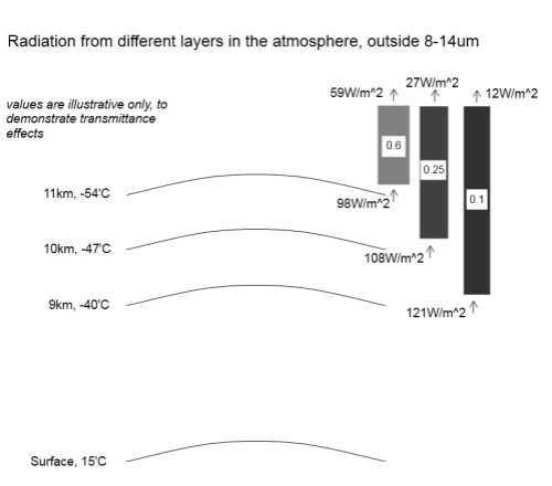
Remember that this isn’t exactly how radiation gets radiated out to space – it doesn’t come from one “skin layer”. We might consider that if the transmittance of the atmosphere is 1 at this height, then maybe at 10km the transmittance is 0.8 and at 9km the transmittance is 0.5, and at 8km the transmittance is 0.1..

So each layer is radiating energy, with higher layers being colder but more of their radiation getting through, and lower layers being warmer – so radiating a higher amount – but less of their radiation getting through.

For many people reading, this is a straightforward concept, why so long.. for others it might still seem tough to grasp..

So here is a sample radiation diagram with illustrative values only (and values a little different from above):

Radiation from different heights in the atmosphere, illustrative values only

Radiation from different heights in the atmosphere, illustrative values only

What the diagram shows is the radiation outside the 8-14μm band. That’s because in our thought experiment the 8-14μm band doesn’t absorb any radiation (and therefore can’t radiate in this band either).

Take the top layer at 11km. If we calculate the blackbody radiation of 219K (-54°C) and exclude radiation in the 8-14μm band the radiation is 98W/m2. Then the grey block above with “0.6” is the atmosphere above with transmittance of 0.6, so the radiation actually getting through from this layer to the top of atmosphere is 59W/m2. Similarly for the two other layers (with different values).

In total, the energy leaving the top of atmosphere (outside of the atmospheric window) is 98W/m2. (It’s just a coincidence that this is the value of the top layer before any absorption). And inside the atmospheric window was the number we already calculated of 141W/m2, so the total OLR is 239W/m2.

Of course, we all know the real atmosphere is much more complex with lots of different absorption at different wavelengths. But hopefully this “intermediate” example help to explain how the atmosphere radiates out energy.

So finally, onto the real point..

What Happens with More Absorbing Gases?

Remember how this long post started..

If you’ve read more in depth discussions about energy balance or CO2 “saturation” you might have read statements like:

More absorption by CO2 causes emission of radiation to move to higher, colder layers of the atmosphere

Now, maybe this kind of statement will make more sense.

In our model – our thought experiment – above, we had a uniform absorber of radiation outside the atmospheric window. Suppose we increase the amount of this absorber – the skies open and someone pours some more in and stirs it around. Let’s say the amount increases by 10%.

Well, take a look back at the last diagram. See the transmittance values for each layer in the atmosphere – 0.6 at 11km high, 0.25 at 10km high and 0.1 at 9km high.

Regardless of how realistic these actual numbers are, increasing the amount of absorbing gas by 10% will automatically mean that each of the transmittance numbers is reduced by 10%. And so less radiation makes it out to the TOA (top of atmosphere).

Effectively because lower layers are contributing less energy out through TOA the effective radiating height has moved up. It’s not because some directive has been passed down from a higher authority. And it’s not because one layer has stopped and another layer has taken over.

It’s just that lower layers contribute less, so the “average radiating height” is now higher and colder.

(Note: it might look at first sight that the average height is still the same even though the amount of radiation has reduced. This is not really the case, see the note at end).

In our particular example what would happen is that the OLR would reduce from 239W/m2 down to 141+98*0.9=229 W/m2. So the surface would warm up and this would warm up each layer of the atmosphere until eventually a new hotter steady state was reached.

Conclusion

This has been a long post to try and create more of an understanding of how the earth actually radiates energy, and why more of any trace gas increases the “greenhouse” effect.

It does it because more “absorbing gases” reduce the amount of radiation that can make it out from lower layers in the atmosphere. These lower layers are hotter and radiate much more energy. Proportionately more energy will then be radiated from higher layers which are colder, and therefore these radiate less energy.

It’s a not a mystical force that raises the “effective radiating height” in the atmosphere. But the effective radiating height does increase.

Note

In the example above, the three layers together contributed 98W/m2 at TOA. That is an “effective temperature” of 219K – remembering that we are excluding radiation from the 8-14μm window. If we reduce the radiation from these three layers by 10%, we now have 89W/m2 which is about 212K – effectively radiating from a colder level in the atmosphere.

Read Full Post »

Gary Thompson at American Thinker recently produced an article The AGW Smoking Gun. In the article he takes three papers and claims to demonstrate that they are at odds with AGW.

A key component of the scientific argument for anthropogenic global warming (AGW) has been disproven. The results are hiding in plain sight in peer-reviewed journals.

The article got discussed on Skeptical Science, with the article Have American Thinker Disproven Global Warming? although the blog article really just covered the second paper. The discussion was especially worth reading because Gary Thompson joined in and showed himself to be a thoughtful and courteous fellow.

He did claim in that discussion that:

First off, I never stated in the article that I was disproving the greenhouse effect. My aim was to disprove the AGW hypothesis as I stated in the article “increased emission of CO2 into the atmosphere (by humans) is causing the Earth to warm at such a rate that it threatens our survival.” I think I made it clear in the article that the greenhouse effect is not only real but vital for our planet (since we’d be much cooler than we are now if it didn’t exist).

However, the papers he cites are really demonstrating the reality of the “greenhouse” effect. If his conclusions – different from the authors of the papers – are correct, then he has demonstrated a problem with the “greenhouse” effect, which is a component – a foundation – of AGW.

This article will cover the first paper which appears to be part of a conference proceeding: Changes in the earth’s resolved outgoing longwave radiation field as seen from the IRIS and IMG instruments by H.E. Brindley et al. If you are new to understanding the basics on longwave and shortwave radiation and absorption by trace gases, take a look at CO2 – An Insignificant Trace Gas?

Take one look at a smoking gun and you know it’s been fired. One look at a paper on a complex subject like atmospheric physics and you might easily jump to the wrong conclusion. Let’s hope I haven’t fallen into the same trap..

Even their mother couldn't tell them apart

Even their mother couldn't tell them apart

The Concept Behind the Paper

The paper examines the difference between satellite measurements of longwave radiation from 1970 and 1997. The measurements are only for clear sky conditions, to remove the complexity associated with the radiative effects of clouds (they did this by removing the measurements that appeared to be under cloudy conditions). And the measurements are in the Pacific, with the data presented divided between east and west. Data is from April-June in both cases.

The Measurement

The spectral data is from 7.1 – 14.1 μm (1400 cm-1 – 710 cm-1 using the convention of spectral people, see note 1 at end). Unfortunately, the measurements closer to the 15μm band had too much noise so were not reliable.

Their first graph shows the difference of 1997 – 1970 spectral results converted from W/m2 into Brightness Temperature (the equivalent blackbody radiation temperature). I highlighted the immediate area of concern, the “smoking gun”:

Spectral difference - 1997 less 1970 over East and West Pacific, Brindley

Spectral difference - 1997 less 1970 over East and West Pacific, Brindley

Note first that the 3 lines on each graph correspond to the measurement (middle) and the error bars either side.

I added wavelength in μm under the cm-1 axis for reference.

What Gary Thompson draws attention to is the fact that OLR (outgoing longwave radiation) has increased even in the 13.5+μm range, which is where CO2 absorbs radiation – and CO2 has increased during the period in question (about 330ppm to 380ppm). Surely, with an increase in CO2 there should be more absorption and therefore the measurement should be negative for the observed 13.5μm-14.1μm wavelengths.

One immediate thought without any serious analysis or model results is that we aren’t quite into the main absorption of the CO2 band, which is 14 – 16μm. But let’s read on and understand what the data and the theory are telling us.

Analysis

The key question we need to ask before we can draw any conclusions is what is the difference between the surface and atmosphere in these two situations?

We aren’t comparing the global average over a decade with an earlier decade. We are comparing 3 months in one region with 3 months 27 years earlier in the same region.

Herein seems to lie the key to understanding the data..

For the authors of the paper to assess the spectral results against theory they needed to know the atmospheric profile of temperature and humidity, as well as changes in the well-studied trace gases like CO2 and methane. Why? Well, the only way to work out the “expected” results – or what the theory predicts – is to solve the radiative transfer equations (RTE) for that vertical profile through the atmosphere. Solving those equations, as you can see in CO2 – Part Three, Four and Five – requires knowledge of the temperature profile as well as the concentration of the various gases that absorb longwave radiation. This includes water vapor and, therefore, we need to know humidity.

Atmospheric Temperature Profile, Brindley

Change in Atmospheric Temperature Profile, Brindley

I’ve broken up their graphs, this is temperature change – the humidity graphs are below.

Now it is important to understand where the temperature profiles came from. They came from model results, by using the recorded sea surface temperatures during the two periods. The temperature profiles through the atmosphere are not usually available with any kind of geographic and vertical granularity, especially in 1970. This is even more the case for humidity.

Note that the temperature – the real sea surface temperature – in 1997 for these 3 months is higher than 1970.

Higher temperature = higher radiation across the spectrum of emission.

Now the humidity:

Change in Humidity Profile through the atmosphere, Brindley

Change in Humidity Profile through the atmosphere, Brindley

The top graph is change in specific humidity – how many grams of water vapor per kg of air. The bottom is change in relative humidity. Not relevant to the subject of the post, but you can see how even though the difference in relative humidity is large high up in the atmosphere it doesn’t affect the absolute amount of water vapor in any meaningful way – because it is so cold high up in the atmosphere. Cold air cannot hold as much water vapor as warm air.

It’s no surprise to see higher humidity when the sea temperature is warmer. Warmer air has a higher ability to absorb water vapor, and there is no shortage of water to evaporate from the surface of the ocean.

Model Results of Expected Longwave Radiation

Now here are some important graphs which initially can be a little confusing. It’s worth taking a few minutes to see what these graphs tell us. Stay with me..

Top - model results not including trace gases; Bottom - model results including all effects

Top - model results not including trace gases; Bottom - model results including all effects

The top graph. The bold line is the model results of expected longwave radiation – not including the effect of CO2, methane, etc – but taking into account sea surface temperature and modeled atmospheric temperature and humidity profiles.

This calculation includes solving the radiative transfer equations through the atmosphere (see CO2 – An Insignificant Trace Gas? Part Five for more explanation on this, and you will see why the vertical temperature profile through the atmosphere is needed).

The breakdown is especially interesting – the three fainter lines. Notice how the two fainter lines at the top are the separate effects of the warmer surface and the higher atmospheric temperature creating more longwave radiation. Now the 3rd fainter line below the bold line is the effect of water vapor. As a greenhouse gas, water vapor absorbs longwave radiation through a wide spectral range – and therefore pulls the longwave radiation down.

So the bold line in the top graph is the composite of these three effects. Notice that without any CO2 effect in the model, the graph towards the left edge trends up: 700 cm-1 to 750 cm-1 (or 13.5μm to 14.1μm). This is because water vapor is absorbing a lot of radiation to the right (wavelengths below 13.5μm) – dragging that part of the graph proportionately down.

The bottom graph. The bold line in the bottom graph shows the modeled spectral results including the effects of the long-term changes in the trace gases CO2, O3, N2O, CH4, CFC11 and CFC12. (The bottom graph also confuses us by including some inter-annual temperature changes – the fainter lines – let’s ignore those).

Compare the top and bottom bold graphs to see the effect of the trace gases. In the middle of the graph you see O3 at 1040 cm-1 (9.6μm). Over on the right around 1300cm-1 you see methane absorption. And on the left around 700cm-1 you see the start of CO2 absorption, which would continue on to its maximum effect at 667cm-1 or 15μm.

Of course we want to compare this bottom graph – the full model results – more easily with the observed results. And the vertical axes are slightly different.

First for completeness, the same graphs for the West Pacific:

Model results for West Pacific

Model results for West Pacific

Let’s try the comparison of observation to the full model, it’s slightly ugly because I don’t have source data, just a graphics package to try and line them up on comparable vertical axes.

Here is the East Pacific. Top is observed with (1 standard deviation) error bars. Bottom is model results based on: observed SST; modeled atmospheric profile for temperature and humidity; plus effect of trace gases:

Comparison on similar vertical axes - top, observed; bottom, model

Comparison on similar vertical axes - top, observed; bottom, model

Now the West Pacific:

Comparison, West Pacific, Observed (top) vs Model (bottom)

Comparison, West Pacific, Observed (top) vs Model (bottom)

We notice a few things.

First, the model and the results aren’t perfect replicas.

Second, the model and the results both show a very similar change in the profile around methane (right “dip”), ozone (middle “dip”) and CO2 (left “dip”).

Third, the models show a negative value in change of brightness temperature (-1K) at the 700 cm-1 wavelength, whereas the actual results for the East Pacific is around 1K and for West Pacific is around -0.5K. The 1 standard deviation error bars for measurement include the model results – easily for West Pacific and just for East Pacific.

It appears to be this last observation that has prompted the article in American Thinker.

Conclusion

Hopefully, those who have taken the time to review:

  • the results
  • the actual change in surface and atmospheric conditions between 1970 and 1997
  • the models without trace gas effects
  • the models with trace gas effects

might reach a different conclusion to Gary Thompson.

The radiative transfer equations as part of the modeled results have done a pretty good job of explaining the observed results but aren’t exactly the same. However, if we don’t include the effect of trace gases in the model we can’t explain some of the observed features – just compare the earlier graphs of model results with and without trace gases.

It’s possible that the biggest error is the water vapor effect not being modeled well. If you compare observed vs model (the last 2 sets of graphs) from 800cm-1 to 1000cm-1 there seems to be a “trend line” error. The effect of water vapor has the potential to cause the most variation for two reasons:

  • water vapor is a strong greenhouse gas
  • water vapor concentration varies significantly vertically through the atmosphere and geographically (due to local vaporization, condensation, convection and lateral winds)

It’s also the case that the results for the radiative transfer equations will have a certain amount of error using “band models” compared with the “line by line” (LBL) codes for all trace gases. (A subject for another post but see note 2 below). It is rare that climate models – even just 1d profiles – are run with LBL codes because it takes a huge amount of computer time due to the very detailed absorption lines for every single gas.

The band models get good results but not perfect – however, they are much quicker to run.

Comparing two spectra from two different real world situations where one has higher sea surface temperatures and declaring the death of the model seems premature. Perhaps Gary ran the RTE calculations through a pen and paper/pocket calculator model like so many others have done.

There is a reason why powerful computers are needed to solve the radiative transfer equations. And even then they won’t be perfect. But for those who want to see a better experiment that compared real and modeled conditions, take a look at Part Six – Visualization where actual measurements of humidity and temperature through the atmosphere were taken, the detailed spectra of downwards longwave radiation was measured and the model and measured values were compared.

The results might surprise even Gary Thompson.

Notes:

1. Wavelength has long been converted to wavenumber, or cm-1. This convention is very simple. 10,000/wavenumber in cm-1 = wavelength in μm.

e.g. CO2 central absorption wavelength of 15μm => 667cm-1 (=10,000/15)

2. Solving the radiative transfer equations through the atmosphere requires knowledge of the absorption spectra of each gas. These are extremely detailed and consequently the numerical solution to the equations require days or weeks of computational time. The detailed versions are known as LBL – line by line transfer codes. The approximations, often accurate to within 10% are called “band models”. These require much less computational time and so the band models are almost always used.

Read Full Post »

General Circulation Models or Global Climate Models – aka GCMs – often have a bad reputation outside of the climate science community. Some of it isn’t deserved. We could say that models are misunderstood.

Before we look at models on the catwalk, let’s just consider a few basics

Introduction

In an earlier series, CO2 – An Insignificant Trace Gas we delved into simpler numerical models. These were 1d models. They were needed to solve the radiative transfer equations through a vertical column in the atmosphere. There was no other way to solve the equations – and that’s the case with most practical engineering and physics problems.

Here’s a model from another world:

Stress analysis in an impeller
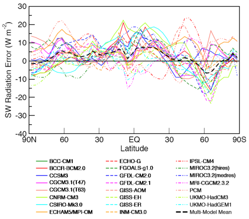
Stress analysis in an impeller
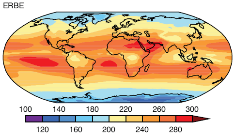
Here’s a visualization of “finite element analysis” of stresses in an impeller. See the “wire frame” look, as if the impeller has been created from lots of tiny pieces?

In this totally different application, the problem of calculating the mechanical stresses in the unit is that the “boundary conditions” – the strange shape – make solving the equations by the usual methods of re-arranging and substitution impossible. Instead what happens is the strange shape is turned into lots of little cubes. Now the equations for the stresses in each little cube are easy to calculate. So you end up with 1000’s of “simultaneous” equations. Each cube is next to another cube and so the stress on each common boundary is the same. The computer program uses some clever maths and lots of iterations to eventually find the solution to the 1000’s of equations that satisfy the “boundary conditions”.
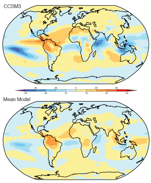
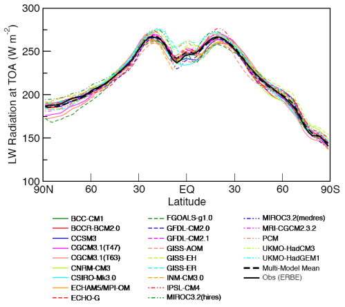
Finite element analysis is used successfully in lots of areas of practical problem solving, many orders simpler of course, than GCMs.

Uses of Models

One use of models is to predict, no project, future climate scenarios. That’s the one that most people are familiar with. And to supply the explanation for recent temperature increases.

But models have more practical uses. They are the only way to provide quantitative analysis of certain situations we want to consider. And they are the only way to test our understanding of the causes of past climate change.

Analysis

On this blog one commenter asked about how much equivalent radiative forcing would be present if all the Arctic sea ice was gone. That is, with no sea ice, there is less reflection of solar radiation. So more absorption of energy – how do we calculate the amount?

You can start with a very basic idea and just look at the total area of Arctic sea ice as a proportion of the globe, and look at the local change in albedo from around 0.5-0.8 down to 0.03-0.09, multiply by the current percentage area in sea ice to find a number in terms of the change in total albedo of the earth. You can turn that into the change in radiation.

But then you think a little bit deeper and want to take into account the fact that solar radiation is at a much lower angle in the Arctic so the first number you got probably overstated the effect. So now, even without any kind of GCM, you can simply use the equation for the reduction in solar insolation due to the effective angle between the sun and the earth:

I = S cos θ – but because this angle, θ, changes with time of day and time of year for any given latitude you have to plug a straightforward equation into a maths program and do a numerical integration. Or write something up in Visual Basic or whatever your programming language of choice is. Even Excel might be able to handle it.

This approach also gives the opportunity to introduce the dependence of the ocean’s albedo on the angle of sunlight (the albedo of ocean with the sun directly overhead is 0.03 and with the sun almost on the horizon is 0.09).

This will give you a better result. But now you start thinking about the fact that the sun’s rays are travelling in a longer path through the atmosphere because of the low angle in the sky.. how to incorporate that? Is it insignificant or highly significant? Perhaps including or not including this effect would change the “radiative forcing” by a factor of two? (I have no idea).

So if you wanted to quantify the positive feedback effect of melting ice your “model” starts requiring a lot more specifics. Atmospheric absorption by O2 and O3 depending on the angle of the sun. And the model should include the spatial profile of O3 in the stratosphere (i.e., is there less at the poles, or more).

It’s only by doing these calculations that the effect of sea ice albedo can be reliably quantified. So your GCM is suddenly very useful – essential in fact.

Without it, you would simply be doing the same calculations very laboriously, slowly and less accurately on pieces of paper. A bit like how an accounts department used to work before modern PCs and spreadsheets. Now one person in finance can do the job of 10 or 20 people from a few decades ago. Without an accountant someone can just change an exchange rate, or an input cost on a well-created spreadsheet and find out the change in cash-flow, P&L and so on. Armies of people would have been needed before to work out the answers.

And of course, the beauty of the GCM is that you can play around with other factors and find out what effect they have. The albedo of the ocean also changes with waves. So you can try some limits between albedo with no waves and all waves and see the change. If it’s significant then you need a parameter that tells you how calm or stormy the ocean is throughout the year. And if you don’t have that data, you have some idea of the “error”.

Everyone wants their own GCM now..

Of course, in that thought experiment about sea ice albedo we haven’t calculated a “final” answer. Other effects will come into play (clouds).. But as you can see with this little example, different phenomena can be progressively investigated and reasonably quantified.

Past Climate

Do we understand the causes of past climate change or not? Do the Milankovitch cycles actually explain the end of the last ice age, or the start of it?

This is another area where models are invaluable. Without a GCM, you are just guessing. Perhaps with a GCM you are guessing as well, but just don’t know it.. A topic for another day.

Common Misconception

The idea floats around that models have “positive feedback” plugged into them. Positive feedback for those few who don’t understand it.. increases in temperature from CO2 will induce more changes (like melting Arctic sea ice) that increase temperature further.

Unless it’s done very secretly, this isn’t the case. The positive feedbacks are the result of the model’s output.

The models have a mixed bag of:

  • fundamental equations – like conservation of energy, conservation of momentum
  • parameterizations – for equations that are only empirically known, or can’t be easily solved in the “grid” that makes up the 3d “mesh” of the GCM

More on these important points in the next post.

“Necessary but Not Sufficient”

A last comment before we see them on the catwalk – the catwalk “retrospective” – is that models matching the past is a necessary but not sufficient condition for them to match the future. However, it is – or it would be – depending on what we find.. a great starting point.

Models On the Catwalk

20th century temperature hindcast vs actual - ensemble

20th century temperature hindcast vs actual - ensemble

Most people have seen this graph. It comes from the IPCC AR4 (2007).

The IPCC comment:

Models can also simulate many observed aspects of climate change over the instrumental record. One example is that the global temperature trend over the past century (shown in Figure 1) can be modeled with high skill when both human and natural factors that influence climate are included.
And a little later:

In summary, confidence in models comes from their physical basis, and their skill in representing observed climate and past climate changes. Models have proven to be extremely important tools for simulating and understanding climate, and there is considerable confidence that they are able to provide credible quantitative estimates of future climate change, particularly at larger scales. Models continue to have significant limitations, such as in their representation of clouds, which lead to uncertainties in the magnitude and timing, as well as regional details, of predicted climate change. Nevertheless, over several decades of model development, they have consistently provided a robust and unambiguous picture of significant climate warming in response to increasing greenhouse gases.

Now of course, this is a hindcast. Looking backwards. One way to think about a hindcast is that it’s easy to tweak the results to match the past. That’s partly true and, of course, that’s how the model gets improved- until it can match the past.

The other way to think about the hindcast is that it’s a good way to test the model and find out how accurate it is.

The model gets to “past predict” many different scenarios. So if someone could tweak a model so that it accurately ran temperature patterns, rainfall patterns, ocean currents, etc – if it can be tweaked so that everything in the past is accurate – how can that be a bad thing? Also the model “tweaker” can change a parameter but it doesn’t give the flexibility that many would think. Let’s suppose you want to run the model to calculate average temperatures from 1980-1999 (see below) so you put your start conditions into the model, which are values for 1980 for temperature and all other “process variables” and crank up the model.

It’s not like being able to fix up a painting with a spot of paint in the right place – it’s more like tuning an engine and hoping you win the Dhaka rally. After you blew the engine halfway through you get to do a rebuild and guess what to change next. Well, analogies – just illustrations..

Obviously, these results would need to be achieved by equations and parameterizations that matched the real world. If “tweaking” requires non-physical laws then that would create questions. Well, more on this also in later posts.

More model shots.. The top graphic is the one of interest. This is actual temperature (average 1980-1999) in contours with the shading denoting the model error (actual minus model values). Light blue and light orange (or is it white?) are good..

Actual 1980-1999 temperature and Model error from actual

Actual 1980-1999 temperature with shading denoting model error (top graphic)

The model error is not so bad. Not perfect though. (Note that for some reason, not explained, the land temperature average is over a different time period than sea surface temperatures).

Temperature range:

1980-1999 Temperature range in each location and Model error in temperature range

1980-1999 Temperature range in each location and Model error in temperature range

The standard deviation in temperature gives a measure of the range of temperatures experienced. The colors on the globe indicate the difference between the observed and simulated standard deviation of temperatures.

Simplifying, the light blue and light orange areas are where the models are best at working out the monthly temperature range. The darker colors are where the models are worse. Looks pretty good.

Rainfall:

Actual Rainfall vs Model Rainfall, 1980-99

Actual Rainfall vs Model Rainfall, 1980-99

This one is awesome. Remember that rainfall is calculated by physical processes. Temperature, available water sources, clouds, temperature changes, winds, convection..

Ocean temperature:

Ocean potential temperature and model error 1957-1990

Ocean potential temperature and model error 1957-1990

Ocean potential temperature, what’s that? Think of it as the real temperature with unstable up and down movements factored out, or read about potential temperature.. Note that the contours are the measurements (averaged over 34 years) and the shaded colors are the deviations of actual – model. So once again the light blue and light orange are very close to reality, the darker colors are further away from reality.

This one you would expect to be easier to get right than rainfall, but still, looking good.

Conclusion

It’s just the start of the journey into models. There will be more, next we will look at Models Off the Catwalk. So if you have comments it’s perhaps not necessary to write your complete thoughts on past climate, chaos.. Interesting, constructive and thoughtful comments are welcome and encouraged, of course. As are questions.

Hopefully, we can avoid the usual bunfight over whether the last ten years actual match the model’s predictions. Other places are so much better for those “discussions”..

Update – Part Two now published.

Read Full Post »

We cover some basics in this post. The subject was inspired by one commenter on the blog.

  • When we look at a “radiative forcing” what does it mean?
  • What immediate and long-term impact does it have on temperature?
  • What is the new equilibrium temperature?

Radiative Forcing

The IPCC, drawing on the work of many physicists over the years, states that the radiative forcing from the increase in CO2 to about 380ppm is 1.7 W/m2. You can see how this is all worked out in the series CO2 – An Insignificant Trace Gas.

What is “radiative forcing”? At the top of atmosphere (TOA) there is an effective downward increase in radiation. So more energy reaches the surface than before..

Thermal Lag

If you put very cold water in a pot and heat it on a stove, what happens? Let’s think about the situation if the water doesn’t boil because we don’t apply so much heat..

Simple Thermal Lag

Simple Thermal Lag

I used simple concepts here.

T= water temperature and the starting temperature of the water, T (t=0) = 5°C

Air temperature, T1 = 5°C

Energy in per second = constant (=1000W in this example)

Energy out per second = h x (T – T1), where h is just a constant (h=20 in this example)

And the equation for temperature increase is:

Energy per second, Q = mc.ΔT

m = mass, and c= specific heat capacity (how much heat is required to raise 1kg of that material by 1’C) – for water this is 4,200 J kg-1 K-1. I used 1kg.

ΔT is change in temperature (and because we have energy per second the result is change in temperature per second)

The simple and obvious points that we all know are:

  • the liquid doesn’t immediately jump to its final temperature
  • as the liquid gets closer to its final temperature the rate of temperature rise slows down
  • as the temperature of the liquid increases it radiates or conducts or convects more energy out, so there will be a new equilibrium temperature reached

In this case, the heat calculation is by some kind of simple conduction process. And is linearly proportional to the temperature difference between the water and the air.

It’s not a real world case but is fairly close – as always, simplifying helps us focus on the key points.

What might be less obvious until attention is drawn to it (then it is obvious) – the final temperature doesn’t depend on the heat capacity of the liquid. That only affects how long it takes to reach its equilibrium – whatever that equilibrium happens to be.

Heating the World

Suppose we take the radiative forcing of 1.7W/m2 and heat the oceans. The oceans are the major store of the climate system’s heat, around 1000x more energy stored than in the atmosphere. We’ll ignore the melting of ice which is a significant absorber of energy.

Ocean mean depth = 4km (4000m)  – the average around the world

Only 70% of the earth’s surface is covered by ocean and we are going to assume that all of the energy goes into the oceans so we need to “scale up” – energy into the oceans =  1.7/0.7 = 2.4 W/m2 going into the oceans.

The density of ocean water is approximately 1000 kg/m3 (it’s actually a little more because of salinity and pressure..)

Each square meter of ocean has a volume of 4000 m3 (thinking about a big vertical column of water), and therefore a mass of 4×10⁶ kg.

Q = mc x dT

Q is energy, m is mass, c is specific heat capacity = 4.2 kJ kg-1 K-1,
dT = change in temperature

We have energy per second (W/m2), so change in temperature per second, dT = Q/mc

dT per second = 2.4 / (4×106 x 4.2×103)

= 1.4 x10⁻¹⁰ °C/second

dT per year = 0.004 °C/yr

That’s really small! It would take 250 years to heat the oceans by 1°C..
Let’s suppose – more realistically – that only the top “well-mixed” 100m of ocean receives this heat, so we would get (just scaling by 4000m/100m):

dT per year = 0.18 ‘C per year.

An interesting result, which of course, ignores the increase in heat lost due to increased radiation, and ignores the heat lost to the lower part of the ocean through conduction.

If we took this result and plotted it on a graph the temperatures would just keep going up!

Calculating the new Equilibrium Temperature

The climate is slightly complicated. How do we work out the new equilibrium temperature?

Do we think about the heat lost from the surface of the oceans into the atmosphere through conduction, convection and radiation? Then what happens to it in the atmosphere? Sounds tricky..

Fortunately, we can take a very simple view of planet earth and say energy in = energy out. This is the “billiard ball” model of the climate, and you can see it explained in CO2 – An Insignificant Trace Gas – Part One and subsequent posts.

What this great and simple model lets us do is compare energy in and out at the top of atmosphere (TOA). Which is why “radiative forcing” from CO2 is “published” at TOA. It helps us get the big picture.

Energy radiated from a body per unit area per second is proportional to T4, where T is temperature in Kelvin (absolute temperature). Energy radiated from the earth has to be balanced by energy we absorb from the sun.

This lets us do a quick comparison, using some approximate numbers.

Energy absorbed from the sun, averaged over the surface of the earth, we’ll call it Pold = 239 W/m2.

Surface temperature, we’ll call it Told = 15°C = 288K

If we add 1.7W/m2 at TOA what does this do to temperature? Well, we can simply divide the old and new values, making the equation slightly easier..

(Tnew/Told)4 =Pnew/Pold

So Tnew=288 x (239+1.7/239)1/4

Therefore, Tnew = 288.5K or 15.5°C   – a rise of 0.5°C

I don’t want to claim this represents some kind of complete answer, but just for some element of completeness, if we redo the calculation with the radiative forcing for all of the “greenhouse” gases, excluding water vapor, we have a radiative forcing of 2.4W/m2.

Tnew = 288.7 or 15.7°C   – a rise of 0.7°C.

(Note for the purists, I believe the only way to actually calculate the old and new surface temperature is using the complete radiative transfer equations, but the results aren’t so different)

Conclusion

The aim of this post is to clarify a few basics, and in the process we looked at how quickly the oceans might warm as a result of increased radiative forcing from CO2.

It does demonstrate that depending on how well-mixed the oceans are, the warming can be extremely slow (250 years for 1°C rise) or very quick (5 years for 1°C rise).

So from the information presented so far, temperatures we currently experience at the surface might be the new equilibrium from increased CO2, or a long way from it – this post doesn’t address that huge question! Or any feedbacks.

What we ignored in the calculation of temperature rise was the increased energy lost as the temperature rose – which would slow the rise down (like the heated water in the graph). But at least it’s possible to get a starting point.

We can also see a rudimentary calculation of the final increase in temperature – the new equilibrium – as a result of this forcing (we are ignoring any negative or positive feedbacks).

And the new equilibrium doesn’t depend on the thermal lag of the oceans.

Of course, calculations of feedback effects in the real climate might find thermal lag parameters to be extremely important.

Read Full Post »

« Newer Posts - Older Posts »