Feeds:
Posts
Comments

Archive for the ‘Measurement’ Category

Many questions have recently been asked about the relative importance of various mechanisms for moving heat to and from the surface, so this article covers a few basics.

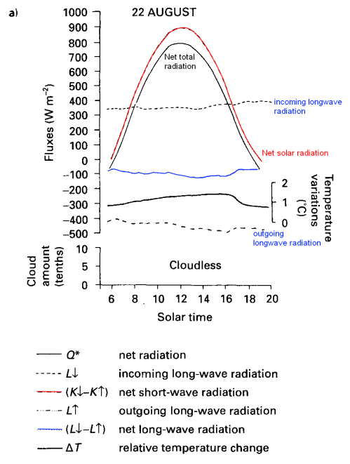
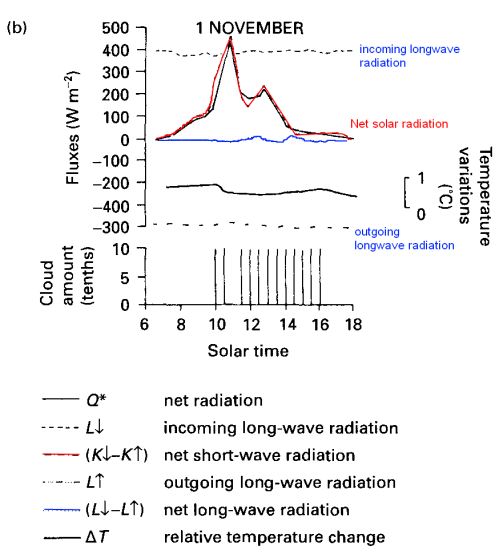
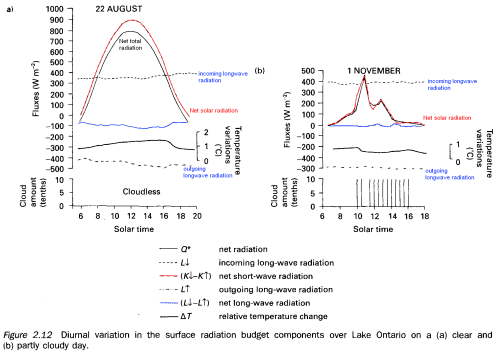
One Fine Day – the Radiation Components


Surface Radiation - clear day and cloudy day, from Robinson (1999)

Surface Radiation - clear day and cloudy day, from Robinson (1999)


I added some color to help pick out the different elements, note that temperature variation is also superimposed on the graph (on its own axis). The blue line is net longwave radiation.

Not so easy to see with the size of graphic, here they are expanded:


Clear sky

Clear sky


Cloudy sky

Cloudy sky


Note that the night-time is not shown, which is why the net radiation is almost always positive. You can see that the downward longwave radiation measured from the sky (in clear violation of the Imaginary Second Law of Thermodynamics) doesn’t change very much – equally so for the upwards longwave radiation from the ground. You can see the terrestrial (upwards longwave) radiation follows the temperature changes – as you would expect.

Sensible and Latent Heat

The energy change at the surface is the sum of:

  • Net radiation
  • “Sensible” heat
  • Latent heat
  • Heat flux into the ground

“Sensible” heat is that caused by conduction and convection. For example, with a warm surface and a cooler atmosphere, at the boundary layer heat will be conducted into the atmosphere and then convection will move the heat higher up into the atmosphere.

Latent heat is the heat moved by water evaporating and condensing higher up in the atmosphere. Heat is absorbed in evaporation and released by condensation – so the result is a movement of heat from the surface to higher levels in the atmosphere.

Heat flux into the ground is usually low, except into water.


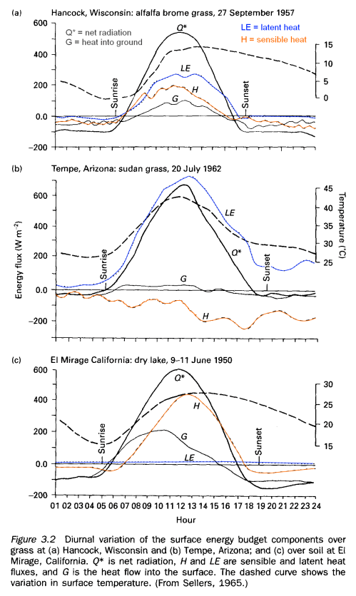
Surface Heat Components in 3 Locations, Robinson (1999)

Surface Heat Components in 3 Locations, Robinson (1999)


All of these observations were made under clear skies in light to moderate wind conditions.

Note the low latent heat for the dry lake – of course.

The negative sensible heat in Arizona (2nd graphic) is because it is being drawn from the surface to evaporate water. It is more usual to see positive sensible heat during the daytime as the surface warms the lower levels of the atmosphere.

The latent heat is higher in Arizona than Wisconsin because of the drier air in Arizona (lower relative humidity).

The ratio of sensible heat to latent heat is called the Bowen ratio and the physics of the various processes mean that this ratio is kept to a minimum – a moist surface will hardly increase in temperature while evaporation is occurring, but once it has dried out there will be a rapid rise in temperature as the sensible heat flux takes over.

Heat into the Ground


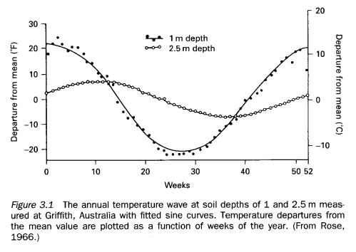
Temperature at two depths in soil - annual variation, Robinson (1999)

Temperature at two depths in soil - annual variation, Robinson (1999)


We can see that heat doesn’t get very far into soil – because it is not a good conductor of heat.

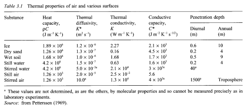
Here is a useful table of properties of various substances:

The rate of heat penetration (e.g. into the soil) is dependent on the thermal diffusivity. This is a combination of two factors – the thermal conductivity (how well heat is conducted through the substance) divided by the heat capacity (how much heat it takes to increase the temperature of the substance).

The lower the value of the thermal diffusivity the lower the temperature rise further into the substance. So heat doesn’t get very far into dry sand, or still water. But it does get 10x further into wet soil (correction thanks to Nullius in Verba- really it gets 3x further into wet soil because “Thickness penetrated is proportional to the square root of diffusivity times time” – and I didn’t just take his word for it..)

Why is still water so similar to dry sand? Water has 4x the ability to conduct heat, but also it takes almost 4x as much heat to lift the temperature of water by 1°C.

Note that stirred water is a much better conductor of heat – due to convection. The same applies to air, even more so – “stirred” air (= moving air) conducts heat a million times more effectively than still air.

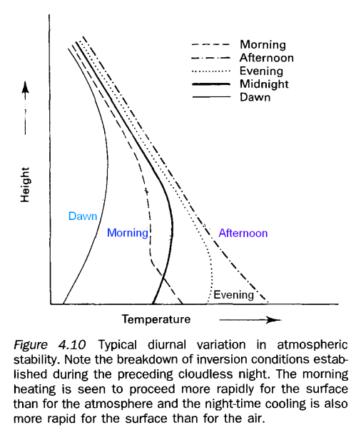
Temperature Profiles Throughout a 24-Hour Period


Temperature profiles throughout the day, Robinson (1999)

Temperature profiles throughout the day, Robinson (1999)


I’ll cover more about temperature profiles in a later article about why the troposphere has the temperature profile it does.

During the day the ground is being heated up by the sun and by the longwave radiation from the atmosphere. Once the sun sets, the ground cools faster and starts to take the lower levels of the atmosphere with it.

Conclusion

Just some basic measurements of the various components that affect the surface temperature to help establish their relative importance.

Note: All of the graphics were taken from Contemporary Climatology by Peter Robinson and Ann Henderson-Sellers (1999)

Read Full Post »

This post covers a dull subject. If you are new to Science of Doom, the subject matter here will quite possibly be the least interesting in the entire blog. At least, up until now. It’s possible that new questions will be asked in future which will compel me to write posts that climb to new heights of breath-taking dullness.

So commenters take note – you have a duty as well. And new readers, quickly jump to another post..

Recap

In an earlier post – Why Global Mean Surface Temperature Should be Relegated, Or Mostly Ignored – we looked at the many problems of trying to measure the surface of the earth by measuring the air temperature a few feet off the ground. And also the problems encountered in calculating the average temperature by an arithmetic mean. (An arithmetic mean for those not familiar with the subject is the “usual” and traditional averaging where you add up all the numbers and divide by how many values you had).

We looked at an example where the average temperature increased, but the amount of energy radiated went down. Energy radiated out would seem to be a more useful measure of “real temperature” so clearly arithmetic averages of temperature have issues. This is how GMST is calculated – well not exactly, as the values are area-weighted, but there is no factoring in of how surface temperature affects energy radiated.

But in the discussion someone brought up emissivity and what effect it has on the calculation of energy radiated. So in the interests of completeness we arrive here.

Emissivity of the Earth’s Surface

Our commenter asked:

So what are the non-black body corrections required for the initial calculation 396W/sqm? And what are the corrections for the equivalent temperature calculation? And do they cancel out (I think not due to the non-linearity issue) ?

What’s this about? (Of course, read the earlier post if you haven’t already).

Energy radiated from a body, E=εσT4

where T is absolute temperature (in K), σ=5.67×10⁻⁸ and ε is the emissivity.

ε is a value between 0 and 1, and 1 is the “blackbody”. The value – very important to note – is dependent on wavelength.

So the calculations I showed (in the thought experiment) where temperature went up but energy radiated went down need adjustment for this non-blackbody emissivity.

How Emissivity Changes

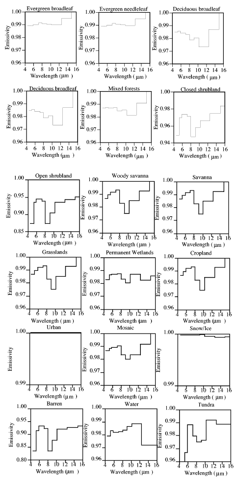
Here we consult the “page-turner”, Surface Emissivity Maps for use in Satellite Retrievals of Longwave Radiation by Wilber (1999).

Emissivity vs wavelength for various substances, Wilber (1999)

Emissivity vs wavelength for various substances, Wilber (1999)

And yet more graphs at the end of the post – spreading out the excitement..

Note the key point, in the wavelengths of interest emissivity is close to 1 – close to a blackbody.

For beginners to the subject, who somehow find this interesting and are therefore still reading, the wavelengths in question: 4-30μm are the wavelengths where most of the longwave radiation takes place from the earth’s surface. Check out CO2 – An Insignificant Trace Gas? for more on this.

I did wonder why the measurements weren’t carried on to 30μm and as far as I can determine it is less interesting for satellite measurements – because satellites can see the surface the best in the “atmospheric window” of 8-14μm.

So with the data we have we see that generally the value is close to unity – the earth’s surface is very close to a “blackbody”. Energy radiated in 4-16μm wavelengths only account for 50-60% of the typical energy radiated from the earth’s surface, so we don’t have the full answer. Still with my excitement already at fever pitch on this topic I think others should take on the task of tracking down emissivity of representative earth surface types at >16μm and report back.

So we have some ideas of emissivities, they are not 1, but generally very close. How does this affect the calculation of energy radiated?

Mostly Harmless

Not much effect.

I took the original example with 7 equal areas at particular temperatures for 1999 and show emissivities (these are arbitrarily chosen to see what happens):

  • Equatorial region: 30°C ;  ε = 0.99
  • Sub-tropics: 22°C, 22°C ;  ε = 0.99
  • Mid-latitude regions: 12°C, 12°C ;  ε = 0.80
  • Polar regions: 0°C, 0°C ;  ε = 0.80

The average temperature, or “global mean surface temperature” = 14°C.

And in 2009 (same temperatures as in the previous article):

  • Equatorial region: 26°C ;  ε = 0.99
  • Sub-tropics: 20°C, 20°C ;  ε = 0.99
  • Mid-latitude regions: 12°C, 12°C ;  ε = 0.80
  • Polar regions: 5°C, 5°C ;  ε = 0.80

The average temperature, or “global mean surface temperature” = 14.3°C.

The calculation of the energy radiated is done by simply taking each temperature and applying the equation above – E=εσT4

Because we are calculating the total energy we are simply adding up the energy value from each area. All the emissivity does is weight the energy from each location.

  • With the emissivity values as shown, the 1999 energy = 2426 W/ arbitrary area
  • With the emissivity values as shown, the 2009 energy = 2416 W/ same arbitrary area

So once again the energy radiated has gone down, even though the GMST has increased.

If we change around the emissivities, so that ε=0.8 for Equatorial & Sub-Tropics, while ε=0.99 for Mid-Latitude and Polar regions, the GMST values are the same.

  • With the new emissivity values, the 1999 energy = 2434 W/ arbitrary area
  • With the emissivity values as shown, the 2009 energy = 2442 W/ same arbitrary area

So the temperature has gone up and the energy radiated has also gone up.

Therefore, emissivity does change the situation a little. I chose more extreme values of emissivity than are typically found to see what the effect was.

The result is not complex or non-linear because emissivity simple “weights” the value of energy making it more or less important as the emissivity is higher or lower.

In the second example above, if the magnitude of temperature changes was slightly greater in the polar and equatorial regions this would be enough to still show a decrease in energy while “GMST” was increasing.

More Emissivity Graphs

Emissivity vs wavelength of various substances, Wilber (1999)

Emissivity vs wavelength of various substances, Wilber (1999)

Conclusion

Emissivity in the wavelengths of interest for the earth’s radiation is generally very close to 1. Assuming “blackbody” radiation is a reasonable assumption for most calculations of interest – as other unknowns are typically a higher source of error.

Because the earth’s surface has been mapped out and linked to the emissivities, if a particular calculation does need high level accuracy the emissivities can be used.

In the terms of how emissivity changes the “surprising” result that temperature can increase while energy radiated decreases – the answer is “not much”.

Read Full Post »

Gary Thompson at American Thinker recently produced an article The AGW Smoking Gun. In the article he takes three papers and claims to demonstrate that they are at odds with AGW.

A key component of the scientific argument for anthropogenic global warming (AGW) has been disproven. The results are hiding in plain sight in peer-reviewed journals.

The article got discussed on Skeptical Science, with the article Have American Thinker Disproven Global Warming? although the blog article really just covered the second paper. The discussion was especially worth reading because Gary Thompson joined in and showed himself to be a thoughtful and courteous fellow.

He did claim in that discussion that:

First off, I never stated in the article that I was disproving the greenhouse effect. My aim was to disprove the AGW hypothesis as I stated in the article “increased emission of CO2 into the atmosphere (by humans) is causing the Earth to warm at such a rate that it threatens our survival.” I think I made it clear in the article that the greenhouse effect is not only real but vital for our planet (since we’d be much cooler than we are now if it didn’t exist).

However, the papers he cites are really demonstrating the reality of the “greenhouse” effect. If his conclusions – different from the authors of the papers – are correct, then he has demonstrated a problem with the “greenhouse” effect, which is a component – a foundation – of AGW.

This article will cover the first paper which appears to be part of a conference proceeding: Changes in the earth’s resolved outgoing longwave radiation field as seen from the IRIS and IMG instruments by H.E. Brindley et al. If you are new to understanding the basics on longwave and shortwave radiation and absorption by trace gases, take a look at CO2 – An Insignificant Trace Gas?

Take one look at a smoking gun and you know it’s been fired. One look at a paper on a complex subject like atmospheric physics and you might easily jump to the wrong conclusion. Let’s hope I haven’t fallen into the same trap..

Even their mother couldn't tell them apart

Even their mother couldn't tell them apart

The Concept Behind the Paper

The paper examines the difference between satellite measurements of longwave radiation from 1970 and 1997. The measurements are only for clear sky conditions, to remove the complexity associated with the radiative effects of clouds (they did this by removing the measurements that appeared to be under cloudy conditions). And the measurements are in the Pacific, with the data presented divided between east and west. Data is from April-June in both cases.

The Measurement

The spectral data is from 7.1 – 14.1 μm (1400 cm-1 – 710 cm-1 using the convention of spectral people, see note 1 at end). Unfortunately, the measurements closer to the 15μm band had too much noise so were not reliable.

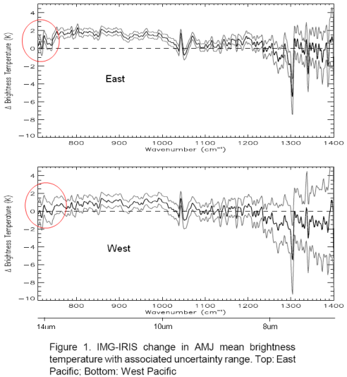
Their first graph shows the difference of 1997 – 1970 spectral results converted from W/m2 into Brightness Temperature (the equivalent blackbody radiation temperature). I highlighted the immediate area of concern, the “smoking gun”:

Spectral difference - 1997 less 1970 over East and West Pacific, Brindley

Spectral difference - 1997 less 1970 over East and West Pacific, Brindley

Note first that the 3 lines on each graph correspond to the measurement (middle) and the error bars either side.

I added wavelength in μm under the cm-1 axis for reference.

What Gary Thompson draws attention to is the fact that OLR (outgoing longwave radiation) has increased even in the 13.5+μm range, which is where CO2 absorbs radiation – and CO2 has increased during the period in question (about 330ppm to 380ppm). Surely, with an increase in CO2 there should be more absorption and therefore the measurement should be negative for the observed 13.5μm-14.1μm wavelengths.

One immediate thought without any serious analysis or model results is that we aren’t quite into the main absorption of the CO2 band, which is 14 – 16μm. But let’s read on and understand what the data and the theory are telling us.

Analysis

The key question we need to ask before we can draw any conclusions is what is the difference between the surface and atmosphere in these two situations?

We aren’t comparing the global average over a decade with an earlier decade. We are comparing 3 months in one region with 3 months 27 years earlier in the same region.

Herein seems to lie the key to understanding the data..

For the authors of the paper to assess the spectral results against theory they needed to know the atmospheric profile of temperature and humidity, as well as changes in the well-studied trace gases like CO2 and methane. Why? Well, the only way to work out the “expected” results – or what the theory predicts – is to solve the radiative transfer equations (RTE) for that vertical profile through the atmosphere. Solving those equations, as you can see in CO2 – Part Three, Four and Five – requires knowledge of the temperature profile as well as the concentration of the various gases that absorb longwave radiation. This includes water vapor and, therefore, we need to know humidity.

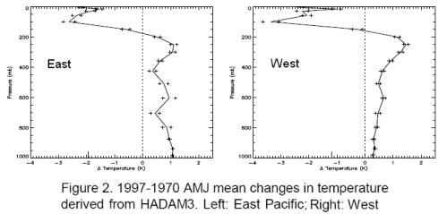
Atmospheric Temperature Profile, Brindley

Change in Atmospheric Temperature Profile, Brindley

I’ve broken up their graphs, this is temperature change – the humidity graphs are below.

Now it is important to understand where the temperature profiles came from. They came from model results, by using the recorded sea surface temperatures during the two periods. The temperature profiles through the atmosphere are not usually available with any kind of geographic and vertical granularity, especially in 1970. This is even more the case for humidity.

Note that the temperature – the real sea surface temperature – in 1997 for these 3 months is higher than 1970.

Higher temperature = higher radiation across the spectrum of emission.

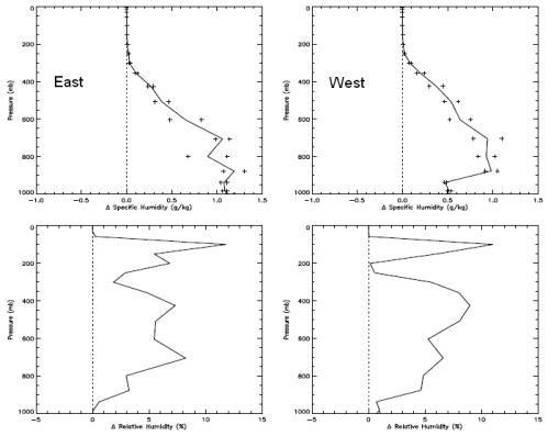
Now the humidity:

Change in Humidity Profile through the atmosphere, Brindley

Change in Humidity Profile through the atmosphere, Brindley

The top graph is change in specific humidity – how many grams of water vapor per kg of air. The bottom is change in relative humidity. Not relevant to the subject of the post, but you can see how even though the difference in relative humidity is large high up in the atmosphere it doesn’t affect the absolute amount of water vapor in any meaningful way – because it is so cold high up in the atmosphere. Cold air cannot hold as much water vapor as warm air.

It’s no surprise to see higher humidity when the sea temperature is warmer. Warmer air has a higher ability to absorb water vapor, and there is no shortage of water to evaporate from the surface of the ocean.

Model Results of Expected Longwave Radiation

Now here are some important graphs which initially can be a little confusing. It’s worth taking a few minutes to see what these graphs tell us. Stay with me..

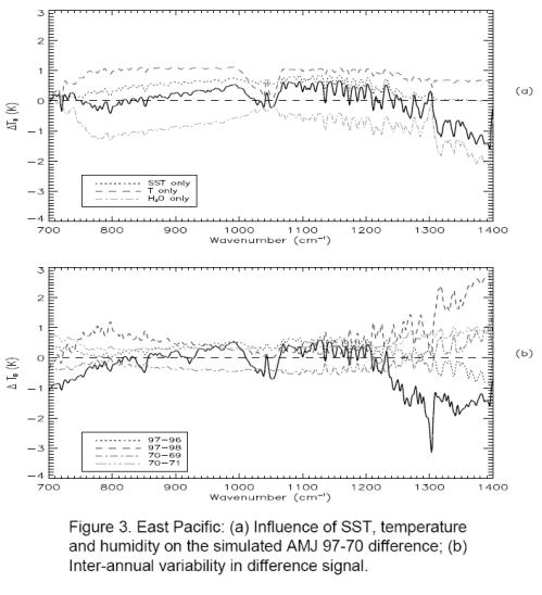
Top - model results not including trace gases; Bottom - model results including all effects

Top - model results not including trace gases; Bottom - model results including all effects

The top graph. The bold line is the model results of expected longwave radiation – not including the effect of CO2, methane, etc – but taking into account sea surface temperature and modeled atmospheric temperature and humidity profiles.

This calculation includes solving the radiative transfer equations through the atmosphere (see CO2 – An Insignificant Trace Gas? Part Five for more explanation on this, and you will see why the vertical temperature profile through the atmosphere is needed).

The breakdown is especially interesting – the three fainter lines. Notice how the two fainter lines at the top are the separate effects of the warmer surface and the higher atmospheric temperature creating more longwave radiation. Now the 3rd fainter line below the bold line is the effect of water vapor. As a greenhouse gas, water vapor absorbs longwave radiation through a wide spectral range – and therefore pulls the longwave radiation down.

So the bold line in the top graph is the composite of these three effects. Notice that without any CO2 effect in the model, the graph towards the left edge trends up: 700 cm-1 to 750 cm-1 (or 13.5μm to 14.1μm). This is because water vapor is absorbing a lot of radiation to the right (wavelengths below 13.5μm) – dragging that part of the graph proportionately down.

The bottom graph. The bold line in the bottom graph shows the modeled spectral results including the effects of the long-term changes in the trace gases CO2, O3, N2O, CH4, CFC11 and CFC12. (The bottom graph also confuses us by including some inter-annual temperature changes – the fainter lines – let’s ignore those).

Compare the top and bottom bold graphs to see the effect of the trace gases. In the middle of the graph you see O3 at 1040 cm-1 (9.6μm). Over on the right around 1300cm-1 you see methane absorption. And on the left around 700cm-1 you see the start of CO2 absorption, which would continue on to its maximum effect at 667cm-1 or 15μm.

Of course we want to compare this bottom graph – the full model results – more easily with the observed results. And the vertical axes are slightly different.

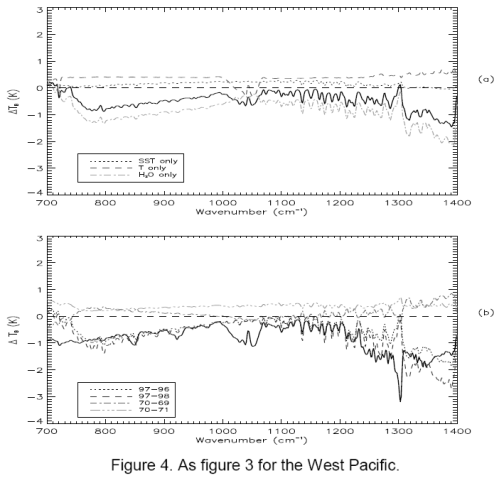
First for completeness, the same graphs for the West Pacific:

Model results for West Pacific

Model results for West Pacific

Let’s try the comparison of observation to the full model, it’s slightly ugly because I don’t have source data, just a graphics package to try and line them up on comparable vertical axes.

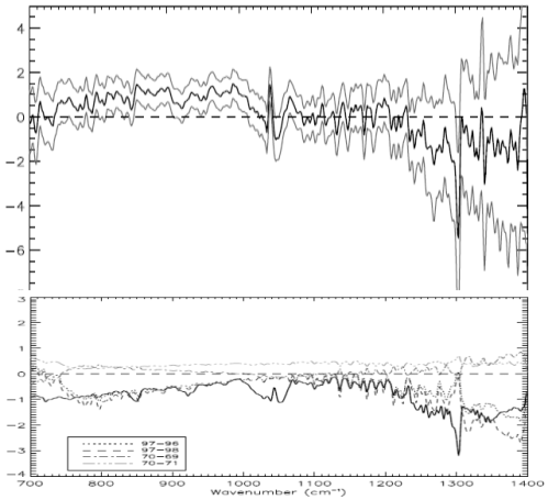
Here is the East Pacific. Top is observed with (1 standard deviation) error bars. Bottom is model results based on: observed SST; modeled atmospheric profile for temperature and humidity; plus effect of trace gases:

Comparison on similar vertical axes - top, observed; bottom, model

Comparison on similar vertical axes - top, observed; bottom, model

Now the West Pacific:

Comparison, West Pacific, Observed (top) vs Model (bottom)

Comparison, West Pacific, Observed (top) vs Model (bottom)

We notice a few things.

First, the model and the results aren’t perfect replicas.

Second, the model and the results both show a very similar change in the profile around methane (right “dip”), ozone (middle “dip”) and CO2 (left “dip”).

Third, the models show a negative value in change of brightness temperature (-1K) at the 700 cm-1 wavelength, whereas the actual results for the East Pacific is around 1K and for West Pacific is around -0.5K. The 1 standard deviation error bars for measurement include the model results – easily for West Pacific and just for East Pacific.

It appears to be this last observation that has prompted the article in American Thinker.

Conclusion

Hopefully, those who have taken the time to review:

  • the results
  • the actual change in surface and atmospheric conditions between 1970 and 1997
  • the models without trace gas effects
  • the models with trace gas effects

might reach a different conclusion to Gary Thompson.

The radiative transfer equations as part of the modeled results have done a pretty good job of explaining the observed results but aren’t exactly the same. However, if we don’t include the effect of trace gases in the model we can’t explain some of the observed features – just compare the earlier graphs of model results with and without trace gases.

It’s possible that the biggest error is the water vapor effect not being modeled well. If you compare observed vs model (the last 2 sets of graphs) from 800cm-1 to 1000cm-1 there seems to be a “trend line” error. The effect of water vapor has the potential to cause the most variation for two reasons:

  • water vapor is a strong greenhouse gas
  • water vapor concentration varies significantly vertically through the atmosphere and geographically (due to local vaporization, condensation, convection and lateral winds)

It’s also the case that the results for the radiative transfer equations will have a certain amount of error using “band models” compared with the “line by line” (LBL) codes for all trace gases. (A subject for another post but see note 2 below). It is rare that climate models – even just 1d profiles – are run with LBL codes because it takes a huge amount of computer time due to the very detailed absorption lines for every single gas.

The band models get good results but not perfect – however, they are much quicker to run.

Comparing two spectra from two different real world situations where one has higher sea surface temperatures and declaring the death of the model seems premature. Perhaps Gary ran the RTE calculations through a pen and paper/pocket calculator model like so many others have done.

There is a reason why powerful computers are needed to solve the radiative transfer equations. And even then they won’t be perfect. But for those who want to see a better experiment that compared real and modeled conditions, take a look at Part Six – Visualization where actual measurements of humidity and temperature through the atmosphere were taken, the detailed spectra of downwards longwave radiation was measured and the model and measured values were compared.

The results might surprise even Gary Thompson.

Notes:

1. Wavelength has long been converted to wavenumber, or cm-1. This convention is very simple. 10,000/wavenumber in cm-1 = wavelength in μm.

e.g. CO2 central absorption wavelength of 15μm => 667cm-1 (=10,000/15)

2. Solving the radiative transfer equations through the atmosphere requires knowledge of the absorption spectra of each gas. These are extremely detailed and consequently the numerical solution to the equations require days or weeks of computational time. The detailed versions are known as LBL – line by line transfer codes. The approximations, often accurate to within 10% are called “band models”. These require much less computational time and so the band models are almost always used.

Read Full Post »

The title should really be:

The Real Measure of Global Warming – Part Two – How Big Should Error Bars be, and the Sad Case of the Expendable Bathythermographs

But that was slightly too long.

This post picks up from The Real Measure of Global Warming which in turn followed Why Global Mean Surface Temperature Should be Relegated, Or Mostly Ignored

The discussion was about ocean heat content being a better measure of global warming than air temperature. However, ocean heat down into the deep has been less measured than air temperature, so is subject to more uncertainty the further back in time we travel.

We had finished up with a measure of changes in OHC (ocean heat content) over 50 years from Levitus (2005):

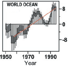
Ocean heat change, Levitus (2005)

Ocean heat change, Levitus (2005)

Some of the earlier graphs were a little small but you could probably see that the error bars further back in time are substantial. Unfortunately, it’s often the case that the error bars themselves are placed with too much confidence, and so it transpired here.

In 2006, GRL (Geophysical Research Letters) published the paper How much is the ocean really warming? by Gouretski and Koltermann.

They pointed out a significant error source in XBTs (expendable bathythermographs ). The XBT’s estimate temperature against depth by estimating depth from fall rate, a value which was found to be inaccurate.

The largest discrepancies are found between the expendable bathythermographs (XBT) and bottle and CTD data, with XBT temperatures being positively biased by 0.2–0.4C on average. Since the XBT data are the largest proportion of the dataset, this bias results in a significant World Ocean warming artefact when time periods before and after introduction of XBT are compared.

And conclude:

Comparison with LAB2005 [Levitus 2005] results shows that the estimates of global warming are rather sensitive to the data base and analysis method chosen, especially for the deep ocean layers with inadequate sampling. Clearly instrumental biases are an important issue and further studies to refine estimates of these biases and their impact on ocean heat content are required. Finally, our best estimate of the increase of the global ocean heat content between 1957–66 and 1987–96 is 12.8 ± 8.0 x 10²² J with the XBT offsets corrected. However, using only the CTD and bottle data reduces this estimate to 4.3 ± 8.0 x 10²² J.

If we refer back to Levitus, they had calculated a value over the same time period of 15×1022 J.

Gouretski and Koltermann are saying, in layman’s terms, if I might paraphrase:

Might be around what Levitus said, might be a lot less, might even be zero.. we don’t know.

Some readers might be asking, does this heretical stuff really get published?

Well, moving back to ocean heat content, we don’t want to drown in statistical analysis because anything more than a standard deviation and I am out of my depth, so to speak.. Better just to see what the various experts have concluded as our measure of uncertainty.

Ocean Heat Content is one of the hot topics, so no surprise to see others weighing in..

Domingues et al

In 2008, Nature then published Improved estimates of upper-ocean warming and multi-decadal sea-level rise by Domingues et al.

Remembering that the major problem of ocean heat content is first a lack of data, and now revealed, problematic data in the major data source.. Domingues says in the abstract:

..using statistical techniques that allow for sparse data coverage..

My brief excursion into statistics was quickly abandoned when the first paper cited (Reduced space optimal interpolation of historical marine sea level pressure: 1854-1992, Kaplan 2000) states:

..A novel procedure of covariance adjustment brought the results of the analysis to the consistency with the a priori assumptions on the signal covariance structure..

Let’s avoid the need for strong headache medication and just see their main points, interesting asides and conclusions. Which are interesting.

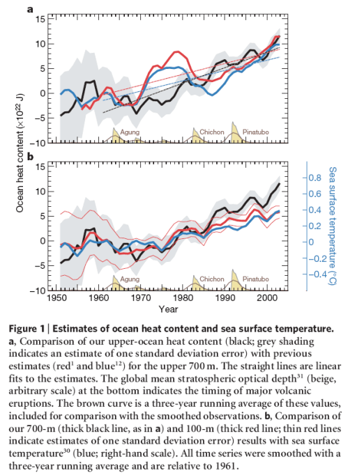
OHC 1951-2004, Domingues (2008)

OHC 1951-2004, Domingues (2008)

The black line is their story. Note their “error bars” in the top graph, the grey shading around the black line is one standard deviation. This helps us see “a measure” of uncertainty as we go back in time. The red line is the paper we have just considered, Levitus 2005.

Domingues calculates the 1961-2003 increase in OHC as 16 x1022 J, with their error bars as ±3 x1022 J. They calculate a number very close to Levitus (2005).

Interesting aside:

Climate models, however, do not reproduce the large decadal variability in globally averaged ocean heat content inferred from the sparse observational database.

From one of the papers they cite (Simulated and observed variability in ocean temperature and heat content, AchutaRao 2007) :

Several studies have reported that models may significantly underestimate the observed OHC variability, raising concerns about the reliability of detection and attribution findings.

And on to Levitus et al 2009

From GRL, Global ocean heat content 1955–2008 in light of recently revealed instrumentation problems

Or, having almost the last word with his updated paper:

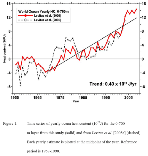
Ocean heat change 1955- 2009 - Levitus (2009)

Ocean heat change 1955- 2009 - Levitus (2009)

The red line being the updated version, the black dotted line the old version.

Willis Back, 2006 and Forwards, 2009

In the meantime, Josh Willis, using the brand new Argo floats, (see part one for the Argo floats) published a paper (GRL 2006) showing such a sharp reduction in ocean heat from 2003 – 2005 that there was no explanation for.

And then a revised paper in 2009 in Journal of Atmospheric and Oceanic Technology showing that the previous correction was a mistake, instrument problems again.. now it’s all flat for a few years:

no significant warming or cooling is observed in upper-ocean heat content between 2003 and 2006

Probably more papers we could investigate, including one which I planned to cover before realizing I can’t find it and this post has gone on way too long already.

Conclusion

We are looking at a very important measurement, ocean heat content. We aren’t as sure as we would like to be about the history of OHC and not much can be done about that, although novel statistical methods of covariance adjustment may have their place.

Some could say, based on one of the papers presented here, “No ocean warming for 50 years”. It’s a possibility, but probably a distant one. One day when we get to the sea level “budget”, more usefully called “sea level rise”, we will probably think that the rise of sea level is usefully explained by the ocean heat content going up.

We do have excellent measurements in place now, and since around 2000, although even that exciting project has been confused by instrument uncertainty, or uncertainty about instrument uncertainty.

We have seen a great example that error bars aren’t really error bars. They are “statistics”, not real life.

And perhaps, most useful of all, we might have seen that papers which show “a lot less warming” and “unexplained cooling”, still make it into print with peer-reviewed science journals like GRL. This last factor may give us more confidence than anything that we are seeing real science in progress. And save us from having to analyze 310,000 temperature profiles with and without covariance adjustments. Instead, we can wait for the next few papers to see what the final consensus is.

Or spend a lifetime in study of statistics.

Read Full Post »

In an earlier post – Why Global Mean Surface Temperature Should be Relegated, Or Mostly Ignored – I commented:

There’s a huge amount of attention paid to the air temperature 6ft off the ground all around the continents of the world. And there’s an army of bloggers busy re-analyzing the data.

It seems like one big accident of history. We had them, so we used them, then analyzed them, homogenized them, area-weighted them, re-analyzed them, wrote papers about them and in so doing gave them much more significance than they deserve. Consequently, many people are legitimately confused about whether the earth is warming up.

Then we looked at some of the problems of measuring the surface temperature of the earth via the temperature of a light ephemeral substance approximately 6ft off the ground.

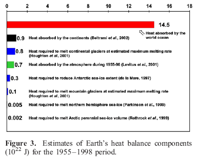
In Warming of the World Ocean 1955-2003, Levitus (2005) shows an interesting comparison of estimates of absorbed heat over almost half a century:

Heat absorbed in different elements of the climate, Levitus (2005)

Heat absorbed in different elements of the climate, Levitus (2005)

Once you find out that the oceans have around 1000x the heat capacity of the atmosphere, the above chart won’t be surprising.

For those who haven’t considered this relative difference in heat capacity before:

  • if the oceans cooled down by a tiny 0.1°, transferring their heat to the atmosphere, the atmosphere would heat up by 100°C (it wouldn’t happen like this but it gives an idea of the relative energy in both)
  • if the atmosphere transferred so much heat to the oceans that the air temperature went from an average of 15°C to a freezing -15°C, the oceans would heat up by a tiny, almost unnoticeable 0.03°C

So if we want to understand the energy in the climate system, if we want to understand whether the earth is warming up, we need to measure the energy in the oceans.

An Accident of History

Measuring the temperature of the earth’s surface by measuring the highly mobile atmosphere 6ft off the ground is a problem. By contrast, measuring ocean heat is simple..

Except we didn’t start until much later. Sea surface temperatures date back to the 19th century, but that doesn’t tell us much. We want to know the temperature down into the deep all around the world.

Ocean temperature vs depth in one location, Bigg (2003)

Ocean temperature vs depth in one location, "Oceans and Climate", Bigg (2003)

Here is a typical sample. Unlike the atmosphere, the oceans are more “stratified” – see Why Global Mean Surface Temperature Should be Relegated, Or Mostly Ignored for more on the basic physics of why the ocean is warmer at the surface. However, the oceans have complex global currents so we need to take a lot of measurements.

Measurements of the temperature down into the ocean depths didn’t really start until the 1940s and progressed very slowly since then. Levitus says:

Most of the data from the deep ocean are from research expeditions. The amount of data at intermediate and deep depths decreases as we go back further in time.

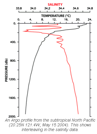
Fast forward to 2000 and the Argo project began to be deployed. By early 2010, over 3300 sensors have been moved into place around the world’s oceans. The Argo sensors drop to 2km in depth every 10 days and automatically measure temperature and salinity from the surface to this 2km depth:

Argo profile, Temperature and Salinity vs Depth

Argo profile, Temperature and Salinity vs Depth

Why salinity? Salinity is the other major factor apart from temperature which affects ocean density and therefore controls the ocean currents. See Predictability? With a Pinch of Salt please.. for more..

As we go back from 2010 there is progressively less data available. Even during the last 10 years measurement issues have created waves. But more on that later..

The Leviathan

It’s often best to step back a little to understand a subject better.

In 2000, Science published the paper Warming of the World Ocean by Sydney Levitus and a few co-workers. The paper has a thorough analysis of the previous 50 years of ocean history.

Ocean heat change, upper 3000m, 1955-1996, from Levitus (2000)

Ocean heat change, upper 3000m, 1955-1996, from Levitus (2000)

Now and again the large number of joules (unit of energy) are turned into a comparison W/m2 absorbed for the time period in question. 1W/m2 for a year (averaged over the entire surface of the earth) translates into 1.6×10²²J.

But it’s better to get used to the idea that change in energy in the oceans is usually expressed as 1022J.

The graphs above show a lot of variability between oceans but still they all demonstrate the similar warming pattern.

Comparison of OHC in top 3000m, top 800m, top 300m, Levitus (2000)

Comparison of OHC in top 3000m, top 800m, top 300m, Levitus (2000)

Here is the data shown (from left to right) as the energy change in the deeper 3000m, 800m and 300m.

We are used to seeing temperature graphs, even sea surface temperature graphs that go up and down from year to year. Of course we want to understand exactly why, for example see Is climate more than weather? Is weather just noise? It’s easy to think of reasons why that might happen, even in a warming world (or a cooling world) – with one of the main reasons being that heat has moved around in the oceans.

For example, due to ocean currents colder water has been brought to the surface. The measured sea surface temperature would be significantly lower but the total heat hasn’t necessarily changed – because we are only measuring the temperature at one vertical location (the top).

So we wouldn’t expect to see a big yearly decline in total energy.. not if the planet was “warming up”.

So this is quite surprising! See the change downward in the 1980’s:

Ocean heat change - global summary, Levitus (2000). Numbers in 10^22 J

Ocean heat change - global summary, Levitus (2000). Numbers in 10^22 J

What caused this drop?

Here’s a another fascinating look into the depths that we don’t usually get to see:

Temperature comparison 1750m down. 1970-74 cf 55-59 & 1988-92 cf 70-74

Temperature comparison 1750m down. 1970-74 cf 55-59 & 1988-92 cf 70-74

Here we see changes in the deeper North Atlantic in two comparison periods about 15 years apart. (As a minor note the reason for the comparisons of averaged 5-year periods is the sparsity of data below the surface of the oceans).

See how the 1990 period has cooled from 15 years earlier.

Levitus, Antonov and Boyer updated their paper in 2005 (reference below).

They comment:

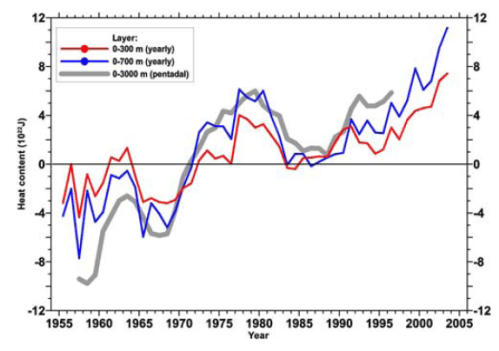
Here we present new yearly estimates for the 1955– 2003 period for the upper 300 m and 700 m layers and pentadal (5-year) estimates for the 1955–1959 through 1994–1998 period for the upper 3000 m of the world ocean.

The heat content estimates we present are based on an additional 1.7 million temperature profiles that have become available as part of the World Ocean Database 2001.

Also, we have processed approximately 310,000 additional temperature profiles since the release of WOD01 and include these in our analyses.

(My emphasis added). Think re-doing GISS and CRU is challenging? And for those who like to know where the data lives, check out the World Ocean Database and World Ocean Atlas Series

Ocean heat change, Levitus (2005)

Ocean heat change, Levitus (2005)

Here’s a handy comparison of the changing heat when we look at progressively deeper sections of the ocean with the more up-to-date data.

The actual numbers (change in energy) from 1955-1998 were calculated to be:

  • 0-300m:   7×10²²J
  • 0-700m:   11×1022J
  • 0-3000m:   15×1022J
  • 1000-3000m:   1.3×10²²J

So the oceans below 1000m only accounted for 9% of the change. This gives an idea of the relative importance of measuring the temperatures as we go deeper.

In their 2005 paper they comment on the question of the early 80’s cooling:

One dominant feature .. is the large decrease in ocean heat content beginning around 1980. The 0–700 m layer exhibits a decrease of approximately 6 x 10²² J between 1980 and 1983. This corresponds to a cooling rate of 1.2 Wm2 (per unit area of Earth’s total surface).

Most of this decrease occurs in the Pacific Ocean.. Most of the net decrease occurred at 5°S, 20°N, and 40°N. Gregory et al. [2004] have cast doubt on the reality of this decrease but we disagree. Inspection of pentadal data distributions at 400 m depth (not shown here) indicates excellent data coverage for these two pentads.

And they also comment:

However, the large decrease in ocean heat content starting around 1980 suggests that internal variability of the Earth system significantly affects Earth’s heat balance on decadal time-scales.


So far so interesting, but as the article is already long enough we will come back to the subject in a later post with the follow up:

How Big Should Error Bars be and the Sad Case of the Expendable Bathythermographs.

And for one reader, in anticipation:

XBT

XBT

Update – follow up post – The Real Measure of Global Warming – Part Two – How Big Should Error Bars be, and the Sad Case of the Expendable Bathythermographs

References

Warming of the World Ocean, Levitus et al, Science (2000)

Warming of the World Ocean 1955-2003, Levitus et al, GRL (2005)

Read Full Post »

There’s a huge amount of attention paid to the air temperature 6ft off the ground all around the continents of the world. And there’s an army of bloggers busy re-analyzing the data.

It seems like one big accident of history. We had them, so we used them, then analyzed them, homogenized them, area-weighted them, re-analyzed them, wrote papers about them and in so doing gave them much more significance than they deserve. Consequently, many people are legitimately confused about whether the earth is warming up.

I didn’t say land surface temperatures should be abolished. Everyone’s fascinated by their local temperature. They should just be relegated to a place of less importance in climate science.

Problems with Air Surface Temperature over Land

If you’ve spent any time following debates about climate, then this one won’t be new. Questions over urban heat island, questions over “value-added” data, questions about which stations and why in each index. And in journal-land, some papers show no real UHI, others show real UHI..

One of the reasons I posted the UHI in Japan article was I hadn’t seen that paper discussed, and it’s interesting in so many ways.

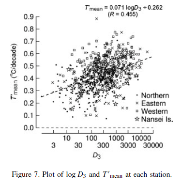
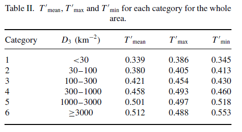
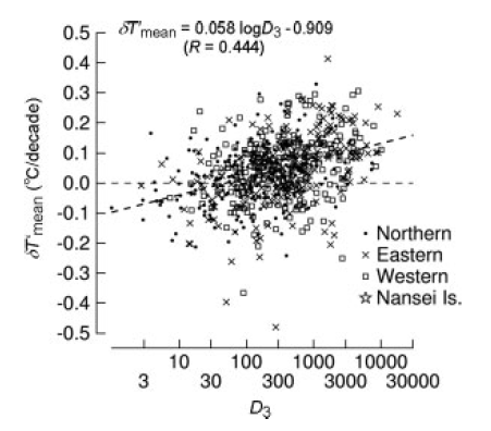
The large number of stations (561) with high quality data revealed a very interesting point. Even though there was a clear correlation between population density and “urban heat island” effect, the correlation was quite low – only 0.44.

Lots of scatter around the trend:

Estimate of actual UHI by referencing the closest rural stations

Estimate of actual UHI by referencing the closest rural stations - again categorized by population density

This doesn’t mean the “trend” wasn’t significant, as the result had a 99% confidence around it. What it meant was there was a lot of variability in the results.

The reason for the high variability was explained as micro-climate effects. The very local landscape, including trees, bushes, roads, new buildings, new vegetation, changing local wind patterns..

Interestingly, the main effect of UHI is on night-time temperatures:
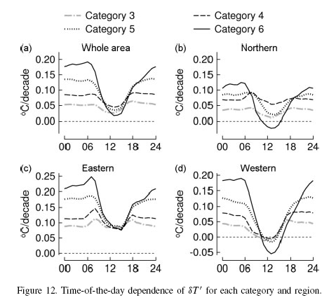
Temperature change per decade: time of day vs population density

Temperature change per decade: time of day vs population density

Take a look at the top left graphic (the others are just the regional breakdown in Japan). Category 6 is the highest population density and category 3 the lowest.

What is it showing?

If we look at the midday to mid-afternoon temperatures then the average temperature change per decade is lowest and almost identical in the big cities and the countryside.

If we look at the late at night to early morning temperatures then average change per decade is very dependent on the population density. Rural areas have experienced very little change. And big cities have experienced much larger changes.

Night time temperatures have gone up a lot in cities.

A quick “digression” into some basic physics..

Why is the Bottom of the Atmosphere Warmer than the Top while the Oceans are Colder at the Bottom?

The ocean surface temperature somewhere on the planet is around 25°C, while the bottom of the ocean is perhaps 2°C.
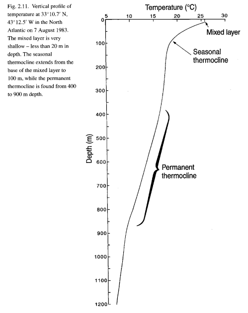
Ocean temperature vs depth, Grant Bigg, Oceans and Climate (2003)

Ocean temperature vs depth, Grant Bigg, Oceans and Climate (2003)

The atmosphere at the land interface somewhere on the planet is around 25°C, while the top of the troposphere is around -60°C. (Ok, the stratosphere above the troposphere increases in temperature but there’s almost no atmosphere there and so little heat).
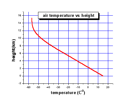
Typical temperature profile in the troposphere

Typical temperature profile in the troposphere

The reason why it’s all upside down is to do with solar radiation.

Solar radiation, mostly between wavelengths of 100nm to 4μm, goes through most of the atmosphere as if it isn’t there (apart from O2-O3 absorption of ultraviolet). But the land and sea do absorb solar radiation and, therefore, heat up and radiate longwave energy back out.

See the CO2 series for a little more on this if you wonder why it’s longwave getting radiated out and not shortwave.

The top of the ocean absorbs the sun’s energy, heats up, expands, and floats.. but it was already at the top so nothing changes and that’s why the ocean is mostly “stratified” (although see Predictability? With a Pinch of Salt please.. for a little about the complexity of ocean currents in the global view)

The very bottom of the atmosphere gets warmed up by the ground and expands. So now it’s less dense. So it floats up. Convective turbulence.

This means the troposphere is well-mixed during the day. Everything is all stirred up nicely and so there are more predictable temperatures – less affected by micro-climate. But at night, what happens?

At night, the sun doesn’t shine, the ground cools down very rapidly, the lowest level in the atmosphere absorbs no heat from the ground and it cools down fastest. So it doesn’t expand, and doesn’t rise. Therefore, at night the atmosphere is more stratified. The convective turbulence stops.

But if it’s windy because of larger scale effects in the atmosphere there is more “stirring up”. Consequently, the night-time temperature measured 6ft off the ground is very dependent on the larger scale effects in the atmosphere – quite apart from any tarmac, roads, buildings, air-conditioners – or urban heat island effects (apart from tall buildings preventing local windy conditions)

There’s a very interesting paper by Roger Pielke Sr (reference below) which covers this and other temperature measurement subjects in an accessible summary. (The paper used to be available free from his website but I can’t find it there now).

One of the fascinating observations is the high dependency of measured night temperatures on height above the ground, and on wind speed.

Micro-climate and Macro-climate

Perhaps the micro-climate explains much of the problems of temperature measurement.

But let’s turn to a thought experiment. No research in the thought experiment.. let’s take the decent-sized land mass of Australia. Let’s say large scale wind effects are mostly from the north to south – so the southern part of Australia is warmed up by the hot deserts.

Now we have a change in weather patterns. More wind blows from the south to the north. So now the southern part of Australia is cooled down by Antarctica.

This change will have a significant “weather” impact. And in terms of land-based air surface temperature we will have a significant change which will impact on average surface temperatures (GMST). And yet the energy in the climate system hasn’t changed.

Of course, we expect that these things average themselves out. But do they? Maybe our assumption is incorrect. At best, someone had better start doing a major re-analysis of changing wind patterns vs local temperature measurements. (Someone probably did it already, as it’s a thought experiment, there’s the luxury of making stuff up).

How much Energy is Stored in the Atmosphere?

The atmosphere stores 1000x less energy than the oceans. The total heat capacity of the global atmosphere corresponds to that of only a 3.2 m layer of the ocean.

So if we want a good indicator – a global mean indicator – of climate change we should be measuring the energy stored in the oceans. This avoids all the problems of measuring the temperature in a highly, and inconsistently, mobile lightweight gaseous substance.

Right now the ocean heat content (OHC) is imperfectly measured. But it’s clearly a much more useful measure of how much the globe is warming up than the air temperature a few feet off the ground.

If the primary measure was OHC with the appropriately-sized error bars, then at least the focus would go into making that measurement more reliable. And no urban heat island effects to worry about.

How to Average

There’s another problem with the current “index” – averaging of temperatures, a mix of air over land and sea surface temperatures. There is a confusing recent paper by Essex (2007), see the reference below, just the journal title says it’s not for the faint-hearted, which says we can’t average global temperatures at all –  however, this is a different point of view.

There is an issue of averaging land and sea surface temperatures (two different substances). But even if we put that to one side there is still a big question about how to average (which I think is part of the point of the confusing Essex paper..)

Here’s a thought experiment.

Suppose the globe is divided into 7 equal sized sections, equatorial region, 2 sub-tropics, 2 mid-latitude regions, 2 polar regions. (Someone with a calculator and a sense of spherical geometry would know where the dividing lines are.. and we might need to change the descriptions appropriately).

Now suppose that in 1999 the average annual temperatures are as follows:

  • Equatorial region: 30°C
  • Sub-tropics: 22°C, 22°C
  • Mid-latitude regions: 12°C, 12°C
  • Polar regions: 0°C, 0°C

So the “global mean surface temperature” = 14°C

Now in 2009 the new numbers are:

  • Equatorial region: 26°C
  • Sub-tropics: 20°C, 20°C
  • Mid-latitude regions: 12°C, 12°C
  • Polar regions: 5°C, 5°C

So the “global mean surface temperature” = 14.3°C – an increase of 0.3°C. The earth has heated up 0.3°C in 10 years!

After all, that’s how you average, right? Well, that’s how we are averaging now.

But if we look at it from more a thermodynamics point of view we could ask – how much energy is the earth radiating out? And how has the radiation changed?

After all, if we aren’t going to look at total heat, then maybe the next best thing is to use how much energy the earth is radiating to get a better feel for the energy balance and how it has changed.

Energy is radiated proportional to σT4, where T is absolute temperature (K).  0°C = 273K. And σ is a well-known constant.

Let’s reconsider the values above and average the amount of energy radiated and find out if it has gone up or down. After all, if temperature has gone up by 0.3°C the energy radiated must have gone up as well.

What we will do now is compare the old and new values of effective energy radiated. (And rather than work out exactly what it means in W/m2, we just calculate the σT4 value for each region and sum).

  • 1999 value = 2714.78 (W/arbitrary area)
  • 2009 value = 2714.41 (W/arbitrary area – but the same units)

Interesting? The “average” temperature went up. The energy radiated went down.

The more mathematically inclined will probably see why straight away. Once you have relationships that aren’t linear the results doesn’t usually change in proportion to the inputs.

Well, energy radiated out is more important in climate than some “arithmetic average of temperature”.

When Trenberth and Kiehl updated their excellent 1997 paper in 2008 the average energy radiated up from the earth’s surface was changed from 390W/m2 to 396W/m2. The reason? You can’t average the temperature and then work out the energy radiated from that one average (how they did it in 1997). Instead you have to work out the energy radiated all around the world and then average those numbers (how they did it in 2008).

Conclusion

Measuring the temperature of air to work out the temperature of the ground is problematic and expensive to get right. And requires lot of knowledge about changing wind patterns at night.

And even if we measure it accurately, how useful is it?

Oceans store heat, the atmosphere is an irrelevance as far as heat storage is concerned. If the oceans cool, the atmosphere will follow. If the oceans heat up, the atmosphere will follow.

And why take a lot of measurements and take an arithmetic average? If we want to get something useful from the surface temperatures all around the globe we should convert temperatures into energy radiated.

And I hope to cover ocean heat content in a follow up post..

Update – check out The Real Measure of Global Warming

References

Detection of urban warming in recent temperature trends in Japan, Fumiaki Fujibe, International Journal of Climatology (2009)

Unresolved issues with the assessment of multidecadal global land surface temperature trends, Roger A. Pielke Sr. et al, Journal of Geophysical Research (2007)

Does a Global Temperature Exist? C. Essex et al, Journal of Nonequilibrium Thermodynamics (2007)

Read Full Post »
In the series CO2 – An Insignificant Trace Gas? we concluded (in Part Seven!) with the values of “radiative forcing” as calculated for the current level of CO2 compared to pre-industrial levels.

That value is essentially a top of atmosphere (TOA) increase in longwave radiation. The value from CO2 is 1.7 W/m2. And taking into account all of the increases in trace gases (but not water vapor) the value totals 2.4 W/m2.

Comparing Radiative Forcing

The concept of radiative forcing is a useful one because it allows us to compare different first-order effects on the climate.

The effects aren’t necessarily directly comparable because different sources have different properties – but they do allow a useful first pass or quantitative comparison. When we talk about heating something, a Watt is a Watt regardless of its source.

But if we look closely at the radiative forcing from CO2 and solar radiation – one is longwave and one is shortwave. Shortwave radiation creates stratospheric chemical effects that we won’t get from CO2. Shortwave radiation is distributed unevenly – days and nights, equator and poles – while CO2 radiative forcing is more evenly distributed. So we can’t assume that the final effects of 1 W/m2 increase from the two sources are the same.

But it helps to get some kind of perspective. It’s a starting point.

The Solar “Constant”, now more accurately known as Total Solar Irradiance

TSI has only been directly measured since 1978 when satellites went into orbit around the earth and started measuring lots of useful climate values directly. Until it was measured, solar irradiance was widely believed to be constant.

Prior to 1978 we have to rely on proxies to estimate TSI.

Earth from Space

Earth from Space - pretty but irrelevant..

Accuracy in instrumentation is a big topic but very boring:

  • absolute accuracy
  • relative accuracy
  • repeatability
  • long term drift
  • drift with temperature

These are just a few of the “interesting” factors along with noise performance.

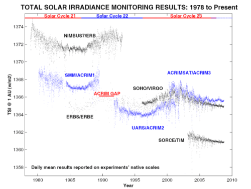
We’ll just note that absolute accuracy – the actual number – isn’t the key parameter of the different instruments. What they are good at measuring accurately is the change. (The differences in the absolute values are up to 7 W/m2, and absolute uncertainty in TSI is estimated at approximately 4 W/m2).

So here we see the different satellite measurements over 30+ years. The absolute results here have not been “recalibrated” to show the same number:

Total Solar Irradiation, as measured by various satellites

Total Solar Irradiation, as measured by various satellites

We can see the solar cycles as the 11-year cycle of increase and decrease in TSI.

One item of note is that the change in annual mean TSI from minimum to maximum of these cycles is less than 0.08%, or less than 1.1 W/m2.

In The Earth’s Energy Budget we looked at “comparing apples with oranges” – why we need to convert the TSI or solar “constant” into the absorbed radiation (as some radiation is reflected) averaged over the whole surface area.

This means a 1.1 W/m2 cyclic variation in the solar constant is equivalent to 0.2 W/m2 over the whole earth when we are comparing it with say the radiative forcing from extra CO2 (check out the Energy Budget post if this doesn’t seem right).

How about longer term trends? It seems harder to work out as any underlying change is the same order as instrument uncertainties. One detailed calculation on the minimum in 1996 vs the minimum in 1986 (by R.C. Willson, 1998) showed an increase of 0.5 W/m2 (converting that to the “radiative forcing” = 0.09 W/m2). Another detailed calculation of that same period showed no change.

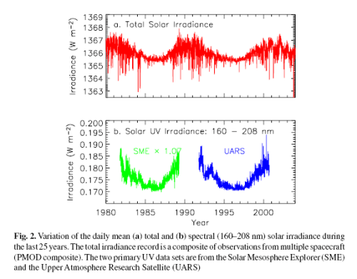
Here’s a composite from Fröhlich & Lean (2004) – the first graphic is the one of interest here:

Composite TSI from satellite, 1978-2005, Frohlich & Lean

Composite TSI from satellite, 1978-2004, Frohlich & Lean

As you can see, their reanalysis of the data concluded that there hasn’t been any trend change during the period of measurement.

Proxies

What can we work out without satellite data – prior to 1978?

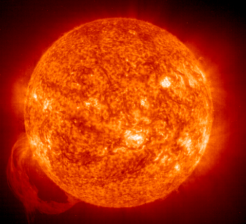
The Sun

The Sun

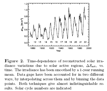
The historical values of TSI have to be estimated from other data. Solanski and Fligge (1998) used the observational data on sunspots and faculae (“brightspots”) primarily from the Royal Greenwich Observatory dating to back to 1874. They worked out a good correlation between the TSI values from the modern satellite era with observational data and thereby calculated the historical TSI:

Reconstruction of changes in TSI, Solanski & Fligge

Reconstruction of changes in TSI, Solanski & Fligge

As they note, these kind of reconstructions all rely on the assumption that the measured relationships have remained unchanged over more than a century.

They comment that depending on the reconstructions, TSI averaged over its 11-year cycle has varied by 0.4-0.7W/m2 over the last century.

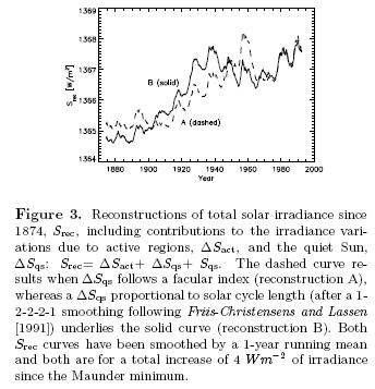
Then they do another reconstruction which includes changes that take place in the “quiet sun” periods – because the reconstruction above is derived from observations of active regions –  in part from data comparing the sun to similar stars.. They comment that this method has more uncertainty, although it should be more complete:

Second reconstruction of TSI back to 1870, Solanski & Fligge

Second reconstruction of TSI back to 1870, Solanski & Fligge

This method generates an increase of 2.5 W/m2 between 1870 and 1996. Which again we have to convert to a radiative forcing of 0.4 W/m2

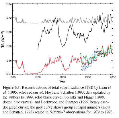
The IPCC summary (TAR 2001), p.382, provides a few reconstructions for comparison, including the second from Solanski and Fligge:

Reconstructions of TSI back to 1600, IPCC (2001)

Reconstructions of TSI back to 1600, IPCC (2001)

And then bring some sanity:

Thus knowledge of solar radiative forcing is uncertain, even over the 20th century and certainly over longer periods.

They also describe our level of scientific understanding (of the pre-1978 data) as “very low”.

The AR4 (2007) lowers some of the historical changes in TSI commenting on updated work in this field, but from an introductory perspective the results are not substantially changed.

Second Order Effects

This post is all about the first-order forcing due to solar radiation – how much energy we receive from the sun.

There are other theories which rely on relationships like cloud formation as a result of fluctuations in the sun’s magnetic flux – Svensmart & Friis-Christensen. These would be described as “second-order” effects – or feedback.

These theories are for another day.

First of all, it’s important to establish the basics.

Conclusion

We can see from satellite data that the cyclic changes in Total Solar Irradiance over the last 30 years are small. Any trend changes are small enough that they are hard to separate from instrument errors.

Once we go back further, it’s an “open field”. Choose your proxies and reconstruction methods and wide ranging numbers are possible.

When we compare the known changes (since 1978) in TSI we can directly compare the radiative forcing with the “greenhouse” effect and that is a very useful starting point.

References

Solar radiative output and its variability: evidence and mechanisms, Fröhlich & Lean, Astrophysics Review (2004)

Solar Irradiance since 1874 Revisited, Solanski & Fligge, Geophysical Research Letters (1998)

Total Solar Irradiance Trend During Solar Cycles 21 and 22, R.C.Willson, Science (1997)

Read Full Post »
In Part One we looked at a few basic numbers and how to compare “apples with oranges” – or the solar radiation in vs the earth’s longwave radiation going out.

And in Part One I said:

Energy radiated out from the climate system must balance the energy received from the sun. This is energy balance. If it’s not true then the earth will be heating up or cooling down.

Why hasn’t the Outgoing Longwave Radiation (OLR) increased?

In a discussion on another blog when I commented about CO2 actually creating a “radiative forcing” – shorthand for “it adds a certain amount of W/m^2 at the earth’s surface” – one commenter asked (paraphrasing because I can’t remember the exact words):

If that’s true – if CO2 creates extra energy at the earth’s surface – why has OLR not increased in 20 years?

This is a great question and inspired a mental note to add a post which includes this question.

Hopefully, most readers of this blog will know the answer. And understanding this answer is the key to understanding an important element of climate science.

Energy Balance and Imbalance

It isn’t some “divine” hand that commands that Energy in = Energy out.

Instead, if energy in > energy out, the system warms up.

And conversly, if energy in < energy out, the system cools down.

So if extra CO2 increases surface temperature… pause a second… backup, for new readers of this blog:

First, check out the CO2 series if it seems like some crazy idea that CO2 in the atmosphere can increase the amount of radiation at the earth’s surface. 10,000 physicists over 100 years are probably right, but depending on what and where you have been reading I can understand the challenge..

Second, we like to use weasel words like “all other things being equal” to deal with the fact that the climate is a massive mix of cause and effect. The only way that science can usually progress is to separate out one factor at a time and try and understand it..

So, if extra CO2 increases surface temperature – all other things being equal, why hasn’t energy out of the system increased?

Because the system will accumulate energy until energy balance is restored?

More or less correct. No, definitely correct – probably an axiom – and probably describes what we see.

Higher Surface Temperature – Same OLR  – Does that make sense?

The question that the original commenter was asking was a very good one. He (or she) was trying to get something clear – if surface temperature has increased why hasn’t OLR increased?

Here’s a graphic which has caused much head scratching for non-physicists: (And I can understand why).

Upward Longwave Radiation, Numbers from Kiehl & Trenberth

Upward Longwave Radiation, Numbers from Kiehl & Trenberth (1997)

For those new to the blog or to climate science concepts, “Longwave” means energy originally radiated from the earth’s surface (check out CO2 – An Insignificant Trace Gas – Part One for a little more on this).

Where’s the energy going? Everyone asks.

Some of it is being absorbed and re-radiated. Of this, some is re-radiated up. No real change there. And some is re-radiated down.

The downwards radiation, which we can measure – see Part Six – Visualization, is what increases the surface temperature.

Add some CO2 – and, all other things being equal, or weasel words to that effect, there will be more absorption of longwave radiation in the atmosphere, and more re-radiation back down to the surface – so clearly, less OLR.

In fact, that’s the explanation in a nutshell. If you add CO2, as an immediate effect less longwave radiation leaves the top of atmosphere (TOA). Therefore, more energy comes in than leaves, therefore, temperatures increase.

Eventually, energy balance is restored when higher temperatures at the surface finally mean that enough longwave radiation is leaving through the top of atmosphere.

If you are new to this, you might be saying “What?

So, take a minute and read the post again. Or even – come back tomorrow and re-read it.

New concepts are hard to absorb inside five minutes.

Conclusion

This post has tried to look at energy balance from a couple of perspectives. Picture the whole climate system and think about energy in and energy out.

The idea is very illuminating.

The energy balance at TOA (top of atmosphere) is the “driver” for whether the earth heats or cools.

In the next post we will learn the annoying fact that we can’t measure the actual values accurately enough.. Which is also why even if there is an energy imbalance for an extended period, it is hard to measure.

Update – Part Three in the series on how the earth radiates energy from its atmosphere and what happens when the amount of “greenhouse” gas is increased. (And not, as promised, on measurement issues..)

Read Full Post »

This post tries to help visualizing, or understanding better, the greenhouse effect.

By the way, if you are new to this subject and think CO2 is an insignificant trace gas, then at least take a look at Part One.

I tried to think of a good analogy, something to bring it to life. But this is why the effect of these invisible trace gases is so difficult to visualize and so counter-intuitive.

The most challenging part is that energy flowing in – shortwave radiation from the sun – passes through these “greenhouse” gases like they don’t exist (although strictly speaking there is a small effect from CO2 in absorption of solar radiation). That’s because solar radiation is almost all in the 0.1-4μm band (see The Sun and Max Planck Agree – Part Two).

But energy flowing out from the earth’s surface is absorbed and re-radiated by these gases because the earth’s radiation is in the >4μm band. Again, you can see these effects more clearly if you take another look at part one.

If we try and find an analogy in everyday life nothing really fits this strange arrangement.

Upwards Longwave Radiation

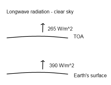
So let’s try and look at it again and see if starts to make sense. Here is the earth’s longwave energy budget – considering first the energy radiated up:

Upward Longwave Radiation, Numbers from Kiehl & Trenberth

Upward Longwave Radiation, Numbers from Kiehl & Trenberth (1997)

Of course, the earth’s radiation from the surface depends on the actual temperature. This is the average upwards flux. And it also depends slightly on the factor called “emissivity” but that doesn’t have a big effect.

The value at the top of atmosphere (TOA) is what we measure by satellite – again that is the average for a clear sky. Cloudy skies produce a different (lower) number.

These values alone should be enough to tell us that something significant is happening to the longwave radiation. Where is it going? It is being absorbed and re-radiated. Some upwards – so it continues on its journey to the top of the atmosphere and out into space – and some back downwards to the earth’s surface. This downwards component adds to the shortwave radiation from the sun and helps to increase the surface temperature.

As a result the longwave radiation upwards from the earth’s surface is higher than the upwards value at the top of the atmosphere.

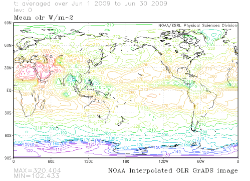
Here’s the measured values by satellite averaged over the whole of June 2009.

Measured Outgoing Longwave Radiation at the top of atmosphere, June 2009

Measured Outgoing Longwave Radiation at the top of atmosphere, June 2009

Of course, the hotter parts of the globe radiate out more longwave energy.

Downwards Longwave Radiation

But what does it look like at the earth’s surface to an observer looking up – ie the downwards longwave radiation? If there was no greenhouse effect we should, of course, see zero longwave radiation.

Here are some recent measurements:

Downwards Longwave Radiation at the Earth's Surface, From Evans & Puckrin

Downwards Longwave Radiation at the Earth's Surface, From Evans & Puckrin (2006)

Note that the wavelengths have been added under “Wavenumber” (that convention of spectrum people) and so the graph runs from longer to shorter wavelength.

This is for a winter atmosphere in Canada.

Now what the scientists did was to run a detailed simulation of the expected downwards longwave radiation using the temperature, relative humidity and pressure profiles from radiosondes, as well as a detailed model of the absorption spectra of the various greenhouse gases:

Measured vs Simulated Downward Longwave Radiation at the Surface, Evans & Puckrin

Measured vs Simulated Downward Longwave Radiation at the Surface, Evans & Puckrin

What is interesting is seeing the actual values of longwave radiation at the earth’s surface and the comparison 1-d simulations for that particular profile. (See Part Five for a little more about 1-d simulations of the “radiative transfer equations”). The data and the mathematical model matches very well.

Is that surprising?

It shouldn’t be if you have worked your way through all the posts in this series. Calculating the radiative forcing from CO2 or any other gas is mathematically demanding but well-understood science. (That is a whole different challenge compared with modeling the whole climate 1 year or 10 years from now).

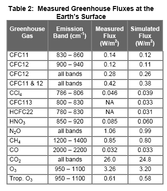
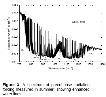
They did the same for a summer profile and reported in that case on the water vapor component:

Downwards Longwave Radiation at the Earth's Surface, Summer

Downwards Longwave Radiation at the Earth's Surface, Summer

As an interesting aside, it’s a lot harder to get the data for the downwards flux at the earth’s surface than it is for upwards flux at the top of atmosphere (OLR). Why?

Because a few satellites racing around can measure most of the radiation coming out from the earth. But to get the same coverage of the downwards radiation at the earth’s surface you would need thousands or millions of expensive measuring stations..

Conclusion

Measurements of longwave radiation at the earth’s surface help to visualize the “greenhouse” effect. For people doubting its existence this measured radiation might also help to convince them that it is a real effect!

If there was no “greenhouse” effect, there would be no longwave radiation downwards at the earth’s surface.

Calculations of the longwave radiation due to each gas match quite closely with the measured values. This won’t be surprising to people who have followed through this series. The physics of absorption and re-emission is a subject which has been extremely thoroughly studied for many decades, in fact back into the 19th century.

How climate responds to the “extra radiation” (radiative forcing is the standard term) from increases in some “greenhouse” gases is whole different story.

More in this series

Part Seven – The Boring Numbers – the values of “radiative forcing” from CO2 for current levels and doubling of CO2.

Part Eight – Saturation – explaining “saturation” in more detail

CO2 Can’t have that Effect Because.. – common “problems” or responses to the theory and evidence presented

AND much more about the downward radiation from the atmosphere – The Amazing Case of “Back-Radiation”Part Two, and Part Three

Reference

Measurements of the Radiative Surface Forcing of Climate, W.J.F. Evans & E. Puckrin, American Meteorological Society, 18th Conference on Climate Variability and Change (2006)

Read Full Post »
Urban Heat Island in Japan

For newcomers to the climate debate it is often difficult to understand if global warming even exists. Controversy rages about temperature records, “adjustments” to individual stations, methods of creating the global databases like CRU and GISS and especially the problem of UHI.

UHI, or the urban heat island, refers to the problem that temperatures in cities are warmer than temperatures in nearby rural areas, not due to a real climatic effect, but due to concrete, asphalt, buildings and cars. There are also issues raised as to the actual location of many temperature stations, as Anthony Watts and his volunteer work demonstrated in the US.

First of all, everyone agrees that the UHI exists. The controversy rages about how large it is. The IPCC (2007) believes it is very low – 0.006°C per decade globally. This would mean that out of the 0.7°C temperature rise in the 20th century, the UHI was only 0.06°C or less than 10% – not particularly worth worrying about.

For those few not familiar with the mainstream temperature reconstruction of the last 150 years, here is the IPCC from 2007 (global reconstructions):

IPCC 2007 Global Temperature 1840-2000

IPCC 2007, Working Group 1, Historical Overview of Climate Change

New Research from Japan

Detection of urban warming in recent temperature trends in Japan by Fumiaki Fujibe was published in the International Journal of Climatology (2009). It is a very interesting paper which I’ll comment on in this post.

The abstract reads:

The contribution of urban effects on recent temperature trends in Japan was analysed using data at 561 stations for 27 years (March 1979–February 2006). Stations were categorized according to the population density of surrounding few kilometres. There is a warming trend of 0.3–0.4 °C/decade even for stations with low population density (<100 people per square kilometre), indicating that the recent temperature increase is largely contributed by background climatic change. On the other hand, anomalous warming trend is detected for stations with larger population density. Even for only weakly populated sites with population density of 100–300/km2, there is an anomalous trend of 0.03–0.05 °C/decade. This fact suggests that urban warming is detectable not only at large cities but also at slightly urbanized sites in Japan. Copyright, 2008 Royal Meteorological Society.

Why the last 27 years?

The author first compares the temperature over 100 years as measured in Tokyo in the central business district with that in Hachijo Island, 300km south.

Tokyo –               3.1°C rise over 100 years (1906-2006)
Hachijo Island –  0.6°C over the same period

Tokyo vs Hachijo Island, 100 years

This certainly indicates a problem, but to do a thorough study over the last 100 years is impossible because most temperature stations with a long history are in urban areas.

However, at the end of the 1970’s, the Automated Meteorological Data Acquisition System (AMeDAS) was deployed around Japan providing hourly temperature data at 800 stations. The temperature data from these are the basis for the paper. The 27 years coincides with the large temperature rise (see above) of around 0.3-0.4°C globally.

And the IPCC (2007) summarized the northern hemisphere land-based temperature measurements from 1979- 2005 as 0.3°C per decade.

How was Urbanization measured?

The degree of urbanization around each site was calculated from grid data of population and land use, because city populations often used as an index of urban size (Oke, 1973; Karl et al., 1988; Fujibe, 1995) might not be representative of the thermal environment of a site located outside the central area of a city.

What were the Results?

Temperature anomaly against population density, Japan

Mean temperature anomaly vs population density, Japan

The x-axis, D3, is a measure of population density. T’mean is the change in the mean temperature per decade.

Tmean is the average of all of the hourly temperature measurements, it is not the average of Tmax and Tmin.

Notice the large scatter – this shows why having a large sample is necessary. However, in spite of that, there is a clear trend which demonstrates the UHI effect.

There is large scatter among stations, indicating the dominance of local factors’ characteristic to each station. Nevertheless, there is a positive correlation of 0.455 (Tmean = 0.071 logD3 + 0.262 °C), which is significant at the 1% level, between logD3 and Tmean.

Here’s the data summarized with T’mean as well as the T’max and T’min values. Note that D3 is population per km2 around the point of temperature measurement, and remember that the temperature values are changes per decade:

The effect of UHI demonstrated in various population densities

The effect of UHI demonstrated in various population densities

Note that, as observed by many researchers in other regions, especially Roger Pielke Sr, the Tmin values are the most problematic – demonstrating the largest UHI effect. Average temperatures for land-based stations globally are currently calculated from the average of Tmax and Tmin, and in many areas globally it is the Tmin which has shown the largest anomalies. But back to our topic under discussion..

And for those confused about how the Tmean can be lower than the Tmin value in each population category, it is because we are measuring anomalies from decade to decade.

And the graphs showing the temperature anomalies by category (population density):

Dependence of Tmean, Tmax and Tmin on population density for different regions in Japan

Dependence of Tmean, Tmax and Tmin on population density for different regions in Japan

Quantifying the UHI value

Now the author carries out an interesting step:

As an index of net urban trend, the departure of T from its average for surrounding non-urban stations was used on the assumption that regional warming was locally uniform.

That is, he calculates the temperature deviation in each station in category 3-6 with the locally relevant category 1 and 2 (rural) stations. (There were not enough category 1 stations to do it with just category 1). The calculation takes into account how far away the “rural” stations are, so that more weight is given to closer stations.

Estimate of actual UHI by referencing the closest rural stations

Estimate of actual UHI by referencing the closest rural stations - again categorized by population density

And the relevant table:

Temperature delta from nearby rural areas vs population density

Temperature delta from nearby rural areas vs population density

Conclusion

Here’s what the author has to say:

On the one hand, it indicates the presence of warming trend over 0.3 °C/decade in Japan, even at non-urban stations. This fact confirms that recent rapid warming at Japanese cities is largely attributable to background temperature rise on the large scale, rather than the development of urban heat islands.

..However, the analysis has also revealed the presence of significant urban anomaly. The anomalous trend for the category 6, with population density over 3000 km−2 or urban surface coverage over 50%, is about 0.1 °C/decade..

..This value may be small in comparison to the background warming trend in the last few decades, but they can have substantial magnitude when compared with the centennial global trend, which is estimated to be 0.74°C/century for 1906–2005 (IPCC, 2007). It therefore requires careful analysis to avoid urban influences in evaluating long-term temperature changes.

So, in this very thorough study, in Japan at least, the temperature rise that has been measured over the last few decades is a solid result. The temperature increase from 1979 – 2006 has been around 0.3°C/decade

However, in the larger cities the actual measurement will be overstated by 25%.

And in a time of lower temperature rise, the UHI may be swamping the real signal.

The IPCC (2007) had this to say:

A number of recent studies indicate that effects of urbanisation and land use change on the land-based temperature record are negligible (0.006ºC per decade) as far as hemispheric- and continental-scale averages are concerned because the very real but local effects are avoided or accounted for in the data sets used.

So, on the surface at least, this paper indicates that the IPCC’s current position may be in need of modification.

Read Full Post »

« Newer Posts - Older Posts »