If we open an introductory atmospheric physics textbook, we find that the temperature profile in the troposphere (lower atmosphere) is mostly explained by convection. (See for example, Things Climate Science has Totally Missed? – Convection)
We also find that the temperature profile in the stratosphere is mostly determined by radiation. And that the overall energy balance of the climate system is determined by radiation.
Many textbooks introduce the subject of convection in this way:
- what would the temperature profile be like if there was no convection, only radiation for heat transfer
- why is the temperature profile actually different
- how does pressure reduce with height
- what happens to air when it rises and expands in the lower pressure environment
- derivation of the “adiabatic lapse rate”, which in layman’s terms is the temperature change when we have relatively rapid movements of air
- how the real world temperature profile (lapse rate) compares with the calculated adiabatic lapse rate and why
We looked at the last four points in some detail in a few articles:
Density, Stability and Motion in Fluids – some basics about instability
Potential Temperature – explaining “potential temperature” and why the “potential temperature” increases with altitude
Temperature Profile in the Atmosphere – The Lapse Rate – lots more about the temperature profile in the atmosphere
In this article we will look at the first point.
All of the atmospheric physics textbooks I have seen use a very simple model for explaining the temperature profile in a fictitious “radiation only” environment. The simple model is great for giving insight into how radiation travels.
Physics textbooks, good ones anyway, try and use the simplest models to explain a phenomenon.
The simple model, in brief, is the “semi-gray approximation”. This says the atmosphere is completely transparent to solar radiation, but opaque to terrestrial radiation. Its main simplification is having a constant absorption with wavelength. This makes the problem nice and simple analytically – which means we can rewrite the starting equations and plot a nice graph of the result.
However, atmospheric absorption is the total opposite of constant. Here is an example of the absorption vs wavelength of a minor “greenhouse” gas:

From Vardavas & Taylor (2007)
Figure 1
So from time to time I’ve wondered what the “no convection” atmosphere would look like with real GHG absorption lines. I also thought it would be especially interesting to see the effect of doubling CO2 in this fictitious environment.
This article is for curiosity value only, and for helping people understand radiative transfer a little better.
We will use the Matlab program seen in the series Visualizing Atmospheric Radiation. This does a line by line calculation of radiative transfer for all of the GHGs, pulling the absorption data out of the HITRAN database.
I updated the program in a few subtle ways. Mainly the different treatment of the stratosphere – the place where convection stops – was removed. Because, in this fictitious world there is no convection in the lower atmosphere either.
Here is a simulation based on 380 ppm CO2, 1775 ppb CH4, 319 ppb N2O and 50% relative humidity all through the atmosphere. Top of atmosphere was 100 mbar and the atmosphere was divided into 40 layers of equal pressure. Absorbed solar radiation was set to 240 W/m² with no solar absorption in the atmosphere. That is (unlike in the real world), the atmosphere has been made totally transparent to solar radiation.
The starting point was a surface temperature of 288K (15ºC) and a lapse rate of 6.5K/km – with no special treatment of the stratosphere. The final surface temperature was 326K (53ºC), an increase of 38ºC:
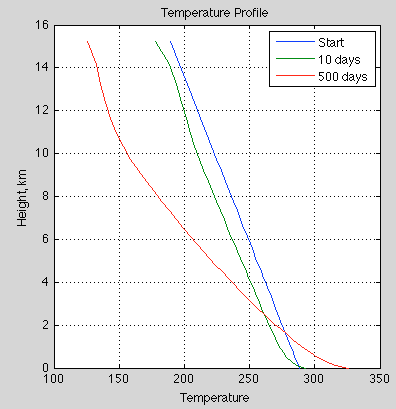
Figure 2
The ocean depth was only 5m. This just helps get to a new equilibrium faster. If we change the heat capacity of a system like this the end result is the same, the only difference is the time taken.
Water vapor was set at a relative humidity of 50%. For these first results I didn’t get the simulation to update the absolute humidity as the temperature changed. So the starting temperature was used to calculate absolute humidity and that mixing ratio was kept constant:
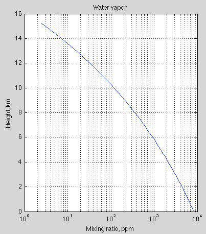
Figure 3
The lapse rate, or temperature drop per km of altitude:
Figure 4
The flux down and flux up vs altitude:
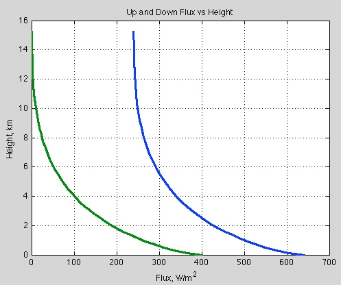
Figure 5
The top of atmosphere upward flux is 240 W/m² (actually at the 500 day point it was 239.5 W/m²) – the same as the absorbed solar radiation (note 1). The simulation doesn’t “force” the TOA flux to be this value. Instead, any imbalance in flux in each layer causes a temperature change, moving the surface and each part of the atmosphere into a new equilibrium.
A bit more technically for interested readers.. For a given layer we sum:
- upward flux at the bottom of a layer minus upward flux at the top of a layer
- downward flux at the top of a layer minus downward flux at the bottom of a layer
This sum equates to the “heating rate” of the layer. We then use the heat capacity and time to work out the temperature change. Then the next iteration of the simulation redoes the calculation.
And even more technically:
- the upwards flux at the top of a layer = the upwards flux at the bottom of the layer x transmissivity of the layer plus the emission of that layer
- the downwards flux at the bottom of a layer = the downwards flux at the top of the layer x transmissivity of the layer plus the emission of that layer
End of “more technically”..
Anyway, the main result is the surface is much hotter and the temperature drop per km of altitude is much greater than the real atmosphere. This is because it is “harder” for heat to travel through the atmosphere when radiation is the only mechanism. As the atmosphere thins out, which means less GHGs, radiation becomes progressively more effective at transferring heat. This is why the lapse rate is lower higher up in the atmosphere.
Now let’s have a look at what happens when we double CO2 from its current value (380ppm -> 760 ppm):
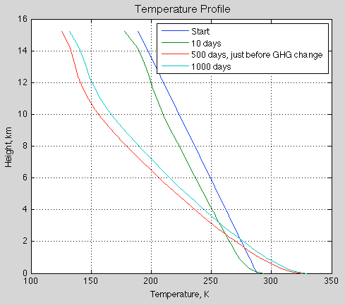
Figure 6 – with CO2 doubled instantaneously from 380ppm at 500 days
The final surface temperature is 329.4, increased from 326.2K. This is an increase (no feedback of 3.2K).
The “pseudo-radiative forcing” = 18.9 W/m² (which doesn’t include any change to solar absorption). This radiative forcing is the immediate change in the TOA forcing. (It isn’t directly comparable to the IPCC standard definition which is at the tropopause and after the stratosphere has come back into equilibrium – none of these have much meaning in a world without convection).
Let’s also look at the “standard case” of an increase from pre-industrial CO2 of 280 ppm to a doubling of 560 ppm. I ran this one for longer – 1000 days before doubling CO2 and 2000 days in total- because the starting point was less in balance. At the start, the TOA flux (outgoing longwave radiation) = 248 W/m². This means the climate was cooling quite a bit with the starting point we gave it.
At 180 ppm CO2, 1775 ppb CH4, 319 ppb N2O and 50% relative humidity (set at the starting point of 288K and 6.5K/km lapse rate), the surface temperature after 1,000 days = 323.9 K. At this point the TOA flux was 240.0 W/m². So overall the climate has cooled from its initial starting point but the surface is hotter.
This might seem surprising at first sight – the climate cools but the surface heats up? It’s simply that the “radiation-only” atmosphere has made it much harder for heat to get out. So the temperature drop per km of height is now much greater than it is in a convection atmosphere. Remember that we started with a temperature profile of 6.5K/km – a typical convection atmosphere.
After CO2 doubles to 560 ppm (and all other factors stay the same, including absolute humidity), the immediate effect is the TOA flux drops to 221 W/m² (once again a radiative forcing of about 19 W/m²). This is because the atmosphere is now even more “resistant” to the escape of heat by radiation. The atmosphere is more opaque and so the average emission of radiation of space moves to a higher and colder part of the atmosphere. Colder parts of the atmosphere emit less radiation than warmer parts of the atmosphere.
After the climate moves back into balance – a TOA flux of 240 W/m² – the surface temperature = 327.0 K – an increase (pre-feedback) of 3.1 K.
Compare this with the standard IPCC “with convection” no-feedback forcing of 3.7 W/m² and a “no feedback” temperature rise of about 1.2 K.
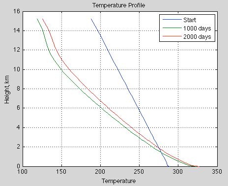
Figure 7 – with CO2 doubled instantaneously from 280ppm at 1000 days
Then I introduced a more realistic model with solar absorption by water vapor in the atmosphere (changed parameter ‘solaratm’ in the Matlab program from ‘false’ to ‘true’). Unfortunately this part of the radiative transfer program is not done by radiative transfer, only by a very crude parameterization, just to get roughly the right amount of heating by solar radiation in roughly the right parts of the atmosphere.
The equilibrium surface temperature at 280 ppm CO2 was now “only” 302.7 K (almost 30ºC). Doubling CO2 to 560 ppm created a radiative forcing of 11 W/m², and a final surface temperature of 305.5K – that is, an increase of 2.8K.
Why is the surface temperature lower? Because in the “no solar absorption in the atmosphere” model, all of the solar radiation is absorbed by the ground and has to “fight its way out” from the surface up. Once you absorb solar radiation higher up than the surface, it’s easier for this heat to get out.
Conclusion
One of the common themes of fantasy climate blogs is that the results of radiative physics are invalidated by convection, which “short-circuits” radiation in the troposphere. No one in climate science is confused about the fact that convection dominates heat transfer in the lower atmosphere.
We can see in this set of calculations that when we have a radiation-only atmosphere the surface temperature is a lot higher than any current climate – at least when we consider a “one-dimensional” climate.
Of course, the whole world would be different and there are many questions about the amount of water vapor and the effect of circulation (or lack of it) on moving heat around the surface of the planet via the atmosphere and the ocean.
When we double CO2 from its pre-industrial value the radiative forcing is much greater in a “radiation-only atmosphere” than in a “radiative-convective atmosphere”, with the pre-feedback temperature rise 3ºC vs 1ºC.
So it is definitely true that convection short-circuits radiation in the troposphere. But the whole climate system can only gain and lose energy by radiation and this radiation balance still has to be calculated. That’s what current climate models do.
It’s often stated as a kind of major simplification (a “teaching model”) that with increases in GHGs the “average height of emission” moves up, and therefore the emission is from a colder part of the atmosphere. This idea is explained in more detail and less simplifications in Visualizing Atmospheric Radiation – Part Three – Average Height of Emission – the complex subject of where the TOA radiation originated from, what is the “Average Height of Emission” and other questions.
A legitimate criticism of current atmospheric physics is that convection is poorly understood in contrast to subjects like radiation. This is true. And everyone knows it. But it’s not true to say that convection is ignored. And it’s not true to say that because “convection short-circuits radiation” in the troposphere that somehow more GHGs will have no effect.
On the other hand I don’t want to suggest that because more GHGs in the atmosphere mean that there is a “pre-feedback” temperature rise of about 1K, that somehow the problem is all nicely solved. On the contrary, climate is very complicated. Radiation is very simple by comparison.
All the standard radiative-convective calculation says is: “all other things being equal, an doubling of CO2 from pre-industrial levels, would lead to a 1K increase in surface temperature”
All other things are not equal. But the complication is not that somehow atmospheric physics has just missed out convection. Hilarious. Of course, I realize most people learn their criticisms of climate science from people who have never read a textbook on the subject. Surprisingly, this doesn’t lead to quality criticism..
On more complexity – I was also interested to see what happens if we readjust absolute humidity due to the significant temperature changes, i.e. we keep relative humidity constant. This led to some surprising results, so I will post them in a followup article.
Notes
Note 1 – The boundary conditions are important if you want to understand radiative heat transfer in the atmosphere.
First of all, the downward longwave radiation at TOA (top of atmosphere) = 0. Why? Because there is no “longwave”, i.e., terrestrial radiation, from outside the climate system. So at the top of the atmosphere the downward flux = 0. As we move down through the atmosphere the flux gradually increases. This is because the atmosphere emits radiation. We can divide up the atmosphere into fictitious “layers”. This is how all numerical (finite element analysis) programs actually work. Each layer emits and each layer also absorbs. The balance depends on the temperature of the source radiation vs the temperature of the layer of the atmosphere we are considering.
At the bottom of the atmosphere, i.e., at the surface, the upwards longwave radiation is the surface emission. This emission is given by the Stefan-Boltzmann equation with an emissivity of 1.0 if we consider the surface as a blackbody which is a reasonable approximation for most surface types – for more on this, see Visualizing Atmospheric Radiation – Part Thirteen – Surface Emissivity – what happens when the earth’s surface is not a black body – useful to understand seeing as it isn’t..
At TOA, the upwards emission needs to equal the absorbed solar radiation, otherwise the climate system has an imbalance – either cooling or warming.


SOD, please do not confuse the misunderstandings of some of the skeptics with many of the skeptics who do understand the issues. Selecting an ignorant sub group on either side of the issue is a false distraction (a straw man) of the valid arguments of skeptics. I and many skeptics agree with the basics of radiation and convection science. It is the effects of feed-backs and the fact that all other factors do not stay the same, that is the basis for our positions. Real world DATA and historical records support the point that the CO2 increase has had little effect on global temperature compared to natural variation, as emphasized by the last 17 or so year lack of increase. I also want to point out that there are large number of supporters of the position that AGW is a major problem, that are truly ignorant of the science and facts.
I did appreciate your analysis of a radiation only atmosphere, and it clearly shows the increased effect on the near surface lapse rate. However, buoyancy alone would keep this from happening.
Leonard,
I think you’re overreacting. SoD made it very clear that he was referring to fantasy climate blogs. You can’t pretend that they don’t exist. This isn’t Skeptical Science either. As far as I can tell, there is no party line here, other than actual physics, like there is at Real Climate and Skeptical Science. People can be banned, but until then, no one’s comments are edited with no opportunity to respond.
“As far as I can tell, there is no party line here, other than actual physics, like there is at Real Climate and Skeptical Science. People can be banned, but until then, no one’s comments are edited with no opportunity to respond.”
Agreed. The comments at Real Climate are heavily filtered and censored. Less so at Skeptical Science, but still significantly censored there too.
However, I do agree with Leonard that so-called ‘skeptics’ are often mischaracterized as being ignorant of the ‘basics’.
Yet more proof that irony increases.
“Yet more proof that irony increases.”
How so? I certainly don’t deny the RT simulations that calculate an increased IR opacity for increased CO2. While I may not yet precisely understand all the details of how they work, I don’t deny them. There is just no credible reason that I’ve seen to do so, and besides multiple people going out of their way to find fault anywhere they can have done them and gotten about the same results.
Leonard,
I don’t.
I know.
There must be some party position that I didn’t know about. I didn’t think there was a monolith position called “skeptic”.
I consider myself a skeptic. This means I don’t accept what people tell me just because they are smart, well-qualified or have been working in the field for many decades. Instead I ask for evidence.
I think the problem is to consider that there is a group of “skeptics of AGW”. Instead there are lots of people with different opinions from each other who don’t accept AGW. Of course, some have the same opinions as each other, but lots have different opinions.
This article is not attacking “skeptics”. This article is not attacking “people who accept radiation and convection basics but disagree with the conclusions of AGW”.
This article is about radiation-only atmospheres and is written for curiosity value only, and for helping people understand radiative transfer a little better.
I probably should have stated that in the article.
The article does criticize people who believe climate science has ignored convection in its pre-feedback calculation of doubling CO2. I probably should have said that in the article.
And I don’t think that such people can be called skeptics because real skeptics ask for evidence rather than just believing what they read in fantasy blogs.
So this article is not attacking any skeptics at all. You are in the clear!
Whether they are the best or the worst metric does not change the explicit fact that they are presently the principal indicators of global warming.
No, they are the *traditional* indicators of warming. The principal indicator is OHC.
If you had a terrarium with water and a little island of dirt, and you wanted to know if the terrarium was warming, would you stick your thermometer in the water, or would you hover it closely over the dirt and see if the temperature there is changing?
C&W tell something additional, but that does not make the result of their analysis a batter indicator.
It’s a better indicator of surface warming, but obviously not as good as OHC for detecting global warming.
…historical records support the point that the CO2 increase has had little effect on global temperature compared to natural variation, as emphasized by the last 17 or so year lack of increase.
This is just false — yet people casually toss it around as if it was a fact. It is not.
There’s been enormous warming in the last 17 years, mostly in the ocean. That doesn’t happen without an energy imbalance. Ice is still melting and the ocean is still rising. Even the surface, which is just a tiny sliver of the climate system, has warmed some in the last 17 years, especially if you do better infilling like Cowtan & Way.
RSS and UAH differ significantly for the lower troposphere over this period. Until that gets sorted out, it’s not clear which is better, if either.
Good point. In fact, the rate of change of ocean heat content is probably the best measure we have of the radiative imbalance at the TOA.
It may be true that we ‘know’ that the missing energy must have gone somewhere. However it is hard to explain how all that heat entered the ocean without having any effect on global SST !
Hadcrut4 actually did add 100s of new stations in arctic regions. The real black spots for coverage for H4 are in Africa, South America and Antarctica. I think that fairly correcting for these areas would offset somewhat the C&W result.
David: No one should conclude that Leonard’s statement is false unless they can determine how much warming has been caused by unforced variability. You can’t do so. The observational record is far too short for us to draw strong statistical inferences about the magnitude of decadal unforced variability. AOGCMs do a poor job reproducing short-term unforced variability (ENSO, MJO) and show no sign of longer-term natural variability (PDO, AMO, and possibly the current hiatus). If Leonard’s statement means he believes that at least half of the warming in some period (which he hasn’t clearly defined) is due to unforced variability, he may be right – even if that period is as long as the past century.
Your “enormous warming” has been enormously less than projected. Climate models projected surface temperature rises of 0.2 degC or more per decade (mostly due to increasing CO2); leading to a deficit of roughly 0.3-0.4 degC over the last 17 years or so. Cowtan and Way may have found some warming, but certainly not enough to close this gap. UAH, RSS and ocean heat content have not been rising as fast as projected. The planetary energy imbalance from ARGO data may be a low as 0.3 W/m2, half or a third of that projected a decade ago.
David,
Global average surface temperatures as represented by the well known time series like HadCRUT4 (and 3), and GISTEMP are still the principal indicators of warming. They have long histories and they can be determined accurately enough from observations. There are other time series, which include further developments of those series as well as OHC data, but such time series contain either more non-empirical input or have other weaknesses. The OHC data, in particular, suffers from lack of high quality long term time series. The ARGO data is better, but covers a period so short that it cannot serve as a substitute for GMST. I consider also the history of ARGO data too short to have full trust for the stated uncertainties of that data.
The hiatus in the best known GMST is a fact. It can be argued that the hiatus does not affect much best understanding of many important issues, but the hiatus cannot be denied. It’s also wrong to claim that the hiatus has no influence on best scientific understanding. Whatever you think of Judith Curry’s recent contributions otherwise, her comparison of AR4 to other IPCC reports and to the present understanding tells clearly that the hiatus has made an effect on understanding.
How internal variability and AGW combine is not known. Based on Bayesian reasoning it seems clear that the hiatus has not affected the best estimates of climate sensitivity very much, but it has affected them to a non-negligible amount. It’s still true that best estimates tell that most warming since 1950s is AGW, it’s quite possible that natural variability has a net effect of approximately 0C over this particular period (that’s my subjective best estimate), but the uncertainties around that value are large.
It may be true that we ‘know’ that the missing energy must have gone somewhere. However it is hard to explain how all that heat entered the ocean without having any effect on global SST !
Heat is transported down into the ocean via downward flowing currents, like in the North Atlantic.
HadSST3 has increased by 0.04 C in the last 17 years.
The hiatus in the best known GMST is a fact.
It is just the typical oscillation around the sameline trendline, as Tamino showed very elegantly here:
In the last 17 years, GISS has warmed by 0.12 C, HadCRUT4 by 0.07 C, and Cowtan and Way by 0.16 C. The last number is probably the best number, due to the way it infills regions with no stations.
Global average surface temperatures as represented by the well known time series like HadCRUT4 (and 3), and GISTEMP are still the principal indicators of warming.
Absolutely false — they’re about the worst metric you could use to detect an energy imbalance from GHGs.
The surface is a tiny piece of the Earth’s climate system, subject to a lot of noise from natural variability from ENSOs, the PDO and AMO, and other noise..
By far the best metric is ocean heat content, as Roger Pielke Sr keeps saying. About 93% of the extra, trapped heat goes into the ocean, and it is warming strongly — the 0-2000 m region is warming at 0.56 W/m2 since 2005, a number that is easily statistically significant.
The real black spots for coverage for H4 are in Africa, South America and Antarctica. I think that fairly correcting for these areas would offset somewhat the C&W result.
Why?
Because they are not warming. There is a projection bias in H4. Grid cells get geometrically smaller with latitude. At the North Pole you can walk through 72 H4 cells by spinning round. To be fair you should now do the same at the South Pole where it is not warming.
That’s not a valid explanation.
All vertical movement of water and all mixing transports heat. Some of tha transport is up and some down. The total mass flow must be zero. Thus the balance changes when the temperatures change at locations of vertical transport. Whether deep ocean warms or cools depends on this whole complex balance, and can be explained only by looking at the whole balance.
Growth and decline of Western Pacific Warm Pool is one example of processes that affect the HC of deep ocean, so is the related upwelling on the cold water in Eastern Pacific. These are linked to ENSO, but there may be related longer term phenomena. Changes in Atlantic Meridional Overturning Circulation contribute, but the whole circulation must be considered to find out, how. Similar effects occur everywhere. Mixing related to tidal currents and ocean ridges contributes as well. All of the components may change.
David,
Whether they are the best or the worst metric does not change the explicit fact that they are presently the principal indicators of global warming. I cannot see, how anything else comes even close.
No single indicator is perfect. HadCRUT4 has many properties that make it batter than most others. it has also some weaknesses. It’s actually quite possible that it’s a better indicator of global warming that a real GMST would be, if it could be determined.
C&W tell something additional, but that does not make the result of their analysis a batter indicator.
All vertical movement of water and all mixing transports heat. Some of tha transport is up and some down.
Of course the warming is complex. But besides downward diffusion of heat, you have a surface that is warming, with many sverdrups carrying that heat downward, and more sverdrups carrying cold water upward to where it is warmed.
Climate models projected surface temperature rises of 0.2 degC or more per decade (mostly due to increasing CO2)
No one predicts or expects a monotonic rise of surface temperatures with increasing CO2. Climate models aren’t short-term tools, because they solve a boundary value problem, not an intitial value problem.
If Leonard’s statement means he believes that at least half of the warming in some period (which he hasn’t clearly defined) is due to unforced variability, he may be right – even if that period is as long as the past century.
Over the last century, everything has warmed — the troposphere, the surface, the ocean. How does that happen with “unforced variability?”
David wrote: Over the last century, everything has warmed — the troposphere, the surface, the ocean. How does that happen with “unforced variability?”
Modeling has shown that unusual warmth and coolness in the Eastern Equatorial Pacific might be responsible for the recent hiatus in surface warming and significant enhancement of warming during the decades that preceded the hiatus. That modeling was performed by driving a small section of the Eastern Equatorial Pacific will actual SSTs instead of the SSTs produced by the model run with observed forcing agents. The difference between modeled and observed SSTs is unforced variability driven by a small section of the ocean.
Unforced variability in cloud cover (aldebo) can easily produce unforced variability in all temperature records by changing the amount of SWR reflected to space. Since the atmosphere and the surface respond quickly to changes, unforced variability in cloud cover would probably need to be driven by changes ocean currents.
With ARGO, we may have accurate enough data to track unforced variability in the amount of radiative imbalance retained in the atmosphere and the amount “disappearing” into the ocean. I personally have little faith that the pre-ARGO record (with limited coverage and changing technology) is accurate enough to detect the small changes in ocean heat content that could explain variations in surface warming trends. I would like to know more about this subject however. One problem is that ocean heat content and atmospheric heat content are not usually given in the same units.
I personally have little faith that the pre-ARGO record (with limited coverage and changing technology) is accurate enough to detect the small changes in ocean heat content that could explain variations in surface warming trends.
The professionals disagree — see the error bars in “World ocean heat content and thermosteric sea level change (0–2000 m), 1955–2010,” S. Levitus et al, GRL (2012) — but what would they know? They only spend their entire careers working with the data.
For example:
“NOAA Atlas NESDIS 60
WORLD OCEAN DATABASE 2005”
ftp://ftp.nodc.noaa.gov/pub/WOD05/DOC/wod05_intro.pdf
David,
You have a choice of papers by professionals. An alternative is the paper of Lyman and Johnson (JClimate 27, 1945-1957 (2014)) that specifically studies the accuracy and reliability of the data, and seems to tell that it’s not that good.
What should we non-professionals conclude?
David: You are right, the professionals studying ocean heat content disagree – but with each other (not necessarily with me). Figure 3.2 from AR5 shows the ocean heat content from five different (and presumably reputable) groups. Taken together they don’t provide the same level of confidence that a single graph with error bars from one group provides. Error bars only tell you about the uncertainty arising from random errors, not systematic errors. The 25*10^22 joule increase in ocean heat content in the top 700 m in the past half-century amounts to an average increase of 0.12 degC and less than half as much over the top 2000 m. So these measurements are very difficult and the data has been reprocessed several times due to difficulties with the equipment and changing equipment. See:
If one really believes that heat hasn’t been accumulating at the surface recently because it has been transported to the deep ocean, they should compare the changes in the heat content of the atmosphere+mixed layer to the changes in the heat content of the deep ocean. When heat has been accumulating slower than normal in the atmosphere+mixed layer (say during the hiatus) has it been accumulating faster than normal in the deep ocean? Has anyone seen such an analysis? (For some reason, no one seems to separate changes in the mixed layer (which is in equilibrium with the surface) from the slower changes in the deeper ocean below. Nor does anyone talk about the heat content of the atmosphere.)
David Appell,
There are still inconsistencies in the OHC and resulting thermosteric expansion data, especially below 1000m. Cazenave, et.al., 2009 ignored data from below 900m when comparing satellite altimetry, GRACE mass measurements and ARGO heat content data:
Yet relatively recent data purports to show that more than half of the current OHC accumulation is in the 700-2000m layer (0.45E22J/year compared to 0.28E22J/year from 0-700m) layer (. Then there’s things like this graph.. What amounts to a step change in 0-700m OHC that just happens to coincide with a change in the measurement system does not inspire confidence. Then there’s this graph. It doesn’t inspire a lot of confidence in the people who do this for a living.
This is not to say that OHC isn’t increasing. It is. But by how much is still not settled science.
Frank,
Remember that the heat capacity of the entire atmosphere is equivalent to about 3m of water. Any significant increase or decrease in OHC must be a result of a radiative imbalance at the TOA. That also means that the precision required of OHC measurements to do the correlations you want is not there and not likely to ever be there.
If the TOA is 100 mbar, then downward LW flux isn’t zero. MODTRAN, US 1976 Standard Atmosphere 16.23 km (~100mbar) looking up, the flux is 13,6 W/m².
Constant relative humidity should be interesting. A quick look at MODTRAN shows that the downward flux at the surface for the US Standard atmosphere increases more than 100 W/m² compared to the constant water vapor pressure case. The window is nearly gone.
Constant relative humidity is interesting. I’m sure the results that I will present have some flaw in them, but the basic idea of keeping RH constant is a sensible one – at least, more sensible than the idea of keeping absolute humidity constant. With the major temperature changes we see here (from the starting point) it is a little crazy to keep RH constant.
“And it’s not true to say that because “convection short-circuits radiation” in the troposphere that somehow more GHGs will have no effect.”
Well, I think few ‘skeptics’ are making this argument. The real argument is it’s extremely physically illogical that the increased IR opacity from increased water vapor is stronger than the combined cooling effects of evaporation and clouds, especially since warming causes increased evaporation which is the fuel for cloud coverage.
Moreover, these two below plots of cloud coverage to surface temperature and water concentration to surface temperature demonstrate this quite clearly (at least for those who can grasp the often counterintuitive way feedback operates in a system, which seems to be very few):
The inflection point around 0C is where the net effect of increasing/decreasing clouds switches from cooling to warming and warming to cooling. That this inflection point is roughly where the surface reflectivity, due to the presence or not of snow and ice, is a pretty clear indication of why the net effect of clouds changes in response to a change in surface reflectivity. Above about 0C, the net effect of clouds is to cool, i.e. more solar power is reflected than is delayed beneath the clouds, where as below about 0C, the net effect of clouds is to warm, i.e. more solar energy is delayed beneath than is reflected away in total (due to the reflectivity of snow and ice being about the same as the clouds).
Note that at approximately the same point that the clouds start to increase again (above 0C) in the prior above plot is also where increased water concentration no longer results in further rise in temperature. The fundamental physical mechanism(s) behind this is beyond a certain temperature there is so much water being evaporated, removing so much heat from the surface (as the latent heat of evaporation), providing so much ‘fuel’ (i.e. water) for cloud formation, that the combination of cloud caused (from solar reflection) and evaporative caused cooling overwhelms any increase in atmospheric opacity from increased water vapor.
If anything, in a warming world, there would be less snow and ice covered surface. Hardly a case for the net effect of clouds acting to further warm — instead of remaining to cool — on incremental global warming.
*For the satellite data plots, each small orange dot represents a monthly average for one grid area for a 2.5 degree slice of latitude. The green and blue dots are the 25 year averages for each 2.5 degree slice of latitude (1983-2008). From right to left, it goes from the tropics to poles.
It’s important to note that this plot:
does not establish causation in either direction. Rather it simply establishes that above about 0C, the more cloud covered surface there is — the cooler it is on average, and below about 0C, the more cloud covered surface there is — the warmer it is on average; and that this is independent of why the cloud coverage is what it is in a particular location.
Write on the blackboard 100 times: Correlation does not imply causation.
How are you interpreting me as saying correlation equals causation?
It’s important to note that the plot doesn’t establish a physical reason why average cloud coverage is what it is in a particular grid area, latitude or hemisphere. In both hemispheres, the average cloud coverage is highest in the higher latitudes.
The positive feedback case that is supposed to result in +3C or more at the surface for 2xCO2 requires the net effect of clouds will act to further warm on incremental global warming. Is it not? Only a very small amount of the positive feedback comes from decreased surface reflectivity from melting ice.
The reason why the plot is so significant is that the data points are composed of the total cloud amounts independent of the combination of cloud types that make up the amounts.
If you have a better explanation of this data, let’s hear it.
I realize that this explanation is kind of embarrassingly simplistic — given the billions spent in trying to determine these things, but that doesn’t mean it’s wrong.
Can you come up with a better physical reason why the net effect of clouds is to cool by about 20 W/m^2 on global average than what I’ve offered above? Does the atmospheric science community even offer a physical reason for this?
These plots here are what establish causation for temperature changes to cloud changes (again 25 year averages from the same data set):
Note how as the incoming solar energy increases, the cloud coverage increases, and as the incoming solar energy decreases, the cloud coverage decreases. Note how in both hemispheres the average surface temperature stays well above 0C. This suggests the fundamental mechanism that maintains the energy balance appears to be that, on global average, increasing cloud coverage causing cooling (more solar energy is reflected than is delayed) and decreasing cloud coverage causes warming (more solar energy is absorbed than exits to space). Or that on global average, when clouds are increasing, the surface is too warm and trying to cool, and when clouds are decreasing, the surface is too cool and trying to warm. That is, these counter balancing mechanisms dynamically maintain the energy balance.
Note also the claimed advantage of the author’s approach is the use of long term averages (multiple decades). This is because climate change is fundamentally a change in the average steady-state surface temperature of the system. The short term behavior and net effect of clouds and water vapor is largely chaotic and unpredictable, where as if you look at the long term averages, a clear pattern of net average behavior emerges. The idea is the plots provide the average net dynamics of clouds and water vapor, and which is what is applicable for how the average dynamics would change in response to climate change.
I wanted to make another point regarding these two referenced plots:
The reason why these plots are so significant (at least to me) is because relative to climate change, what matters is a change in the average net behavior of clouds and water vapor. I see nothing in either plot that would be fundamentally altered in a warmer world. The exception only being less snow and ice covered surface.
Moreover, the 20 W/m^2 net cooling effect of clouds is a dynamic average – not a static average, and the vast majority of energy from the Sun arrives in the area of the globe that is not snow and ice covered.
The critical lapse rate of 6.5 K / km is achieved already at a higher altitude (lower pressure).
Note also here:
that as the data goes into the tropics and the clouds start to increase again, the surface temperature fairly quickly hits a hard upper limit (and even curls back the opposite way in the Northern Hemisphere). This suggests the net negative feedback from increased evaporation and increased clouds is strongest in the tropics, and consistent with the results of L&C 2011 who are looking at tropical data.
The data is from ISCCP.
Can you please be more specific — links to the data pages?
Can you please just give me the links to the actual data that makes up the plot, instead of sending me in circles?
All of the information regarding the plots is contained here:
http://www.palisad.com/co2/sens/
OK, you’d rather send me on a hunt than simply provide the links.
I’m sorry I asked. It won’t happen again.
I’m sorry, I don’t understand what you’re asking me. I’ve provided the link which has the detailed explanation of the data processing of the plots as well as where the data comes from. What more do you want? The raw data itself is available on the ISCCP website for download. There is link provided for that.
Where do the results in your linked graphs come from?
David Appell,
Unless you have the patience of a saint, it’s not worth getting involved with RW.
The data is from ISCCP.
The processing and plotting is from this author here:
http://www.palisad.com/co2/eb/eb.html
The specific plots are linked here:
http://www.palisad.com/co2/sens/
David,
One other thing worth noting that’s probably not apparent is the global average 1.6 to 1 power densities ratio between the surface and the TOA (i.e. 385/239 = 1.61) is the so-called ‘zero-feedback’ gain, where +1K = +5.3 W/m^2 of net gain from a baseline of 287K and 5.3/1.6 = 3.3; and 3.3 W/m^2 is the ‘zero-feedback’ flux change at the TOA for +1K.
For expressing sensitivity, the author — unlike climate science — uses dimensionless power densities ratios, which is what is used in standard systems analysis (based on the standards established in control theory). On global average, for warming, an incremental gain of less than about 1.6 indicates negative feedback and an incremental gain more than 1.6 indicates positive feedback. For example, Lindzen and Choi 2011 derives a sensitivity of about 0.8C from 3.7 W/m^2 of ‘forcing’. +0.8C = +4.4 W/m^2 of net gain at the surface and 4.4/3.7 = dimensionless gain of 1.19, which less than the ‘zero-feedback’ gain of 1.6 — indicating negative feedback.
The point is quantifying sensitivity as dimensionless power densities ratios as the author does has the exact same physical meaning as to how sensitivity is quantified in climate science.
In this paper:
http://www.palisad.com/co2/eb/eb.html
The author is using dimensionless gain to quantify sensitivity to changing radiative forcing. In standard systems analysis, the gain being out of phase with the input energy source (in this case post albedo solar power) is the signature of a system that is controlled by net negative feedback.
“Can you please be more specific — links to the data pages?”
The geographical variation of water vapor with temperature looks similar.
( I did a similar analysis using the analysis field of the GFS data ).
But I don’t believe you can use the geographical distribution to make the case for temporal feedback. The minimum at very cold temperatures is consistent with subsidence of polar air masses. The maximum around the freezing point is consistent with the midlat jet stream convergence. And the max just short of the max in temperatures is consistent with the ITCZ.
In other words, dynamic features appear more important than temperature in determining clouds.
That doesn’t mean there are no feedbacks to temperature over time, just that the geographic distribution is not a good analog.
[…] Radiative Atmospheres with no Convection […]
These correlations have been found Fourier in 1824. Ohnne convection is the surface temperature is higher and by convection reduced (paragraph [55] in http://www.ing-buero-ebel.de/Treib/Fourier.pdf or equivalent in http://geosci.uchicago.edu/ ~ rtp1/papers/Fourier1827Trans.pdf p. 12, paragraph “In effect, if all the layers …”
Click to access Fourier1827Trans.pdf
I find this post very interesting because it shows exactly why the steeper lapse rate of a pure radiative balance then drives global convection towards the thermodynamically stable (moist) adiabatic rate. Most heat loss to space is concentrated in the tropics which follow a moist adiabatic lapse rate. I think this diagram taken from an old Richard Lindzen talk gives a good summary of how radiation drives the atmospheric heat engine leading to greenhouse warming with increased CO2
However, if you take ~100% relative humidity then changes to shape of the moist lapse rate with temperature are essentially a negative feedback on surface temperature, although in the upper troposphere temperatures actually rises faster.
If I light a camp fire then the hot smokey air rises several hundred feet until it is dispersed horizontally, because it can’t radiate heat directly to space.
The smoke will only disperse horizontally if there’s a temperature inversion blocking further convection.
Yes that’s true, but even without a temperature inversion the energy source ( camp fire) becomes too weak to maintain convection.
Good topic/post SoD.
One reason Meteorologists, in particular, emphasize convection is its obvious importance in weather but also the climatological role it plays in opposing the imbalance imposed by earth’s spheroid in orbit.
Convection transports energy from the surplus zone at the surface to the deficit zone aloft.
Advection transports energy from the surplus zone at the equator to the deficit zones at the poles.
These are critical transfers, but, as you note, they do not restore the imbalance imposed by CO2 forcing, for while convection may heat the upper levels and heat the poles, only radiance ( excepting the assumed small transfers from troposphere to stratosphere ) may restore an imbalance of radiance for the troposphere as a whole.
The major questions I see regarding convection in AGW theory relate to the absence of the Tropical Upper Tropospheric ‘Hot Spot’ which has not been observed. Since the TUT ‘Hot Spot’ is not a radiative feature, it likely represents a failure of the parameterizations of tropical convection in the models. Or perhaps it represents an underestimation of troposphere-stratosphere exchange. It is not clear what significance this has, but there is, as we would expect, error with the fluid dynamic transfer of heat in the models.
I realize that what I am about to put forth is not exactly on topic. However, my topic does involve the bottom line between the modeled and the observed.
Satellite data began in 1979. And 1978 was the last time that (NOAA) showed the global average (Land and Ocean) to be below the 20th Century average. NOAA aggressively always declares a given annual or month analysis to be to in either 1st or 2nd or 7th or 15th place, compared since temperature data records began in 1880.
I would hope that I would have agreement here, that data collected in 1880 or 1900 or 1920 etc. is in no way comparable to 2014 satellite data nor valid to subtract 1880 temperature values from 2014 values and state any where near what the actual increase was during the past 134 years.
And it is very odd that 1978/79 just so happened to be the beginning of a 20 year temperature ramp-up ending (basically) in 1998. Years, 1998, 2005 and 2010 are the 3 highest annual average global temperatures on record. Separated by about 3/100th of 1 degree C. Sounds to me like a leveling off.
I idea that the Oceans are some how storing heat and that is why the atmosphere temperature has not increased above those high readings (this year so far being the 5th highest).
What were those same oceans doing in 1985 (example) why were they not storing heat and preventing the atmosphere from warming as being claimed today?
IMO, the satellite network, in its first few years of operation, simply demonstrated (being a more accurate measuring method/process) that the Earth always was warmer than the previous earth-based system(s) since 1880 showed. That warming period was only 0.58 degrees C.
Smoothing of 1979 though 1998 data (from a provided reference point) gave the impression of a ramp-up warming trend.
Temperature values from 1880 to 1901 to 1930 to 1940 etc. showed a warming trend (albeit with more flux). Or were those early systems over time, with improved equipment, methods and more monitoring locations, also acting out a “smoothing”.
NOAA is reporting surface temperatures. Their data does not come from satellites, but from land stations and ocean surface measurements.
By the way, it’s not at all clear that satellite measurements of the atmosphere’s temperature are “a more accurate measuring method/process,” as you write. A good deal of modeling goes into getting temperatures from microwave readings, and those models (especially UAH’s) have undergone many corrections and adjustments since 1979.
This document by RSS provides a lot of detail on the modeling required:
“Climate Algorithm Theoretical Basis Document (C-ATBD)”
RSS Version 3.3 MSU/AMSU-A
Mean Layer Atmospheric Temperature
Click to access MSU_AMSU_C-ATBD.pdf
David Appell,
And that is why I think UAH is more trustworthy than RSS. They find errors or acknowledge errors that others find and fix them. The RSS model has what I consider to be a fundamental flaw that I won’t go into as it’s not on topic.
The real problem is that remote sensing by microwave sounding units does not measure the same thing as surface stations.
I don’t agree about UAH. They were dragged kicking and screaming into making adjustments in the 1990s, and those adjustments almost always meant higher temperatures, not lower.
The bias of, especially, Roy Spencer is very obvious. It’s hard to believe that doesn’t affect his science. It certainly affects his blog.
David,
In the Etiquette section of the blog we have some points including:
It’s pretty easy to point out the bias in people who have an opposing point of view. It’s pretty hard to see the bias in the people who agree with you.
The field of experimental psychology has a rich literature in this and is fascinating in its own right. Our aim is to stick to pointing out the scientific flaws in people’s positions. Or the scientific strength in people’s positions.
It’s overall much less interesting for the general population but I’m happy to have a niche approach.
Al Hopfer,
The world ocean average depth is something like 4 km. The mass of air above every square meter of the earth’s surface is ~10,000kg. The heat capacity of dry air is ~1000 Jkg-1K-1. Which makes the heat capacity of the atmosphere 1E07 J/K.
The world ocean average depth is something like 4 km. The mass of one cubic meter of water is 1000 kg. The heat capacity of water is ~4000 Jkg-1K-1. That makes the heat capacity of 2.5 m of water or 0.06% of the average depth of the world ocean equal to the heat capacity of the atmosphere above it.
Correcting for the ratio of ocean surface to land surface still makes it 3.6m and 0.1%. It would take only a tiny increase in the rate of OHC accumulation, much smaller than we can measure, to keep the surface temperature from rising for a decade or two. Conversely, a slight decrease would cause the surface temperature to increase faster than it would have otherwise.
DeWitt: It was the RSS group who pointed out many of UAH’s flaws.
Thank you, all.
AL
So, trying to understand the mechanics behind elements of CO2 with a ratio of 1:2500 between CO2: and the rest of the 99.96% of the atmosphere. Which math tells us that some 100 or so years ago the atmosphere was 99.97% NOT CO2. No doubt a disaster in the making.
Just how much heat transferred by Earth’s surface do these CO2 elements actually capture? Do these elements (molecules I am assuming, and yes I understand the concept of assuming) of CO2 actually “attract” or suck-in long wave radiation or is a more direct collision necessary?
How much and for how long does CO2 hold before re-radiating? If some of this CO2 is a certain distance from the surface is it correct to say some it’s downward re-radiated warm/heat never makes it back to human-measuring surfaces? Even if for any other reason it collides with more rising heat.
Al Hopfer,
If you’re really interested in learning something, I suggest you start at the beginning here. The questions you raise cannot be answered in a short comment. That’s why there’s a series of fairly long posts on the subject.
Al,
The subject is not simple, but is “basic” physics = fundamental physics, not in any dispute. (That is, the “greenhouse” effect is fundamental physics. The question about the complete climate system and its feedbacks is much more complicated).
The real world of physics is very “non-linear”. You can’t do a ratio and expect to get the right answer.
In a very simplistic sense..
The “radiatively-active” gases (water vapor, CO2, CH4, N2O, O3) in the atmosphere absorb the radiation from the surface and transfer this energy via collision with the local atmosphere.
Therefore, absorbed radiation by a small proportion of molecules affects the temperature of all of the (local) atmosphere. Including O2 and N2 that absorb almost no terrestrial radiation directly. These same radiatively-active gases are the ones that are responsible for all of the atmospheric emission of radiation – and this emission intensity depends on the local temperature of the atmosphere.
The real effect of the absorption and radiation by the atmosphere is that most of the “climate system” radiation to space is emitted by the atmosphere, not by the surface. And the only way the whole climate system can lose energy is by radiation.
If most of the radiation to space comes from the atmosphere what does that mean?
It means that the temperature of the location(s) in the atmosphere from which the atmosphere is radiating to space are very important.
If the atmosphere emits on average from a higher altitude the radiation intensity is lower – because the higher you go the colder it gets (in the troposphere).
If the atmosphere emits on average from a lower altitude the radiation intensity is higher – because its warmer.
All of these questions are covered in many series. You can see most of them listed in the top right pane, or in the Roadmap.
Frank wrote (somewhat mistakenly): Climate models projected surface temperature rises of 0.2 degC or more per decade (mostly due to increasing CO2)
David replied: No one predicts or expects a monotonic rise of surface temperatures with increasing CO2. Climate models aren’t short-term tools, because they solve a boundary value problem, not an intitial value problem.
Frank replies: I never said the rise must be monotonic, that is a strawman. I should have said something like climate models predict 0.20 +/- 0.10 degC (70% ci) of warming in any given decade, but the IPCC’s scientists ever said whether it should be +/-0.05 degC, +/-0.10 degC or +/-0.15 degC. Here is what a news article in Science magazine said in 2009, when the possibility of a significant pause in warming first became apparent.
“In 10 [Hadley] modeling runs of 21st century climate totaling 700 years worth of simulation, long-term warming proceeded about as expected: 2.0°C by the end of the century. But along the way in the 700 years of simulation, about 17 separate 10-year intervals had temperature trends resembling that of the past decade—that is, more or less flat…”
“But natural climate variability in the model has its limits. Pauses as long as 15 years are rare in the simulations, and “we expect that [real-world] warming will resume in the next few years,” the Hadley Centre group writes. And that resumption could come as a bit of a jolt, says Adam Scaife of the group, as the temperature catches up with the greenhouse gases added during the pause.”
I think 0.20 +/- 0.10 degC (70% ci = “likely”) is a reasonable estimate under these circumstances, but I’d much prefer a proper reference.
Frank wrote above:
“If one really believes that heat hasn’t been accumulating at the surface recently because it has been transported to the deep ocean, they should compare the changes in the heat content of the atmosphere+mixed layer to the changes in the heat content of the deep ocean. When heat has been accumulating slower than normal in the atmosphere+mixed layer (say during the hiatus) has it been accumulating faster than normal in the deep ocean? Has anyone seen such an analysis? (For some reason, no one seems to separate changes in the mixed layer (which is in equilibrium with the surface) from the slower changes in the deeper ocean below. Nor does anyone talk about the heat content of the atmosphere.)”
DeWitt Payne replied on June 24, 2014 at 12:51 am
“Remember that the heat capacity of the entire atmosphere is equivalent to about 3m of water. Any significant increase or decrease in OHC must be a result of a radiative imbalance at the TOA. That also means that the precision required of OHC measurements to do the correlations you want is not there and not likely to ever be there.”
Frank continues: Suppose the pause has resulted in say 0.30 degC of warming missing from the troposphere+mixed layer. 95% of the heat capacity of the troposphere+mixed layer is in a 60 m of mixed layer. Suppose the missing heat were in the 600 m of ocean below the mixed layer. That layer would warm by 0.03 degC. Are you telling me that we aren’t capable of measuring that 0.03 degC change? Remember, total half-century warming of the 0-700m layer averaged 0.12 degC. So I’m looking for confidence in a change that represents about 1/4 the total change in ocean heat content.
You’d think someone would be separating the mixed layer from the deeper ocean where heat is accumulating slowly. (Judy’s article had a graph with 0-100m data separated, and it shows that changes 0-700m ocean heat content far bigger change changes in 0-100m ocean heat content.) It appears to be trivial to define a mixed layer depth for each ARGO site from seasonal changes and then have a sensible discussion of heat accumulation in the “mixed layer” (where there presumably has been a pause) and the “deep ocean”? I suppose if I looked at some real data, I’d find that things are not as simple as I think they are.
Frank,
I think you are overestimating the magnitude of the temperature change in the ocean.
Look at it the other way. Suppose that the rate of change of OHC is equivalent to 0.5 W/m². Ignoring that the ocean doesn’t cover the entire planet, let’s say that the rate drops to 0.49 W/m² because the energy is going into the atmosphere instead of the ocean. 0.01 * 365.25 * 24 * 3600 is 315585 J/m². If that’s evenly distributed through the whole atmosphere, the temperature of the atmosphere will increase by 315585/10000000 = 0.032°C or 0.3°C/decade. But the problem is that even if we could measure the change in OHC to a precision of better than 2%, we don’t know if the change is because the distribution of incoming energy has changed or that the radiative imbalance at the TOA has changed, because we don’t have an independent measure of the radiative imbalance.
Remember also that El Nino and La Nina are actually changes in the heat distribution and content of the upper ocean. And then there’s whatever causes the AMO index to vary quasi-periodically with a period on the order of 65 years. The ARGO system has only been on line for about ten years. I would be very surprised if there aren’t still significant bugs in that system.
DeWitt: I estimated that “missing heat” in the surface record during the hiatus amounts to 0.3 degC, mostly in SST. I am under the impression (mistaken?) that the depth of the mixed layer contains the volume of water that would normally have risen 0.3 degC along with this expected change in SST.
I believe that the amount of rise actually decreases (roughly linearly?) with depth so that a 60 m mixed layer would have a 0.30 degC rise in SST, an 0.15 degC rise at 60 m and negligible rise below 120 m. So the heat capacity of the top 60 m times 0.30 degC would contain all of the heat content change, even though more heat is concentrated at the top and extends somewhat below 60 m. (The mixed layer is the depth that responds to seasonal changes in surface temperature or to transient multi-year forcing like Pinatubo.
SOD,
Thank you (and DeWitt) for your time, very informative kind reply.
I will follow w/the suggested reading.
AL
Al,
Indeed, and this is one of the best sites because it makes a genuine effort to be objective and present an unbiased point of view (extremely rare — if not entirely non-existent — anywhere else). Nor does this site sensor any one particular view.
SOD wrote: “One of the common themes of fantasy climate blogs is that the results of radiative physics are invalidated by convection, which “short-circuits” radiation in the troposphere. No one in climate science is confused about the fact that convection dominates heat transfer in the lower atmosphere.”
I did a quick search of WUTW for “convection” to see skeptics saying that convection short-cirucuits convection. I did not find anything useful in the first 20 hits. Then I check RealClimate for “convection”. The second hit is shown below. (Convection is mentioned three times in the post and several hundred times in the comments, which I didn’t read.) I personally think that misunderstandings about the role of convection arises from overly simplistic radiation models like this one, which has been arbitrarily tuned using an emissivity of 0.769 to produce the correct surface temperature in the absence of convection. The post does contain some caveats – the question is whether or not they have been emphasized enough. Gavin Schmidt could have admitted what aspects of the model were wrong (lamba = 0.9), only 2/3 of S_0 reaches the surface, and convection equal to about G/4 contributes to the upward flux, making the atmosphere much warmer and DLR much stronger. Then the reader would see what an important role convection plays in the real Earth. At the end, Gavin could still show that a small increase in lamba (the greenhouse effect) would raise surface temperature – unless of course it was taken away by an increase in convection.
http://www.realclimate.org/index.php/archives/2007/04/learning-from-a-simple-model/
“One of the common themes of fantasy climate blogs is that the results of radiative physics are invalidated by convection, which “short-circuits” radiation in the troposphere. No one in climate science is confused about the fact that convection dominates heat transfer in the lower atmosphere.”
Maybe by the Slayers, but not in most blogs I’ve been too. The point — as I’ve understood it — is convection accelerates or increases surface cooling, and acts to significantly offset or reduce the amount of warming due to increased IR opacity from GHGs.
It is a strange thing: Water vapor is the most potent GHG, but it has no place in the calulation of climate sensitivity. It can give an additional climate warming of over 2 C when the planet has an increse in temperature of 1 C. It is not mentioned in papers that is explaining the transition from ice age.
Really?
Can you supply this list of papers?
A mistake. It is not warming of 2 C but energy increase 2 W/m2.
One paper I read was:Target Atmospheric CO2: Where Should Humanity Aim?
James Hansen*,1,2, Makiko Sato1,2, Pushker Kharecha1,2, David Beerling3
, Robert Berner4, Valerie Masson-Delmotte, Mark Pagani, Maureen Raymo6
,Dana L. Royer and James C. Zachos8
Water vapor is a feedback. You can’t increase the humidity independent of the temperature like you can with CO2. Also, you don’t reinvent the wheel when you’re writing a paper. Things that are obvious don’t need to be mentioned every time.
Northern Hemisphere forcing of Southern Hemisphere climate during the last deglaciation, He, Shakun, Clark, Carlson, Liu, Otto-Bliesner & Kutzbach, Nature (2013)
In this paper the GCM simulations are:
ORB (22–14.3 kyr BP), forced only by transient variations of orbital configuration
GHG (22–14.3 kyr BP), forced only by transient variations of atmospheric greenhouse gas concentrations
MOC (19–14.3 kyr BP), forced only by transient variations of meltwater fluxes from the Northern Hemisphere (NH) and Antarctic ice sheets
ICE (19– 14.3 kyr BP), forced only by quasi-transient variations of ice-sheet orography and extent based on the ICE-5G (VM2) reconstruction.
Each one of these used a GCM which has water vapor feedback.
True to Milankovitch: Glacial Inception in the New Community Climate System Model, Jochum, Jahn, Peacock, Bailey, Fasullo, Kay, Levis & Otto-Bliesner, Journal of Climate (2012)
Again, using a GCM which has water vapor feedback. They breakdown some key elements of the feedbacks to demonstrate some important factors. They don’t pick out water vapor feedback but not because it’s been ignored or “avoided”. It’s in the climate model.
I could go on. Everyone working in climate modeling using GCMs knows there is water vapor feedback. It’s pretty much accepted that all of the GCMs produce a positive feedback from water vapor (it’s not “prescribed”, it is a result of the physics and the parameterizations in the models).
Whether or not that is correct is a subject of much discussion – see Clouds & Water Vapor.
So when you say:
You are wrong. It is the most important part of climate sensitivity calculation as you will find with just about any paper discussing a breakdown of climate sensitivity.
(People often wonder why no one acknowledges that water vapor is the most important GHG so I wrote this article).
For example, Quantifying Climate Feedbacks Using Radiative Kernels, by Soden et al (2008):
And when you say:
This is sometimes true because everyone knows that water vapor is part of the model so why repeat it, and sometimes false because water vapor and the moisture balance do get discussed when the moisture balance is a component in someone’s hypothesis.
The hypotheses proposed for the inception and termination of ice ages are mostly not those that rely on the climate sensitivity from water vapor. The hypotheses are around many other factors. That doesn’t mean it’s ignored. It means no one is disputing it, and the varying calculations of climate sensitivity from water vapor are not critical in determining inception or termination.
Hopefully that is clear.
SOD. Thank you for the answer. It made it somewhat clearer.
But I am not quite convinced about this: “the varying calculations of climate sensitivity from water vapor are not critical in determining inception or termination.” Have you discussed this topic any place?
One inception scenario that is natural to think of is that insolation and perhaps the other forcings coming from the earth – sun relation have a equatorial local warming effect. This is affecting the moisture balance, and can have a widening effect over greater areas. A new moisture balance is acting as a forcing for more warming, setting more feedbacks in work, like CO2. GHGs will then be a part of the feedback system.
Is this a hypothesis that is unreasonable?
What I find unreasonable and illogical is the idea that the water vapor feedback can be quantified separately from the cloud feedback. No doubt the water vapor feedback by itself with no clouds in the sky is net positive, but it doesn’t operate alone on a global scale. Clouds and water vapor are by far the two most dynamic and ever changing components of the whole atmosphere, and there is really no way of disentangling one from the other. The two are clearly interconnected. The fundamental question is what is the combined net feedback of clouds and water vapor? This is the crux of the climate sensitivity debate.
http://www.pnas.org/content/110/19/7568.full (No paywall).
Abstract: In the climate system, two types of radiative feedback are in operation. The feedback of the first kind involves the radiative damping of the vertically uniform temperature perturbation of the troposphere and Earth’s surface that approximately follows the Stefan–Boltzmann law of blackbody radiation. The second kind involves the change in the vertical lapse rate of temperature, water vapor, and clouds in the troposphere and albedo of the Earth’s surface. Using satellite observations of the annual variation of the outgoing flux of longwave radiation and that of reflected solar radiation at the top of the atmosphere, this study estimates the so-called “gain factor,” which characterizes the strength of radiative feedback of the second kind that operates on the annually varying, global-scale perturbation of temperature at the Earth’s surface. The gain factor is computed not only for all sky but also for clear sky. The gain factor of so-called “cloud radiative forcing” is then computed as the difference between the two. The gain factors thus obtained are compared with those obtained from 35 models that were used for the fourth and fifth Intergovernmental Panel on Climate Change assessment. Here, we show that the gain factors obtained from satellite observations of cloud radiative forcing are effective for identifying systematic biases of the feedback processes that control the sensitivity of simulated climate, providing useful information for validating and improving a climate model.