In Part V we looked at the IPCC, an outlier organization, that claimed floods, droughts and storms had not changed in a measurable way globally in the last 50 -100 years (of course, some regions have seen increases and some have seen decreases, some decades have been bad, some decades have been good).
This puts them at a disadvantage compared with the overwhelming mass of NGOs, environmental groups, media outlets and various government departments who claim the opposite, but the contrarian in me found their research too interesting to ignore. Plus, they come with references to papers in respectable journals.
We haven’t looked at future projections of these events as yet. Whenever there are competing effects to create a result we can expect it to be difficult to calculate future effects. In contrast, one climate effect that we can be sure about is sea level. If the world warms, as it surely will with more GHGs, we can expect sea level to rise.
In my own mental list of “bad stuff to happen”, I had sea level rise as an obvious #1 or #2. But ideas and opinions need to be challenged and I had not really investigated the impacts.
The world is a big place and rising sea level will have different impacts in different places. Generally the media presentation on sea level is unrelentingly negative, probably following the impact of the impressive 2004 documentary directed by Roland Emmerich, and the dramatized adaption by Al Gore in 2006 (directed by Davis Guggenheim).
Let’s start by looking at some sea level basics.
Like everything else related to climate, getting an accurate global dataset on sea level is difficult – especially when we want consistency over decades.
The world is a big place and past climatological measurements were mostly focused on collecting local weather data for the country or region in question. Satellites started measuring climate globally in the late 1970s, but satellites for sea level and mass balance didn’t begin measurements until 10-20 years ago. So, climate scientists attempt to piece together disparate data systems, to reconcile them, and to match up the results with what climate models calculate – call it “a sea level budget”.
“The budget” means balancing two sides of the equation:
- how has sea level changed year by year and decade by decade?
- what contributions to sea level do we calculate from the effects of warming climate?
Components of Sea Level Rise
If we imagine sea level as the level in a large bathtub it is relatively simple conceptually. As the ocean warms the level rises for two reasons:
- warmer water expands (increasing the volume of existing mass)
- ice melts (adding mass)
The “material properties” of water are well known and not in doubt. With lots of measurements of ocean temperature around the globe we can be relatively sure of the expansion. Ocean temperature has increasing coverage over the last 100 years, especially since the Argo project that started a little more than 10 years ago. But if we go back 30 years we have a lot less measurements and usually only at the surface. If we go back 100 years we have less again. So there are questions and uncertainties.
Arctic ice melting has no impact on sea level because it is already floating. Water or ice that is already floating doesn’t change the sea level by melting/freezing. Ice on a continent that melts and runs into the ocean increases sea level due to increasing the mass. Some Antarctic ice shelves are in the ocean but are part of the Antarctic ice sheet that is supported by the continent of Antarctica – melt these ice sheets and they will add to ocean level.
Sea level over the last 100 years has increased by about 0.20m (about 8 inches, if we use advanced US units).
To put it into one perspective, 20,000 years ago the sea level was about 120m lower than today – this was the end of the last ice age. About 130,000 years ago the sea level was a few meters higher (no one is certain of the exact figure). This was the time of the last “interglacial” (called the Eemian interglacial).
If we melted all of Greenland’s ice sheet we would see a further 7m rise from today, and Greenland and Antarctica together would lead to a 70m rise. Over millennia (but not a century), the complete Greenland ice sheet melting is a possibility, but Antarctica is not (at around -30ºC, it is a very long way below freezing).
Complications
Why not use tide gauges to measure sea level rise? Some have been around for 100 years and a few have been around for 200 years.
There aren’t many tide gauges going back a long time, and anyway in many places the ground is moving relative to the ocean. Take Scandinavia. At the end of the last ice age Stockholm was buried under perhaps 2km of ice. No wonder Scandinavians today appear so cheerful – life is all about contrasts. As the ice melted, the load on the ground was removed and it is “springing back” into a pre-glacial position. So in many places around the globe the land is moving vertically relative to sea level.
In Nedre Gavle, Sweden, the land is moving up twice as fast as the average global sea level rise (so relative sea level is falling). In Galveston, Texas the land is moving down faster than sea level rise (more than doubling apparent sea level rise).
That is the first complication.
The second complication is due to wind and local density from salinity changes. So as an example, picture a constant sea level but Pacific winds change from W->E to E->W. The water will “pile up” in the west instead of the east, due to the force of the wind. Relative sea level will increase in the west and decrease in the east. Likewise, if the local density changes from melting ice (or ocean currents with different salinity) we can adjust the local sea level relative to the reference.
Here is AR5, chapter 3, p. 288:
Large-scale spatial patterns of sea level change are known to high precision only since 1993, when satellite altimetry became available.
These data have shown a persistent pattern of change since the early 1990s in the Pacific, with rates of rise in the Warm Pool of the western Pacific up to three times larger than those for GMSL, while rates over much of the eastern Pacific are near zero or negative.
The increasing sea level in the Warm Pool started shortly before the launch of TOPEX/Poseidon, and is caused by an intensification of the trade winds since the late 1980s that may be related to the Pacific Decadal Oscillation (PDO).
The lower rate of sea level rise since 1993 along the western coast of the United States has also been attributed to changes in the wind stress curl over the North Pacific associated with the PDO..
Measuring Systems
We can find a little about the new satellite systems in IPCC, AR5, chapter 3, p. 286:
Satellite radar altimeters in the 1970s and 1980s made the first nearly global observations of sea level, but these early measurements were highly uncertain and of short duration. The first precise record began with the launch of TOPEX/Poseidon (T/P) in 1992. This satellite and its successors (Jason-1, Jason-2) have provided continuous measurements of sea level variability at 10-day intervals between approximately ±66° latitude. Additional altimeters in different orbits (ERS-1, ERS-2, Envisat, Geosat Follow-on) have allowed for measurements up to ±82° latitude and at different temporal sampling (3 to 35 days), although these measurements are not as accurate as those from the T/P and Jason satellites.
Unlike tide gauges, altimetry measures sea level relative to a geodetic reference frame (classically a reference ellipsoid that coincides with the mean shape of the Earth, defined within a globally realized terrestrial reference frame) and thus will not be affected by VLM, although a small correction that depends on the area covered by the satellite (~0.3 mm yr–1) must be added to account for the change in location of the ocean bottom due to GIA relative to the reference frame of the satellite (Peltier, 2001; see also Section 13.1.2).
Tide gauges and satellite altimetry measure the combined effect of ocean warming and mass changes on ocean volume. Although variations in the density related to upper-ocean salinity changes cause regional changes in sea level, when globally averaged their effect on sea level rise is an order of magnitude or more smaller than thermal effects (Lowe and Gregory, 2006).
The thermal contribution to sea level can be calculated from in situ temperature measurements (Section 3.2). It has only been possible to directly measure the mass component of sea level since the launch of the Gravity Recovery and Climate Experiment (GRACE) in 2002 (Chambers et al., 2004). Before that, estimates were based either on estimates of glacier and ice sheet mass losses or using residuals between sea level measured by altimetry or tide gauges and estimates of the thermosteric component (e.g., Willis et al., 2004; Domingues et al., 2008), which allowed for the estimation of seasonal and interannual variations as well. GIA also causes a gravitational signal in GRACE data that must be removed in order to determine present-day mass changes; this correction is of the same order of magnitude as the expected trend and is still uncertain at the 30% level (Chambers et al., 2010).
The GRACE satellite lets us see how much ice has melted into the ocean. It’s not easy to calculate this otherwise.
The fourth assessment report from the IPCC in 2007 reported that sea level rise from the Antarctic ice sheet for the previous decade was between -0.3mm/yr and +0.5mm/yr. That is, without the new satellite measurements, it was very difficult to confirm whether Antarctica had been gaining or losing ice.
Historical Sea Level Rise
From AR5, chapter 3, p. 287:
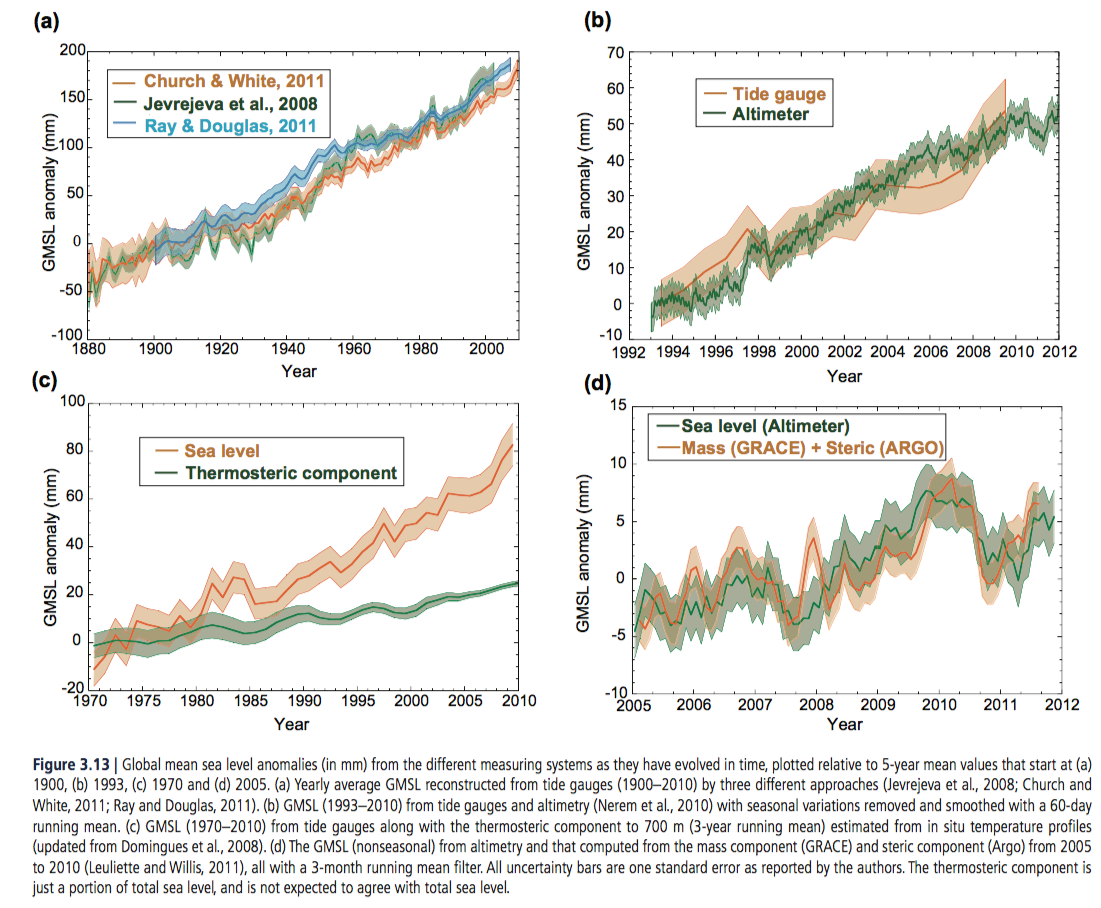
From AR5, chapter 3
Figure 1 – Click to expand
- The top left graph shows that various researchers are fairly close in their calculations of overall sea level rise over the past 130 years
- The bottom left graph shows that over the last 40 years the impact of melting ice has been more important than the expansion of a warmer ocean (“thermosteric component” = the effect of a warmer ocean expanding)
- The bottom right graph shows that over the last 7 years the measurements are consistent – satellite measurement of sea level change matches the sum of mass loss (melting ice) plus an expanding ocean (the measurements from Argo turned into sea level rise).
This gives us the mean sea level. Remember that local winds, ocean currents and changes in salinity can change this trend locally.
Many people have written about the recent accelerating trends in sea level rise. Here is AR5 again, with a graph of the 18-year trend at each point in time. We can see that different researchers reach different conclusions and that the warming period in the first half of the 20th century created sea level rise comparable to today:
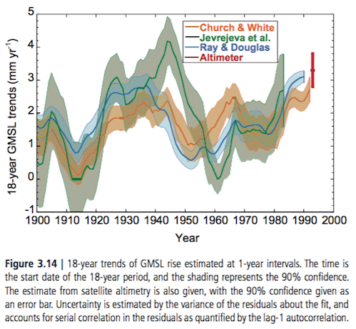
From AR5, chapter 3
The conclusion in AR5:
It is virtually certain that globally averaged sea level has risen over the 20th century, with a very likely mean rate between 1900 and 2010 of 1.7 [1.5 to 1.9] mm/yr and 3.2 [2.8 and 3.6] mm/yr between 1993 and 2010.
This assessment is based on high agreement among multiple studies using different methods, and from independent observing systems (tide gauges and altimetry) since 1993.
It is likely that a rate comparable to that since 1993 occurred between 1920 and 1950, possibly due to a multi-decadal climate variation, as individual tide gauges around the world and all reconstructions of GMSL show increased rates of sea level rise during this period.
Forecast Future Sea Level Rise
AR5, chapter 13 is the place to find predictions of the future on sea level, p. 1140:
For the period 2081–2100, compared to 1986–2005, global mean sea level rise is likely (medium confidence) to be in the 5 to 95% range of projections from process-based models, which give:
- 0.26 to 0.55 m for RCP2.6
- 0.32 to 0.63 m for RCP4.5
- 0.33 to 0.63 m for RCP6.0
- 0.45 to 0.82 m for RCP8.5
For RCP8.5, the rise by 2100 is 0.52 to 0.98 m..
We have considered the evidence for higher projections and have concluded that there is currently insufficient evidence to evaluate the probability of specific levels above the assessed likely range. Based on current understanding, only the collapse of marine-based sectors of the Antarctic ice sheet, if initiated, could cause global mean sea level to rise substantially above the likely range during the 21st century.
This potential additional contribution cannot be precisely quantified but there is medium confidence that it would not exceed several tenths of a meter of sea level rise during the 21st century.
I highlighted RCP6.0 as this seems to correspond to past development pathways with little CO2 mitigation policies. No one knows the future, this is just my pick, barring major changes from the recent past.
In the next article we will consider impacts of future sea level rise in various regions.
Articles in this Series
Impacts – II – GHG Emissions Projections: SRES and RCP
Impacts – III – Population in 2100
Impacts – IV – Temperature Projections and Probabilities
Impacts – V – Climate change is already causing worsening storms, floods and droughts
References
Observations: Oceanic Climate Change and Sea Level. In: Climate Change 2007: The Physical Science Basis. Contribution of Working Group I to the Fourth Assessment Report of the Intergovernmental Panel on Climate Change, NL Bindoff et al (2007)
Observations: Ocean. In: Climate Change 2013: The Physical Science Basis. Contribution of Working Group I to the Fifth Assessment Report of the Intergovernmental Panel on Climate Change, M Rhein et al (2013)
Sea Level Change. In: Climate Change 2013: The Physical Science Basis. Contribution of Working Group I to the Fifth Assessment Report of the Intergovernmental Panel on Climate Change, JA Church et al (2013)


Besides the known climate risks the risk of atmospheric disintegration has been under exposed.
Sulfate aerosols can profide a substrate for processes leading to catastrophic loss of stratospheric ozone. A snowball effect once started as cooling enhances further cooling.
_______________________________________________________________
Prather ‘Catastrophic Loss of Stratospheric Ozone in Dense Volcanic Clouds’
ftp://halo.ess.uci.edu/public/prather/papers/044_1992JGR_Prather-catastrophicO3loss-volcano.pdf
‘ 4. Laboratory and Atmospheric Constraints’
The different laboratory measurements are in qualitative agreement regarding the sharp dependence of reaction (2) on the water content of the sulfuric acid-water mix, although absolute values for gamma2 vary by a factor of 2. A gamma2 of 0.01 or greater corresponds to extremely wet mixtures with less than 52% by weight of H2SO4. Such wet sulphuric acid droplets would occur in the lower-middle stratosphere only if temperatures dropped to 197 K or less (approaching the threshold for condensation of nitric acid-water mixtures, or if water vapor were greatly enhanced.
…
5 Implications and Tests
The chlorine-catalyzed ozone loss predicted here for mid-latitudes is similar in magnitude to polar processes causing the Antarctic ozone hole, but is driven predominantly by the O+ClO and HOCL+hv cycles, rather than the Cl2O2 cycle..’
_______________________________________________________________
The reaction occurs if the temperature drops below a certain threshold and water vapor condenses on the surface of the aerosol. This creates the possibility for the same destruction mechanism as on the surface of polar stratospheric clouds. But, with the difference that this process only stops when there is to little ozone left for the reaction. It reduces the temperature inverse that currently stabilizes the atmosphere, thus leading to atmospheric disintegration.
It explaines recent measured temperature trends:
Nature: Vol 491, 29 November 2012
Thompson Etal ‘The mystery of recent stratospheric temperature trends’
page 694: ‘.. at altitudes sampled by SSU channel1, long-term tropical cooling is most likely to result from either anomalous rising motion, which decreases air temperature through expansion, or in situ ozone depletion, which decreases temperature by reducing the absorption of short-wave radiation.’
L. Peek’s proposed catastrophe has no basis in fact. It would require that lower stratosphere temperatures drop by about 30K. Ain’t gonna happen.
@Mike M. Could you please explain how a 30K decrease in temperature leads to the threshold temperature? And could explain why the effect occurs at current temperatures in dense volcanic clouds? And could you explain how you encompassed the influences as for instance the increase in CH4 in your answer?
On subsidence…
Galveston Island and New Orleans area
It is not physically possible for sea level rise to increase by more than 6 inches in 100 years (1.7mm per year). There is no evidence of any acceleration anywhere on the planet. Acceleration means there is a doubling period. To get to 1 meter by 2100 the acceleration would have to be in the 2% per year. That 2% has a doubling period of around 30 years. That means every 30 years the rate of increase is twice as much as all the previous years combined. That means by the last year, 2099, sea level would have to be rising some ten times the rate it is today. Not going to happen.
See also this recent paper on the subject:
Click to access 1-s2.0-S0964569116300205-main.pdf
J. Richard Wakefield
If lots of ice melts it is physically possible. If the temperature increases sufficiently it is physically possible.
I’m interested instead in the question about the likely outcomes. Perhaps you meant “unlikely”. But then you wrote “Not going to happen” as if you had presented virtually irrefutable evidence.
Discuss ice sheet dynamics and explain why a 1m rise by 2100 is “not physically possible”.
You provide no math to back up your claim. No evidence that the heat will be high enough to melt polar ice fast enough. So I have to, to prove my point.
There is no acceleration in the rate of rise. At current rate of 1.74mm per year that’s 14cm by 2100, not 100cm.
This is so easy to see what the acceleration would have to be to make 1 meter by 2100. So easy it can be done on a spread sheet.
To get to 100cm by 2100 would require an acceleration of 3.8% per year. By 2100 the yearly rate of rise would be 38.5mm/year or 22 times today’s rate. There is no other mathematical way, no other physical way, to get to 1 meter by 2100.
Hence, I say your claim is impossible.
Of course, that acceleration rate increases for every year the current sea level rise stays at the 1.74mm.
I guess you also dismiss the science reference I posted which backs up my claim. Why do you ignore the science you dont like? You should be relieved that the worst isnt going to happen.
Sure there is. There’s no reason that the acceleration has to be uniform or the sea level rise exponential. It can be super-exponential, sub-exponential, jumpy, etc. It could increase 2% one year and 3% the next, and 1% the year after that. It could increase at 2% per year for 3 decades, then 5% per year until the end of the century. Etc.
Mathematically, there are an infinite number of ways that we could see a meter of sea level rise by 2100. This is mathematically provable; a mathematical fact. (Not all of these ways are physically possible, of course, as we live in a finite universe).
Sea level rise at the end of the last glacial period was quite a bit faster than 1m/century, so the claim that “it is not physically possible for sea level rise to increase by more than 6 inches in 100 years” is incorrect.
Physically impossible == it can’t happen. It happened before. So it’s physically possible.
Not with Antarctic sea ice still growing.
You claim it can be many mathematical ways? Prove it. Take your numbers and see what happens in a spreadsheet.
For example. To go from zero to 100km/h in 60 seconds requires a specific over all acceleration. Slow that acceleration and you miss the speed in that time, increase it, you end up faster in that time. Over all, a specific acceleration is required to get to that speed in that time frame.
How do you explain the science papers that refute your claim and show no acceleration?
J. Richard Wakefield
Let’s assume acceleration is a constant. Now we get a result.
Let’s assume acceleration is not contact. All kinds of other results are possible.
A challenge for you:
Prove that d3l/dt3 = 0.
where l = global mean sea level, t= time.
scienceofdoom
Why are you being so complicated? If you have a slower than 3.8% acceleration you wont get to 1 meter by 2100. You would have to increase the acceleration above 3.8% to compensate. Over all, the average acceleration rate MUST BE 3.8% or you cant get to 1 meter by 2100.
Acceleration = change in velocity/time
That is the simple math of the issue.
Have you even tried to do this on a spreadsheet?
JRW, as ScienceOfDoom says, try not assuming that the acceleration is constant. It doesn’t have to be.
Yes, there are an infinite number of ways to get from 0 to 100km/h within 60 seconds. You can go accelerate to 100km/h within the first second, and the stay there for the remaining 59 seconds. Or accelerate to 100km/h in 2 seconds, and remain there for the remaining 58 seconds. Etc. Substitute any value between 0 and 60 for “2” in the previous example, of which there are an infinite number.
Acceleration does not have to be constant.
SOD’s challenge nails it.
Windchasers
And you think that will happen to sea level????? Again, regardless of what short term accelerations you do, the over all average MUST BE 3.8%.
The fact is, there is no evidence of any acceleration.
J. Richard Wakefield, see my comment below on your suggested paper.
Richard wrote: “It is not physically possible for sea level rise to increase by more than 6 inches in 100 years (1.7mm per year)”.
At the end of the last ice age, sea level rose, 120 m over 10 millennia, an average of about 1 m/century for 100 centuries. That is 5 times as fast as you say is physically impossible. And this was caused by about 5 degC of warming over many millennia. The worst case scenario is that we could get another 4 degC of warming (plus the one we already have experienced) over the next century. I don’t think we will get 1 m of SLR in the next century. but it not impossible.
Richard wrote: “There is no evidence of any acceleration anywhere on the planet.”
That isn’t quite correct? How does one measure the rate and acceleration of sea level rise? You do a multiple linear regression of sea level height (h) vs time and time^2 over a certain period of time and get h = at^2 + bt + c. Then you look at the confidence interval for the a and b coefficients. If the confidence intervals include zero, then you are forced to conclude that SLR or the acceleration of SLR is not statistically significant.
The key point is that you can only determine the rate and acceleration (or technically the AVERAGE rate or acceleration) over a given PERIOD of time. The noisier your data, the longer the period must be in order to get a statistically significant rate or acceleration. For tide gauge records, you generally need about 50 years of data to get a useful rate, one at least twice the confidence interval. So a tide gauge record is too noisy to tell us how much sea level rose in Miami, Fl during the last decade and possibly during the last quarter century. And if we are having trouble getting the average rate of rise in less than a half-century of time, we are going to have even more trouble detecting acceleration. The absence of statistically significant acceleration may not evidence that SLR is not accelerating, it just means that acceleration isn’t fast enough to be conclusively detect against a background of noise.
It can help to look at many tide gauge records and average the results. Unfortunately, there is glacial isostatic rebound in some locations and subsidence in others and the records start and end at different times. Most composite analyses of tide gauges remove “outliers”, with potential for cherry-picking.
The same requirement for a period applies to satellite altimetry. The data can’t reliably measure a rate of SLR in 2016, but it does give a useful rate for the last decade or two. However, our two decades of data is too short a period to detect any acceleration in SLR – assuming there is any.
However, you can detect an acceleration in SLR by comparing the tide gauge record (an average rate for a period of at least a half-century) and the altimetry record averaged over the past two decades. It would be vastly preferable to detect acceleration using tide gauges alone or satellite altimetry alone, but the data is too noisy for that. That implies that acceleration is small.
How much acceleration is needed to reach 1 m. Sea level is currently rising at a rate of 1″/decade and if acceleration were 1″/decade/decade (quadratic acceleration, not exponential), then SLR would total 1 m around the end of the century. So we don’t appear to be on track for 1 m of SLR right now. However, we should ask, if SLR rose to 2″/decade, how long a PERIOD would be needed to prove statistically significant acceleration was occurring? Probably about two decades.
I used to be very confident that there was no sign of the acceleration needed to produce 1 m of SLR by the end of the century. Now I’m a little less confident, but still optimistic.
Here is a 100 year dataset. Do you see any acceleration?
https://tidesandcurrents.noaa.gov/sltrends/sltrends_global_station.shtml?stnid=680-140
Do your “1″/decade/decade” math and tell me what the rate of rise of sea level would be in the year 2099. Tell me that rate is realistic.
Sea-Level Acceleration Based on U.S. Tide Gauges and Extensions of Previous Global-Gauge Analyses
J. R. Houston† and R. G. Dean‡
†Director Emeritus, Engineer Research and Development Center, Corps of Engineers, 3909 Halls Ferry Road, Vicksburg, MS 39180, U.S.A. james.r.houston@usace.army.mil
‡Professor Emeritus, Department of Civil and Coastal Civil Engineering, University of Florida, Gainesville, FL 32611, U.S.A. dean@coastal.ufl.edu
Abstract
Without sea-level acceleration, the 20th-century sea-level trend of 1.7 mm/y would produce a rise of only approximately 0.15 m from 2010 to 2100; therefore, sea-level acceleration is a critical component of projected sea-level rise. To determine this acceleration, we analyze monthly-averaged records for 57 U.S. tide gauges in the Permanent Service for Mean Sea Level (PSMSL) data base that have lengths of 60–156 years. Least-squares quadratic analysis of each of the 57 records are performed to quantify accelerations, and 25 gauge records having data spanning from 1930 to 2010 are analyzed. In both cases we obtain small average sea-level decelerations. To compare these results with worldwide data, we extend the analysis of Douglas (1992) by an additional 25 years and analyze revised data of Church and White (2006) from 1930 to 2007 and also obtain small sea-level decelerations similar to those we obtain from U.S. gauge records.
http://www.jcronline.org/doi/abs/10.2112/JCOASTRES-D-10-00157.1?code=cerf-site
A recent paper by A. Parker and C.D. Ollier (Ocean & Coastal Management, 124, 1–9, 2016), concerned with the use of ‘proven’ sea-level data for coastal planning, contained a number of incorrect or misleading statements about sea-level data sets and measurement methods. In this commentary, we address aspects of sea-level records that could have been misunderstood by readers of that paper. While we agree with the main point made by the authors, that the best possible sea-level data are required by coastal planners, we suggest that planners should base their work on wider and better informed sources of sea-level information. …
I think http://www.nature.com/nature/journal/v517/n7535/full/nature14093.html is the best current estimate of sea level rise. Jevrejeva et al., in particular, was flawed (that was the IPCC study with the highest level of 1940s sea level rise). Using the Hay et al. approach makes it more likely that we’ve already observed acceleration. Note, contrary to Mr. Wakefield, sea level has been rising at 3.4 mm/year over the past 2+ decades (http://sealevel.colorado.edu).
Meanwhile, in terms of the IPCC projections, they do state in your quoted text the possibility of several tenths of a meter from Antarctica in addition to their range: the National Academies and USGCRP grant higher probabilities to that occurence, which is why the upper end of their ranges is closer to 2 meters. If I were a betting person, I’d probably go with about 0.8 meters as the median 2100 sea level rise.
From the paper I posted:
“The
satellite altimetry returns a noisy signal so that a þ3.2 mm/year trend is only achieved by arbitrary
“corrections”.”
Their rate of rise:
“. We show as
the naïve averaging of all the tide gauges included in the PSMSL surveys show “relative” rates of rise
about þ1.04 mm/year (570 tide gauges of any length)”
There’s nothing arbitrary about corrections applied to satellite altimetry data. Several groups have produced analyses and trends are all close to 3.4mm/yr. On the other hand, their laughable attempt to remove corrections from the satellite data is completely arbitrary. They literally took the (then) 3.2mm/yr trend and just subtracted 3.2. It’s a joke of a paper.
Global tide gauge averages for the altimeter period (1993-present) also agree on a rate of about 3mm/yr.
You say it is a joke of a paper, that’s because you dont like what it says. The joke is the claim that sea level will hit 1 meter by 2100 without any hint of acceleration.
Do you see any acceleration?
https://tidesandcurrents.noaa.gov/sltrends/sltrends_global_station.shtml?stnid=680-140
You say it is a joke of a paper, that’s because you dont like what it says.
Nope, there are plenty of papers I disagree with, and very few of them are jokes. The paper you linked is in the joke category.
They dismiss the satellite altimeter analyses based on nothing, then claim to “remove subjective corrections” without any analysis of those corrections – they just assumed based on nothing that the trend without corrections must be exactly zero so subtracted the trend. It’s ridiculous.
paulski0
Dont tell me. Tell them. Publish a paper refuting. Until that is done their paper stands.
J. Richard Wakefield,
They (your favored authors) claim, without evidence, without analysis, and without even citing any papers on the satellite algorithms – that two satellite groups arbitrarily add a trend to zero to create a trend they believe exists.
In essence they claim fraud or complete incompetence. And they just claim it.
No rebuttal is necessary in the peer-reviewed literature.
Because there are already 10s or 100s of papers analyzing and confirming these satellite algorithms and results.
Perhaps your authors are correct. If so, they need to prove it. This means demonstrating they understand the theory and practice of the satellite groups with references.
I doubt they have a clue myself, but I’m just running with the odds. A paper by a geologist and someone else (couldn’t find his background) publishing in a paper that has no knowledge of satellite algorithms. What was the background of the peer reviewers?
A journal that covers subjects like:
– Implementation feasibility of a marine ecotourism product on the reef environments of the marine protected areas of Tinharé and Boipeba Islands (Cairu, Bahia, Brazil)
– Balancing sustainability in two pioneering marine national parks in Scandinavia
– Maritime spatial planning and spatial planning: Synergy issues and incompatibilities. Evidence from Crete island, Greece
is unlikely to have any expertise in satellite measurement.
Based on my analysis of large numbers of papers including papers in the field of satellite measurements (ERBE, AIRS, CERES, and many others) I found them to be painstakingly thorough.
scienceofdoom
Did you tell them that yet? Not going to give them a chance to defend their position? Isnt that what science is about? I reject your claim of their paper until you get a reply from them. Do science!!
Missing from the above budget is groundwater extraction. There’s been back and forth about relative contribution of extraction and dam water storage.
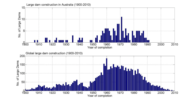
Estimates of groundwater extraction exceeded 1mm/year IIRC. Dam storage was thought to have largely negated that. However, dam storage is only a factor while the dam is filling. Afterward, dam storage goes to zero. And while large dam construction has gone towards zero, ground water extraction is continuing to increase:
That’s not entirely true. Lake Powell, behind the Glen Canyon Dam, for example, leaks about 120 billion gallons of water per year into the porous sandstone underlying the lake. Combine that with the evaporation loss and the downstream water users are short about 6% of the flow of the river.
Also, evaporated water tends to find it’s way back to the ocean. I wonder how well these things are assessed. What is the storage in small dams, stock tanks, and the like?
OK, so we have from IPCC a sea level increase of 0.33 to 0.63 m for RCP6.0, with nearly identical values for RCP4.5. Is the range due to varying estimates of climate sensitivity?
If so, we should expect something at the bottom of the range, since actual sensitivity appears to be at the bottom end of the IPCC range. That would be about 3.9 mm/decade, which is higher than even the highest estimates for recent increase. If forcing continues to rise linearly for the rest of the century (smack in between RCP4.5 and RCP 6.0) then temperature should rise linearly. Is there some solid reason to expect that a linear increase in temperature should lead to a non-linear increase in sea level?
Mike,
The expansion of sea water gives us something relatively linear. The melting of ice is the non-linear aspect and not well constrained.
Ice sheet dynamics is difficult. For the sake of an example, you could warm the climate until 2100 then hold temperature constant and sea level might well be higher in 2200 than 2100, and the increase from the last 100 years might be higher than the first 100 years.
SoD,
That makes sense. Even a super simple model in which rate of net melting is linear in temperature anomaly would give a quadratic result for cumulative melting.
I was surprised by the small thermosteric contribution in Figure 1. I had always read that it was the major contribution. Do you know if that is a recent re-evaluation (perhaps due to Argo float data)?
Correction to my comment above: I wrote “3.9 mm/decade” where it should have been “3.9 mm/yr”.
Minor point, just because I think it’s fun: Melting ice floating in pure water does not change the water level, as you say. But melting ice floating in seawater does change the water level, due to the change in salinity. But it is a very small effect.
Mike
I was surprised by that as well. Had also believed the same as you. Haven’t dug into it.
The steric contribution during the ARGO period is indeed quite small, about 0.3mm/year according to Cazenave, et.al., 2009. It’s not at all clear, however, that it’s been that small for the entire century.
SOD: The rate of SLR after the last ice age didn’t reach zero until sometime between 2 and 4 millennia ago. (Zero means less than 2″/century.) So I would say warming through 2100 is likely to produce sea level rise through 3100.
The thermosteric graph above shows only contribution from 700m depth. Full depth would be larger. AR5 Chapter 13 covers the sea level budget in more detail and assesses observed full depth thermosteric contribution to be 0.8mm/yr over 1971-2010 – a little under half of the best estimate observed SL trend.
Durack et al. 2014 found that spatial coverage of available observations likely causes an underestimate of true global ocean heat content accumulation over 1970-2004.
The Argo era is typically now defined as 2005-onwards because of sparse coverage prior to 2005. Still, I’m not sure that would necessarily change the picture of a relatively small trend from 2003-2008. According to 2000m depth Levitus data the most recent equivalent period of the Argo era (2011-2016) produces a trend of about 1.65mm/yr. I suspect this variation is partly real and partly due to coverage biases which tend to exaggerate influence of Pacific variability (e.g. von Schuckmann et al. 2014). Trend over the full Argo period (2005-2016) is currently 1.15mm/yr.
Experiments in reconstructing twentieth-century sea levels
Abstract
One approach to reconstructing historical sea level from the relatively sparse tide-gauge network is to employ Empirical Orthogonal Functions (EOFs) as interpolatory spatial basis functions. The EOFs are determined from independent global data, generally sea-surface heights from either satellite altimetry or a numerical ocean model. The problem is revisited here for sea level since 1900. A new approach to handling the tide-gauge datum problem by direct solution offers possible advantages over the method of integrating sea-level differences, with the potential of eventually adjusting datums into the global terrestrial reference frame. The resulting time series of global mean sea levels appears fairly insensitive to the adopted set of EOFs. In contrast, charts of regional sea level anomalies and trends are very sensitive to the adopted set of EOFs, especially for the sparser network of gauges in the early 20th century. The reconstructions appear especially suspect before 1950 in the tropical Pacific. While this limits some applications of the sea-level reconstructions, the sensitivity does appear adequately captured by formal uncertainties. All our solutions show regional trends over the past five decades to be fairly uniform throughout the global ocean, in contrast to trends observed over the shorter altimeter era. Consistent with several previous estimates, the global sea-level rise since 1900 is 1.70 ± 0.26 mm yr−1. The global trend since 1995 exceeds 3 mm yr−1 which is consistent with altimeter measurements, but this large trend was possibly also reached between 1935 and 1950.
I thought it wasn’t the melting of ice that was the problem, but rather the collapse of ice sheets on land allowing ice into the sea ‘rapidly’. The history of sea level changes is periods of slow change punctuated by rapid surges… It’s the surges that are the biggest problem.
Which ice sheets are collapsing into the ocean beyond normal? Speculative BS.
No, it’s actual history. At the end of the last ice age, that’s what happened. Multiple pulses of rapid sea level rise due to ice sheet collapse. You need to investigate the mechanics of large ice sheets
Nathan Tetlaw
You need to provide evidence this is happening today on the scale needed to rise sea level by 1 meter. Not models. Not speculation. Which specific ice sheets are currently doing this.
Nathan Tetlaw,
I think that ice sheath collapse at the end of glacial periods is widely accepted. But for current ice sheath conditions it is highly speculative. The leading candidate seems to be the West Antarctic ice sheath. If that collapsed, it would raise seas level by 2-3 meters over several centuries. Maybe something like 5-10 mm/yr, if I’ve done my sums right. Not nothing, but does not seem catastrophic,
The West Antarctic ice sheet has been around for at least 20-30 million years. It didnt collapse (or it wouldnt be there today). So what evidence is there it will collapse today? None.
Hi Mike M
But that 5-10mm per year is in addition to the rest from thermal expansion etc. On it’s own it may not sound like much, but it needs to be viewed in the context of increasing CO2 concentrations
This paper Indicates it could take a few thousand years; but most of the rise is near the start:
Click to access feldmann_levermann15b.pdf
J Richard Wakefield
There was very little ice at the pole last time CO2 was this high – it’s mostly all unstable at this CO2 concentration. Also note we don’t need a big Sea level rise to have pretty crap outcomes.
Apparently people have though the WAIS is unstable since the early 1970s…
Click to access jgr_hughes_1973_wais_instability.pdf
Nathan Tetlaw,
You wrote: “But that 5-10mm per year is in addition to the rest from thermal expansion etc.”
OK, so 8-12 mm per year total. A meter per century as a near a worst case scenario.
You wrote: “There was very little ice at the pole last time CO2 was this high”
Irrelevant. The last time CO2 was this high, the continents were in different positions. The cooling over the last ~20 million years was not due to CO2 change, so the formation of Antarctic ice was not due to CO2 change.
You wrote: “it’s mostly all unstable at this CO2 concentration”.
There is no evidence for that, There is speculation that some of it might be unstable.
You wrote: “Also note we don’t need a big Sea level rise to have pretty crap outcomes.”
I disagree. A sudden rise of even a meter would be a big problem. But a rise of even a meter a century is probably something we could readily deal with. The main problem would be the interaction with built infrastructure. How much of our built infrastructure was around even a century ago? Rate matters.
You wrote: “Apparently people have though the WAIS is unstable since the early 1970s. ”
They have been speculating about that since the 70’s. And 40 years later they are still just speculating, in spite of the fact that some are determined to obtain that result.
“There was very little ice at the pole last time CO2 was this high – it’s mostly all unstable at this CO2 concentration. Also note we don’t need a big Sea level rise to have pretty crap outcomes.”
That is false.
https://phys.org/news/2015-12-east-antarctic-ice-sheet-frozen.html
14myo CO2 was well above 1000ppm.
“The last time CO2 was this high, the continents were in different positions. ”
This high???? CO2 hasnt been this low in over 300 million years. 50myo CO2 was five times. 120 myo CO2 was twenty times. Even 120myo the continents were close to where they are now. Atlantic was half the width. India was an island fresh separated from Antarctica.
Hi Mike
It wouldn’t be 8-10, it would be higher again. (you were assuming linear and it isn’t linear it’s front-loaded)
And the current rate of 3 (over the last few years) is already showing impacts along the East Coast of the US
So, it’s already a problem.
You’re also not considering other effects like coastal erosion, seen estimates of 10cm of erosion for each mm of sea level rise (rule of thumb here, would depend on the nature of the shore line)
The continents may be in a different position, but the fact remains at these levels of CO2 we have no ice sheets in geological times; perhaps in the Ordovician, but that was very different.
Modelling also suggests that 400ppm CO2 = unstable ice sheets.
Not saying it’s imminent, just saying they’re unstable
J R Wakefield
Yes, but hasn’t been this high since prior to Antarctic Glaciation…
Oh well it may have been very slightly higher
http://www.sciencedirect.com/science/article/pii/S0031018213000047
But you get the drift.
Last time CO2 was at 400ppm Sea Levels were around 25m above what they are today
https://en.wikipedia.org/wiki/Pliocene_climate
Nathan Tetlaw
It’s not that polar ice is unstable, it’s that it’s extremely rare in earth history. we are talking about only the last 0.2% of earth history.
On the robustness of Bayesian fingerprinting estimates of global sea-level change
Abstract
Global mean sea level (GMSL) over the 20th century has been estimated using techniques that include regional averaging of sparse tide gauge observations (e.g., Douglas, 1997; Jevrejeva et al., 2008), combining satellite altimetry observations with tide gauge records in empirical orthogonal function (EOF) analyses (e.g., Church and White, 2011), and most recently, the Bayesian approaches of Kalman smoothing (KS) and Gaussian process regression (GPR) (Hay et al., 2015). Estimated trends in GMSL over 1901-1990 obtained using the Bayesian techniques are 1.1-1.2 mm/yr, ~20% lower than previous estimates. It has been suggested that the adoption of a less restrictive subset of records biased the Bayesian-derived estimates (Hamlington et al., 2015). Here we use different subsets of records to demonstrate that GMSL estimates based on the Bayesian methodologies are robust to tide gauge selection. We also present and apply a method for determining the resolvability of individual sea-level components estimated in a Bayesian framework. We find that the incomplete observations result in posterior correlations between individual sea-level contributions, making robust separation of the individual components impossible. However, various weighted sums of these components, as well as the total sum (i.e., GMSL) are resolvable. Finally, the KS and GPR methodologies allow for the simultaneous estimation of sea level at sites with and without observations. We present the first KS and GPR global maps of sea-level change over the 20th century. These maps provide new estimates of 20th century sea level in data sparse regions.
This is, imo, the best sea level group. Their number for the rate of 20th century sea level rise, 1.1-1.2 mm/yr, is well below most. They have now defended their work.
J. Richard Wakefield proposes this paper:
Coastal planning should be based on proven sea level data, A Parker, CD Ollier, Ocean & Coastal Management (2016)
It’s very much an outlier compared with other papers on sea level rise. They propose a sea level rise of about 0.25mm/yr.
They claim satellites are arbitrarily corrected from zero to a (comparatively) large positive trend.
For example:
They don’t reference the papers on the satellite calculations so the first possibility is that they have no idea about the algorithms. A second possibility (their favorite I think) is that the satellite groups just make it up as they go along.
Maybe there isn’t even a satellite.
They cite Nerem et al (2007) as providing implicit support. Here is what Nerem and colleagues had to say:
I recommend reading the whole comment (it is short and illuminating).
—
I tried to see whether they claimed any support from any other researchers.
Early in the paper say:
I looked up the first reference, Is there a 60-year oscillation in global mean sea level? Don P Chambers et al, GRL (2012), which says:
[Emphasis added].
Perhaps I will dig into satellite calculations a little further. It may be too much of a diversion for this series.
It isn’t just satellite altimetry that shows increasing sea level. There’s also GRACE that shows increasing ocean mass and decreasing ice sheet mass. The change in sea level calculated from the GRACE experiment data is very similar to the Topex/Poseidon and Jason measurements.
Nope:
Conclusion :
The two extremely different methods of level and gravity measurements (GRACE satellites) agree surprisingly well, to one tenth of a millimeter, with 1.7 mm / yr each! However, this again raises the question, which is repeatedly criticized in the literature, which is why the satellite measuring methods TOPEX / POSEIDON / JASON – as the only one of all measurement methods – give nearly twice as high values ( è chapter 8)) :
J. Richard Wakefield,
Your question is: Why do reported trends from tide gauge reconstructions typically differ from satellite altimeter trends?
Answer: Because they’re looking at different periods of time. According to your link the 1.65mm/yr trend refers to the period 1700-2013. Tide gauge reconstructions within the satellite era (1993-present) agree on a rate of about 3mm/yr. This is an example of what acceleration may look like.
If you go back to the original article linked in your Puls authored reference that claims GRACE showed only 1.7mm/year:
http://sealevel.colorado.edu/content/continental-mass-change-grace-over-2002%E2%80%932011-and-its-impact-sea-level
You find that the sea level rise from mass change as measured by GRACE in the period from 2002-2011 is 2.5mm/year, 1.1mm/year from continental water and 1.4mm/year from ice sheet melting. Add thermal expansion and you get over 3mm/year, not 1.7. Apparently Puls has a problem with English.
So you are agreeing then that sea level rise is 1,74mm per year. That’s not 1 meter by 2100.
http://hockeyschtick.blogspot.ca/2013/10/satellite-sea-level-data-has-been.html
Again, I post this on the difference with satellite data:
Richard Wakefield. I tend to agree with you. I think that a sea level rise of 75 cm or 1 m by 2100 is almost impossible. When those who call themselves climate scientists come with these predictions they most clearly show their incompetence or lack of understanding. So large accelleration in SLR would need substantial melting of Greenland and Antarctica. Climate models predict that the South Pole will be colder with more CO2 and that high altitudes of Greenland will not get warmer. That says something, even if climate models are unreliable. It is interesting to look at why many climate scientists get this so wrong. One reason is that they overestimate the current sea level rise, with few exceptions. And that they rely too heavy on satellite models. And another reason is that they rely too much on general climate models. I hope to come back with examples of sea level rise exaggerations related to tide gauges. How CSIRO and Peltier models get GIA adjustments wrong.
From the activist Aslak Grinsted.(who call himself a scientist): presenting IPCC ca 0,75 m SLR by 2100 as most probable: “For the ice sheet contribution we used a shap-shot of the expert uncertainty from 2012 (Bamber & Aspinall, 2013). Since then several studies have found that parts of Antarctica is already collapsing. This new knowledge may alter expert opinion (as we note in the paper), but we can only speculate by how much. This has led Joe Romm at Think Progress to argue that our study therefore “vastly* underestimates” worst case sea level rise. However, domain experts are ahead of the game, and ice sheet experts have long considered the possibility of a collapse. It is important to realize that the expert elicitation we used did not only ask for a best estimate, but asked each scientist to give a confidence interval. And it is clear from their responses that they did consider this possibility. ” and “We construct the probability density function of global sea level at 2100, estimating that sea level rises larger than 180 cm are less than 5% probable.”
And Hay et al who stand for another attitude and understanding as JCH present
nobodysknowledge,
I agree with your conclusion and think you makes some good arguments. But you say that you agree with Wakefield. Do you really agree with his argument, or only his conclusion?
Wakefield’s argument seems to be that we can draw conclusions about physical systems just by using algebra, without regard to either physics or the properties of the system. He then assumes that all change must be exponential. Since exponential growth tends to give intuitively surprising results, his assumption leads to intuitively surprising results. Then he concludes that the intuitively surprising result must be “impossible”. Silliness, arrogantly expressed.
Windchasers
And you think that will happen to sea level????? Again, regardless of what short term accelerations you do, the over all average MUST BE 3.8%.
The fact is, there is no evidence of any acceleration.
Mike M.
You cannot go from one speed to another speed without going through acceleration.
Not even the 3mm/y will make 1 meter by 2100. So when we see this new rate to get us to 1 meter? Next year? Next 10 years? Ever?
Mike M. Thank you for your comment. When some scientists come with their predictions of sea level rise, they come up with some huge accelleration. Earlier predictions should have resulted in higher sea level rise by now. And the logic of accelleration result in very high SLR by the end of the century. I don`t know if models show an exponential growth. It can be OK that Wakefield show where it develops if it is followed ad absurdum. But I think you are right when you say that it cannot be that way in the real world. When a scientist say he can guarantee that sea level will rise 75 cm at the end of the century (from 2009), he clearly implicate a great accelleration and has lost some perspective.
Earlier predictions should have resulted in higher sea level rise by now.
If Hay and Mitrovica are correct:
1900 to 1990 – 1.1 to 1.2 mm/yr
1993 to present – 3.27 mm/yr
last ten years – 4.27 mm/yr
last 5 years – 4.92 mm /yr
Even so, I can find nothing that suggests the SLR should have reached a specific level by 2017.
About the logic of exponential rise:
“We hypothesize that ice mass loss from the most vulnerable ice, sufficient to raise sea level several meters, is better approximated as exponential than by a more linear response. Doubling times of 10, 20 or 40 years yield multi-meter sea level rise in about 50, 100 or 200 years. Recent ice melt doubling times are near the lower end of the 10-40-year range, but the record is too short to confirm the nature of the response” Hansen et al. 2016
Hansen, J., M. Sato, P. Hearty, R. Ruedy, M. Kelley, V. Masson-Delmotte, G. Russell, G. Tselioudis, J. Cao, E. Rignot, I. Velicogna, B. Tormey, B. Donovan, E. Kandiano, K. von Schuckmann, P. Kharecha, A.N. LeGrande, M. Bauer, and K.-W. Lo, 2016: Ice melt, sea level rise and superstorms:
In an interview on CNN’s Fareed Zakaria GPS, Hansen could have corrected Zakaria when he said, “You say that there will be a 10-feet rise in 50 years.” But instead, Hansen responded, “Not only would it be 10 feet, but it would imply that in the next decades after that it would be even more.” From arstechnica 2015.
What is the point? Hansen is not a sea level scientist. Those scientists, and the IPCC, are not going to go there unless they can model the dynamics that get land-based ice into the ocean at that speed. That modelling does not exist at this this time.
There is nothing I can find that predicts sea level was going to reach a certain rate by 2017. It’s obvious that a small fraction of the rise expected by 2100 is going to happen in the first 1/4 of the 21st century.
Also, the current holiday of SSH numbers coming in above trend is the longest in the satellite record… since just after the start of 2015. If this continues, and it does not look like 2017 will provide much of a break, is not acceleration in the satellite record unavoidable in the near future?
In 1988, James Hansen told Congress that the Midwest will have frequent episodes of very high temperatures in the current decades, predicted 3 to 9 degrees warming by 2025, and predicted 1 to 4 feet sea level rise by the middle of this century. Most probable scenario ca 75 cm SLR by 2050. With his idea of exponential growth, what would that be in 2017?
First it has to get hot. The rate of rise since 2013 is just under 6 mm/yr. The temperature rise since 2013 is: record warmest year; record warmest year; record warmest year.
I know, impossible.
“First it has to get hot. The rate of rise since 2013 is just under 6 mm/yr. The temperature rise since 2013 is: record warmest year; record warmest year; record warmest year.”
“warmest” by the fact that winters are getting milder and shorter. But summer temps are not increasing. The number of heat wave days are not increasing (still held by the 1930s). Not even record breaking TMax in the summer is any indication as those record days are temps LOWER than record days held in years before 1950.
SOD: As best I can tell, the sea level altimetry groups aren’t very candid about their methodology. I spent some time at one site reading some working documents. IIRC, they can’t keep track of satellite altitude to better than 1 cm/yr in a good year, which is not good enough to measure 3 mm/yr of SLR. So they have to calibrate satellite altitude using reference points on the surface of the earth with as little land nearby as possible. One reference is an old oil-drilling platform off of California. There appear to be many more. All reference sites have been monitored by GPS for more than a decade and corrected for local motion. The data also needs to be corrected (using reanalysis data) for the weather that lies between the satellite and the surface, the state of the ionosphere, the roughness of the ocean etc. Before they started calibrating, they were reporting no appreciable sea level rise during the first five years.
[…] « Impacts – VI – Sea Level Rise 1 […]
To further my claim this is impossible, keeping an average acceleration of 3.8%, then by 2110, only ten years after 2100 with one meter rise, by 2110 sea level rise would be 145cm, that’s a 45% increase in just 10 years. The rate of rise in 2110 would be 56mm/yr.
By 2125 sea level rise would be 2.6 meters with a rate of 98mm/yr.
By 2200 sea level rise would be 4.4 meters with a rate of rise of 1602mm per year (1.6 meters per year).
Welcome to compound growth (acceleration).
I say again, impossible.
Typo on my part. (cant edit a post???) By 2200 sea level rise would be 44 meters, not 4,4,
[…] Parts VI and VII we looked at past and projected sea level rise. It is clear that the sea level has risen […]
SOD: With 20/20 hindsight, it is hard to scientific discussion about the net result of SLR by multiple mechanisms. One could have a scientific discussion of the expected time course of expansion after various amounts of SST warming. One might have a scientific discussion of surface melting on Greenland as a function of surface temperature. (Probably negligible.) One might have a scientific discussion about the rate of erosion of grounded underwater ice with rising ocean temperature. Maybe one could have a scientific discussion about the balance of forces keeping an ice-sheet in a steady-state and what happens when the edges change.
SOD: Rising and finishing the above thought. With 20/20 hindsight, it is hard to have a scientific discussion about the net result of SLR by multiple mechanisms. One might have a scientific discussion of the expected time course of expansion after various amounts of SST warming. One might have a scientific discussion of surface melting on Greenland as a function of surface temperature. (Probably negligible.) One might have a scientific discussion about the rate of erosion of grounded underwater ice with rising ocean temperature. Maybe one could have a scientific discussion about the balance of forces keeping an ice-sheet in a steady-state and what happens when the edges change. One could have a scientific discussion about what limits the Holocene Climate Optimum places of the relationship between ice sheet mechanics in Greenland and temperature. Constraints have probably also been derived from disappearance of ice sheets at the end of the last ice age – which took 10 millennia. (Did those sheets flow into the ocean (as projected for Antartica and mostly?for Greenland.)
However, when the net result of all of these processes is lumped into one overall rate of SLR and possibly arbitrarily fit with empirical linear, quadratic or exponential functions, the discussion quickly degenerates to opinion with little scientific basis.
There is a work to be done to disentangle the lumps. And I am not sure the scientific community is honest or interested enough to do this job. Papers that take tide gauge data as a departure are most honest, I think. And then you have to go into every dataset to sort out the mechanisms of sea level change. There are very few datasets which are reliable enough and that can show long time trends and variations.
Thompson et al has said that tide gauges are underestimating sea level change, because of their placement, and think that Greenland ice sheet and other glaciers rapid melting leave a fingerprint. I think that is true, but when the glaciers ogf the NH and Greenland ice Sheet were melting very rapidly from 1920 to 1950, and should lesve the same fingerprint as today, it was not so pronounced in tide gauge data. How could that be. Was there a cooling of sea shores that stopped some sea level rise? Or were there other mechanisms? Can deeper ocean warming and cooling play some part? As Wunch and Heimbach showed (2014) there are also warming from the medieval warm period and cooling from little ice age still working in deep oceans, leaving some spatial fingerprints.
An example: How can you understand New York tide gauge data. When corrected for GPS measure of land subsidence it shows a sea level rise of 0,88 mm pr year for the 20th century. When Church and White come with their “god-know-what” correction (also called GIA), they get a sea level rise of more than 2 mm pr year. I think that tide gauge and GPS are doing a good job, and that it is reasonable that New York show a sea level rate with some Greenland melting finerprint from the first half of the 20th century.
… We show that RSL in NYC rose by ~1.70 m since ~575 CE (including ~0.38 m since 1850 CE). The rate of RSL rise increased markedly at 1812–1913 CE from ~1.0 to ~2.5 mm/yr, which coincides with other reconstructions along the US Atlantic coast. …
To begin an abstract in this way put me in a suspicious mode:
“New York City (NYC) is threatened by 21st-century relative sea-level (RSL) rise because it will experience a trend that exceeds the global mean and has high concentrations of low-lying infrastructure and socioeconomic activity.”
Agenda before science. Big conclusions based on proxies. Use proxies to suspend measurements. How can you conclude like that, Andrew C Kemp, Troy D Hill, Christopher H Vane, Niamh Cahill, Philip M Orton, Stefan A Talke, Andrew C Parnell, Kelsey Sanborn, Ellen K Hartig?
JCH.
Some afterthought. Perhaps not so grat difference after all between some proxies and measurement, when we account for land sinking. But I think proxies are best fitted to some long trnds, lasting for some hundred years. And that uncertainties grow big when it is used for short periods.
To end an abstract in this way also make me suspicious:
“The current rate of RSL rise is the fastest that NYC has experienced for >1500 years, and its ongoing acceleration suggests that projections of 21st-century local RSL rise will be realized.”
Activist fingerprint? Activists who call themselves scientists.
Nobodysknowledge: Your comments are interesting. However, the biggest limitation with tide gauges is that you need decades of data from a tide gauge to produce a trend with useful signal-to-noise (trend/confidence interval). The NYC tide gauge can’t tell us much about SLR there since 2000. Detecting acceleration is even more challenging. It would be useful to be able to trust the satellite record.
Frank.
I don`t know if the satellite-boys can trust their own records. How can they detect that satellite altimeters are wrong? By comparing them to tide gauges:
“Several major improvements to an existing method for calibrating satellite altimeters using tide gauge data are described. The calibration is in the sense of monitoring and correcting temporal drift in the altimetric time series, which is essential in efforts to use the altimetric data for especially demanding applications. Examples include the determination of the rate of change of global mean sea level and the study of the relatively subtle, but climatically important, decadal variations in basin scale sea levels.”
From: An Improved Calibration of Satellite Altimetric Heights Using Tide Gauge Sea Levels with Adjustment for Land Motion. G T Mitchum, 2000.
Would they use this method if they didn`t trust tide gauges?
nobodysknowledge,
Pretty much all the satellite measurements are still works in progress. Christy and Spencer at UAH are on version 6 of their software to convert MSU readings to air temperature. The advantage of satellite data is that it covers a vast area. The disadvantage is that it can be quite noisy and has to be averaged over time and space. It may also not be an absolute measure and require some sort of reference method. I would think that comparing reliable tide gauge series to satellite altimetry for that local area would be a no brainer.
nobodysknowledge wrote: “”How can they detect that satellite altimeters are wrong? By comparing them to tide gauges … Would they use this method if they didn`t trust tide gauges?”
The key is understanding that the measurements are not wrong so much as that they are biased in understandable ways. So by intelligently combining measurements, one can largely eliminate the biases.
From: http://sealevel.colorado.edu/content/calibration
“Briefly, the method works by creating an altimetric time series at a tide gauge location, and then differencing this time series with the tide gauge sea level time series. In this difference series, ocean signals common to both series largely cancel, leaving a time series that is dominated by the sum of the altimetric drift and the land motion at the tide gauge site. Making separate estimates of the land motion rates and combining the difference series from a large number of gauges globally results in a times series that is dominated by the altimeter drift. Since the difference series at separate time gauge locations have been shown to be nearly statistically independent[2], the final drift series has a variance much smaller than any of the individual series that go into it.”
So in any given difference series, the errors from drifting orbit and land motion can not be distinguished. But the former error is the same for every tide gauge while the latter errors cancel when you combine many tide gauges.
75 pages… good read.
Key findings include that:
● For almost all future GMSL rise scenarios, RSL rise is projected to be greater than the global average along the coasts of the U.S. Northeast and the western Gulf of Mexico.
● Under the Intermediate and Low GMSL rise scenarios, RSL is projected to be less than the global average along much of the Pacific Northwest and Alaska coasts.
● Under the Intermediate-High, High and Extreme GMSL rise scenarios, RSL is projected to be higher than the global average along almost all U.S. coasts outside Alaska.
Mike M wrote: “So in any given difference series, the errors from drifting orbit and land motion can not be distinguished. But the former error is the same for every tide gauge while the latter errors cancel when you combine many tide gauges.”
In theory. At the risk of sounding like every paranoid skeptic at WUWT, I spent some time trying to understand why Morner has been complaining about the satellite record. (IMO, Morner has shown that the dispersion in the tide gauge records due to subsidence and rebound allows one to cherry-pick a rate of SLR – until GPS corrections are standard.) In practice, converting the time it takes signals to bounce off the ocean and return to the spacecraft into a distance is a highly complicated process that depends on the state of the sea surface and knowledge of the atmospheric conditions between, which are obtained from reanalysis for the lower atmosphere and ? for the upper atmosphere. I got the impression they weren’t calibrating altitude vs surface landmarks for the first few years. Morner has graphs showing that the earliest reported rate of sea level rise was zero until it was suddenly adjusted upward around 2000, which could be when calibration became standard. (It isn’t clear how one could go back in time if one wasn’t collecting the needed calibration data all along). A major software error was also discovered. The ambiguous state of the satellite results then can be detected in the tone of AR3:
http://www.grida.no/publications/other/ipcc_tar/src=/climate/ipcc_tar/wg1/426.htm
One calibration site appears to be an old oil drilling platform off the coast of South California, where there is no land nearby that can return a signal, but there may be a dozen or more by now. What appears to be missing from all of this are publications that cover precisely how the current record is being produced (as opposed to research comparing methods for signal processing and how one satellite compared with another). Sea level has not reached the status of an official climate data record (CDR). UAH and RSS have.
Haines, B. J., D. Dong, G. H. Born, and S. K. Gill. 2003. The Harvest experiment: Monitoring Jason-1 and TOPEX/Poseidon from a California offshore platform. Marine Geodesy 26:239–260.
Click to access nerem_etal_2010_SLR_topex_jason.pdf
There are least five groups reporting the change SL from satellite data. I don’t know what analysis procedures they share in common (satellite track? sea level height vs location?) and what they calculate completely independently. I believe at least one record was recently adjusted down to produce an overall trend less that 3 mm/yr.
/paranoia
We show that improved geophysical corrections, dedicated processing algorithms, reduction of instrumental bias and drifts, and careful linkage between missions led to improved sea level products. Regarding the long-term trend, the new global mean sea level record accuracy now approaches the GCOS requirements (of ~0.3 mm/year).
JCH,
“the new global mean sea level record accuracy now approaches the GCOS requirements (of ~0.3 mm/year)”
I am skeptical when people claim that “improved geophysical corrections, dedicated processing algorithms, reduction of instrumental bias and drifts” can lead to better accuracy, rather than better precision. Also, the reference they seem to cite says the target is 0.5 mm/decade: GCOS (2011) Systematic observation requirements for satellite-based data products for climate (2011 update)—supplemental details to the satellite-based component of the “Implementation plan for the global observing system for climate in support of the UNFCCC (2010 update)”. GCOS-154 (WMO, December 2011)
I will first cite the “Einstein of oceans”, Munk, at the end of the Enigma article: “We are in the uncomfortable position of extrapolating into the next century without understanding the last.” So how can we understand the last century?
Is there a way to select tide gauges that can be representative of sea level change. I will chose to follow P. R. Thompson, B. D. Hamlington, F. W. Landerer, and S. Adhikari in the paper : Supporting Information for \Are long tide gauge records in the wrong place to measure global mean sea level rise?”
They are arguing in the following way. “The TG records that are most likely to represent 20th century GMSL rise satisfy the following criteria:
(1) long and mostly complete time series,
(2) located where solid earth models generally agree on the rate of sea level change due to GIA. (Perhaps solid earth models should be disqualified instead of TG records for 49 stations excluded by these criteria?)
(3) minimally affected by local, non-GIA vertical land motion.”
Then they come out with 15 TG stations: Honolulu, San Francisco, San Diego, Balboa, Christobal, Key West, Pensacola, New York, Cascais, Newlyn, Marseille, Trieste, Buenos Aires, Auckland II, and Freemantle. If we should use GPS measurements to estimate sea level rise from these stations, there are some additional problems. Balboa and Christobal don`t have GPS stations close enough to the tide gauge station. There has been recently local land subsidence at Buenos Aires and Freemantle stations, affecting GPS measurements. San Francisco GPS “not robust” because of tectonics. Auckland GPS “not robust” because groundwater variations.
So there are 9 stations left. What do they say? First we use PSMSL Tide Gauge Data to estimate local sea level change mm pr year for the years 1900 – 1999 (by Xuru linear regression). Then go into SONEL GPS data, and find vertical land movement. This give an estimate of relative SLR. And then compare it to CSIRO and ICE-6G adjustments
Honululu 1905 -1999: 1,50mm/year. GPS: -0,23 (SLR: 1,27).
CSIRO GIA: 0,34 (SLR: 1,84). Peltier ICE-6G: -0,23 (SLR: 1,27).
San Diego 1906 – 1999: 2,21mm/year, GPS: -0,99 (SLR: 1,22).
CSIRO GIA: -0,26 (SLR: 1,95). Peltier ICE-6G: -0,73 (SLR: 1,48)
Key West 1913 – 1999: 2,25mm/year. GPS: -1,07 (SLR: 1,18).
CSIRO GIA: -0,22 (SLR: 2,03). Peltier ICE-6G: -0,82 (SLR: 1,43)
Pensacola 1924 – 1999: 2,17mm/year. GPS: -0,42 (SLR: 1,75).
CSIRO GIA: -0,58 (SLR: 1,59). Peltier ICE-6G: -1,07 (SLR: 1,10)
New York 1900 – 1999: 3,00mm/year. GPS: -2,12 (SLR: 0,88).
CSIRO GIA: -0,88 (SLR: 2,12). Peltier ICE-6G: -1,80 (SLR: 1,20)
Cascais 1900 – 1993: 1,61mm/year. GPS: – 0,05 (SLR: 1,56).
CSIRO GIA: 0,05 (SLR: 1,66). Peltier ICE-6G: -0,34 (SLR: 1,27)
Newlyn 1915 – 1999: 1,65mm/year. GPS: -0,17 (SLR: 1,48).
CSIRO GIA: -0,40 (SLR: 1,25). Peltier ICE-6G: -0,72 (SLR: 0,93)
Marseille 1900 – 1999: 1,16mm/year. GPS: -0,18 (SLR: 0,98).
CSIRO GIA: -0,04 (SLR: 1,12). Peltier ICE-6G: -0,32 (SLR: 0,84)
Trieste 1901 – 1999: 1,14mm/year. GPS: 0,32 (SLR: 1,46).
CSIRO GIA: -0,03(Bar) (SLR:1,11). Peltier ICE-6G: -0,03 (SLR: 1,11)
This gives a mean rate of sea level rise of 1,31. Church and White (CSIRO) get a mean rate of sea level change of 1,63 for the same tide gauge stations, with their GIA corrections. Peltier GIA adjustments come out with a very low SLR on these stations, with mean rate of 1,18 (after changing and correcting models for 25 years).
Frank and nobodysknowledge,
You both make good points. It is not at all clear if the satellite determination of sea level trends is superior to, or even as good as, an average of carefully analyzed tide gauges. And it is not clear if the satellites make it possible to decide between competing methods of analyzing the tide gauge data.
Church and White 2011 data
http://www.cmar.csiro.au/sealevel/sl_data_cmar.html
A list of the tide gauges used is available here (zipfile, 21,008 bytes)
Peltier data
http://www.atmosp.physics.utoronto.ca/~peltier/data.php
Rate of radial displacement (UP) at PSMSL locations: drad.PSMSL.txt
http://www.atmosp.physics.utoronto.ca/~peltier/datasets/Ice6G_C_VM5a_O512/drad.PSMSL.ICE6G_C_VM5a_O512.txt
NK and Mike M: The attached or linked Figure is from Morner. It’s not peer reviewed, so I don’t trust it. However, this early work does prove to me that one can cherry-pick a group of tide gauges that will produce a high or low rate of SLR. Tide gauges that lack correction for vertical land motion at the time gauge isn’t good enough these days. If the tide gauge is supported by sediment or sand (rather than bedrock), a nearby GPS reference point also is not good enough.
Frank: “The NYC tide gauge can’t tell us much about SLR there since 2000. Detecting acceleration is even more challenging. It would be useful to be able to trust the satellite record.”
The NYC tide gauge show a sea level rise of 2,78mm pr year from 2000 to 2016, when adjusted for vertical land movement (GPS). This is lower SLR than most other tide gauges. I think that it is meaningless to use this short time span to say anything about acceleration. And clearly much of the SLR after 2000 is part of a greater natural variation. We can see the same changes in periods of short time acceleration in the 20th century.
NK: Is that 2.78 mm/yr with a 95% confidence interval of 0.3 mm/yr or 3.0 mm/yr? With short periods and noisy autocorrelated data, confidence intervals can be so wide that the central estimate isn’t very meaningful.
NK: Here is some real trend data from PSMSL that illustrates my point:
New York (The Battery):
3.05 +/- 0.13 mm/yr (1900-2015) +/- 4.3%
4.40 +/- 0.95 mm/yr (1986-2015) +/- 22%
4X shorter period; 7X wider confidence interval. How wide will the confidence interval for be for 2000-2015? Guessing, half the length 4X wider confidence interval. 4.40 +/- 3.8 mm/yr???
Brest:
1.57 +/- 0.24 mm/yr (1900-2015) +/-15%
2.53 +/- 1.29 mm/yr (1986-2015) +/-51%
It all depends on how accurately you wish to know the rate of SLR. With 30 years of data, you can probably be sure SL is rising, but you may not be able to say how fast it is rising with much confidence. A 30-year periods seems to give an average of about +/-0.75 mm/yr. Fifty years, +/- 0.5 mm/yr.
If you intend to average the central estimate from a hundred or so tide gauges, you may not care about the large uncertainty in the trend associated with short periods. If you care about what is happening at one site, short periods aren’t very useful.
Frank.
I would just like to present what a TG station can show, without thinking too much of confidence intervals or cherrypicking of sites. New York (The Battery) is a good example. So what can the tide gauge station say about acceleration of sea level during the last 120 years? I have taken out 30 year intervals with SLR corrected for land movement (vertical GPS):
1897 – 1926: -0,39mm/year
1927 – 1956: 2,74mm/year
1957 – 1986: 0,04mm/year
1987 – 2016: 2,15mm/year
Even if it doesn`t prove anything, it is something to reflect over?
Here is some real trend data from PSMSL that illustrates my point
NY (the Battery): 4.40 +/- 0.95 mm/yr (1986-2015) +/- 22%
What GIA correction is this?
Oh, sorry. I see. It is sea level rise without GIA correction.
NK,
Not surprisingly, the low SLR rates coincide with negative phases of the AMO Index and conversely.
A sine wave fit to the AMO Index data from 1856 to the present has peaks at 1878, 1944 and 2011. The minimums are 1911 and 1978.
NK: The range of possible adjustments for SLR can be seen in Figure 4 from Morner that I posted above.
I’m not sure what “GIA” includes. VLM (vertical land motion) covers all possible biases. GIA is more complex. Globally, since the end of the last ice age land has been rising and the ocean bottom has been falling, making the oceans deeper, meaning sea level would fall if there were not ice on land melting, water expanding, aquifers depleting, reservoirs filling, etc. When comparing all of the melting, expansion, etc to the measured rising in SLR, a “global GIA adjustment” of +0.3 mm/yr is added to measured SLR – rather than subtracted from these sources – inflating the reported amount of SLR experienced by 10%.
A GIA is also applied to changes in ice cap altitude. In Antarctica, when ice cap loss is calculated from changes in the altitude of the top of the ice sheet (and by some other methods), much of the loss comes from the assumption that land is rising underneath the ice. However, for that land to rise, the ocean floor must be sinking somewhere around Antarctica, meaning the sea level we experience doesn’t fall.
Frank: I think you are right that the GIA-word can be confusing. But scientists use the word when they are correcting their data sets for vertical land motion. I think VLM is better.
Church and White: “GIA (mm/year) – a negative number means that the land is rising, positive means that it is falling”
Peltier: “values for the predicted present-day rate of vertical motion of the solid earth due to GIA.
NK wrote: “I would just like to present what a TG station can SHOW, without thinking too much of confidence intervals or cherrypicking of sites. New York (The Battery) is a good example. So what can the tide gauge station SAY about acceleration of sea level during the last 120 years?”
I like DeWitt’s suggestion about your data. Changing wind can also make a difference. ENSO produces something like 0.5 m of “SLR” on the west coast of South American and 0.5 m of SL fall in the Western Pacific due to the change in trade winds. I’ve read claims that a signal for the solar cycle can be found in changing sea level.
However, data can’t “show” or “say” anything, they are just numbers. Statistics can help you abstract “meaning from data”. When you want to know if there is a meaningful or statistically significant difference between two rates of SLR, there is a simple formula for the confidence interval for the difference between two means: You take the square root of the sum of the squares of the separate confidence intervals. For Brest above.
1.57 +/- 0.24 mm/yr (1900-2015) +/-15%
2.53 +/- 1.29 mm/yr (1986-2015) +/-51%
Difference: 0.96 +/- 1.31 mm/yr. Since the confidence interval includes zero, you can’t tell if the difference between 1.57 and 2.53 is meaningful. So you might also conclude there is no proof of acceleration
For NY, the confidence interval for 1986-2016 (30 yr) was about +/- 1 mm/yr. For the difference between your four 30-year periods, the confidence interval will be about +/-1.4 mm/yr. So those big differences are meaningful.
However, there is a better way to detect acceleration. If there is acceleration, the confidence interval for your rate will be widened by acceleration. Instead of a simple linear regression (for simple linear rate), you perform a multiple linear regression for sea level height vs both time and time^2: z = at^2 + bt + c. If the confidence interval for the b coefficient includes zero, you aren’t sure that SL is rising. If the confidence interval for the a coefficient includes zero, you aren’t sure that SLR is accelerating.
Frank,
You’re forgetting serial autocorrelation. Time series data are frequently dependent on the value of the previous data point or more and so aren’t independent and identically distributed. What that amounts to is that the effective number of degrees of freedom are reduced and the true confidence interval is larger than that calculated assuming independence. There are tests for that. Converting to anomalies also helps as it removes highly correlated seasonal variation.
DeWitt: I didn’t forget about auto-correlation, but I did choose skip its complications with someone who wanted to ignore confidence intervals and calculate acceleration from the difference between the central estimate for the trend over two periods.
I think psmsl.com calculates confidence intervals with some sophistication, but I didn’t study the details.
Mike M. Thanks. Time and time^2 are obviously fairly co-linear – unless t=0 is the midpoint of your time series. There is no correlation between x any y for y=x^2 between x=-50 and +50. (:))
Frank: “Instead of a simple linear regression (for simple linear rate), you perform a multiple linear regression for sea level height vs both time and time^2: z = at^2 + bt + c.”
Can you tell me if there is an online calculator for this? Or a simple procedure that I can follow? What is the difference from just calculating acceeration?
NK: If you are working in EXCEL, you can add a linear fit or polynomial fit (order 2) graph. That facility doesn’t give confidence intervals for coefficients (slope and intercept for simple linear). The older version of EXCEL had a data analysis package that you could activate (add-in?) that would provide confidence intervals for you coefficients. For the newer versions of EXCEL, you need to download a statistics package whose simplest features are free (including multiple linear regression).
Once you have done any kind of regression, you are supposed to look at the residuals, the difference between the observed and predicted y value for all of your x values. (When you add trend lines to a graph, you can see these differences visually, but you can’t see them when looking at the output table for coefficients and their confidences intervals.) Confidence intervals are calculated assuming that these residuals are randomly distributed noise. When this isn’t true, your confidence intervals aren’t valid. If you put a straight line fit through quadratic data, the residuals in the middle will be mostly have the opposite sign from those near the ends. DeWitt is suggesting that the NYC tide data has a sinusoidal component from AMO that you might see in the residuals.
In the case of temperature (and other aspects of climate probably including SLR), El Nino tends to produce warmer than average temperature for many months in a row and La Nina the opposite. So the residuals for temperature vs time are not randomly distributed. If global temperature this month is way above the recent average, you can be fairly sure that the same will be true for next month. So you really don’t have as many INDEPENDENT observations of temperature as you have total monthly measurements. That is called autocorrelation, and there are ways to correct for that problem that widen your confidence interval. It is a pretty complicated subject that I’m not qualified to explain in detail. Nick Stokes corrects for autocorrelation in this facility:
https://moyhu.blogspot.com.au/p/temperature-trend-viewer.html
If you personally want to look for acceleration in sea level data, you can do the multiple linear regression and see if the confidence interval for the coefficient for time^2 includes zero. If it does, you haven’t detected significant acceleration. If the confidence interval doesn’t include zero, your confidence interval may be too narrow due to autocorrelation. Then maybe the best thing to do is read what professionals have concluded. They are trying to combine the inconclusive evidence for acceleration at many tide gauges in an attempt to demonstrate that the global average trend includes acceleration. AFAIK, they haven’t done it with tide gauge data (or satellite altimetry) alone yet, but claim the combination of the two methods proves acceleration. That isn’t ideal proof.
Remember, tides rise and fall a meter or more twice a day and are modified by the ellipticity of the moon’s orbit and the sun. Storm winds can raise tides several feet. The ground may be rising or falling. And we are trying to detect an acceleration in SLR that recently has been about 1 inch/decade.
Frank. Thank you for your answer. I will at least have these things in my mind.
There is a second issue with the confidence intervals provided by many statistics packages. They are often based on an implicit assumption of orthogonality; that is, they assume no correlation between the independent variables. That is definitely not the case for a polynomial fit. The result is confidence intervals that are narrower (often much narrower) than they should be.
The way to test for that is to run the fit, fix all but one parameter at the resulting values, then rerun the fit. If the confidence interval on the remaining free parameter does not shrink, the intervals are being calculated incorrectly.
A paper on sea level rise and acceleration.
Determination and Characterization of 20th Century Global Sea Level Rise
by Chung-Yen Kuo 2006
A very thorough methodology.
“In this study, we provide a determination of the 20th Century (1900–2002) global sea level rise, the associated error budgets, and the quantifications or characterization of various geophysical sources of the observed sea level rise, using data and geophysical models. We analyzed significant geographical variations of global sea level change including those caused by the steric component (heat and salinity) in the ocean, and sea level redistribution resulting from ice sheets and glacier melting in consequence of self gravitation, and the effects of glacial isostatic adjustment (GIA) since the Pleistocene affecting sea level signals in the observations. In particular, relative sea level data from up to 651 global long-term (longest record is 150 years) tide gauges from Permanent Service for Mean Sea Level (PSMSL) and other sources, and geocentric sea level data from multiple satellite radar altimetry (1985–2005) have been used to determine and characterize the 20th Century global sea level rise. Altimeter and selected tide gauge data have been used for sea level determination, accounting for relative biases between different altimeters and offsets between the tide gauges, effects of thermosteric sea level variations, vertical motions affecting tide gauge sea level measurements, sea level redistribution due to ice melt resulting from self gravitation, and barotropic ocean response due to atmospheric forcing. This study is also characterized by the role of the polar ocean in the global sea level study and addressing the question whether there is a detectable acceleration of sea level rise during the last decade. Vertical motions have been estimated by combining geocentric sea level measurements from satellite altimetry (TOPEX/POSEIDON, T/P) and long-term relative (crustfixed) sea level records from global tide gauges using the Gauss-Markov model with stochastic constraints. The study provided a demonstration of improved vertical motion solutions in semienclosed seas and lakes, including Fennoscandia and the Great Lakes region, showing excellent agreement with independent GPS observed radial velocities, or with predictions from GIA models. In general, the estimated uncertainty of the observed vertical motion is <0.5 mm/yr, significantly better than other studies. Finally, improved algorithms to account for nonlinear vertical motions caused by other geodynamic processes than GIA including post-seismic deformations, have been developed and applied to tectonically active regions such as Alaska and compared well with GPS velocities and other studies. This novel technique could potentially provide improved vertical motion globally where long-term tide gauge records exist."
So, what is the result?
"The resulting 20 th Century (1900–2002) globally averaged sea level trend is estimated to be 1.73±0.42 mm/yr (95% confidence or 2σ) after summing the above forcing factors. The estimate of the resulting last 50 year (1948–2002) global sea level trend is 1.74±0.48 mm/yr (95% confidence or 2σ)."
And, what about acceleration?
"Finally, we address the issue of whether the sea level trend acceleration is detectable. An analysis indicates that the minimum data span to obtain a stable rate of sea level trend from 27 selected tide gauges [Douglas, 2001] is 20 years or more, while one should use a 30-year or longer data span to derive a stable thermosteric sea level trend from WOA01. It is concluded that, with 95% confidence, there is no statistically significant evidence of sea level acceleration during 1900–2000 from tide gauge data, and during 1950-2000 from thermosteric data."
Even if there should be a small bias in estimates of vertical land movement, and sea level rise is in the lower end of the confidence interval, it should not affect acceleration.
Conclusion: If there has been any sea level acceleration, it has happened in the last 14 years.
And let me repeat: “Sea level is important as a metric for climate change as well as in its own right. We are in the uncomfortable position of extrapolating
into the next century without understanding the last.”
I hope we are beginning to understand the 20th century climate change.
I was looking at
http://www.aviso.altimetry.fr/en/data/products/ocean-indicators-products/mean-sea-level/products-images.html
Jason-2 and seasonality removed plot recently and thought , hang on a bit why are they fitting a straight line to this plot. Also the rate of rise ,end of 2016 was the highest on that plot . Previous highest was 2011 , also a time of record breaking global sea-ice summations (as an indicator of thermal expansion of sea-water + glacial run-off, as sea-ice itself is a zero contributor to sea-level rise)
Even to the eye a slight curve would be a better fit. Going to an
online curve-fit site with 19 datsapoints transcribed off that Aviso plot.
Gives a “best” linear fit of
y=4.42c + 0.017
x=0 for year 2000, y as Aviso cm scale
so 4.42 and ( 0,0) origin ,close and on the downplaying side of their 4.44 so my datapoint set is reasonably representative for 20 Dec 2016 .
Going for quadratic , R^2 value is better and best fit curve
y = 3.0329 – 0.03173*x + 0.01787*x^2
Going for exponential , R^2 is even better and best fit curve
y=2.1465 – (2.00209)*(1 – e^(+0.07779*x))
Graphing these out and visibly comparing side-by-side , the linear is obviously a poor fit, but cannot see any obvious difference to goodness of fit of the curves.
Building a calculator to project those curves into the future, I decided to go with the best fit exponential to some arbitrary year this century when a new normal would emerge (transition year) and return to the more steady-state quadratic form for the remainder of the century, giving this range of possible outcomes to the year 2100
transition year , Sea Level, cm in 2100
2030 20.8
2040 45.1
2050 98
2060 213
2070 464
2080 1009
2090 2198
2100 47845 48 metres
How about that for doom-mongering.
Each 10 day public outputing of the Jason-2 Aviso plot, I’ll return to the curve-fit site for a new optimal exponential and see how things change.
Nick_Cook: Before giving us updates of the best exponential fit to sea level data since 2000, how about using your current exponential fit to hindcast SLR before 2000? If your exponential fit is truly capable of predicting the future, then it should work for 1990 to present or 1950 to present or 1900 to present. Fortunately, your exponential equation does a lousy job before 2000.
SLR is a complicated function of temperature rise, not time. Temperature causes water to expand, and ice caps to melt and to flow into the ocean. Simple trial and error fitting is unlikely to capture the physics controlling these processes.
So why do we report linear fits to SLR data? For convenience. If we say that the AVERAGE rate of SLR in the satellite era has been about 3 mm/yr, we aren’t saying it was 3 mm in any particular year. Nor are we saying that the rate is accelerating, decreasing, or remaining constant. It doesn’t imply that we can use 3 mm/yr to forecast the future or hindcast SLR before the satellite era.
The only confidence interval I might get with all this lot, is surviving the next 6 month interval of Jason-2 data without the whole lot falling over . Also the latest Aviso public outputs are not placed in stone until another 3 months are passed, because of the 6month filter, the most recent are bound to drift a bit. I’d be interested to see someone elses attempt to curvefit to Jason-2 data , hindcast-correlate and project forwards or whatever.
This might be a stronger and simpler correlation (or coincidence of course) , between the simple end-point gradient of the exponential and quadratic curvefits of the preceeding year to the overshoot/undershoot values of the (hindcast) predictive year.
This is the changed matrix of the inverse factors, to modify to the hindcast predictive curves , each year to connect with reality. ie applying each year-end , would end up with the real data for the end of 2016. This time in polarised terms of subtraction or addition percentages. E exp, Q quad.
2014 E -35%,-5.37 , Q -11%, -4.68
2015 E +33%,+5.33 , Q +73% , +4.67
2016 E -51%, -6.96, Q -38%, -6.39
So percentages to decrease or increase the predictions on best curve types each end of year and gradients in mm/yr where the sign is determined by the sum balance of squares below(giving +) or above(giving -) a fudge line joining the previous year best fit exponential curve only, not the quadratic, year start point, to the end of year actual Jason reading.
giving “correlation” curve for the exponentials
y = -.30169 * x^2 + 6.343 * x + 7.762
y is the percentage and x is the gradients with added signs,
and for the quadratics
y = -0.6153 * x^2 + 8.9778 * x + 44.49
So what of
2017 for predicting 2018
E ?%, +6.33 , Q ? %, +5.60
now becomes
2017 E +36%,+6.33 , Q 75%, +5.60
Giving 2 sort of predictive adjustments to the 2017 to 2018 increments (not absolute, ie removing 2017 curve-fit evaluations ) of height of the previous best curve-fits , E and Q, 8.68cm and 9.28cm.
then by curve fit to those projected points
for exponential, in and beyond 2017
y = 2.8121 – (0.6917)*(1 – e^(+0.12367*x))
for quadratic, in and beyond 2017
y = 7.10098 – 0.7044*x + 0.04453*x^2
y is the Jason-2 height in Aviso cm and x is the year minus 2000
so new projections into the future, or the trash can , if someone comes up with a more reasonable hindcast correlation structure
Again these curves do not pass through real or projected datapoints, so differences at Aviso update points during 2017 (allowing for the 3month dither)
for the exponential curve
10day 0.02cm
20day 0.04
30day 0.06
60day 0.12
120day 0.23
180day 0.36
240day 0.48
300day 0.61
2020 10.32cm
2030 30.38
2050 337.38, or 33.8m
2100 is seriously off the planet
for the quadratic curve
10day 0.02cm
20day 0.04
30day 0.07
60day 0.13
120day 0.27
180day 0.41
240day 0.55
300day 0.69
year
2020 10.82cm
2030 26.0
2050 83.2
2100 382= 3.82m
If I was on the Jason team, in the UK. I’d get permission to mount a flapper plate wave generator at one end of Lake Windermere , prior to a Jason overpass. Time the start so just one passage of waves for the overpass, to get a calibration for the wave-compensation algorithm as distinct to the simple flat level. Repeat for different wave amplitudes and frequencies, and repeat on the other lakes used around the world.
Quite a large negative change for the recent Aviso Jason2 update of 29 Apr 2017
“Black” 6month filter data, x = year -2000
08 Feb 2017, x = 17.107,y= 7.54cm as per Aviso
29 Jan , x= 17.079 , y= 7.55cm
29 dec 2016 now y= 7.45cm
best fit exponential
y = 2.45 – (1.3832)*(1 – e^(+0.09121*x))
R^2 =.9712
year Sea Level rise
2060 3.30m
off the planet for 2100
previous update gave
2060 5.48m
best quadratic fit
y = 2.1459 + 0.1146*x + 0.011897*x^2
R^2 = .9646
year Sea Level rise
2100 1.33m
previously
2100 1.67m
Perhaps someone else would like to repeat this with their chosen scalings ,phase diffence etc
Overlaid on the Jason2 plot ( blue and black) is the (red and green insead of blue) ENSO plot for the same period (used previously on these postings) , delayed .33 year or 4 months.
The straight blue line is the 24 degree .443 gradient line of the Jason plot.
I’ve differentially reduced the red side of the ENSO image by 78% relative to the blue, so the upper diagonal black lines are closer spaced than the lower , here changed to green, ones.
The Enso plot is angled at 28 degree and skewed 28 degree, horizontally scaled to match the time period and vertical scale changed along with hovering over, until best visual maximal conjuction of both plots .
If there should be any validity to this graphical playing around, I make the current Jason2 level 0.6m higher than it should be , with ENSO “correction”, considering not much left of the 6-month filter to drop it much farther. Fast global warming , end of last year, as shown by the loss of global sea-ice ?
The double grey vertical lines are the 2010 and 2015 lines on the enso plot, after edge detection to remove the red and blue solid colours. Any suggestions as to how to improve the correlation?
For 11 May 2017 Aviso update
best fit exponential
y= 2.3976 – 1.52329*(1 – e^(0.08704*x))
R^2 =0.9705
year Sea Level
2010 4.51
2020 9.56
2030 21.62
2040 50.40
2050 1.191m
2060 2.833
previous update
2060 5.48m
quadratic
y = 1.8427 + 0.17066*x + 0.0095649*x^2
R^2 =0.9646
year Sea Level
2010 4.50
2020 9.08
2030 15.57
2040 23.97
2050 34.28
2060 46.51
2070 60.66
2080 76.71
2090 94.68
2100 1.146m
previously
2100 1.33m
I’ve now changed the enso “filter” onto the exponential fit to the Jason2 plot. A bit of a transcribing Jason2 error at year 2010.1 , will be corrected for the next time. Red is piecewise linear sampling of the black Jason2 line, green is the ENSO linear sampling, lilac is the exponential .
Adjusting lag and scaling to minimise the quadrilaterals, processing mathematically rather than graphically.
So minimum sum of quads is now with a lag of .303 years (so green extending into the legend area of the Jason2 plot) and a scaling of the ENSO “strength ” units by 0.18 aplied uniformally.
The stumbling block is around 2012/2013. The next filter will be for global sea-ice, and optimise as well , like the ENSO.
AFAIK seaice is near enough fresh water, ok icebergs are 10% above water as the density change of solid and liquid phase princially. But on melting , is about 2.5% lighter than the salt water ,density 1.025. So for each cubic km that melts about 25m extra height, vol for vol. For the total 360 x10^6 sq km of global ocean surface area, I make that about 0.07mm SLR for each 1000 km^3 unit of global GIOMAS sea-ice determination loss against time.
https://sites.google.com/site/arctischepinguin/home/giomas
Offsetting for the Jason2 2012/3 peak, over and above enso correction, is likely
to suppress the current SLR, unless the global sea-ice values return to the longterm values, ie a new-normal of onging global sea-ice deficit.
What a relief, we’re no longer doomed, according to Jason-3 update on the Aviso site.
A more logical approach to my sign of correction factors is to take the slope of the Jason-2 curve over the month before the turn of year, and split + or – via a yet to be determined gradient divisor
Still no Aviso Jason-2 update , so I’ve been playing around.

I got into this global monitoring about October 2016. It became obvious that the global sea-ice anomaly was going seriously negative.
This metric got corrupted, from a duff datafeed, in early 2016 but it is the only one I’ve found in terms of the simple millions of sq km rather than the time varying standard-deviations.
The lower trace of
For 20 years no one had asked let alone answered the simple question , why with all the different weather, oceanography and geography between north and south poles ,should that plot have only required fixed bounds of +3 to -3. In fact for 28 years +/-2 was sufficient. Only when it started going seriously off the plot last year did anyone start asking , what global “hand of Gaia” had kept things in balance for all that time.
I’ve only been able to access NSIDC sea-ice extent rather than area data since then, so about .3 million sq km jump, between the 2 metrics, in early 2016.
Continuing that lower plot onwards , as extent rather than (slightly different) area terms, tabulated in units of 10^6 km^2
using, noth and south extent measures on
http://nsidc.org/arcticseaicenews/charctic-interactive-sea-ice-graph/
01 March 2016 -1.29
01 May -1.616
01 July -1.63
01 Aug -2.445
01 nov -3.465
record minimum 0f -4.376 on 22 Nov 2016
01 Dec -3.907
then continuing recovery
eg 15 April 2017 stood at -2.441
First the dies-anno, day of the year , all satellite era global anomaly record fell , then the simple global sea-ice minimum record fell, then the Antarctic minimum record fell, then the lowest maximum Arctic record fell
My theory to explain the elevated , beyond linear, of the Jason-2 record , it could be associated with the latterly downwards trend in that global sea-ice amount since about 2000 as a global proxy for temp increase and thermal expansion of the oceans.
A curvefit to that trend is
y= -0.12532 * e^(0.111934 * x)
where x is the year -2000 and y is the negative amount in units of 10^6 km^2
For the curvefit to the Jason2 plot of
y = 2.6829 – 0.8798*(1 – e^(+0.11216*x))
and the gradient at mid 2008 , the start of Jason2, 2.56mm/yr linear trend.
Subtract that linear trend (to account for the long term , nearer linear, climate change global temperature increase)
y=0.256*j +4.085
from the exponential fit values
and produce a table of differences for 2009 to 2017
Then for a potential transfer/conversion function of
K=2.9381 * L^0.996964 + 0.00066
R^2 goodness of fit 0.999999
where L is the negative of the global sea-ice anomaly in 10^6 sq km, and K is the global sea level rise , to be added to the linear 2.56mm/yr rise .
It will be interesting to see what Jason-2 makes of end of 2016 spike , if any, if the sea-ice anomaly does reflect a proxy global themometer .
Also interesting to see if there is any correlation , should there be a new normal for the cryosphere and global sea-ice figures fail to recover.
Also considering the ENSO plot and the Jason-2 plot, I had a go graphically overlaying one over the other. It looks as though a proper mathematical treatment might remove a lot of the , beyond annual+seasonal lumps from the Jason2 plot.
Enso plot on
https://www.esrl.noaa.gov/psd/enso
my overlay image
Because of rotating the Aviso image 23 degrees, the peaks move to the right and so the overlay is shifted to the left and scaled and hovered for best visual overlay .
The lower 2 red squares are for mid 2008 and start of 2017.
The brown squares are the exponential fit referred to above.
The blue line is the Aviso 4.44 mm/yr “trend” line. The lowest image I could not perfectly bend the plot , so the exponential line is only nearer flat, not flat.
The Aviso blue straight line is now curved.
For the GRACE curve for Greenland, on
http://polarportal.dk/fileadmin/polarportal/mass/
a curve fit for that is
y = -0.0164 * x^2 – 2.469 * x + 42.779
where x is year – 2000, and y =0 for -2400 GT
Using mass-loss conversion of 458 GigaTons to 1.45mm of global sea level rise,
the anomalous 2010 to 2012 mass-loss leading to a peak of about 1.4mm / yr, then dropping back to somewhat insignificant .4mm /yr. I’ve not taken into account , as overall , at the moment the Greenland effect is not too significant compared to thermal expansion of the world’s oceans.
I don’t think you looked very hard or at least very efficiently.
NOAA has daily and monthly average sea ice extent and area for North and South here:
ftp://sidads.colorado.edu/DATASETS/NOAA/G02135/
JAXA has lots of sea ice extent data here:
https://ads.nipr.ac.jp/vishop/#/extent
The Polar Science Center has Arctic Sea ice volume data in 1,000km^3 going back to 1979 here:
http://psc.apl.washington.edu/research/projects/arctic-sea-ice-volume-anomaly/
Some sites use millions of square kilometers or Mm², while others use square kilometers.
From the previous posting, correction
y=0.256*j +4.085
should be
y=0.256*x +1.91
Anyone know why, for turn of year 16/17, the Saral altimetry is showing negative trend , well below linear trend line, readings and filtered also negative, but Jason-2 well above its linear trend line, reading sand filtered values both positive going as well?
Black seasonality-removed curve on Aviso Jason-2 plot , updated on 23 April 2017 for 09 and 19 Jan 2017 and pixel counting
In decimal year terms (-2000)
16.75 7.17cm
16.997 7.61
17.025 7.69
17.052 7.71
Previous 27 March 2017 processing, for 30 Dec 2016 Jason-2
best exp was
exponential , R^2= 0.9724, x is year -2000, y is Aviso cm
y = 2.6829- (0.87983)*(1 – e^(+0.11216*x))
16.75 7.561cm
16.997 7.723
17.052 7.760
quadratic R^2 =.9668
y = 3.06968 – 0.03913*x + 0.018229*x^2
24 apr 2017,
best exponential curve fit, R^2 = 0.9730
y = 2.6053 – (1.02962)*(1 – e^(+0.1046*x))
year Sea Level
2017 7.67cm
2018 8.342
2019 9.088
2020 9.916
2030 25.3
2040 69.1
2050 1.93m
2060 5.48m
16.75 7.512
16.997 7.668
17.052 7.703
quadratic best fit now R^2= 0.969
y = 2.82 + 0.004729*x + 0.016358*x^2
year Sea Level
2017 7.627cm
2018 8.205
2019 8.815
2020 9.457
2030 17.7
2040 29.2
2050 43.95
2060 61.99
2070 83.3
2080 1.07m
2090 1.36m
2100 1.67m
From actual Aviso plot , pixel counting
16.75 7.17
16.997 7.61
17.052 7.71
Without removing the “ENSO” effect , its not possible to say whether trend is nearer exponential or quadratic or how much , if any, “global sea-ice” global warming effect end of 2016.
Other than downplaying of next century predictions, if exponential then for 2050 1.93m wheras previous processing for 30 Dec 2016 data gave 33.8m. The quadratics for 2100 “now” 1.67m wheras previously was 3.82m
Relevant NSIDC global sea-ice extent anomaly processing is
16.5 -1.63
16.83 -3.44
16.89 -4.38
17.29 -2.44
continuing on to the present. Should there be a correlation between
sea-ice situation and global sea-level rise then towards a conversion factor.
Best curve fit for 2000 to the present
y=-5.921*10^-6 * (e^(0.7704x) + 1)
y is 10^6 sq km units
sea-ice anomaly
2009 -0.006
2010 -0.01
2011 -0.03
2012 -0.06
2013 -0.13
2014 -0.29
2015 -0.62
2016 -1.33
2017 -2.88
0.006 0
0.013 0.034
0.028 0.099
0.061 0.202
0.132 0.347
0.286 0.54
0.618 0.786
1.335 1.091
2.885 1.464
n sea-ice units (negative removed), m cm of SLR over the linear increase
m=(1.173 *n^0.3495) – 0.221
[ R^2= 0.999 ]
So for NSIDC global sea-ice anomaly as of 19 Jan 2017 of -2.51 units
m= 1.397cm from that conjectured conversion formula.
From the latest exponential curve-fit above and 17.052 decimal-year date,
subtracting the linear (7.703-6.275cm ) , gives an increment over linear component of 1.428cm. Jason-2 provisional height (still in filter period) of 7.71cm for that date , to be aware of.
More likely just luck, as all the ocean thermal inertia etc, have to wait for some more updates, but interesting all the same.
Next project is an ENSO filter to offset a lot of the lumps and bumps of the Jason-2 seasonality-removed plot.
Nick: If quadratic, exponential and linear fits to SLR data give similar R2 and very different projections of 2100, how does one determine which is best? If SLR data since 1992 provides a better R2 in all three cases than data since 2000, would those fits make better projections.
I’ve heard statistics called “obtaining meaning from data. What do all these different projections mean?
A short note to Frank, as I’d not bothered with linear “fits” since starting this.
rankings of best fits using mid2008 to 19 Jan 2017 dataset,
top , via R^2 rating , is
y = 2.6053 – (1.02962)*(1 – e^(+0.1046*x))
R^2 = 0.973
quadratic
R^2= 0.969
y = 2.82 + 0.004729*x + 0.016358*x^2
then tried a pallette of about 50 such weird and wonderful non-linear functions of about 80 until getting down to R^2 of the linear “fits”
, top 2 being
y=ln(0.004.5936* e^(0.5429*10-1 x) + 1) + 3.75396
R^2 = 0. 9716
and
y=-1.006213* x^3/2 + 12.17169 x – 45.1048 x^1/2 + 57.1738
R^2= 0.97184
I’ll run those through to the end of the next century as R^2 would suggest better than the quadratic, but maybe not as off-the-planet as exponential
…. linear way down the rankings
.9589 R^2, weighting none option
y = 0.4304*x + 0.1597
.9599, x^2 weighting
y = 0.4471*x – 0.07396
.9621 , y^2, weighting
y = 0.44266*x + 0.008397
x AND y squared weightings being better presumably also suggests non-linear is a better fit choice, reciprocal x or y squared weightings are worse than none, also hinting that way
Nick_cook,
R^2 is not a good statistic for determining improvement in fit. The R language (free) has lots of statistical tools that are better and would also give error estimates on the fit coefficients, which would allow you to test whether additional coefficients are even significant. There’s also things like the Akaike Information Criterion. That will give you an idea whether a model increases information significantly.
(correcting errant decimal point)
y=ln((0.0045936* e^(0.5429 x)) + 1) + 3.75396
R^2 = 0. 9716
gives
year Sea Level cm
2010 4.47
2020 9.23
2030 14.66
2040 20.09
2050 25.51
2060 30.94
2070 36.37
2080 41.80
2090 47.23
2100 52.66
so near enough linear as close to log of anti-log of x, one for the skeptics, just 8cm more than the 4.44mm/yr linear over the century. But valid in maximising R^2 terms, better than the best quadratic fit, but not the exponential
and
y=-1.006213* x^3/2 + 12.17169 x – 45.1048 x^1/2 + 57.1738
R^2= 0.97184
year Sea Level
2010 4.44cm
2020 8.89
2030 9.94
2040 4.22
2050 -8.93
2060 -29.55
2070 -57.48
2080 -92.51
2090 -134.39
2100 -182.92
so scrub that one
then this one
0.5918733*x – 2.5891 + 17.682267*( e^(x*-0.274789 ))
R^2=0.9714, also better than the quadratic best and compound of linear and exponential
year Sea Level
2010 4.46cm
2020 9.32
2030 15.17
2040 21.09
2050 27.00
2060 32.92
2070 38.84
2080 44.76
2090 50.68
2100 56.60
tried exponential+quadratic compound function optimising on R^2 , giving
y= 2.9851 +e^(-0.23945*x) +0.01877*x^2 -0.0461305*x
and R^2 =0.9702
so better R^2 than the best fit simple quadratic so far, still below the .973 R^2 of best fit exponential, well above best linear R^2 of .9621 , exponential part vanishingly small later in the century.
Moved on to an Enso filter, a tidied up version of the previous graphical floating overlay. This time tabulated the differences in y for Jason-2 peaks and troughs from the best fit exponential curve for same x.
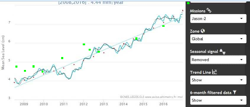
Graphed them out and formed a transparent copy to float the overlay with scaling, over the bit of the Enso-Index plot of 2008 to 2017.
Obviously subjective here, moved around for best correlation to the peaks and troughs of the ENSO plot.
Jason2 out of sync by .33year or 4months later than Enso and the y=0
of the enso plot shifted up 1 unit, so red values are less by 1 unit and blue are
larger by 1 unit. The conversion became Jason2 cm compensation = 0.28 * enso units.
Then made the opposite sign of those peak and trough correlations to the Jason plot, giving the green squares on
the 2017.13 point is .37cm over the guessed at Jason-2 level not yet in the public realm.
No particularly good fit of curve to that
eg quadratic, R^2 =0.9573
y = 6.030854 – 0.4062662*x + 0.02983813*x^2
year Sea Level
2010 4.95cm
2020 9.84
2030 20.7
2040 37.5
2050 60.3
2060 89.1
2070 1.24m
2080 1.64
2090 2.11
2100 2.64
best linear fit
y = .358034* x + 1.36104
R^2 = 0.9176
lower slope of 3.5mm/yr for the skeptics, but no sign of the Saral downturn of end of 2016/start 2017. Will try adding the (new +1) zero crossings of the Enso plot as well, to that Jason2+enso filter plot, for as-is points on the plot
Next is to try unravelling this
http://sealevel.colorado.edu/content/2016rel3-gmsl-and-multivariate-enso-index
Enso correlation plot for the earlier Jason , to give cm rather than SDs and use that on Jason2. Or repeat using Aviso-Jason1 and Enso for another stab at a correlation regime.
Frank wrote: “What do all these different projections mean?”
They are entirely devoid of meaning. Fitted curves are almost never suitable for extrapolation, unless they are based on a verified physical model.
corrected table of outcomes (previous was the rise at the transition year, not 2100)
transition year , Sea Level rise in cm for 2100
2030 , 181.2
2040 , 205.5
2050 , 258
2060 , 374
2070 , 624
2080 , 1170
2090 , 2359
2100 , 4785 = approx 48m
No Jason-2 update 23 ,24 or 25 March on the Aviso site, but Jason-3 retro-plot is now up there.
I hope that does not mean they have stopped outputting Jason-2 , they had 4 years of overlap Jason-1 to 2
A couple of months back I was talking to one of the lead electronics engineers of the NOC Southampton
, designing, implementing and operating Jason2 and Jason3 and asked him about calibrating.
At least they don’t use sea-level for that. As long as there is no seiching at the time they use land-locked lakes , large enough for a return, so Lake Windermere in the UK and many others around the world.
They also use active transponders on geologically known stability land, permanent and prior to an overpass , if there is a suspect area,
On the other hand there is a lot of non-obvious corrections they have to monitor for and adjust for , like varying atmospheric gas concentration and
free-electrons in the ionosphere.etc etc
On the history, at least no one fitted a smooth curve to this plot

http://www.columbia.edu/~mhs119/SeaLevel/
despite iffy looking curvi-linear structure with breakpoints coincident with ends of the studies.
Jason 2 mission:
Nick_Cook or JCH or others: 23 years of 3.4 mm/yr SLR makes a total of 3 inches. Over the same period, tide gauges supposedly report about 2 mm/yr or about 1 inch total less than satellite altimetry. What evidence demonstrates that the satellite altimetry groups have achieved this level of accuracy?
The United States Navy. Pretty tough to BS them:
As of today, Jason-2 data has been updated to 30 Dec 2016 and Jason-3 to 14 Jan 2017 , 2 more datapoints from yesterday, on Aviso site.
I scaled the plots so they match, seasonality removed and also not-removed, for 2016 Jason-3 and if you restrict to just looking at the summer months only of the dot-curve 6-month filtered plots then surprisingly they match quite well the 2016 summer Jason-2 plots, about the same match as the 3 year overlap of Jason1 and 2.
Jason2, removed, 6month filter, Aviso linear gradient 4.44 mm/yr
previously my gradient was 4.420 mm/yr, 4.320 still on the downplaying side,
x=0 is year 2000, and y is cm scale of the Aviso plots
y = 0.4320*x + 0.1442
(goodness of fit) R^2, 0.9565
for revised data , into online curve-fit site
quadratic curve form optimised ,
y = 3.06968 – 0.03913*x + 0.018229*x^2
better R^2, 0.9668
projecting into the future with that curve
year, sea level cm
2020 9.578
2030 18.301
2040 30.67
2050 46.68
2060 66.35
2070 89.65
2080 116.6
2090 147.2
2100 181.4
best fit is exponential,
y = 2.45034 – 1.2531*(1 – e^(+0.096797*x))
R^2 , 0.9714
year , sea level
2020 9.88
2030 24.06
2040 61.39
2050 159.65
2060 418.34
2070 1099.38
2080 2892.26
2090 7612.2
2100 20037.9 approx 200m
Some attempts to explain the anomaly between recent tide-gauge records of mean sea level and global satellite SLR determinations
https://eos.org/opinions/why-we-must-tie-satellite-positioning-to-tide-gauge-data
https://www.hakaimagazine.com/article-short/biased-tide-gauges-mean-weve-been-systematically-underestimating-sea-level-rise
Difficult to find , not on http://www.psmsl.org etc for 2016.
Looking in history and sea-level section of
http://www.ibiexplorer.eu/
for some European tide-gauge sites and monthly mean sea levels for 2016 shows nothing amiss.
I’ve not managed to find any similar 2016 records for southern hemisphere sites.
Looks like the rate of sea level rise has been above trend for a record length of time. Call it since Jan 2015. Could stay up there for another year.
Nick: Thanks for the links.
https://www.hakaimagazine.com/article-short/biased-tide-gauges-mean-weve-been-systematically-underestimating-sea-level-rise The opening paragraph says:
“But as a new study shows, because the majority of these tide gauges were located in North Atlantic port cities, scientists have been systematically underestimating the rate of global sea level rise.”
However, tide gauges are located at sites that will suffer most of the damage from rising SLR. If one is calculating the social cost of carbon, for example, it doesn’t make any difference what is happening to SLR in the middle of the ocean, along unpopulated coasts or in populated areas with little infrastructure. So, I can argue that the tide gauge record is more relevant.
I can only “reply” to myself on this board it would seem.
Directed to Frank’s comment the last day.
This is one of the most difficult altimeter corrections they have to make, but easy to explain. So if not compensated for the SL would be determined as too low and with more storminess over time , then ever lower estimations.
So if the compensation is in fact over compensation, then progressively over estimations of height , if storminess and waves are increasing over time.
Sea-State Bias.
Due essentially to what they are trying to measure, over the footprint of the
altimeter for one of its pulses, trying to see the mean sea surface .
The return signal is not really the mean but more related
to the median of the sea state. So the half-point of the distribution of heights. Because the wind-waves are not perfectly sinusoidal ie peakier with
flatter troughs , swell tends to be similar.
Also in pure electromagnetic terms,
for the peaks , the energy is factored away so they get a lower intensity
return, compared to the flat bottom and concaveness of the troughs. Without
compensating for that, the altimeter will over-estimate the range and
a lower SL than actuality.
I find the bias of tide gauge SLR probable because of the localization. But this is a small difference. It doesn`t matter much compared to all other problems with estimates and calculations. Mitrovica, Hay and others think the SLR from most studies for the 20th century is biased 0,3 to 0,5 mm/yr too high, and the placement bias of tide gauges gives an underestimation of 0,1 mm/yr, according to the Thompson study.
But Thompson cannot even agree with himself: ” The result of this northern hemispheric concentration in tide gauges, then, is that long-term records have provided data that has led scientists to underestimate the rate of 20th-century sea level rise by as much as 0.2 millimeters per year, says Thompson. This is a fairly large amount, as the average rate of sea level rise over the past century is thought to be around 1.7 millimeters per year. ” https://www.hakaimagazine.com/article-short/biased-tide-gauges-mean-weve-been-systematically-underestimating-sea-level-rise
“The analyzed records have an average twentieth century rate of approximately 1.6 mm/yr, but based on the locations of these gauges, we show that the simple average underestimates the twentieth century global mean rate by 0.1 ± 0.2 mm/yr. ” Are long tide gauge records in the wrong place to measure global mean sea level rise? Authors P. R. Thompson, B. D. Hamlington, F. W. Landerer, S. Adhikari.
Some numbers from some studies to show the components of SLR in the 20th century:
steric 0,43, glaciers 0,45, Greenland 0,25, Antarctica -0,08, groundwater depletion and reservoir impoundment -0,01, give a sum of 1,04 mm/yr. So I don`t think the sea level budget is closed yet.
What about the last years closing of the sea level budget?
I wrote: “I find the bias of tide gauge SLR probable because of the localization.” There is one argument against the postulate of underestimation because of the placement of tide gauges. It is about how the steric component is geographically distributed. Some say that there are more warming along coastlines where the most important tide gauges are siituated. So there is an overestimation. Not discussed by Thompson et al.?
From Woodworth: Some important issues to do with long-term sea level change.
“Cabanes et al. (2001) raised this issue most strongly, by pointing out that many of the gauges with long records in the PSMSL data set were located in regions for which ocean temperatures, as represented in the hydrographic data set of Levitus et al. (1998, 2000), appeared to have been rising faster than average during the last half century. If correct, this observation would have meant that the real value of global sea level rise during the past century would have been more likely 0.5 mm yr−1, rather than the 1–2 mm yr−1 of Church et al. (2001).”
Looking more into some studies to show the components of SLR in the 20th century, it seems that I have got some numbers wrong. The steric component seems to be for the last half of the 20th century, and some studies have numbers that are a little higher for the same timespan. It is difficult to find estimates for the whole century. The Antarctic component seems to be for the 1990ies.
repeated but revised with a pic
previous best fit exponential,
y = 2.45034 – 1.2531*(1 – e^(+0.096797*x))
R^2 , 0.9714 , assuming picture emerges here
shows that curve superimposed as red squares
and a better fit curve ,indistinguishable from that plot but better fit and less incline
R^2 0.9724
y = 2.6829 – 0.8798*(1 – e^(+0.11216*x))
year Global Sea Level rise (cm)
2020 10.093
2030 27.253
2040 79.93
2050 241.635
2060 738.03
2070 2261.846
2080 6939.597
2090 21299.18
2100 65379.68 approx 65m
nick_cook,
My guess would be that the confidence interval for the 2100 value would be wall to wall and probably include zero. Confidence intervals for projections increase rapidly, even for linear fits. That means that it’s completely pointless to project an exponential fit more than ten to twenty years.
Nick: In case you missed it, I posted a long reply to your fitting of experimental SLR data at the bottom of this thread.
For data from 2008 to 2017 and curve fitting, its problematic to back-predict 6 years before 2008 , just as it is for 6 years beyond 2017 let alone further.

But hindcast, backtesting a presumed predictive model , is permitted.
The following I thought would be a stronger correlation. I’ve included an image and perhaps someone else here can see another avenue for exploration.
Perhaps a divisor splitting + and – squares equally over and below the lines then the gradient as a predictor, or mixing real and curvefit data perhaps, or going for 6monthly hindcasting perhaps.
Assuming no Santorini, Tambora, Yellowstone, Pinotubo, Laki events in 2017.
This idea was to use the data as available to someone in 2014, 2015 , 2016 to use the then best curvefit exponential (E) and quadratic (Q) curves to the then known data.
Predict forward 1 year and compare the overshoot or undershoot to the real data 1 year on. Then constuct the inverse of that, the amount to “correct” the hindcast predictions, there is a bit of correlation but I’d have liked more , and of course fitting a quadratic curve to 3 datapoints will always give a perfect curve, so ignore that specious effect .
This is a matrix of the inverse factors, to add to the predictive curves , each year to connect with reality, ie applying each year would end up with the real data for the end of 2016.
2014 E 65%, -16 , Q 89%, -4.5
2015 E 133%, -30, Q 173% -20.5
2016 E 49%, -9, Q 62%, -14.5
So percentages to decrease or increase the predictions on best curve types each year. The -values are the result of summing the squares over(+) and under (-) the segments of the curves for the last year before predictions, to the grey 6-month filtered, seasonality-removed Aviso Jason-2 plot.
The squares are mm * deci-year
overlaid on image
(may require URL copy and paste)
(light blue straight line is the Aviso 4.44 mm/yr gradient)
The weak “correlation” curves are
for the exponentials
y = 0.12 * x^2 + 0.77 * x + 46.06
where y is the percentage correction to the yearly increment and x is the sum of squares
for the quadratics
y = 1.32 * x^2 + 27.87 * x + 187.6
So what of
2017 for predicting 2018 E ?%, -6 , Q ?%, -3.5
becomes
2017 E 46%, -6 , Q 106%, -3.5
Giving 2 sort of predictive adjustments to the 2017 to 2018 increments (not absolute, ie removing 2017 curve-fit evaluations ) of height of the previous best curve-fits , E and Q, 8.43cm (*.46) and 8.25 (*1.06).
Amended to become projected 2018 spotheights of 8.05cm and 8.29cm
added to the genuine Jason-2 set , giving 2 new curves E and Q for 2017 onwards
y = 2.4261 – (1.39179)*(1 – e^(+0.091585*x))
R^2, 0.975
(none of these curves pass through the real or predicted points, so eg not the Jason-2, 7.74cm for 2017.00 )
2017 7.64cm
2020 9.72
2030 22.75
2050 136.65
2100 13215.8 , approx 132m
for 2017 to 2018 Aviso 10day updates check, subtract 7.64 from each
10 day, 7.65cm
20 day, 7.67
30 day 7.69
60 day 7.74
120 day 7.84
180 day 7.94
240 day 8.05
300 day 8.15 (+0.51cm over the year)
to give the increment from 7.74 cm start of 2017 to Aviso update day
, hopefully to give a better idea of nearer E or Q type curves over theyear, or of course all total BS and totally off the plot, as so little difference between the curves over just 1 year.
quadratic curve,
y = 3.093 – 0.041629*x + 0.0183098*x^2
R^2 .973
2017 7.68cm
2020 9.58cm
2030 18.32
2050 46.79
2100 182.03 = 1.82m
for 2017 to 2018 Aviso 10day updates check, subtract 7.68 from each
2017 7.68cm
10 day 7.69
20 day 7.71
30 day 7.72
60 day 7.77
120 day 7.87
180 day 7.97
240 day 8.07
300 day 8.17 (+0.49cm over the year)
It seems impossible to get less than 1.8m for global mean sea level to the end of this century.
Aviso Jason-2 updates not appeared by midday GMT today.
nick_cook,
Hindcasting is a useful model screening method. However, unlike AOGCM’s, what you have is still a purely mathematical model with no physical basis. As such, it’s predictive value beyond a few years, much less 83 years, is zero even if it passes the hindcast test.
nick_cook,
You should at least try to calculate uncertainty limits for your fit. Each of the coefficients in your fit has an uncertainty range which you should be able to calculate. The brute force method would be a Monte Carlo approach where you vary the coefficients randomly in their uncertainty range, using, perhaps, a standard distribution for each, many times and see what the envelope looks like.
Nick wrote: For data from 2008 to 2017 and curve fitting, its problematic to back-predict 6 years before 2008, just as it is for 6 years beyond 2017 let alone further.
If your model based on 2008-2017 isn’t capable of accurately hindcasting what happened in 1999-2008, then there is no reason to think that model will be of any value for 2017-2026. And extrapolating that model out to 2100 is a bad joke:
“It seems impossible to get less than 1.8m for global mean sea level to the end of this century.”
If we hindcast all the way back to sea level in 1900, it is clear that no model fits all of the data well. Our models aren’t derived from physical principles: such as how much water expands with rising temperature, how fast rising temperature is transported into the deep ocean, and how much faster ice caps flow or melt with rising temperature. So there is no reason to expect purely empirically-chosen models to be valid at all times in the past or future. Especially when you ignore the uncertainty in your model coefficients. (See below.)
You appear to be trying to model a sub-period of your data and test that model on other sub-period of data to prove you model is valid. Such a model may have some value using the qualifier: “If recent trends continue, then ….” However, there are better options than wasting half of your data to validate a model constructed using the other half.
The standard solution to this problem is to consider the confidence interval about the coefficients obtained by regression. Suppose y = mx + b. For each value of x, I can calculate a y. However, when I do an experiment, I get a value of y + e, where e is a DIFFERENT random error associated with each measurement of y. These e’s have a mean of zero (assuming no systemic error and a standard deviation. Now imagine calculating the results for 10,000 simulated experiments by y = mx + b – e, where e for each y is chosen at random. If I do a least-squares fit to those 10,000 simulated experiments, I will get 10,000 different slopes (m+/-m’) and intercepts (b+/-b’) where m’ and b’ are the standard deviations from the 10,000 experiments. The 95% confidence intervals for the slope will be m +/- 1.96*m’.
More sophisticated statistical analysis methods will give you m, m’, b and b’ from your data. (And confidence intervals for the coefficients of quadratic and exponential fits too.) The observed linear rate of sea level rise for the last 8 years isn’t 4.4 mm/yr, because all the points don’t lie exactly on a line. (See 2011.) The slope is something like 4.4 +/- 0.3 mm/yr based on: the change over 8 years, AND the scatter in the data, AND the assumption that the data is linear. (The y-intercept is also uncertain.)
DeWitt suggested a Monte Carlo calculation using m, m’, b and b’. Use a spreadsheet to generate 10,000 random slopes of m+/-m’ and 10,000 random y-intercepts of b+/-b’ and 10,000 values for sea level time for x = 2100. Find the mean and eliminate the 250 lowest and highest results. That gives you a 95% confidence interval for your projection. Since linear, quadratic, and exponential functions fit SLR data roughly equally well, the confidence intervals for all three should overlap. However, you’ll find that the uncertainty in the acceleration for quadratic fits and the exponential factor are very wide, they will project a wide range of possibilities. That is because the limited data we have doesn’t clear defined how non-linear (accelerating) the observations are. Remember linear regression is based on the change in the data, the scatter in the data and the ASSUMPTION that the data is linear, quadratic or exponential.
It may help to look at the mathematical relationships between linear, quadratic and exponential fits. If you chose t = 0 for a quadratic fit to be the midpoint of evenly spaced data and then fit linear and quadratic functions are:
y = at2 + bt + c
and y = bt + c
and the linear coefficient b and the y-intercept c are the same in both cases. (When other choices for t = 0 are used, these values are different, obscuring the fact SLR is linear plus a very small acceleration term. That acceleration puts all data points above the line y = bt + c by an amount at^2. You lose sight of this valuable relationship by choosing a different time for t = 0. Transform to a new time system t’ = t + k, and see how the coefficients are now different.
I believe your exponential fit is equivalent to y – y(t=0) + a = a*exp(kt). Often we choose our y scale so y(t=0) = a for simplicity. Then y = a*exp(kt) and ln(y) = ln(a) + kt. If we expand the exponential function:
y – y(t=0) + a = a*exp(kt) = a*(1 + kt + (1/2)(kt)^2/2 + (1/6)(kt)^3/6 + …)
The first three terms are just a quadratic fit in disguise:
y = (a*k^2)*t^2 + (a*k)*t + ( y(t=0) – a )
The difference between exponential and quadratic only becomes important when (1/6)(kt)^3 is comparable to the earlier terms. You found k = 0.091, so this cubic term isn’t very important when you are fitting 8 years worth of data. When t = 100, the higher order terms are much bigger than the quadratic one.
When expressed in this manner, the non-linear terms are fairly small and uncertain over a decade. If you check the full 25 years of the SLR data, however, the k in the exponential fit probably will be much smaller than 0.091. If it were this big, the data would be much more non-linear.
n_c: About Columbia sea level “acceleration”. “On the history, at least no one fitted a smooth curve to this plot”. As you obviously like curve-fitting exercises, why couldn`t you do it yorself?
1900 – 1929, 30 years, 0,6mm/yr
1930 – 1992, 63 years, 1,4mm/yr
1993 – 2016. 24 years, 3,4mm/yr
That could give some more meaning than calculating on very short timespans. Even if the numbers are very questionable, and the interpretation related to real change would be difficult.
The IPPC with most of their leading scientists had a tendency to estimate 20th century sea level rise at a high rate compared to sea level budget, as Mitrivica and others have shown.
AR5: “It is virtually certain that globally averaged sea level has risen over the 20th century, with a very likely mean rate between 1900 and 2010 of 1.7 [1.5 to 1.9] mm/yr and 3.2 [2.8 and 3.6] mm/yr between 1993 and 2010.”
Probabilistic reanalysis of twentieth-century sea-level rise
Carling C. Hay, Eric Morrow, Robert E. Kopp & Jerry X. Mitrovica (2015)
“Estimating and accounting for twentieth-century global mean sea-level (GMSL) rise is critical to characterizing current and future human-induced sea-level change. Several previous analyses of tide gauge records1, —employing different methods to accommodate the spatial sparsity and temporal incompleteness of the data and to constrain the geometry of long-term sea-level change—have concluded that GMSL rose over the twentieth century at a mean rate of 1.6 to 1.9 millimetres per year. Efforts to account for this rate by summing estimates of individual contributions from glacier and ice-sheet mass loss, ocean thermal expansion, and changes in land water storage fall significantly short in the period before 1990. The failure to close the budget of GMSL during this period has led to suggestions that several contributions may have been systematically underestimated. However, the extent to which the limitations of tide gauge analyses have affected estimates of the GMSL rate of change is unclear. Here we revisit estimates of twentieth-century GMSL rise using probabilistic techniques, and find a rate of GMSL rise from 1901 to 1990 of 1.2 ± 0.2 millimetres per year (90% confidence interval). Based on individual contributions tabulated in the Fifth Assessment Report of the Intergovernmental Panel on Climate Change, this estimate closes the twentieth-century sea-level budget.”
I think all these reports of warming from 1918 to the middle of the century are important. It clearly affected global sea level rise by the Greenland melting. Most of the melting of Greenland in the 20th century.happened in that period. And perhaps it was not so popular to focus on the warming and sea level rise of the first half of the century in part of the scientific community.
There is something that I don`t understand of GIA correction due to ocean floor subsidence. How should that affect sea level?
SoD cite AR5: “Unlike tide gauges, altimetry measures sea level relative to a geodetic reference frame (classically a reference ellipsoid that coincides with the mean shape of the Earth, defined within a globally realized terrestrial reference frame) and thus will not be affected by VLM, although a small correction that depends on the area covered by the satellite (~0.3 mm yr–1) must be added to account for the change in location of the ocean bottom due to GIA relative to the reference frame of the satellite (Peltier, 2001; see also Section 13.1.2).”
And from Colorado sea level group ( What is glacial isostatic adjustment (GIA), and why do you correct for it?) CU, 2011, we can read:
“We apply a correction for GIA because we want our sea level time series to reflect purely oceanographic phenomena. In essence, we would like our GMSL time series to be a proxy for ocean water volume changes. This is what is needed for comparisons to global climate models, for example, and other oceanographic datasets.”
“Prior to release 2011_rel1, we did not account for GIA in estimates of the global mean sea level rate, but this correction is now scientifically well-understood and is applied to GMSL estimates by nearly all research groups around the world. Including the GIA correction has the effect of increasing previous estimates of the global mean sea level rate by 0.3 mm/yr.”
It looks like we have to add 0,3 mm/yr because ocean floor is subsiding, when we use satellite measurements. What is the logic? And another question is if ocean floor is really sinking in that rate. I have also seen a rate of 0,1 mm/yr.
NK,
Sea floor dropping means the volume of the container is increasing. GIA corrects for that.
If the ocean volume was constant, the absolute sea level referenced to the geoid would drop 0.3mm/year, if that was indeed the correct adjustment.
NK: If you care about how fast SLR is drowning our coastal cities, it is inappropriate to apply a GIA for subsiding sea floors. If you care about quantifying the causes of SLR – X mm/yr from thermal expansion, plus Y mm/yr from melting ice caps plus …. – then you need a GIA. Of course, everyone except a few climate scientists cares more about the the former, but the latter is a large rate. /cynicism
What bothers me is that the climate scientist community seems to have a concept of GMSL that add sinking of ocean floor. Then the sea surface rise will seem faster than it actually is. Most people will think that sea level is the same as average ocean surface hight. So why fool people in this way?
Based on the figures in the supplemental material, this recent review article (paywalled) may address some inconsistencies and limitations of satellite altimetry and tide gauges.
Wöppelmann, G., and M. Marcos (2016), Vertical land motion as a key to understanding sea level change and variability, Rev. Geophys., 54, 64–92, doi:10.1002/2015RG000502.
Abstract: Vertical land motions are a key element in understanding how sea levels have changed over the past century and how future sea levels may impact coastal areas. Ideally, to be useful in long-term sea level studies, vertical land motion should be determined with standard errors that are 1 order of magnitude lower than the contemporary climate signals of 1 to 3 mm/yr observed on average in sea level records, either using tide gauges or satellites. This metrological requirement constitutes a challenge in geodesy. Here we review the most successful instrumental methods that have been used to determine vertical displacements at the Earth’s surface, so that the objectives of understanding and anticipating sea levels can be addressed adequately in terms of accuracy. In this respect, the required level of uncertainty is examined in two case studies (global and local). A special focus is given to the use of the Global Positioning System (GPS) and to the combination of satellite radar altimetry with tide gauge data. We update previous data analyses and assess the quality of global satellite altimetry products available to the users for coastal applications. Despite recent advances, a near-plateau level of accuracy has been reached. The major limitation is the realization of the terrestrial reference frame, whose physical parameters, the origin and the scale factor, are beyond the scope of a unique technique such as the GPS. Additional practical but nonetheless important issues are associated with the installation of GPS antennas, such as ensuring that there is no unknown differential vertical motion with the tide gauge.
Nick_Cook wrote about SLR above and I condensed his results as shown below: (As best I can tell, there appears to be a problem with the quadratic fit. The linear coefficient is negative and the acceleration is fast enough to change the negative rate of SLR to zero in two years.)
linear fit:
x=0 is year 2000, and y is cm scale of the Aviso plots
y = 0.4320*x + 0.1442
(goodness of fit) R^2, 0.9565
for revised data , into online curve-fit site
quadratic curve form optimized ,
y = 3.06968 – 0.03913*x + 0.018229*x^2 Typo?
better R^2, 0.9668
best fit is exponential,
y = 2.45034 – 1.2531*(1 – e^(+0.096797*x))
R^2 , 0.9714
In practice, an increase in R^2 from 0.956 to 0.967 or 0.971 by fitting with an additional parameter is fairly meaningless improvement in fit. All three equations are probably equivalently good at fitting existing data, but they do make vastly different predictions about the future. What is missing are confidence intervals about the coefficients for these regressions. Then we might know what to believe.
I took the full 1993-2017 AVISO sea level data (seasonally corrected) and did a multiple linear regression vs t and t^2 where t is years since 2005. 2005 is the middle time point. This time scale ensures that t and t^2 are not be correlated with each other and the linear coefficient for both linear and quadratic fits are the same, 3.27 mm/yr. The R2 for the linear and quadratic fits are nearly identical: 0.983 and 0.986. They are equally valid. The quadratic fit:
SL (mm) = 0.0275 * t^2 + 3.27 * t + 33.3
(0.023-0.032) (3.25-3.30) 95% confidence intervals
However, the lag1 autocorrelation in the residuals for this fit is 0.959, making the Quenouille correction 0.0208. Instead of 881 separate measurements of global SL made every 10 days, correcting for autocorrelation leaves only 18 degrees of freedom (one measurement every 16 months). This widens the confidence intervals by 7-fold.
0.5*acceleration = 0.0276 (-0.002 to 0.0567, 95% ci) mm/yr/yr
linear rate = 3.27 (3.09 to 3.45) mm/yr
So the 95% ci for acceleration includes zero and barely fails to be statistically significant for 1993-2017.
The central estimate for acceleration means that it would take about 60 years for the current linear rate of SLR to double from 3.3 mm/yr to 6.6 mm/yr. (This looks reasonable; the slope has not changed much visibly in 25 years). Sea level would rise 0.58 m between 2000 and 2100.
The upper confidence interval for 0.5*acceleration is twice as big as the central estimate: 0.0567 vs 2*0.0276 mm/yr/yr. This means the linear rate could double in about 30 years and SLR would be about 0.84 m from 2000 to 2100. Interestingly, this is consistent with the IPCC’s projections made by climate models.
1 m of SLR in one century starting with an initial rate of 3.27 mm/yr requires an acceleration of 0.15 mm/yr/yr about 3X bigger than the central estimate for observed acceleration over 1993-2017. The SLR needs to double roughly every 20 years – and we aren’t positive than any acceleration is occurring right now. If acceleration is constant, we won’t reach 1 m of SLR this century.
So a proper(?) statistical analysis of satellite SLR data does not appear to provide conclusive evidence for any acceleration in SLR, nor for SLR outside the range projected by the IPCC. Nick_Cook’s numbers differ from mine, but I won’t speculate why. (He uses cm/yr not mm/yr, but there appear to be other problems).
The last ten years saw a large drop in sea level due to the 2011-2012 La Nina events. A great deal depends upon whether or not Matt England’s anomalous trade winds return. That would probably require a rapid increase in Chinese GDP, which does not appear to be in the offing. NASA’s new chart confirms AVISO… the rate of SLR has gone back up. If the El Nino forecast comes true, still a fairly big if, then a rate of SLR somewhere between 4.50 mm/yr and 5 mm/yr is the immediate future – halfway through 2018 is probably in the bag.
Which is why Fasullo et al says an acceleration is imminent.
Above I did a multiple linear regression for 1993-2017 AVISO sea level data against t and t^2, where t = 0 in 2005, the midpoint of the data.
h = at^2 + bt + c
Correcting for autocorrelation:
a = 0.0275 (-0.0016 to 0.0567 95% ci) mm/yr^2
b = 3.27 (3.09 to 3.45 95% ci) mm/yr
c = 33.3 (31.4 to 35.2 95% ci) mm
I simulated 10,000 random values of a, b, and c with the appropriate mean and standard deviation. From the 10,000 calculate SLR, sea level in 2100 (t = 95) was:
h = 0.59 (0.33 to 0.86 95% ci) m
0.31 m from linear rise for 95 years
0.25 m from acceleration in rise for 95 years
0.03 m was SLR in 2005 (t=0).
Most of the uncertain is associated with the acceleration term a.
Without correcting for autocorrelation:
h = 0.59 (0.55 to 0.63 95% ci) m
Nick is looking at SLR over shorter, more recent periods of time when the linear rate of SLR is higher (4.44? mm/yr). In one case, his acceleration is lower (0.0182 mm/yr^2). His confidence interval presumably will increase by about the SQRT of the ratio of the periods w used (. If my confidence interval is about 0.5 m wide, his will be even wider.
Note: I haven’t understand everything Nick is doing differently from me. He is using six-month smoothed data. Which means the number of independent data points and autocorrelation analysis are not the same. I’m using t=0 for 2005 to keep t and t^2 uncorrelated in regression and the linear and constant coefficients the same for a linear and quadratic fit.
Whatever the differences, the single values he is reporting for SLR in 2100 come with a massive amount of uncertain. The deviation for a linear fit in current data is small, which means that the coefficients associated with non-linear terms are extremely uncertain …. +/-100% for the acceleration I calculated. So, whatever single value he calculates for 2100, a realistic confidence interval presumably no acceleration on the low end (0.3 or 0.4 m). One can’t estimate the outcome from non-linear processes without a reasonable idea of how non-linear they are. When R2 for a linear fit is high (0.98 in my case), the amount of non-linearlity is low.
I wondered if I could find a confidence interval for projecting exponential SLR from the full AVISO record (as I did above for quadratic growth). I ran into several difficulties with positive exponential growth that I hadn’t encountered before. Those difficulties began with the fact that the first few raw sea level heights were slightly less than zero, and a simple exponential function can not be both negative and positive. In the bigger picture, the predictions from the fit should be independent of my choice for t = 0 and h = 0.
Nick has been fitting an exponential function of this type:
h – h(t=0) = a*( exp(kt) -1 )
ln(h + a- h(t=0)) = k*t + ln(a)
There are three parameters to fit. Using the trend line in EXCEL, I thought I could find a decent value for a – h(t=0) by trial and error. Then could do a linear regression for ln(h + a- h(t=0)) and time, using 1993 for t=0. However, I found that I could get an R2 >0.98 for any choice of a – h(t=0) greater than 60 mm – up to at least 10,000 mm (10 m). The choice of 60 mm made the earliest time points h = 50-60 mm. R2 peaked at 0.98651 for a – h(t=0) equal to 180 mm. R2 dropped to only 0.98650 for 170 mm and 0.98649 for 190 mm. These minuscule changes in R2 were associated with a 5% change in k. For a-h(t=0) =180 mm, I found that and a and k had relatively small confidence intervals.
h +180 = 177.7*exp(0.0153*t)
h(t=107) = 771 mm (2100 SL)
Compared with a quadratic fit, an exponential fit adds cubic and higher order terms. Using these values, the cubic Taylor expansion term (1/6)*(kt)^3 amounts to about 1.5 mm over the 24 years sea level has risen 80 mm, well within error. By 2100, that term alone is worth 130 mm.
Conclusions: 1) I failed to yield a useful confidence interval. There are some aspects of fitting positive exponential data I don’t understand very well. (Exponential decay appears simpler.) 2) The numbers Nick is presenting almost certainly have very wide confidence intervals.
JCH: The 24 years of the satellite altimetry record cover a variety of ENSO and other conditions (though not a full cycle of the AMO). A change in trade winds can cause sea level to rise up to a foot on one side of the Pacific and drop on the other, but this shouldn’t change mean global sea level. SLR requires “new” water to enter the ocean.
FORCED global warming obviously causes expansion of ocean water, a modest amount of ice cap melting, and possibly a large increase the rate at which ice caps flow into into the ocean. However, in comments at SOD, we aren’t considering the physics associated with any of these processes; we are merely opportunistically fitting observations of SLR to convenient functions (linear, quadratic, exponential) which have not been derived from fundamental physics. Due to autocorrelation in the observations, there is a large amount of uncertainty in the acceleration of SLR – enough uncertainty that we formally can’t conclude that there has been any acceleration over the satellite altimetry period.
Without evidence that some new is happening – something that hasn’t impacted the past 24 years of observation – the best we can say is that current trends are likely to continue: a little more than 3.3 mm/yr of sea level rise gradually accelerating to twice that rate – most likely in about 60 years, possibly as soon as 30 years or possibly in a century or more.
The anomalous winds came with a negative PDO and La Nina dominance, which resulted in more ocean evaporation raining out over the continents instead of the over the oceans, which caused sea level to drop by a large amount. This was not a normal ENSO cycle as the record clearly shows around 2011-2012. That water eventually returned to the oceans and sea level rose back up.
As for the AMO, how do you know we have not seen a full cycle, or that it will ever cycle again? The big blue blob south of Greenland may have recently resulted in the coldest the North Atlantic that will be seen, short of a severe slowdown of the AMOC, for the rest of the 21st century.
JCH,
It’s widely thought that the AMO has a period of between 60 and 70 years. The AMO Index, compiled since the middle of the nineteenth century, shows about two full cycles. Satellite altimetry covers less than one half of one cycle. You are correct, though, that we don’t know if we will see a return to consistently negative values of the AMO Index and a continuation of the cycle.
http://www.cdc.noaa.gov/data/correlation/amon.us.long.data
DeWitt: There is a weak 65-year signal in the CET record that could be due to the existence of earlier cycles of the AMO. The data isn’t very convincing and the authors use the term AMO.
http://onlinelibrary.wiley.com/store/10.1029/97GL01184/asset/grl10172.pdf?v=1&t=j0y5xngz&s=978871162be6fab785e9163730638a16bb4cdfde
JCH: We haven’t observed the AMO long enough to be able to predict its long-term behavior. Unforced variability like the AMO or La Nina can impact the rate of SLR, but I think it is naive to think that unforced variability only obscures SLR and never enhances it.
DeWitt – always read and enjoy your comments. The way I see it, the problem with these cycles is the “they are thought to be” element. The GMST appears to mostly be on either an upward or downward trajectory. I think it is mostly for a confluence of physical reasons to do mostly with the Eastern Pacific, and that the AMO is not much of a factor. People are free to wait for the AMO to perform its infamous cooling act on the global stage. I doubt that it can do that in our ACO2-juiced atmosphere. Meanwhile, the Eastern Pacific has been center stage for more than a century.
JCH,
If you look at the pattern of ice around Svalbard, it’s clear that the path of the North Atlantic Gyre shifted northward around twenty years ago. IMO, that’s the positive phase of the AMO. The question is: will it shift back to the south anytime soon. My bet is yes, but I wouldn’t put much, if any, money on it. There does seem to be something happening in the Antarctic. Sea ice extent is averaging three standard deviations below the previous all time lows. Maybe that represents a shift in the South Atlantic and or Pacific Gyre. The next five years should be interesting.
JCH wrote: ” I think it is mostly for a confluence of physical reasons to do mostly with the Eastern Pacific, and that the AMO is not much of a factor. People are free to wait for the AMO to perform its infamous cooling act on the global stage.”
There seems to be a linkage between various cycles scattered about the globe: AMO, PDO, ENSO, various measures of sea ice, and global temperature. Judith Curry has dubbed it the “stadium wave”. It is plausible that such things are linked. Sea surface temperature and sea ice distributions are connected to ocean currents, ocean currents are connected to downwelling (a significant, but secondary, driver of currents) and upwelling (largely resulting from wind driven currents), and, of course, downwelling and upwelling must be equal, even though separated by long distances (downwelling in the North Atlantic, upwelling in the eastern tropical Pacific). It may not be A causes B causes C … so much as A, B, C, … are inextricably linked. I suspect that the linkage to climate comes from changing cloud distributions; even small changes in clouds can constitute a significant change in forcing.
Global cooling is associated with the warm phase of the AMO, which we have been in for the last two decades or so. The pause may be due to that cooling balancing out greenhouse gas driven warming. If so, when the AMO shifts to its cool phase, we should see a resumption of warming, as we had during the last AMO cool phase. It will be interesting to see what the satellites tell us about clouds and albedo when that happens.
I would say global cooling is associated with a cooling Eastern Pacific, and global warming is associated with a warming Eastern Pacific… especially when the PDO and ENSO are in the same phase. With AGW in the mix, this may not look like what one would expect.
The Eastern Pacific, which was cooling, masked AGW in progressively larger amounts, from 1980 to 2013, ending with the “hiatus”, from 2006 to 2013.
When the Eastern Pacific flipped to warming in 2013-2014, AGW has been unleashed: three record warmest years in a row… and a real possibility of 2017, with an El Nino forecast for May-June, being either the 2nd warmest year n the record or maybe even the 4th record warmest year.
And, when an El Nino starts mid NH summer, it usually lasts well into the following year and that year, in this speculative case 2018, could be record hot as well. Think 97-98.
An interesting, open access AMO study:
Amplification of the Atlantic Multidecadal Oscillation associated with the onset of the industrial-era warming
Mike M.,
Do you mean the NAO instead of the AMO? The AMO Index has been increasing since mid 1970’s, marking the end of the global cooling craze. If it does have a cyclic behavior, it should have peaked in about 2011. Year-to-year variation is quite large, however. You need a 21 year moving average to really fit the sine wave.
DeWitt wrote: “Do you mean the NAO instead of the AMO? The AMO Index has been increasing since mid 1970’s, marking the end of the global cooling craze. If it does have a cyclic behavior, it should have peaked in about 2011. Year-to-year variation is quite large, however. You need a 21 year moving average to really fit the sine wave.”
I mean the AMO. The NAO is an atmospheric oscillation that varies much more frequently.
Maybe you are looking at non-detrended data? There are different ways of defining the AMO index. I used the NOAA one, which seems to be the most common and longest established. I based my comment on data that I downloaded from: https://www.esrl.noaa.gov/psd/data/timeseries/AMO/
If you click on the link to FAQ’s at the bottom of the page linked above you will find:
“What phase are we in right now?
Since the mid-1990s we have been in a warm phase.”
You can see a plot of that data at: https://en.wikipedia.org/wiki/Atlantic_multidecadal_oscillation
From what I have seen, the AMO is not thought to be a sine wave but instead fairly abrupt shifts between the warm and cool phases. But of course there is a lot of noise that makes it hard to be sure.
Also, under the NOAA FAQ’s, you will find:
“What is the AMO?
The AMO is an ongoing series of long-duration changes in the sea surface temperature of the North Atlantic Ocean, with cool and warm phases that may last for 20-40 years at a time and a difference of about 1°F between extremes. These changes are natural and have been occurring for at least the last 1,000 years.”
Mike M.,
I’ve been using ESRL NOAA data, which is detrended:
https://www.esrl.noaa.gov/psd/data/correlation/amon.us.long.data
A shift in the mid 1990’s would correspond to the start of the rapid decrease in Arctic Sea ice extent.
This, btw, is the instrumental index in JCH’s reference above:
Enfield, D. B., Mestas-Nunez, A. M. & Trimble, P. J. The Atlantic multidecadal oscillation and its relation to rainfall and river flows in the continental US. Geophysical Research Letters 28, 2077–2080, doi: 10.1029/2000gl012745 (2001).
DeWitt wrote: “I’ve been using ESRL NOAA data, which is detrended”
That looks like it ought to be the same data, except that I downloaded it some time ago.
Dewitt: “A shift in the mid 1990’s would correspond to the start of the rapid decrease in Arctic Sea ice extent.”
It makes sense that the warm phase should decrease sea ice. It will be interesting to see if sea ice starts to recover after the shift to the cool phase.
What cycle is leading the changes in the trajectory of the GMST trend?
I see the PDO leading the downward shift during WW2, and the upward shift in the 1970s. When the AMO finally goes negative just before, roughly, 1960, it appears to have affect on the GMST.
whoops, should be:
When the AMO finally goes negative just before, roughly, 1960, it appears to have little affect on the GMST.
JCH wrote: “What cycle is leading the changes in the trajectory of the GMST trend?”
I don’t see how one can tell from a graph like that or why it should matter.
As for when the PDO diverges, around 1985, with no apparent affect on the GMST, there are actually upward surges, some pronounced, in the PDO, each of which appears to have caused a record warmest year: 1998, 2005, and 2010. And, when the PDO goes solidly positive in 2014, it is followed by record warmest years in 2014, 2015, and 2016. And there is now serious speculation that 2017 could be either the 2nd warmest year, or even a record warmest year:
The cause of the big hiatus could also be the cause of the little hiatus, and of the warming surges that came both before and after them. If it’s all Pacific, then we’re in for a lot of warming between 2014 and 2024 to 2040.
Why would it matter? Ask Wyatt and Curry:
The stadium wave signal predicts that the current pause in global warming could extend into the 2030s,” said Wyatt, the paper’s lead author.
JCH,
It will take an El Nino as big as the last one to make 2017 a record year. That might happen, but I wouldn’t bet the farm on it. The UAH global anomaly for March was 0.19°C, hardly record territory.
Looks like GISS March anomaly will be 1.00 to 1.07 ℃, so its first 1/4, which should be the coldest 1/4 if there is an El Niño, is already above last years annual mean. If the PDO stays positive and an EL Niño develops mid summer, a near record/record is a lock. Say it’s a near record… .95 ℃. The longterm trend gets a boost. Looks at years where an EL Niño begins mid summer… often followed by a record warmest next year… 97-98, 04-05, 09-10.
I don’t take UAH seriously. I listen to the chief scientist at RSS.
JCH,
I don’t take GISS seriously.
RSS and UAH aren’t all that different. The average for RSS for the first three months of 2017 is 0.399. The average for the first three months of 2016 was 0.829. For UAH it’s 0.28 and 0.70. Last years averages were: RSS 0.559 and UAH 0.500.
Most of the impact of sea level rise would affect some of the largest cities in the world. I find an essay at WUWT interesting (and balanced). From the abstract:
“Human population is becoming increasingly urban, and most of the world’s largest and fastest-growing cities border tidewater. This note presents charts of annual-value (AV) tide-gauge records in or near major coastal cities to illustrate the sea-level change these cities have observed recently, and fits linear trends to the records. Trends range from -1.5 mm per year (mm/y) to 18 mm/y. Tectonic uplift can explain the lowest trends, and cities growing rapidly on unconsolidated sediments (perhaps dredged) have the highest trends due to land subsidence. Urban areas that encompass ground of variable stability observe variable sea-level change. Where the ground is stable, typical change appears to be a rise of 1- to 2-mm/y. Rates above 3 mm/y seem to have a substantial component of natural and/or anthropogenic subsidence. Rates above 10 mm/y appear to be a primarily a consequence of human activity, which implies they should be manageable to some degree.”
Recent Sea-Level Change at Major Cities. Guest essay by Rich Taylor.
Improvements in Precise Orbits of Altimetry Satellites and Their Impact on Mean Sea Level Monitoring
…The internal orbit consistency in the radial direction is between 0.5 and 1.9 cm. The global mean sea level trend for the period 1993-2014 from TOPEX, Jason-1, and Jason-2 is 2.8 and 3.0 mm/year using GFZ VER6 and VER11 orbits, respectively.
JCH’s full abstract: New, precise, consistent orbits (VER11) of altimetry satellites ERS-1, ERS-2, TOPEX/Poseidon, Envisat, Jason-1, and Jason-2 have been recently derived at the GFZ German Research Centre for Geosciences in the extended ITRF2008 terrestrial reference frame using improved models and covering the time span 1991-2015. These orbits show improved quality, as compared with GFZ previous (VER6) orbits derived in 2013. Improved macromodels reduce root mean square (RMS) fits of satellite laser ranging (SLR) observations by 2.6%, 6.9%, and 7% for TOPEX/Poseidon, Jason-1, and Jason-2, respectively. Applying Vienna Mapping Functions 1 instead of Hopfield model for tropospheric correction of Doppler Orbitography and Radiopositioning Integrated by Satellite (DORIS) observations reduces RMS fits of SLR observations by 2%-2.4% and those of DORIS observations by 2.6% for Envisat and Jason satellites. Using satellite true attitude instead of models improves Jason-1 SLR RMS fits by 41% from July 2012 until July 2013. The VER11 orbits indicate the mean values of the SLR RMS fits between 1.2 and 2.1 cm for the different missions. The internal orbit consistency in the radial direction is between 0.5 and 1.9 cm. The global mean sea level trend for the period 1993-2014 from TOPEX, Jason-1, and Jason-2 is 2.8 and 3.0 mm/year using GFZ VER6 and VER11 orbits, respectively. Regionally, the decadal trends from GFZ VER11 and external orbits vary in the order of 1 mm/year.
“It’s Turtles All the Way Down”
“We live on a crust of earth which is on the back of a giant turtle,”
“If your theory is correct, madam,” he asked, “what does this turtle stand on?”
“The first turtle stands on the back of a second, far larger, turtle, who stands directly under him.”
“But what does this second turtle stand on?” persisted James patiently.
To this the little old lady crowed triumphantly. “It’s no use, Mr. James – it’s turtles all the way down.”
In this case, it’s “models all the way down”. From the ITRF2008 model to model orbits to many models for converting time into distance from the orbit to the ocean. “Internal orbit consistency in the radial direction is between 0.5 and 1.9 cm.” We need to know consistency in units of distance per time: mm/yr across a quarter-century and three satellites. (Actually there are more than three. One group compared composite records from different combinations of satellites and decided its methodology needed improvement.)
In the case of tide gauges (which have their limitations), there is only “one turtle” – the land under the tide gauge. We have excellent technology for detecting the motion of that turtle, though we aren’t attaching that technology to many tide gauges. And all of our infrastructure near the ocean is attached to nearby turtles with tide gauges, not the ITRF2008. I’d sure like to read or hear something about satellite altimetry that is more tangible than the ITRF2008. (Perhaps this is an ignorant request, but the technical jargon makes this subject hard.)
All of their lives they had been committed to excellence… from grammar school through their PhDs. I honestly do not get your problem. The most likely thing is the tide gauges, if there were enough of them in the right places and with the appropriate technologies, would simply affirm the altimeters.
JCH: I presume that you are familiar with the fact that reanalysis of historical atmosphere data shows that the upper atmosphere has become drier since 1973 when reliable humidity data from radiosondes was first collected. Many people think this drying is a artifact of changing technology and the changing observations entering the re-analysis program.
Satellite altimetry uses re-analysis data to convert time into distance through the atmosphere. As the humidity data shows, it is possible that there are biases in reanalysis data. A gradually developing bias in the re-analysis data used by satellite altimetry groups can translate into a bias in the rate of SLR. The presence of such biases can’t be detected without calibration. The atmosphere model is only one of many used in processing satellite altimetry data.
GPS is limited by some of the same factors, but the accuracy of GPS systems can be ascertained by physically measuring the distance between two GPS receivers. IIRC, precise GPS measurements are always difference measurements between two or three receivers, one in a fixed location. In satellite altimetry, there is only one receiver (on the satellite) and it is constantly moving.
JCH said: “The most likely thing is the tide gauges, if there were enough of them in the right places and with the appropriate technologies, would simply affirm the altimeters.”
There are enough tide gauges and they are located in the most important locations. However, we aren’t making a major effort to monitor their vertical motion by GPS. Even worse:
“Regionally, the decadal trends from GFZ VER11 and external orbits vary in the order of 1 mm/year.”
So regional comparisons with local tide gauges may not be accurate enough to confirm the difference between 3 mm/yr and 2 or 4 mm/yr of local SLR at any particular tide gauge even if its vertical motion were properly characterized. (Apparently, the ability to average over a larger area is important to the confidence interval for global SLR.)
This situation is somewhat analogous to the surface and satellite temperature record. Surface warming is about +0.15 K/decade for the satellite era, but the satellite record is warming at about half of this rate. Fortunately, we have twice daily radiosonde data for several hundred sites to valid the satellite record. In the case of satellite altimetry, we have data only from coastal area, where signal return from both land and ocean complicates the data.
JCH: “The global mean sea level trend for the period 1993-2014 from TOPEX, Jason-1, and Jason-2 is 2.8 and 3.0 mm/year using GFZ VER6 and VER11 orbits, respectively.”
If I should plan some dikes I would like to know if the global mean sea level trend is the fake sea level rise, GMSL, (GIA corrected 0,3 mm) or the vertical change of the ocean surface (the ocean surface hight as Mitrovica calls it).
Hi Frank and Science of Doom… I keep trying to post my Correction Two at the end of part six on the greenhouse effect and the site will not post. Any suggestions?
According to this article, there was no Greenland ice cap and the sea level was 3m higher than it was now during the Holocene Optimum from about 8,000 to 4,500 years before the present. Arctic sea ice during the summer was no more than half the extent in 2007, if it did not completely melt. Apparently the seals and the polar bears didn’t have a problem with this.
DeWitt wrote: “According to this article, there was no Greenland ice cap and the sea level was 3m higher than it was now during the Holocene Optimum”
It does not say no ice cap, it just says that one piece of the ice cap was not there. There is ice in the high interior of Greenland that is over 100,000 years old. It is well established that the interior ice cap has been present for a long time (throughout the Pleistocene, I think). Complete melting would have raised sea level by 7 m, plus whatever would have come from Antarctica. So all that can really be said is that the ice cap was somewhat smaller then.
The link looks very interesting . But it also looks like it might require a bit of salt.
Mike M. : I would even say that the link seems to be pure garbage, a compilation of third-hand (mis)information from dubious sources of the Internet. Not even grey literature, so.
For instance, further we can learn that:
Accordingly to the site, the flawed AGW theory, depite having been debunked by Svensmark, is still discussed only because of sociological considerations:
Note that the site is allegedly hosting material for a danish political debate club, so perhaps it is fine as long as one does not pretend it has any scientific value.
Ort wrote: “I would even say that the link seems to be pure garbage, a compilation of third-hand (mis)information from dubious sources of the Internet”.
The link is definitely not a critical review, but most of what is there seems fine. The biggest problem would seem to be what is not there; for example, I think that estimates of sea level during the Holocene optimum vary, but the author cites 3 m as though it were authoritative. The cosmic ray theory has always struck me as silly.
That is “Mike M.” not “m”. Weird glitch.
Ort,
Here’s a reference to the age of the Hans Tausen plateau ice cap that isn’t grey literature: http://www.nbi.ku.dk/english/Calendar/Activities_07/Hans_Tausen_Iskappe/
Here’s the northern Greenland beach ridges reference, also not grey:
http://science.sciencemag.org/content/333/6043/747?sid=6dd66f17-4fe9-4f36-bda4-0b589ea22723
I don’t have access to the full article, so I don’t know if the statement on summer sea ice extent is correct.
The site does appear to be rather uncritical, to put it kindly, but that doesn’t mean you can safely tar every reference quoted with the same brush.
I didn’t see a reference on the sea level being higher. so I can’t verify that.
I’ve often wondered what the warmth of the Holocene Climate Optimum tells us about fears for polar bears and the GIS. For millennia, trees supposedly grew to the edge of the Arctic ocean on both continents during the HCO, yet neither the GIS nor the polar bears disappeared.
The image on page 10 below shows an image from space where the 345 m Peary Land ice core was dug. Almost all of the surrounding land is not covered with ice today. The fact that is wasn’t covered with ice during the HCO and it is today is not very surprising.
Click to access hanstauseniskappenorthgreenland-studiesusinganiceflowmodel.pdf
DeWitt’s author claimed about the HCO: “Since less water was bound at the poles as inland ice than nowadays, the World Sea surface level at that time was 3 meters above today’s sea surface level.” This is grossly wrong.
There are too many snap shots at different points in time that don’t provide a continuous records. The continuous records we do have for the Holocene are Ice Cores and ocean sediment cores. I have never see a Greenland ice core, an Antarctic Ice Core, and some sediment cores to get an idea of GLOBAL climate change during the Holocene. Links to such information would be useful.
[…] latest IPCC report the forecast of sea level rise by 2100 might be around 0.5m (for RCP 6.0, see earlier article). In the light of the idea that global society should pay for problems to people caused by global […]
Abstract
Probabilistic sea-level projections have not yet integrated insights from physical ice-sheet models representing mechanisms, such as ice-shelf hydrofracturing and ice-cliff collapse, that can rapidly increase ice-sheet discharge. Here, we link a probabilistic framework for sea- level projections to a small ensemble of Antarctic ice-sheet (AIS) simulations incorporating these physical processes to explore their influence on projections of global-mean sea-level (GMSL) and relative sea-level (RSL) change. Under high greenhouse gas emissions (Repre- sentative Concentration Pathway [RCP] 8.5), these physical processes increase median pro- jected 21st century GMSL rise from ∼80 cm to ∼150 cm. Revised median RSL projections would, without protective measures, by 2100 submerge land currently home to > 79 million people, an increase of ∼25 million people. …
[…] level is expected to rise between around 0.3m to 0.6m (see Impacts – VI – Sea Level Rise 1 and IX – Sea Level 4 – Sinking Megacities) – this is from AR5 of the IPCC (under […]