Feeds:
Posts
Comments

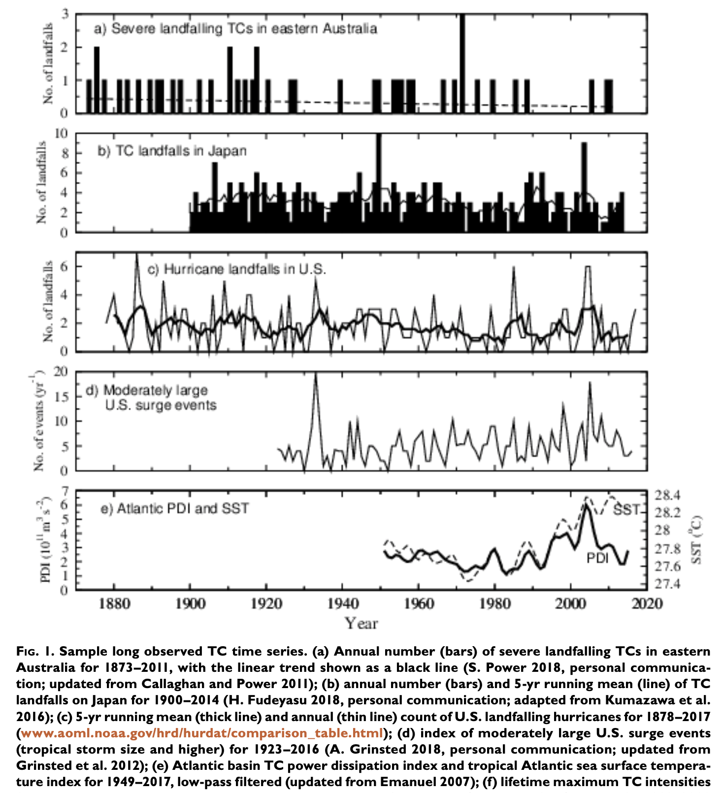
In Extreme Weather #1 we looked at trends in landfalling tropical cyclones (TCs), where data goes back over 100 years. Way more TCs form over the ocean and don’t hit land, thankfully. Trends on these would be informative – are they getting worse?

There isn’t much quality data before satellites started going up around 1980, so we have good data for over 40 years. More coverage was added around 1990 so we have even better data over the last 30 years.

What does the latest IPCC report say? Chapter 11 of AR6 covers extreme weather.

Here’s the simple version:

There are significant positive global trends in TC intensity.

The actual text, from p. 1585, is in the Notes at the end of this article.

This seems like bad news but it’s actually good news.

The Executive Summary for the chapter includes the “bad news”, p. 1519:

It is likely that the global proportion of Category 3–5 tropical cyclone instances has increased over the past four decades.. The global frequency of TC rapid intensification events has likely increased over the past four decades. None of these changes can be explained by natural variability alone (medium confidence).

I was confused when I read this section of the report and the paper referenced – Kossin et al., “Global increase in major tropical cyclone exceedance probability over the past four decades”, 2020. I’ve read a number of papers on TCs in the satellite era and “getting worse” didn’t seem correct. I found a paper from Klotzbach et al 2022 in my files and reread it. Both Kossin and Klozbach are heavily cited in this field, including by this IPCC report and the previous report (AR5).

Here’s Klotzbach 2022:

This study investigates 1990–2021 global tropical cyclone (TC) activity trends, a period characterized by consistent satellite observing platforms. We find that fewer hurricanes are occurring globally and that the tropics are producing less Accumulated Cyclone Energy—a metric accounting for hurricane frequency, intensity, and duration.

Here’s Kossin 2020:

Here we address and reduce these heterogeneities and identify significant global trends in TC intensity over the past four decades. The results should serve to increase confidence in projections of increased TC intensity under continued warming.

I emailed Phil Klotzbach asking for clarification – different dataset? different time period? looking at a different metric? and he very kindly replied within 24 hours explaining. (I’ve emailed a number of climate scientists during the years of writing this blog and have found them to be exceptionally responsive, courteous and helpful).

Now it’s clear. And I should have figured it out myself. Here is my plain English version:

The number of category 4-5 TCs (the most extreme) hasn’t changed. The number of category 1-3 TCs has reduced.

So this seems like good news. We can express it as “the percentage of the most extreme TCs has increased” but that’s just another way of saying the same thing.

For people still confused, like a couple of friends I explained this to.. suppose the number of murders is flat but the number of other violent offences has reduced. We could say “violent crime is down”, or we could say “extreme violence has increased (as a percentage of overall violent crime)”. The first one is the plain English version.

Now, we’re looking at a short duration – 30-40 years. Is the trend due to climate variables like La Nina? Will the trend continue? Reverse? All good questions, perhaps to be considered in a future article.

This aim of this article is about the simpler question of what has been observed about trends in tropical cyclones out over the oceans. We’ll let Phil have the last word:

We find that fewer hurricanes are occurring globally and that the tropics are producing less Accumulated Cyclone Energy—a metric accounting for hurricane frequency, intensity, and duration

Notes

Text of AR6 on TC trends in the satellite era, from p. 1585:

There are previous and ongoing efforts to homogenize the best-track data (Elsner et al., 2008; Kossin et al., 2013, 2020; Choy et al., 2015; Landsea, 2015; Emanuel et al., 2018) and there is substantial literature that finds positive trends in intensity-related metrics in the best-track during the ‘satellite period’, which is generally limited to around the past 40 years (Kang and Elsner, 2012; Kishtawal et al., 2012; Kossin et al., 2013, 2020; Mei and Xie, 2016; Zhao et al., 2018; Tauvale and Tsuboki, 2019).

When best-track trends are tested using homogenized data, the intensity trends generally remain positive, but are smaller in amplitude(Kossin et al., 2013; Holland and Bruyère, 2014).

Kossin et al. (2020) extended the homogenized TC intensity record to the period 1979–2017 and identified significant global increases in major TC exceedance probability of about 6% per decade.

In addition to trends in TC intensity, there is evidence that TC intensification rates and the frequency of rapid intensification events have increased within the satellite era (Kishtawal et al., 2012; Balaguru et al., 2018; Bhatia et al., 2018). The increase in intensification rates is found in the best-track and the homogenized intensity data.

References

Seneviratne et al, 2021: Weather and Climate Extreme Events in a Changing Climate. In Climate Change 2021: The Physical Science Basis. Contribution of Working Group I to the Sixth Assessment Report of the Intergovernmental Panel on Climate Change

Global increase in major tropical cyclone exceedance probability over the past four decades, Kossin et al, PNAS (2020)

Trends in Global Tropical Cyclone Activity: 1990–2021, Philip J. Klotzbach et al, GRL (2022)

The latest IPCC report, AR6, was released in draft form in 2021 and in what seemed like an approved released form early 2022. You can download each chapter from ipcc.ch (Working Group 1 is “the physical science basis”).

Chapter 11 covers extreme events – “Weather and Climate Extreme Events in a Changing Climate”.

Here’s the simple version of what they say about long term trends in tropical cyclones (severe tropical storms):

For long term trends of landfalling tropical cyclones, we have a data quality issue. We do have good data for the USA going back to 1900 and there’s been no increase. We do have good data for Australia going back to the late 1800s and there’s been a decrease. On a global basis the data quality isn’t good enough to have any confidence in trends in intensity or frequency.

The actual text, from p. 1585-1586, is in the Notes at the end of this article.

This how the executive summary for the chapter captures the essence of this apparently good news, p.1519:


That’s the main dish.

Here’s an extract from Thomas Knutson et al 2019:

One of their summaries:

In summary, no detectable anthropogenic influence has been identified to date in observed TC- landfalling data, using type I error avoidance criteria. From the viewpoint of type II error avoidance, one of the above changes (decrease in severe landfalling TCs in eastern Australia), was rated as detectable, though not attributable to anthropogenic forcing (9 of 11 authors), with one dissenting author expressing reservations about the historical data quality in this case.

It’s important to note that landfalling TCs are only a small subset of TCs that form out over the ocean, and in the next article we’ll look at this.

Notes

Text of AR6 from p. 1585-1586 about long term trends in tropical cycles:

Identifying past trends in TC metrics remains a challenge due to the heterogeneous character of the historical instrumental data, which are known as ‘best-track’ data (Schreck et al., 2014). There is low confidence in most reported long-term (multi-decadal to centennial) trends in TC frequency- or intensity-based metrics due to changes in the technology used to collect the best-track data. This should not be interpreted as implying that no physical (real) trends exist, but rather as indicating that either the quality or the temporal length of the data is not adequate to provide robust trend detection statements, particularly in the presence of multi-decadal variability..

..A subset of the best-track data corresponding to hurricanes that have directly impacted the USA since 1900 is considered to be reliable, and shows no trend in the frequency of USA landfall events (Knutson et al., 2019)…

..A similarly reliable subset of the data representing TC landfall frequency over Australia shows a decreasing trend in Eastern Australia since the 1800s (Callaghan and Power, 2011), as well as in other parts of Australia since 1982 (Chand et al., 2019; Knutson et al., 2019). A paleoclimate proxy reconstruction shows that recent levels of TC interactions along parts of the Australian coastline are the lowest in the past 550–1500 years (Haig et al., 2014).

References

Seneviratne et al, 2021: Weather and Climate Extreme Events in a Changing Climate. In Climate Change 2021: The Physical Science Basis. Contribution of Working Group I to the Sixth Assessment Report of the Intergovernmental Panel on Climate Change

Knutson, T.R. et al., 2019: Tropical Cyclones and Climate Change Assessment: Part I: Detection and Attribution. Bulletin of the American Meteorological Society

In VI – Australia CanESM2, CSIRO, Miroc and MRI compared vs history we looked at how each model thought rainfall had changed in Australia over about 100 years, and we compared that to observations. We did this for annual rainfall, also for Australian summer (Dec, Jan, Feb) and Australian winter (Jun, Jul, Aug).

Here we will look at two of the four emissions scenarios. We compare 2081-2100 vs 1979-2005.

Note that we are not comparing the end of the 21st century from the model with observations at the end of the 20th century. That produces much different results – the model’s view of recent history doesn’t match observations very well. We are comparing the model future with the model past. So we are asking the model to say how it sees rainfall changing as a result of different amounts of CO2 being emitted.

The two scenarios are:

  • RCP4.5 – with current trends continuing we are something like RCP6. I think of RCP4.5 as being “what we are doing now” but with some substantial reductions in CO2 emissions. But it’s nothing like RCP2.6, which is more “project Greta” where emissions basically stop in a decade
  • RCP8.5 – extreme CO2 emissions. Often described as “business as usual” perhaps to get people’s attention. Think – most of Africa moving out of abject poverty, not passing through the demographic transition (so population going very high) and burning coal like crazy with the efficiency of 19th century Europe.

Each pair of graphs is future RCP4.5 as % of recent past, and RCP8.5 as % of recent past. The four models, clockwise from top left – MPI (Germany), Miroc (Japan), CSIRO (Australia) and CAN (Canada):

Figure 1 – Click to expand

And now the same, but only looking at Australian summer, DJF:

Figure 2 – Click to expand

Depending on which model you like, things could be really bad, or really good, or about the same with “climate change”.

Note that the color scale I’m using here is the same as the last article, but different from all the earlier articles, the % range is from 50% to 150% (rather than 0% to 200%).

References

An overview of CMIP5 and the experiment design, Taylor, Stouffer & Meehl, AMS (2012)

GPCP data provided by the NOAA/OAR/ESRL PSL, Boulder, Colorado, USA, from their Web site at https://psl.noaa.gov/

GPCC data provided from https://psl.noaa.gov/data/gridded/data.gpcc.html

CMIP5 data provided by the portal at https://esgf-data.dkrz.de/search/cmip5-dkrz/

In V – CanESM2, CSIRO, Miroc and MRI compared we compared four models among themselves for two future scenarios of CO2 emissions, and also the four models compared with historical observations.

Here we zero in on Australia. Let’s compare all months 1979-2005, i.e. recent history with around 100 years before that, all months 1891-1910 (note 1).

This first figure is a % comparison. Each map is annual data: average 1979-2005 % of average 1891-1910. Note that the color scale I’m using here is different from previous articles, the % range is from 50% to 150% (rather than 0% to 200%).

The left-most map is observations, GPCC, and on the right the four different models. Each of the four maps is one model, 1979-2005 as a % of that model for 1891-1910 – clockwise from top left, MPI, MIROC, CSIRO, CanESM2 (note 2):

Figure 1 – Click to expand

So we are seeing how well the models compare among themselves, and with observations, for a century or so change. All of the models are run with the identical set of conditions (the best estimate of forcings like CO2, aerosols, etc) – that’s what CMIP5 is all about.

This second graphic is % comparison over Australian summer: December, January, February (DJF). It is otherwise exactly the same as the figure 1:

Figure 2 – Click to expand

The annual model comparisons look “better” than the summer (DJF) comparisons.

With the DJF comparisons, Australian summer observations across a century have the western half of Australia wetter, and coastal Queensland (that’s the right edge from halfway up) drier. Also some inland NSW regions drier.

MPI and CSIRO show the western edge drier. Miroc and CAN show the western edge wetter. CSIRO has the Adelaide region and west much drier, observations show much wetter, CAN and MPI show this area a little wetter while Miroc has it about the same.

It’s difficult to claim the summer model comparisons demonstrate any insight – given that we can check them against observations. And overall, these four models don’t demonstrate any particular biases, i.e., they don’t all agree with each other against the observations. Apart from inland western Australia where they fail to predict the much higher rainfall seen in observations.

Place yourself back in 1900. You have these models, how useful are they for predicting 100 years ahead what would happen to summer rainfall?

References

An overview of CMIP5 and the experiment design, Taylor, Stouffer & Meehl, AMS (2012)

GPCP data provided by the NOAA/OAR/ESRL PSL, Boulder, Colorado, USA, from their Web site at https://psl.noaa.gov/

GPCC data provided from https://psl.noaa.gov/data/gridded/data.gpcc.html

CMIP5 data provided by the portal at https://esgf-data.dkrz.de/search/cmip5-dkrz/

Notes

Note 1: The choice of dates is constrained by:

  • 1891 being the start of the GPCC observational dataset
  • 1979 being the start of the satellite era
  • 2005 being the end date that this class of models ran to for their “historical” simulation – CMIP5 historical simulations were from 1850-2005

As a result, lots of comparisons in climate papers involve 1979-2005, so even though we aren’t using satellite data here, I have been using that 27-year period.

Note 2: Each model output is the median of all of the simulations

In the last article we looked at a comparison between Miroc (Japanese climate mode) and MPI (German climate model). See that article for more details.

Now we add CanESM2 and CSIRO-Mk3-6-0 to the comparison.

CanESM2 is a Canadian climate model, with an ESM component – this is an earth system model, basically it means that CO2 emissions are explicitly controlled, but not the atmospheric CO2 concentration (so the model simulates aspects of the carbon cycle). Their model has 5 historical simulations and 5 each each of three RCPs (skipping RCP6 like many other CMIP5 contributors)

CSIRO-Mk3-6-0 is an Australian model. Their model has 3 historical simulations and 10 each of the four RCPs.

As in the previous article, MPI, Miroc, CAN and CSIRO for RCP4.5 for 2081-2100. Each graphic – the median of all of the simulations as % of the median of that model’s historical 1979-2005 simulations:

Figure 1 – MPI, Miroc, CAN & CSIRO for RCP4.5 (%) – Click to expand

And for RCP8.5 for 2081-2100

Figure 2 – MPI, Miroc, CAN & CSIRO for RCP8.5 (%) – Click to expand


And comparisons of each models’ historical runs (the median of multiple runs): % of observations (GPCC) over 1979-2005. So blue means the model over-estimates actual rainfall, whereas red means the model under-estimates:

Figure 3 – MPI, Miroc, CAN & CSIRO historical runs compared with GPCC over the same 1979-2005 period – Click to expand

Clearly a strong consensus.

In Models and Rainfall – III – MPI Seasonal and Models and Rainfall – II – MPI we looked at one model, MPI from Germany, from a variety of perspectives.

In this article we’ll look at another model that took part in the last Climate Model Intercomparison Project (CMIP5) – Miroc5 from Japan and compare it with MPI.

A reminder from an earlier article – the scenarios (Representative Concentration Pathways) in brief (and see van Vuuren reference below):

Miroc5 (just called Miroc in the rest of the article) did five simulations of historical and three simulations of each RCP through to 2100.

The first graphic has five maps: first, the median Miroc simulation of 1979-2005, followed by simulations of 2081-2100 for rcp2.6 to rcp8.5 (each one is the median of the three simulations):

Figure 1 – Miroc simulations of historical 1979-2005 and the 4 RCPs in 2081-2100 – Click to expand

The % change of the median Miroc simulation for each scenario from the median historical simulation:

We can see a consistent theme through increasing CO2 concentrations.

Figure 2 – Miroc simulations for RCPs 2081-2100 as % of Miroc historical 1979-2005 – Click to expand

As the previous figure, but difference (future – historical):

Figure 3 – Miroc simulations for RCPs 2081-2100 less Miroc historical 1979-2005 – Click to expand

Side by Side Comparisons of MPI and Miroc Predictions

And now some comparisons side by side. On the left MPI, on the right Miroc. Both are comparing RCP4.5 as a percentage of their own historical simulation (and both are the medians of the simulations):

Figure 4 – MPI compared with Miroc for RCP4.5 (%) – Click to expand

I think seeing the future less historical (as a difference rather than %) is also useful – in areas with very low rain the % difference can appear extreme even though the impact is very low. Overall, % graphs are more useful – if you live in an area with say 20mm of rainfall per month on average then -10mm might not show up very well on a difference chart, but it can be critical. But for reference, the difference:

Figure 5 – MPI compared with Miroc for RCP4.5 (difference) – Click to expand

Now the same two graphs for RCP8.5. On the left MPI, on the right Miroc. % of their historical simulation in each case:

Figure 6 – MPI compared with Miroc for RCP8.5 (%) – Click to expand

And now difference (future less historical) in each case:

Figure 7 – MPI compared with Miroc for RCP8.5 (difference) – Click to expand

Side by Side Comparisons of Models vs Observations

In Part II we saw some comparisons of the MPI model with GPCC observations, both over the same 1979-2005 time period. Here is MPI (left) and MIROC (right) each as a % of GPCC:

Figure 8 – MPI compared with Miroc for GPCC observations (%) – Click to expand

It’s clear that different models, at least for now MPI and Miroc, have significant differences between them.

References

An overview of CMIP5 and the experiment design, Taylor, Stouffer & Meehl, AMS (2012)

GPCP data provided by the NOAA/OAR/ESRL PSL, Boulder, Colorado, USA, from their Web site at https://psl.noaa.gov/

GPCC data provided from https://psl.noaa.gov/data/gridded/data.gpcc.html

CMIP5 data provided by the portal at https://esgf-data.dkrz.de/search/cmip5-dkrz/

The representative concentration pathways: an overview, van Vuuren et al, Climatic Change (2011)


In the last article we looked at the MPI model – comparisons of 2081-2100 for different atmospheric CO2 concentrations/emissions with 1979-2005. And comparisons between the MPI historical simulation and observations. These were all on an annual basis.

This article has a lot of graphics – I found it necessary because no one or two perspectives really help to capture the situation. At the end there are some perspectives for people who want to skip through.

In this article we look at similar comparisons to the last article, but seasonal. Mostly winter (northern hemisphere winter), i.e. December, January, February. Then a few comparisons of northern hemisphere summer: June, July, August. The graphics can all be expanded to see the detail better by clicking on them.

Future scenarios vs modeled history

Here we see the historical simulation over DJF 1979-2005 (1st graph) followed by the three scenarios, RCP2.6, RCP4.5, RCP8.5 over DJF 2080-2099:

Figure 1 – DJF Simulations from MPI-ESM-LR for historical 1979-2005 & 3 RCPs 2080-2099 – Click to expand

Now the results are displayed as a difference from the historical simulation. Positive is more rainfall in the future simulation, negative is less rainfall:

Figure 2 – DJF Simulations from MPI-ESM-LR for 3 RCPs in 2080-2099 minus simulation of historical 1979-2005 – Click to expand

And the % change. The Saharan changes look dramatic, but it’s very low rainfall turning to zero, at least in the model. For example, I picked one grid square, 20ºN, 0ºE, and the historical simulated rainfall was 0.2mm/month, under RCP2.6 0.05mm/month and for RCP8.6 0mm/month.

Figure 3 – DJF Simulations from MPI-ESM-LR for 3 RCPs in 2080-2099 as % of simulation of historical 1979-2005 – Click to expand

I zoomed in on Australia – each graph is absolute values. The first is the historical simulation, then the 2nd, 3rd, 4th are the 3 RCPs as before:

Figure 4 – DJF Australia – simulations from MPI-ESM-LR for historical 1979-2005 & 3 RCPs 2080-2099 – Click to expand

Then differences from the historical simulation:

Figure 5 – DJF Australia – Simulations from MPI-ESM-LR for 3 RCPs in 2080-2099 minus simulation of historical 1979-2005 – Click to expand

Then percentage changes from the historical simulation:

Figure 6 – DJF Australia – Simulations from MPI-ESM-LR for 3 RCPs in 2080-2099 as % of simulation of historical 1979-2005 – Click to expand

And the same for Europe – each graph is absolute values. The first is the historical simulation, then the 2nd, 3rd, 4th are the 3 RCPs as before:

Figure 7 – DJF Europe – simulations from MPI-ESM-LR for historical 1979-2005 & 3 RCPs 2080-2099 – Click to expand

Then differences from the historical simulation:

Figure 8 – DJF Europe – Simulations from MPI-ESM-LR for 3 RCPs in 2080-2099 minus simulation of historical 1979-2005 – Click to expand

Then percentage changes from the historical simulation:

Figure 9 – DJF Europe – Simulations from MPI-ESM-LR for 3 RCPs in 2080-2099 as % of simulation of historical 1979-2005 – Click to expand

Now the global picture for northern hemisphere summer, June July August. First, absolute for the model for historical, then absolute for each RCP:

Figure 10 – JJA Simulations from MPI-ESM-LR for historical 1979-2005 & 3 RCPs 2080-2099 – Click to expand

Now the results are displayed as a difference from the historical simulation. Positive is more rainfall in the future simulation, negative is less rainfall:

Figure 11 – JJA Simulations from MPI-ESM-LR for 3 RCPs in 2080-2099 minus simulation of historical 1979-2005 – Click to expand

And the % change:

Figure 12 – JJA Simulations from MPI-ESM-LR for 3 RCPs in 2080-2099 as % of simulation of historical 1979-2005 – Click to expand

Modeled History vs Observational History

As in the last article, how the historical model compares with observations over the same period but for DJF. The GPCC observational data on the left and the median of all the historical simulations from the three MPI models (8 simulations total) on the right:

Figure 13 – DJF 1979-2005 GPCC Observational data & Median of all MPI historical simulations – Click to expand

The difference, so blue means the model produces more rain than reality, while red means the model produces less rain:

Figure 14 – DJF 1979-2005 Median of all MPI historical simulations less GPCC Observational data – Click to expand

And percentage change:

Figure 15 – DJF 1979-2005 Median of all MPI historical simulations as % of GPCC Observational data – Click to expand

Some Perspectives

Now let’s look at annual, DJF and JJA for how simulation compare with observations, this is median MPI less GPCC – like figure 13. You can click to expand the image:

Figure 16 – Annual/seasons 1979-2005 Median of all MPI historical simulations less GPCC Observational data – Click to expand

Another perspective, compare projections of climate change with model skill. Top is skill (MPI simulation of DJF 1979-2005 less GPCC observation), bottom left is 2081-2100 RCP2.6 less MPI simulation, bottom right is RCP8.5 less MPI simulation:

Figure 17 – DJF Compare model skill with projections of climate change for RCP2.6 & RCP8.5 – Click to expand

So let’s look at it another way.

Let’s look at the projected rainfall change for RCP2.6 and RCP8.5 vs actual observations. That is, MPI median DJF 2081-2099 less GPCC DJF 1979-2005:

Figure 18 – DJF Compare model projections with actual historical – Click to expand

And the same for annual:

Figure 19 – Annual Compare model projections with actual historical – Click to expand

Let’s just compare the same two RCPs with model projections of climate change (as they are usually displayed, future less model historical):

Figure 20 – For contrast, as figure 19 but compare with model historical – Click to expand

If we look at SW Africa, for example, we see a progressive drying from RCP2.6 (drastic cuts in CO2 emissions) to RCP8.5 (very high emissions). But if we look at figure 19 then the model projections at the end of the century for that region have more rainfall than current.

If we look at California we see the same kind of progressive drying. But compare model projections with observations and we see more rainfall in California under both those scenarios.

Of course, this just reflects the fact that climate models have issues with simulating rainfall, something that everyone in climate modeling knows. But it’s intriguing.

In the next article we’ll look at another model.

References

An overview of CMIP5 and the experiment design, Taylor, Stouffer & Meehl, AMS (2012)

GPCP data provided by the NOAA/OAR/ESRL PSL, Boulder, Colorado, USA, from their Web site at https://psl.noaa.gov/

GPCC data provided from https://psl.noaa.gov/data/gridded/data.gpcc.html

CMIP5 data provided by the portal at https://esgf-data.dkrz.de/search/cmip5-dkrz/

The representative concentration pathways: an overview, van Vuuren et al, Climatic Change (2011)

If you look at model outputs for rainfall in the last IPCC report, or in most papers, it’s difficult to get a feel for what models produce, how they compare with each other, and how they compare with observational data. It’s common to just show the median of all models.

In this, and some subsequent articles, I’ll try and provide some level of detail.

Here are some comparisons from a set of models from the Max Planck Institute for Meteorology. MPI is just one of about 20 climate modeling centers around the world. They took part in the Climate Model Intercomparison Project (CMIP5). As part of that project, for the IPCC 5th assessment report (AR5), they ran a number of simulations. Details of CMIP5 in the Taylor et al reference below.

Future scenarios vs modeled history

Here is the % change in rainfall – 2081-2100 vs 1979-2005 from one of the MPI models (MPI-ESM-LR) for 3 scenarios. The median of 3 runs for each scenario is compared with the median of 3 runs for the historical period, and we see the % change:

Figure 1 – Simulations from MPI-ESM-LR for 3 RCPs vs simulation of historical – Click to expand

The scenarios (Representative Concentration Pathways) in brief (and see van Vuuren reference below):

We can see that rcp 2.6 has some small reductions in rainfall in northern Africa, Middle East and a few other regions. RCP 8.5 has large areas of greatly reduced rainfall in northern Africa, Middle East , SW Africa, the Amazon, and SW Australia.

So from a model only point of view the less emissions the better.

It’s common to find that RCP6 is not modeled, something that I find difficult to understand. I understand that computing time is valuable but RCP6 seems like the emissions pathway we are currently on.

Perhaps it should be explicitly stated that the simulation results of RCP4.5 and RCP6 are effectively identical – if that is in fact the case. That by itself would be useful information given that there is a substantial difference in CO2 emissions between them.

I had a look at a couple of regions of interest – Australia:

Figure 2 – Australia – Simulations from MPI-ESM-LR for 3 RCPs vs simulation of historical – Click to expand

And Europe:

Figure 3 – Europe – Simulations from MPI-ESM-LR for 3 RCPs vs simulation of historical – Click to expand

Modeled History vs Observational History

Here we compare the historical MPI model runs with observations (GPCC). MPI has 3 models and a total of 8 runs:

  • MPI-ESM-LR (3 simulations)
  • MPI-ESM-MR (3 simulations)
  • MPI-ESM-P (2 simulations)

Each model that takes part in CMIP5 produces one or more simulations over identical ‘historical’ conditions (our best estimate of them) from 1850-2005.

I compared the median of each model with GPCC over the last 27 years of the ‘historical’ period, 1979-2005:

Figure 4 – The median of simulations from each MPI model vs observation 1979-2005 – Click to expand

And the % difference of each MPI model vs GPCC over the same period:

Figure 5 – The median of simulations from each MPI model, % change over observation 1979-2005 – Click to expand

The different models appear quite similar. So let’s take the median of all 8 runs across the 3 models and compare with observations (GPCC) for clarity (the graph title isn’t quite correct, this is across the 3 models):

Figure 6 – The median of simulations from all MPI models, % change over observation 1979-2005 – Click to expand

The same, highlighting Australia:

Figure 7 – Australia – median of simulations from all MPI models, % change over observation 1979-2005 – Click to expand

And highlighting Europe:


Figure 8 – Europe – median of simulations from all MPI models, % change over observation 1979-2005 – Click to expand

I’m not trying to draw any big conclusions here, more interested in showing what model results look like.

But the one thing that stands out in a first look, at least to me – the difference between the MPI model and observations (over the same time period) is more substantial than the difference between the MPI model for 2080-2100 and the MPI model for recent history, even for an extreme CO2 scenario (RCP8.5).

If you want to draw conclusions from a climate model on rainfall, should you compare the future simulations with the simulation of the recent past? Or future simulations with actual observations? Or should you compare past simulations with actual and then decide whether to compare future simulations with anything?

References

An overview of CMIP5 and the experiment design, Taylor, Stouffer & Meehl, AMS (2012)

GPCP data provided by the NOAA/OAR/ESRL PSL, Boulder, Colorado, USA, from their Web site at https://psl.noaa.gov/

GPCC data provided from https://psl.noaa.gov/data/gridded/data.gpcc.html

CMIP5 data provided by the portal at https://esgf-data.dkrz.de/search/cmip5-dkrz/

The representative concentration pathways: an overview, van Vuuren et al, Climatic Change (2011)

Here’s an extract from a paper by Mehran et al 2014, comparing climate models with observations, over the same 1979-2005 time period:

From Mehran et al 2014

Click to enlarge

The graphs show the ratios of models to observations. Therefore, green is optimum, red means the model is producing too much rain, while blue means the model is producing too little rain (slightly counter-intuitive for rainfall and I’ll be showing data with colors reversed).

You can easily see that as well as models struggling to reproduce reality, models can be quite different from each other, for example the MPI model has very low rainfall for lots of Australia, whereas the NorESM model has very high rainfall. In other regions sometimes the models mostly lean the same way, for example NW US and W Canada.

For people who understand some level of detail about how models function it’s not a surprise that rainfall is more challenging than temperature (see Opinions and Perspectives – 6 – Climate Models, Consensus Myths and Fudge Factors).

But this challenge makes me wonder about drawing a solid black line through the median and expecting something useful to appear.

Here is an extract from the recent IPCC 1.5 report:

Global Warming of 1.5°C. An IPCC Special Report

I’ll try to shine some light on the outputs of rainfall in climate models in subsequent articles.

References

Note: these papers should be easily accessible without a paywall, just use scholar.google.com and type in the title.

Evaluation of CMIP5 continental precipitation simulations relative to satellite-based gauge-adjusted observations, Mehran, AghaKouchak, & Phillips, Journal of Geophysical Research: Atmospheres (2014)

The Version-2 Global Precipitation Climatology Project (GPCP) Monthly Precipitation Analysis (1979–Present), Adler et al, American Meteorological Society (2003)

Hoegh-Guldberg, O., D. Jacob, M. Taylor, M. Bindi, S. Brown, I. Camilloni, A. Diedhiou, R. Djalante, K.L. Ebi, F. Engelbrecht, J. Guiot, Y. Hijioka, S. Mehrotra, A. Payne, S.I. Seneviratne, A. Thomas, R. Warren, and G. Zhou, 2018: Impacts of 1.5ºC Global Warming on Natural and Human Systems. In: Global Warming of 1.5°C. An IPCC Special Report on the impacts of global warming of 1.5°C above pre-industrial levels and related global greenhouse gas emission pathways, in the context of strengthening the global response to the threat of climate change, sustainable development, and efforts to eradicate poverty [Masson-Delmotte, V., P. Zhai, H.-O. Pörtner, D. Roberts, J. Skea, P.R. Shukla, A. Pirani, W. Moufouma-Okia, C. Péan, R. Pidcock, S. Connors, J.B.R. Matthews, Y. Chen, X. Zhou, M.I. Gomis, E. Lonnoy, T. Maycock, M. Tignor, and T. Waterfield (eds.)].

The datasets are accessible in websites below – there are options to plot specific regions, within specific dates, and to download the whole dataset as a .nc file.

GPCC – https://psl.noaa.gov/data/gridded/data.gpcc.html

GPCP – https://psl.noaa.gov/data/gridded/data.gpcp.html

I have just been looking at the GPCC dataset, using Matlab to extract and plot monthly data for different time periods including comparisons. I’d like to compare actual with the output of various climate models over similar time periods – and against future simulations under different scenarios.

Have any readers of the blog done this? If so I’d appreciate a few tips having run into a few dead ends.

What I’m looking for – monthly gridded surface precipitation.

GPCC has 0.5ºx0.5º and 2.5ºx2.5º datasets that I’ve downloaded so the same gridded output from models would be wonderful.

I have found:

–  The CMIP5 Data is now available through the new portal, the Earth System Grid – Center for Enabling Technologies (ESG-CET), on the page http://esgf-node.llnl.gov/

–  https://www.wcrp-climate.org/wgcm/references/IPCC_standard_output.pdf

Table A1a: Monthly-mean 2-d atmosphere or land surface data (longitude, latitude, time:month).

CF standard_name; output; variable name;  units;  notes  –
precipitation_flux; pr; kg m-2 s-1;   includes both liquid and solid phases.

So I think this is what I am looking for.

–  https://www.ipcc-data.org/sim/gcm_monthly/AR5/Reference-Archive.html gives a list of different experiments within each climate model. For example – the MPI model, I expect that historical and rcp.. are the ones I want. I would have to dig into MPI-ESM-LR and -MR which I assume are different model resolutions.

But when I work my way through the portal, e.g. https://esgf-data.dkrz.de/search/cmip5-dkrz/ I find a bewildering array of options and after hopefully culling it down to just monthly rainfall from the MPI-LR model, there are 213 files:

I can easily imagine spending 100+ hours trying to establish which files are correct, trying to verify.. So, if any readers have the knowledge it would be much appreciated.

————

Just for interest, here are a few graphs produced from GPCC using Matlab. I checked a couple of outputs against samples produced from their website and they seemed correct.

I set the max monthly rainfall on the color axis to increase contrast for most places in the world – 4 different 10-year periods:

GPCC Precipitation data provided by the NOAA/OAR/ESRL PSL, Boulder, Colorado, USA, from their Web site at https://psl.noaa.gov/

And a delta, % difference:

GPCC Precipitation data provided by the NOAA/OAR/ESRL PSL, Boulder, Colorado, USA, from their Web site at https://psl.noaa.gov/