[Later note, Sep 2015, it’s clear – as can be seen in the later comments that follow the article – there is a difference between a number of papers that cannot be explained by ‘improved efficiencies in manufacturing’ or ‘improved solar-electricity conversion efficiencies’. The discrepancies are literally one group making a large mistake and taking “energy input” to be electricity input rather than fuel to put into power stations to create electricity – or the reverse. I suspect that the paper I highlight below is making the mistake, in which case this article is out by a factor of 3 against solar being a free lunch. In due course, I will try to fight through all the papers again to get to the bottom of it. I also have not been able to confirm that any of the papers really account for building all the new factories that manufacture the solar panels (instead perhaps they are just considering the marginal electricity use to make each solar cell).]
There are lots of studies of the energy and GHG input into production of solar panels. I’ve read some and wanted to highlight one to look at some of the uncertainties.
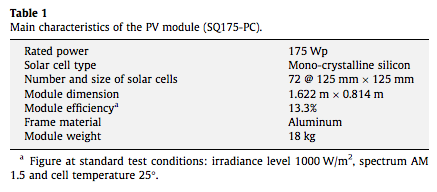
Lu & Yang 2010 looked at the energy required to make, transport and install a (nominal) 22 KW solar panel on a roof in Hong Kong – and what it produced in return. Here is the specification of the module (the system had 125 modules):
For the system’s energy efficiency, the average energy efficiency of a Sunny Boy inverter is assumed 94%, and other system losses are assumed 5%.
This is a grid-connected solar panel – that is, it is a solar panel with an inverter to produce the consumer a.c. voltage, and excess power is fed into the grid. If it had the expensive option of battery storage so it was self-contained, the energy input (to manufacture) would be higher (note 1).
For stand-alone (non-rooftop) systems the energy used in producing the structure becomes greater.
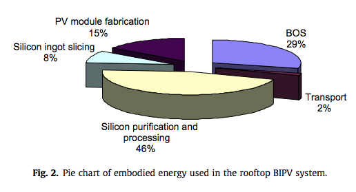
Here’s the pie chart of the estimated energy consumed in different elements of the process:

From Lu & Yang (2010)
A big part of the energy is consumed in producing the silicon, with a not insignificant amount for slicing it into wafers. BOS = “balance of system” and we see this is also important. This is the mechanical structure and the inverter, cabling, etc.
The total energy per meter squared:
- silicon purification and processing – 666 kWh
- slicing process – 120 kWh
- fabricating PV modules – 190 kWh
- rooftop supporting structure – 200 kWh
- production of inverters – 33 kWh
- other energy used in system operation and maintenance, electronic components, cables and miscellaneous – 125 kWh
Transportation energy use turned out pretty small as might be expected (and is ignored in the total).
Therefore, the total energy consumed in producing and installing the 22 kW grid-connected PV system is 206,000 kWh, with 29% from BOS, and 71% from PV modules.
What does it produce? Unfortunately the data for the period is calculated not measured due to issues with the building management system (the plan was to measure the electrical production, however, it appears some data points have been gathered).
Now there’s a few points that have an impact on solar energy production. This isn’t comprehensive and is not from their paper:
- Solar cells rated values are taken at 25ºC, but when you have sunlight on a solar cell, i.e., when it’s working, it can be running at a temperature of up to 50ºC. The loss due to temperature is maybe 12 – 15% (I am not clear how accurate this number is).
- Degradation per year is between 0.5% and 1% depending on the type of silicon used (I don’t know how reliable these numbers are at 15 years out)
- Dust reduces energy production. It’s kind of obvious but unless someone is out there washing it on a regular basis you have some extra, unaccounted losses.
- Inverter quality
Obviously we need to calculate what the output will be. Most locations, and Hong Kong is no exception, have a pretty well-known solar W/m² at the surface. The angle of the solar cells has a very significant impact. This installation was at 22.5º – close to the best angle of 30º to maximize solar absorption.
Lu & Yang calculate:
For the 22 kW roof-mounted PV system, facing south with a tilted angle of 22.5, the annual solar radiation received by the PV array is 266,174 kWh using the weather data from 1996 to 2000, and the annual energy output (AC electricity) is 28,154 kWh. The average efficiency of the PV modules on an annual basis is 10.6%, and the rated standard efficiency of the PV modules from manufacturer is 13.3%. The difference can be partly due to the actual higher cell operating temperature.
The energy output of the PV system could be significantly affected by the orientations of the PV modules. Therefore, different orientations of PV arrays and the corresponding annual energy output are investigated for a similar size PV system in Hong Kong, as given in Table 3. Obviously, for the same size PV system, the energy output could be totally different if the PV modules are installed with different orientations or inclined angles. If the 22 kW PV system is installed on vertical south-facing facade, the system power output is decreased by 45.1% compared that of the case study.
So the energy used will be returned in approximately 7.3 years.
Energy in = 206 MWh. Energy out = 28 MWh per year.
Location Location
Let’s say we put that same array on a rooftop in Germany, the poster-child for solar takeup. The annual solar radiation received by the PV array is about 1000 KWh per m², about 60% of the value in HK (note 2).
Energy in = 206 MWh. Energy out in Germany = 15.8 MWh per year (13 years payback).
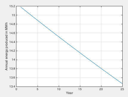
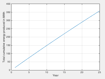
I did a quick calculation using 13.3% module efficiency (rated performance at 25ºC), a 15% loss due to the high temperature of the module being in the direct sunlight (when it is producing most of its electricity), an inverter & cabling efficiency of 90% and a 0.5% loss per year of solar efficiency. Imagine no losses from dust. Here is the year by year production – assumes 1000 kWhr solar radiation annually and 150 m² PV cells:

Here we get to energy payback at end of year 14.
I’m not sure if anyone has done a survey of the angle of solar panels placed on residential rooftops but if the angle is 10º off its optimum value we will see very roughly something towards a 10% loss in efficiency. Add in some losses for dust (pop quiz – how many people have seen residents cleaning their solar panels on the weekend?) What’s the real long term energy efficiency of a typical economical consumer solar inverter? It’s easy to see the energy payback moving around significantly in real life.
Efficiency Units – g CO2e / kWh and Miles per Gallon
When considering the GHG production in generating electricity, there is a conventional unit – amount of CO2 equivalent per unit of electricity produced. This is usually grams of CO2 equivalent (note 3) per KWh (a kilowatt hour is 3.6 MJ, i.e., 1000J per second for 3,600 seconds).
This is a completely useless unit to quote for solar power.
Imagine, if you will, the old school (new school and old school in the US) measurement of car efficiency – miles per gallon. You buy a Ford Taurus in San Diego, California and it gets you 28 miles per gallon. You move to Portland, Maine and now it’s doing 19 miles per gallon. It’s the exact same car. Move back to San Diego and it gets 28 miles per gallon again.
You would conclude that the efficiency metric was designed by ..
I’m pretty sure my WiFi router uses just about the same energy per GBit of data regardless of whether I move to Germany, or go and live at the equator. And equally, even though it is probably designed to sit flat, if I put it on its side it will still have the same energy efficiency to within a few percent. (Otherwise energy per GBit would not be a useful efficiency metric).
This is not the case with solar panels.
With solar panels the metric you want to know is how much energy was consumed in making it and where in the world most of the production took place (especially the silicon process). Once you have that data you can consider where in the world this technology will sit, at what angle, the efficiency of the inverter that is connected and how much dust accumulates on those beautiful looking panels. And from that data you can work out the energy efficiency.
And from knowing where in the world it was produced you can work out, very approximately (especially if it was in China) how much GHGs were produced in making your panel. Although I wonder about that last point..
The key point on efficiency in case it’s not obvious (apologies for laboring the point):
- the solar panel cost = X KWh of electricity to make – where X is a fixed amount (but hard to figure out)
- the solar panel return = Y KWhr per year of electricity – where Y is completely dependent on location and installed angle (but much easier to figure out)
The payback can never be expressed as g CO2e/KWh without stating the final location. And the GHG reduction can never be expressed without stating the manufacturing location and the final location.
Moving the Coal-Fired Power Station
Now let’s consider that all energy is not created equally.
Let’s suppose that instead of the solar panel being produced in an energy efficient country like Switzerland, it’s produced in China. I can find the data on electricity production and on GHG emissions but China also creates massive GHG emissions from things like cement production so I can’t calculate the GHG efficiency of their electricity production. And China statistics have more question marks than some other places in the world. Maybe one of our readers can provide this data?
Let’s say a GHG-conscious country is turning off efficient (“efficient” from a conventional fossil-fuel perspective) gas-fired power stations and promoting solar energy into the grid. And the solar panels are produced in China.
Now while the energy payback stays the same, the GHG payback might be moving to the 20 year mark or beyond – because 1 KWh “cost” came from coal-fired power stations and 1 KWh return displaced energy from gas-fired power stations. Consider the converse, if we have solar panels made in an (GHG) energy efficient country and shipped to say Arizona (lots of sun) to displace coal-fired power it will be a much better equation. (I have no idea if Arizona gets energy from coal but last time I was there it was very sunny).
But if we ship solar panels from China to France to displace nuclear energy, I’m certain we are running a negative GHG balance.
Putting solar panels in high latitude countries and not considering the country of origin might look nice – and it certainly moves the GHG emissions off your country’s balance sheet – but it might not be as wonderful as many people believe.
It’s definitely not free.
Other Data Points
How much energy is consumed in producing the necessary parts?
This is proprietary data for many companies.
Those very large forward-thinking companies that might end up losing business if important lobby groups took exception to their business practices, or if a major government black-listed them, have wonderful transparency. A decade or so ago I was taken on a tour through one of the factories of a major pump company in Sweden. I have to say it was quite an experience. The factory workers volunteer to take the continual stream of overseas visitors on the tour and all seem passionate about many aspects including the environmental credentials of their company – “the creek water that runs through the plant is cleaner at the end than when it comes into the plant”.
Now let’s picture a solar PV company which has just built its new factory next to a new coal-fired power station in China. You are the CEO or the marketing manager. An academic researcher calls to get data on the energy efficiency of your manufacturing process. Your data tells you that you consume a lot more power than the datapoints from Siemens and other progressive companies that have been published. Do you return the call?
There must be a “supplier selection” bias given the data is proprietary and providing the data will lead to more or less sales depending on the answer.
Perhaps I am wrong and the renewables focus of countries serious about reducing GHGs means that manufacturers are only put on the approved list for subsidies and feed-in tariffs when their factory has been thoroughly energy audited by an independent group?
In a fairly recent paper, Peng et al (2013) – whose two coauthors appear to be the same authors of this paper we reviewed – noted that mono-silicon (the solar type used in this study) has the highest energy inputs. They review a number of studies that appear to show significantly better energy paybacks. We will probably look at that paper in a subsequent article, but I did notice a couple of interesting points.
Many studies referenced are from papers from 15 years ago which contain very limited production data (e.g. one value from one manufacturer). They comment on Knapp & Jester (2001) who show much higher values than other studies (including this one) and comment “The results of both embodied energy and EBPT are very high, which deviate from the previous research results too much.” However, Knapp & Jester appeared to be very thorough:
This is instead a chiefly empirical endeavor, utilizing measured energy use, actual utility bills, production data and complete bill of materials to determine process energy and raw materials requirements. The materials include both direct materials, which are part of the finished product such as silicon, glass and aluminum, and indirect materials, which are used in the process but do not end up in the product such as solvents, argon, or cutting wire, many of which turn out to be significant.
All data are based on gross inputs, fully accounting for all yield losses without requiring any yield assumptions. The best available estimates for embodied energy content for these materials are combined with materials use to determine the total embodied and process energy requirements for each major step of the process..
..Excluded from the analysis are (a) energy embodied in the equipment and the facility itself, (b) energy needed to transport goods to and from the facility, (c) energy used by employees in commuting to work, and (d) decommissioning and disposal or other end-of-life energy requirements.
Perhaps Knapp & Jester got much higher results because their data was more complete? Perhaps they got much higher results because their data was wrong. I’m suspicious.. and by the way they didn’t include the cost of building the factory in their calculations.
A long time ago I worked in the semiconductor industry and the cost of building new plants was a lot higher than the marginal cost of making wafers and chips. That was measured in $ not kWh so I have no idea on the fixed/marginal kHr cost of making semiconductors for solar PV cells.
Conclusion
One other point to consider, the GHG emissions of solar panels all occur at the start. The “recovered” GHG emissions of displaced conventional power are year by year.
Solar power is not a free lunch even though it looks like one. There appears to be a lot of focus on the subject so perhaps more definitive data in the near future will enable countries to measure their decarbonizing efforts with some accuracy. If governments giving subsidies for solar power are not getting independent audits of solar PV manufacturers they should be.
In case some readers think I’m trying to do a hatchet job on solar, I’m not.
I’m collecting and analyzing data and two things are crystal clear:
- accurate data is not easily obtained and there may be a selection bias with inefficient manufacturers not providing data into these studies
- the upfront “investment” in GHG emissions might result in a wonderful payback in reduction of long-term emissions, but change a few assumptions, especially putting solar panels into high-latitude energy-efficient countries, and it might turn out to be a very poor GHG investment
Articles in this Series
Renewable Energy I – Introduction
Renewables II – Solar and Free Lunches – Solar power
Renewables III – US Grid Operators’ Opinions – The grid operators’ concerns
Renewables IV – Wind, Forecast Horizon & Backups – Some more detail about wind power – what do we do when the wind goes on vacation
Renewables V – Grid Stability As Wind Power Penetration Increases
Renewables VI – Report says.. 100% Renewables by 2030 or 2050
Renewables VII – Feasibility and Reality – Geothermal example
Renewables VIII – Transmission Costs And Outsourcing Renewable Generation
Renewables IX – Onshore Wind Costs
Renewables X – Nationalism vs Inter-Nationalism
Renewables XI – Cost of Gas Plants vs Wind Farms
Renewables XII – Windpower as Baseload and SuperGrids
Renewables XIII – One of Wind’s Hidden Costs
Renewables XIV – Minimized Cost of 99.9% Renewable Study
Renewables XV – Offshore Wind Costs
Renewables XVI – JP Morgan advises
Renewables XVII – Demand Management 1
Renewables XVIII – Demand Management & Levelized Cost
Renewables XIX – Behind the Executive Summary and Reality vs Dreams
References
Environmental payback time analysis of a roof-mounted building-integrated photovoltaic (BIPV) system in Hong Kong, L. Lu, H.X. Yang, Applied Energy (2010)
Review on life cycle assessment of energy payback and greenhouse gas emission of solar photovoltaic systems, Jinqing Peng, Lin Lu & Hongxing Yang, Renewable and Sustainable Energy Reviews (2013)
Empirical investigation of energy payback time for photovoltaic modules, Knapp & Jester, Solar Energy (2001)
Notes
Note 1: I have no idea if it would be a lot higher. Many people are convinced that “next generation” battery technology will allow “stand-alone” solar PV. In this future scenario solar PV will not add intermittancy to the grid and will, therefore, be amazing. Whether or not the economics mean this is 5 years away or 50 years away, note to the enthusiasts to check the GHG used in the production of these (future) batteries.
Note 2: The paper didn’t explicitly give the solar cell area. I calculated it from a few different numbers they gave and it appears to be 150m², which gives an annual average surface solar radiation of 1770 KWh/m². Consulting a contour map of SE Asia shows that this value might be correct. For the purposes of the comparison it isn’t exactly critical.
Note 3: Putting of 1 tonne of methane into the atmosphere causes a different (top of atmosphere) radiation change from 1 tonne of CO2. To make life simpler, given that CO2 is the primary anthropogenic GHG, all GHGs are converted into “equivalent CO2”.
Read Full Post »


Renewable Energy I
Posted in Commentary, Renewables on July 30, 2015| 122 Comments »
This blog is about climate science.
I wanted to take a look at Renewable Energy because it’s interesting and related to climate science in an obvious way. Information from media sources confirms my belief that 99% of what is produced by the media is rehashed press releases from various organizations with very little fact checking. (Just a note for citizens alarmed by this statement – they are still the “go to source” for the weather, footage of disasters and partly-made-up stories about celebrities).
Regular readers of this blog know that the articles and discussion so far have only been about the science – what can be proven, what evidence exists, and so on. Questions about motives, about “things people might have done”, and so on, are not of interest in the climate discussion (not for this blog). There are much better blogs for that – with much larger readerships.
Here’s an extract from About this Blog:
The same principles will apply for this discussion about renewables. Our focus will be on technical and commercial aspects of renewable energy, with a focus on evidence rather than figuring it out from “motive attribution”. And wishful thinking – wonderful though it is for reducing personal stress – will be challenged.
As always, the moderator reserves the right to remove comments that don’t meet these painful requirements.
Here’s a claim about renewables from a recent media article:
I couldn’t find any evidence in the article that verified the claim. Only that it came from Bloomberg New Energy Finance and was the opposite of a radio shock jock. Generally I favor my dogs’ opinions over opinionated media people (unless it is about the necessity of an infinite supply of Schmackos starting now, right now). But I have a skeptical mindset and not knowing the wonderful people at Bloomberg I have no idea whether their claim is rock-solid accurate data, or “wishful thinking to promote their products so they can make lots of money and retire early”.
Calculating the cost of anything like this is difficult. What is the basis of the cost calculation? I don’t know if the claim in BNEF’s calculation is “accurate” – but without context it is not such a useful number. The fact that BNEF might have some vested interest in a favorable comparison over coal and gas is just something I assume.
But, like with climate science, instead of discussing motives and political stances, we will just try and figure out how the numbers stack up. We won’t be pitting coal companies (=devils or angels depending on your political beliefs) against wind turbine producers (=devils or angels depending on your political beliefs) or against green activists (=devils or angels depending on your political beliefs).
Instead we will look for data – a crazy idea and I completely understand how very unpopular it is. Luckily, I’m sure I can help people struggling with the idea to find better websites on which to comment.
Calculating the Cost
I’ve read the details of a few business plans and I’m sure that most other business plans also have the same issue – change a few parameters (=”assumptions”, often “reasonable assumptions”) and the outlook goes from amazing riches to destitution and bankruptcy.
The cost per MWHr of wind energy will depend on a few factors:
And of course, in any discussion about “the future”, favorable assumptions can be made about “the next generation”. Is the calculation of $74/MWHr based on what was shipped 5 years ago and its actuals, or what is suggested for a turbine purchased next year?
If you want wind to look better than gas or coal – or the converse – there are enough variables to get the result you want. I’ll be amazed if you can’t change the relative costs by a factor of 5 by playing around with what appear to be reasonable assumptions.
Perhaps the data is easy to obtain. I’m sure many readers have some or all of this data to hand.
Moore’s Law and Other Industries
Most people are familiar with the now legendary statement from the 1960s about semiconductor performance doubling every 18 months. This revolution is amazing. But it’s unusual.
There are a lot of economies of scale from mass production in a factory. But mostly limiting cases are reached pretty quickly, after which cost reductions of a few percent a year are great results – rather than producing the same product for 1% of what it cost just 10 years before. Semiconductors are the exception.
When a product is made from steel alloys, carbon fiber composites or similar materials we can’t expect Moore’s law to kick in. On the other hand, products that rely on a combination of software, electronic components and “traditional materials” and have been produced on small scales up until now can expect major cost reductions from amortizing costs (software, custom chips, tooling, etc) and general economies of scale (purchasing power, standardizing processes, etc).
In some industries, rapid growth actually causes cost increases. If you want an experienced team to provide project management, installation and commissioning services you might find that the boom in renewables is driving those costs up, not down.
A friend of mine working for a natural gas producer in Queensland, Australia recounted the story of the cost of building a dam a few years ago. Long story short, the internal estimates ranged from $2M to $7M, but when the tenders came in from general contractors the prices were $10M to $25M. The reason was a combination of:
The point being that industry insiders – i.e., the customer – with a strong vested interest in understanding current costs was out by a factor of more than three in a traditional enterprise. This kind of inaccuracy is unusual but it can happen when the industry landscape is changing quickly.
Even if you have signed a fixed price contract with an EPC you can only be sure this is the minimum you will be paying.
The only point I’m making is that a lot of costs are unknown even by experienced people in the field. Companies like BNEF might make some assumptions but it’s a low stress exercise when someone else will be paying the actual bills.
Intermittency & Grid Operators
We will discuss this further in future articles. This is a key issue between renewables and fossil fuel / nuclear power stations. The traditional power stations can create energy when it is needed. Wind and solar – mainstays of the renewable revolution – create energy when the sun shines and the wind blows.
As a starting point for any discussion let’s assume that storing energy is massively uneconomic. While new developments might be available “around the corner”, storing energy is very expensive. The only real mechanism is pumped hydro schemes. Of course, we can discuss this.
Grid operators have a challenge – balance demand with supply (because storage capacity is virtually zero). Demand is variable and although there is some predictability, there are unexpected changes even in the short term.
The demand curve depends on the country. For example, the UK has peak demand in the winter evenings. Wealthy hotter countries have peak demand in the summer in the middle of the day (air-conditioning).
There are two important principles:
The first is a simple one. An example is the Sizewell B nuclear power station in the UK supplying about 1GW [fixed] out of 80GW of total grid supply. From time to time it shuts down and the grid operator gets very little notice. So grid operators already have to deal with this. They use statistical calculations to ensure excess supply during normal operation, based on an acceptable “loss of load probability”. Total electricity demand is variable and supply is continually adjusted to match that demand. Of course, the scale of intermittency from large penetration of renewables may present challenges that are difficult to deal with by comparison with current intermittency.
The second is the difficult one. Here’s an example from a textbook by Godfrey, that’s actually a collection of articles on (mainly) UK renewables:
The essence of the calculation is a probabilistic one. At small penetration levels, the energy input from wind power displaces the need for energy generation from traditional sources. But as the percentage of wind power increases, the “potential down time” causes more problems – requiring more backup generation on standby. In the calculations above, wind going from 0.5 GW to 25 GW only saves 4 GW in conventional “capacity”. This is the meaning of capacity credit – adding 25 GW of wind power (under this simulation) provides a capacity credit of only 4 GW. So you can’t remove 25 GW of conventional from the grid, you can only remove 4 GW of conventional power.
Now the calculation of capacity credit depends on the specifics of the history of wind speeds in the region. Increasing the geographical spread of wind power generation produces better results, dependent on the lower correlation of wind speeds across larger regions. Different countries get different results.
So there’s an additional cost with wind power that someone has to pay for – which increases along with the penetration of wind power. In the immediate future this might not be a problem because perhaps the capacity already exists and is just being put on standby. However, at some stage these older plants will be at end of life and conventional plants will need to be built to provide backup.
Many calculations exist of the estimated $/MWh from providing such a backup. We will dig into those in future articles. My initial impression is that there are a lot of unknowns in the real cost of backup supply because for much potential backup supply the lifetime / maintenance impact of frequent start-stops is unclear. A lot of this is thermal shock issues – each thermal cycle costs $X.. (based on the design of the plant to handle so many thousand starts before a major overhaul is needed).
The Other Side of the Equation – Conventional Power
It will also be interesting to get some data around conventional power. Right now, the cost of displacing conventional power is new investment in renewables, but keeping conventional power is not free. Every existing station has a life and will one day need to be replaced (or demand will need to be reduced). It might be a deferred cost but it will still be a cost.
$ and GHG emissions
There is a cost to adding 1GW of wind power. There is a cost to adding 1GW of solar power. There is also a GHG cost – that is, building a solar panel or a wind turbine is not energy free and must be producing GHGs in the process. It would be interesting to get some data on this also.
Conclusion– IntroductionI wrote this article because finding real data is demanding and many websites focused on the topic are advocacy-based with minimal data. Their starting point is often the insane folly and/or mendacious intent of “the other side”. The approach we will take here is to gather and analyze data.. As if the future of the world was not at stake. As if it was not a headlong rush into lunacy to try and generate most energy from renewables.. As if it was not an unbelievable sin to continue to create electricity from fossil fuels..
This approach might allow us to form conclusions from the data rather than the reverse.
Let’s see how this approach goes.
I am hoping many current (and future) readers can contribute to the discussion – with data, uncertainties, clarifications.
I’m not expecting to be able to produce “a number” for windpower or solar power. I’m hopeful that with some research, analysis and critical questions we might be able to summarize some believable range of values for the different elements of building a renewable energy supply, and also quantify the uncertainties.
Most of what I will write in future articles I don’t yet know. Perhaps someone already has a website where this project is already complete and in my Part Two will just point readers there..
Articles in this Series
Renewable Energy I – Introduction
Renewables II – Solar and Free Lunches – Solar power
Renewables III – US Grid Operators’ Opinions – The grid operators’ concerns
Renewables IV – Wind, Forecast Horizon & Backups – Some more detail about wind power – what do we do when the wind goes on vacation
Renewables V – Grid Stability As Wind Power Penetration Increases
Renewables VI – Report says.. 100% Renewables by 2030 or 2050
Renewables VII – Feasibility and Reality – Geothermal example
Renewables VIII – Transmission Costs And Outsourcing Renewable Generation
Renewables IX – Onshore Wind Costs
Renewables X – Nationalism vs Inter-Nationalism
Renewables XI – Cost of Gas Plants vs Wind Farms
Renewables XII – Windpower as Baseload and SuperGrids
Renewables XIII – One of Wind’s Hidden Costs
Renewables XIV – Minimized Cost of 99.9% Renewable Study
Renewables XV – Offshore Wind Costs
Renewables XVI – JP Morgan advises
Renewables XVII – Demand Management 1
Renewables XVIII – Demand Management & Levelized Cost
Renewables XIX – Behind the Executive Summary and Reality vs Dreams
References
Renewable Electricity and the Grid : The Challenge of Variability, Godfrey Boyle, Earthscan (2007)
Read Full Post »