In Part Seven – Resolution & Convection we looked at some examples of how model resolution and domain size had big effects on modeled convection.
One commenter highlighted some presentations on issues in GCMs. As there were already a lot of comments on that article the relevant points appear a long way down. The issue deserves at least a short article of its own.
The presentations, by Paul Williams, Department of Meteorology, University of Reading, UK – all freely available:
The impacts of stochastic noise on climate models
The importance of numerical time-stepping errors
The leapfrog is dead. Long live the leapfrog!
Various papers are highlighted in these presentations (often without a full reference).
Time-Step Dependence
One of the papers cited: Time Step Sensitivity of Nonlinear Atmospheric Models: Numerical Convergence, Truncation Error Growth, and Ensemble Design, Teixeira, Reynolds & Judd 2007 comments first on the Lorenz equations (see Natural Variability and Chaos – Two – Lorenz 1963):
Figure 3a shows the evolution of X for r =19 for three different time steps (10-2, 10-3, and 10-4 LTU).
In this regime the solutions exhibit what is often referred to as transient chaotic behavior (Strogatz 1994), but after some time all solutions converge to a stable fixed point.
Depending on the time step used to integrate the equations, the values for the fixed points can be different, which means that the climate of the model is sensitive to the time step.
In this particular case, the solution obtained with 0.01 LTU converges to a positive fixed point while the other two solutions converge to a negative value.
To conclude the analysis of the sensitivity to parameter r, Fig. 3b shows the time evolution (with r =21.3) of X for three different time steps. For time steps 0.01 LTU and 0.0001 LTU the solution ceases to have a chaotic behavior and starts converging to a stable fixed point.
However, for 0.001 LTU the solution stays chaotic, which shows that different time steps may not only lead to uncertainty in the predictions after some time, but may also lead to fundamentally different regimes of the solution.
These results suggest that time steps may have an important impact in the statistics of climate models in the sense that something relatively similar may happen to more complex and realistic models of the climate system for time steps and parameter values that are currently considered to be reasonable.
[Emphasis added]
For people unfamiliar with chaotic systems, it is worth reading Natural Variability and Chaos – One – Introduction and Natural Variability and Chaos – Two – Lorenz 1963. The Lorenz system of three equations creates a very simple system of convection where we humans have the advantage of god-like powers. Although, as this paper shows, it seems that even with our god-like powers, under certain circumstances, we aren’t able to confirm
- the average value of the “climate”, or even
- if the climate is a deterministic or chaotic system
The results depend on the time step we have used to solve the set of equations.
Then the paper then goes on to consider a couple of models, including a weather forecasting model. In their summary:
In the weather and climate prediction community, when thinking in terms of model predictability, there is a tendency to associate model error with the physical parameterizations.
In this paper, it is shown that time truncation error in nonlinear models behaves in a more complex way than in linear or mildly nonlinear models and that it can be a substantial part of the total forecast error.
The fact that it is relatively simple to test the sensitivity of a model to the time step, allowed us to study the implications of time step sensitivity in terms of numerical convergence and error growth in some depth. The simple analytic model proposed in this paper illustrates how the evolution of truncation error in nonlinear models can be understood as a combination of the typical linear truncation error and of the initial condition error associated with the error committed in the first time step integration (proportional to some power of the time step).
A relevant question is how much of this simple study of time step truncation error could help in understanding the behavior of more complex forms of model error associated with the parameterizations in weather and climate prediction models, and its interplay with initial condition error.
Another reference from the presentations is Dependence of aqua-planet simulations on time step, Willamson & Olsen 2003.
What is an aquaplanet simulation?
In an aqua-planet the earth is covered with water and has no mountains. The sea surface temperature (SST) is specied, usually with rather simple geometries such as zonal symmetry. The ‘correct’ solutions of aqua-planet tests are not known.
However, it is thought that aqua-planet studies might help us gain insight into model differences, understand physical processes in individual models, understand the impact of changing parametrizations and dynamical cores, and understand the interaction between dynamical cores and parametrization packages. There is a rich history of aqua-planet experiments, from which results relevant to this paper are discussed below.
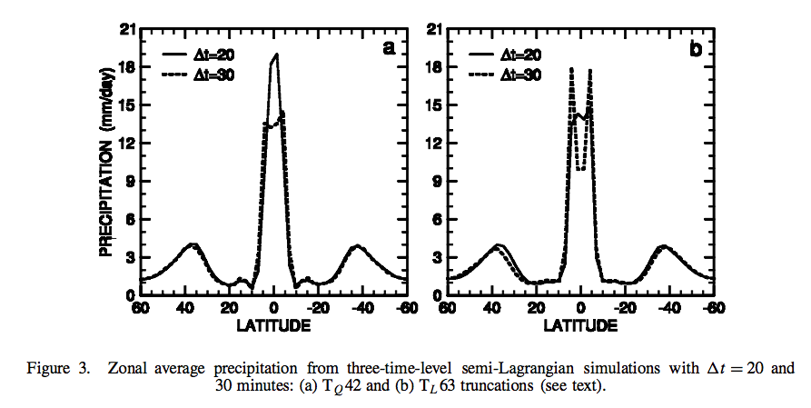
They found that running different “mechanisms” for the same parameterizations produced quite different precipitation results. In investigating further it appeared that the time step was the key change.
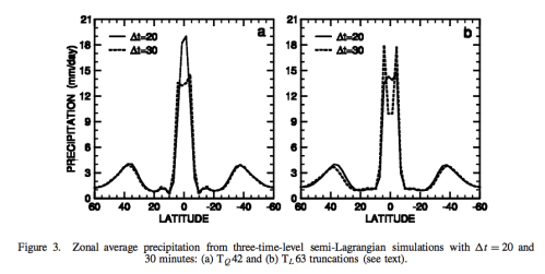
Figure 1 – Click to enlarge
Their conclusion:
When running the Neale and Hoskins (2000a) standard aqua-planet test suite with two versions of the CCM3, which differed in the formulation of the dynamical cores, we found a strong sensitivity in the morphology of the time averaged, zonal averaged precipitation.
The two dynamical cores were candidates for the successor model to CCM3; one was Eulerian and the other semi-Lagrangian.
They were each configured as proposed for climate simulation application, and believed to be of comparable accuracy.
The major difference was computational efficiency. In general, simulations with the Eulerian core formed a narrow single precipitation peak centred on the equator, while those with the semi-Lagrangian core produced more precipitation farther from the equator accompanied by a double peak straddling the equator with a minimum centred on the equator..
..We do not know which simulation is ‘correct’. Although a single peak forms with smaller time steps, the simulations do not converge with the smallest time step considered here. The maximum precipitation rate at the equator continues to increase..
..The significance of the time truncation error of parametrizations deserves further consideration in AGCMs forced by real-world conditions.
Stochastic Noise
From Global Thermohaline Circulation. Part I: Sensitivity to Atmospheric Moisture Transport, Xiaoli Wang et al 1999, the strength of the North Atlantic overturning current (the thermohaline circulation) changed significantly with noise:
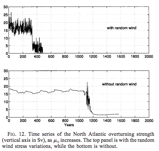
From Wang et al 1999
Figure 2
The idea behind the experiment is that increasing freshwater fluxes at high latitudes from melting ice (in a warmer world) appear to impact the strength of the Atlantic “conveyor” which brings warm water from nearer the equator to northern Europe (there is a long history of consideration of this question). How sensitive is this to random effects?
In these experiments we also include random variations in the zonal wind stress field north of 46ºN. The variations are uniform in space and have a Gaussian distribution, with zero mean and standard deviation of 1 dyn/cm² , based on European Centre for MediumRange Weather Forecasts (ECMWF) analyses (D. Stammer 1996, personal communication).
Our motivation in applying these random variations in wind stress is illustrated by two experiments, one with random wind variations, the other without, in which μN increases according to the above prescription. Figure 12 shows the time series of the North Atlantic overturning strength in these two experiments. The random wind variations give rise to interannual variations in the strength of the overturning, which are comparable in magnitude to those found in experiments with coupled GCMs (e.g., Manabe and Stouffer 1994), whereas interannual variations are almost absent without them. The variations also accelerate the collapse of the overturning, therefore speeding up the response time of the model to the freshwater flux perturbation (see Fig. 12). The reason for the acceleration of the collapse is that the variations make it harder for the convection to sustain itself.
The convection tends to maintain itself, because of a positive feedback with the overturning circulation (Lenderink and Haarsma 1994). Once the convection is triggered, it creates favorable conditions for further convection there. This positive feedback is so powerful that in the case without random variations the convection does not shut off until the freshening is virtually doubled at the convection site (around year 1000). When the random variations are present, they generate perturbations in the Ekman currents, which are propagated downward to the deep layers, and cause variations in the overturning strength. This weakens the positive feedback.
In general, the random wind stress variations lead to a more realistic variability in the convection sites, and in the strength of the overturning circulation.
We note that, even though the transitions are speeded up by the technique, the character of the model behavior is not fundamentally altered by including the random wind variations.
The presentation on stochastic noise also highlighted a coarse resolution GCM that didn’t show El-Nino features – but after the introduction of random noise it did.
I couldn’t track down the reference – Joshi, Williams & Smith 2010 – and emailed Paul Williams who replied very quickly, and helpfully – the paper is still “in preparation” so that means it probably won’t ever be finished, but instead Paul pointed me to two related papers that had been published: Improved Climate Simulations through a Stochastic Parameterization of Ocean Eddies – Paul D Williams et al, AMS (2016) and Climatic impacts of stochastic fluctuations in air–sea fluxes, Paul D Williams et al, GRL (2012).
From the 2012 paper:
In this study, stochastic fluctuations have been applied to the air–sea buoyancy fluxes in a comprehensive climate model. Unlike related previous work, which has employed an ocean general circulation model coupled only to a simple empirical model of atmospheric dynamics, the present work has employed a full coupled atmosphere–ocean general circulation model. This advance allows the feedbacks in the coupled system to be captured as comprehensively as is permitted by contemporary high-performance computing, and it allows the impacts on the atmospheric circulation to be studied.
The stochastic fluctuations were introduced as a crude attempt to capture the variability of rapid, sub-grid structures otherwise missing from the model. Experiments have been performed to test the response of the climate system to the stochastic noise.
In two experiments, the net fresh water flux and the net heat flux were perturbed separately. Significant changes were detected in the century-mean oceanic mixed-layer depth, sea-surface temperature, atmospheric Hadley circulation, and net upward water flux at the sea surface. Significant changes were also detected in the ENSO variability. The century-mean changes are summarized schematically in Figure 4. The above findings constitute evidence that noise-induced drift and noise-enhanced variability, which are familiar concepts from simple models, continue to apply in comprehensive climate models with millions of degrees of freedom..
The graph below shows the control experiment (top) followed by the difference between two experiments and the control (note change in vertical axis scale for the two anomaly experiments) where two different methods of adding random noise were included:
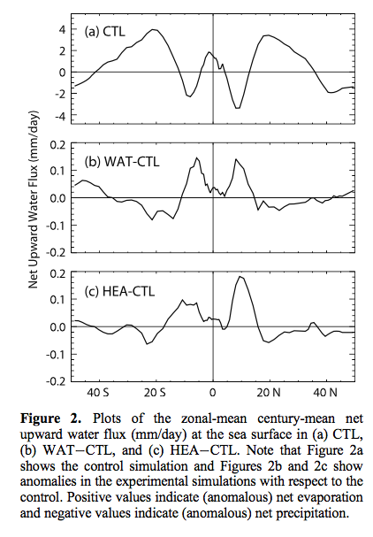
From Williams et al 2012
Figure 3
A key element of the paper is that adding random noise changes the mean values.
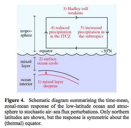
From Williams et al 2012
Figure 4
From the 2016 paper:
Faster computers are constantly permitting the development of climate models of greater complexity and higher resolution. Therefore, it might be argued that the need for parameterization is being gradually reduced over time.
However, it is difficult to envisage any model ever being capable of explicitly simulating all of the climatically important components on all of the relevant time scales. Furthermore, it is known that the impact of the subgrid processes cannot necessarily be made vanishingly small simply by increasing the grid resolution, because information from arbitrarily small scales within the inertial subrange (down to the viscous dissipation scale) will always be able to contaminate the resolved scales in finite time.
This feature of the subgrid dynamics perhaps explains why certain systematic errors are common to many different models and why numerical simulations are apparently not asymptoting as the resolution increases. Indeed, the Intergovernmental Panel on Climate Change (IPCC) has noted that the ultimate source of most large-scale errors is that ‘‘many important small- scale processes cannot be represented explicitly in models’’.
And they continue with an excellent explanation:
The major problem with conventional, deterministic parameterization schemes is their assumption that the impact of the subgrid scales on the resolved scales is uniquely determined by the resolved scales. This assumption can be made to sound plausible by invoking an analogy with the law of large numbers in statistical mechanics.
According to this analogy, the subgrid processes are essentially random and of sufficiently large number per grid box that their integrated effect on the resolved scales is predictable. In reality, however, the assumption is violated because the most energetic subgrid processes are only just below the grid scale, placing them far from the limit in which the law of large numbers applies. The implication is that the parameter values that would make deterministic parameterization schemes exactly correct are not simply uncertain; they are in fact indeterminate.
Later:
The question of whether stochastic closure schemes outperform their deterministic counterparts was listed by Williams et al. (2013) as a key outstanding challenge in the field of mathematics applied to the climate system.
Adding noise with a mean zero doesn’t create a mean zero effect?
The changes to the mean climatological state that were identified in section 3 are a manifestation of what, in the field of stochastic dynamical systems, is called noise-induced drift or noise-induced rectification. This effect arises from interactions between the noise and nonlinearities in the model equations. It permits zero- mean noise to have non-zero-mean effects, as seen in our stochastic simulations.
The paper itself aims..
..to investigate whether climate simulations can be improved by implementing a simple stochastic parameterization of ocean eddies in a coupled atmosphere–ocean general circulation model.
The idea is whether adding noise can improve model results more effectively than increasing model resolution:
We conclude that stochastic ocean perturbations can yield reductions in climate model error that are comparable to those obtained by refining the resolution, but without the increased computational cost.
In this latter respect, our findings are consistent with those of Berner et al. (2012), who studied the model error in an atmospheric general circulation model. They reported that, although the impact of adding stochastic noise is not universally beneficial in terms of model bias reduction, it is nevertheless beneficial across a range of variables and diagnostics. They also reported that, in terms of improving the magnitudes and spatial patterns of model biases, the impact of adding stochastic noise can be similar to the impact of increasing the resolution. Our results are consistent with these findings. We conclude that oceanic stochastic parameterizations join atmospheric stochastic parameterizations in having the potential to significantly improve climate simulations.
And for people who’ve been educated on the basics of fluids on a rotating planet via experiments on the rotating annulus (a 2d model – along with equations – providing great insights into our 3d planet), Testing the limits of quasi-geostrophic theory: application to observed laboratory flows outside the quasi-geostrophic regime, Paul D Williams et al 2010 might be interesting.
Conclusion
Some systems have a lot of non-linearity. This is true of climate and generally of turbulent flows.
In a textbook that I read some time ago on (I think) chaos, the author made the great comment that usually you start out being taught “linear models” and much later come into contact with “non-linear models”. He proposed that a better terminology would be “real world systems” (non-linear) while “simplistic non-real-world teaching models” were the alternative (linear models). I’m paraphrasing.
The point is that most real world systems are non-linear. And many (not all) non-linear systems have difficult properties. The easy stuff you learn – linear systems, aka “simplistic non-real-world teaching models” – isn’t actually relevant to most real world problems, it’s just a stepping stone in giving you the tools to solve the hard problems.
Solving these difficult systems requires numerical methods (there is mostly no analytical solution) and once you start playing around with time-steps, parameter values and model resolution you find that the results can be significantly – and sometimes dramatically – affected by the arbitrary choices. With relatively simple systems (like the Lorenz three-equation convection system) and massive computing power you can begin to find the dependencies. But there isn’t a clear path to see where the dependencies lie (of course, many people have done great work in systematizing (simple) chaotic systems to provide some insights).
GCMs provide insights into climate that we can’t get otherwise.
One way to think about GCMs is that once they mostly agree on the direction of an effect that provides “high confidence”, and anyone who doesn’t agree with that confidence is at best a cantankerous individual and at worst has a hidden agenda.
Another way to think about GCMs is that climate models are mostly at the mercy of unverified parameterizations and numerical methods and anyone who does accept their conclusions is naive and doesn’t appreciate the realities of non-linear systems.
Life is complex and either of these propositions could be true, along with anything inbetween.
More about Turbulence: Turbulence, Closure and Parameterization
References
Time Step Sensitivity of Nonlinear Atmospheric Models: Numerical Convergence, Truncation Error Growth, and Ensemble Design, Teixeira, Reynolds & Judd, Journal of the Atmospheric Sciences (2007) – free paper
Dependence of aqua-planet simulations on time step, Willamson & Olsen, Q. J. R. Meteorol. Soc. (2003) – free paper
Global Thermohaline Circulation. Part I: Sensitivity to Atmospheric Moisture Transport, Xiaoli Wang, Peter H Stone, and Jochem Marotzke, American Meteorological Society (1999) – free paper
Improved Climate Simulations through a Stochastic Parameterization of Ocean Eddies – Paul D Williams et al, AMS (2016) – free paper
Climatic impacts of stochastic fluctuations in air–sea fluxes, Paul D Williams et al, GRL (2012) – free paper
Testing the limits of quasi-geostrophic theory: application to observed laboratory flows outside the quasi-geostrophic regime, Paul Williams, Peter Read & Thomas Haine, J. Fluid Mech. (2010) – free paper
Read Full Post »