In XII – Rainfall 2 we saw the results of many models on rainfall as GHGs increase. They project wetter tropics, drier subtropics and wetter higher latitude regions. We also saw an expectation that rainfall will increase globally, with something like 2-3% per ºC of warming.
Here is a (too small) graph from Allen & Ingram (2002) showing the model response of rainfall under temperature changes from GHG increases. The dashed line marked “C-C” is the famous (in climate physics) Clausius–Clapeyron relation which, at current temperatures, shows a 7% change in water vapor per ºC of warming. The red triangles are the precipitation changes from model simulations showing about half of that.
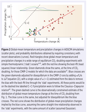
From Allen & Ingram (2002)
Figure 1
Here is another graph from the same paper showing global mean temperature change (top) and rainfall over land (bottom):
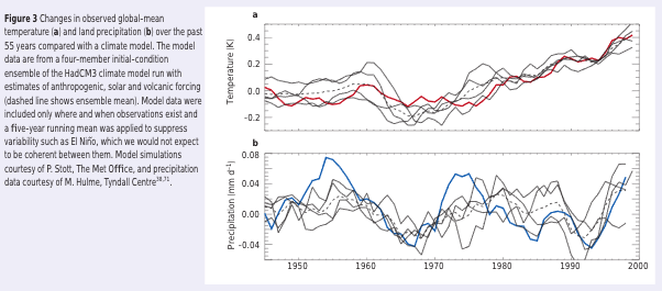
From Allen & Ingram (2002)
Figure 2
The temperature has increased over the last 50 years, and models and observations show that the precipitation has.. oh, it’s not changed. What is going on?
First, the authors explain some important background:
The distribution of moisture in the troposphere (the part of the atmosphere that is strongly coupled to the surface) is complex, but there is one clear and strong control: moisture condenses out of supersaturated air.
This constraint broadly accounts for the humidity of tropospheric air parcels above the boundary layer, because almost all such parcels will have reached saturation at some point in their recent history. Physically, therefore, it has long seemed plausible that the distribution of relative humidity would remain roughly constant under climate change, in which case the Clausius-Clapeyron relation implies that specific humidity would increase roughly exponentially with temperature.
This reasoning is strongest at higher latitudes where air is usually closer to saturation, and where relative humidity is indeed roughly constant through the substantial temperature changes of the seasonal cycle. For lower latitudes it has been argued that the real-world response might be different. But relative humidity seems to change little at low latitudes under a global warming scenario, even in models of very high vertical resolution, suggesting this may be a robust ’emergent constraint’ on which models have already converged.
They continue:
If tropospheric moisture loading is controlled by the constraints of (approximately) unchanged relative humidity and the Clausius-Clapeyron relation, should we expect a corresponding exponential increase in global precipitation and the overall intensity of the hydrological cycle as global temperatures rise?
This is certainly not what is observed in models.
To clarify, the point in the last sentence is that models do show an increase in precipitation, but not at the same rate as the expected increase in specific humidity (see note 1 for new readers).
They describe their figure 2 (our figure 1 above) and explain:
The explanation for these model results is that changes in the overall intensity of the hydrological cycle are controlled not by the availability of moisture, but by the availability of energy: specifically, the ability of the troposphere to radiate away latent heat released by precipitation.
At the simplest level, the energy budgets of the surface and troposphere can be summed up as a net radiative heating of the surface (from solar radiation, partly offset by radiative cooling) and a net radiative cooling of the troposphere to the surface and to space (R) being balanced by an upward latent heat flux (LP, where L is the latent heat of evaporation and P is global-mean precipitation): evaporation cools the surface and precipitation heats the troposphere.
[Emphasis added].
Basics Digression
Picture the atmosphere over a long period of time (like a decade), and for the whole globe. If it hasn’t heated up or cooled down we know that the energy in must equal energy out (or if it has only done so only marginally then energy in is almost equal to energy out). This is the first law of thermodynamics – energy is conserved.
What energy comes into the atmosphere?
- Solar radiation is partly absorbed by the atmosphere (most is transmitted through and heats the surface of the earth)
- Radiation emitted from the earth’s surface (we’ll call this terrestrial radiation) is mostly absorbed by the atmosphere (some is transmitted straight through to space)
- Warm air is convected up from the surface
- Heat stored in evaporated water vapor (latent heat) is convected up from the surface and the water vapor condenses out, releasing heat into the atmosphere when this happens
How does the atmosphere lose energy?
- It radiates downwards to the surface
- It radiates out to space
..end of digression
Changing Energy Budget
In a warmer world, if we have more evaporation we have more latent heat transfer from the surface into the troposphere. But the atmosphere has to be able to radiate this heat away. If it can’t, then the atmosphere becomes warmer, and this reduces convection. So with a warmer surface we may have a plentiful potential supply of latent heat (via water vapor) but the atmosphere needs a mechanism to radiate away this heat.
Allen & Ingram put forward a simple conceptual equation:
ΔRc + ΔRT = LΔP
where the change in radiative cooling ΔR, is split into two components: ΔRc that is independent of the change in atmospheric temperature; and ΔRT that depends only on the temperature
L = latent heat of water vapor (a constant), ΔP = change in rainfall (= change in evaporation, as evaporation is balanced by rainfall)
LΔP is about 1W/m² per 1% increase in global precipitation.
Now, if we double CO2, then before any temperature changes we decrease the outgoing longwave radiation through the tropopause (the top of the troposphere) by about 3-4W/m² and we increase atmospheric radiation to the surface by about 1W/m².
So doubling CO2, ΔRc = -2 to -3W/m²; prior to a temperature change ΔRT = 0; and so ΔP reduces.
The authors comment that increasing CO2 before any temperature change takes place reduces the intensity of the hydrological cycle and this effect was seen in early modeling experiments using prescribed sea surface temperatures.
Now, of course, the idea of doubling CO2 without any temperature change is just a thought experiment. But it’s an important thought experiment because it lets us isolate different factors.
The authors then consider their factor ΔRT:
The enhanced radiative cooling due to tropospheric warming, ΔRT, is approximately proportional to ΔT: tropospheric temperatures scale with the surface temperature change and warmer air radiates more energy, so ΔRT = kΔT, with k=3W/(m²K)..
All this is saying is that as the surface warms, the atmosphere warms at about the same rate, and the atmosphere then emits more radiation. This is why the model results of rainfall in our figure 2 above show no trend in rainfall over 50 years, and also match the observations – the constraint on rainfall is the changing radiative balance in the troposphere.
And so they point out:
Thus, although there is clearly usable information in fig. 3 [our figure 2], it would be physically unjustified to estimate ΔP/ΔT directly from 20th century observations and assume that the same quantity will apply in the future, when the balance between climate drivers will be very different.
There is a lot of other interesting commentary in their paper, although the paper itself is now quite dated (and unfortunately behind a paywall). In essence they discuss the difficulties of modeling precipitation changes, especially for a given region, and are looking for “emergent constraints” from more fundamental physics that might help constrain forecasts.
A forecasting system that rules out some currently conceivable futures as unlikely could be far more useful for long-range planning than a small number of ultra-high-resolution forecasts that simply rule in some (very detailed futures as possibilities).
This is a very important point when considering impacts.
Conclusion
Increasing the surface temperature by 1ºC is expected to increase the humidity over the ocean by about 7%. This is simply the basic physics of saturation. However, climate models predict an increase in mean rainfall of maybe 2-3% per ºC. The fundamental reason is that the movement of latent heat from the surface to the atmosphere has to be radiated away by the atmosphere, and so the constraint is the ability of the atmosphere to do this. And so the limiting factor in increasing rainfall is not the humidity increase, it is the radiative cooling of the atmosphere.
We also see that despite 50 years of warming, mean rainfall hasn’t changed. Models also predict this. This is believed to be a transient state, for reasons explained in the article.
References
Constraints on future changes in climate and the hydrologic cycle, MR Allen & WJ Ingram, Nature (2002) – freely available [thanks, Robert]
Notes
1 Relative humidity is measured as a percentage. If the relative humidity = 100% it means the air is saturated with water vapor – it can’t hold any more water vapor. If the relative humidity = 0% it means the air is completely dry. As temperature increases the ability of air to hold water vapor increases non-linearly.
For example, at 0ºC, 1kg of air can carry around 4g of water vapor, at 10ºC that has doubled to 8g, and at 20ºC it has doubled again to 15g (I’m using approximate values).
So now imagine saturated air over the ocean at 20ºC rising up and therefore cooling (it is cooler higher up in the atmosphere). By the time the air parcel has cooled down to 0ºC (this might be anything from 2km to 5km altitude) it is still saturated but is only carrying 4g of water vapor, having condensed out 11g into water droplets.
Read Full Post »