In Part Two we looked at one paper by Lorenz from 1968 where he put forward the theory that climate might be “intransitive”. In common parlance we could write this as “climate might be chaotic” (even though there is a slight but important difference between the two definitions).
In this article we will have a bit of a look at the history of the history of climate – that is, a couple of old papers about ice ages.
These papers are quite dated and lots of new information has since come to light, and of course thousands of papers have since been written about the ice ages. So why a couple of old papers? It helps to create some context around the problem. These are “oft-cited”, or seminal, papers, and understanding ice ages is so complex that it is probably easiest to set out an older view as some kind of perspective.
At the very least, it helps get my thinking into order. Whenever I try to understand a climate problem I usually end up trying to understand some of the earlier oft-cited papers because most later papers rely on that context without necessarily repeating it.
Variations in the Earth’s Orbit: Pacemaker of the Ice Ages by JD Hays, J Imbrie, NJ Shackleton (1976) is referenced by many more recent papers that I’ve read – and, according to Google Scholar, cited by 2,656 other papers – that’s a lot in climate science.
For more than a century the cause of fluctuations in the Pleistocene ice sheets has remained an intriguing and unsolved scientific mystery. Interest in this problem has generated a number of possible explanations.
One group of theories invokes factors external to the climate system, including variations in the output of the sun, or the amount of solar energy reaching the earth caused by changing concentrations of interstellar dust; the seasonal and latitudinal distribution of incoming radiation caused by changes in the earth’s orbital geometry; the volcanic dust content of the atmosphere; and the earth’s magnetic field. Other theories are based on internal elements of the system believed to have response times sufficiently long to yield fluctuations in the range 10,000 to 1,000,000 years.
Such features include the growth and decay of ice sheets, the surging of the Antarctic ice sheet; the ice cover of the Arctic Ocean; the distribution of carbon dioxide between atmosphere and ocean; and the deep circulation of the ocean.
Additionally, it has been argued that as an almost intransitive system, climate could alternate between different states on an appropriate time scale without the intervention of any external stimulus or internal time constant.
This last idea is referenced as Lorenz 1968, the paper we reviewed in Part Two.
The authors note that previous work has provided evidence of orbital changes being involved in climate change, and make an interesting comment that we will see has not changed in the intervening 38 years:
The first [problem] is the uncertainty in identifying which aspects of the radiation budget are critical to climate change. Depending on the latitude and season considered most significant, grossly different climate records can be predicted from the same astronomical data..
Milankovitch followed Koppen and Wegener’s view that the distribution of summer insolation at 65°N should be critical to the growth and decay of ice sheets.. Kukla pointed out weaknesses.. and suggested that the critical time may be Sep and Oct in both hemispheres.. As a result, dates estimated for the last interglacial on the basis of these curves have ranged from 80,000 to 180,000 years ago.
The other problem at that time was the lack of quality data on the dating of various glacials and interglacials:
The second and more critical problem in testing the orbital theory has been the uncertainty of geological chronology. Until recently, the inaccuracy of dating methods limited the interval over which a meaningful test could be made to the last 150,000 years.
This paper then draws on some newer, better quality data for the last few hundred thousand years of temperature history. By the way, Hays was (and is) a Professor of Geology, Imbrie was (and is) a Professor of Oceanography and Shackleton was at the time in Quarternary Research, later a professor in the field.
Brief Introduction to Orbital Parameters that Might Be Important
Now, something we will look at in a later article, probably Part Four, is exactly what changes in solar insolation are caused by changes in the earth’s orbital geometry. But as an introduction to that question, there are three parameters that vary and are linked to climate change:
- Eccentricity, e, (how close is the earth’s orbit to a circle) – currently 0.0167
- Obliquity, ε, (the tilt of the earth’s axis) – currently 23.439°
- Precession, ω, (how close is the earth to the sun in June or December) – currently the earth is closest to the sun on January 3rd
The first, eccentricity, is the only one that changes the total amount of solar insolation received at top of atmosphere in a given year. Note that a constant solar insolation at the top of atmosphere can be a varying solar absorbed radiation if more or less of that solar radiation happens to be reflected off, say, ice sheets, due to, say, obliquity.
The second, obliquity, or tilt, affects the difference between summer and winter TOA insolation. So it affects seasons and, specifically, the strength of seasons.
The third, precession, affects the amount of radiation received at different times of the year (moderated by item 1, eccentricity). So if the earth’s orbit was a perfect circle this parameter would disappear. When the earth is closest to the sun in June/July the Northern Hemisphere summer is stronger and the SH summer is weaker, and vice versa for winters.
So eccentricity affects total TOA insolation, while obliquity and precession change its distribution in season and latitude. However, variations in solar insolation at TOA depend on e² and so the total variation in TOA radiation has, over a very long period, only been only 0.1%.
This variation is very small and yet the strongest “orbital signal” in the ice age record is that of eccentricity. A problem, that even for the proponents of this theory, has not yet been solved.
Last Interglacial Climates, by a cast of many including George J. Kukla, Wallace S. Broecker, John Imbrie, Nicholas J. Shackleton:
At the end of the last interglacial period, over 100,000 yr ago, the Earth’s environments, similar to those of today, switched into a profoundly colder glacial mode. Glaciers grew, sea level dropped, and deserts expanded. The same transition occurred many times earlier, linked to periodic shifts of the Earth’s orbit around the Sun. The mechanism of this change, the most important puzzle of climatology, remains unsolved.
[Emphasis added].
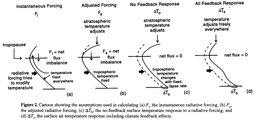
History Cores
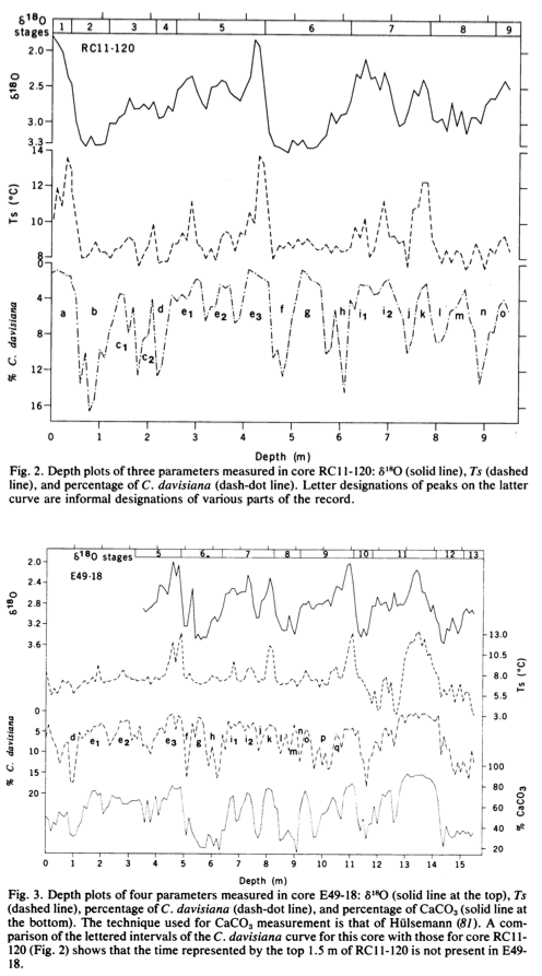
Our geological data comprise measurements of three climatically sensitive parameters in two deep-sea sediment cores. These cores were taken from an area where previous work shows that sediment is accumulating fast enough to preserve information at the frequencies of interest. Measurements of one variable, the per mil enrichment of oxygen 18 (δ18O), make it possible to correlate these records with others throughout the world, and to establish that the sediment studied accumulated without significant hiatuses and at rates which show no major fluctuations..
.. From several hundred cores studied stratigraphically by the CLIMAP project, we selected two whose location and properties make them ideal for testing the orbital hypothesis. Most important, they contain together a climatic record that is continuous, long enough to be statistically useful (450,000 years) and characterized by accumulation rates fast enough (>3 cm per 1,000 years) to resolve climatic fluctuations with periods well below 20,000 years.
The cores were located in the Southern Indian ocean. What is interesting about the cores is that 3 different mechanisms are captured from each location, including δ18O isotopes which should be a measure of ice sheets globally and temperature in the ocean at the location of the cores.
Hays, Imbrie & Shackleton (1976)
Figure 1
There is much discussion about the dating of the cores. In essence, other information allows a few transitions to be dated, while the working assumption is that within these transitions the sediment accumulation is at a constant rate.
Although uniform sedimentation is an ideal which is unlikely to prevail precisely anywhere, the fact that the characteristics of the oxygen isotope record are present throughout the cores suggests that there can be no substantial lacunae, while the striking resemblance to records from distant areas shows that there can be no gross distortion of accumulation rate.
Spectral Analysis
The key part of their analysis is a spectral analysis of the data, compared with a spectral analysis of the “astronomical forcing”.
The authors say:
.. we postulate a single, radiation-climate system which transforms orbital inputs into climatic outputs. We can therefore avoid the obligation of identifying the physical mechanism of climatic response and specify the behavior of the system only in general terms. The dynamics of our model are fixed by assuming that the system is a time-invariant, linear system – that is, that its behavior in the time domain can be described by a linear differential equation with constant coefficients. The response of such a system in the frequency domain is well known: frequencies in the output match those of the input, but their amplitudes are modulated at different frequencies according to a gain function. Therefore, whatever frequencies characterize the orbital signals, we will expect to find them emphasized in paleoclimatic spectra (except for frequencies so high they would be greatly attenuated by the time constants of response)..
My translation – let’s compare the orbital spectrum with the historical spectrum without trying to formulate a theory and see how the two spectra compare.
The orbital effects:
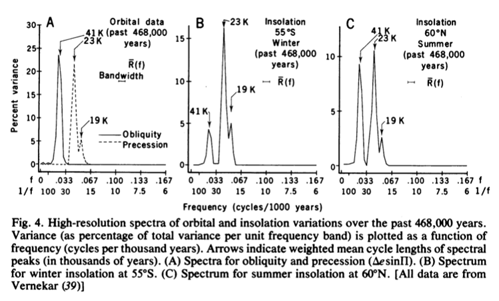
From Hays et al (1976)
Figure 2
The historical data:
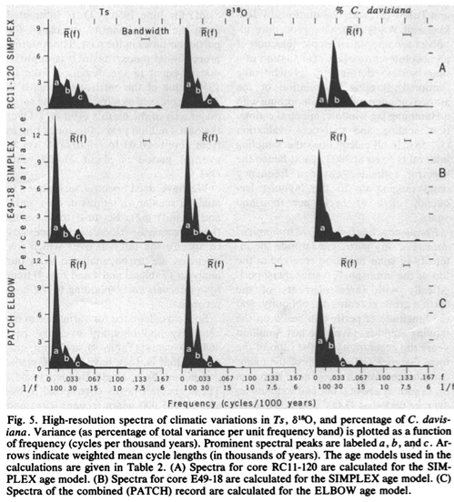
From Hays et al (1976)
Figure 3
We have also calculated spectra for two time series recording variations in insolation [their fig 4 – our fig 2], one for 55°S and the other for 60°N. To the nearest 1,000 years, the three dominant cycles in these spectra (41,000, 23,000 and 19,000 years) correspond to those observed in the spectra for obliquity and precession.
This result, although expected, underscores two important points. First, insolation spectra are characterized by frequencies reflecting obliquity and precession, but not eccentricity.
Second, the relative importance of the insolation components due to obliquity and precession varies with latitude and season.
[Emphasis added]
In commenting on the historical spectra they say:
Nevertheless, five of the six spectra calculated are characterized by three discrete peaks, which occupy the same parts of the frequency range in each spectrum. Those correspond to periods from 87,000 to 119,000 years are labeled a; 37,000 to 47,000 years b; and 21,000 to 24,000 years c. This suggest that the b and c peaks represent a response to obliquity and precession variation, respectively.
Note that the major cycle shown in the frequency spectrum is the 100,000 peak.
There is a lot of discussion in their paper of the data analysis, please have a read of their paper to learn more. The detail probably isn’t so important for current understanding.
The authors conclude:
Over the frequency range 10,000 to 100,000 cycle per year, climatic variance of these records is concentrated in three discrete spectral peaks at periods of 23,000, 42,000, and approximately 100,000 years. These peaks correspond to the dominant periods of the earth’s solar orbit and contain respectively about 10, 25 and 50% of the climatic variance.
The 42,000-year climatic component has the same period as variations in the obliquity of the earth’s axis and retains a constant phase relationship with it.
The 23,000-year portion of the variance displays the same periods (about 23,000 and 19,000 years) as the quasi-periodic precession index.
The dominant 100,000 year climatic component has an average period close to, and is in phase with, orbital eccentricity. Unlike the correlations between climate and the higher frequency orbital variations (which can be explained on the assumption that the climate system responds linearly to orbital forcing) an explanation of the correlations between climate and eccentricity probably requires an assumption of non-linearity.
It is concluded that changes in the earth’s orbital geometry are the fundamental cause of the succession of Quarternary ice ages.
Things were looking good for explanations of the ice ages in 1975..
For those who want to understand more recent evaluation of the spectral analysis of temperature history vs orbital forcing, check out papers by Carl Wunsch from 2003, 2004 and 2005, e.g. The spectral description of climate change including the 100 ky energy, Climate Dynamics (2003).
A Few Years Later
Here are a few comments from Imbrie & Imbrie (1980):
Since the work of Croll and Milankovitch, many investigations have been aimed at the central question of the astronomical theory of the ice ages:
Do changes in orbital geometry cause changes in climate that are geologically detectable?
On the one hand, climatologists have attacked the problem theoretically by adjusting the boundary conditions of energy-balance models, and then observing the magnitude of the calculated response. If these numerical experiments are viewed narrowly as a test of the astronomical theory, they are open to question because the models used contain untested parameterizations of important physical processes. Work with early models suggested that the climatic response to orbital changes was too small to account for the succession of Pleistocene ice ages. But experiments with a new generation of models suggest that orbital variations are sufficient to account for major changes in the size of Northern Hemisphere ice sheets..
..In 1968, Broecker et al. (34, 35) pointed out that the curve for summertime irradiation at 45°N was a much better match to the paleoclimatic records of the past 150,000 years than the curve for 65°N chosen by Milankovitch..
Current Status. This is not to say that all important questions have been answered. In fact, one purpose of this article is to contribute to the solution of one of the remaining major problems: the origin and history of the 100,000-year climatic cycle.
At least over the past 600,000 years, almost all climatic records are dominated by variance components in a narrow frequency band centered near a 100,000-year cycle. Yet a climatic response at these frequencies is not predicted by the Milankovitch version of the astronomical theory – or any other version that involves a linear response..
..Another problem is that most published climatic records that are more than 600,000 years old do not exhibit a strong 100,000-year cycle..
The goal of our modeling effort has been to simulate the climatic response to orbital variations over the past 500,000 years. The resulting model fails to simulate four important aspects of this record. It fails to produce sufficient 100k power; it produces too much 23k and 19k power; it produces too much 413k power; and it loses its match with the record around the time of the last 413k eccentricity minimum, when values of e [eccentricity] were low and the amplitude of the 100k eccentricity cycle was much reduced..
..The existence of an unstable fixed point makes tuning an extremely sensitive task. For example, Weertman notes that changing the value of one parameter by less than 1 percent of its physically allowed range made the difference between a glacial regime and an interglacial regime in one portion of an experimental run while leaving the rest virtually unchanged..
This would be a good example of Lorenz’s concept of an almost intransitive system (one whose characteristics over long but finite intervals of time depend strongly on initial conditions).
Once again the spectre of the Eminent Lorenz is raised. We will see in later articles that with much more sophisticated models it is not easy to create an ice-age, or to turn an ice-age into an inter-glacial.
Articles in the Series
Part One – An introduction
Part Two – Lorenz – one point of view from the exceptional E.N. Lorenz
Part Four – Understanding Orbits, Seasons and Stuff – how the wobbles and movements of the earth’s orbit affect incoming solar radiation
Part Five – Obliquity & Precession Changes – and in a bit more detail
Part Six – “Hypotheses Abound” – lots of different theories that confusingly go by the same name
Part Seven – GCM I – early work with climate models to try and get “perennial snow cover” at high latitudes to start an ice age around 116,000 years ago
Part Seven and a Half – Mindmap – my mind map at that time, with many of the papers I have been reviewing and categorizing plus key extracts from those papers
Part Eight – GCM II – more recent work from the “noughties” – GCM results plus EMIC (earth models of intermediate complexity) again trying to produce perennial snow cover
Part Nine – GCM III – very recent work from 2012, a full GCM, with reduced spatial resolution and speeding up external forcings by a factors of 10, modeling the last 120 kyrs
Part Ten – GCM IV – very recent work from 2012, a high resolution GCM called CCSM4, producing glacial inception at 115 kyrs
Pop Quiz: End of An Ice Age – a chance for people to test their ideas about whether solar insolation is the factor that ended the last ice age
Eleven – End of the Last Ice age – latest data showing relationship between Southern Hemisphere temperatures, global temperatures and CO2
Twelve – GCM V – Ice Age Termination – very recent work from He et al 2013, using a high resolution GCM (CCSM3) to analyze the end of the last ice age and the complex link between Antarctic and Greenland
Thirteen – Terminator II – looking at the date of Termination II, the end of the penultimate ice age – and implications for the cause of Termination II
References
Variations in the Earth’s Orbit: Pacemaker of the Ice Ages, JD Hays, J Imbrie & NJ Shackleton, Science (1976)
Modeling the Climatic Response to Orbital Variations, John Imbrie & John Z. Imbrie, Science (1980)
Last Interglacial Climates, Kukla et al, Quaternary Research (2002)